Tripal Marketing Website Design
Ezike Goodness
Tripal: Travel Platform Marketing Website
Role: Product Designer & UX Lead
Platform: Marketing Website
Overview
Designed Tripal's conversion-focused marketing website for an AI-powered travel platform that aggregates flights and accommodations across 200+ booking sites, featuring interactive mapping and intelligent price comparison.
The Challenge
Create a marketing site that effectively communicates sophisticated travel technology to diverse user segments from budget backpackers to luxury travelers while driving sign-ups and establishing credibility against established competitors like Kayak and Skyscanner.
Design Solutions
Strategic Information Architecture
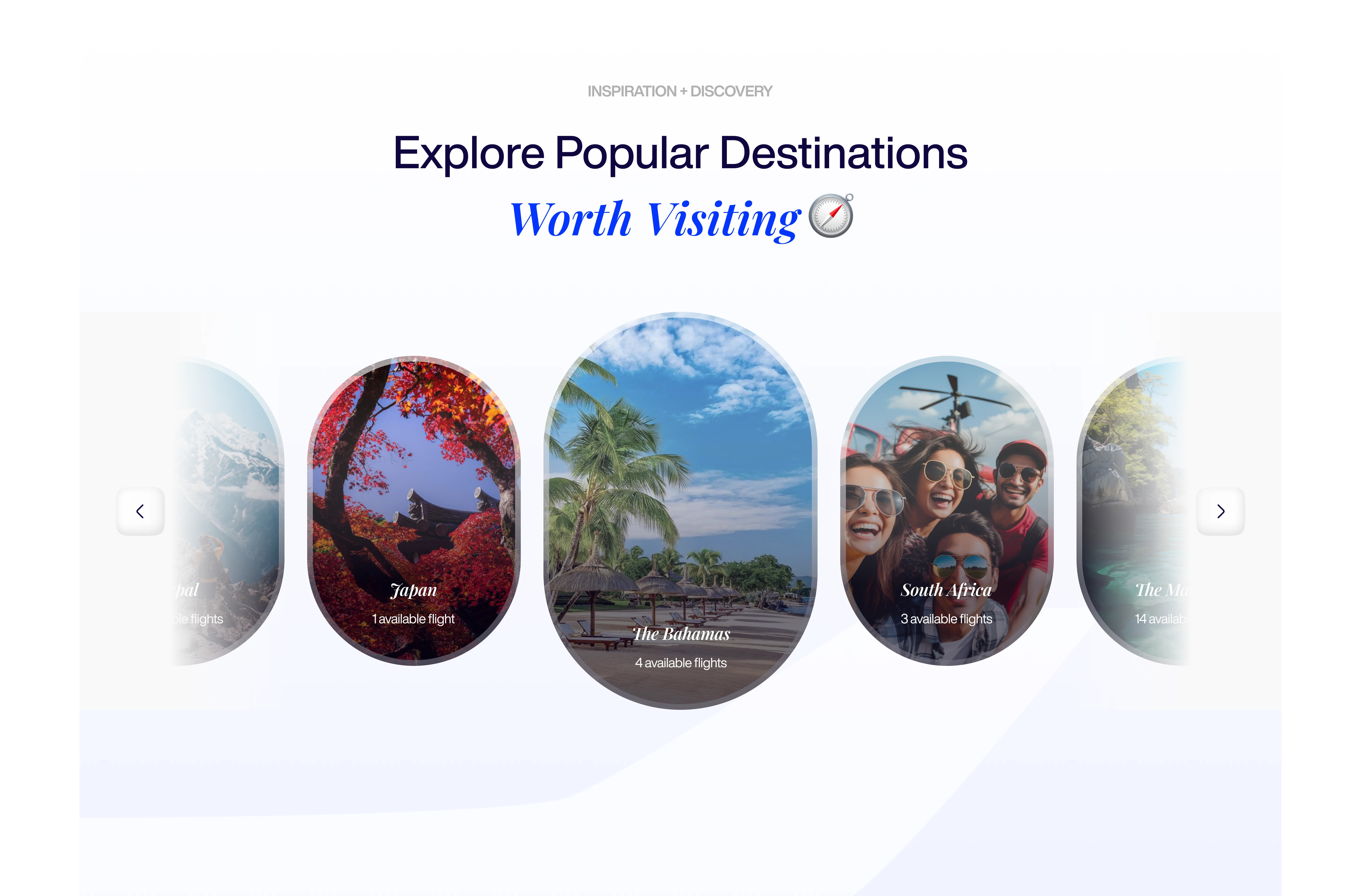
Developed a seven-section landing page that guides visitors through progressive engagement: immediate value communication (hero) → capability demonstration (features) → friction reduction (how it works) → social proof (deals/featured hotels) → conversion (CTA). Each section answers visitor questions at the exact moment they arise during evaluation.
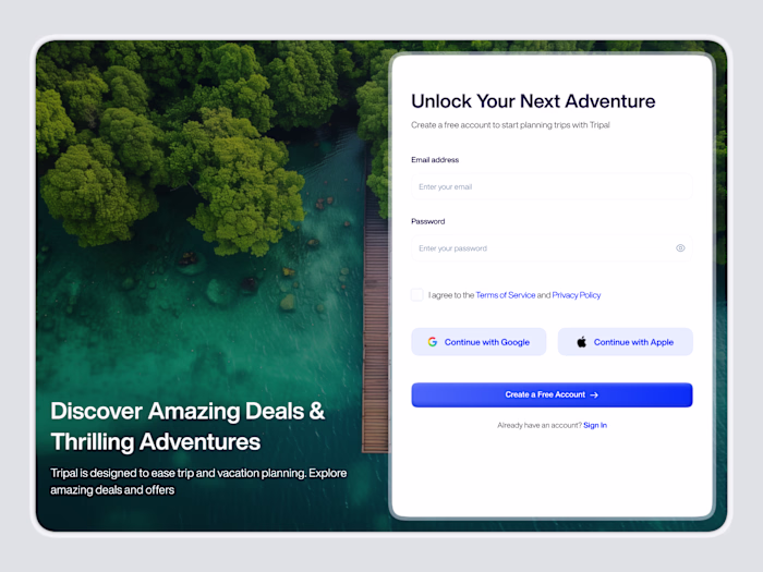
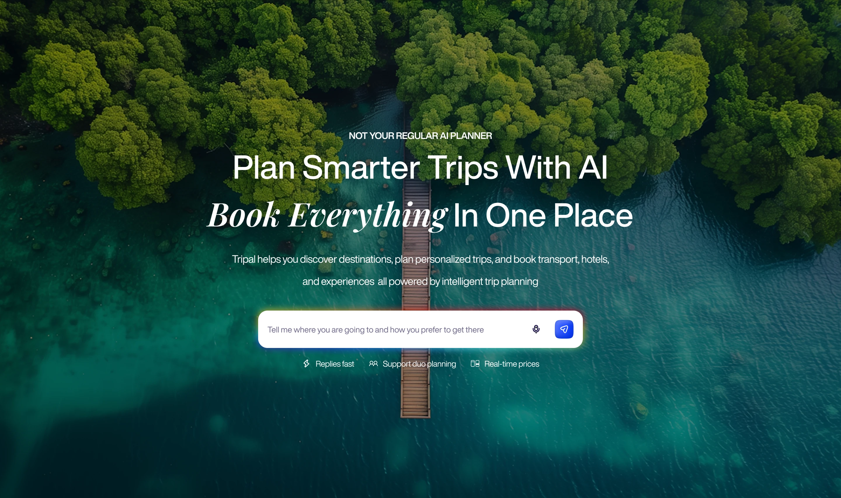
Hero Section Design
Crafted a high-impact entry point with the headline "Plan Smarter Trips with AI" paired with immediate proof: "Book Everything in One Trip", designed an AI prompt field as CTA to encourage users to use the platform AI for trip planning.
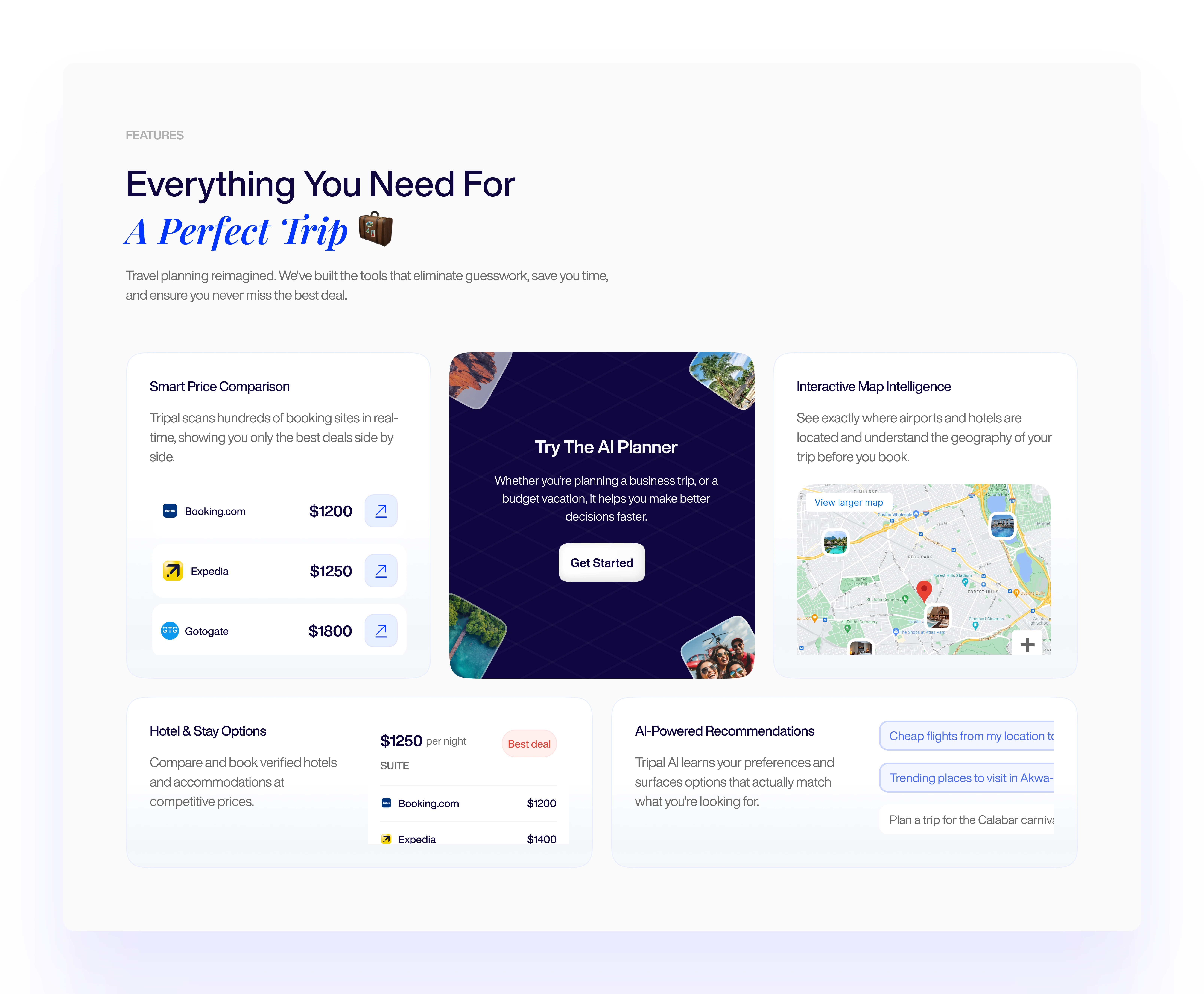
Feature Communication Framework
Translated six complex platform capabilities into benefit-driven narratives:
Smart Price Comparison: Real-time aggregation positioned as "Never overpay again"
Interactive Map Intelligence: Geospatial visualization framed as decision-making confidence
Save & Compare: Multi-scenario planning without data loss
Seamless Booking: One-click handoff to booking platforms
Each feature uses a consistent pattern: benefit headline + functional explanation + user outcome. This creates scannable hierarchy while providing depth for engaged readers.
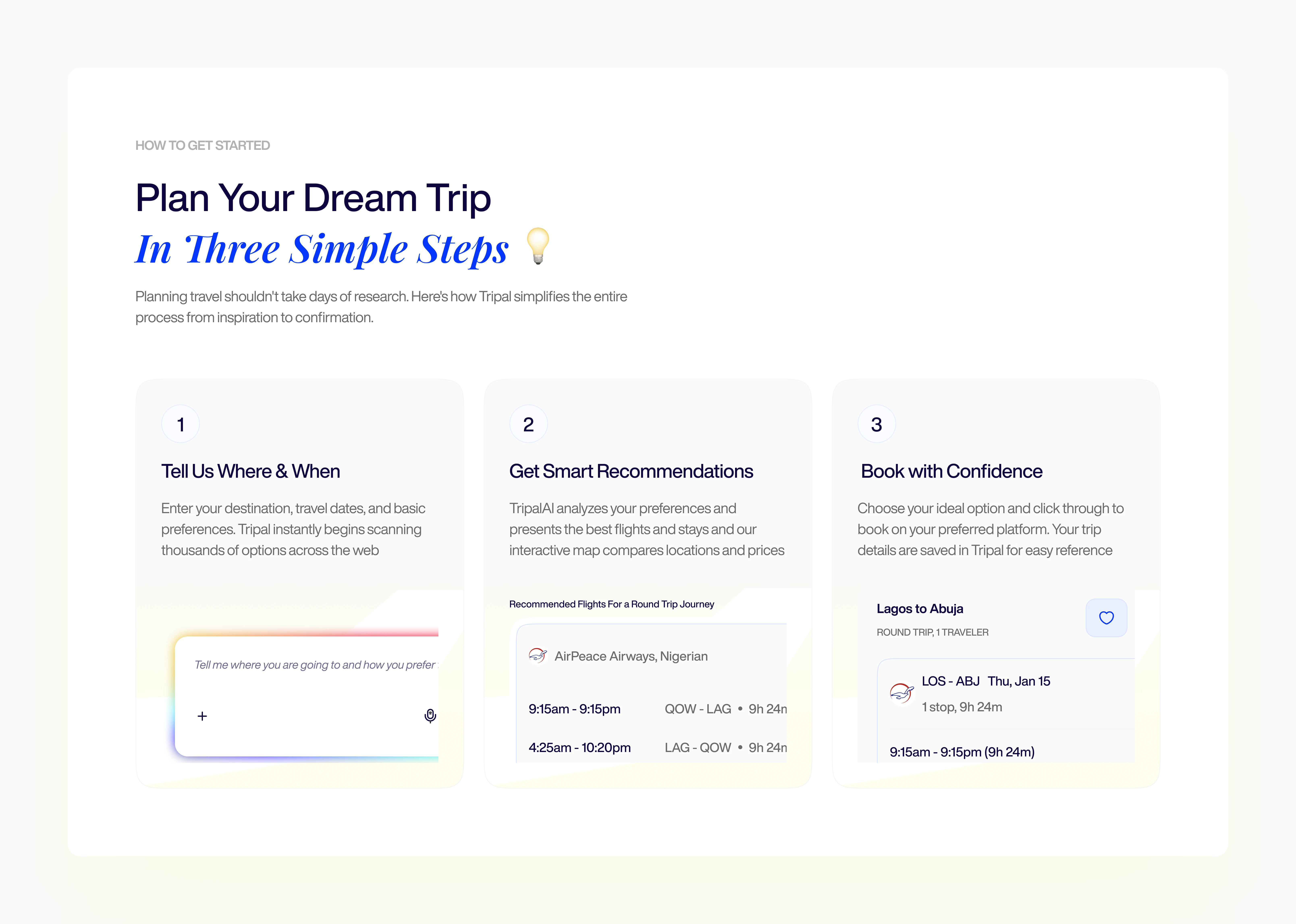
Simplified Onboarding Flow
Designed a three-step visual journey that demystifies platform complexity:
Input basic preferences → instant multi-source scanning
Receive ranked recommendations → explore via interactive map → save favorites
One-click booking handoff → saved trip reference
This framework reduces perceived friction and positions the platform as faster than traditional multi-tab research.
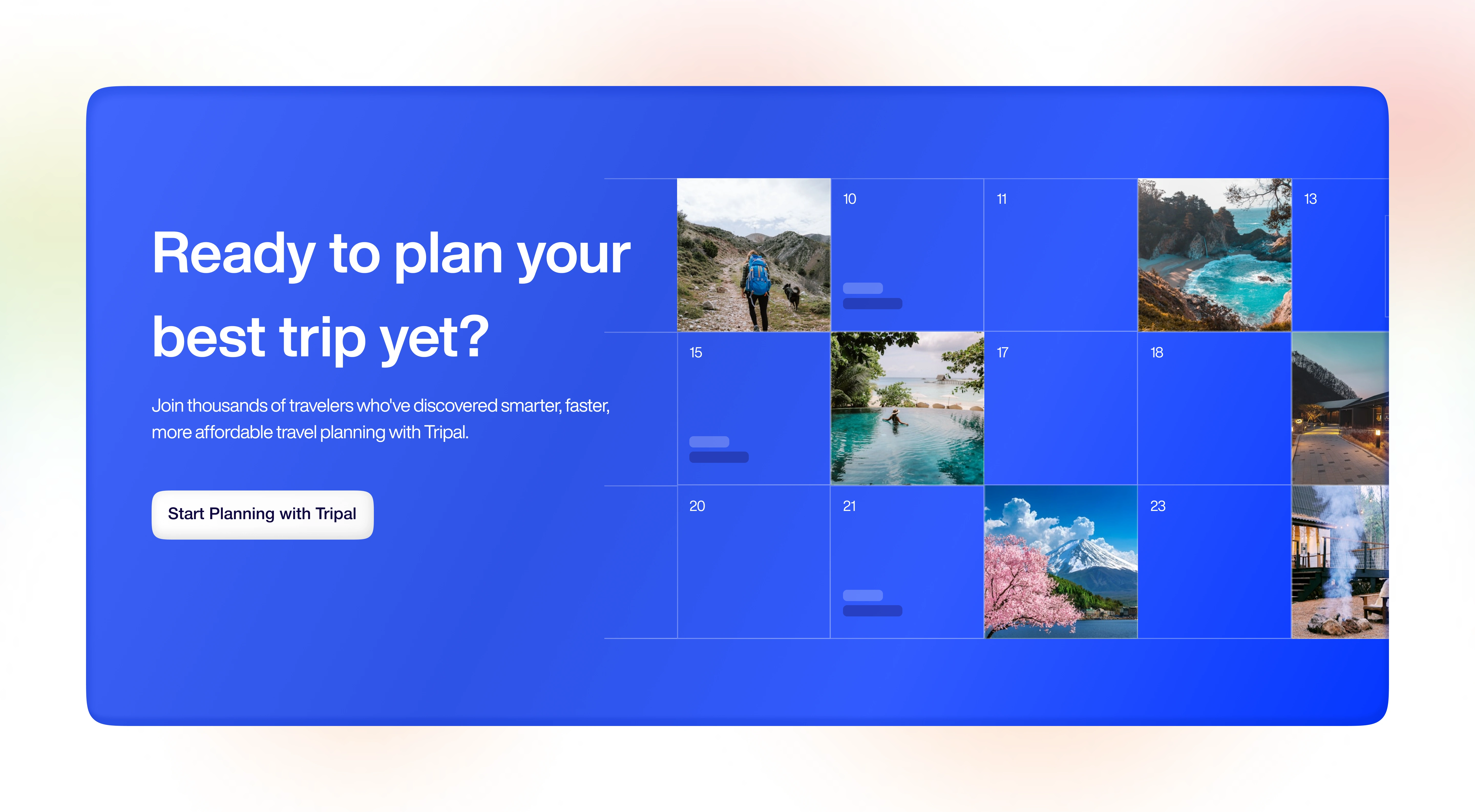
Designed final CTA section with testimonials highlighting the different experiences users have had using the platform for trip planning.
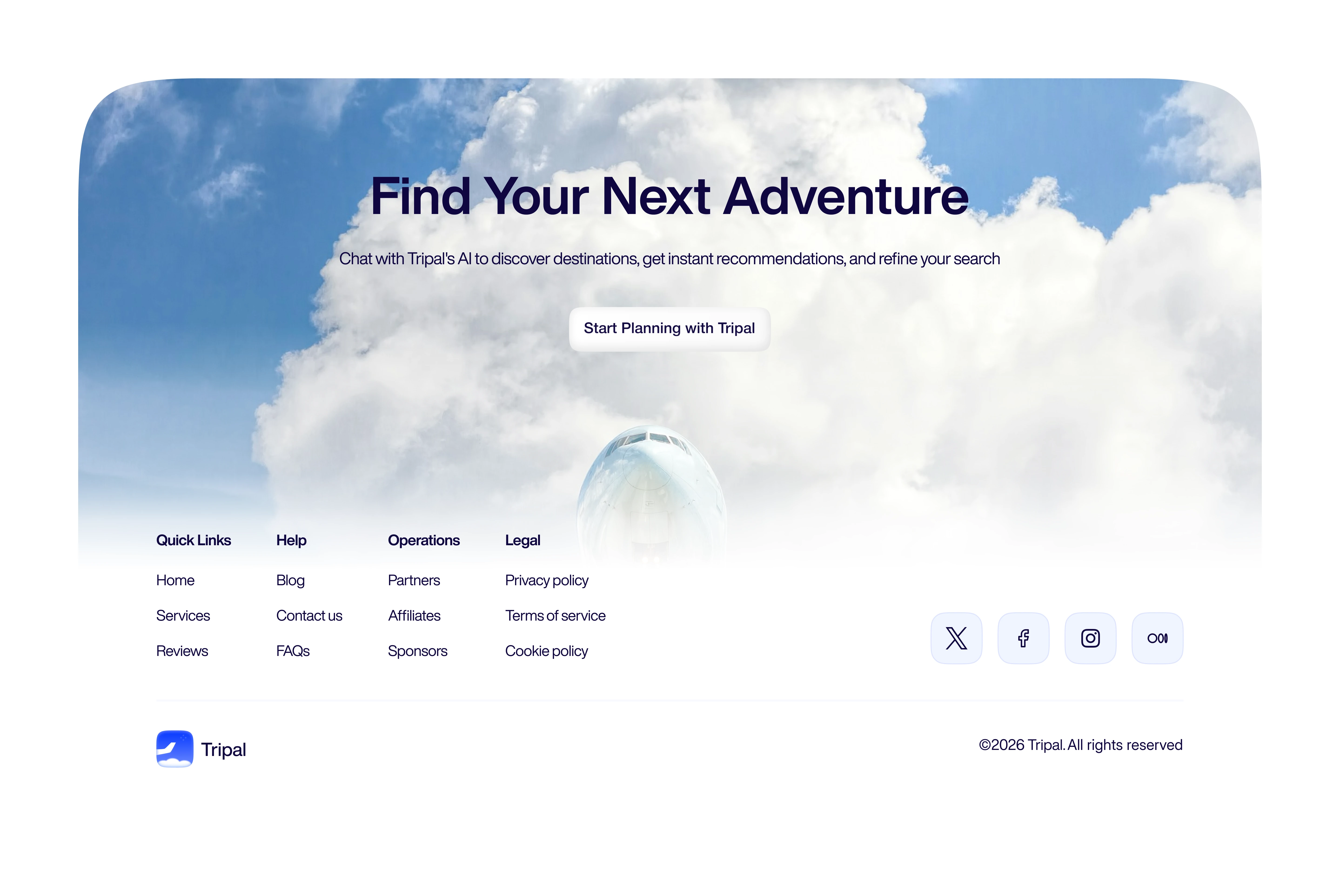
Responsive Footer Design
Architected comprehensive footer navigation (Product, Destinations, Resources, Company, Support, Legal) that serves SEO requirements while providing genuine utility.
Design Principles Applied
Clarity: Technical sophistication expressed through user benefits, not feature lists
Progressive Disclosure: Information depth increases as visitor scrolls, matching engagement level
Authentic Urgency: Scarcity elements backed by transparent algorithmic verification
Friction Elimination: Every design decision evaluated against "does this add or remove barriers to trying the product?"
Visual Hierarchy for Scanning: Key value propositions remain comprehensible at 3-second scan, 30-second skim, or 3-minute deep read
Outcomes
A marketing website that positions Tripal as technologically sophisticated yet immediately accessible converting visitor skepticism into curiosity through transparent value demonstration rather than aggressive sales tactics.
Like this project
Posted Feb 12, 2026
Designed Tripal's conversion-focused site for an AI travel platform.
Likes
0
Views
7