iOS UI design for skincare app
Meher Gulati
Overview
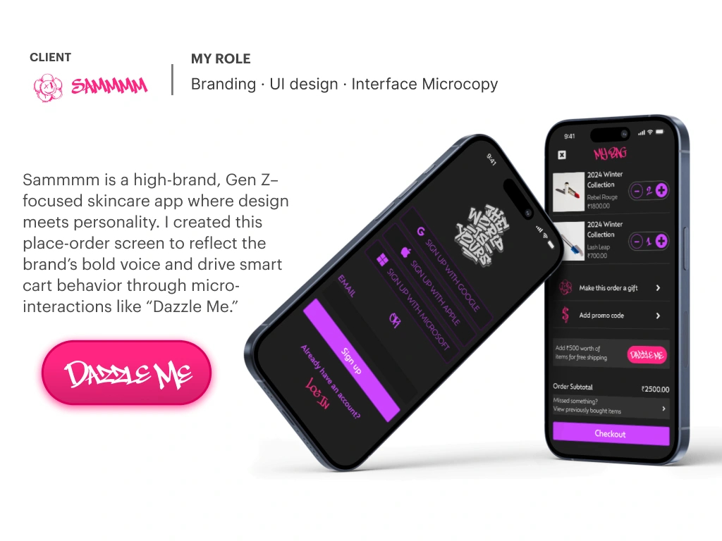
SAM is a high-brand, Gen-Z–focused skincare app where design meets personality. The goal was to create an iOS experience that feels bold and expressive while still driving clean, confident purchasing.
My Role
Branding • Art Direction • iOS UI Design • Interface Microcopy
Problem
Most skincare apps either look premium but sterile, or fun but messy. SAM needed a distinct voice and a smooth checkout, without sacrificing clarity or conversion.
Goals
Create a strong brand-forward UI system that feels Gen-Z and memorable
Design key commerce moments: Signup → Cart → Checkout
Use microcopy + micro-interactions to encourage smarter cart behavior
Keep flows intuitive: minimal friction, clear hierarchy, confident CTAs
What I Designed
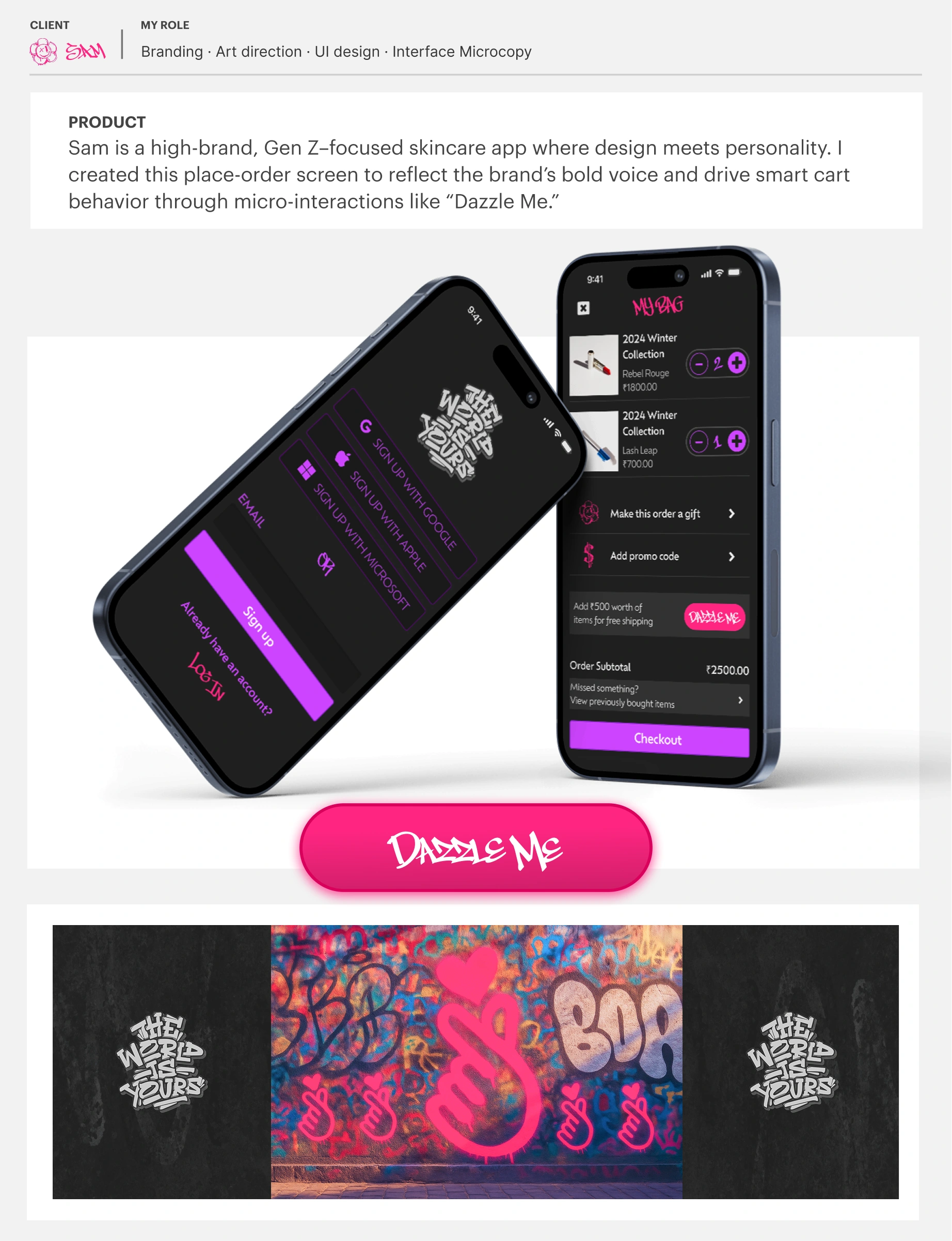
1) Signup / Account creation
Dark-mode, high-contrast layout with neon accents for a “night-lux” vibe
Multiple signup options (Google/Apple/etc.) presented with clean hierarchy
Microcopy that reinforces SAM’s tone without confusing the user
2) Cart / Place-order screen
Product list with quick quantity controls (±) for fast edits
Clear add-ons and actions: gift option, promo code, etc.
A playful, brand-signature prompt (“Dazzle Me”) used as a micro-interaction to nudge users toward higher-intent cart behavior (while still feeling on-brand)
Checkout CTA anchored visually for decisive completion
Visual & Interaction System
Bold black base + electric pink/purple accents (high energy, high contrast)
Street/graffiti-inspired personality cues paired with minimal structure
Strong typographic hierarchy: expressive headers, clean functional labels
UI patterns built for consistency: buttons, quantity controls, list rows, CTAs
Deliverables
High-fidelity iOS screens (Signup + Cart/Checkout)
Brand-direction cues (tone, color, type, visual attitude)
Microcopy/micro-interaction concepts supporting commerce flow
Outcome
A cohesive, personality-driven UI that balances emotion + clarity - making SAM feel unmistakable while keeping the purchase path straightforward.
Like this project
Posted Dec 29, 2025
Brand design & UI for SAM, a Gen-Z skincare app: iOS UI + microcopy for signup and cart/checkout, using bold visuals + micro-interactions.
Likes
0
Views
4