Design system implementation for a SaaS startup - WYNK
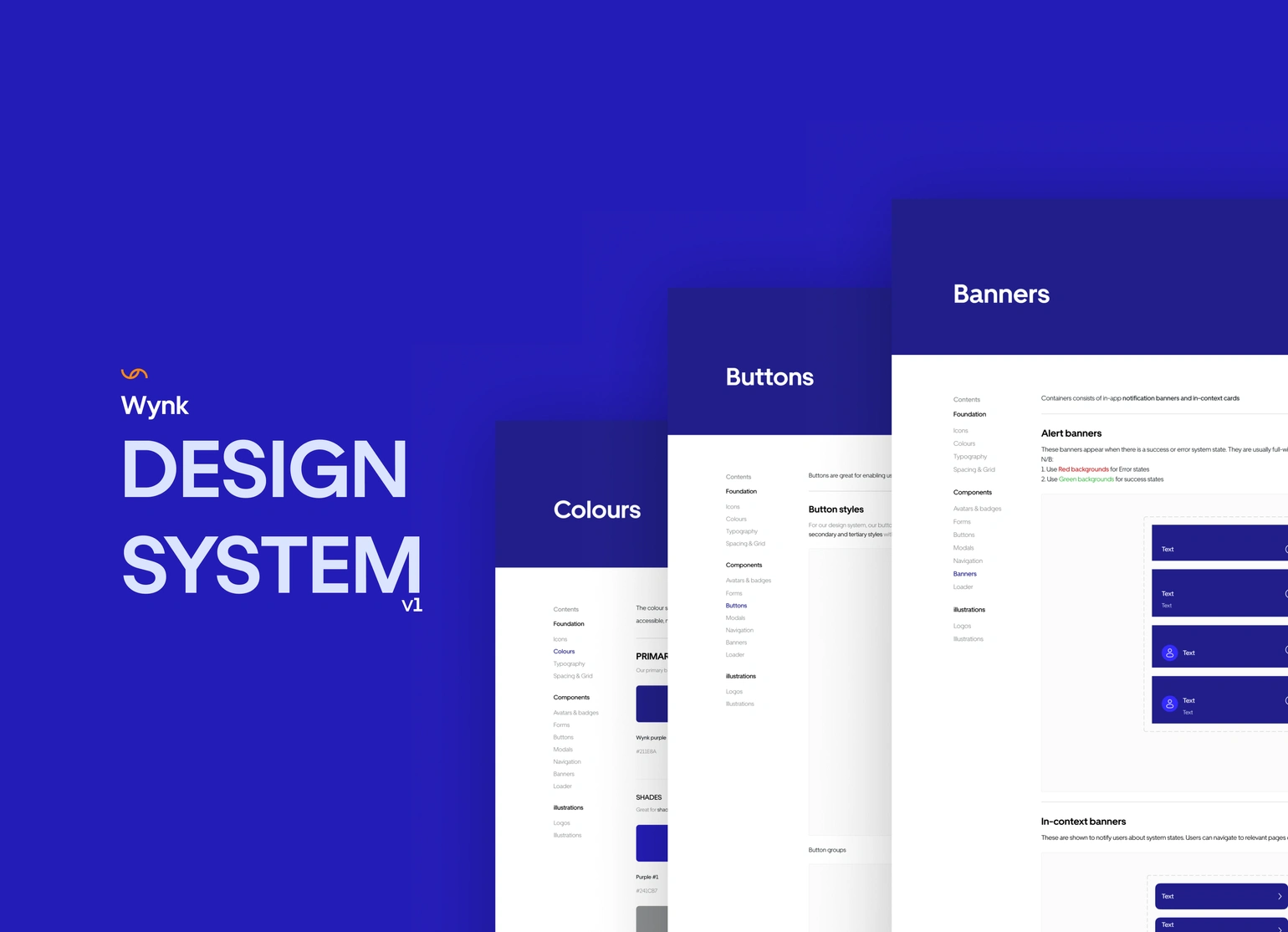
Overview
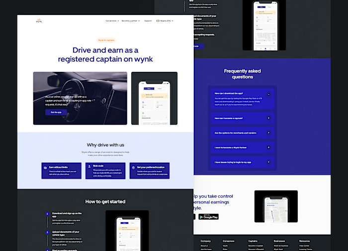
Wynk is super app solution with Payment, ride-hailing and package delivery services in one mobile application.
Project Goals
This project was aimed to:
Improve mobile app visual inconsistency.
Improve team and engineering collaboration.
Create a single source of truth for future team onboarding.
Project timeline - 4 weeks
Outcomes
I led the design and implementation of the company’s first design system - Enhancing team collaboration and cohesiveness across multiple product features.
The first draft of the design system led to an 80% increase in team workflow and engineering collaboration.
Design
highlights
Building Blocks
App UX audit and Inventory
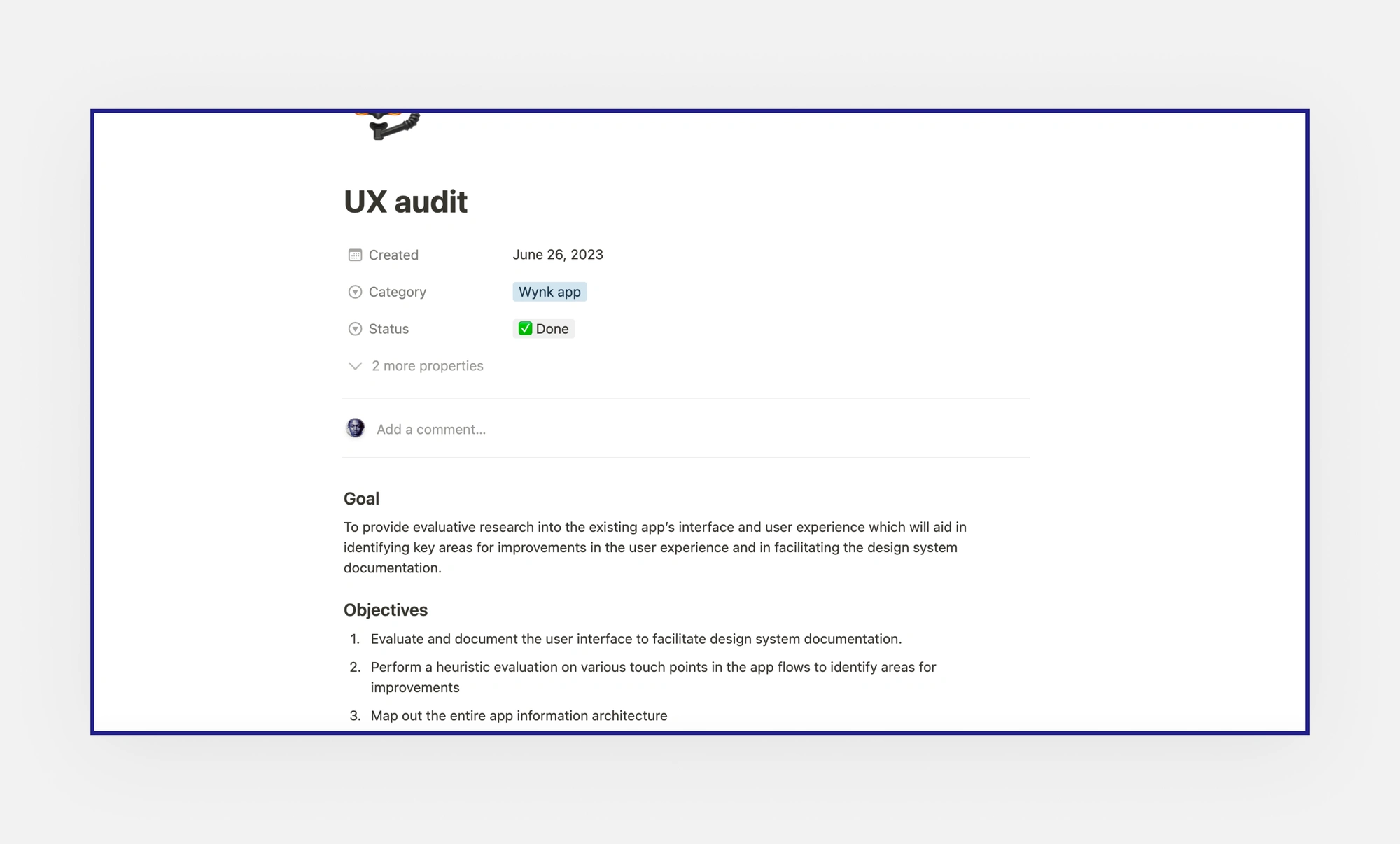
To begin, I conducted a UX audit on the app to provide evaluative research into the app’s existing interface which helped me to:
Identify relevant design components to Facilitate the design systems documentation.
Uncover insights into key areas for improvement.
Map out hidden user flows that seemed unclear. Tap here to view
App UX audit
Defining clear objectives.
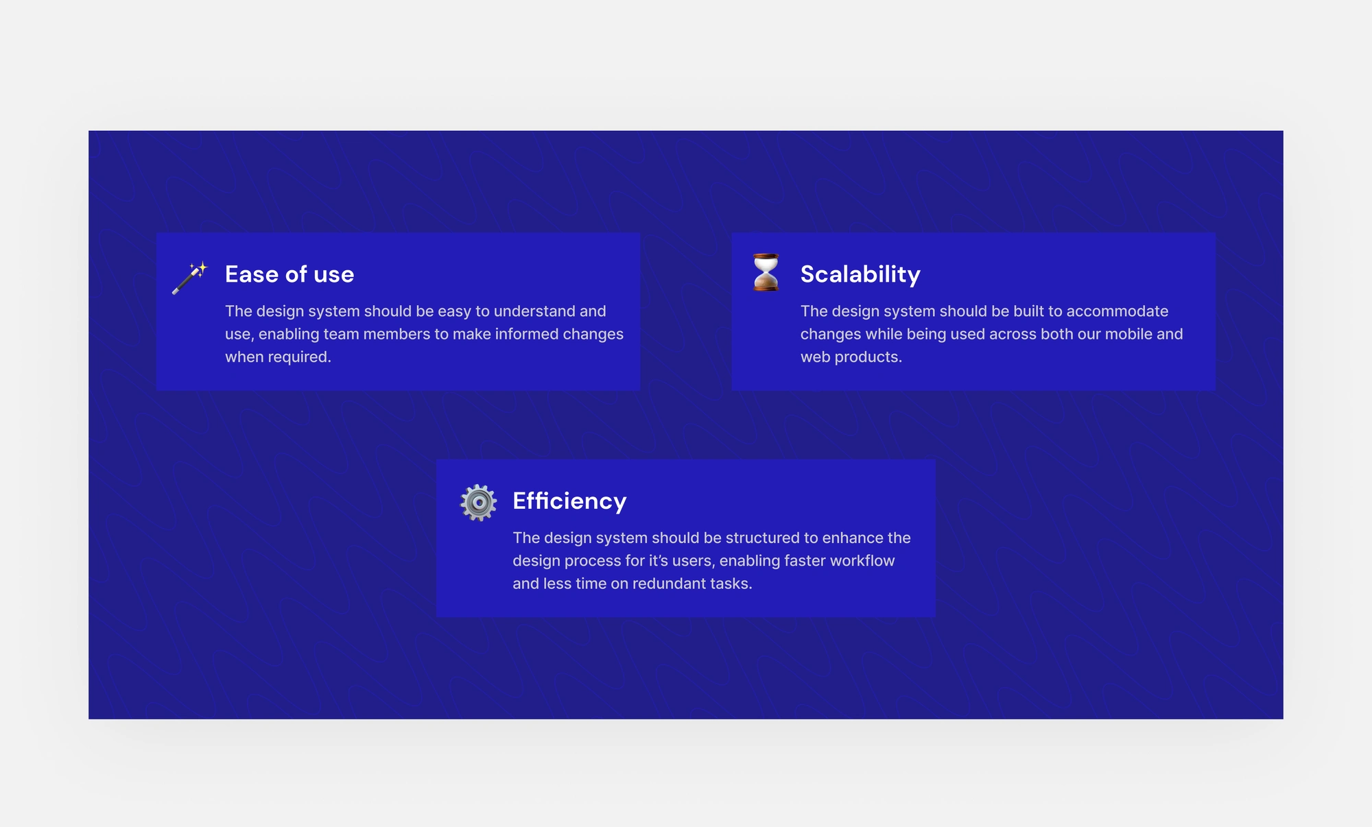
After concluding with the UX audit, I defined 3 main objectives to help guide my design decisions when building the design system.
Design objectives
Starting with the foundation.
I focused on getting the foundations right first because this would determine what the larger blocks and components were gonna look like.
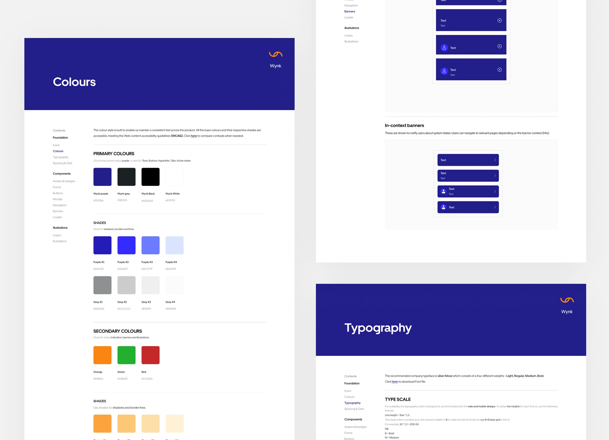
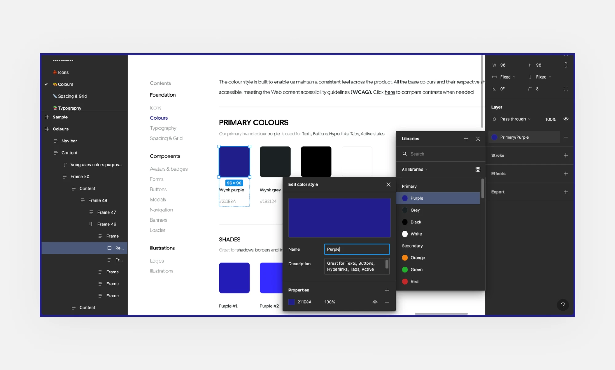
1. Colour style
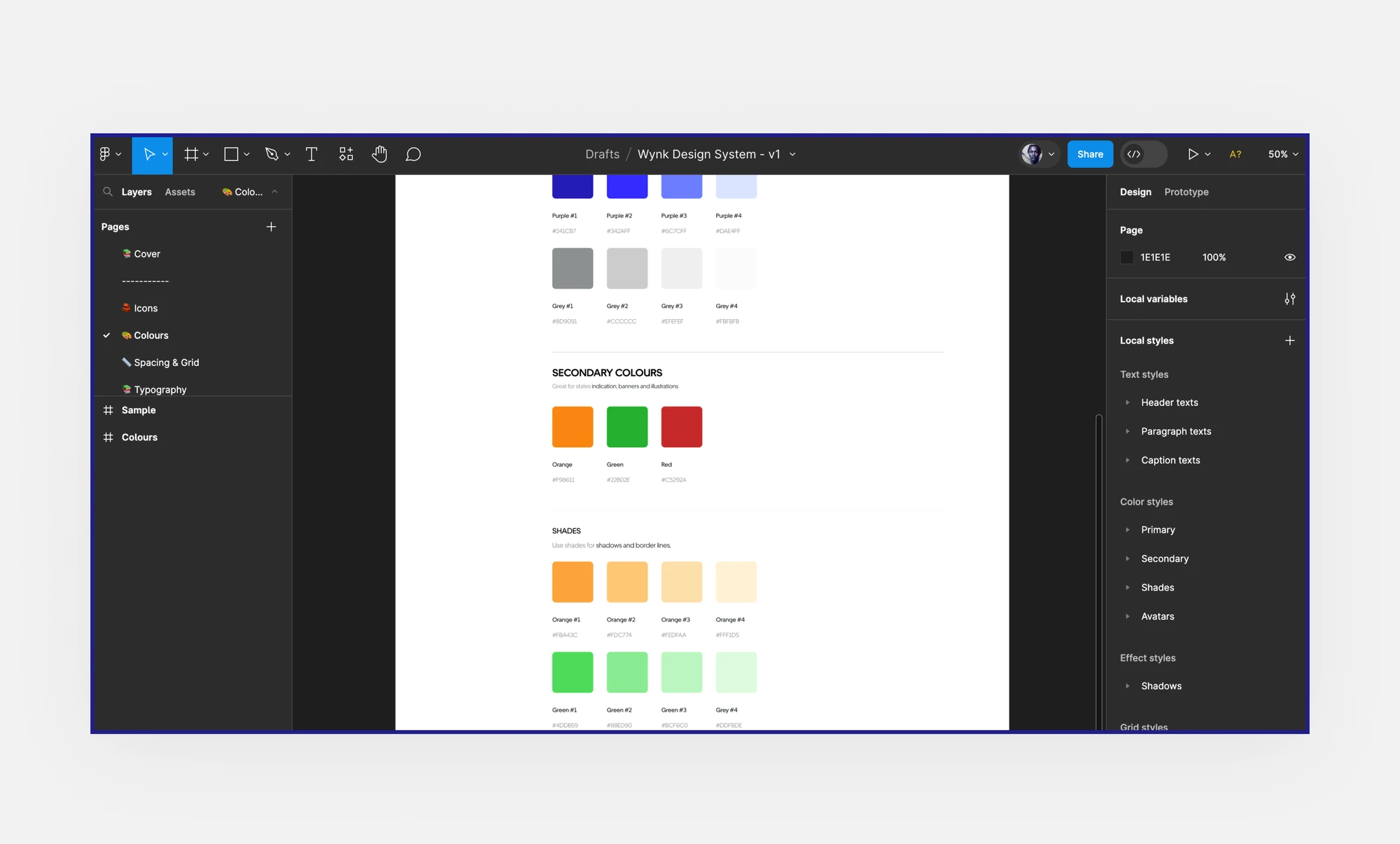
The palette for the colour style was built based on the company’s brand colours, with other colours being added as complements.
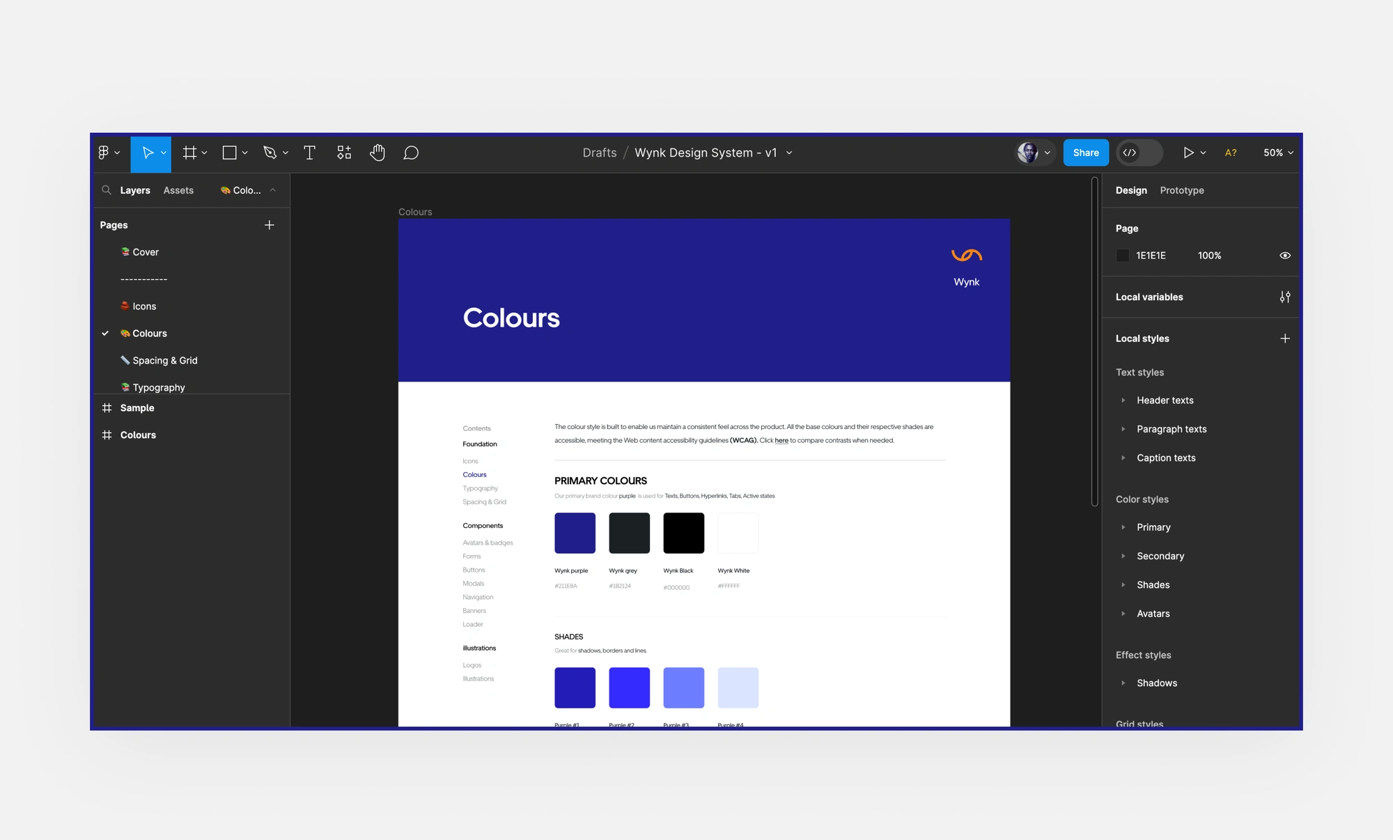
Fewer shades were used to minimise decision time and also to prevent the team from having any technical debt in the future due to redundant colour shades.
Designing for accessibility
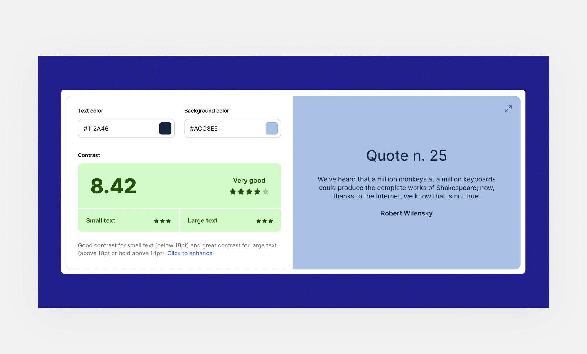
In compliance with WCAG, I used a colour contrast checker to ensure the base colours and their respective shades were accessible. Tap here to view
Each colour shade with its specific use cases was then defined and documented in the team library enabling everyone to access it.

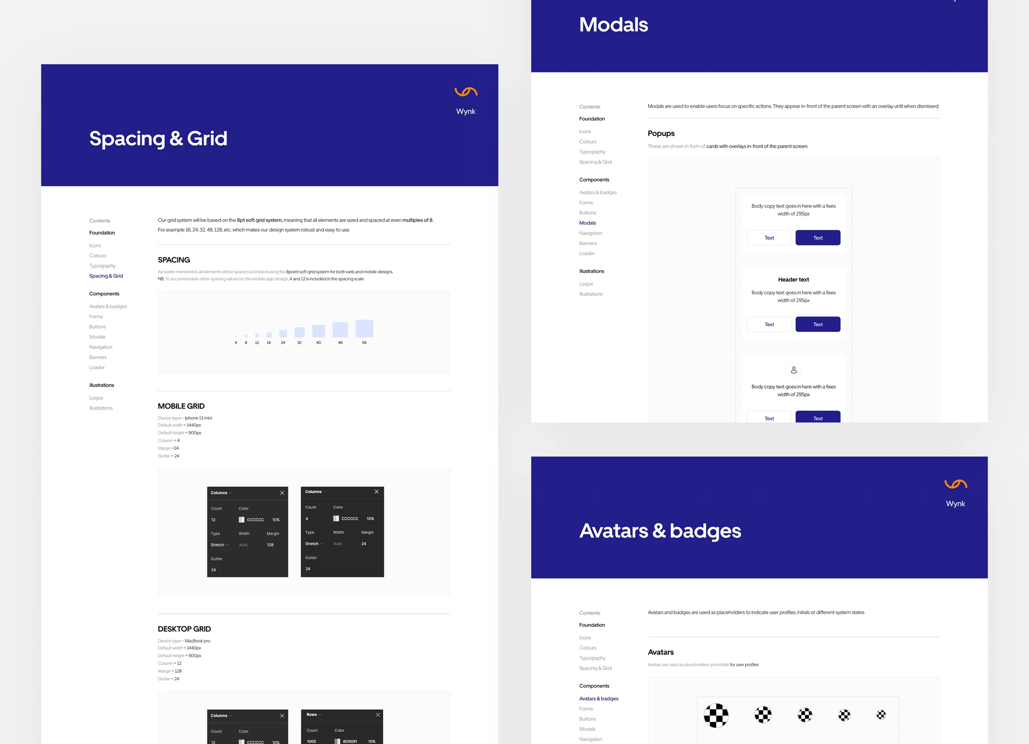
2. Spacing & Grid
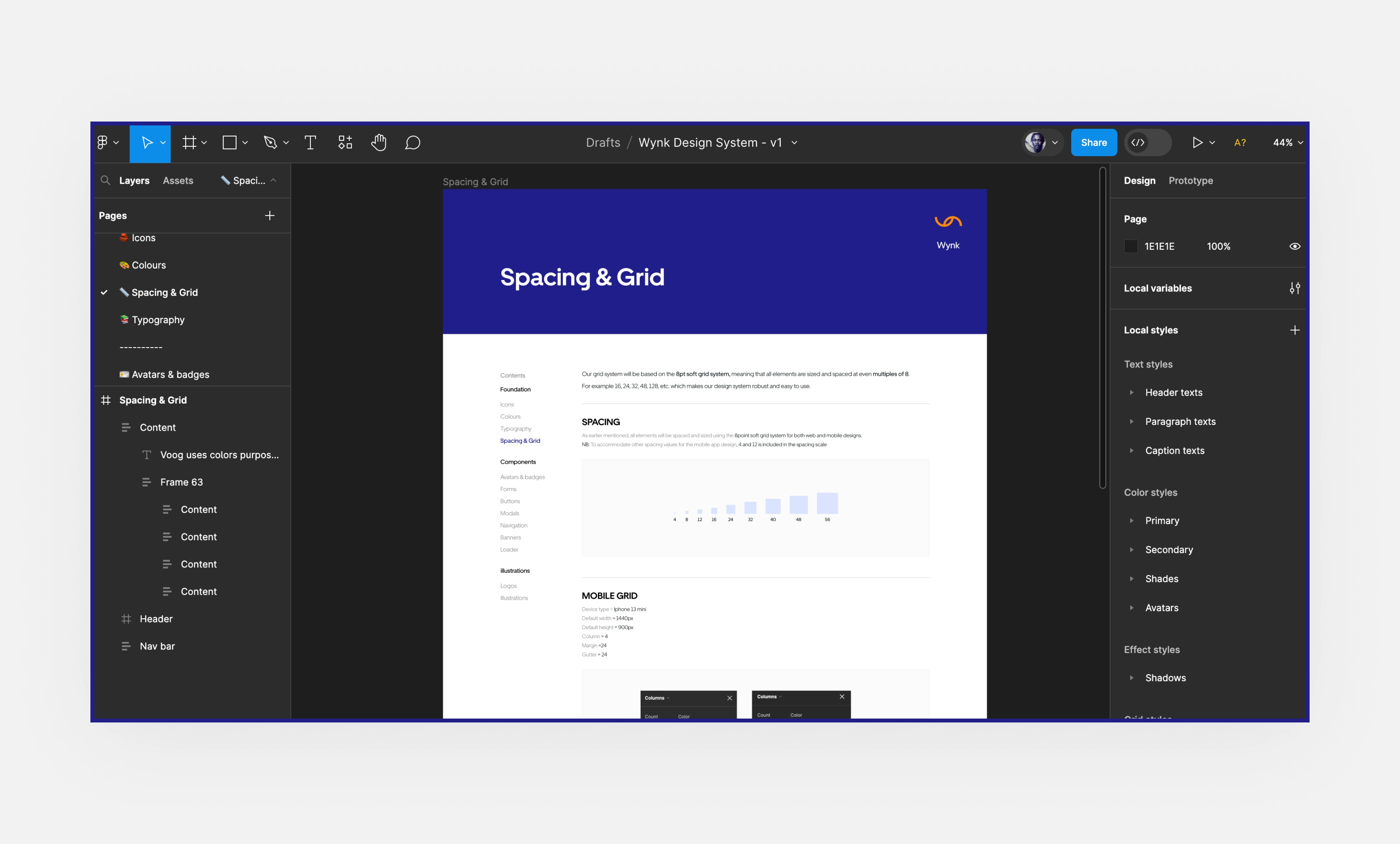
An 8pt grid system was adopted for the design system, meaning all elements were sized and spaced at even multiples of 8.
For example 16, 24, 32, 48, 128, etc.
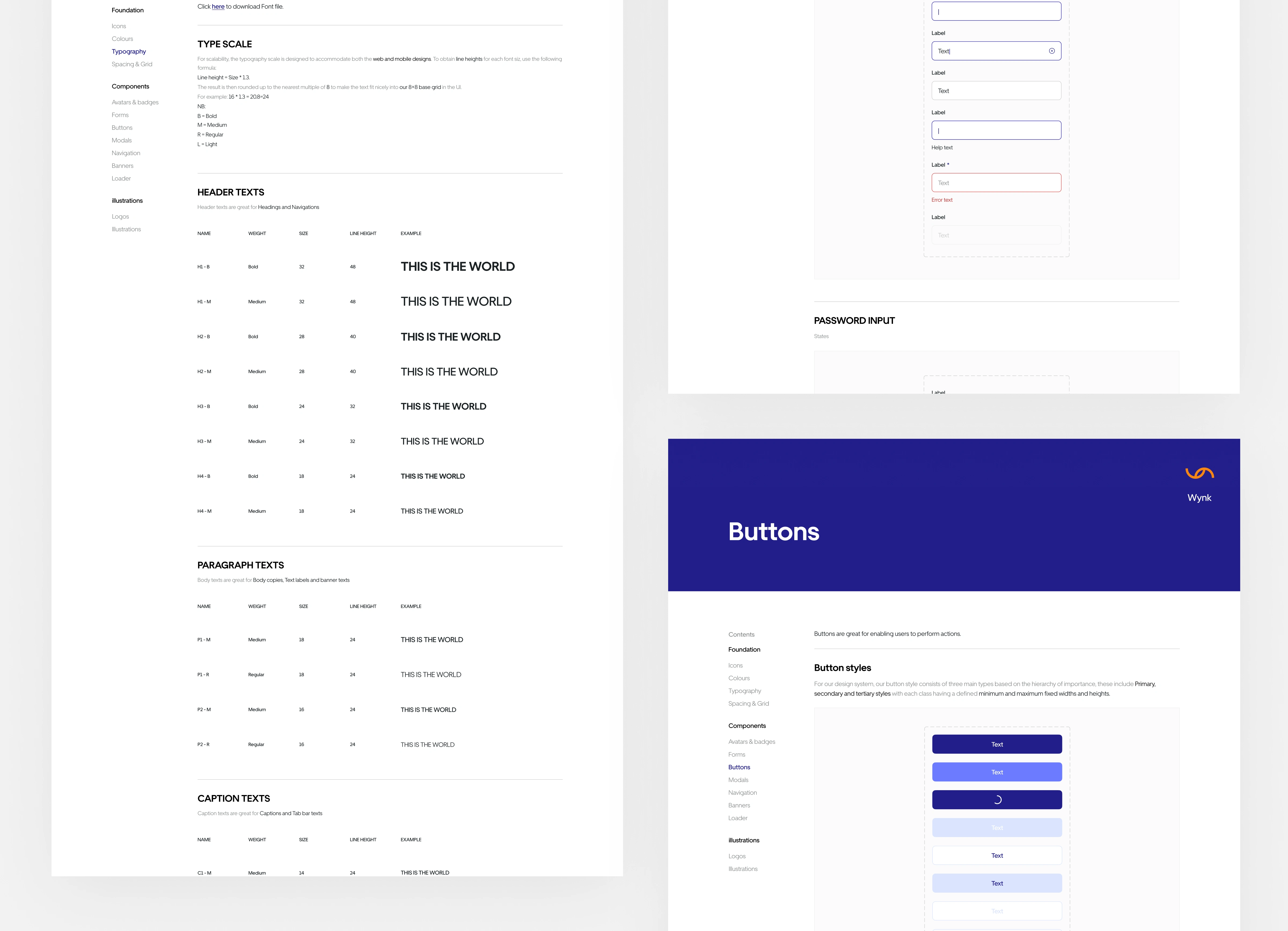
3. Typography
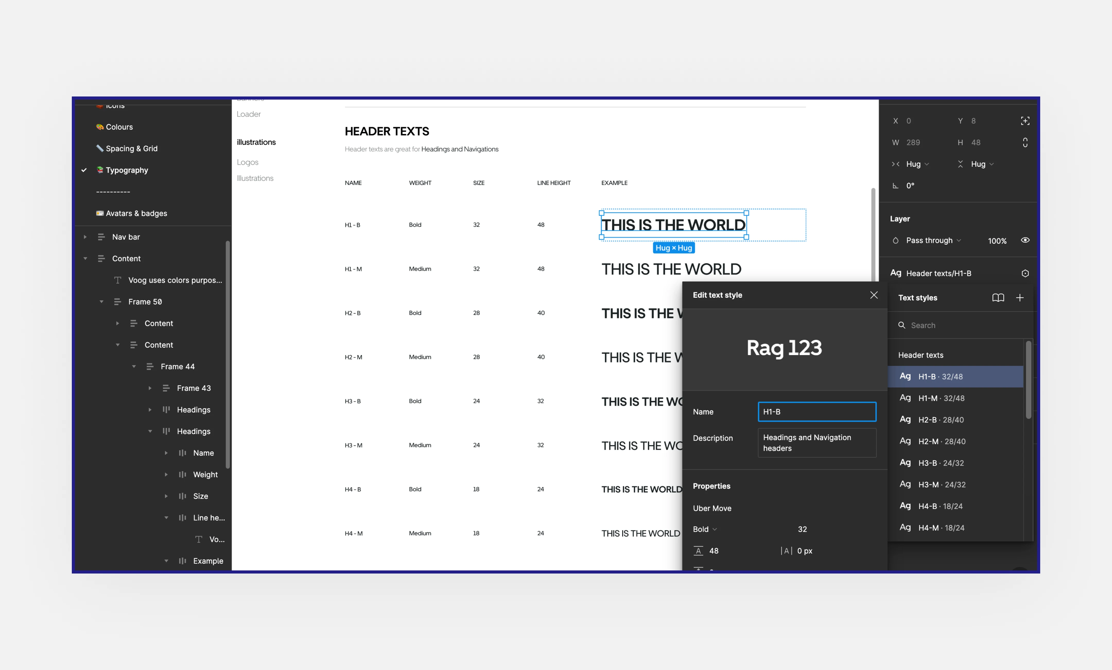
Wynk's main brand typeface was Uber Move as specified by the brand designer.
To mitigate redundancy, I ensured to adhere to using just a single typeface with fewer font sizes for the design system.
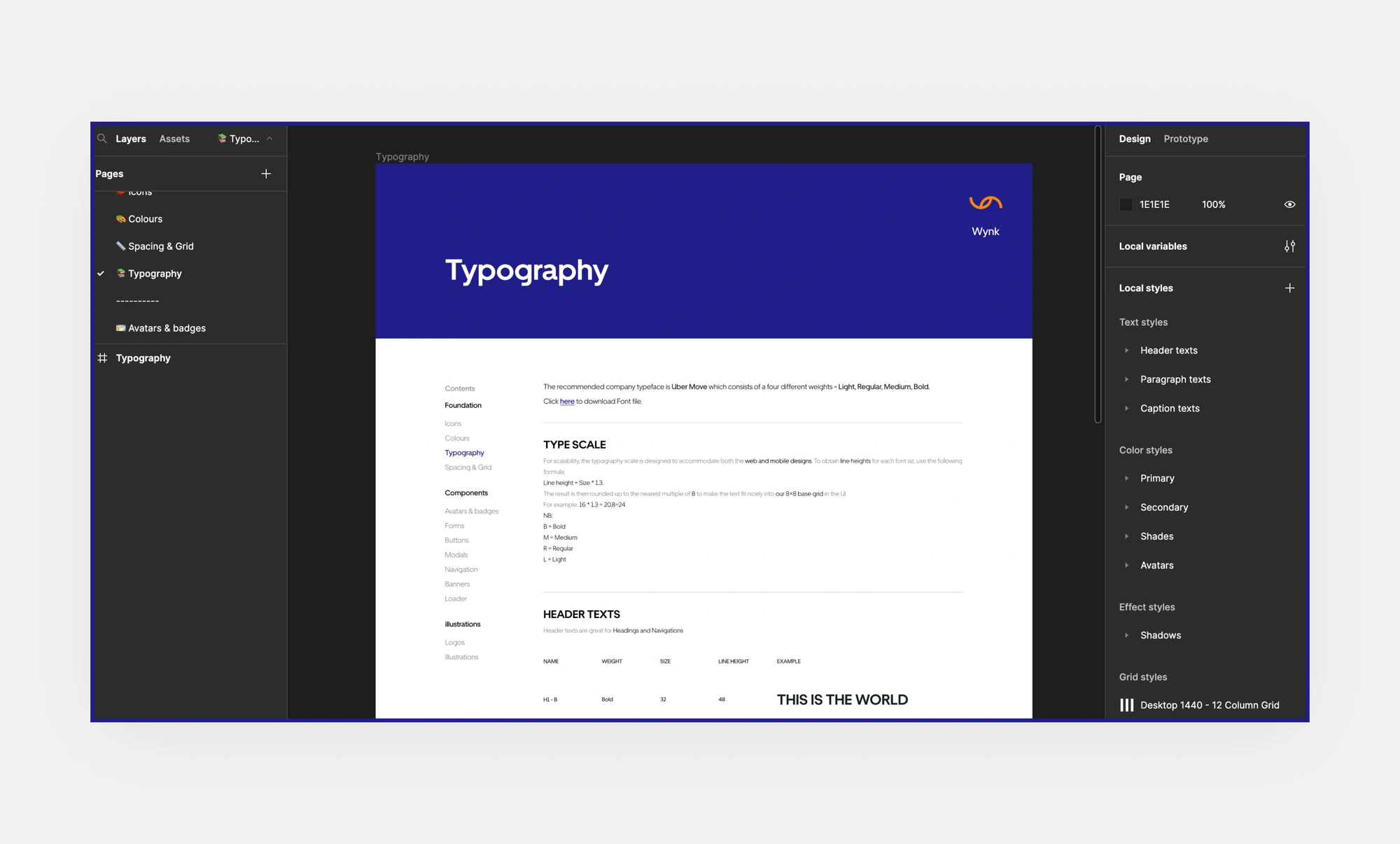
All font sizes with respect to their line height were scaled using our adopted 8pt grid system. Using the formula
Line height = Size * 1.3
Curating the component library.
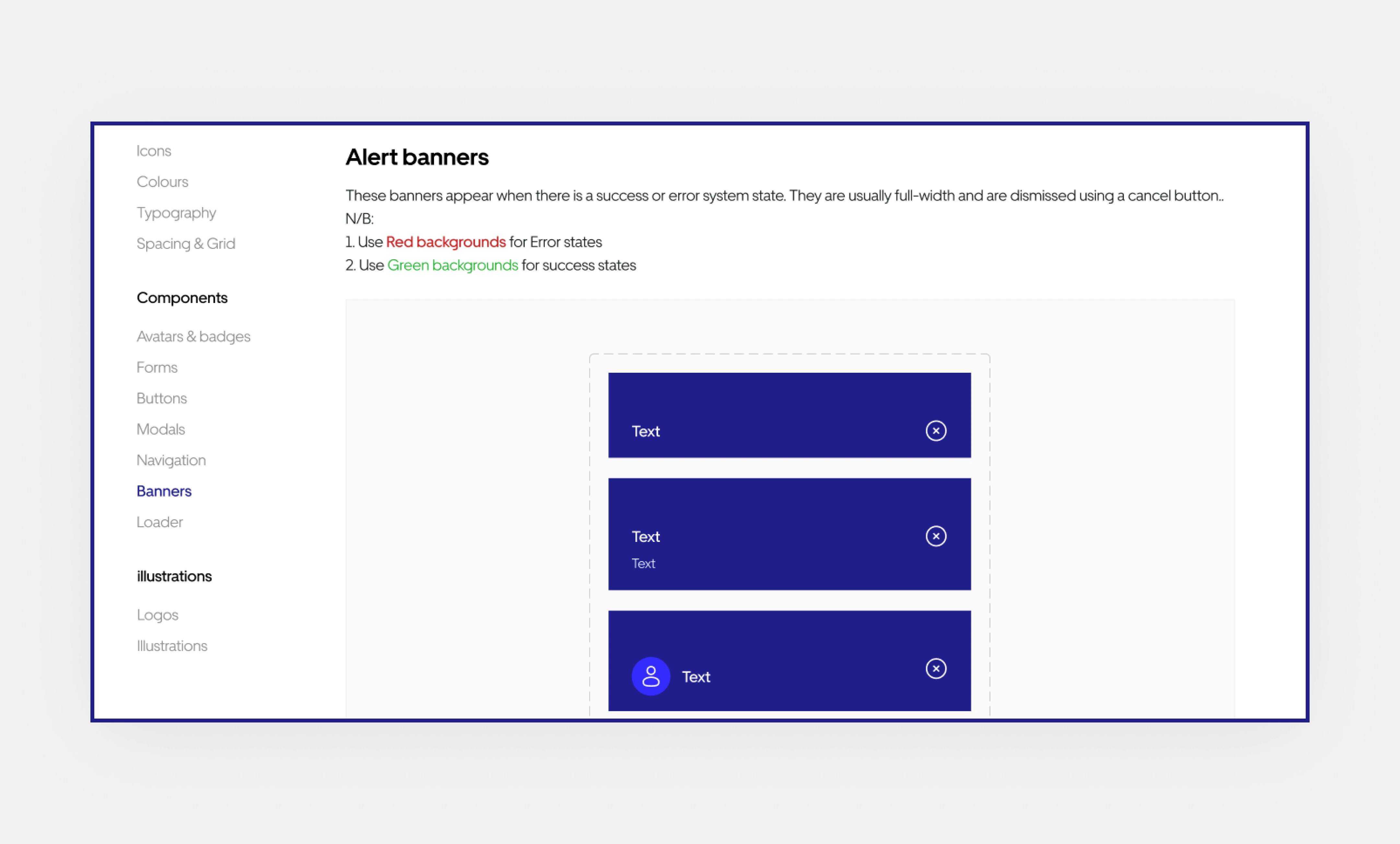
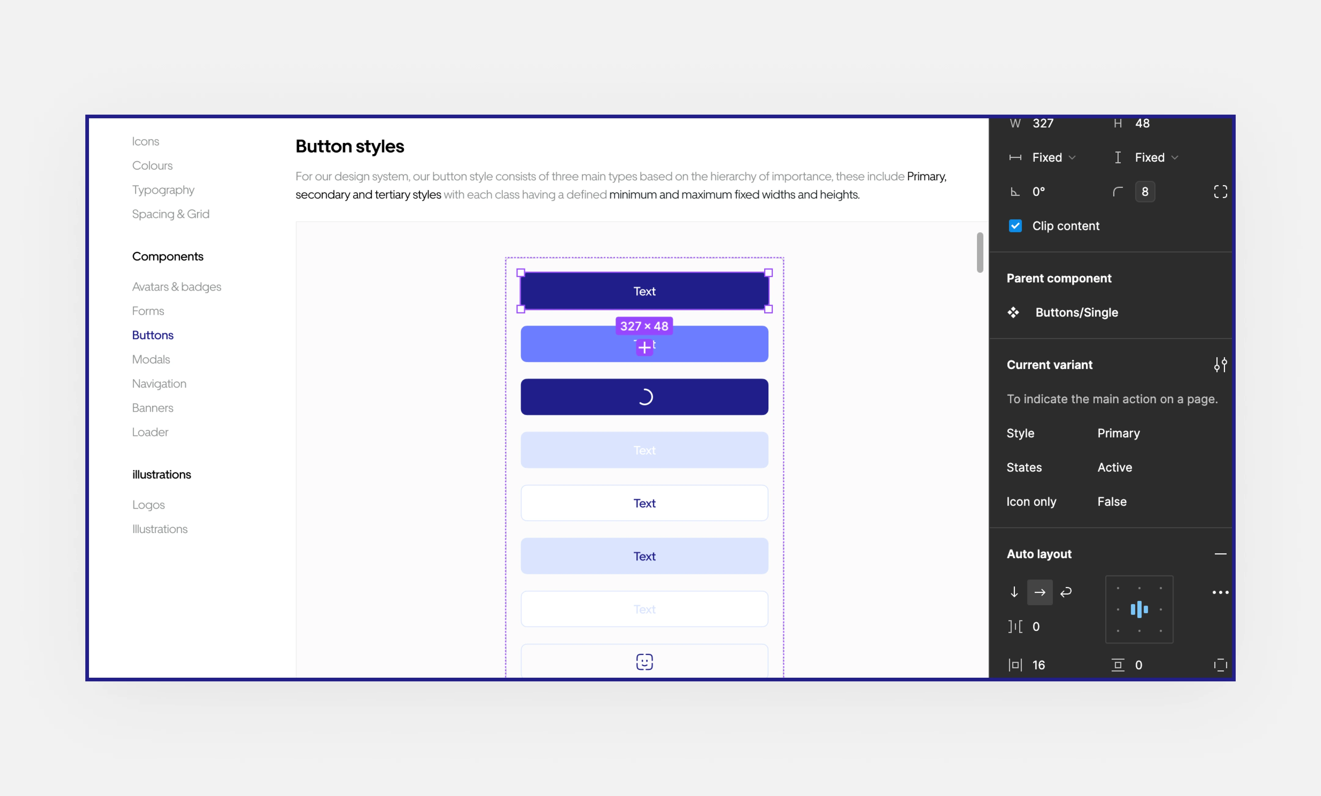
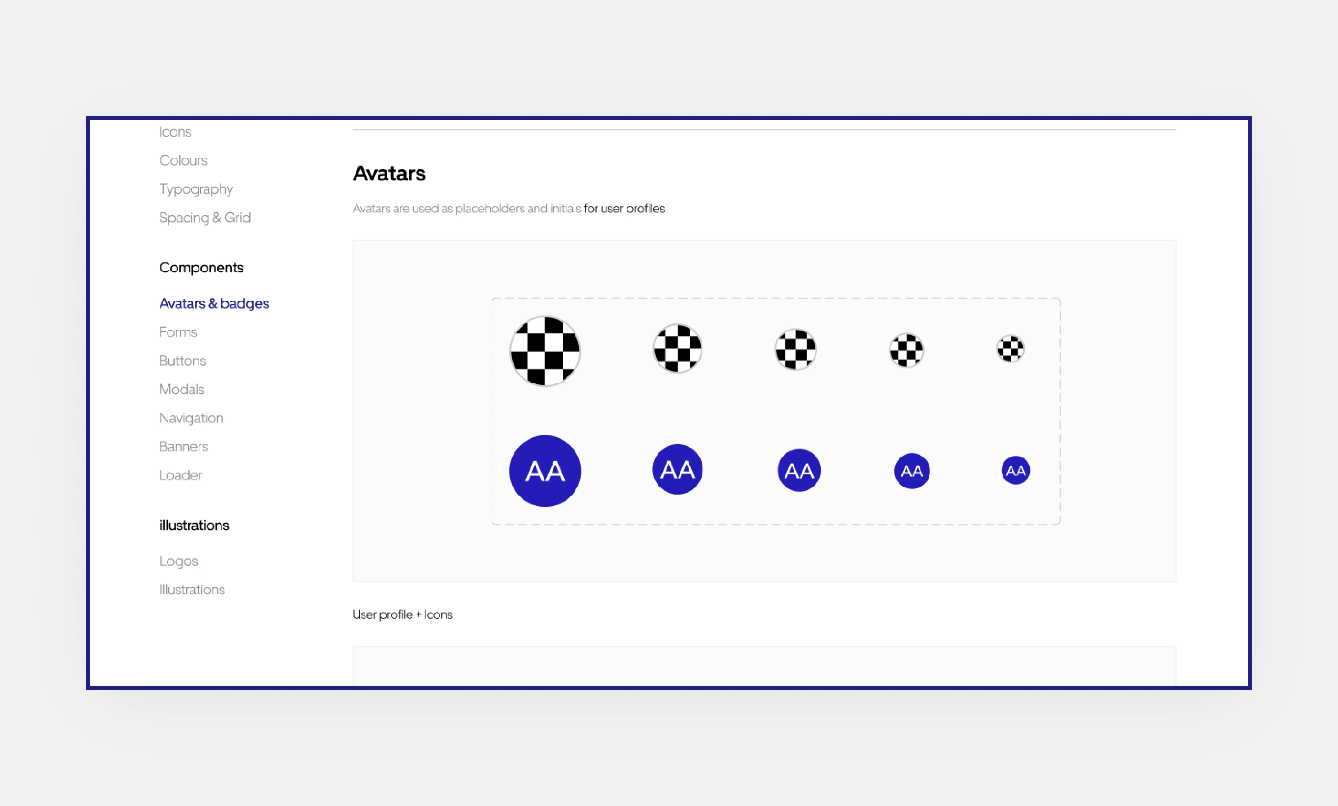
I approached designing components using the Atomic design approach to ensure components were created hierarchically.
Atoms → Molecules → Organisms → Template
We kept components to a minimum initially. As we designed, we added more based on needs. Each component's state and use case was also documented on the go.
Nomenclature.
We used the Global Token naming convention for storing most of our design decisions since it was easier and took less time to implement given the deadline we had.
To store more information about the context of use for each style/component UI, I relied on Figma’s component description modal.
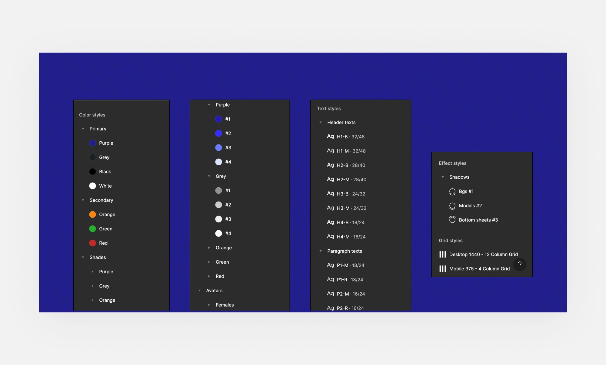
Nomenclature
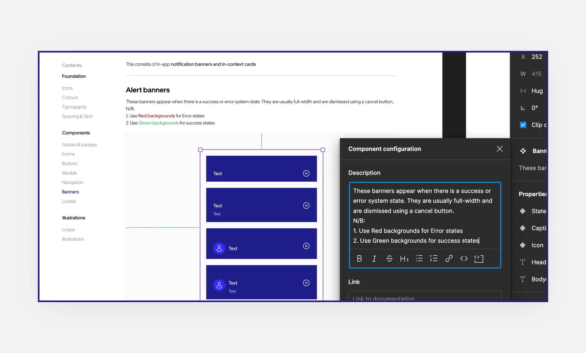
Design Documentation
Measuring outcome.
The first draft of the design system led to an 80% increase in team workflow and collaboration because most components were built-in and accessible from one source document.
Easy and faster onboarding of new design and dev hires
Better impact on our team structure and communication during design handoffs to developers.
Like this project
Posted Jan 9, 2024
Building and scaling the company’s first design system to facilitate better team workflow and product outcome.
Likes
0
Views
4

