Redesigning a new service booking experience - LUHU
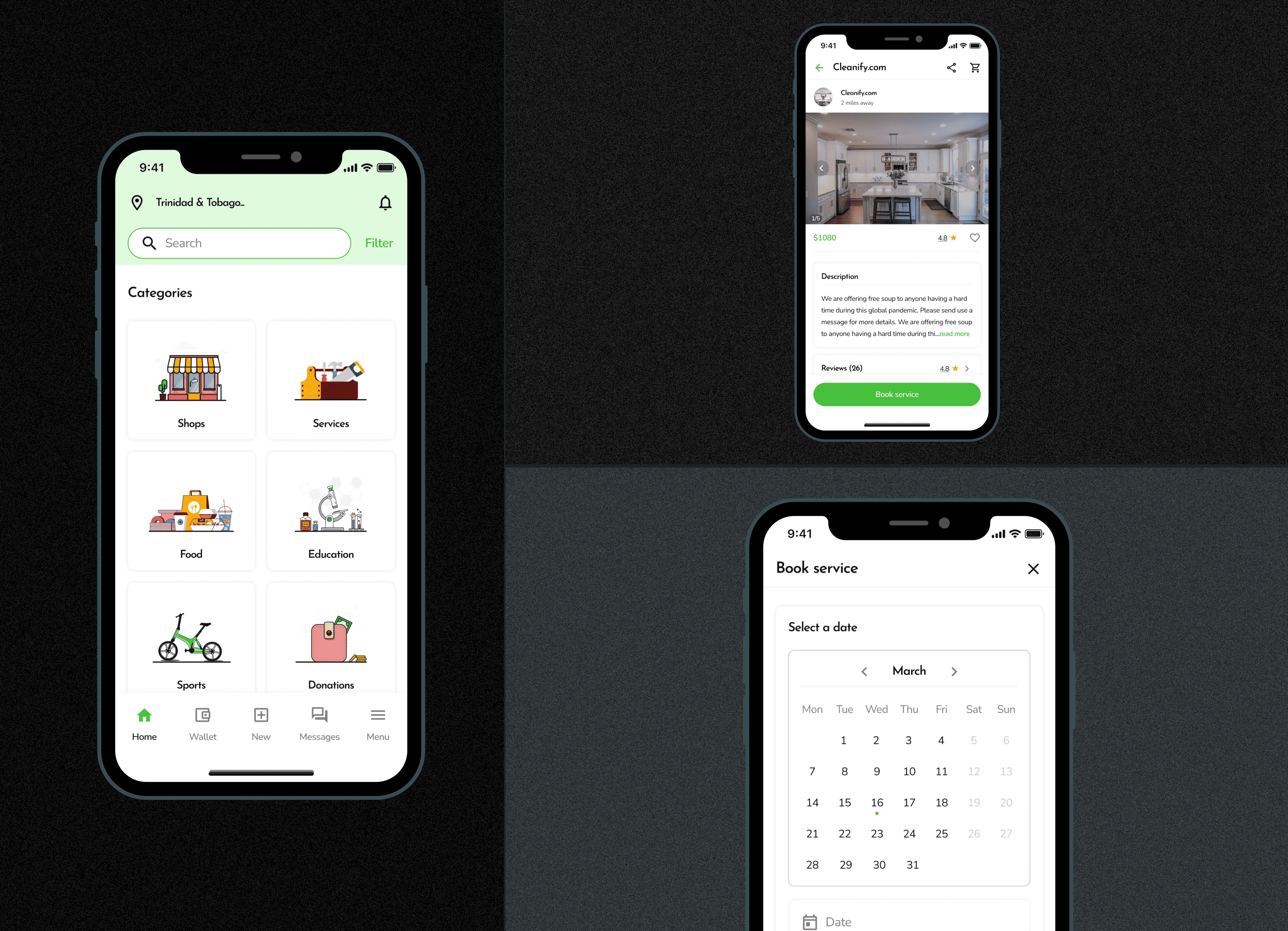
Overview
LUHU is a mobile app that provides a market network connectivity for individuals and small businesses in the Caribbean diaspora - Its target audience. Our value proposition was to build an inclusive platform that enables users to search and book for nearby services(Laundry, cleaning, plumbing services, etc) or shops. I led the product direction and redesign of the service booking experience for the v2 mobile application. My design contributions were pivotal to the company’s acquisition and exit with .
Project Goals
This project was aimed to:
Redesign the service booking expereince and the entire mobile app to improve user engagement.
Project duration - 4 weeks
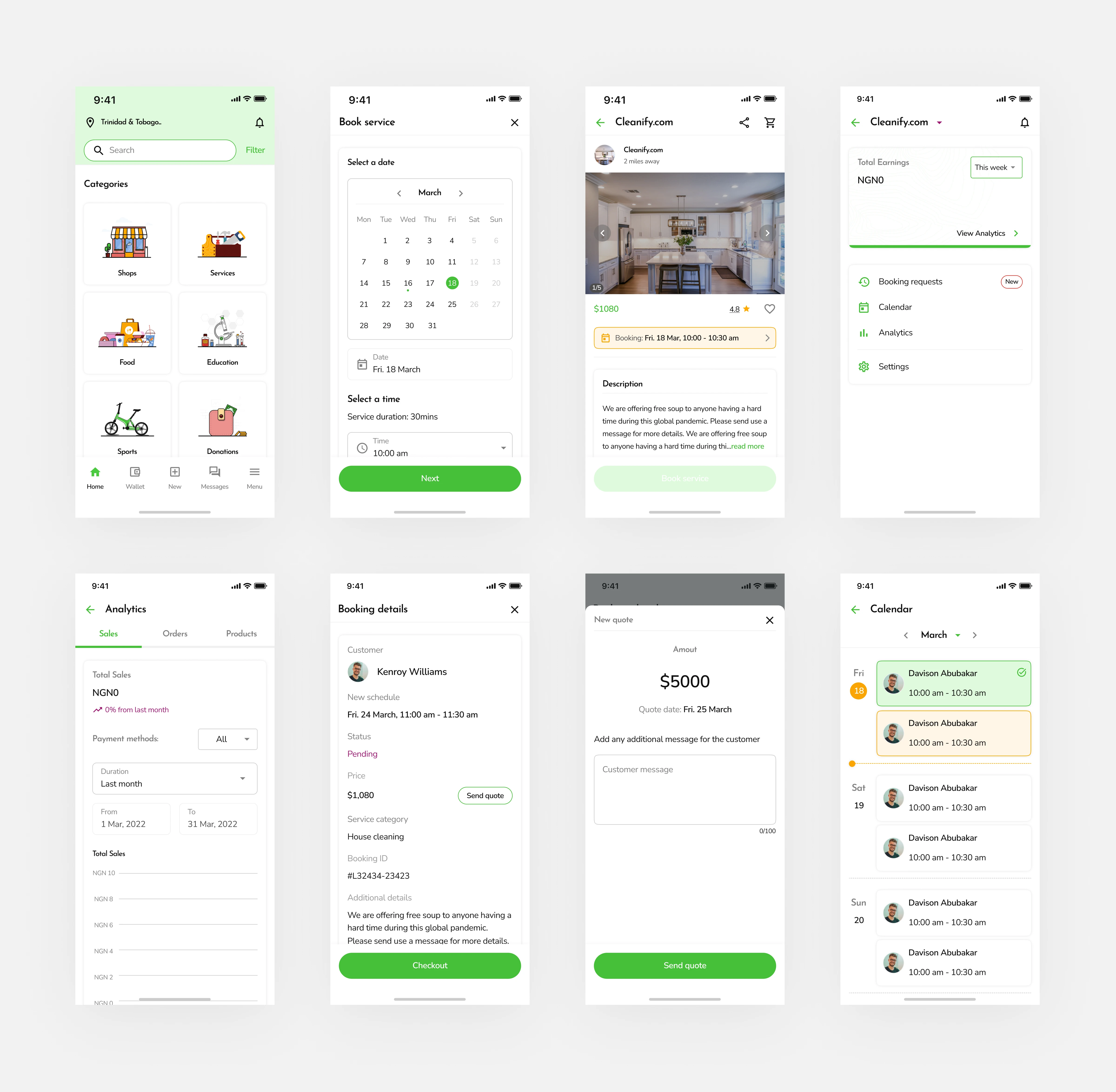
Design highlights
The problem
From the V1 of the mobile app that was released, users were not able to easily navigate through the different categories in the mobile app, search and easily book services.
Also, the product looking to integrate new product offerings which meant redesigning the mobile application to accommodate these changes.
Drafting out a clear approach.
To kick off, I conducted design sessions with my project manager and stakeholders to fully grasp more info about the target audience, clear value proposition, product direction and feature requests for the new service booking experience.
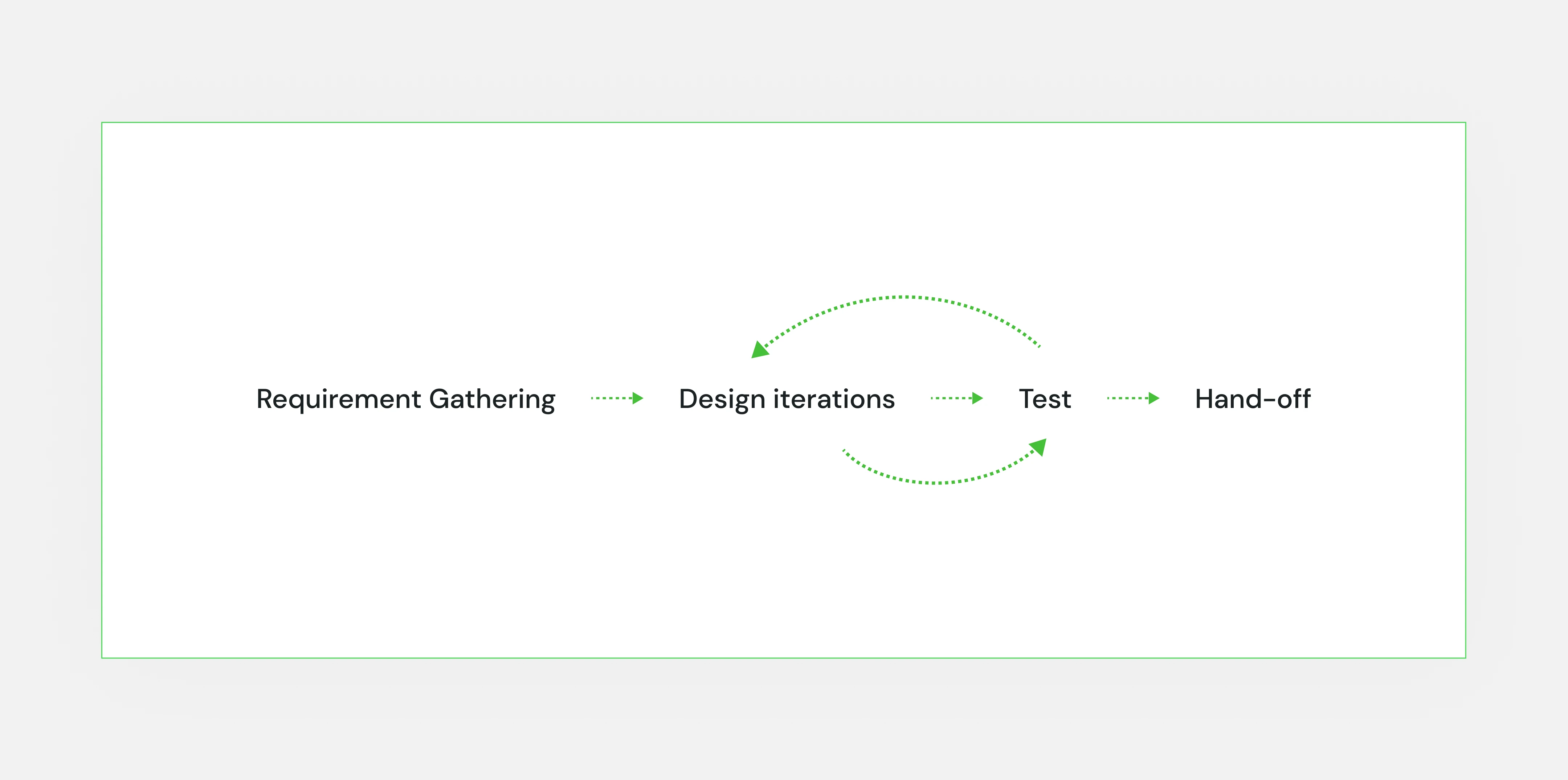
The following product metrics were considered to create a seamless experience:
Service booking time
Number of clicks when booking a service.
Addressing user needs.
To get started with the redesign, I had to address some user needs the team had previously uncovered - Issues with the Home page.
Some of these were:
Users had difficulty identifying and finding the different app categories on the home page because they were previously displayed in a feed view.
Lack of necessary quick actions to enable them to perform search actions.
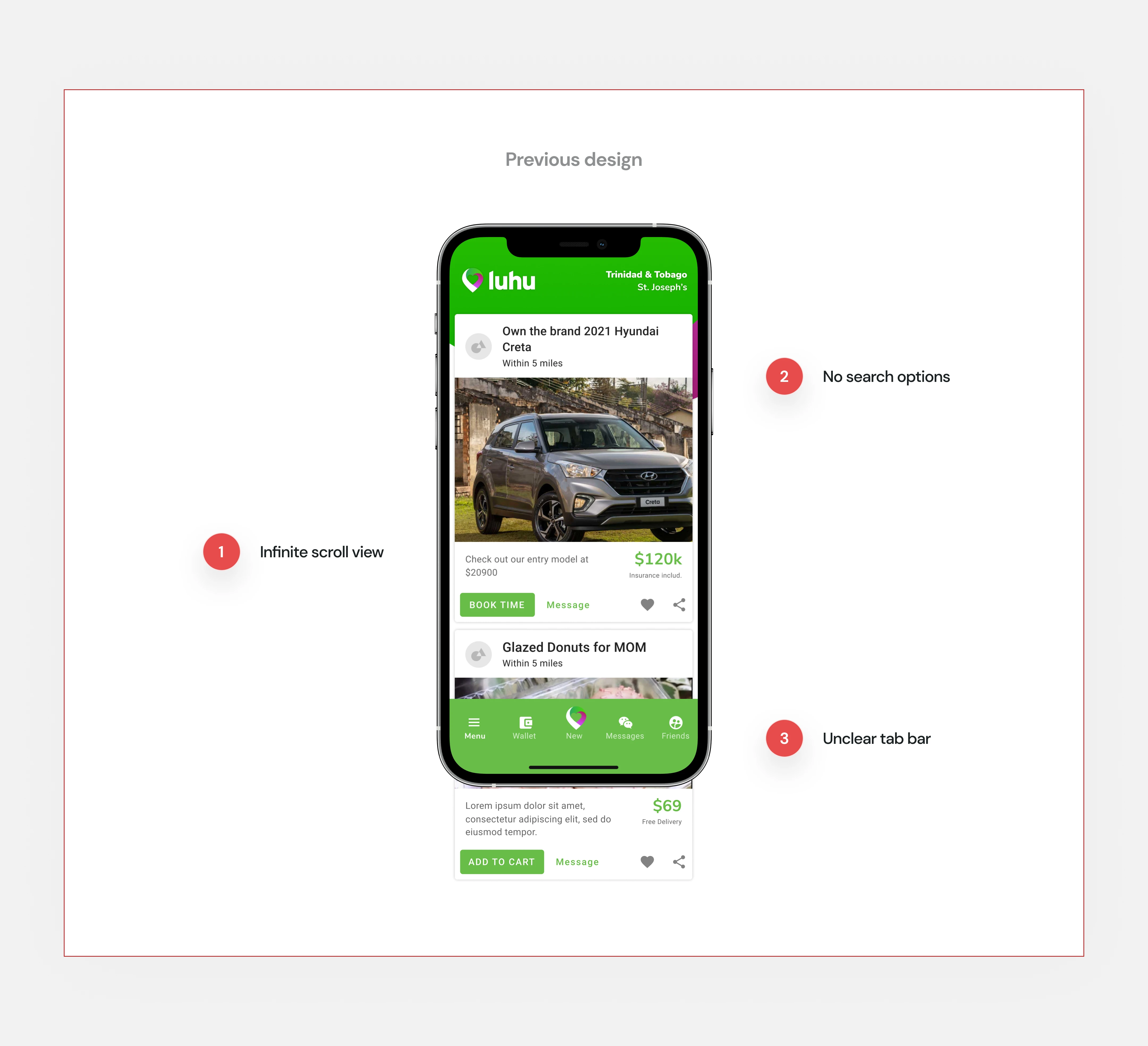
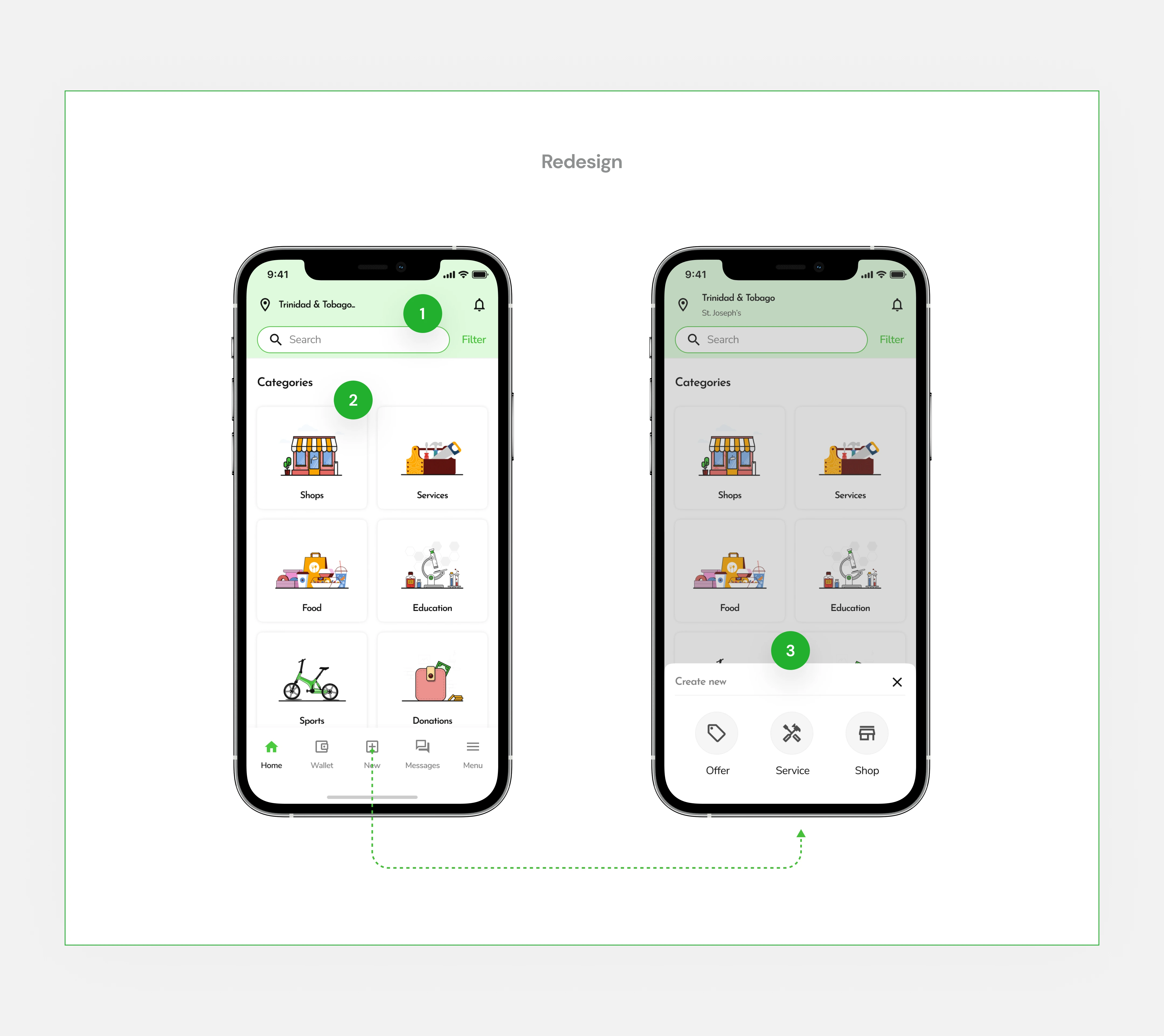
As a result, The new home screen was redesigned as follows:
Prominent search fieldTo assist users with quick search actions and discovery.
Service groupings
Display different app categories in groupings to provide users with a progressive disclosure experience.
Quick actionsRelevant quick actions to make setting up in-app services and shop accounts easier.
Identifying the different user groups.
For the service booking experience, there were explicitly two main types of users:
Primary users (Customers)This represents users who are in search of services.
Service admins (Service providers)This represents users who offer services and have in-app shops set up.
I then had to map out the new service booking flow for both user groups, Identifying relevant touch points within the flows.
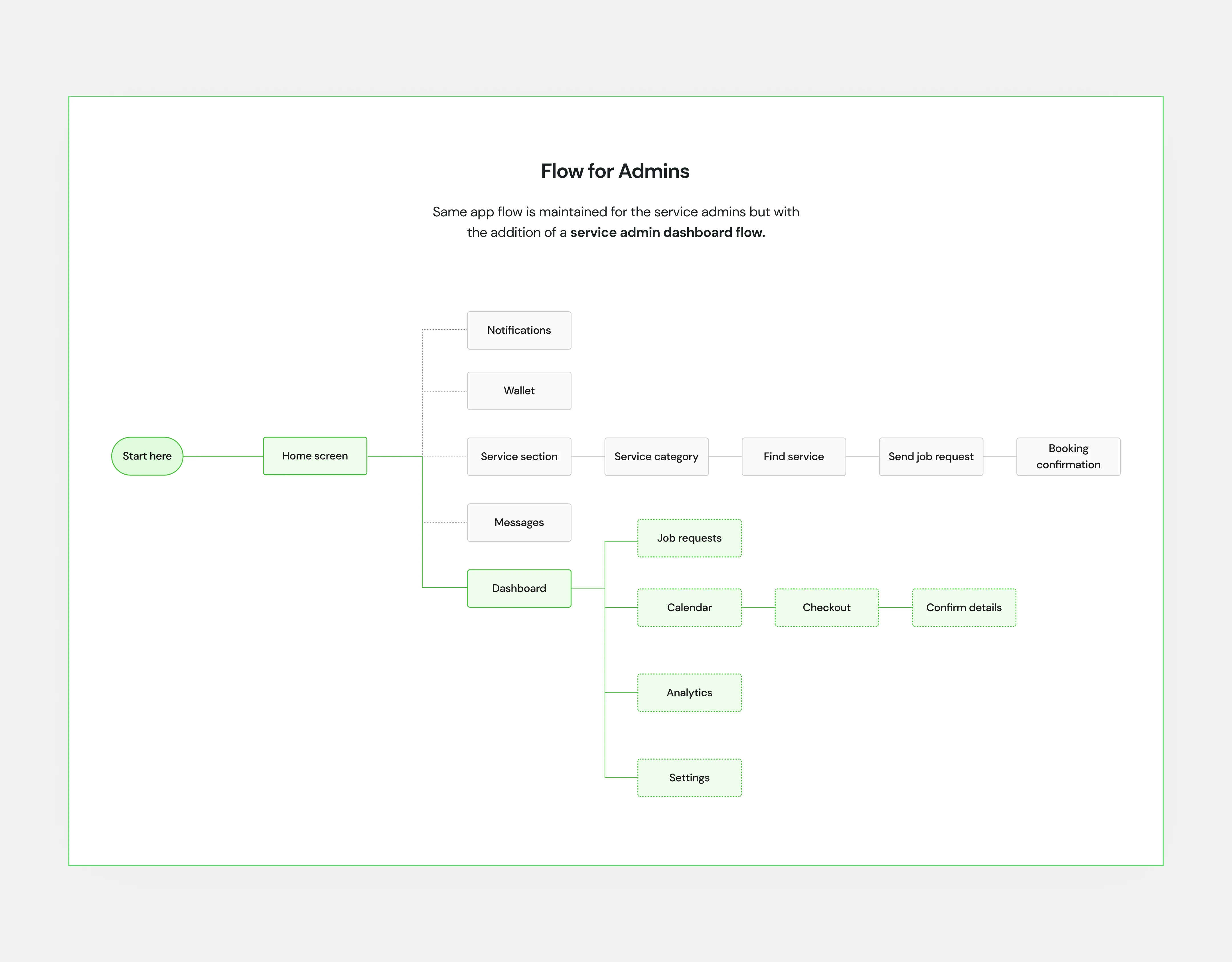
Primary users
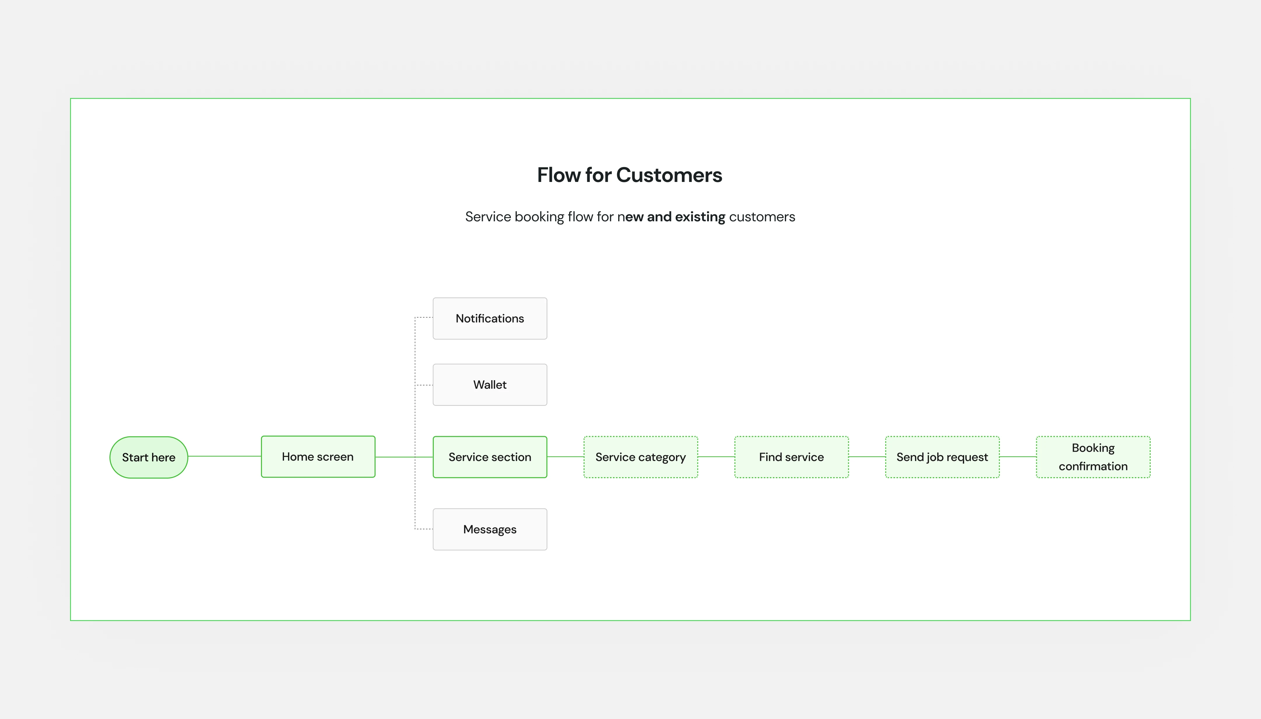
Admin Users
Complete service booking flow - Primary Users
First iteration
With the home page redesigned, I proceeded to iterate on the hi-fi designs for the complete service booking flow for both new and returning customers.
This meant designing to also accommodate the following use cases:
Booking Rescheduling
Booking Cancellation
All of which were integral to creating a holistic experience for users.
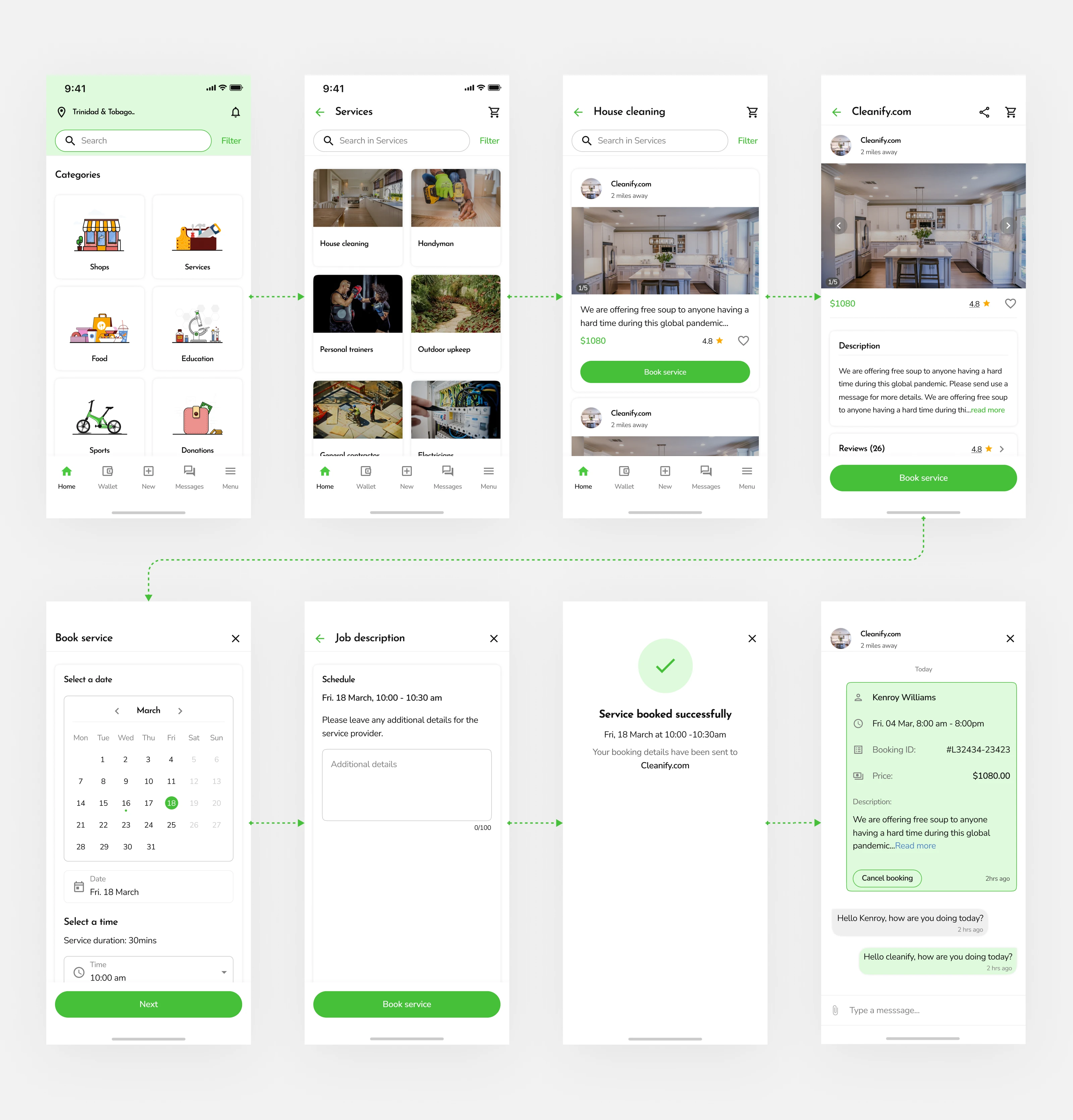
First iteration
Second iteration
After testing the first iteration, I discovered:
Booking details often get buried in lengthy chats, making it inconvenient for users to it, as they appear like regular messages.
In long conversations between customers and service providers, users must scroll extensively to retrieve the essential booking details.
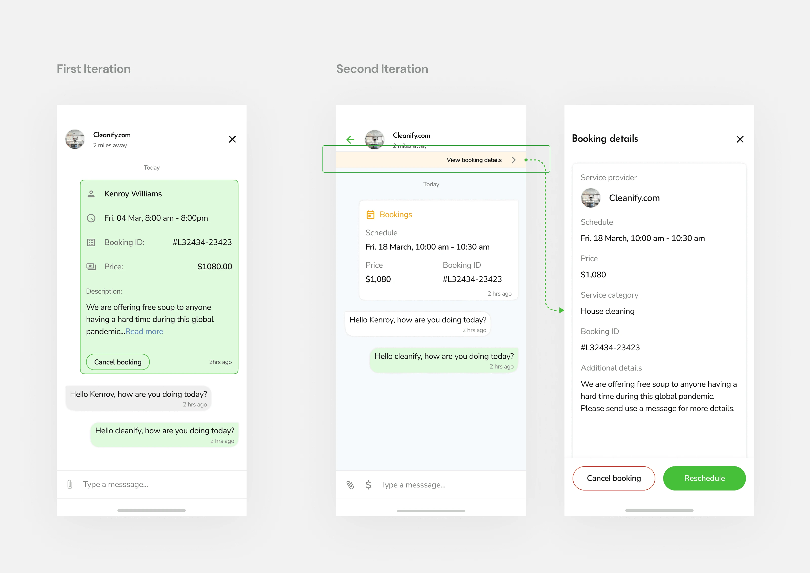
Second Iteration
Designing for Service Providers - Admin Users
Subsequently, I then designed the experience for service providers as follows;
A feature card on the home page to give admins easy access to their stores/dashboards.
Dashboard experience provides admins with tools and analytics to manage booking requests.
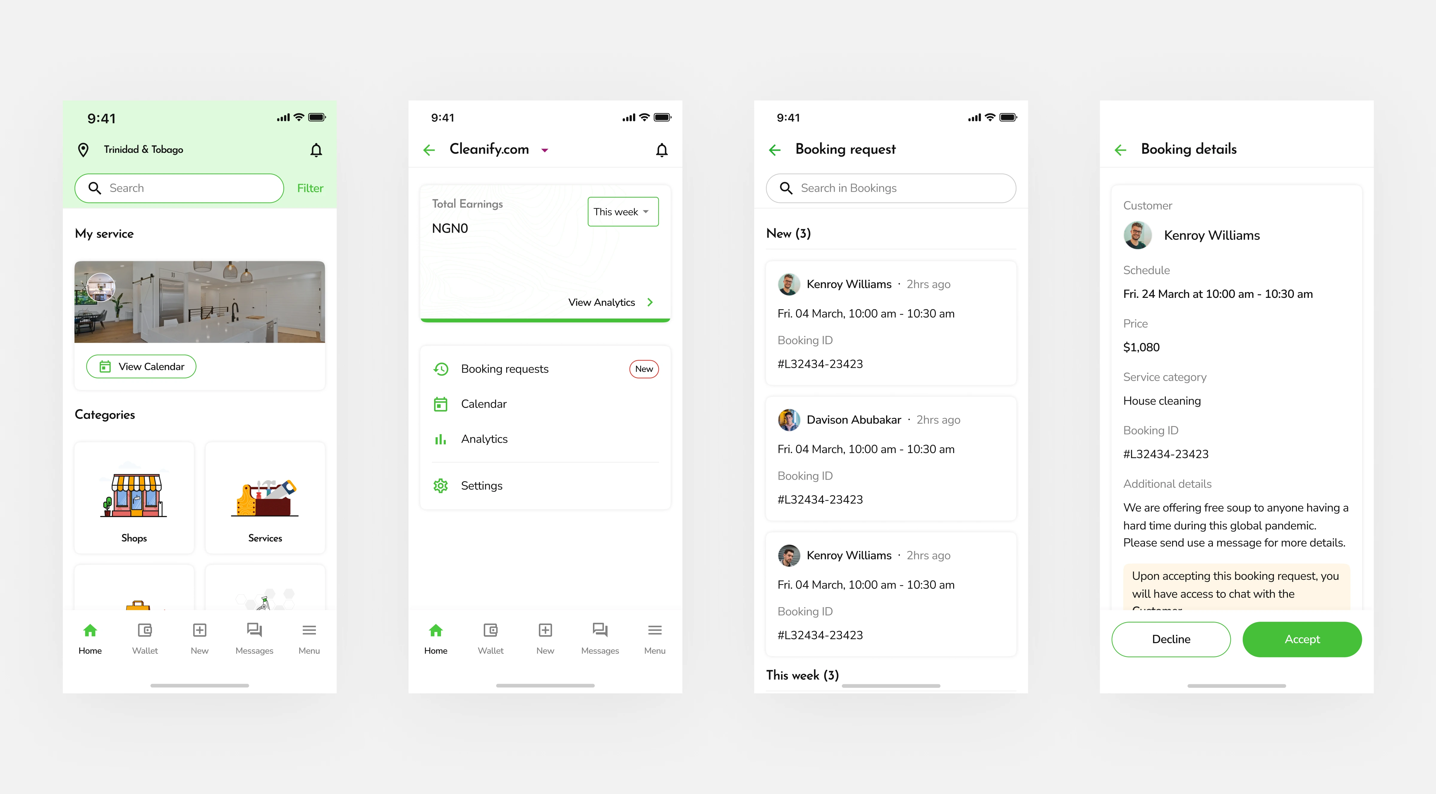
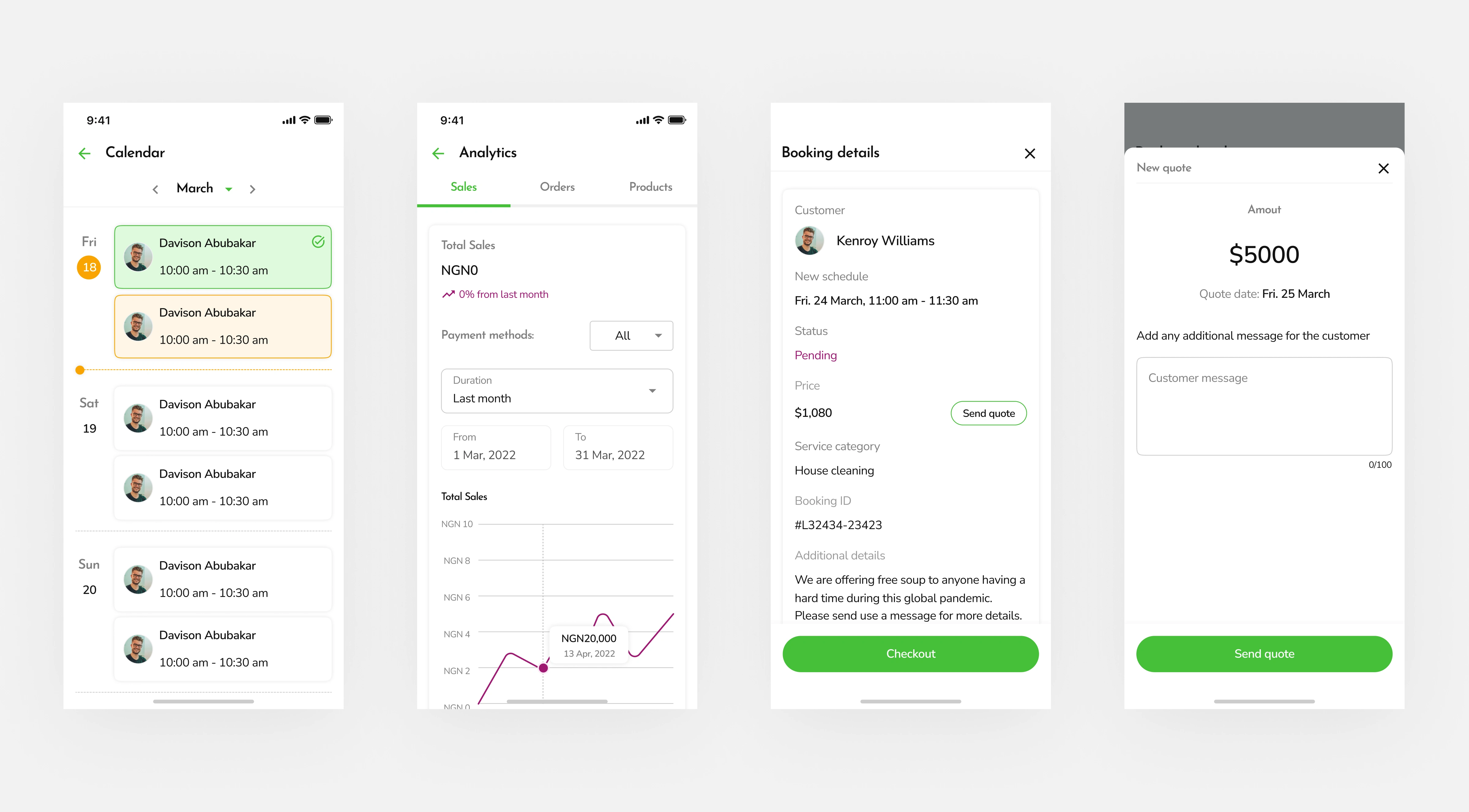
Dashboard Experience
Measuring design outcomes
After a successful final iteration, another round of internal testing sessions was conducted.
During the testing sessions, users could effectively complete a service booking flow in less time with an increased task completion rate of 50%.
Subsequently, design specifications were prepared to enable the dev team to ship the product into production.
Personal takeaways.
Keeping an Open Communication
As the only designer in the team, I maintained open communications with my product manager and dev team.
This made me move fast with a clear understanding of relevant system constraints and business goals.
Like this project
Posted Jan 10, 2024
Implemented an app redesign that led to a 50% increase in service booking experience.

