PromptHealth: Isometric Illustration for AI HealthTech

Amirul Hakim


PromptHealth: Isometric Illustration for AI HealthTech
PromptHealth is an AI-powered SaaS platform for clinic and patient management, specializing in therapy clinics. Their AI features are powerful but technically complex: automated charting, treatment tracking, patient progress analysis, and clinic workflow optimization.
The Problem
PromptHealth's AI features are powerful but technically complex: automated charting, treatment tracking, patient progress analysis, and clinic workflow optimization.
The challenge was communication. Text descriptions alone couldn't convey how these features actually work or why they matter. For clinic owners evaluating the platform, a wall of technical copy creates more confusion than clarity. PromptHealth needed a visual language that could translate complex AI functionality into something immediately understandable.
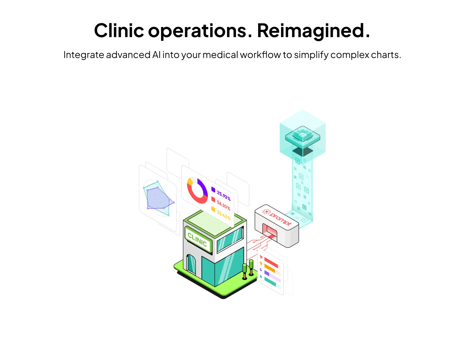
PromptHealth Cover
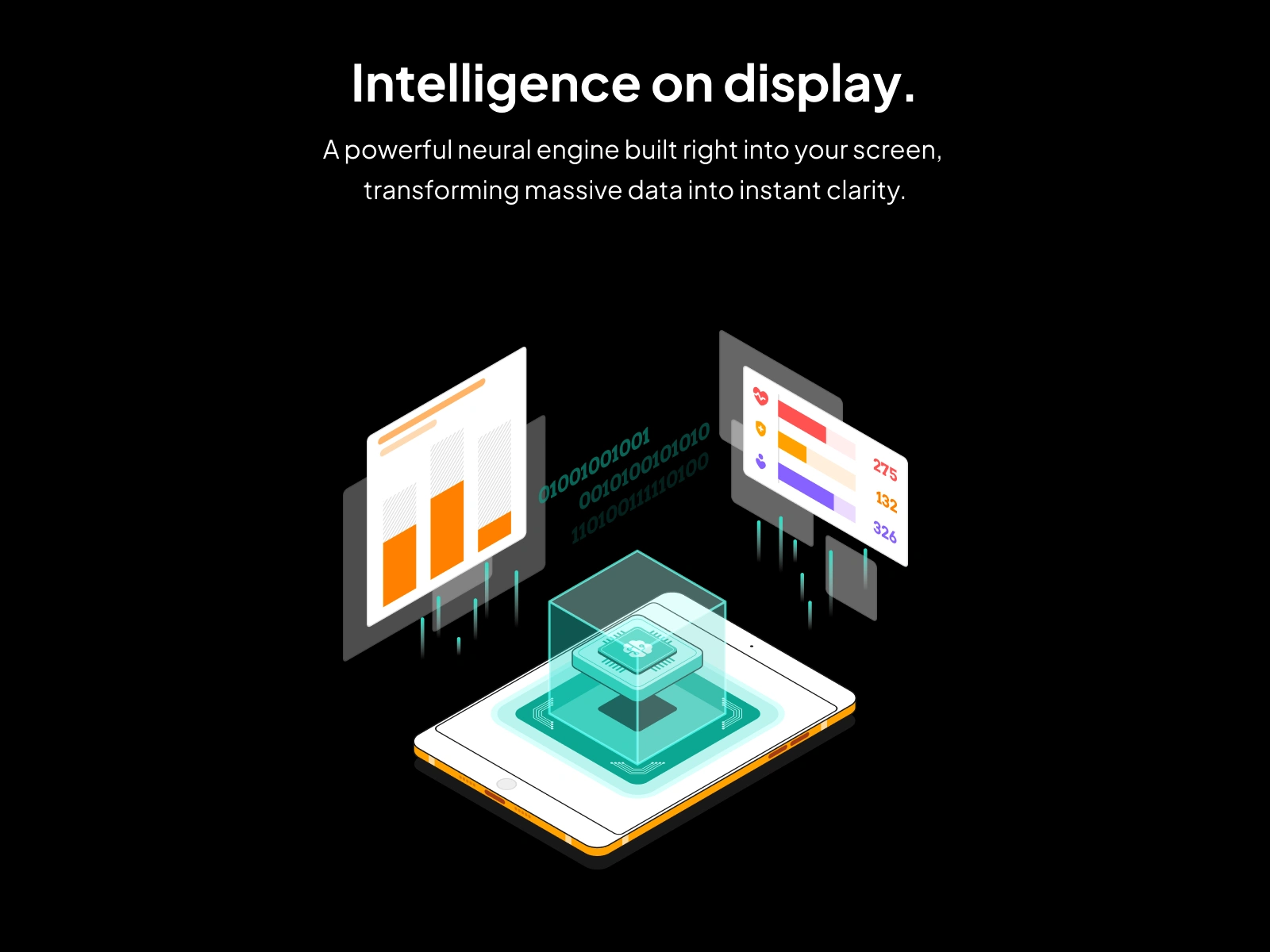
Section 2
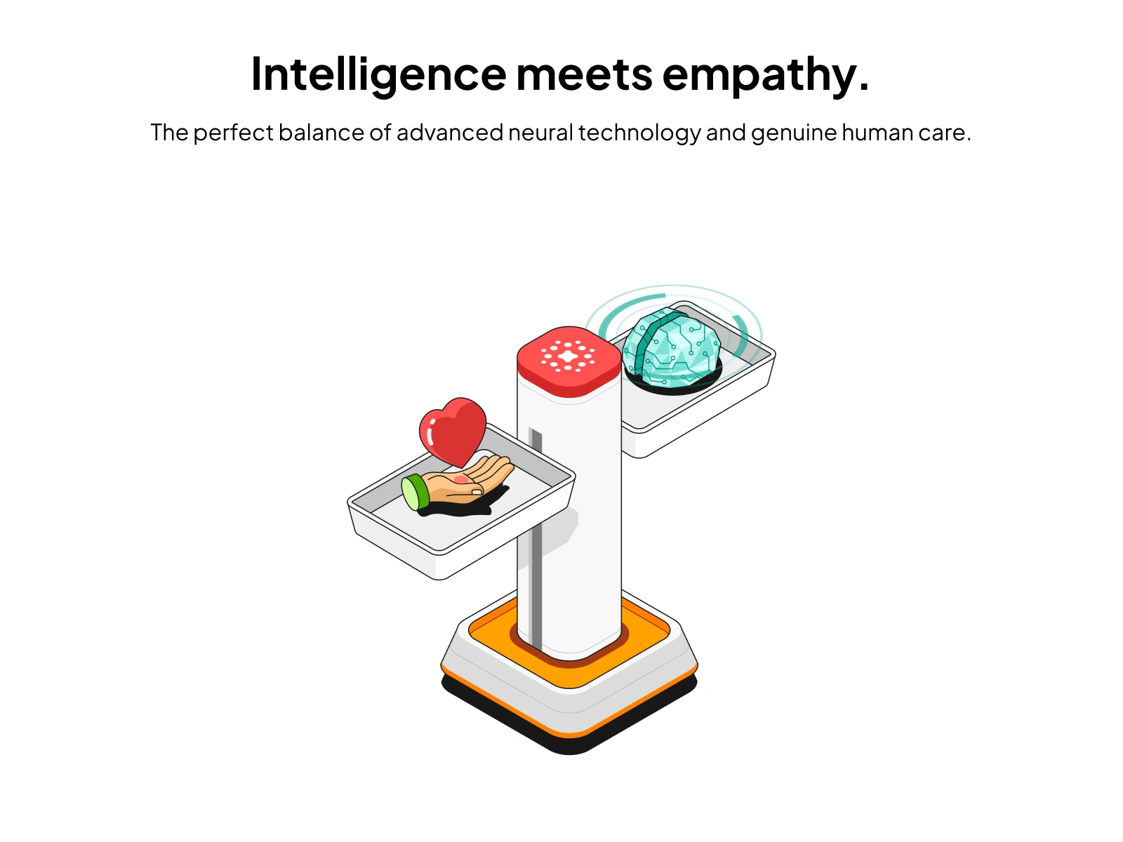
Section 3
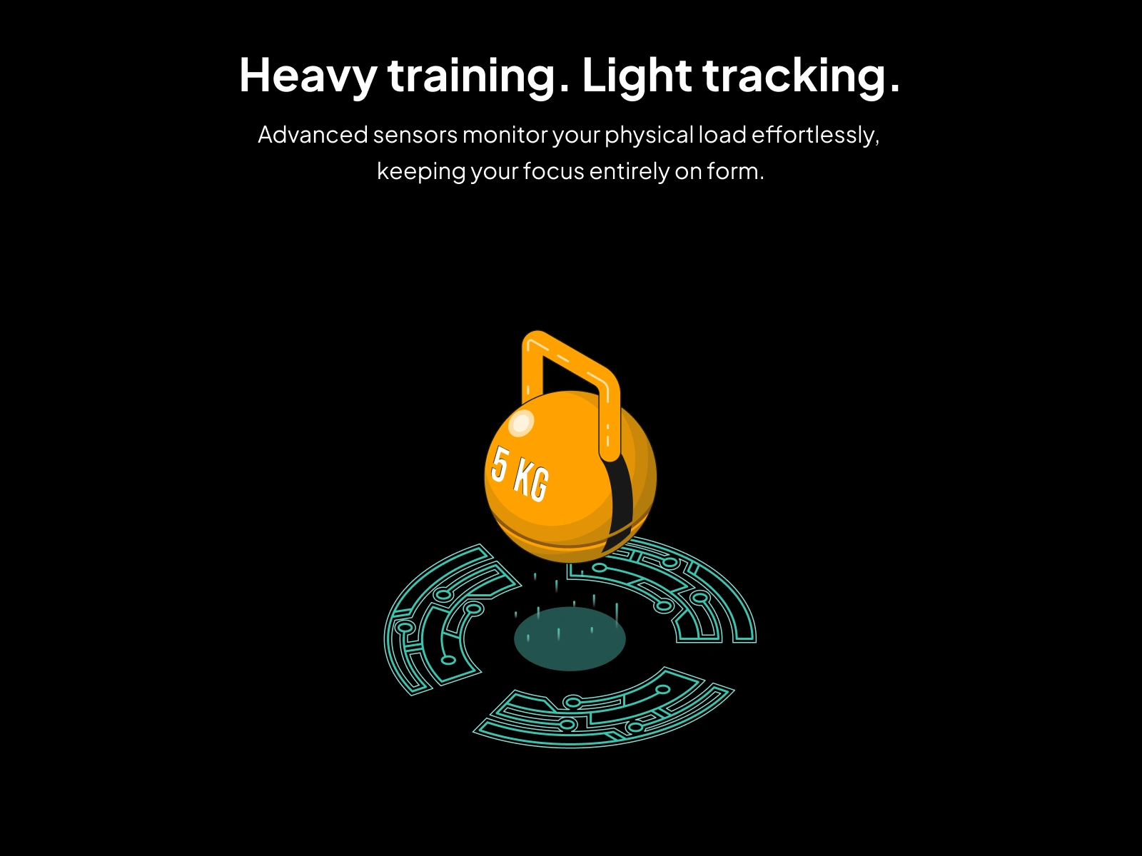
Section 4
The Users
PromptHealth serves three user types:
Clinic owners and managers evaluating the platform and making purchasing decisions. They need to understand the product's value proposition quickly.
Therapist staff who interact with the platform daily. They need to see how features map to their actual workflow.
Patients who engage with the platform through booking, progress tracking, and communication tools.
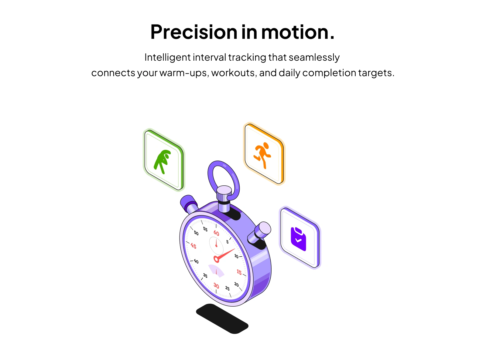
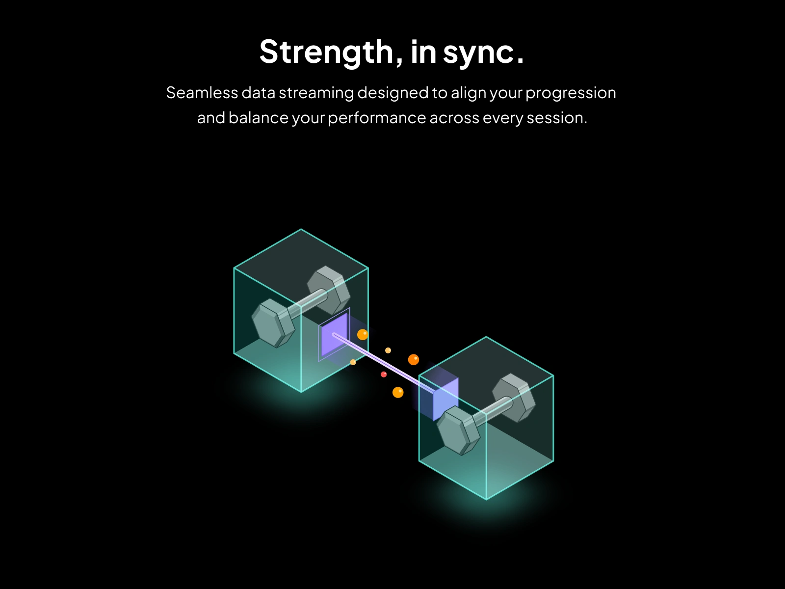
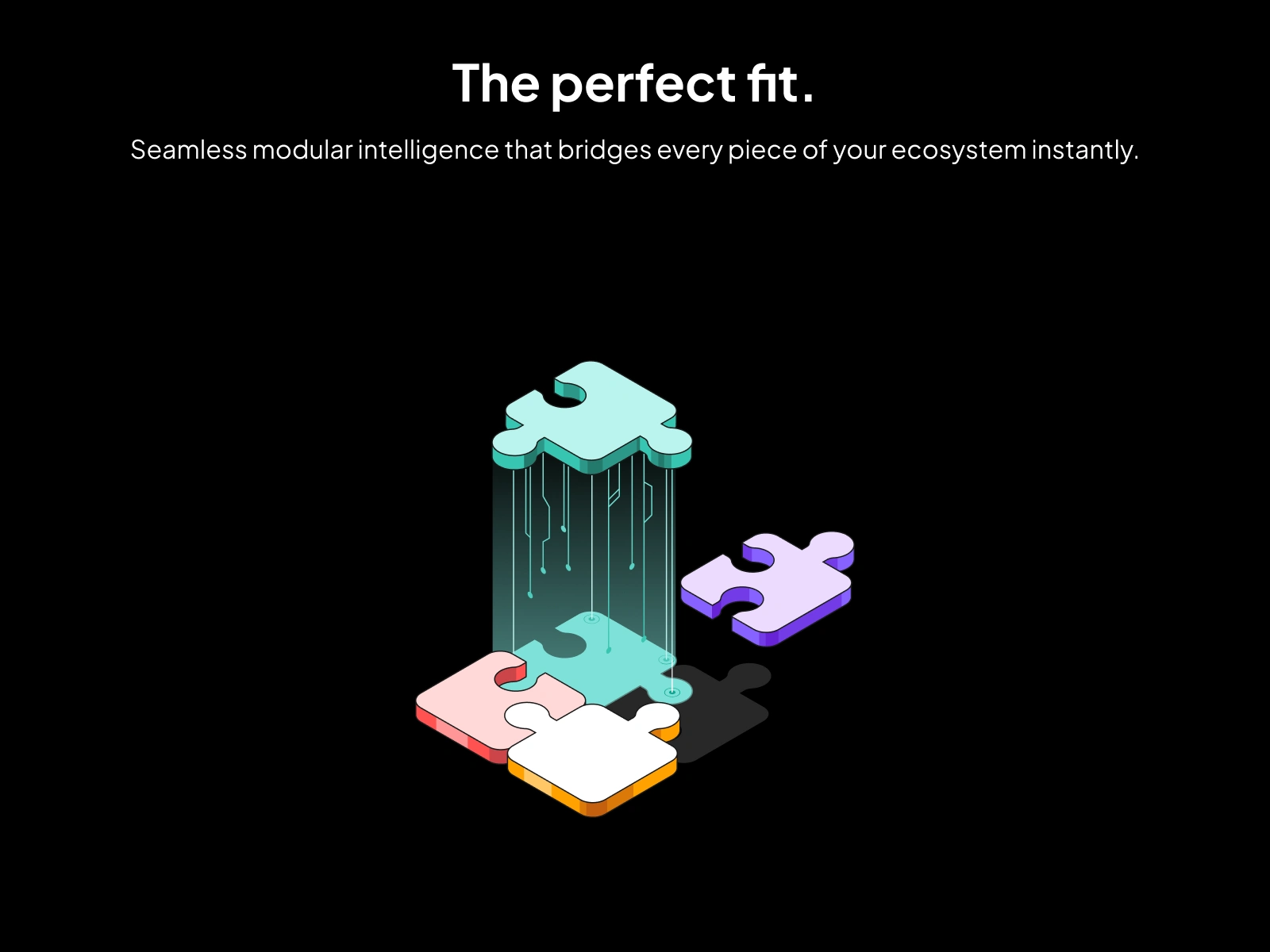
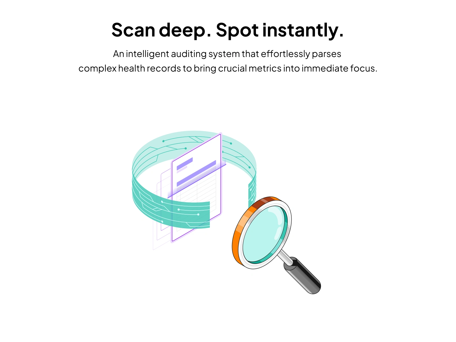
For all three groups, the illustrations needed to bridge the gap between "this is an AI-powered feature" and "this is what it actually does for me."
Section 5
Section 6
Section 7
Section 8
Section 9
The Process
Step 1: I studied every core feature of the PromptHealth platform, identifying which ones were hardest to explain through text alone. AI-assisted charting, treatment progress visualization, and multi-clinic management were the highest-priority surfaces.
Step 2: I mapped each feature to a visual concept, focusing on communicating the benefit and workflow rather than the underlying technology. The goal was always: a clinic owner should understand what this feature does within 3 seconds of seeing the illustration.
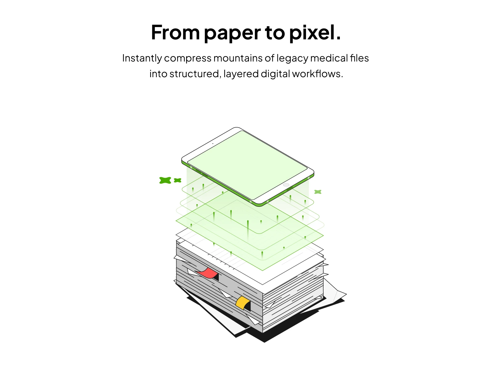
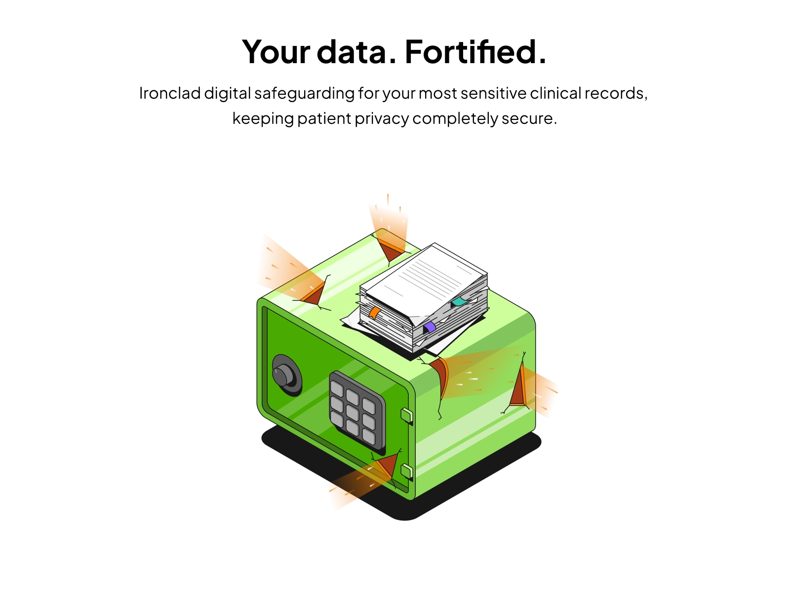
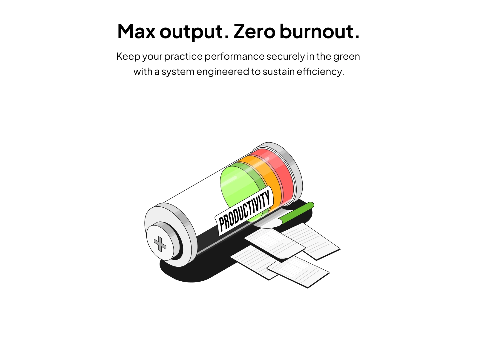
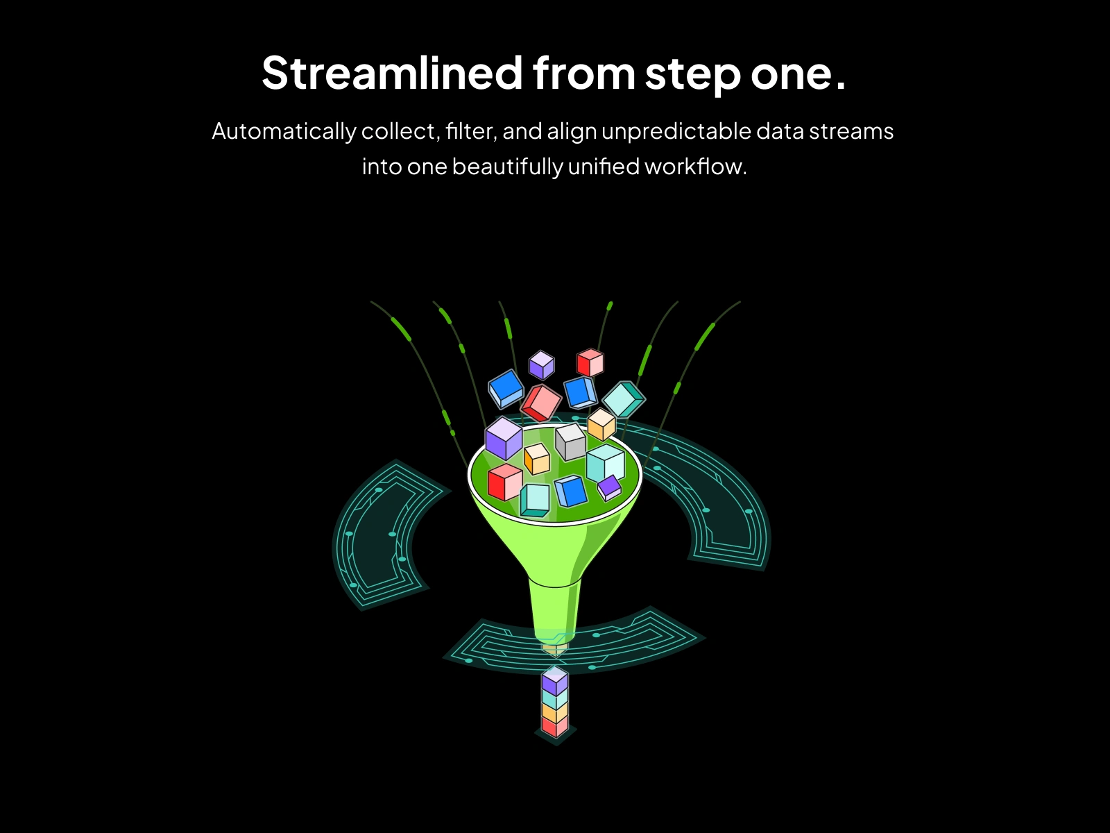
Step 3: I produced 42 illustrations across 2 batches (20 in the first batch, 22 in the second), ensuring consistency across the entire system so every visual felt like part of the same product story.
Section 10
Section 11
Section 12
Section 13
The Key Design Decision
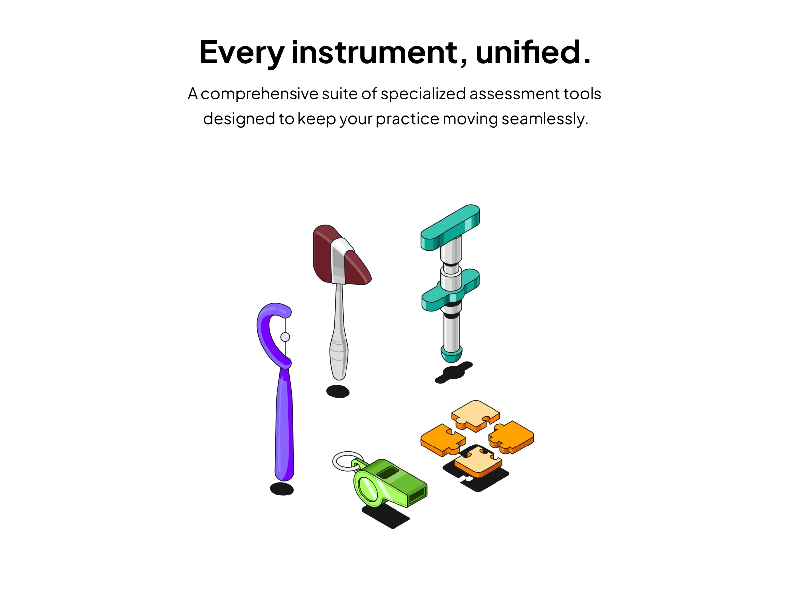
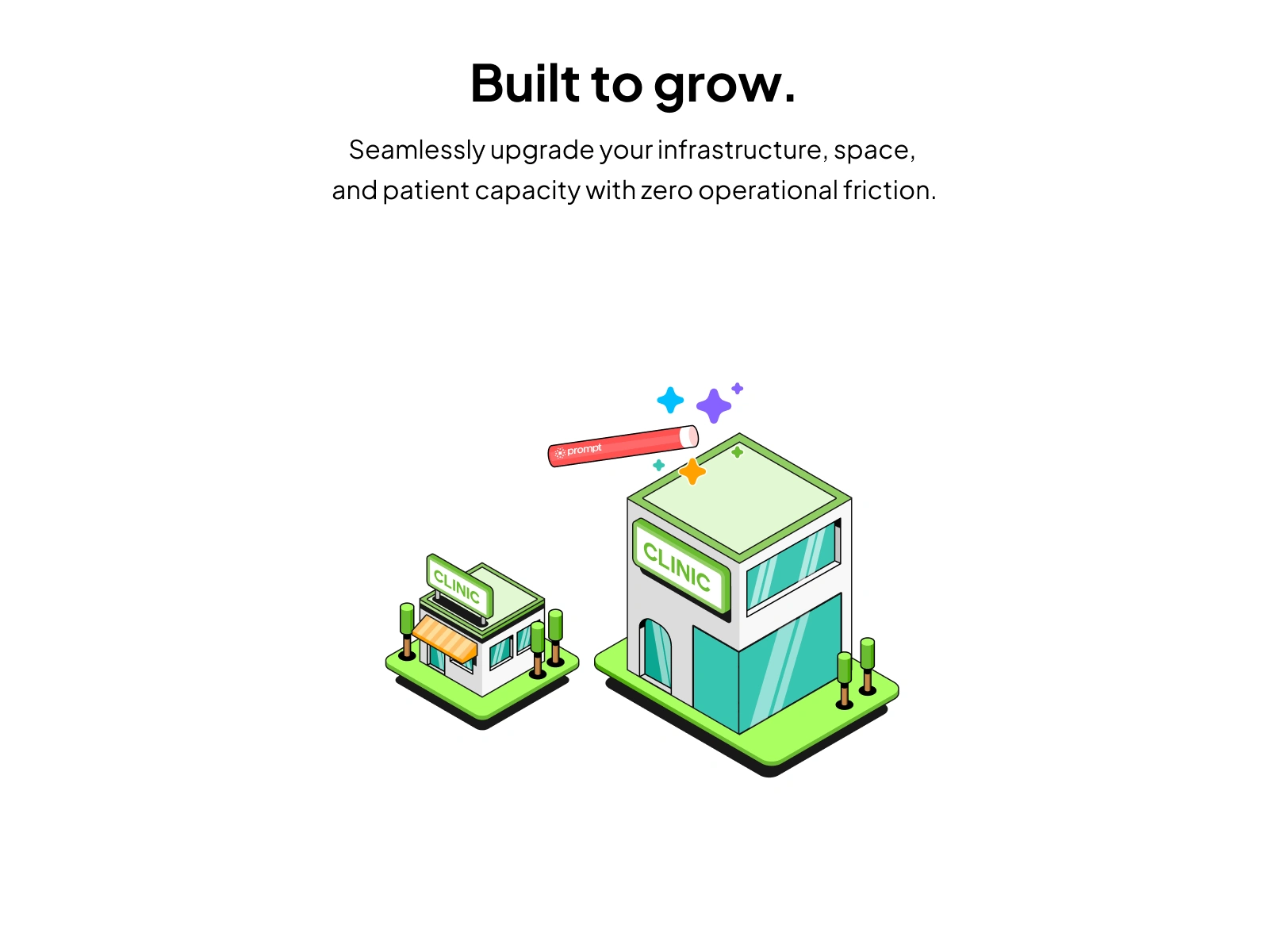
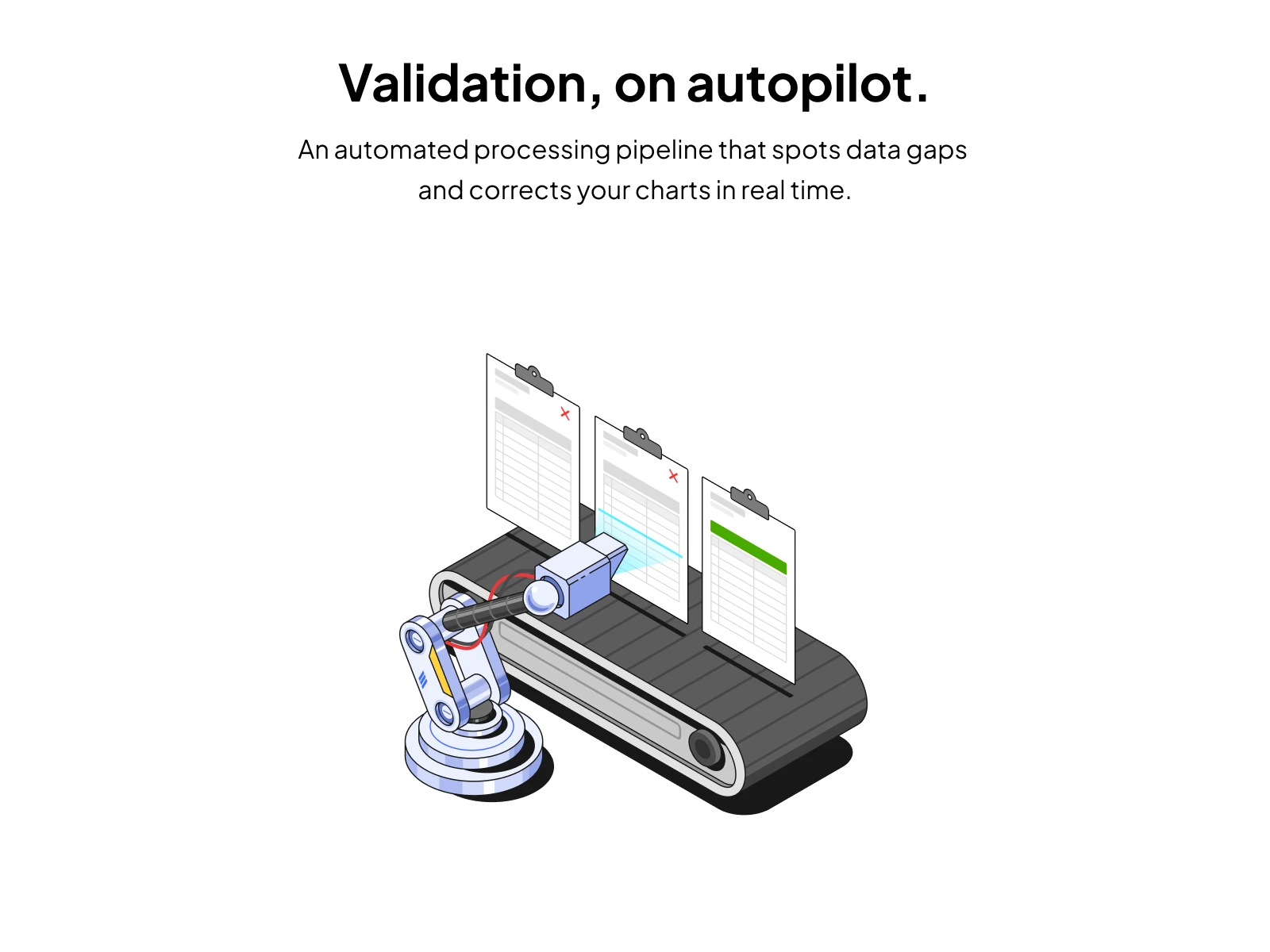
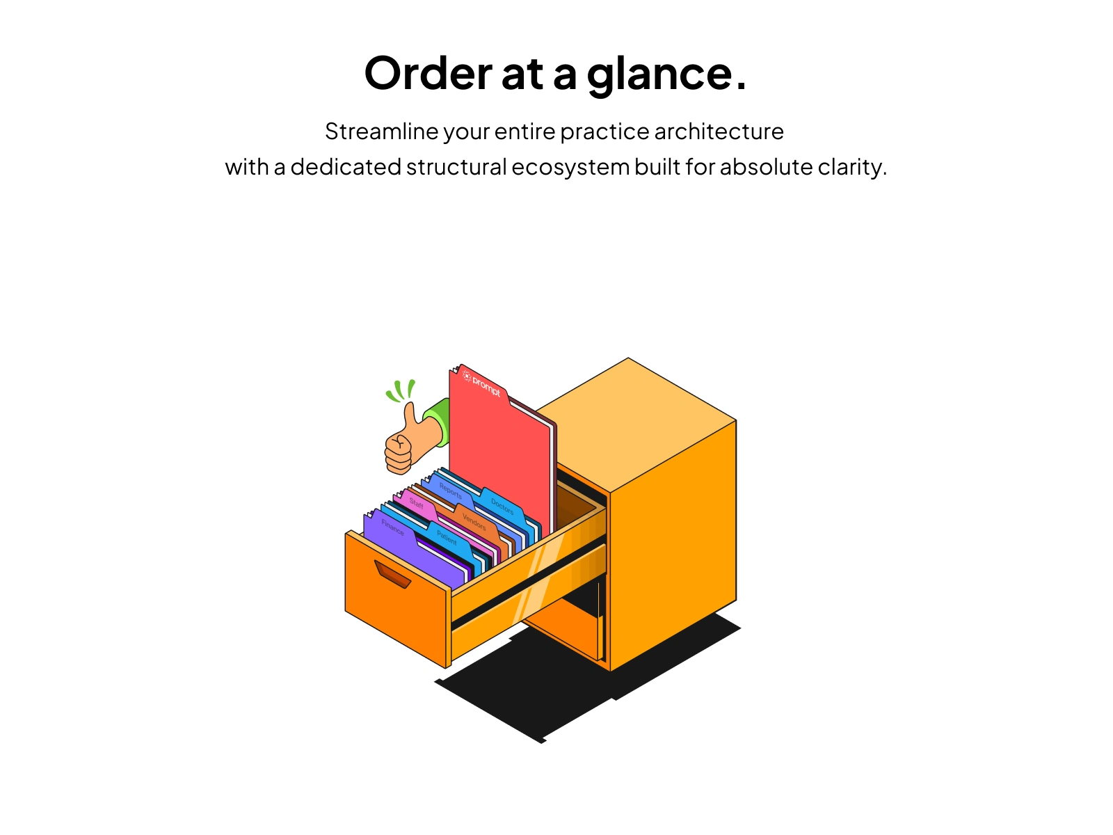
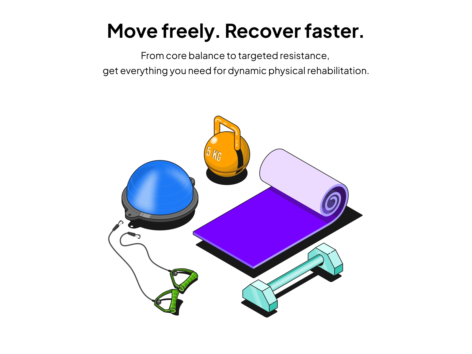
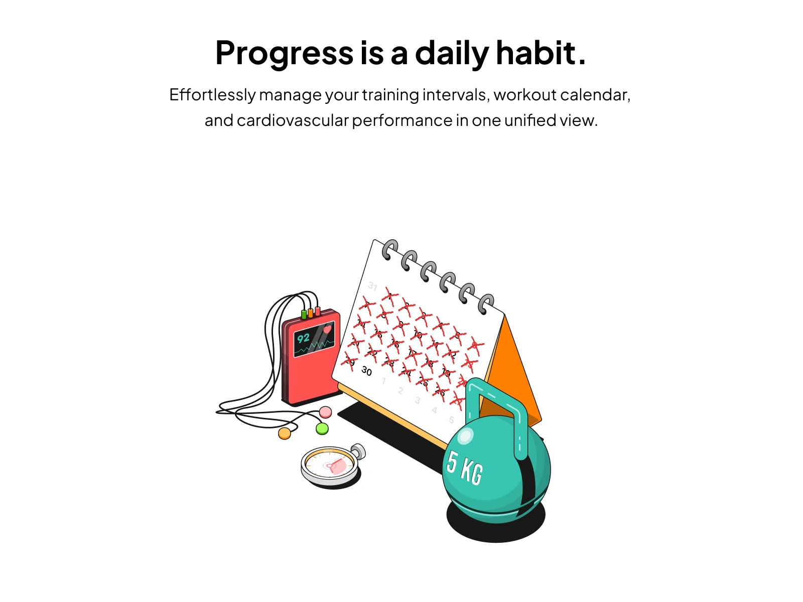
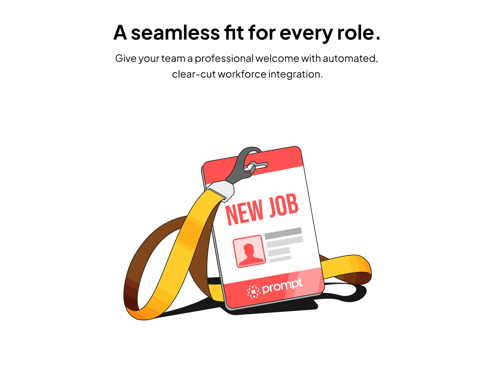
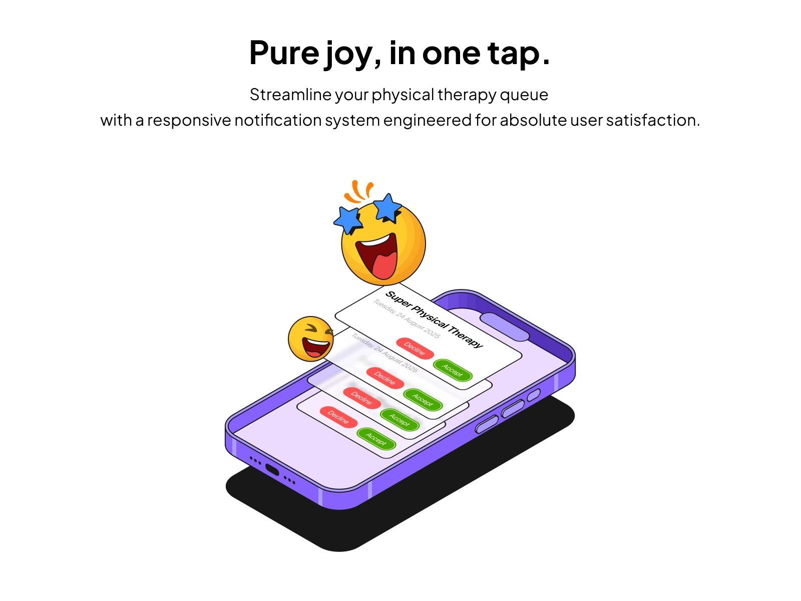
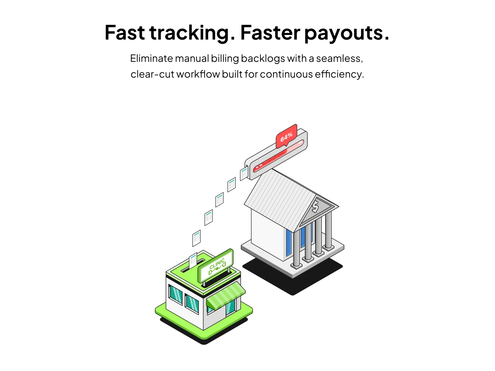
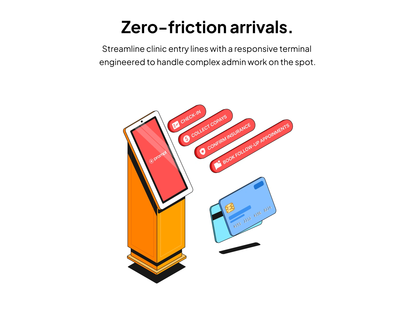
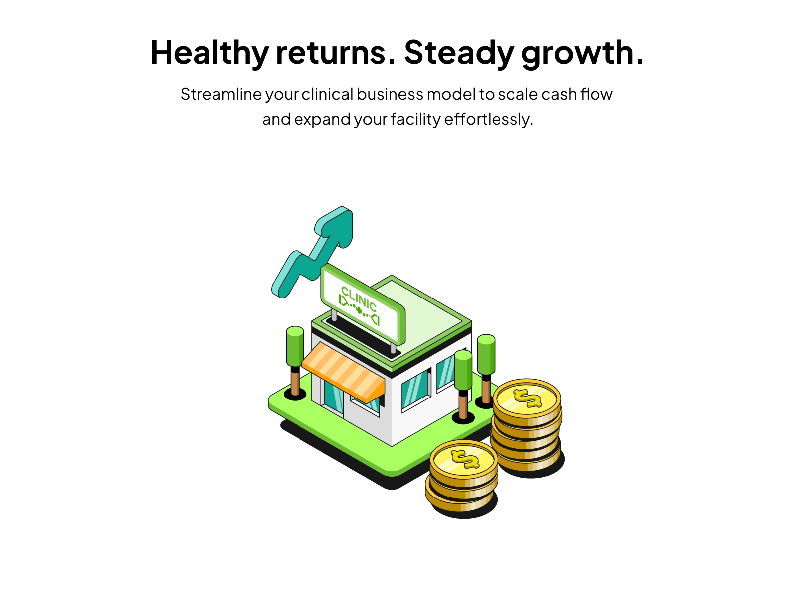
The most important decision was using an isometric illustration style to represent technical complexity in a minimalist, approachable way.
Isometric perspective gives depth and structure without the visual noise of full 3D rendering. It allowed me to show multi-layered workflows (patient data flowing into AI analysis, AI output feeding back to the therapist) as clean, readable scenes. Each illustration communicates a complete feature story in a single frame.
The alternative was flat illustration, but flat couldn't convey the layered, interconnected nature of PromptHealth's AI features. Isometric was the right trade-off: structured enough to show complexity, simple enough to stay scannable.
Section 14
Section 15
Section 16
Section 17
Section 18
The Outcome
The client received the approach enthusiastically. All 42 illustrations shipped across multiple touchpoints: email templates, the marketing website, and campaign materials. The second batch of 22 was commissioned after the first 20 proved effective in production.
For a platform selling to busy clinic owners who have limited time to evaluate new tools, having visuals that communicate value at a glance made the marketing significantly harder to ignore.
Section 19
Section 20
Section 21
Section 22
Section 23

Section 24
Like this project
Posted Jun 13, 2026
Designed the UI for PromptHealth, a HealthTech platform that uses AI to simplify complex medical charting.
Likes
1
Views
31
Timeline
Oct 23, 2024 - Dec 2, 2024
Clients
PromptHealth