Noctygen: Brand Identity for AI SEO SaaS

Amirul Hakim
1 collaborator


Noctygen Hero
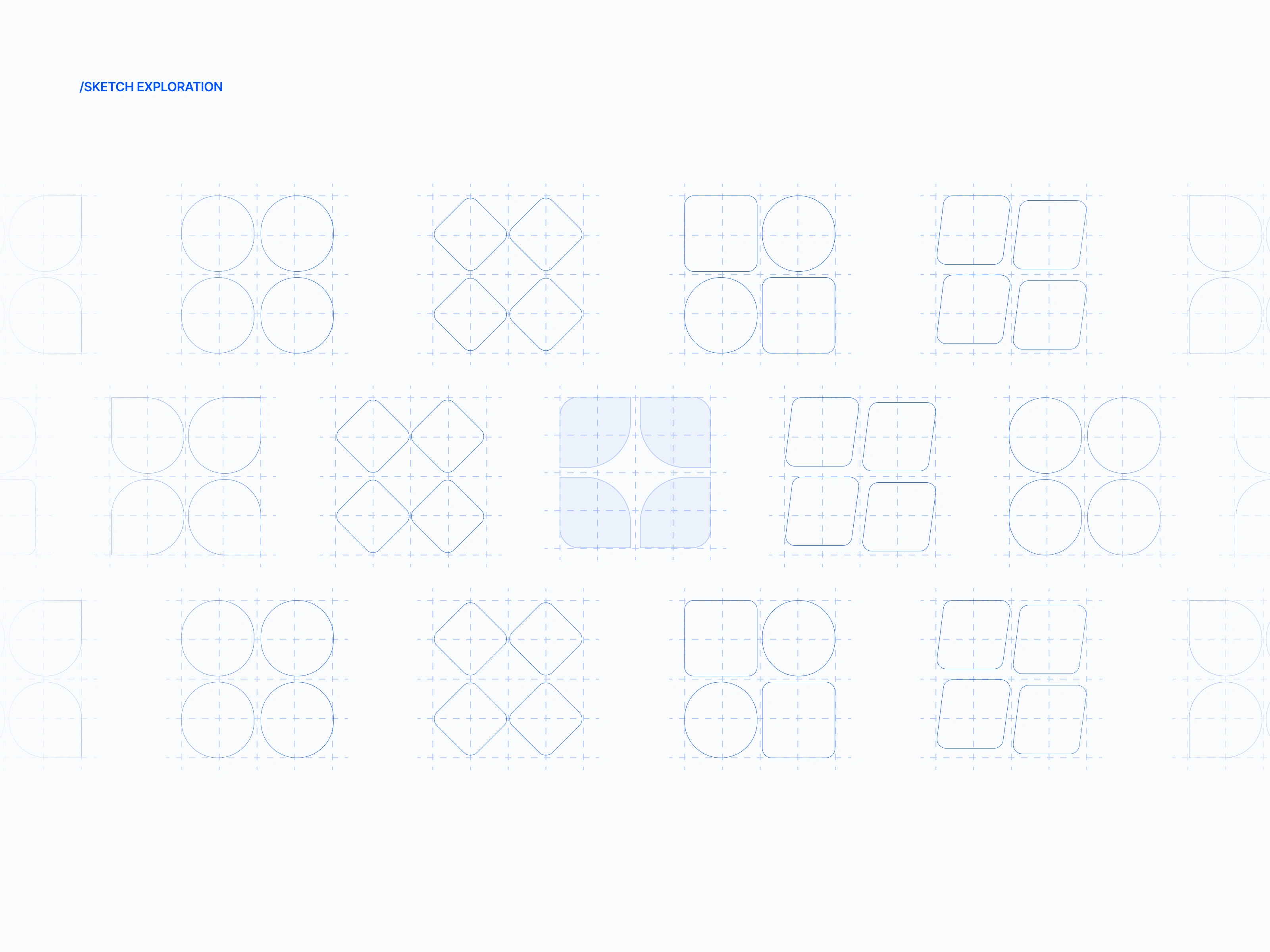
Section 2
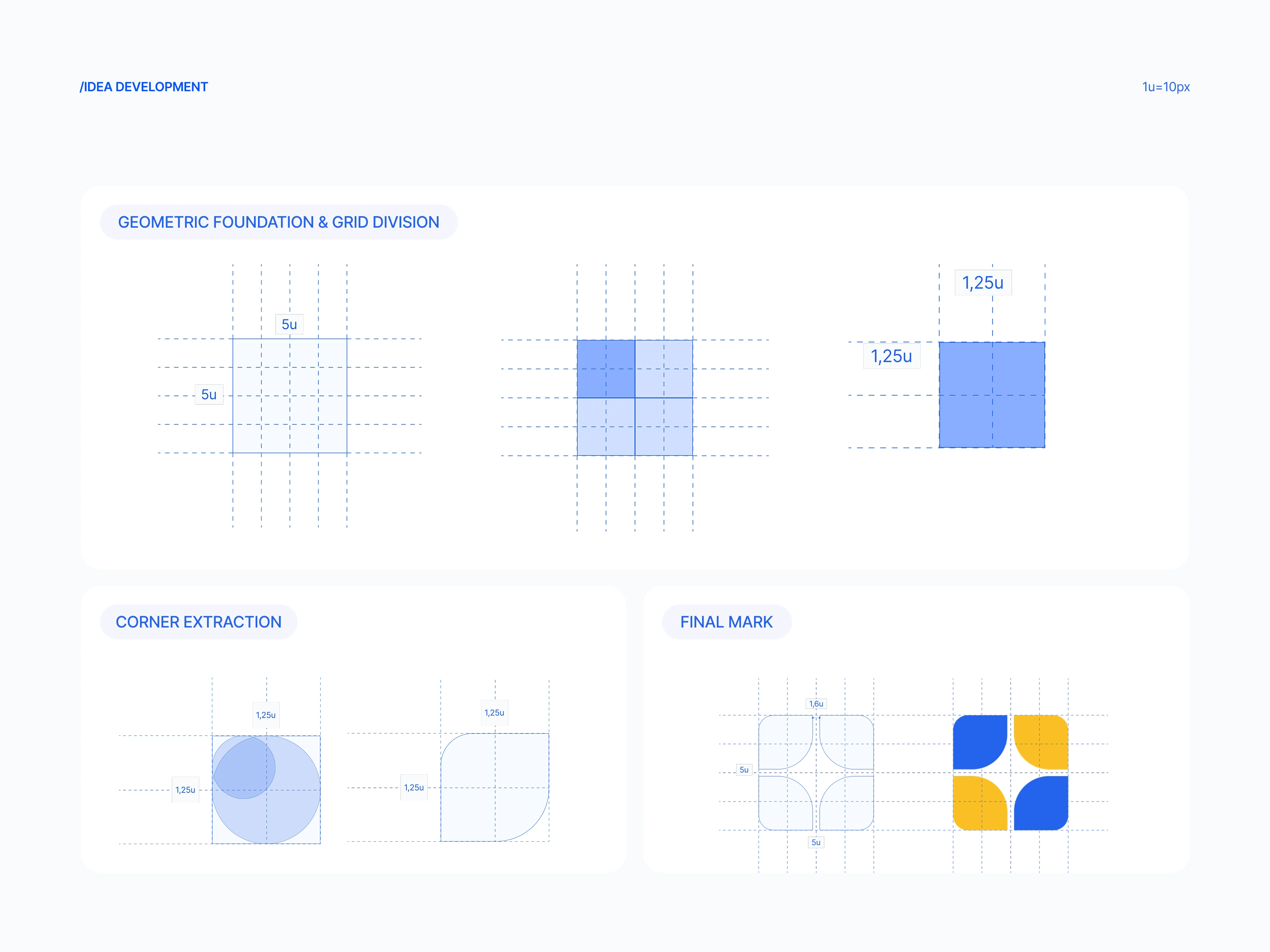
Section 3
The Problem
Noctygen is a SaaS platform that generates SEO and GEO-optimized content using AI. As a brand-new product preparing for launch, they had nothing: no logo, no visual identity, no brand guidelines.
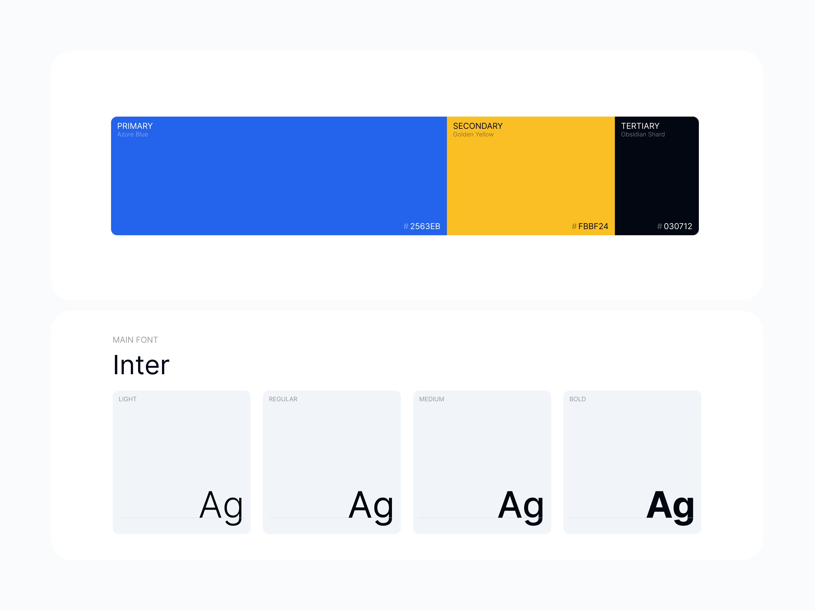
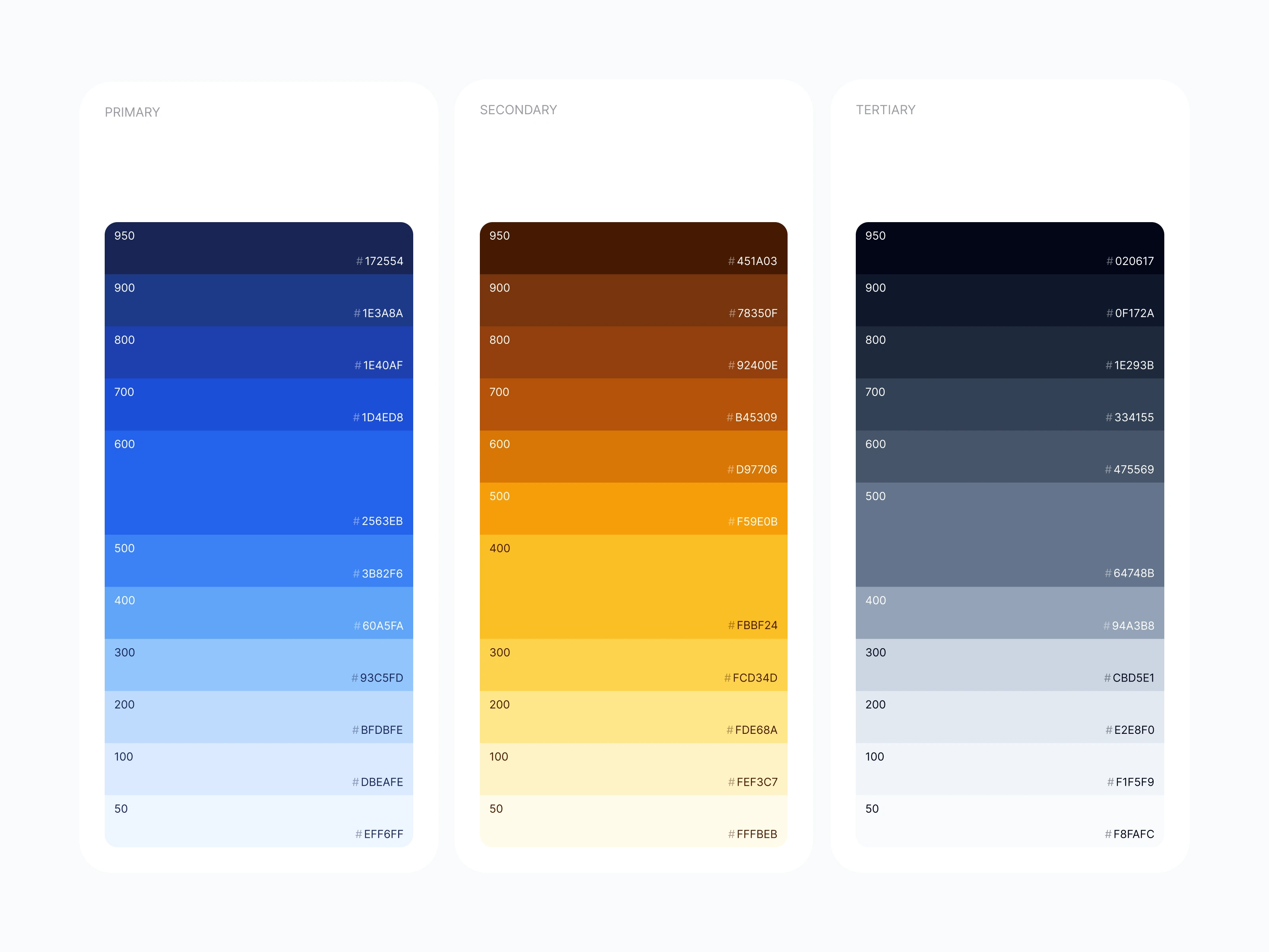
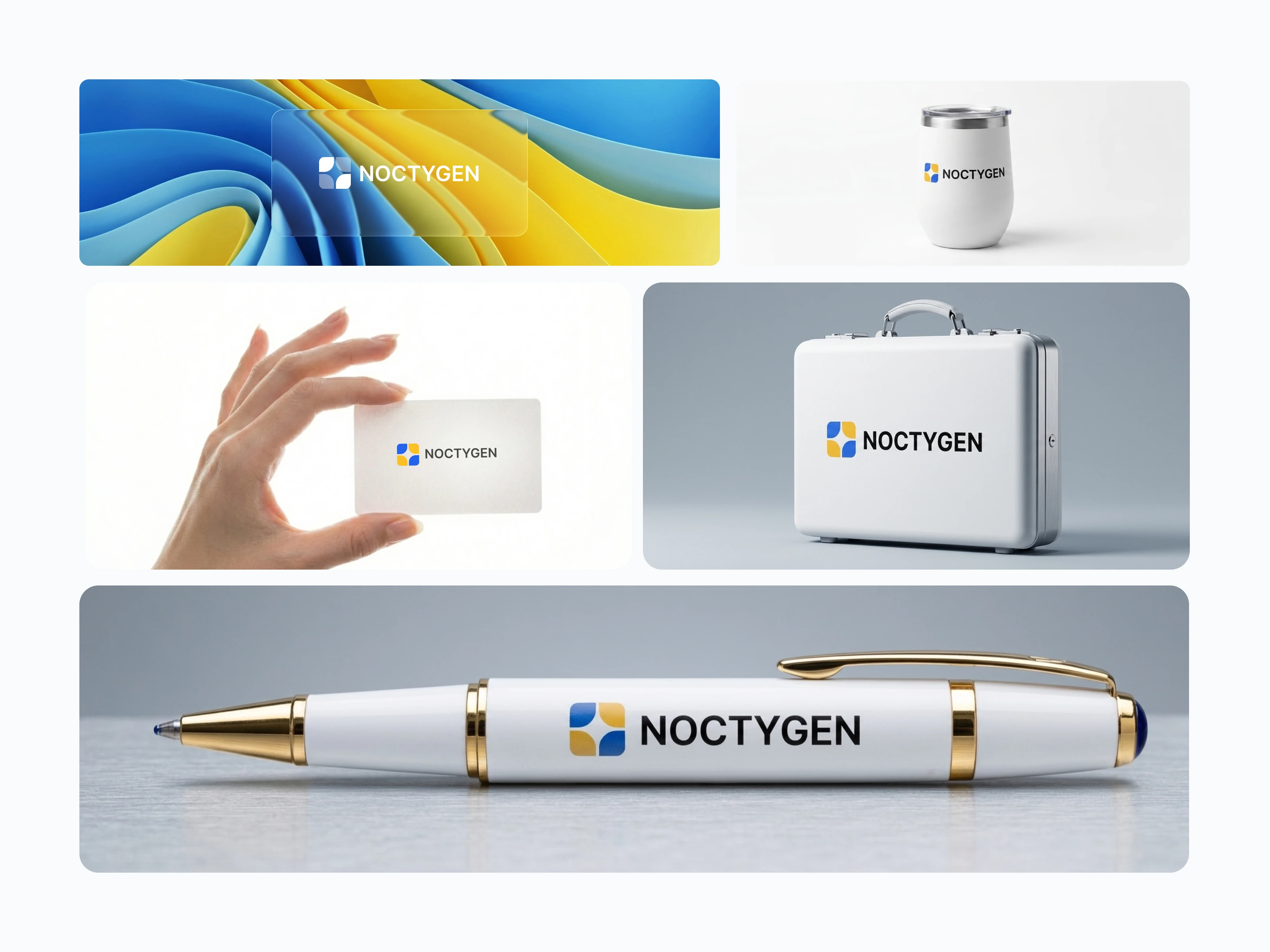
They needed a logo for the product launch and a complete brand guideline system that their team could use to build the UI. Without this foundation, the product couldn't go to market with any visual coherence or credibility.
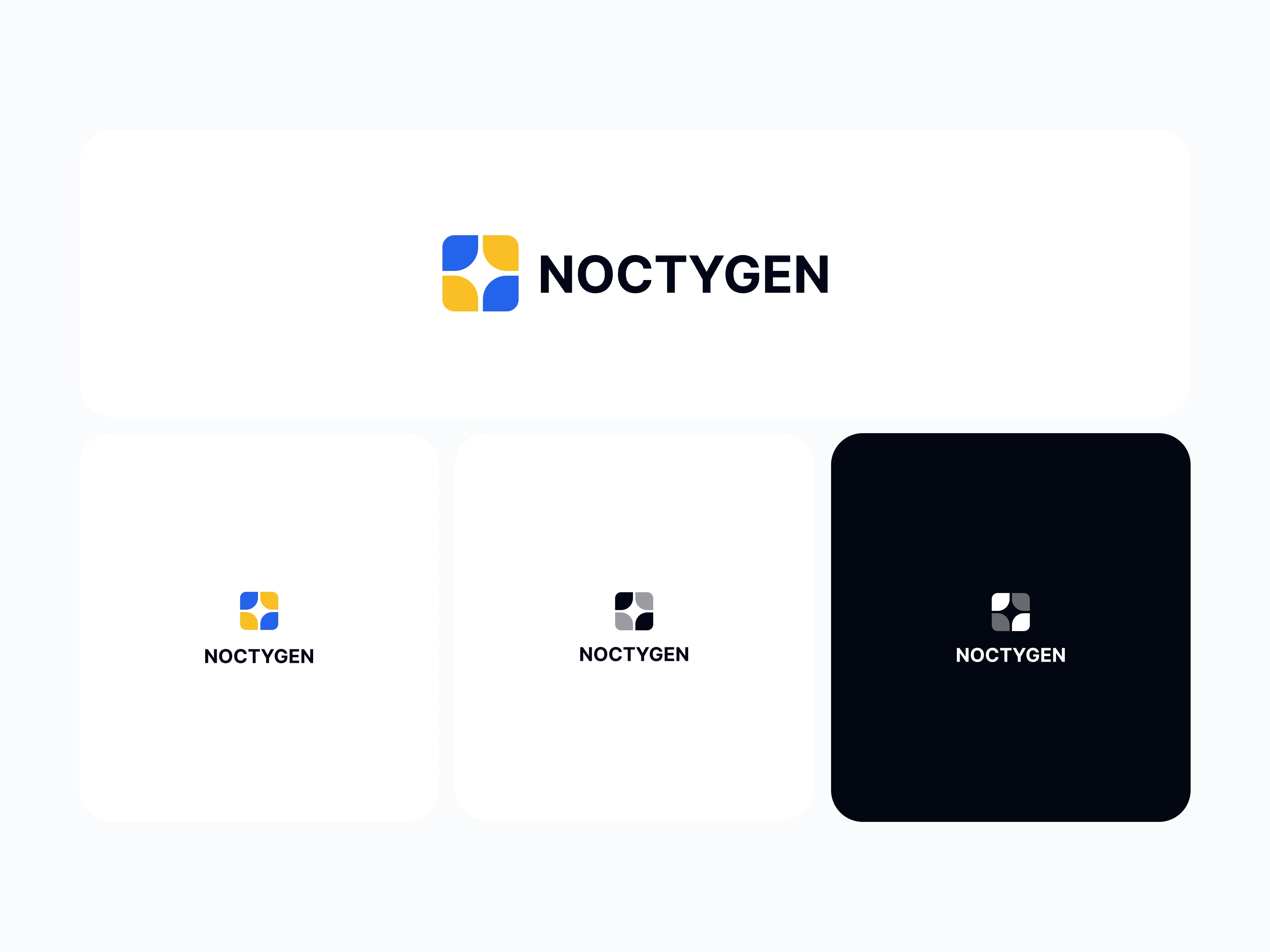
Section 5
Section 6
The Users
Four primary audiences:
Content creators looking to scale their output with AI assistance
Agencies managing SEO and content strategies for multiple clients
News publishers competing for search visibility at speed
Writers who want to improve their SEO and GEO ranking without sacrificing quality
All of them are fighting the same war: visibility. The brand needed to feel intelligent and capable, while remaining approachable for non-technical users.
Section 7
Section 8
The Process
Step 1: Understand the product. I studied Noctygen's core features and the specific problem it solves: helping creators and publishers win the SEO and GEO visibility battle using AI-generated content.
Step 2: Research and benchmarking. I processed all ideas, references, and competitor brands. I studied how other AI content tools present themselves visually, looking for patterns to diverge from and gaps to fill.
Step 3: Audience research. I conducted focused research on content creators and their relationship with AI tools, understanding what builds trust and what feels generic in this space.
Section 9
Section 10
The Key Design Decision
The product is deeply AI-dependent, so the brand's core had to reference AI without looking generic. Every AI tool uses the same visual clichés (neural networks, gradients, abstract tech shapes). I needed something different.
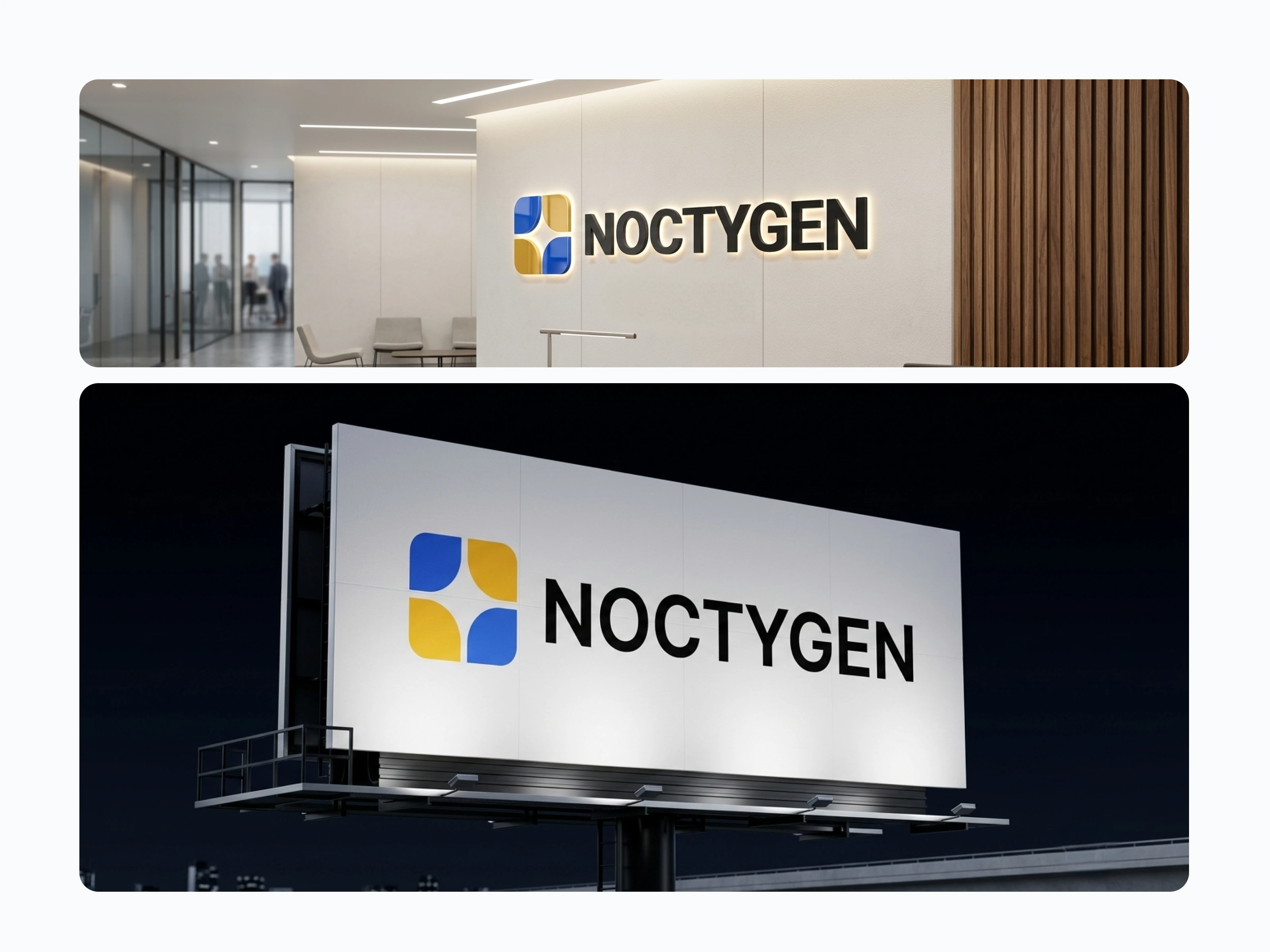
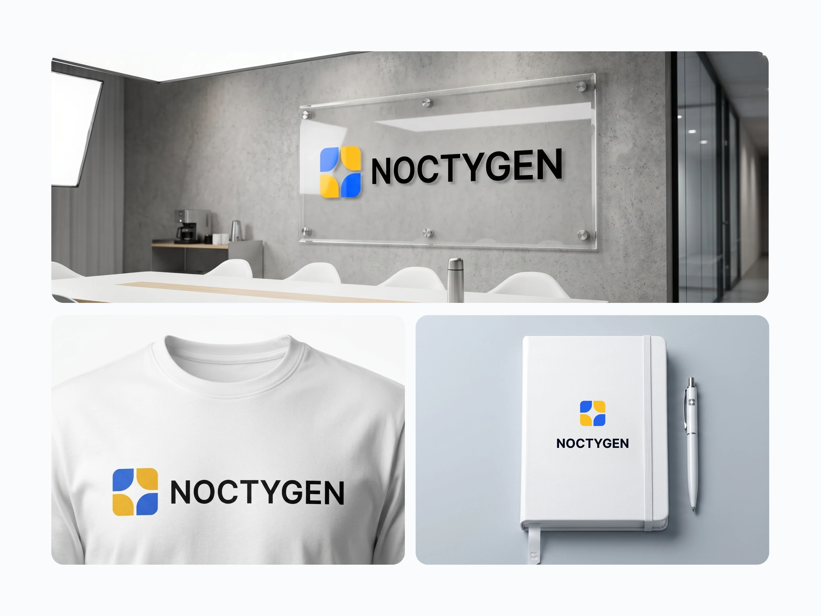
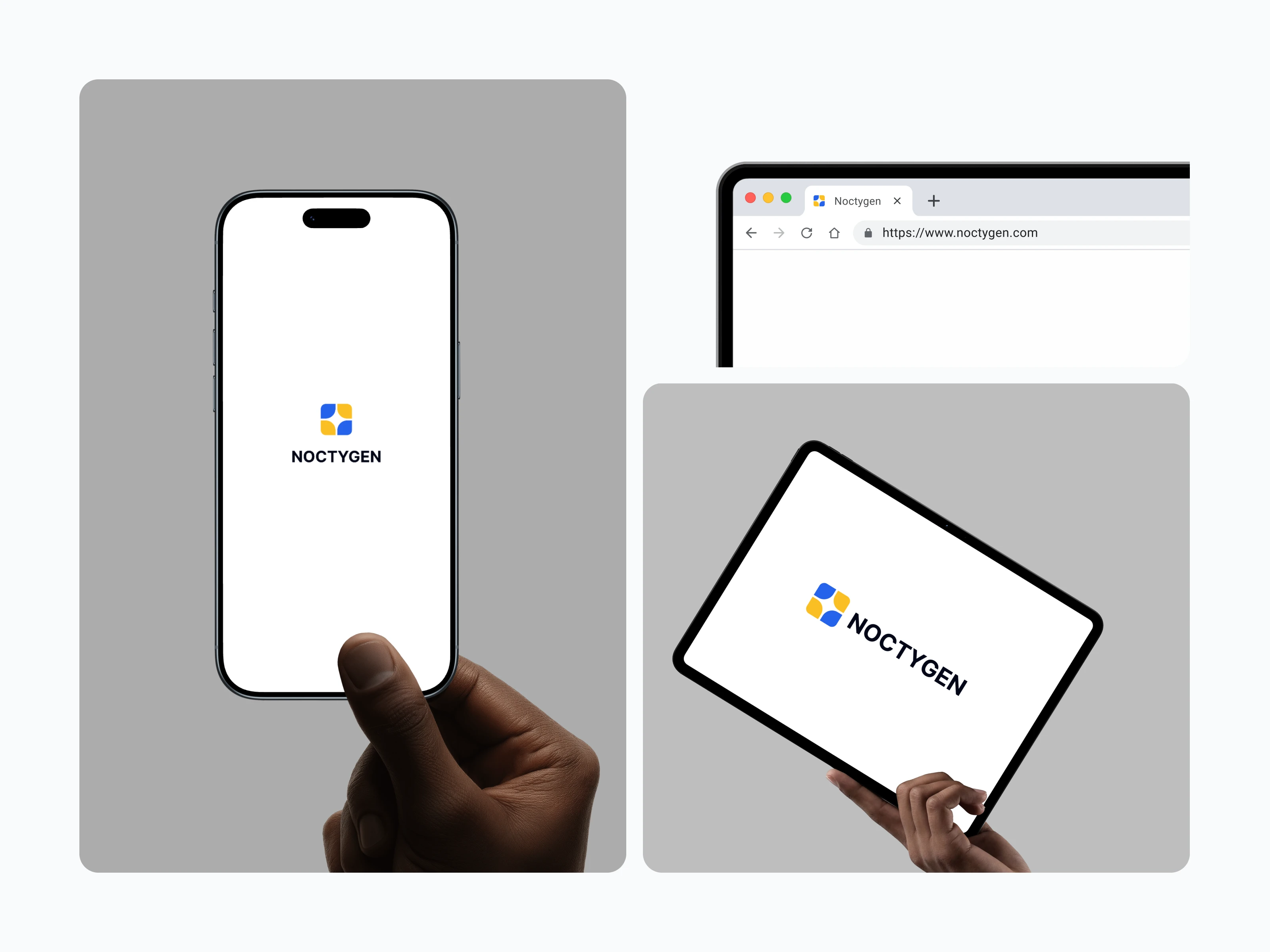
The answer came from the product's own name: Noctygen = Nocturnal Generator. Nocturnal points to the night sky. I took the star as the primary gestalt shape and combined it with a rounded square, which is a universal symbol for content (think app icons, content cards, text blocks).
The result: a logomark that reads as "a star inside your content." It's a simple, immediate impression that communicates the product's promise (your content will shine) while embedding the AI/nocturnal origin story in the shape itself.
This kept the brand rooted in AI without falling into the generic AI visual trap.
Section 11
Section 12
The Outcome
The client approved the brand immediately. Beyond the positive reception, the brand identity produced a tangible business result: Noctygen attracted 7 potential investor leads before the product even launched.
The strength of the brand presentation gave the founding team confidence to keep developing the tool, and they ultimately closed the deal with investors. The brand didn't just look good; it became a fundraising asset.
Like this project
Posted Jul 18, 2026
Created Noctygen’s launch-ready identity for an AI SEO and GEO content platform, including a distinctive star-and-content logomark and brand guidelines for the product UI. The brand drew 7 investor leads before launch.
Likes
2
Views
19
Collaborators