RC Geeks: Custom Icon System for E-Commerce

Amirul Hakim

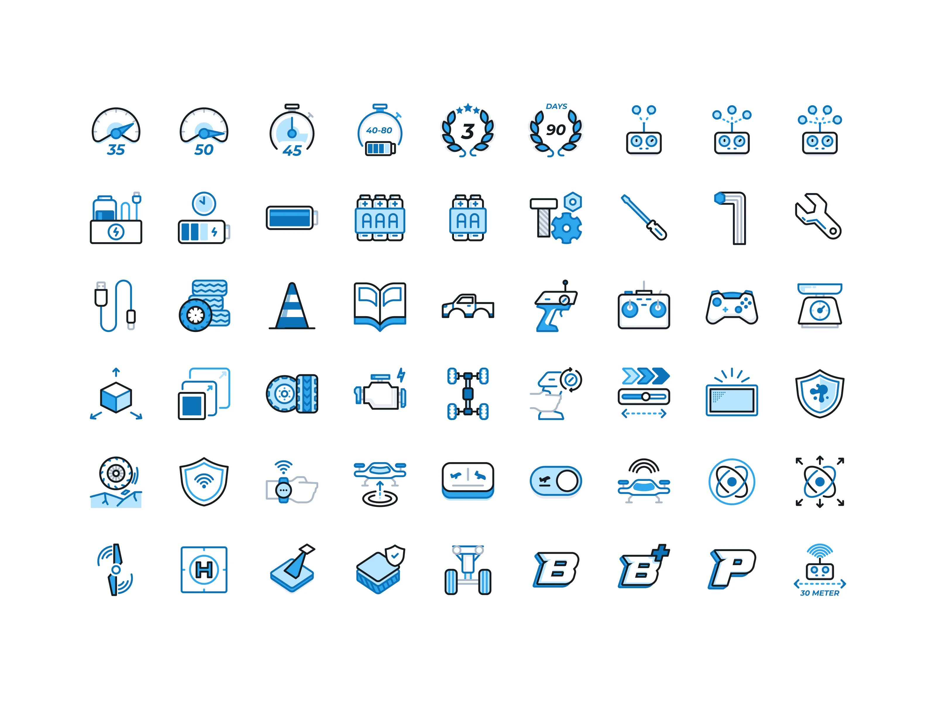
RC Geeks Icon System Hero
Section 2
The Problem
RC Geeks is a niche e-commerce store for remote-controlled vehicles and hobby gear. The RC industry is highly segmented: crawlers, drones, boats, FPV gear, parts, accessories. Not all of these categories have ready-made icons available on the market.
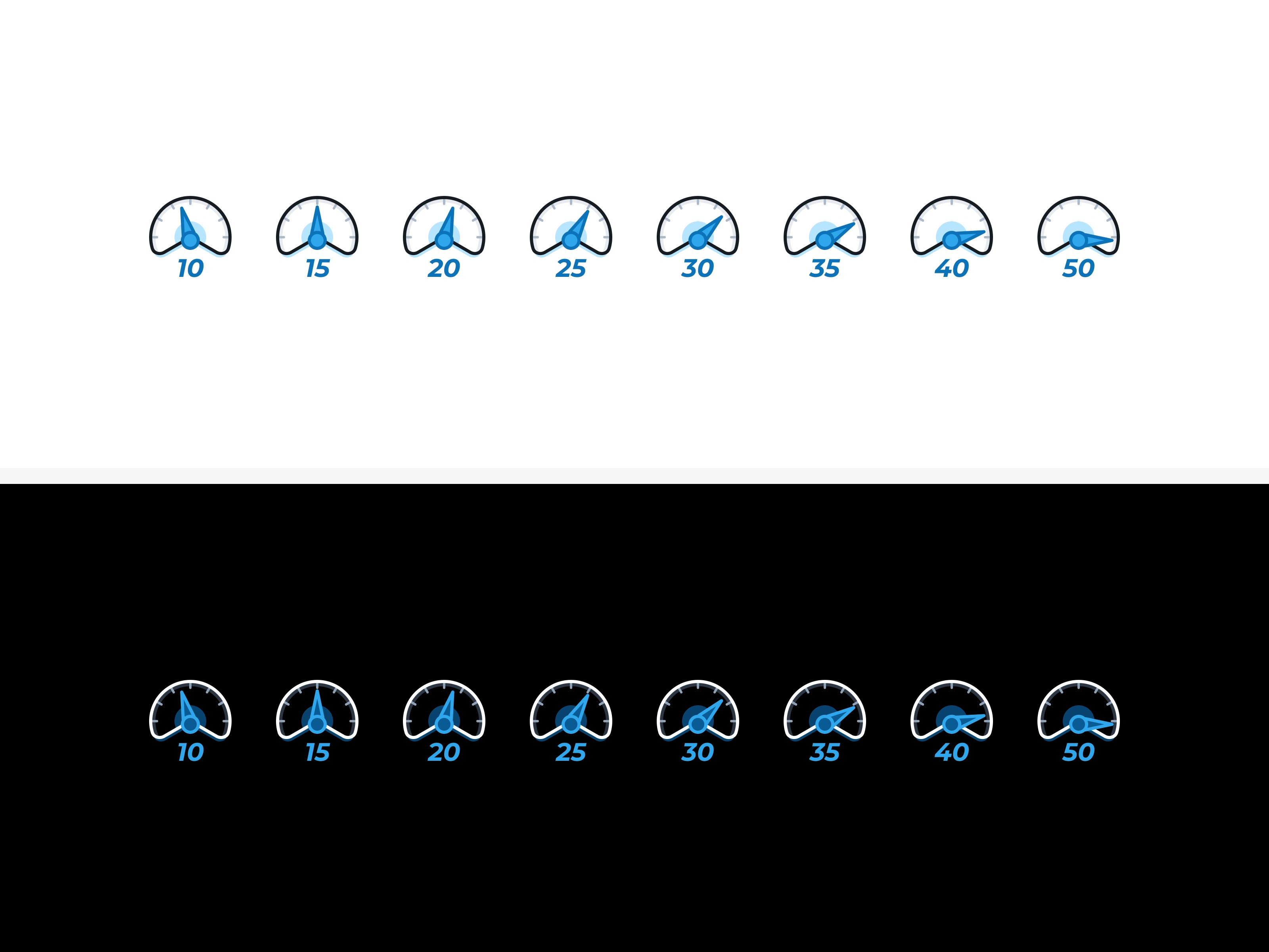
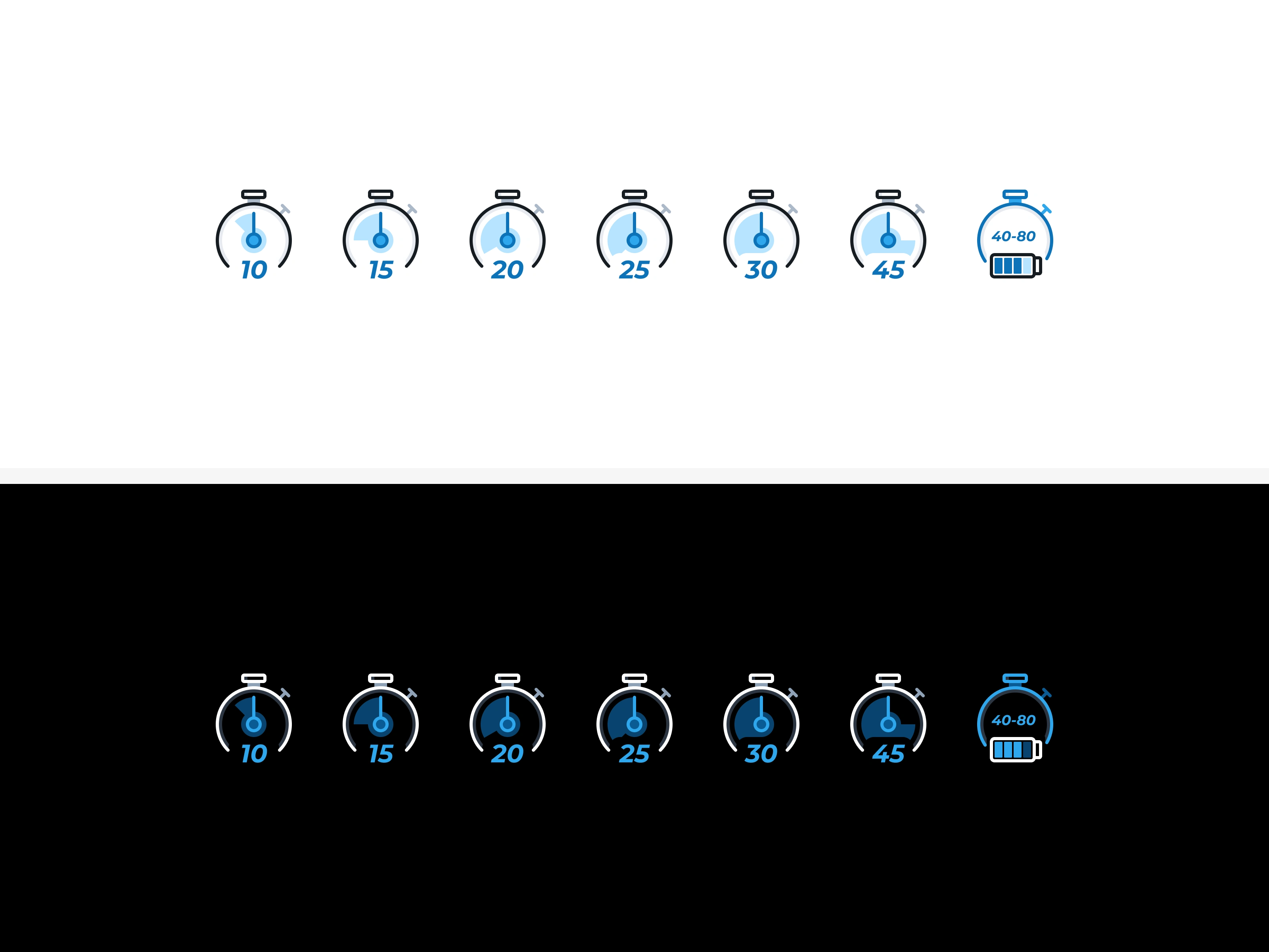
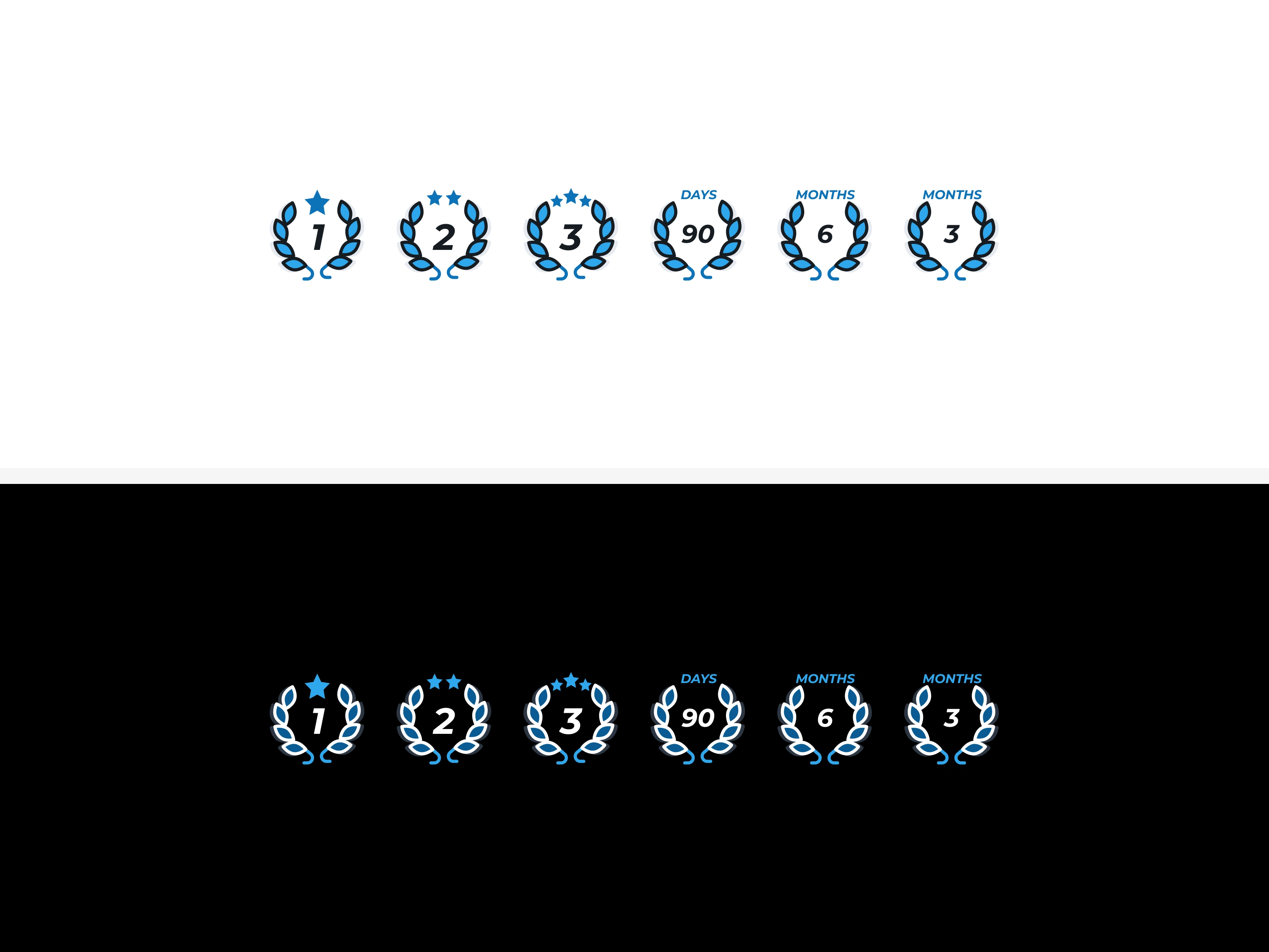
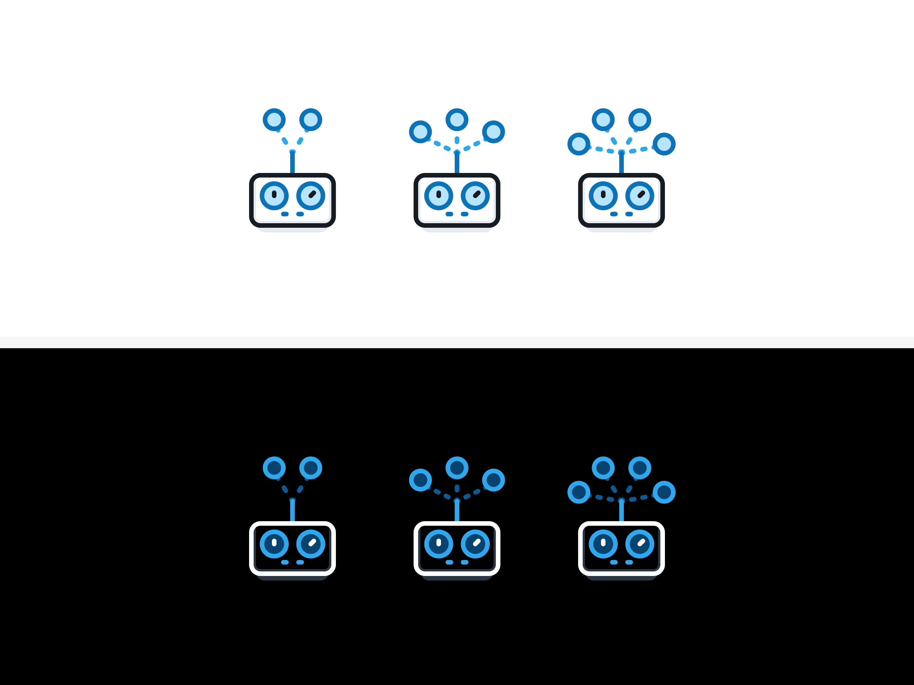
The store's owner, David Feakins, was dealing with an icon set that felt outdated, inconsistent, and unrepresentative. Some icons were pulled from stock image libraries, others were custom but didn't match each other in style or weight. For an e-commerce site where users need to scan categories quickly, that inconsistency was creating friction.
He needed one icon designer to build a complete, unified icon family that could represent every product category clearly and feel native to the RC Geeks brand.
Section 3
Section 4
The Users
RC Geeks serves three distinct user types:
Hobbyists who know exactly what they want and navigate by category
Newcomers trying RC for the first time, who need visual cues to understand what each category contains
Gift buyers (parents buying for kids, relatives buying for enthusiasts) who are least familiar with the product space and rely heavily on icons and labels to orient themselves
For all three groups, icon clarity directly affects how fast they find what they're looking for.
Section 5
Section 6
The Process
Step 1: Audit. I reviewed every existing icon on the site. Icons that were already clear and well-made were kept. Icons that were inconsistent, off-brand, or pulled from stock were flagged for replacement.
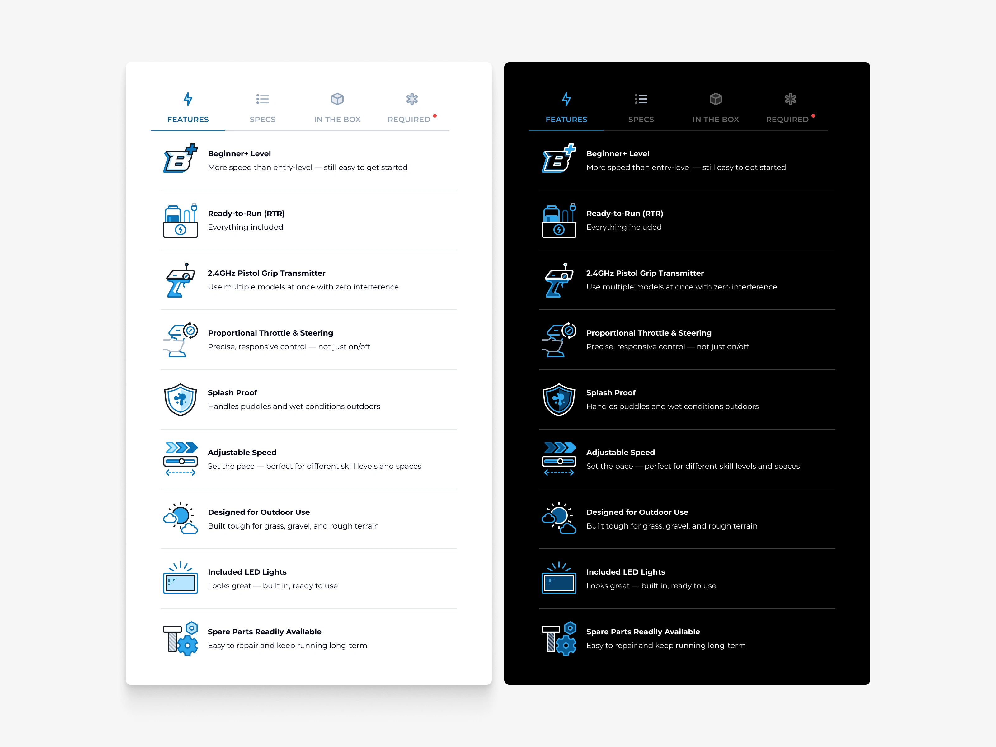
Step 2: Brand alignment. I studied the RC Geeks brand guidelines and built a color variable system anchored to their brand palette. Because the website runs in both dark mode and light mode, every icon needed to work in both environments.
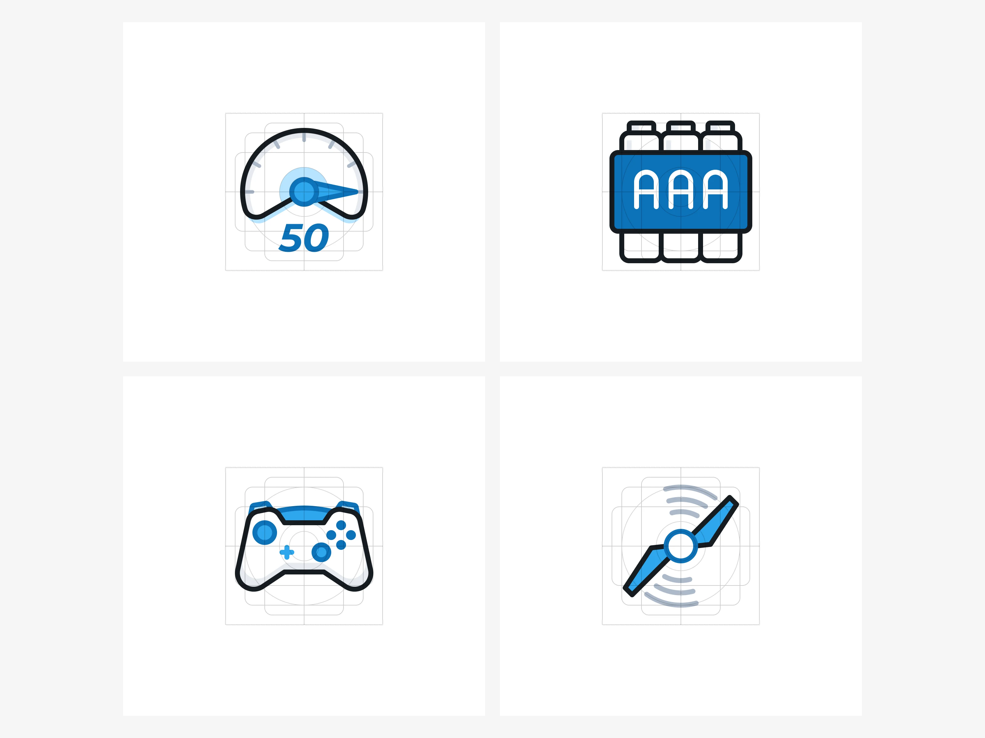
Step 3: Design. I created a custom grid system to enforce consistent sizing, stroke weight, and color across the entire icon family. For each icon, I referenced as many visual sources as possible to land on the shape that communicates meaning fastest at a glance.
Step 4: Testing. I tested every icon in both dark and light mode, verified scalability at the smallest display sizes, and interviewed several users who are active in the RC hobby to validate that each icon was immediately recognizable.
Section 7
Section 8
Section 9
Section 10
The Key Design Decision
The existing icons used a single flat color. They looked generic and could have belonged to any website.
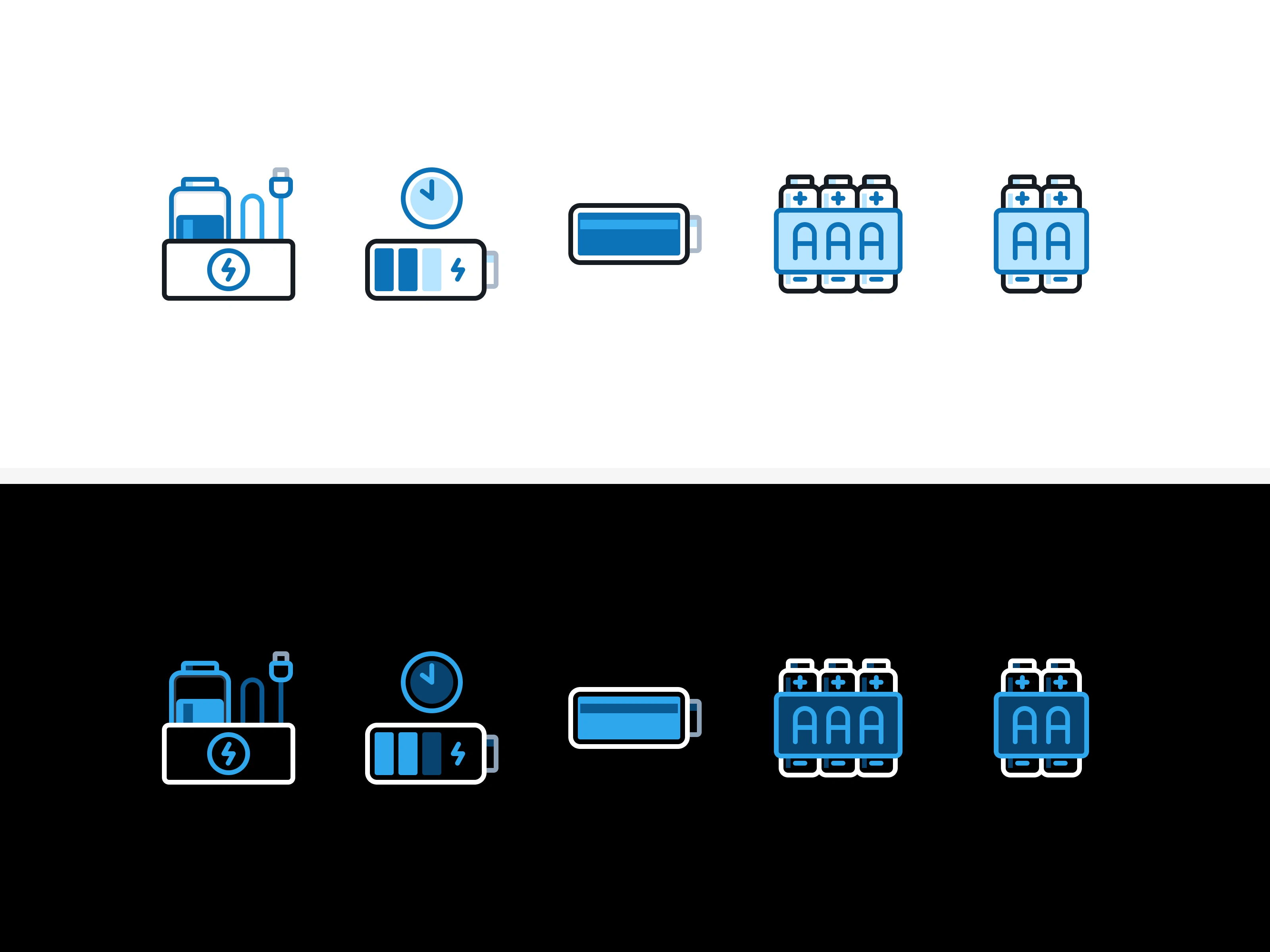
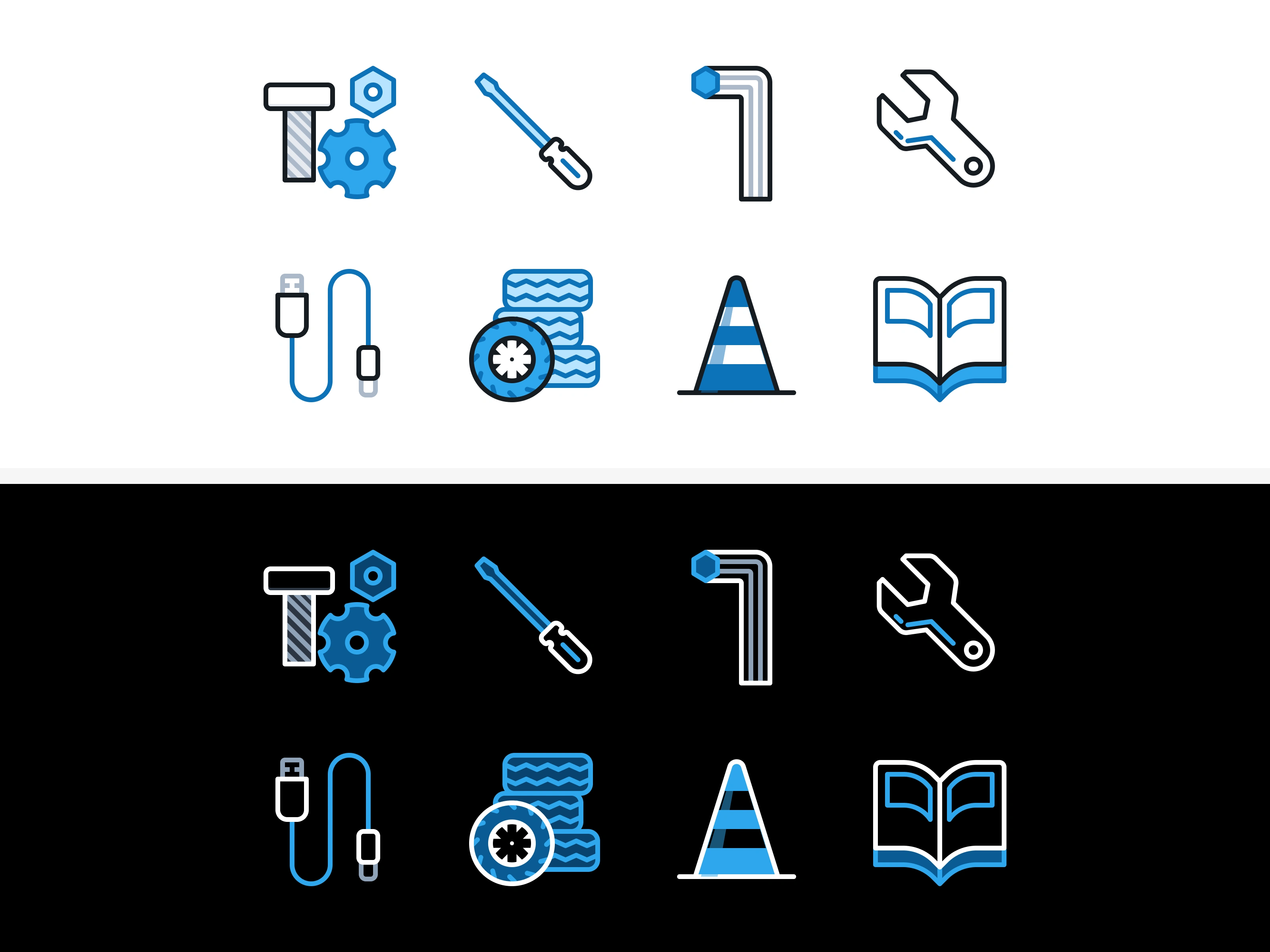
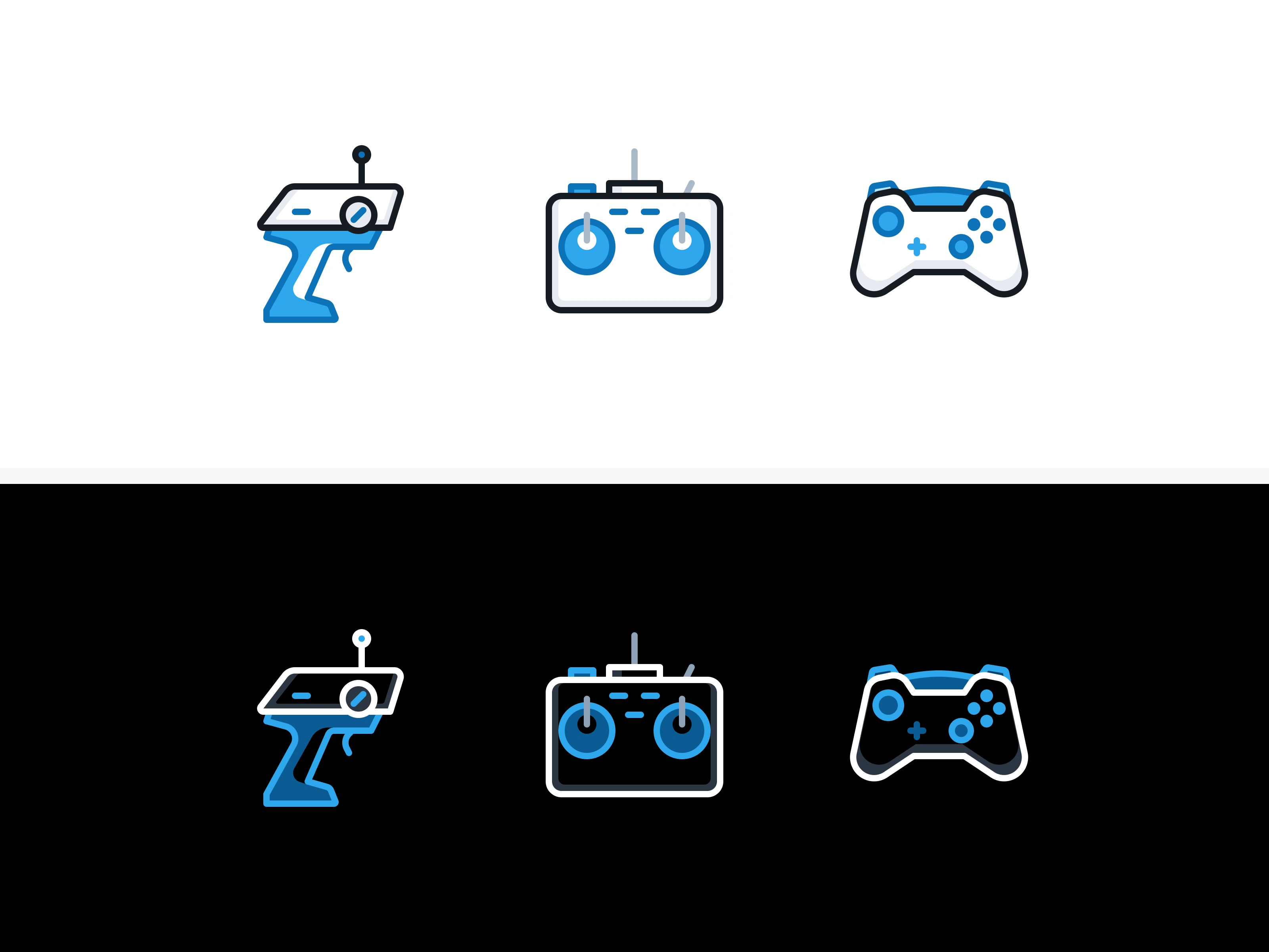
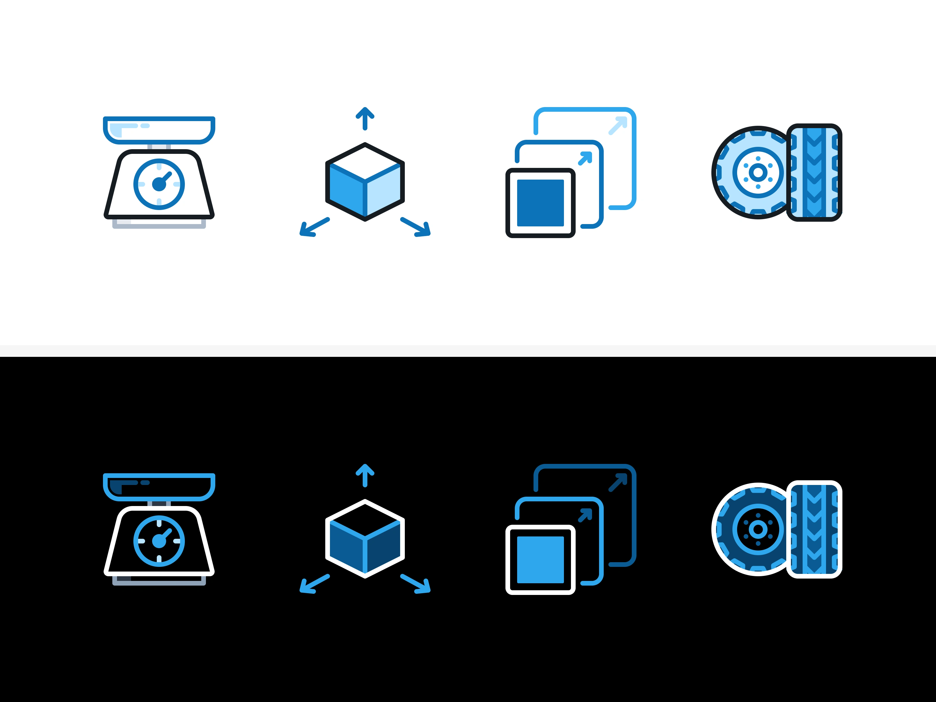
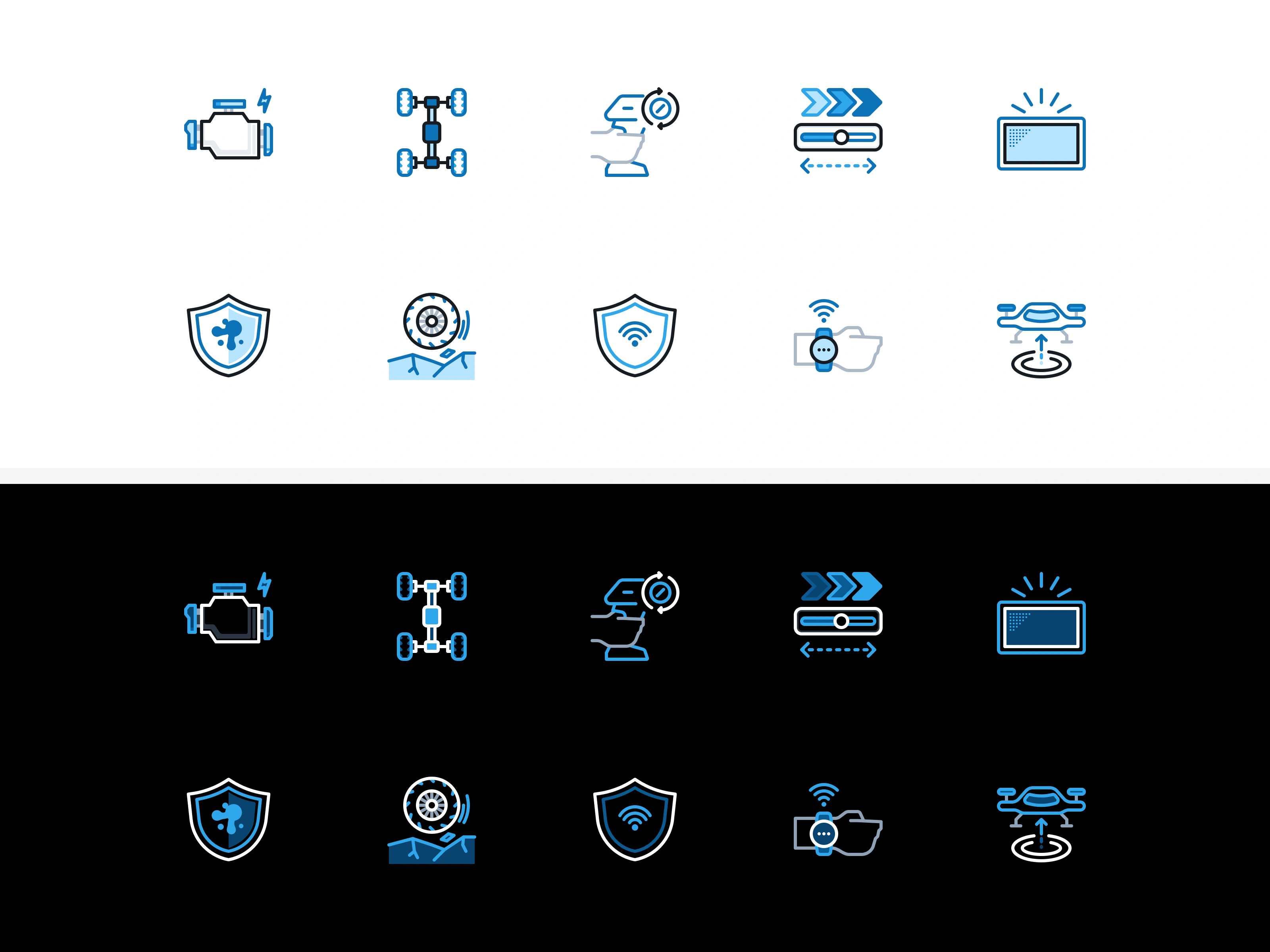
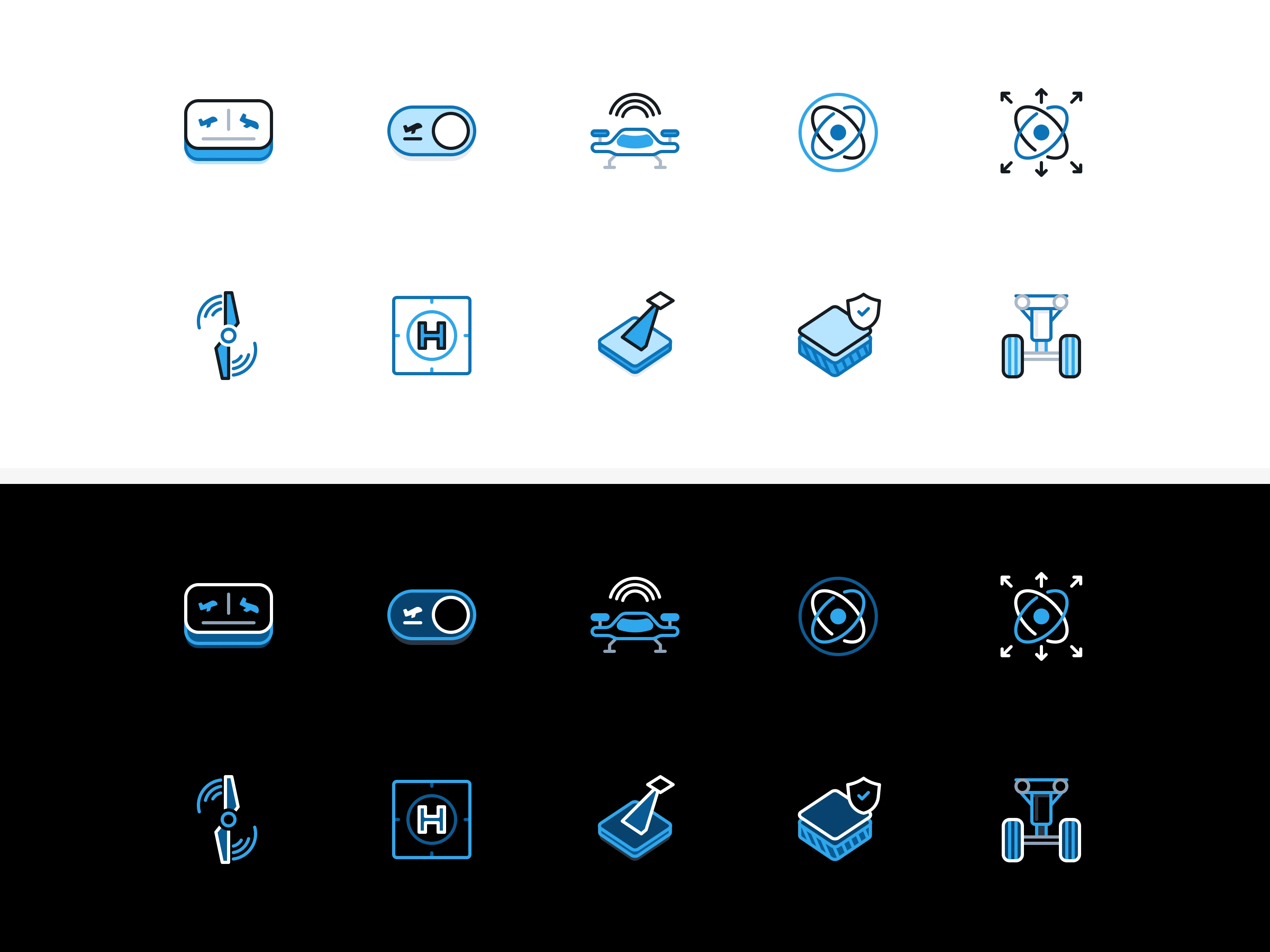
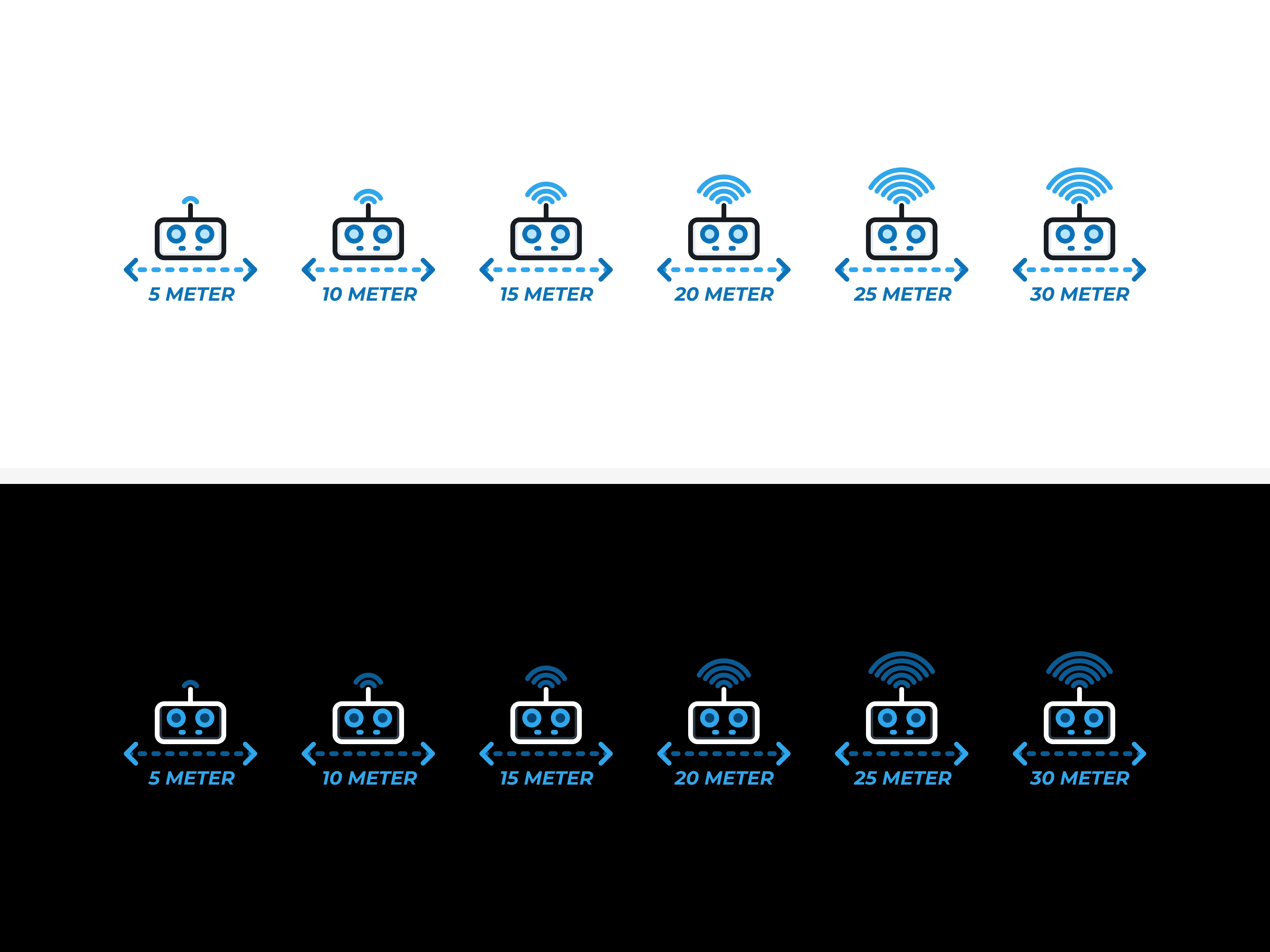
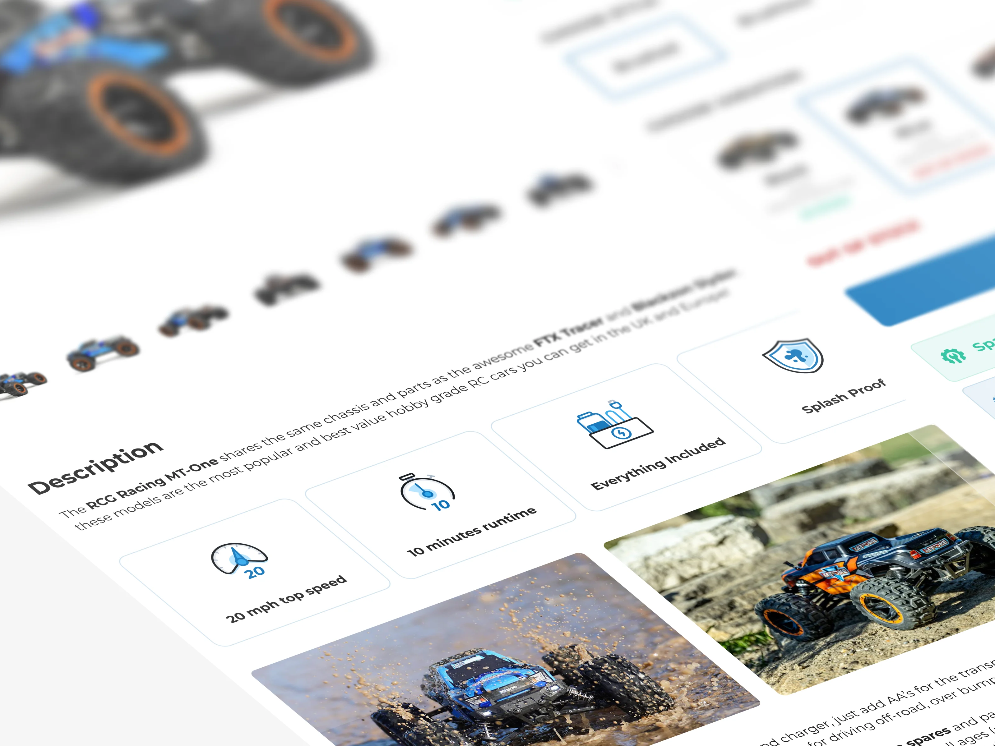
I proposed a multi-color approach using the brand's own color palette as the anchor. Each icon uses multiple brand colors with adaptable modes for dark and light backgrounds. This made the icons feel premium, brand-native, and immediately distinguishable from stock imagery.
The shift from mono-color to multi-color was the single biggest visual upgrade. It gave the entire navigation a cohesive, polished identity that felt like RC Geeks, not a template.
Section 11
Section 12
Section 13

Section 14
Section 15
Section 16
Section 17
Section 18
The Outcome
David Feakins was particularly enthusiastic about the dark mode and light mode approach, and the multi-color system anchored to the brand palette.
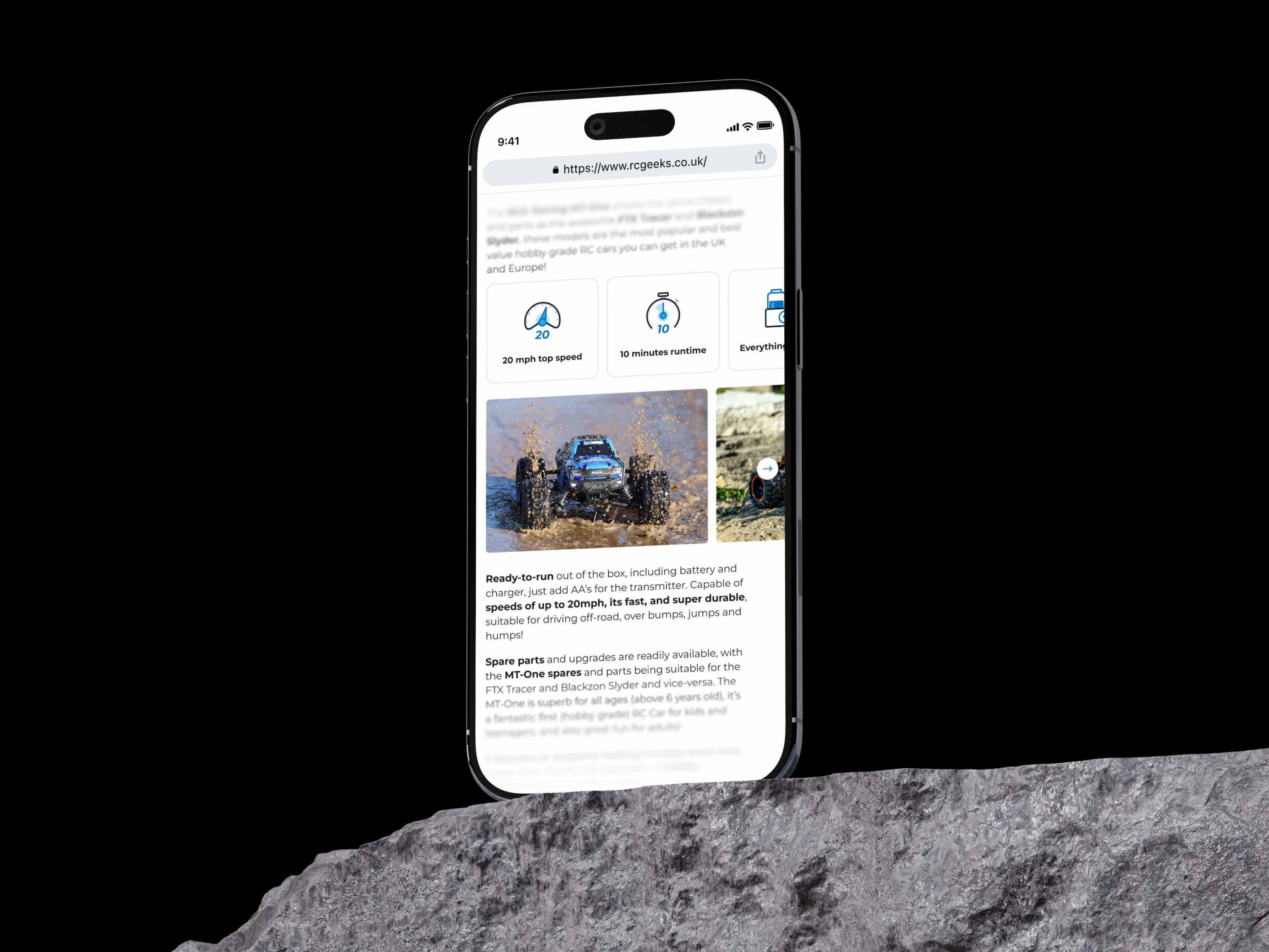
He reported that the new icons gave users a faster first impression and shortened the decision time when browsing product categories. The icons reduced cognitive load and contributed to improved user conversion. To date, there have been zero reports of any icon failing to represent its intended feature or meaning.
The proof is in the simplicity: when every icon communicates instantly, users spend less time figuring out where to go and more time buying.
Like this project
Posted Jul 18, 2026
Designed a custom, multi-color icon system for RC Geeks that makes RC categories faster to scan across light and dark modes. The consistent visual language replaced mismatched stock icons and helped shoppers find products with less friction.