Tanyo App: UI/UX Design to Scale Expert Networks

Amirul Hakim
1 collaborator


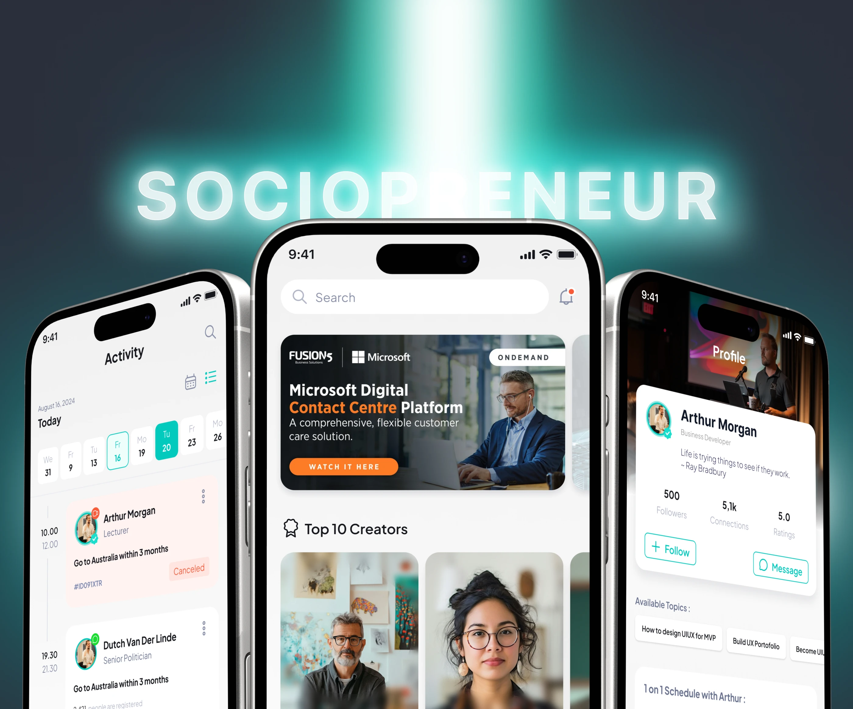
Tanyo Cover
The Problem
Tanyo is a sociopreneur community app built by Crosva. It connects users with industry experts through direct consultations, webinars, and structured classes. The concept was strong, but the existing app had three core UX problems:
Expert visibility was low. High-value experts on the platform had no dedicated exposure. They were buried in the same feed as everyone else, making it difficult for the platform to retain its most important contributors.
Content discovery was broken. Users couldn't filter or sort content by their specific interests. Finding a relevant expert or class meant scrolling through an undifferentiated feed, hoping to stumble on something useful.
Navigation was confusing. The information architecture created friction at every step. Users frequently got lost between sections, and the learning curve discouraged new signups from exploring the platform fully.
Tanyo Section 2
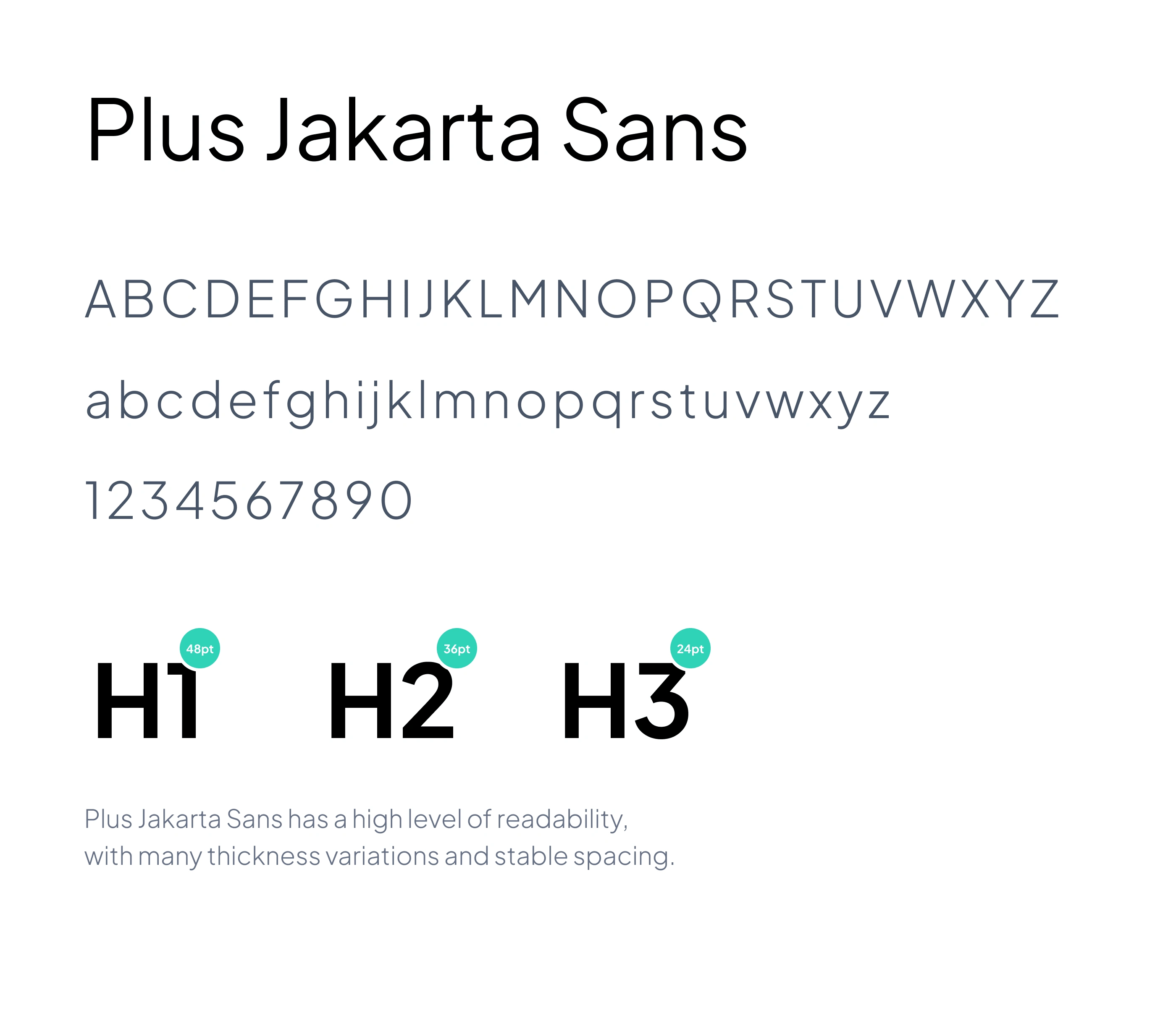
Tanyo Section 3
The Users
Tanyo serves two primary user types:
Sociopreneurs and learners looking for mentorship, classes, and expert guidance in their field. They need to find the right expert quickly and access content that matches their interests without friction.
Expert contributors (consultants, educators, industry professionals) who offer their knowledge through the platform. They need visibility and a system that surfaces their expertise to the right audience.
Both groups share the same need: a platform that connects the right people efficiently, without forcing either side to work around a confusing interface.
Tanyo Section 4
Tanyo Section 5
The Process
Step 1: I audited the existing app's navigation structure and identified where users were dropping off. The main culprits were an overloaded home screen, unclear category labels, and a flat content hierarchy that treated all posts equally regardless of quality or relevance.
Step 2: I restructured the information architecture, separating expert content from general community posts and creating clear pathways for each user type. Learners get a discovery-first experience; experts get a profile system that showcases their credentials and offerings.
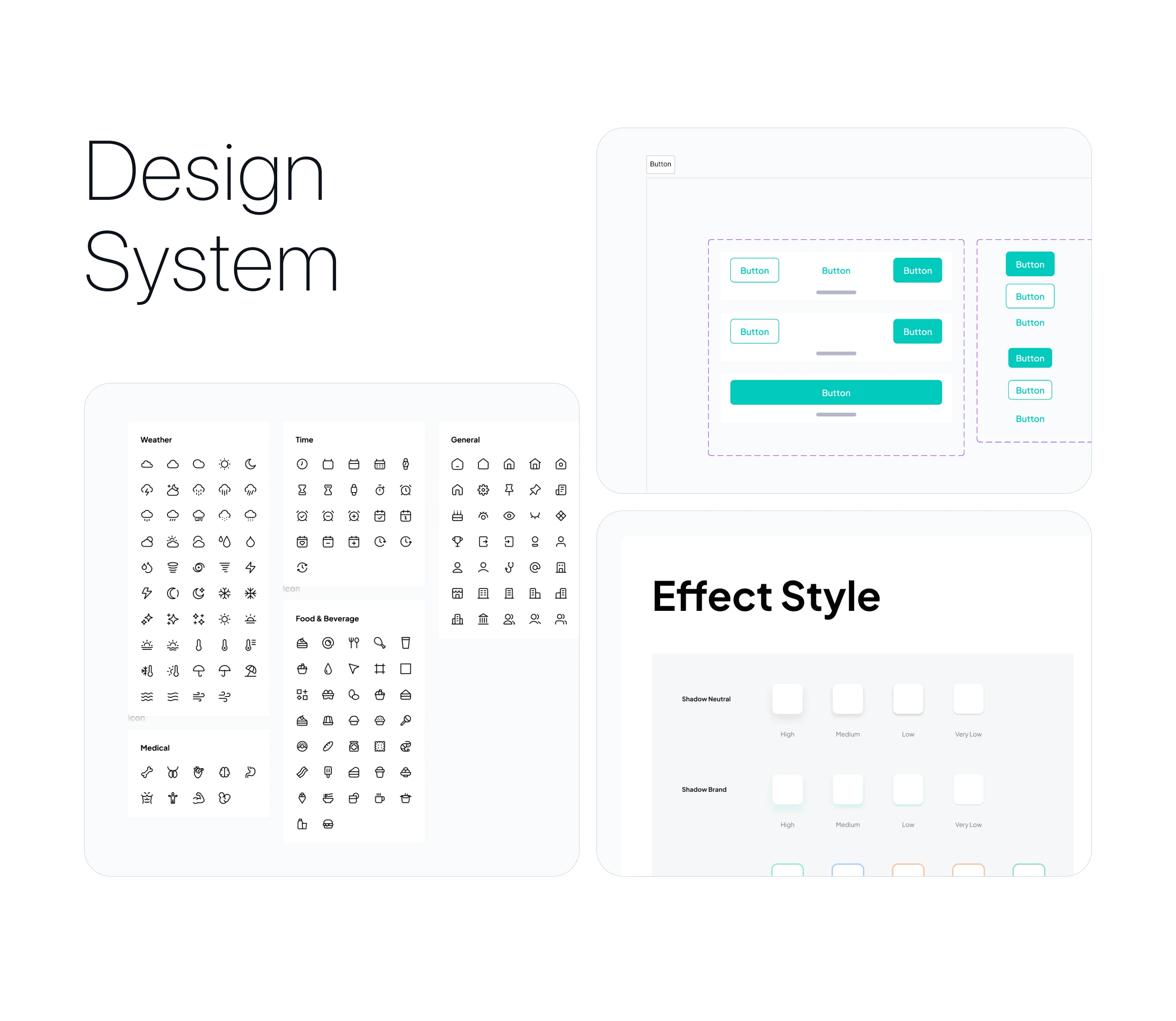
Step 3: I designed and prototyped the full redesign in Figma, working with collaborator Avan Fadli to ensure the design system scaled across all screens and interaction patterns.
Tanyo Section 6
Tanyo Section 7
The Key Design Decisions
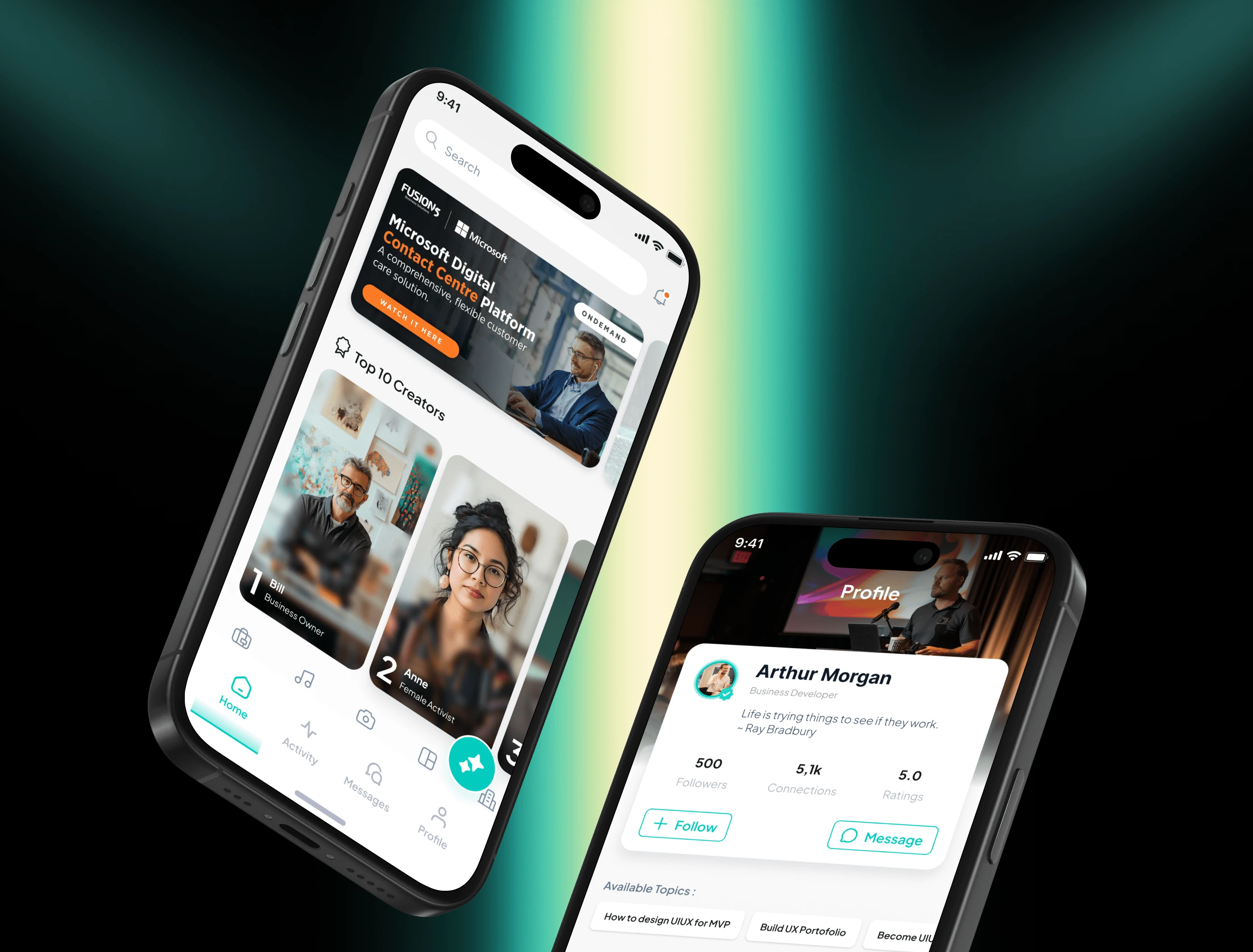
1. Rotating Expert Spotlight. I designed a featured section that highlights the top 10 experts on a regular rotation. This solved two problems at once: experts get the visibility they need to stay engaged with the platform, and learners immediately see high-quality contributors without searching.
2. Interest-Based Content Sorting. Instead of a single chronological feed, I built a system that organizes content by user interests. Users select their topics during onboarding, and the app surfaces relevant experts, classes, and webinars based on those preferences. The feed becomes personalized from day one.
3. Simplified Navigation. I stripped the navigation down to its essential paths. Every screen answers one question: "What can I do here?" The reduced cognitive load made the app significantly easier to use for first-time users.

Tanyo Full Flow
Prototype
A walkthrough of the final interaction flow, showing the redesigned navigation, expert spotlight, and interest-based sorting working together.
The Outcome
After the redesign shipped, Tanyo saw a 38% increase in app downloads. The Crosva team also reported a significant increase in active users, attributing it to the simplified navigation and interest-based content sorting that made the app stickier for both learners and experts.
The rotating expert spotlight had a compounding effect: experts who received featured placement became more active on the platform, which in turn attracted more learners looking for quality content. The redesign didn't just fix usability problems; it created a visibility loop that strengthened both sides of the marketplace.
Like this project
Posted Dec 30, 2024
Redesigned the UI/UX for Tanyo, a sociopreneur community app by Crosva. Simplified navigation, designed a rotating expert spotlight system, and built interest-based content sorting to help users find relevant experts and classes faster.
Likes
2
Views
14
Timeline
Aug 14, 2024 - Sep 25, 2025
Clients
Crosva
Collaborators