

BigDeals Hero
Section 2
Section 3
The Problem
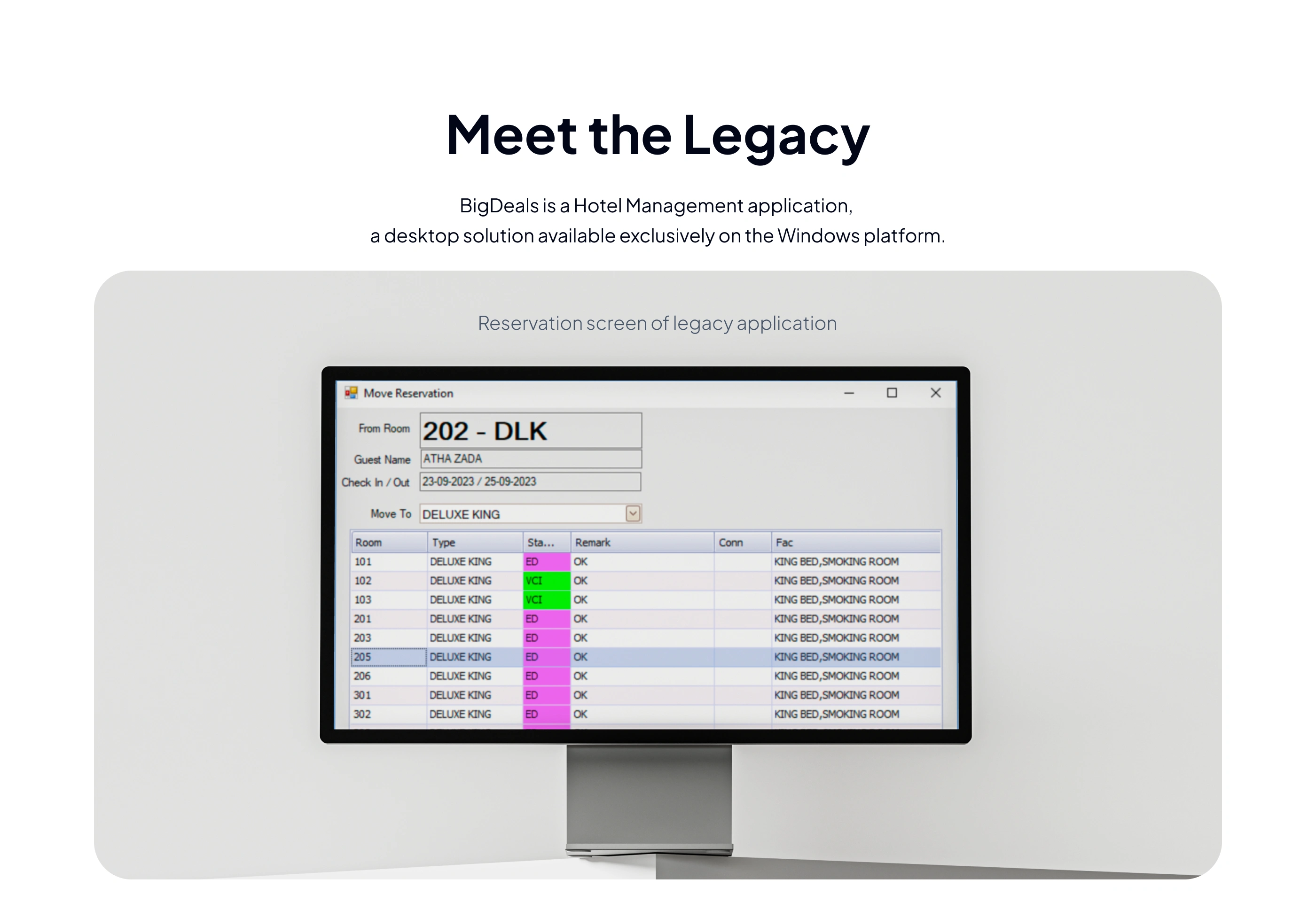
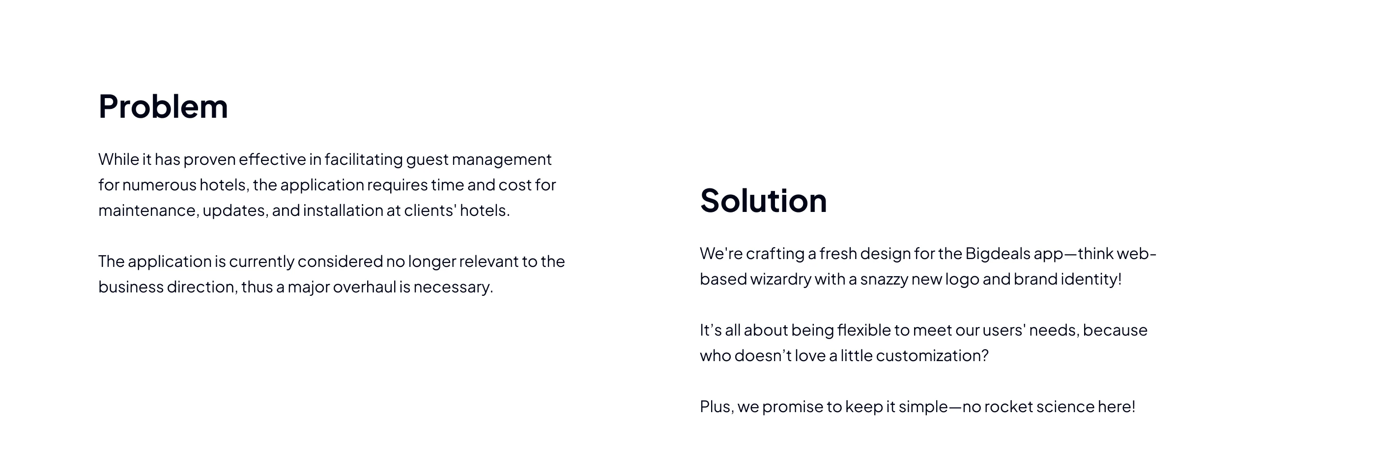
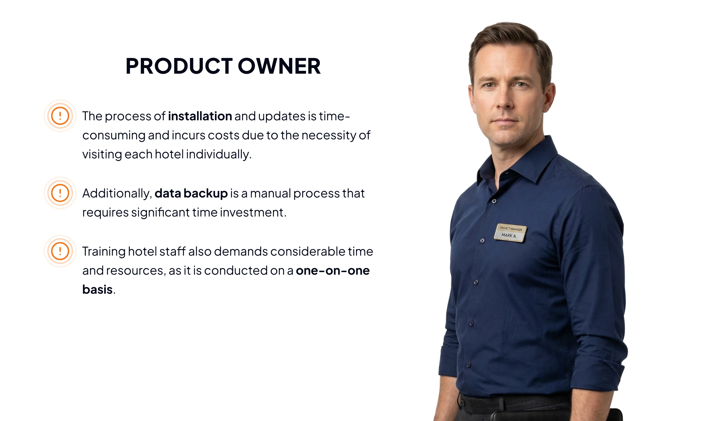
BigDeals (which didn't have a name yet when the project started) was upgrading their hotel management system from a native application to a web-based SaaS platform. They needed a logo and brand identity to anchor this new product.
Without a brand, they had no visual anchor for the product, no identity for marketing materials, and no way to differentiate themselves in a competitive hospitality software market. The brand needed to work from day one: on screens, in print, and at every scale.
Section 4
Section 5
The Users
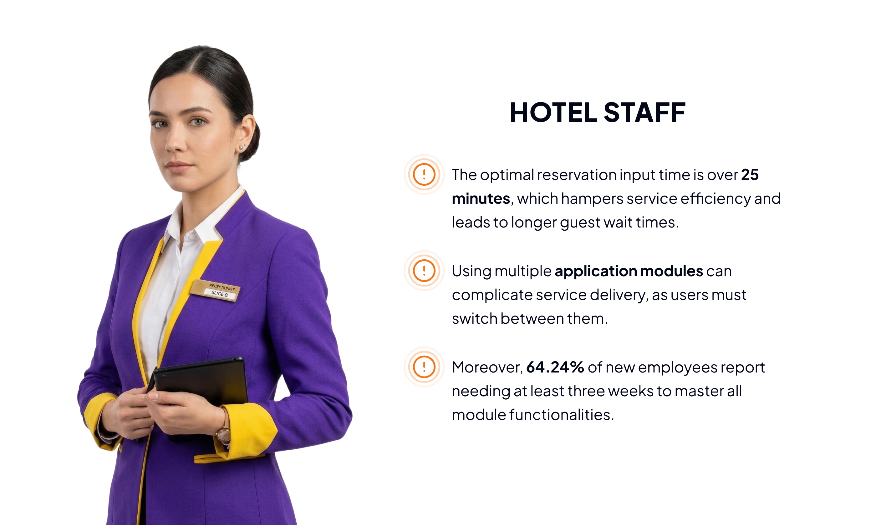
Two primary groups:
Hotel managers and owners who evaluate and purchase the software
Operational staff (receptionists, front desk teams) who use the system daily
The brand needed to feel trustworthy and professional for decision-makers, while remaining approachable for the staff who interact with it every shift.
Section 6
Section 7
Section 8
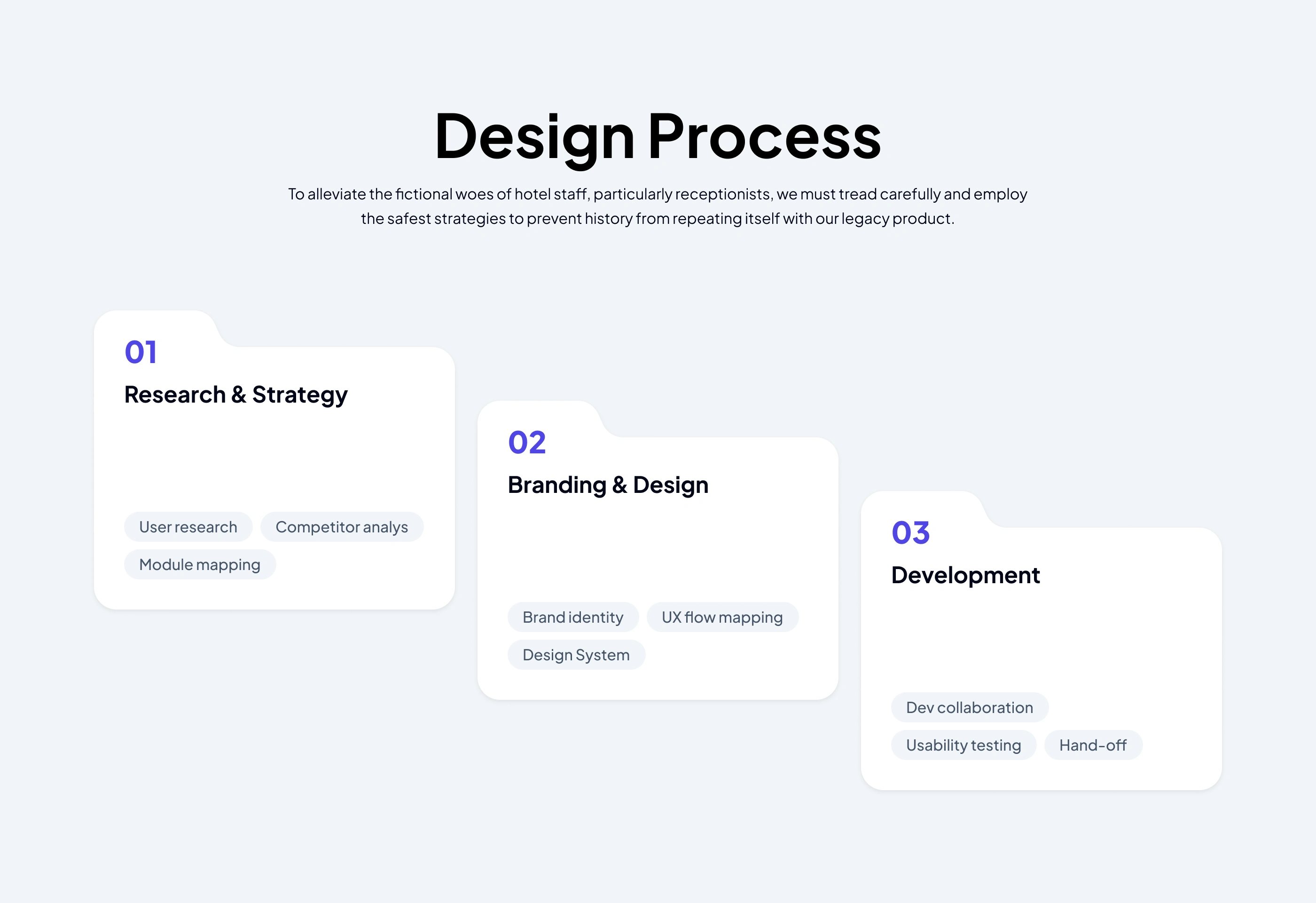
The Process
Step 1: Learn the product and the industry. I studied every feature BigDeals offers and immersed myself in the hospitality and hotel management business. You can't design a brand for an industry you don't understand.
Step 2: Competitive benchmarking. I researched logos and brand identities of competing hotel management systems. The goal was to identify visual patterns in the space, then deliberately diverge: different shapes, different colors, so BigDeals would stand out rather than blend in.
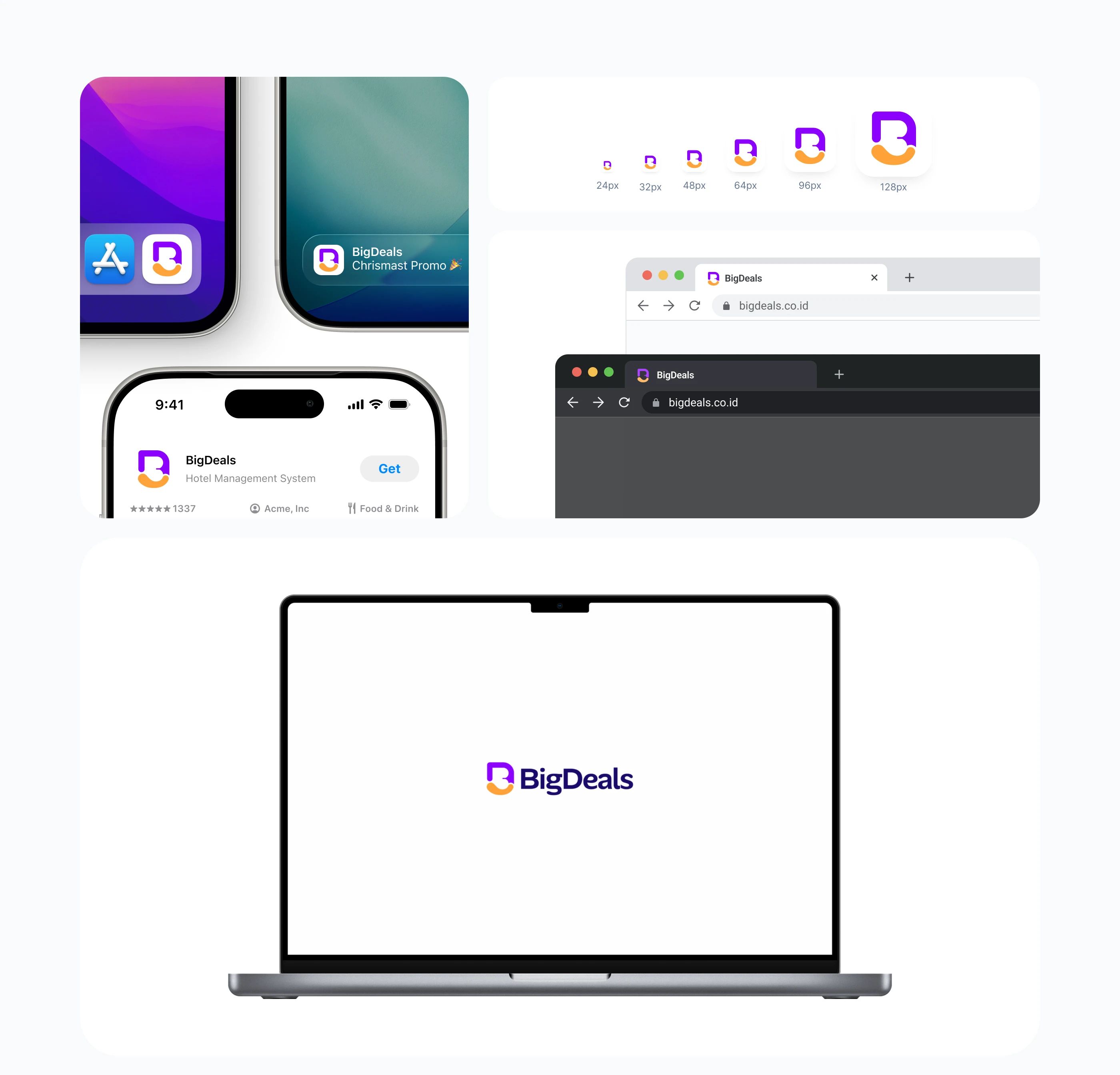
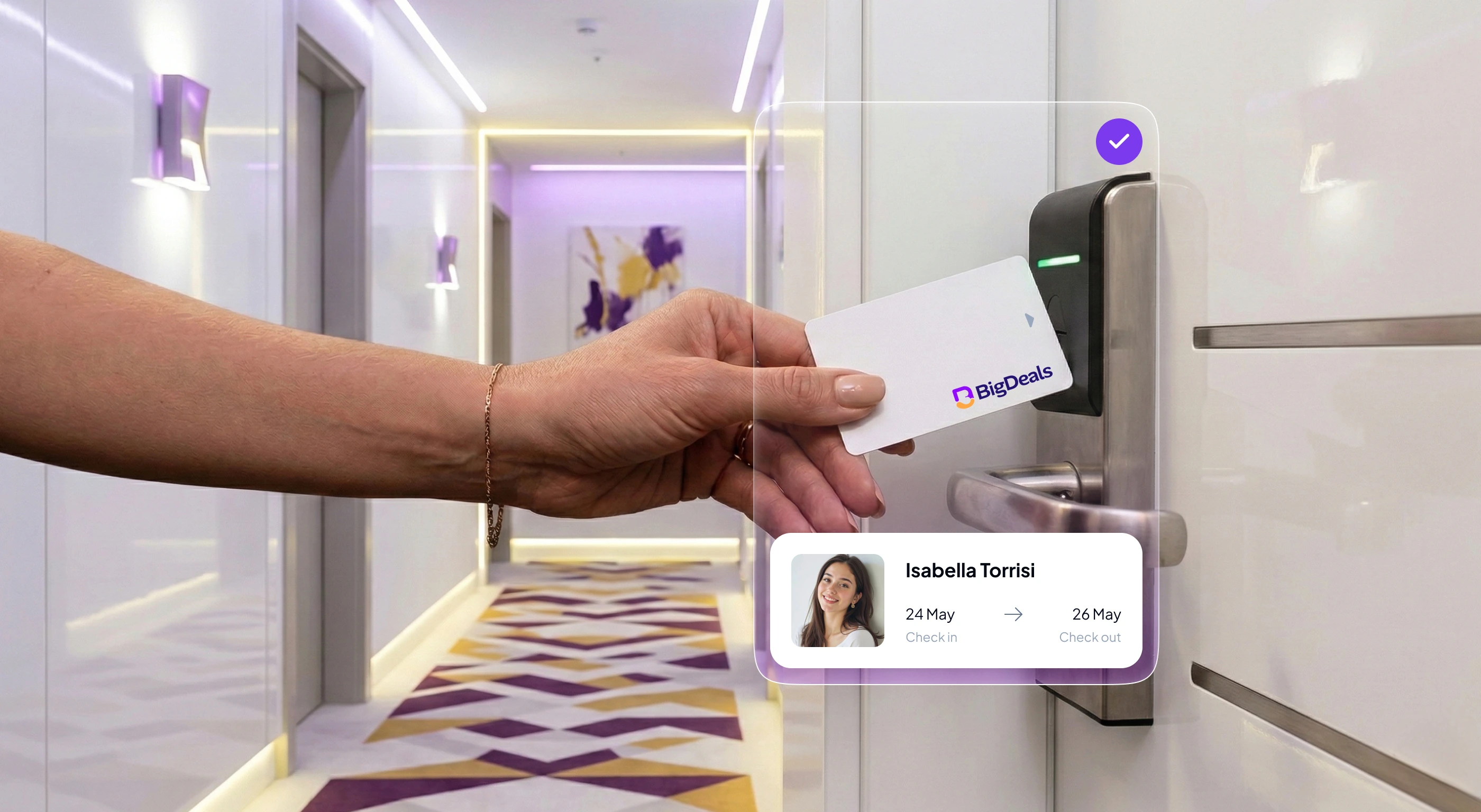
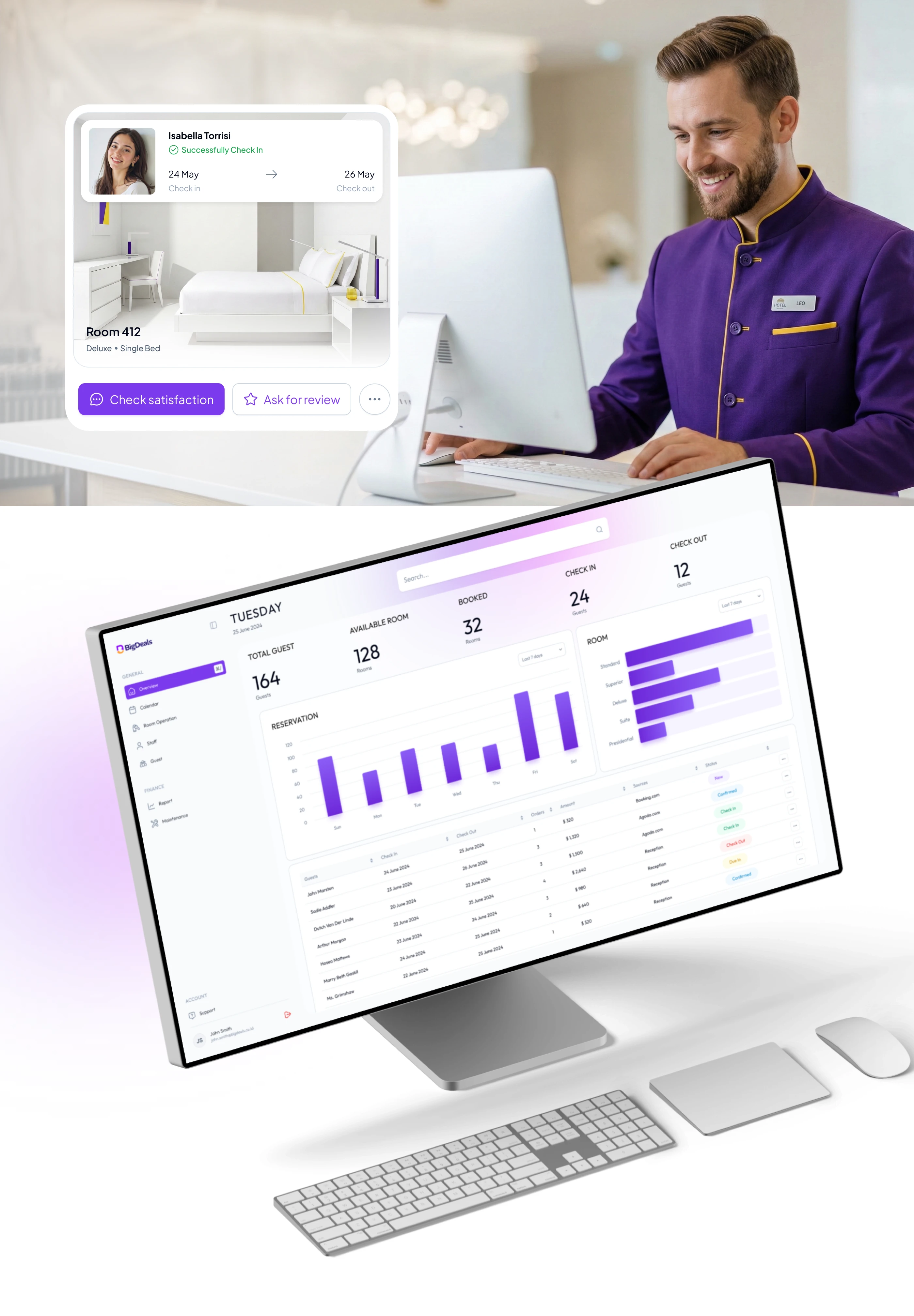
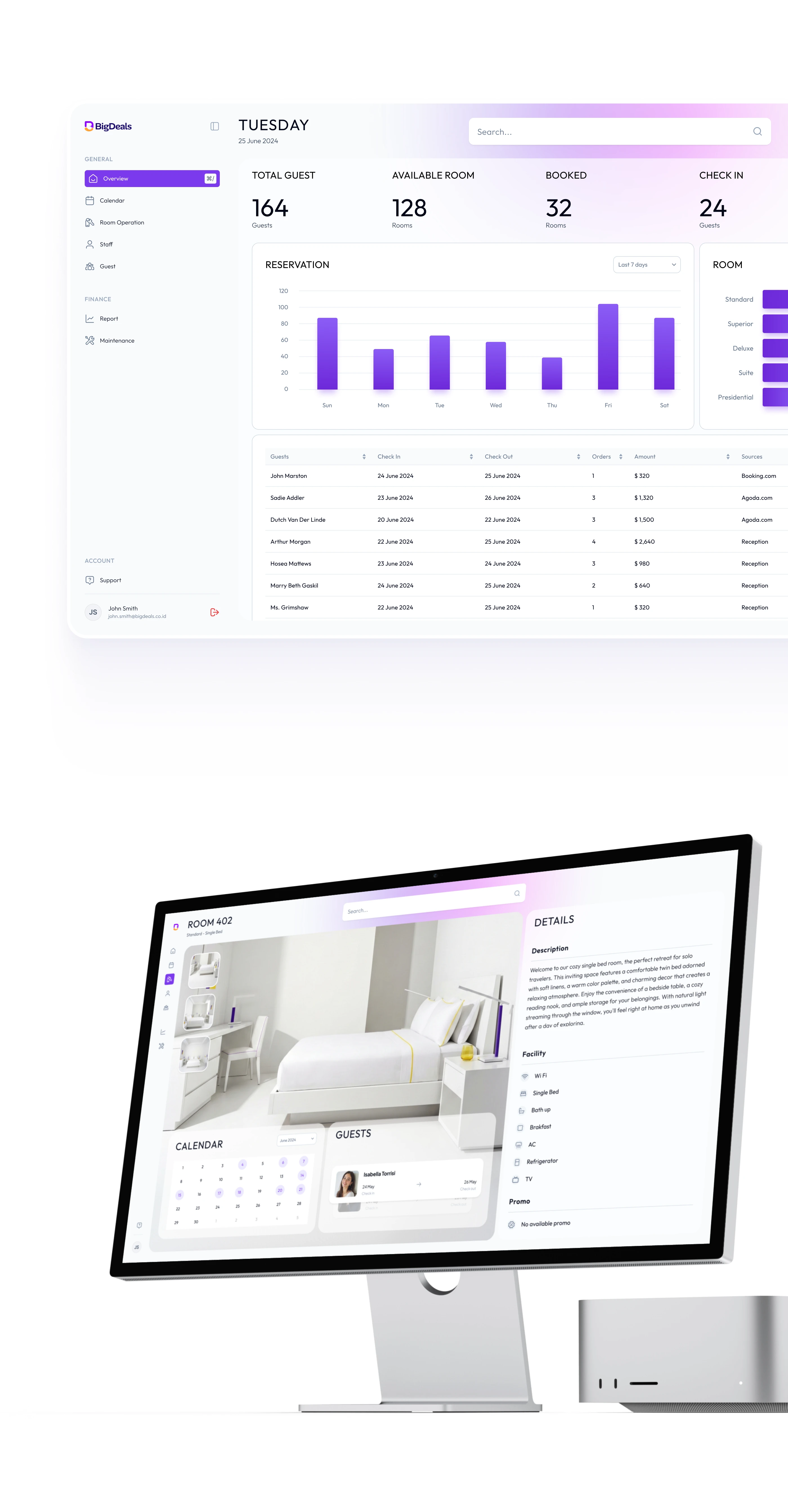
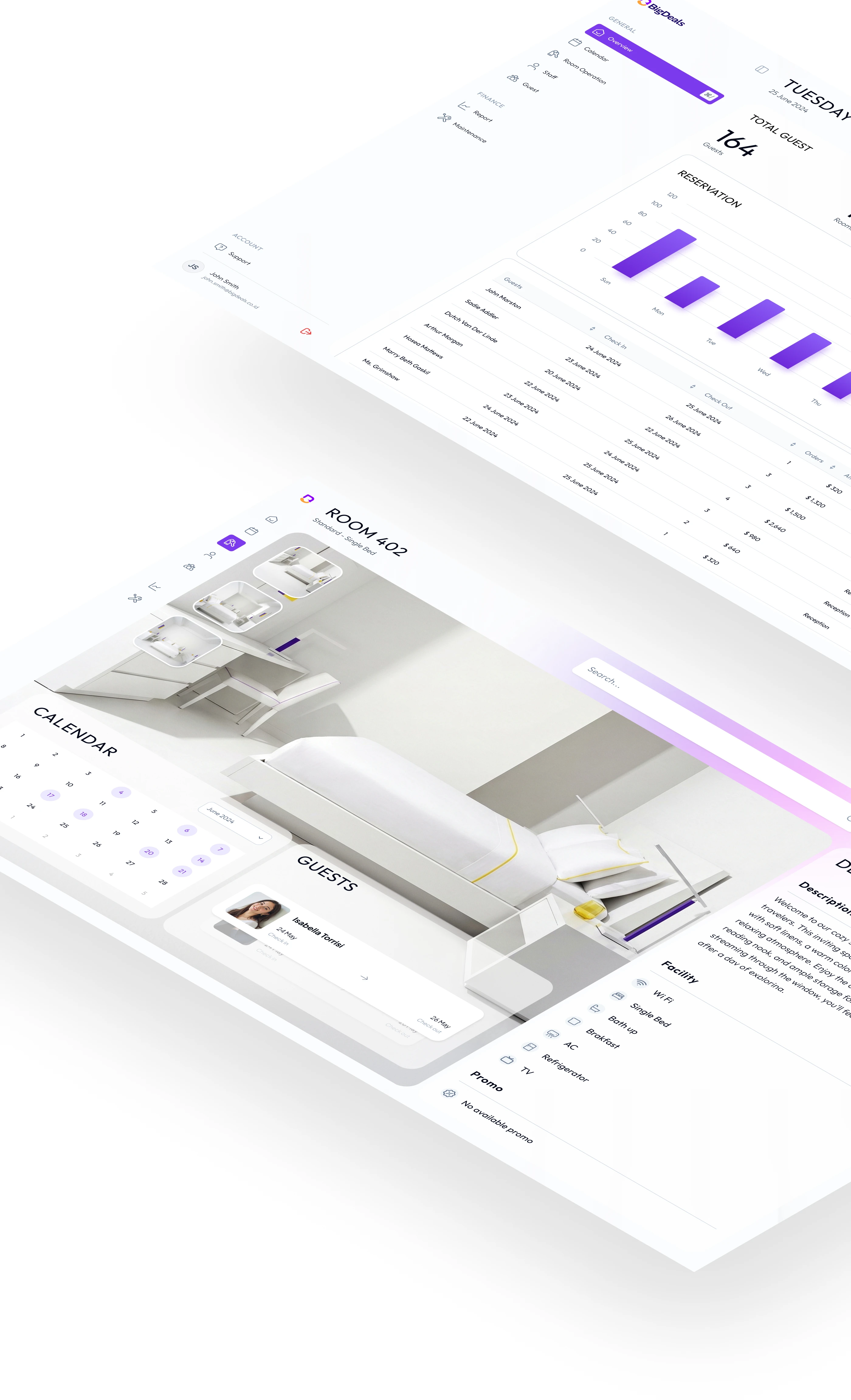
Step 3: Design for every medium. From the start, I designed with the constraint that this brand would live in both print and screen. Every element had to hold up across business cards, signage, web interfaces, and mobile screens.
Section 9
Section 10
Section 11
Section 12
Section 13
The Key Design Decision
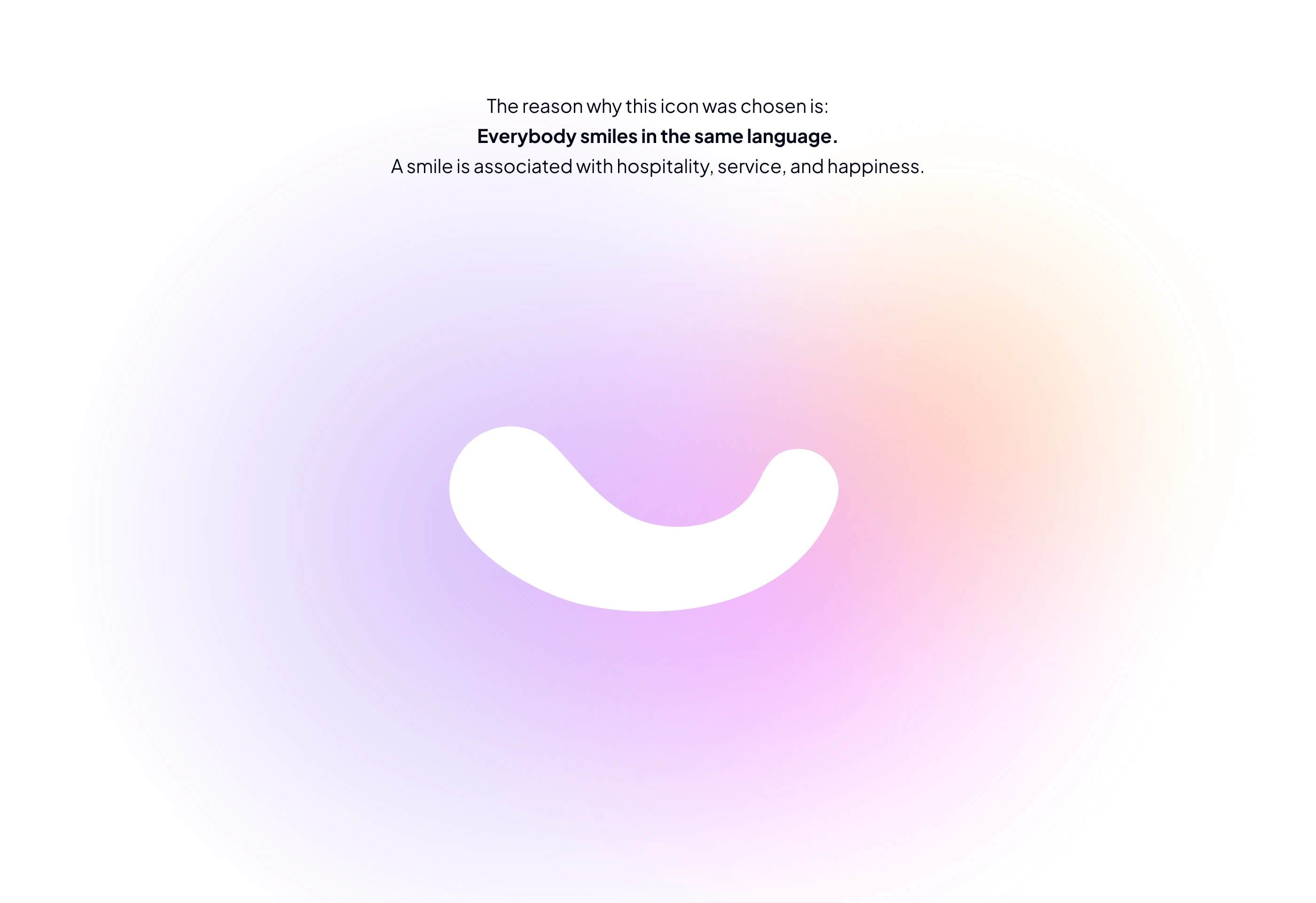
After researching the hospitality industry, I realized the most important thing in this business isn't feature richness, intuitiveness, or flexibility. It's something more fundamental, something already embedded in the name of the industry itself: hospitality. Warmth. Welcome.
I've never seen a hospitality business without a smile. People smile in one universal language.
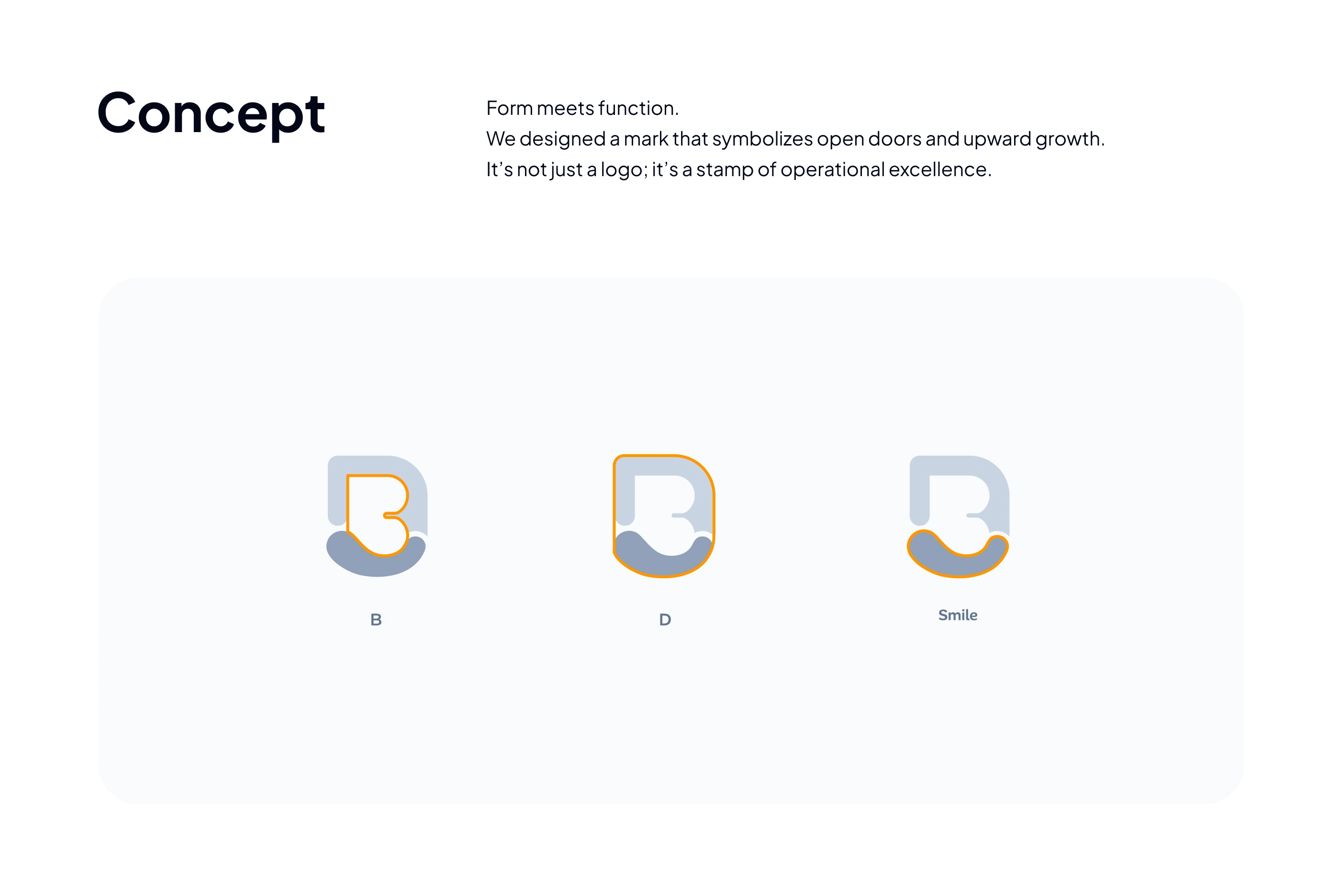
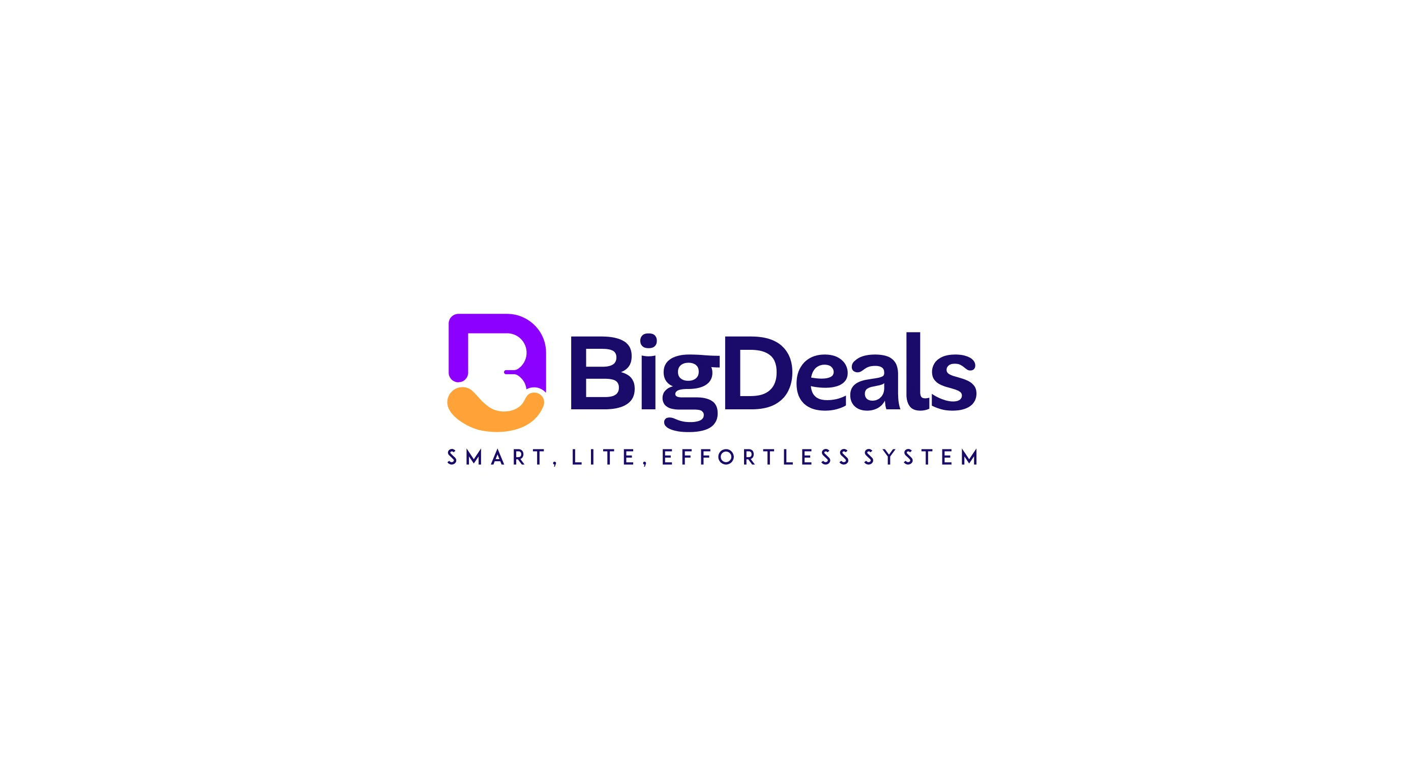
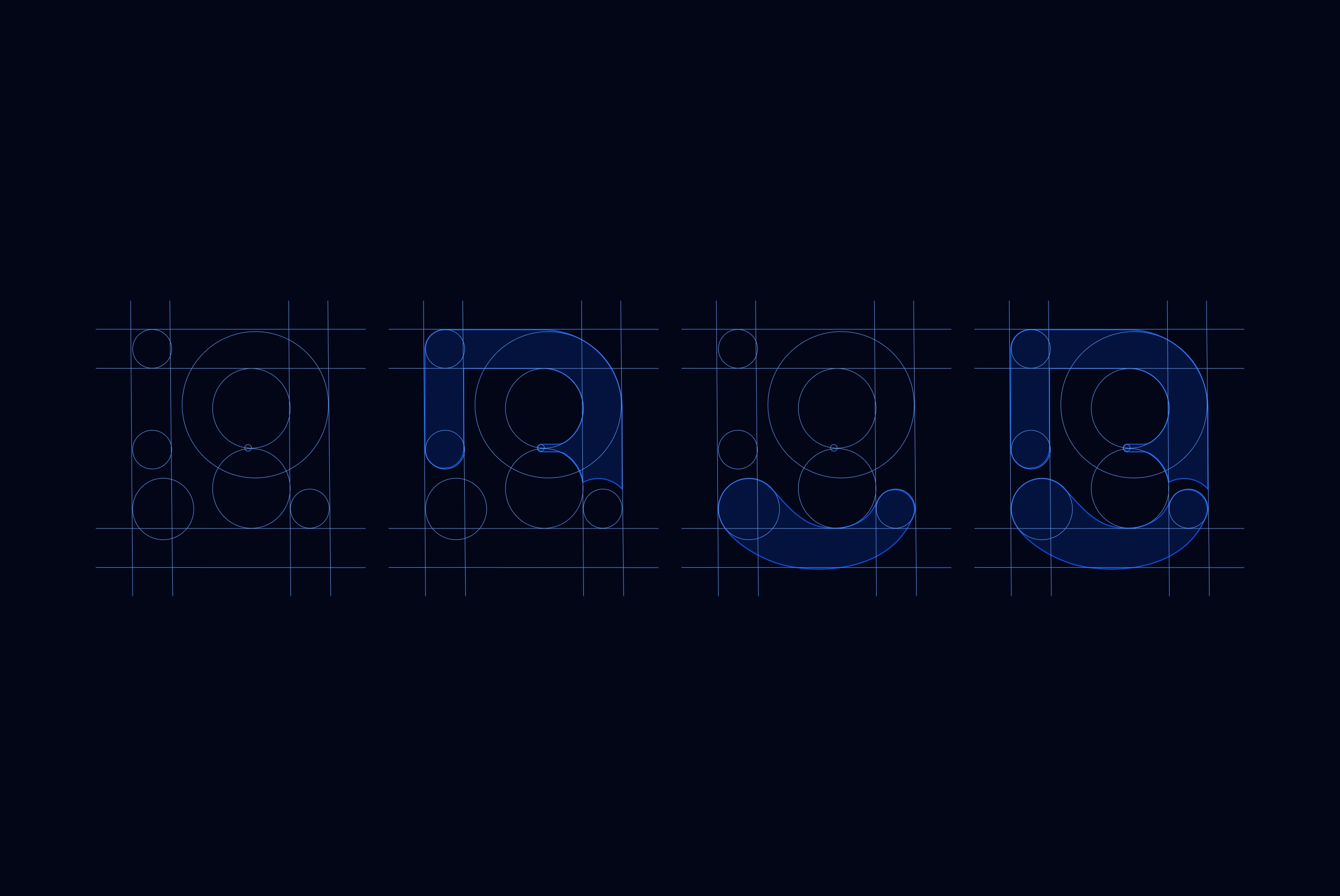
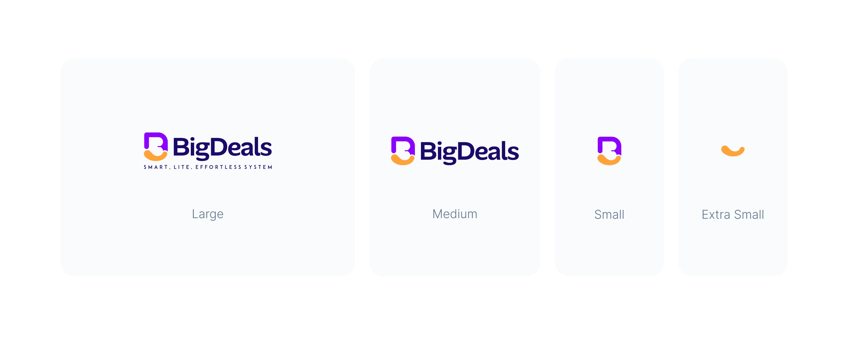
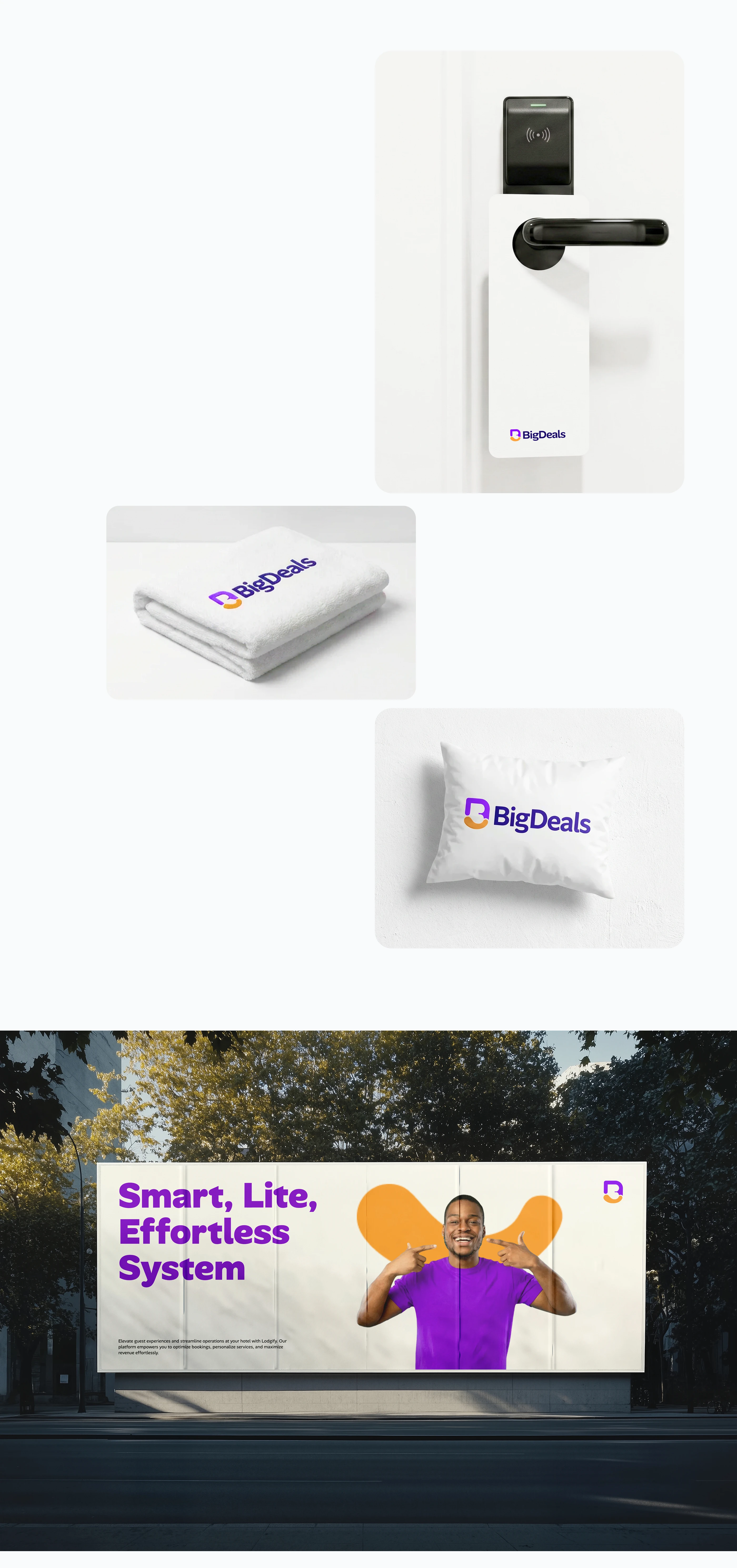
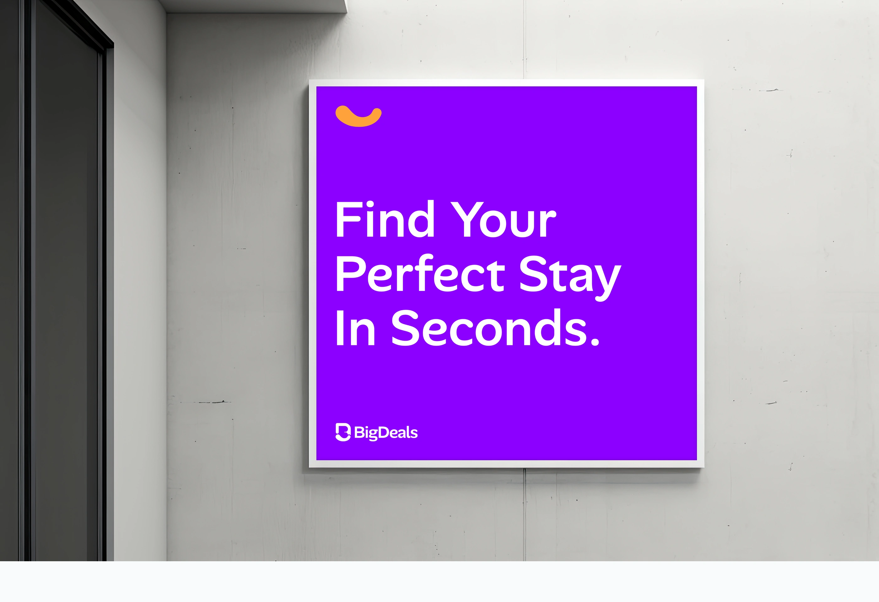
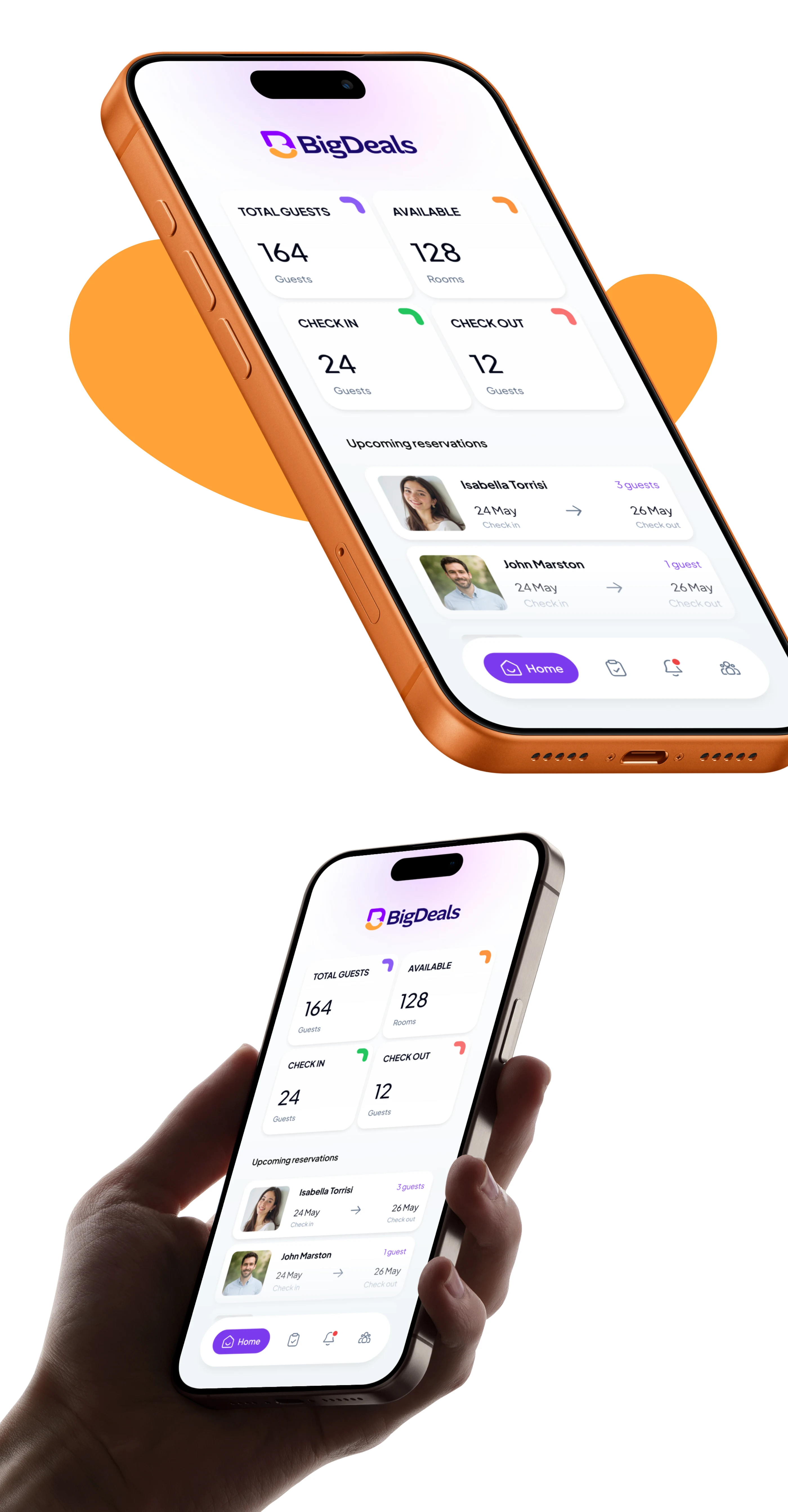
That insight became the foundation of the entire brand. I designed the logomark as a warm smile, integrated into a modified letter "B" (the initial of BigDeals). The smile carries the emotional core of hospitality in a single, instantly recognizable shape.
The second critical decision: this smile had to work at every scale. In a world where logos need extreme scalability (from a favicon to a billboard), the smile becomes the smallest, simplest, most essential form of the brand. It's the core DNA. Even at the tiniest size, the brand's personality comes through.
Section 14
Section 15
Section 16
Section 17
Section 18
Section 19
Section 20
Section 21
Section 22
Section 23
Section 24
Section 25
Section 26
Section 27
Section 28
Section 29
Section 30
Section 31
Section 32
Section 33
Section 34
Section 35
The Outcome
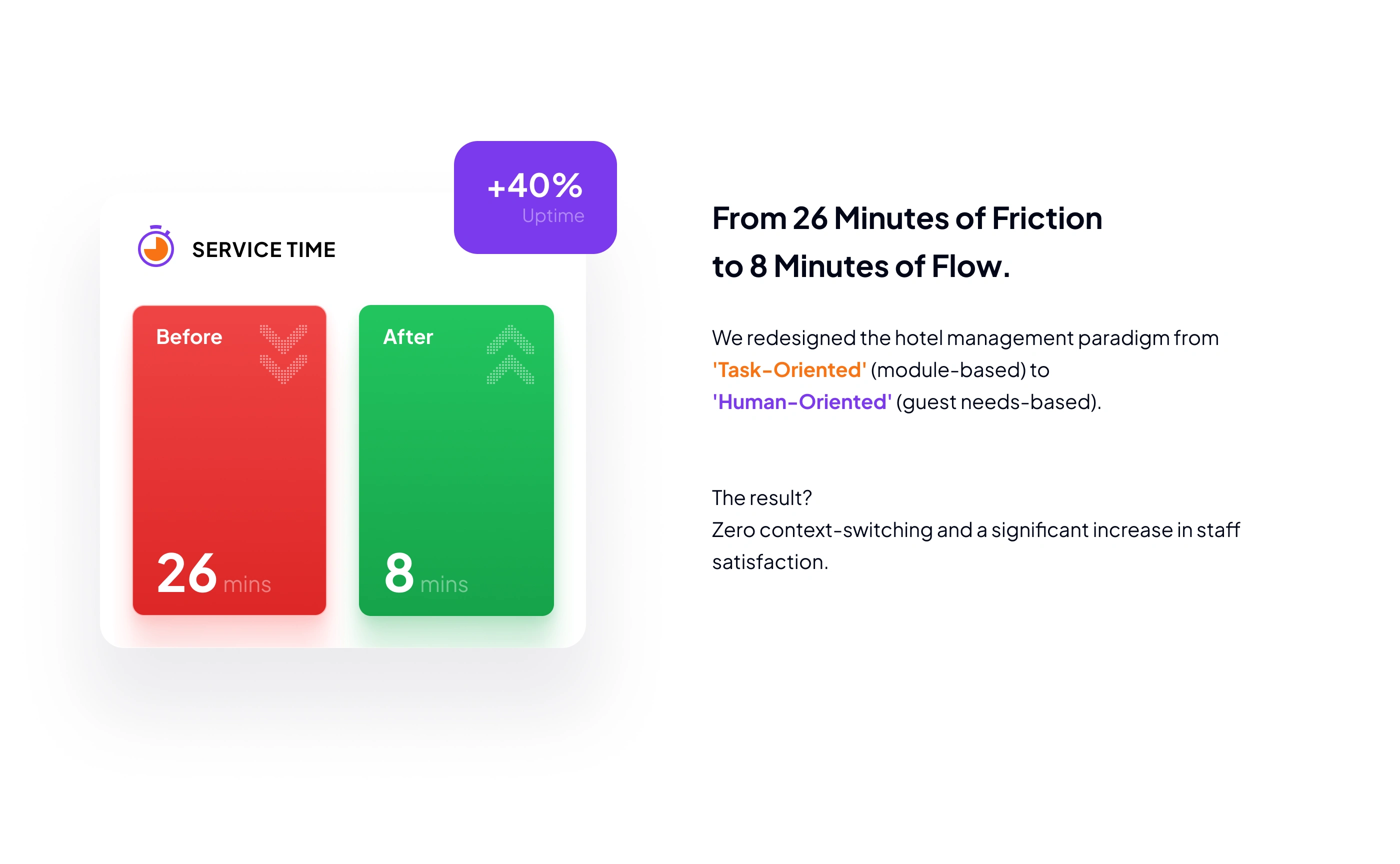
The BigDeals SaaS platform is still in active development, but the brand is already producing results. The marketing team reported that close rates increased 35% year-over-year since the BigDeals brand launched.
Hotel owners and managers have been subscribing before the product even launched, based on the strength of the brand presentation alone. The smile logomark gives the sales team a story to tell: this isn't just software, it's hospitality-first technology built around the same warmth their hotels promise to guests.
Section 36
3 likes · 25 views · Jul 18, 2026
The smile-based logomark anchored the hospitality-first positioning and contributed to a 35% year-over-year increase in close rates.


