Company Logo (CCI Recruitment)
CCInternational Recruitment is a strategic talent and business connector who provides head hunting, talent search, talent acquisition and M&A services. The company started in 2003 and I was engaged to perform a logo refresh for the company.
The brief was to modernise the existing logo so that it was fit for purpose across a variety of applications while maintaining the existing wording. The feedback on the existing logo was that it was too long and inconvenient to use on documentation in the footer or as a letterhead.

Original Logo
I don't need a full rebrand, just a new logo. I want something clean and versatile, so maybe a logo with different variations. It needs to be similar enough to be recognisable with our existing clients.
For the redesign I explored 3 different concepts.
a simply modernised version of the original logo
a minimal take on the original logo
a new take utilising the 2 "C"s illustrating a link symbolising networking and connection

Logo Concepts
After some revisions and colour tweaks, the client was very satisfied with the minimal take of the original logo.
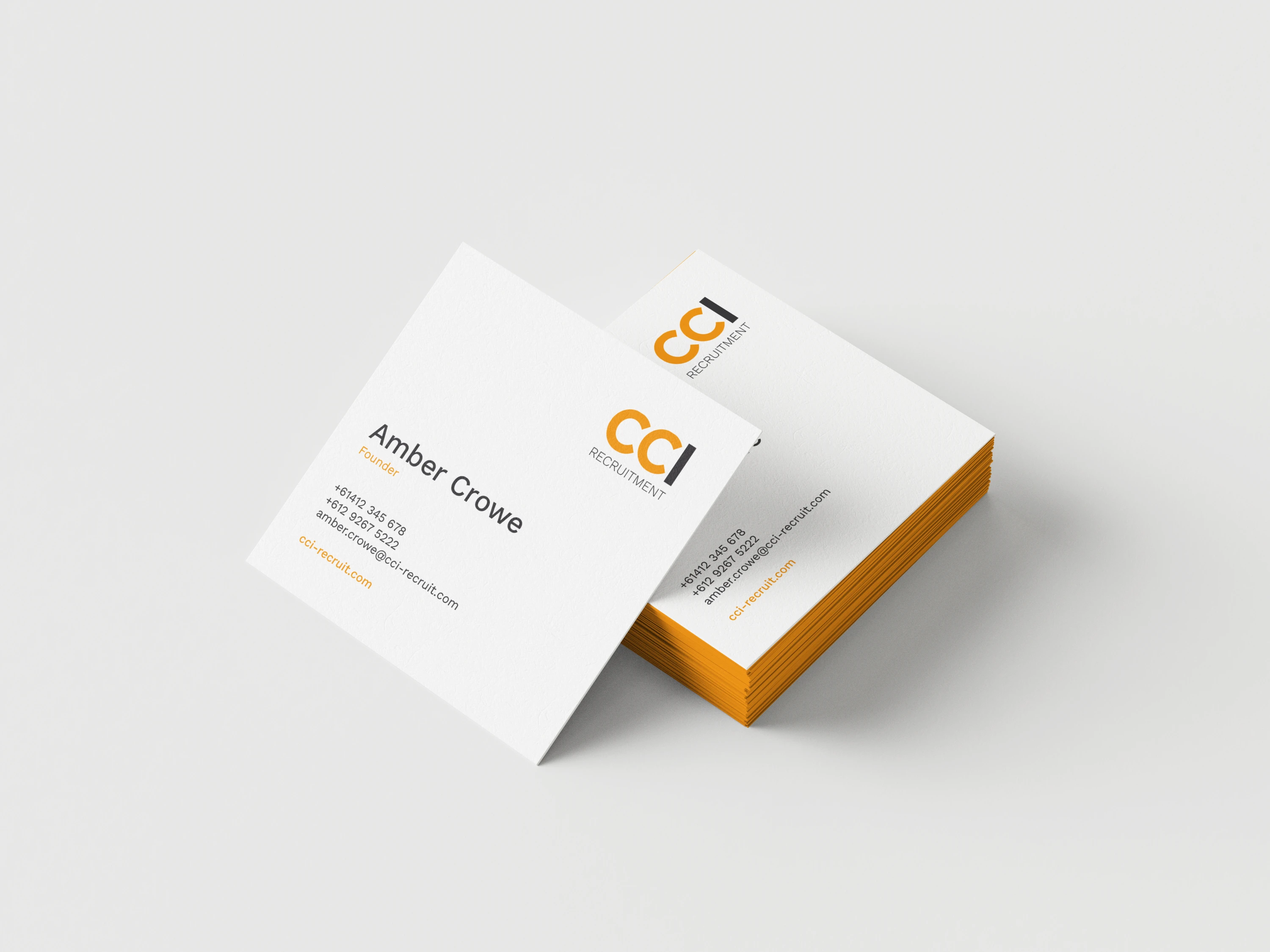
Logo Refresh Applied in a New Business Card Design
As requested, I supplied 2 variations on the logo so that it could be easily used across multiple applications.

Final Logo Designs
Like this project
Posted Nov 7, 2023
Brand Refresh for a recruitment company
Likes
0
Views
9
