Built with Jitter
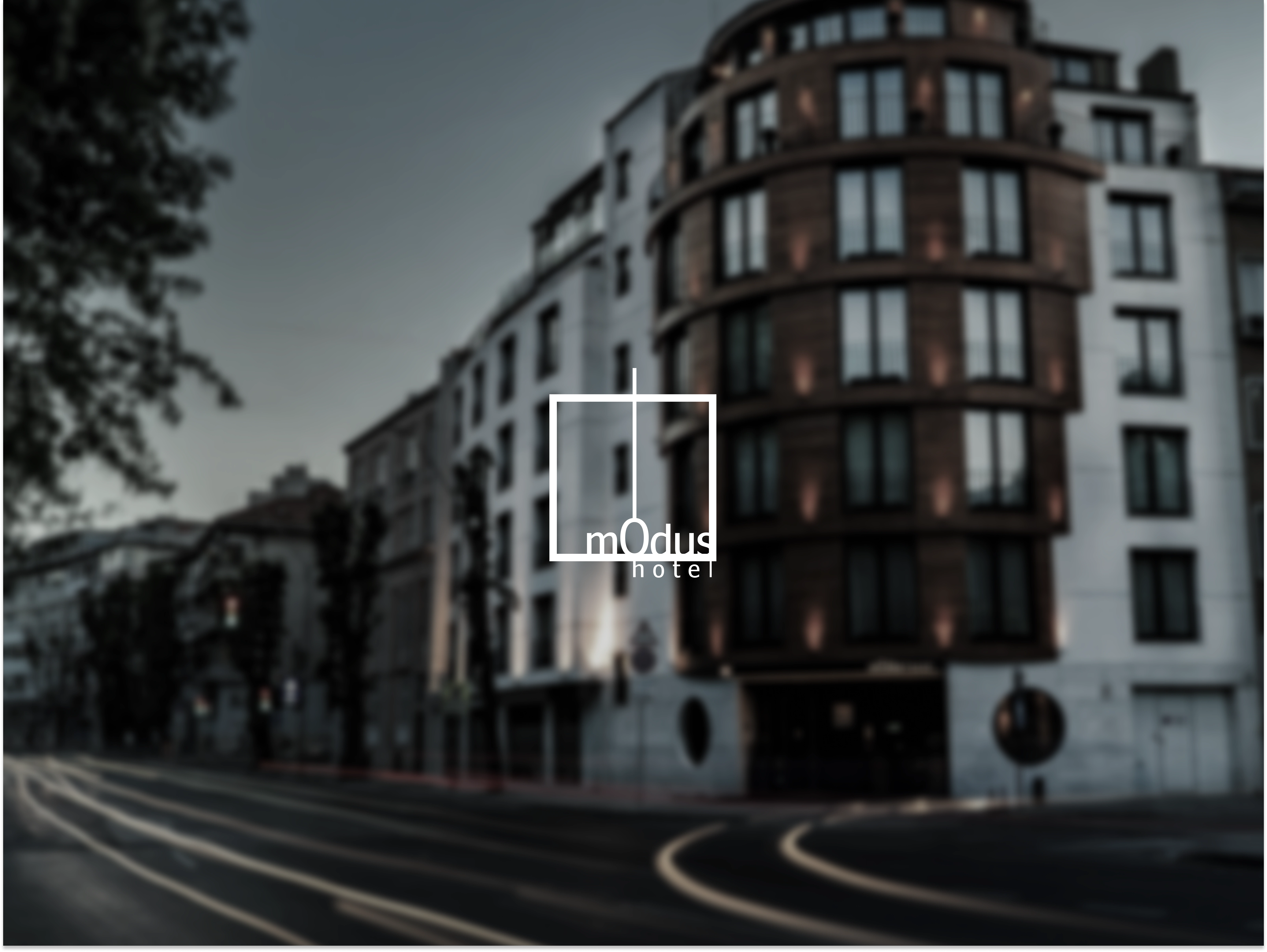
mOdus Hotel Brand Identity Development
Mikhail Yakovlev
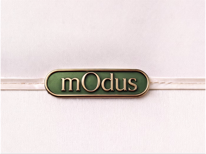
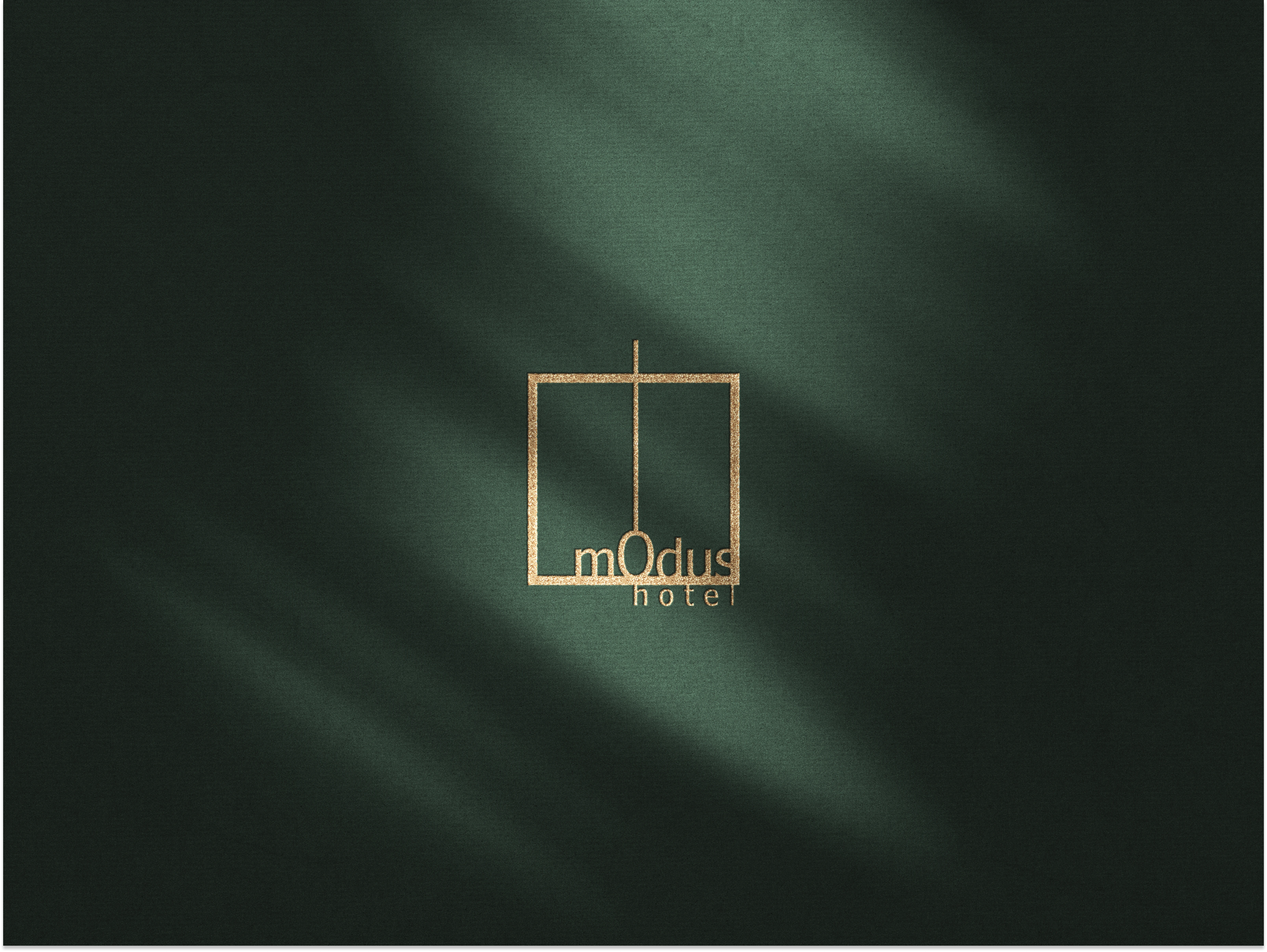
Logo Concept
I designed the mOdus logo as an architectural symbol rather than a decorative mark.
The square frame represents space and structure, while the vertical axis creates balance and integrates into the “O,” turning typography into part of the system.
The lowercase wordmark softens the geometry, keeping the brand refined but not cold. Deep green and metallic gold reinforce quiet, material-driven luxury.
It was designed this way to position mOdus as a hotel defined by proportion, precision, and controlled elegance rather than flashy luxury.
Embossed Logo
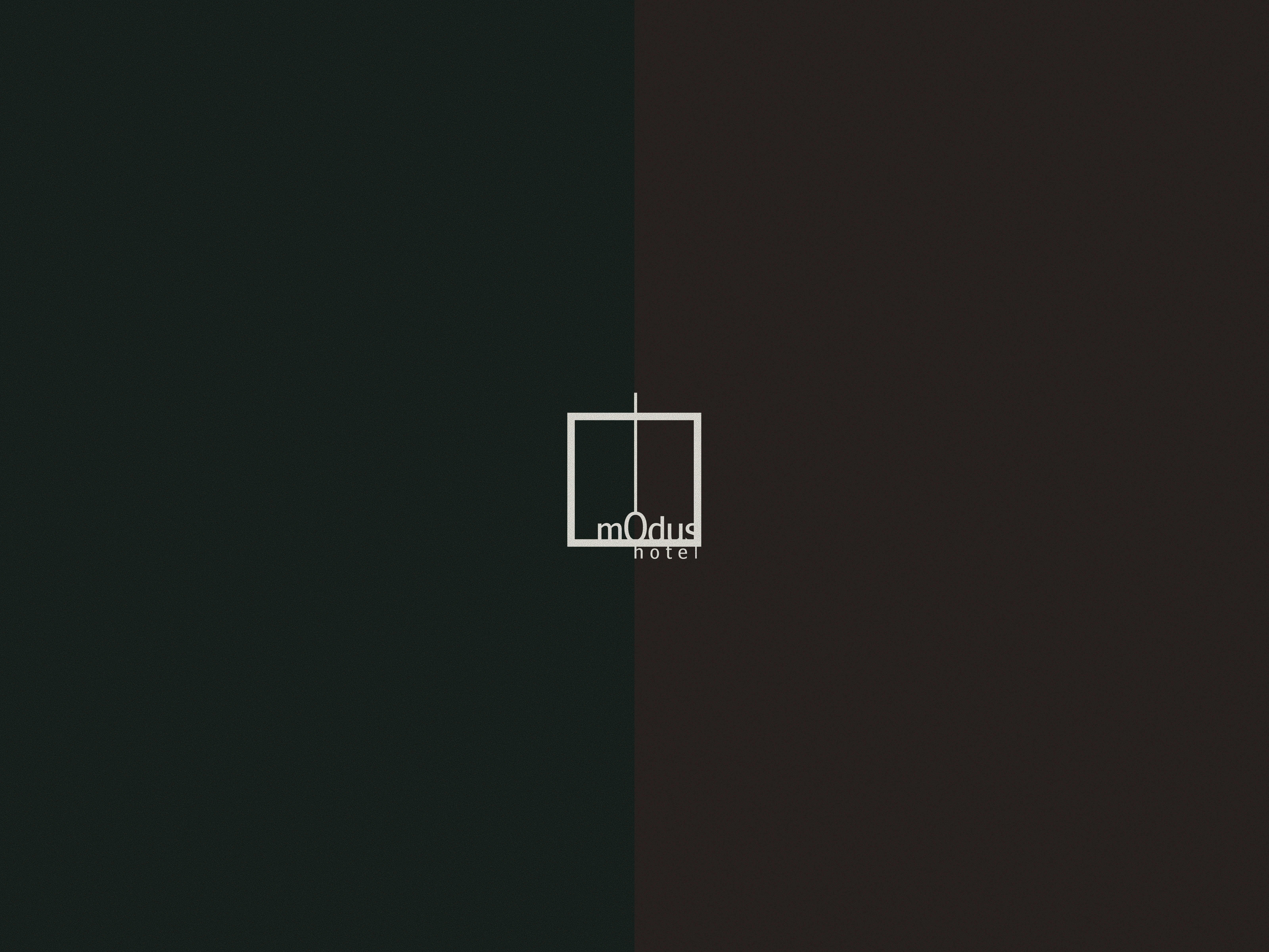
Two tone
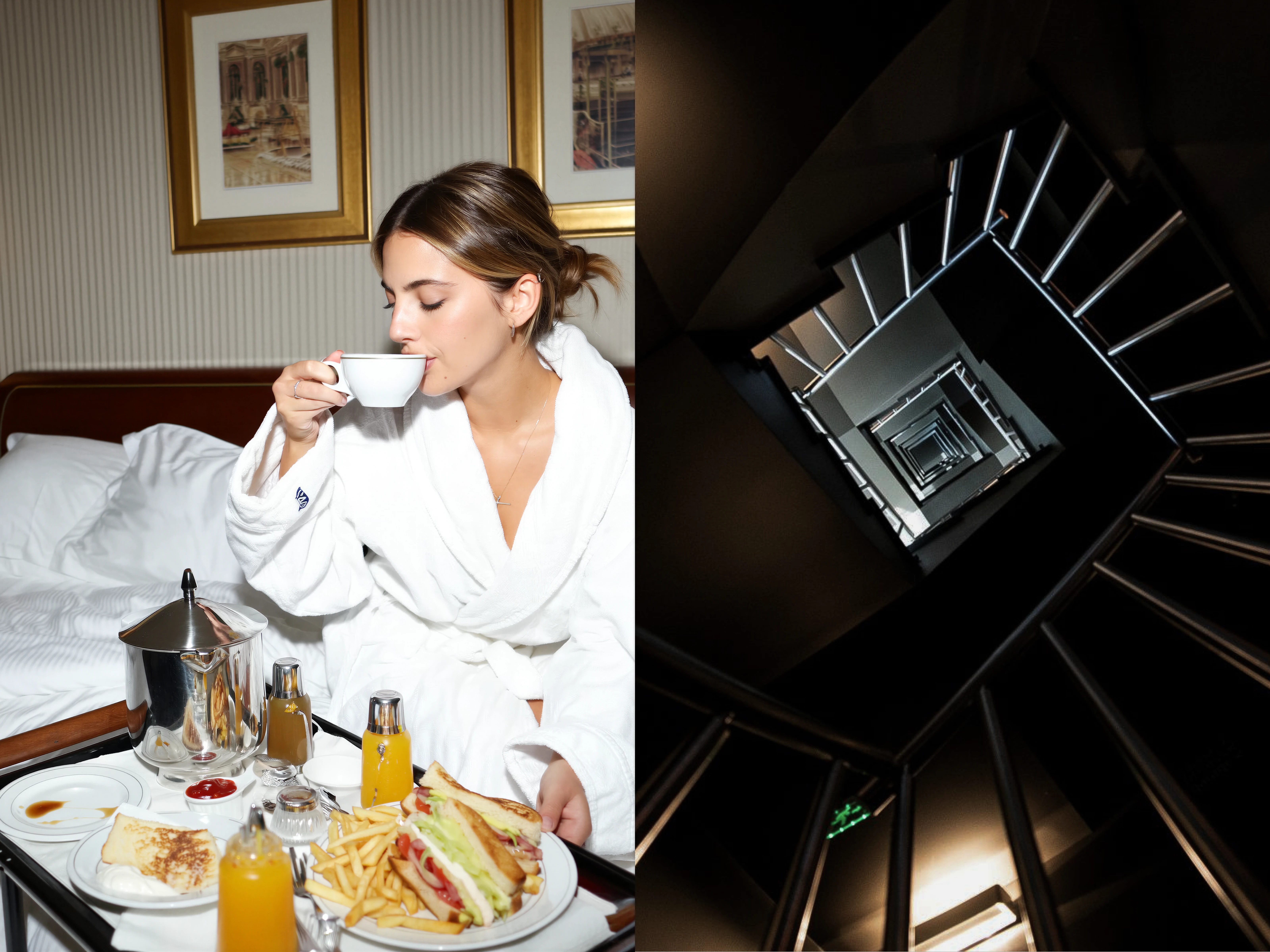
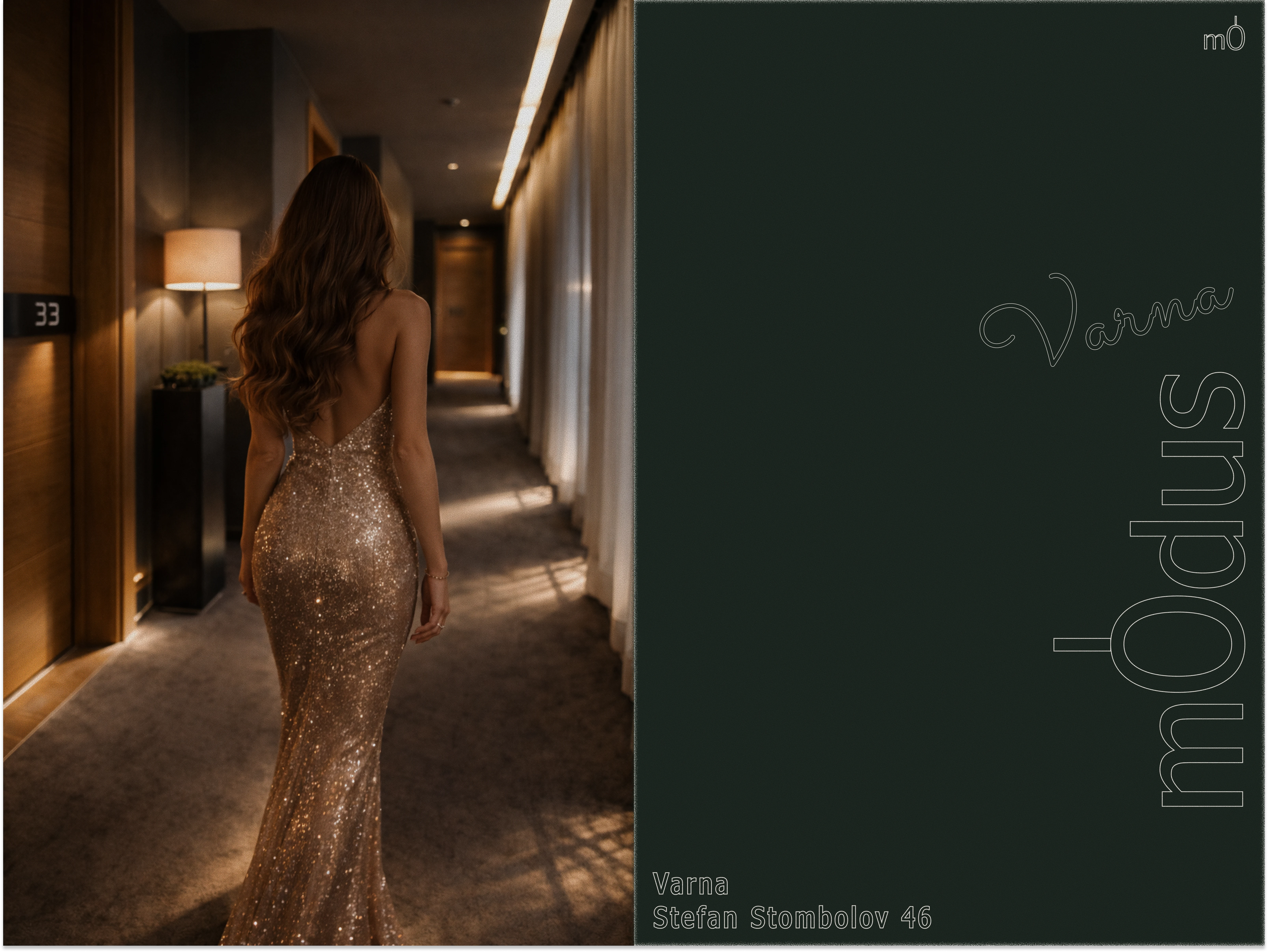
Brand Atmosphere
I defined the visual atmosphere through contrast between intimacy and structure.
On one side, we see a calm, private hotel moment. Soft lighting, tactile materials, and personal space communicate comfort and refined hospitality. On the other side, the architectural staircase introduces depth, geometry, and strong perspective.
This contrast was intentional. It shows that mOdus is not only about comfort, but also about spatial experience and design discipline.
The goal was to position the hotel as a place where human warmth meets architectural precision.
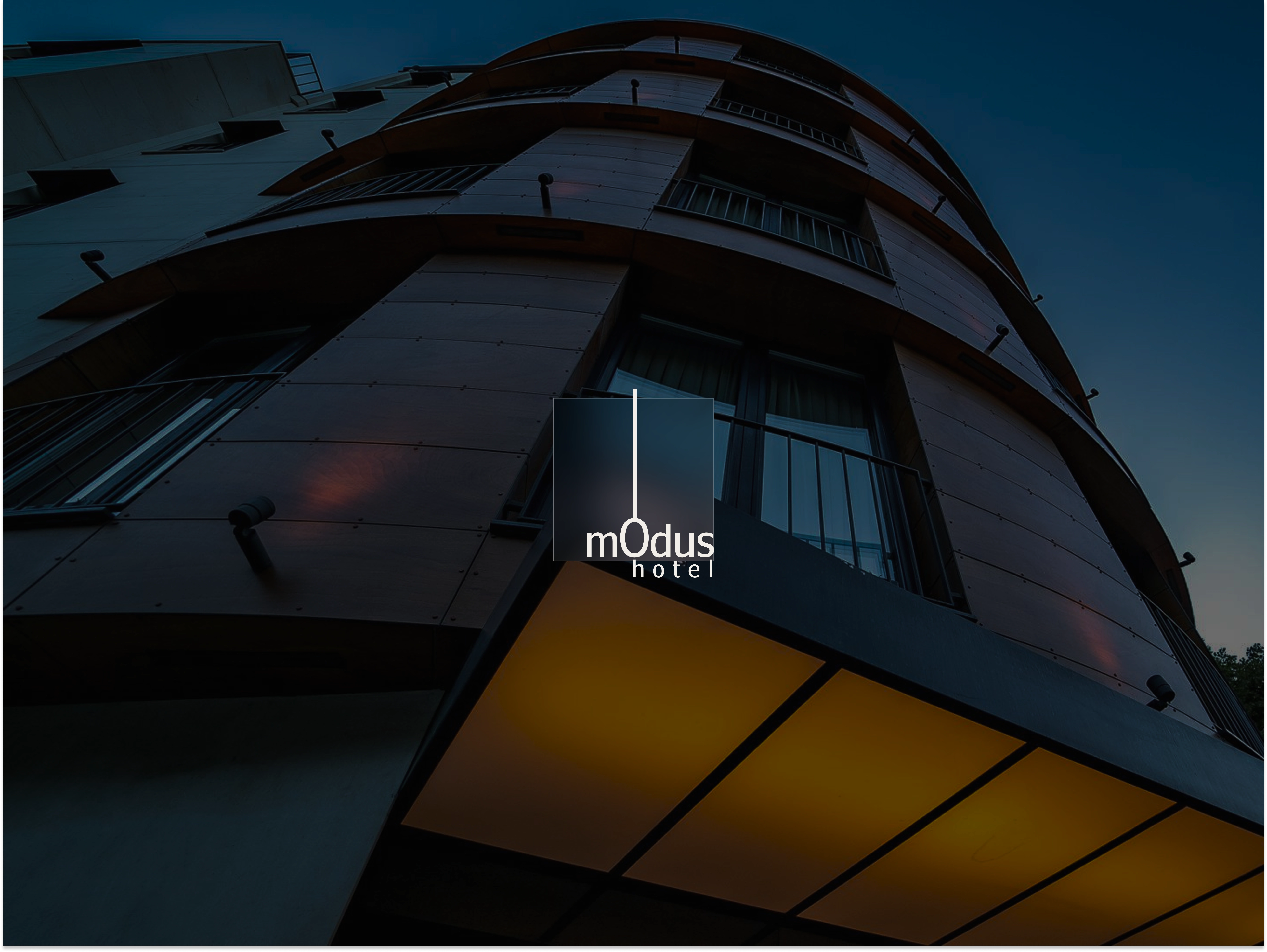
Experience
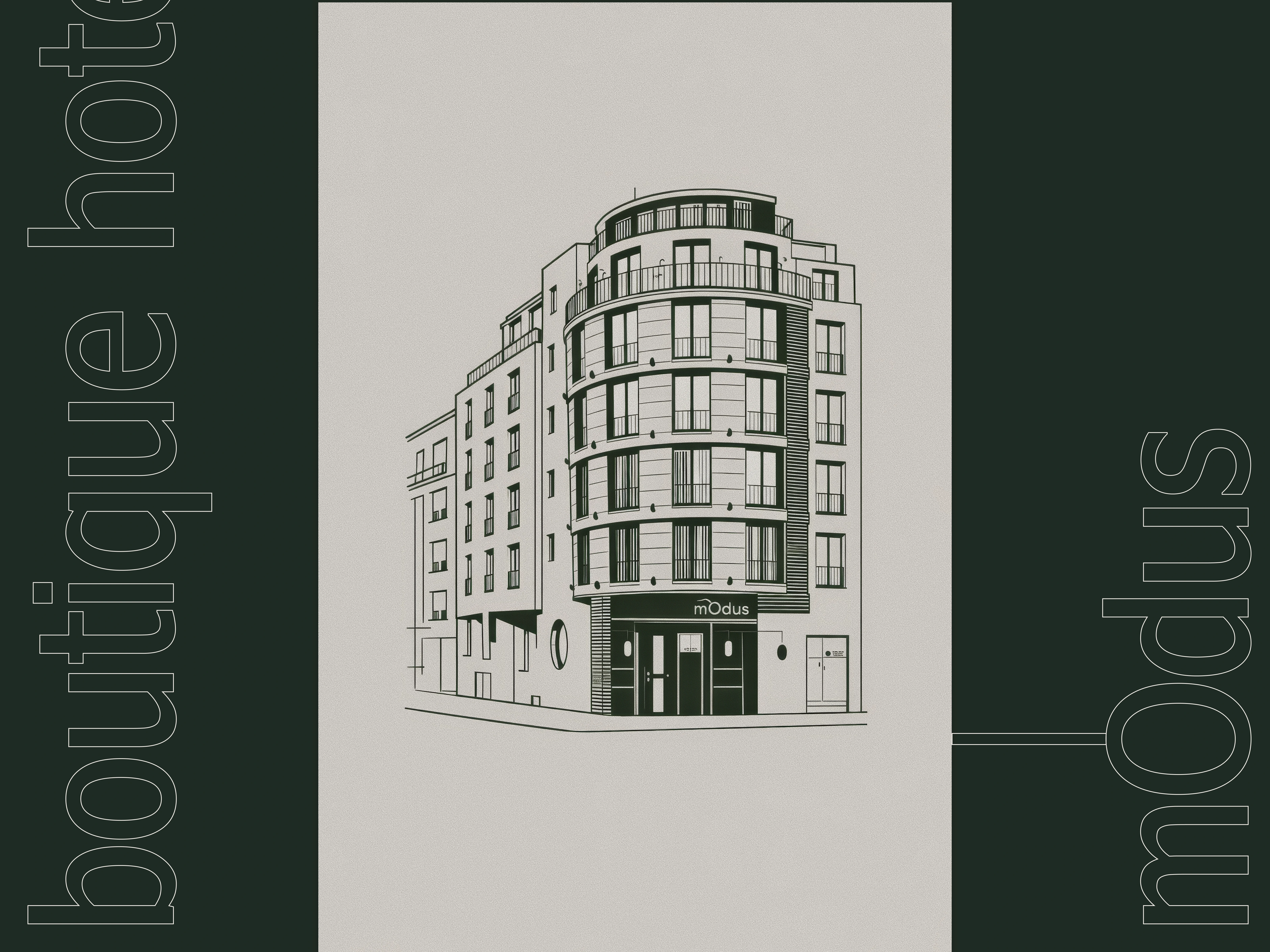
Architectural Identity
I created a custom line illustration of the hotel façade to anchor the brand in real architecture.
The drawing is clean and technical, reinforcing precision and structural clarity. Vertical typography on both sides frames the composition and adds graphic tension while keeping strong symmetry.
This slide connects the identity directly to the physical space. It was designed to show that mOdus is not an abstract luxury concept, but a place defined by structure, proportion, and architectural presence.
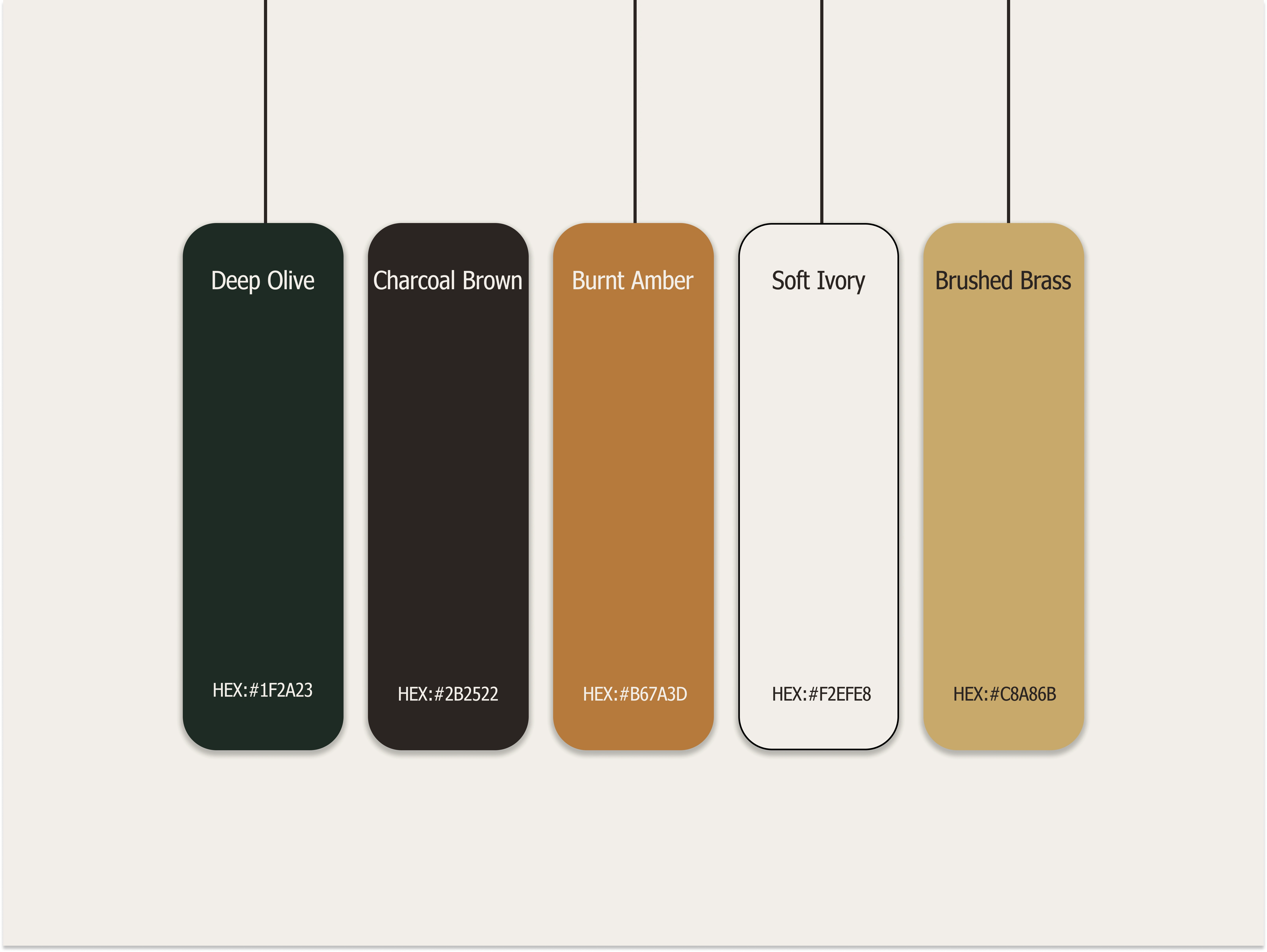
Color System
I built a muted, material-driven palette inspired by architecture and interior finishes rather than trend-based branding.
The combination of deep green, warm browns, amber tones, soft ivory, and brushed brass creates a balance between depth and warmth. The darker shades communicate stability and privacy, while the lighter tones introduce softness and light.
This palette was chosen to express quiet luxury, tactile richness, and timeless elegance. It positions mOdus as refined and grounded rather than flashy or seasonal.
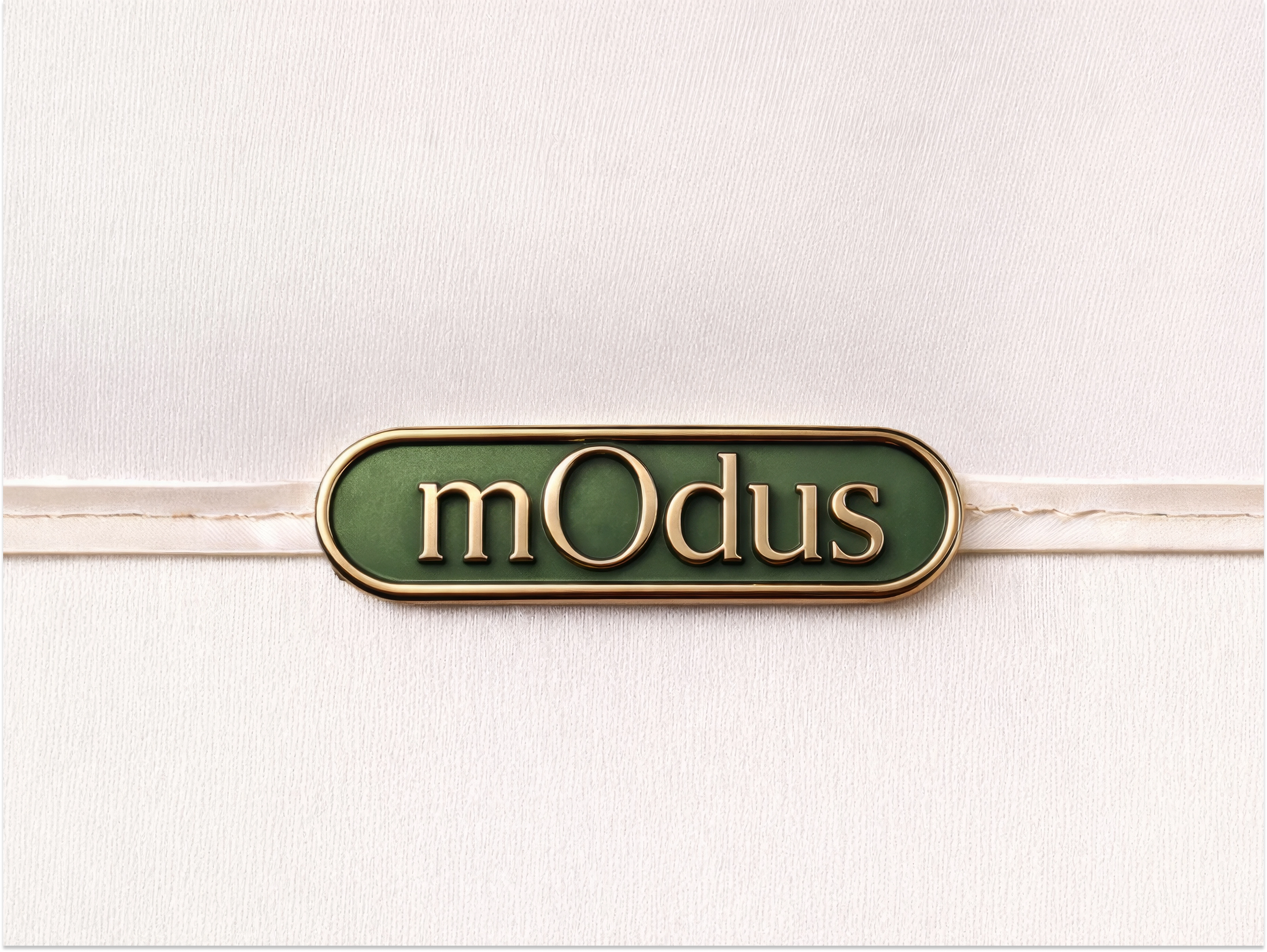
Brand Expression in Space
I translated the identity into physical elements to make the brand feel tangible.
The signage uses layered materials, metallic finishes, and depth to reflect architectural refinement. The rounded plaque softens the strict geometry of the logo while keeping elegance and precision.
The typography composition with large spacing and calm rhythm reinforces the brand’s quiet confidence. It avoids visual noise and focuses on clarity and proportion.
These elements were designed to make mOdus feel immersive, where every detail, from signage to messaging, expresses controlled luxury and refined atmosphere.
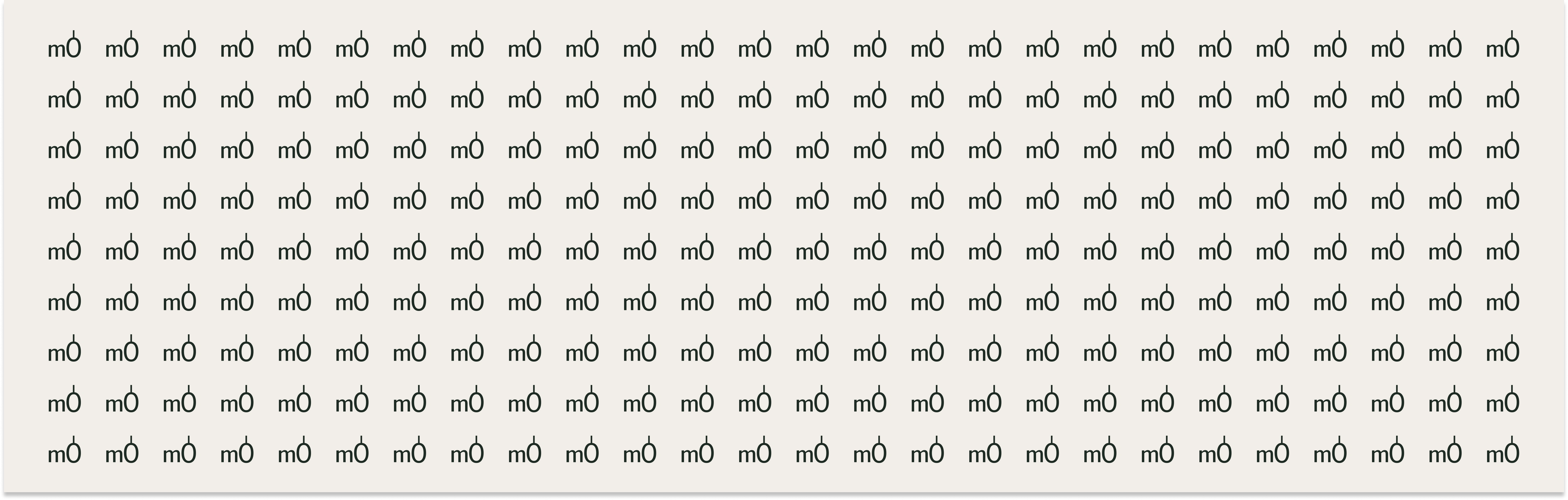
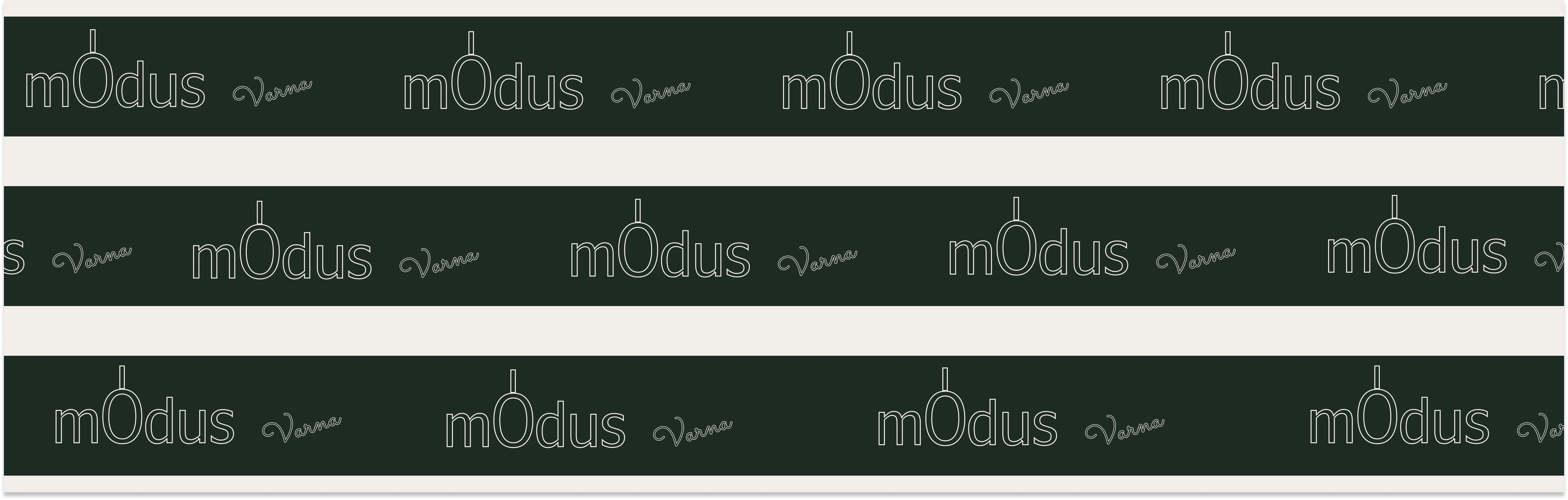
Pattern System
I developed custom patterns based on the logo structure and the vertical axis element.
The repeated “mO” symbol creates a subtle architectural rhythm, turning a brand detail into a scalable graphic system. The linear version with the full wordmark reinforces horizontality and brand recognition while maintaining minimalism.
These patterns were designed to add depth without visual noise. They allow the identity to expand across print, packaging, and interiors while keeping consistency and structural elegance.
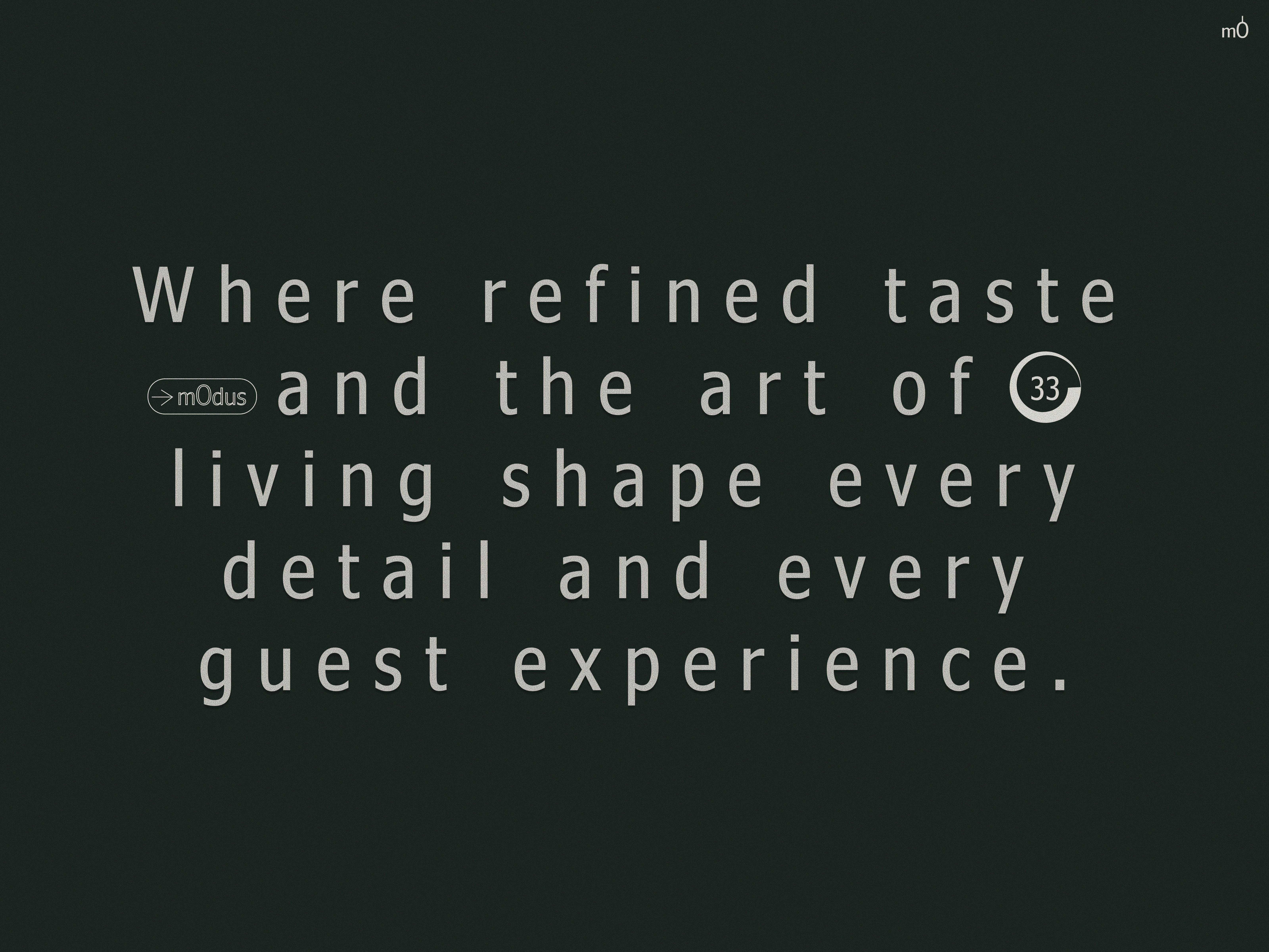
Brand Mood & Positioning
This slide expresses the emotional side of the brand.
The refined evening scene introduces elegance, exclusivity, and quiet confidence. The warm interior lighting contrasts with the deep green brand panel, reinforcing the balance between intimacy and structure.
The vertical typography and minimal layout maintain architectural discipline, while the human presence adds aspiration and lifestyle context.
It was designed to position mOdus as a sophisticated urban hotel where luxury feels personal, controlled, and experiential rather than loud or extravagant.

Stationery & Guest Touchpoints
I extended the identity into everyday hotel elements to ensure consistency across all guest interactions.
The stationery, amenity kit, door hanger, and accessories follow the same architectural minimalism and restrained palette. Clean layouts, fine lines, and subtle logo placement reinforce precision and calm refinement.
Materials and neutral tones keep the focus on texture and detail rather than decoration.
This system was designed to make the brand cohesive at every touchpoint, turning simple functional items into part of the overall luxury experience.
Typography System
Selected a clean, modern serif with strong vertical proportions to reinforce architectural elegance.
The typeface balances sharp structure with refined detailing, allowing it to feel premium without becoming ornamental. Large-scale usage emphasizes confidence and spatial presence, while smaller text remains highly legible.
This typography was chosen to support the brand’s disciplined aesthetic and to create a timeless, sophisticated tone across all applications.
Hotel Experience & Interiors
I showcased real interior photography to ground the identity in tangible experience.
The visuals highlight material richness, warm lighting, spatial depth, and modern comfort. The dark tones and controlled lighting align with the brand palette, reinforcing consistency between identity and environment.
This slide demonstrates that the branding is not conceptual only, it naturally fits the actual hotel atmosphere and enhances its perceived value.
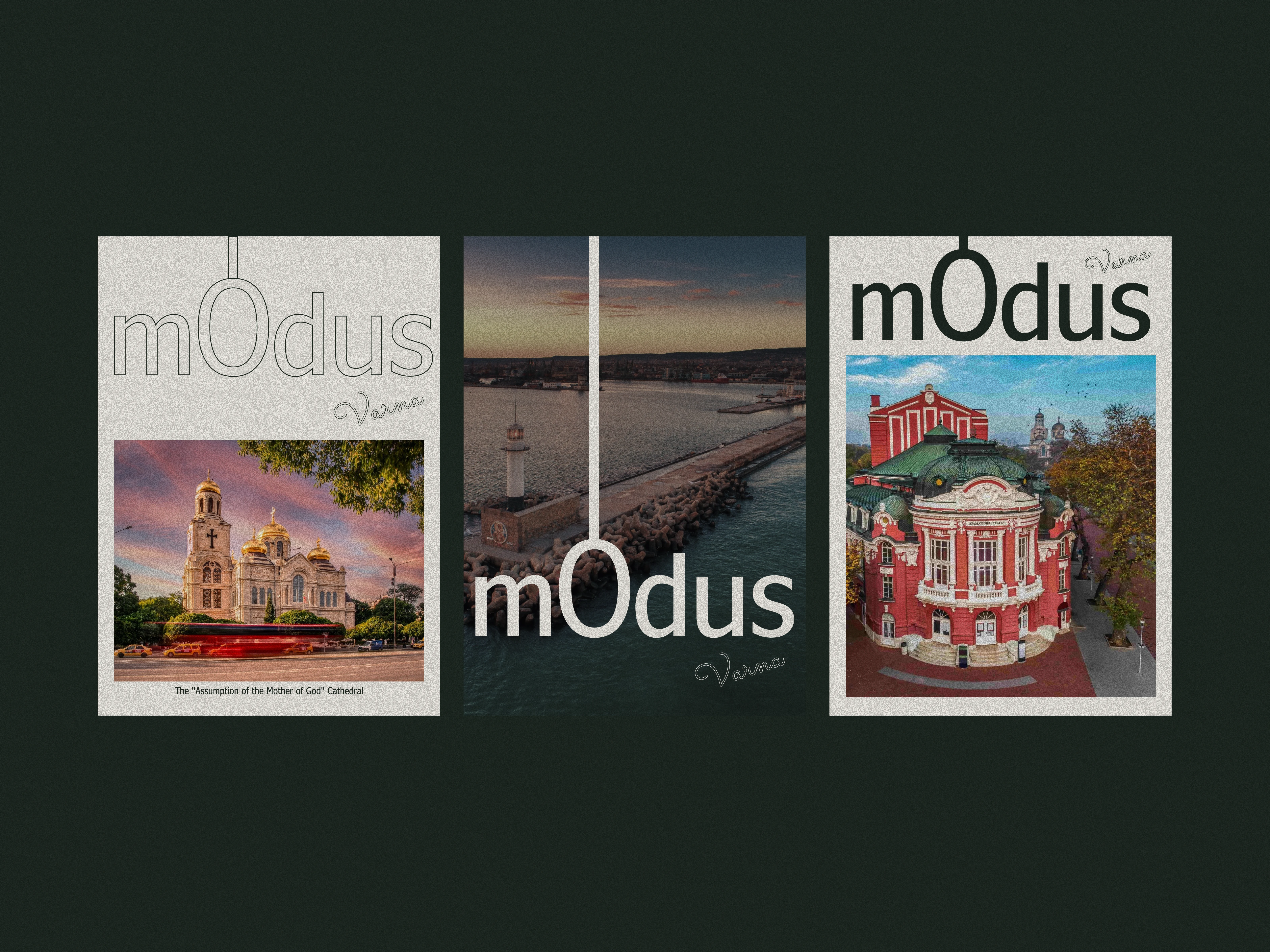
Location & Cultural Context
I created branded posters integrating Varna’s landmarks to connect the hotel with its city.
The layout maintains strong structure and vertical alignment, while photography adds cultural and geographic context. The brand remains dominant, but the city becomes part of the narrative.
This was designed to position mOdus not only as a hotel, but as a refined urban destination rooted in Varna’s identity.
Final Thoughts
For mOdus, I built a complete brand identity system rooted in architectural logic and quiet luxury.
I developed the logo, color system, typography, pattern language, and applied them consistently across signage, stationery, guest touchpoints, posters, and spatial mockups. Every element was designed with structural balance, restrained elegance, and material awareness.
The process focused on transforming the hotel into a cohesive visual experience. Instead of decorative luxury, I created a disciplined system where proportion, symmetry, and depth define the brand.
What was achieved:
I elevated mOdus from a physical space into a controlled, premium identity. The brand now communicates architectural sophistication, emotional refinement, and urban positioning with clarity and consistency.
The result is a scalable visual system that works across digital, print, and physical environments while maintaining a strong, timeless presence.
Like this project
Posted Feb 24, 2026
Designed a full architectural brand identity for mOdus Hotel, translating spatial logic and structural balance into a cohesive visual system.
Likes
13
Views
22
Timeline
Feb 17, 2026 - Feb 24, 2026