Tower 28 Beauty Redesign Concept for Sensitive Skin

Samson Bojesomo


Tower 28 Beauty: A Redesign Concept Built Around "Safe for Sensitive Skin"
Brand: Tower 28 Beauty clean, sensitive skin safe makeup and skincare, inspired by the Los Angeles lifeguard towers
Role: Speculative Redesign Concept (self initiated sample project)
Result: Concept sample not an active client engagement
The Challenge
Tower 28's entire brand promise rests on one specific claim: makeup and skincare that's safe for even the most sensitive, reactive skin. That's a harder promise to make credible than generic "clean beauty" messaging, because sensitive-skin shoppers have usually been burned by products before. I built this redesign concept to explore how a Shopify storefront could carry that trust-first positioning through every section, not just a single "About" paragraph, while still feeling as vibrant and joyful as the brand's playful, sun-drenched visual identity.
Research & Discovery
A sensitive skin shopper isn't browsing casually they're vetting. Before adding anything to cart, they're asking: will this trigger a reaction, is this actually formulated for skin like mine, and can I trust the brand's claims? The concept was built around answering that vetting process directly and early, while layering in the brand's warm, community-driven tone so the site never feels clinical despite the skin-safety focus.
The Design Process, Section by Section
1. Hero — Naming the Fear Directly
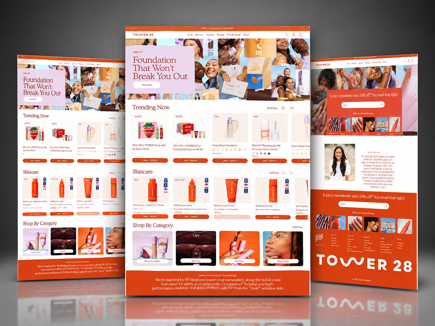
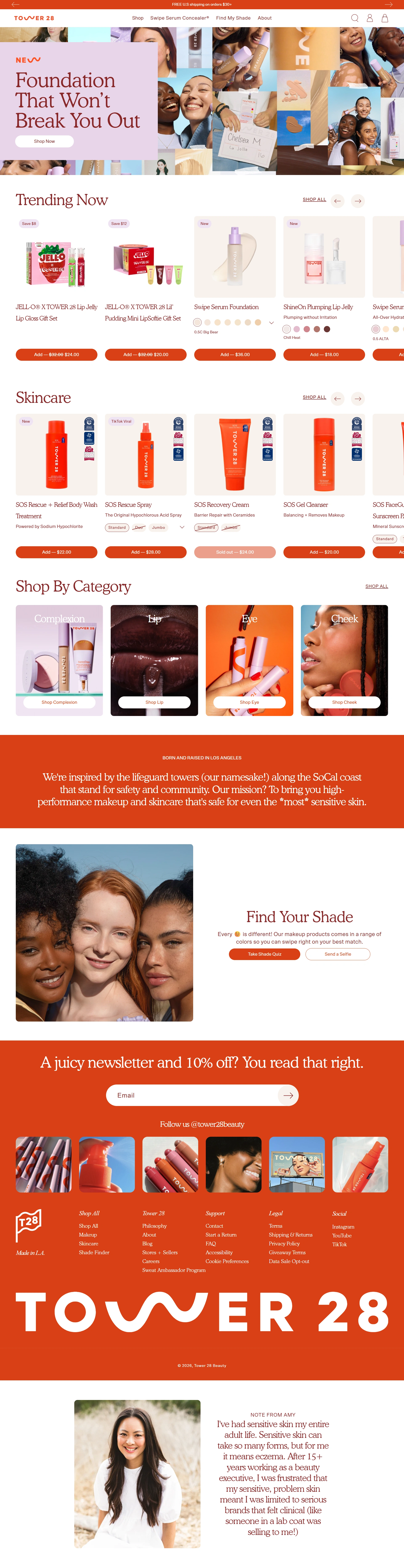
The homepage opens with "Foundation That Won't Break You Out" over a warm, textured photo collage of real, diverse faces. Rather than a generic "new collection" banner, the hero speaks directly to the exact fear a reactive-skin shopper has about foundation breakouts turning the product's core differentiator into the very first thing a visitor reads.
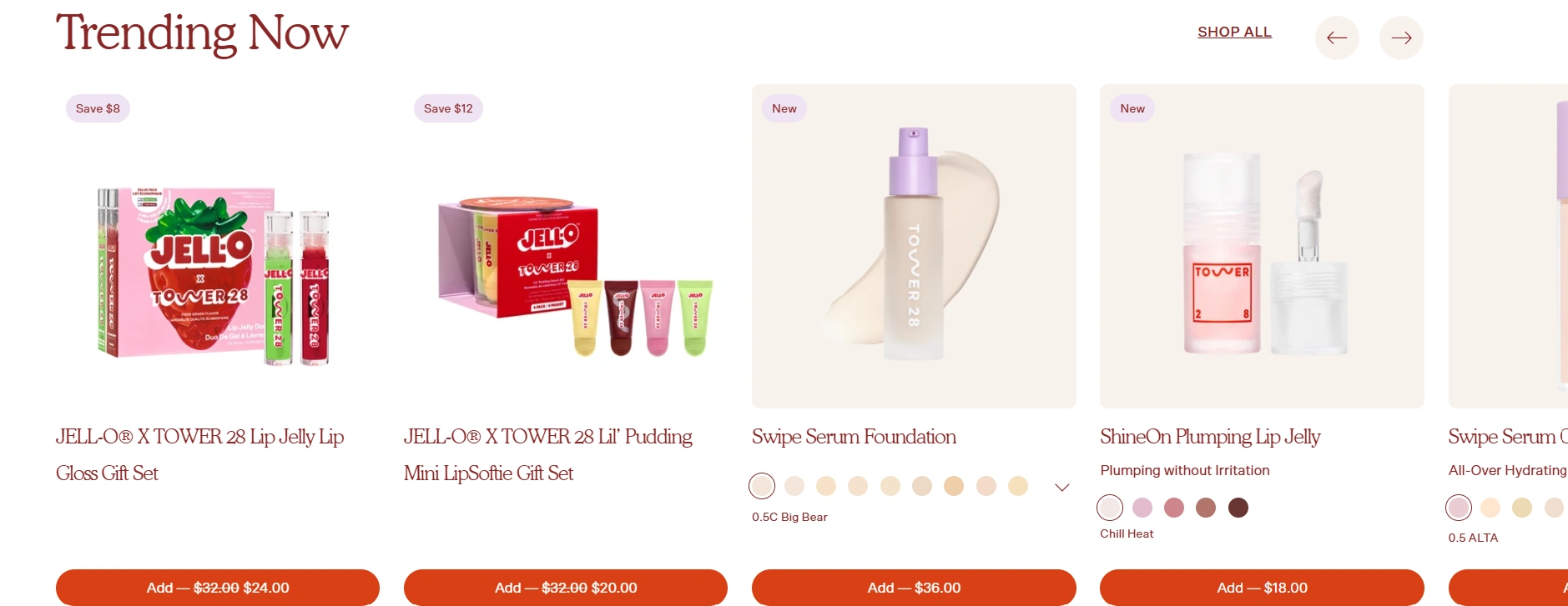
Trending Now — Product-First, Proof-Backed Immediately below the hero, a Trending Now carousel (JELL-O® x Tower 28 lip gloss collab, Swipe Serum Foundation, ShineOn™ Plumping Lip Jelly) leads with visible star ratings and pricing on every card. Featuring a limited collaboration alongside core products signals cultural relevance and freshness, while consistent rating visibility keeps trust present at the product level, not just the brand level.
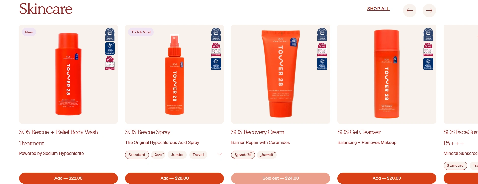
Skincare Row — Letting the "SOS" Naming Do the Reassuring The Skincare section highlights the SOS Rescue + Relief line (Body Wash, Spray, Recovery Cream, Gel Cleanser) — product names that speak directly to a sensitive-skin shopper's mindset of "I need something that fixes this, gently." Grouping skincare directly beneath makeup, rather than in a separate area of the site, reinforces that this is a skin-health brand first, cosmetics second — which is the actual trust differentiator Tower 28 needs to land.
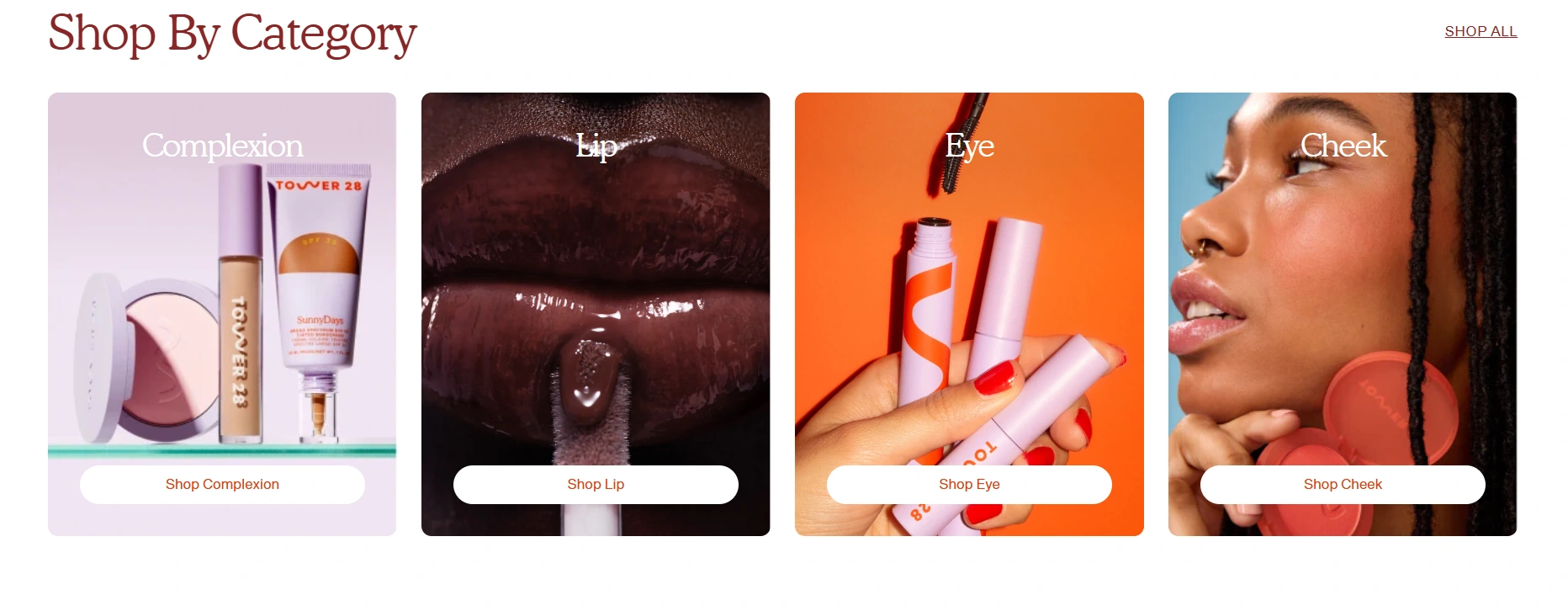
Shop By Category — Reducing Decision Friction for a Focused Catalog A simple four-way category split (Complexion, Lips, Eyes, Cheek) with clean, close-up photography lets shoppers self-navigate instantly by need rather than browsing an undifferentiated grid — important for a brand where product texture and formulation (not just shade) is a primary purchase driver.
Brand Mission Band — Explaining the Name, Reinforcing the Promise The closing band on the homepage ties the brand name back to its origin story — Los Angeles lifeguard towers, "safety and community" — restating the mission ("high-performance makeup and skincare that's safe for even the 'most' sensitive skin") in the brand's own words at the natural end of the browsing journey, reinforcing the promise made in the hero one more time before a visitor leaves the page.

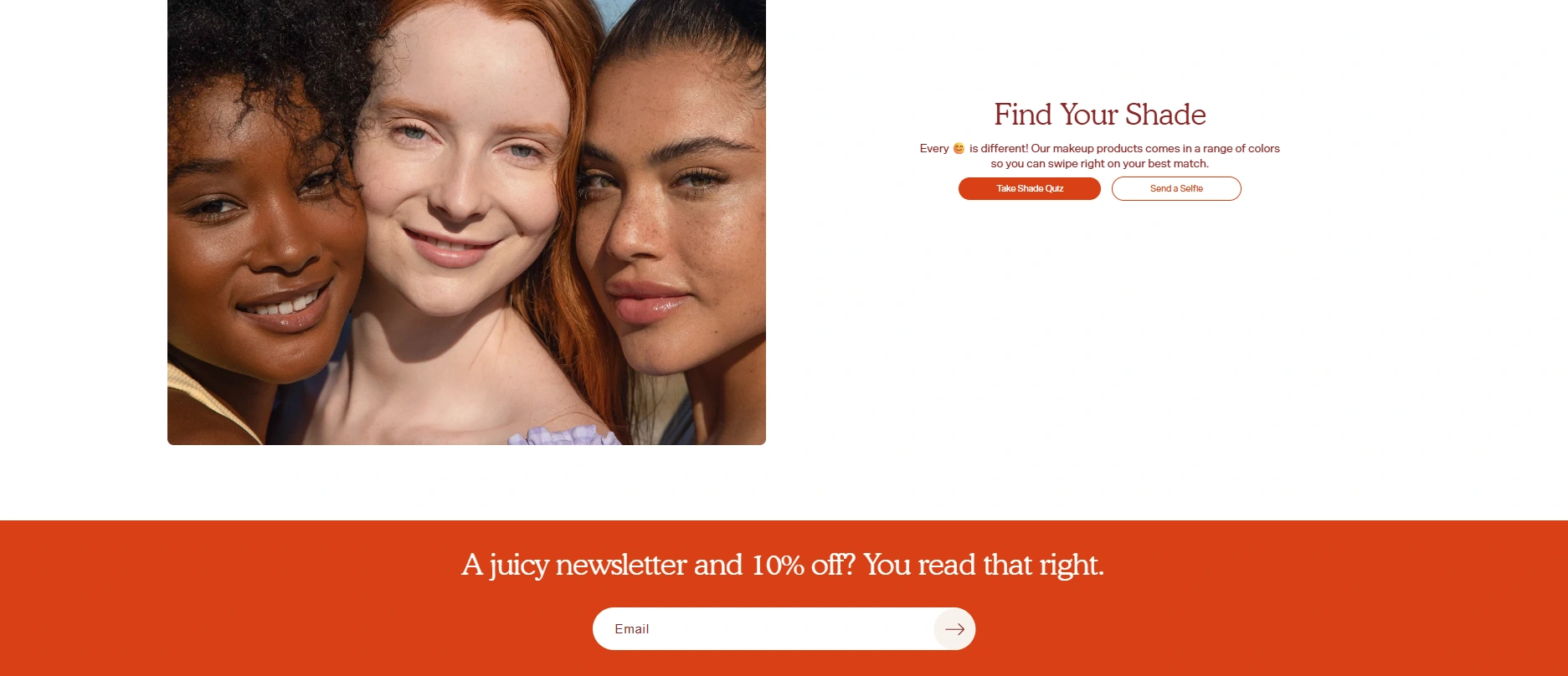
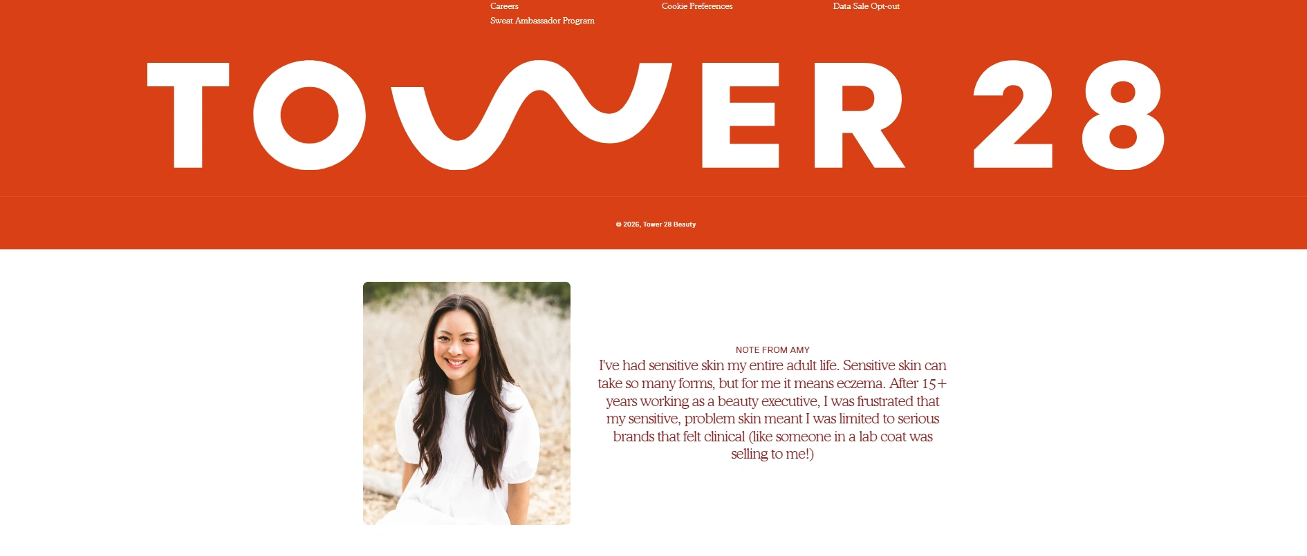
6. Newsletter & Founder Note — A Personal, Human Trust Layer A dedicated "juicy newsletter" signup section is paired with a personal note from the founder, sharing her own lifelong experience with sensitive skin and eczema, and her frustration with brands that felt clinical rather than genuinely made for people like her. Placing a real founder story — in her own voice, with a real photo — directly next to the email capture does significant trust-building work: it reframes the brand from "another clean beauty label" into "someone who actually understands this problem built the solution."
Social Proof Strip — Community as a Trust Signal A row of Instagram-style content beneath the newsletter section reinforces that this is an active, community-engaged brand, not just a storefront — useful supporting proof for a skincare-adjacent brand where shoppers often research a brand's real-world reputation before buying.
Visual & Brand Direction The signature Tower-28 red-orange paired with warm skin-tone photography and playful, rounded typography keeps the entire concept feeling sun-drenched, joyful, and community-driven — deliberately avoiding the sterile, clinical look many "sensitive skin" or "dermatologist-approved" brands default to, since Tower 28's actual differentiator is being both safe and fun.
The Outcome
This is a speculative concept, not an active client engagement — built to demonstrate how a sensitive-skin-first brand promise can be carried through every section of a Shopify storefront, from hero copy to founder story, rather than isolated to a single trust badge or About page.
Want a redesign concept for a brand where trust is the actual product? Let's talk.
Like this project
Posted Sep 20, 2026
Developed a redesign concept for Tower 28 focusing on sensitive skin products.