Nekohama | Brand strategy & Visual Identity
Lana Timmermans
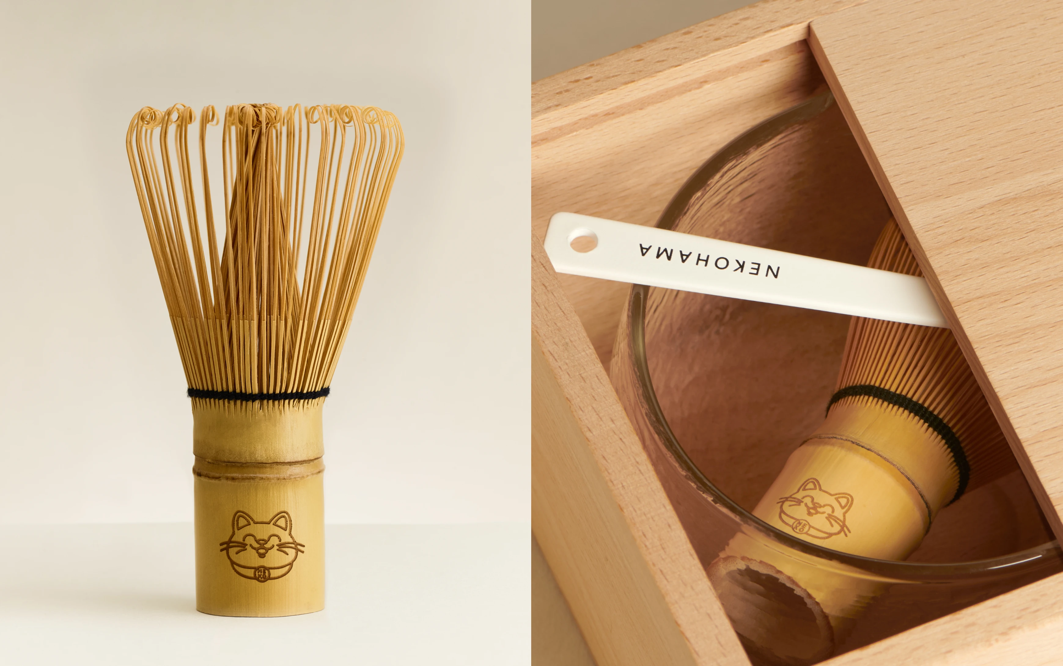
1 — About the Project
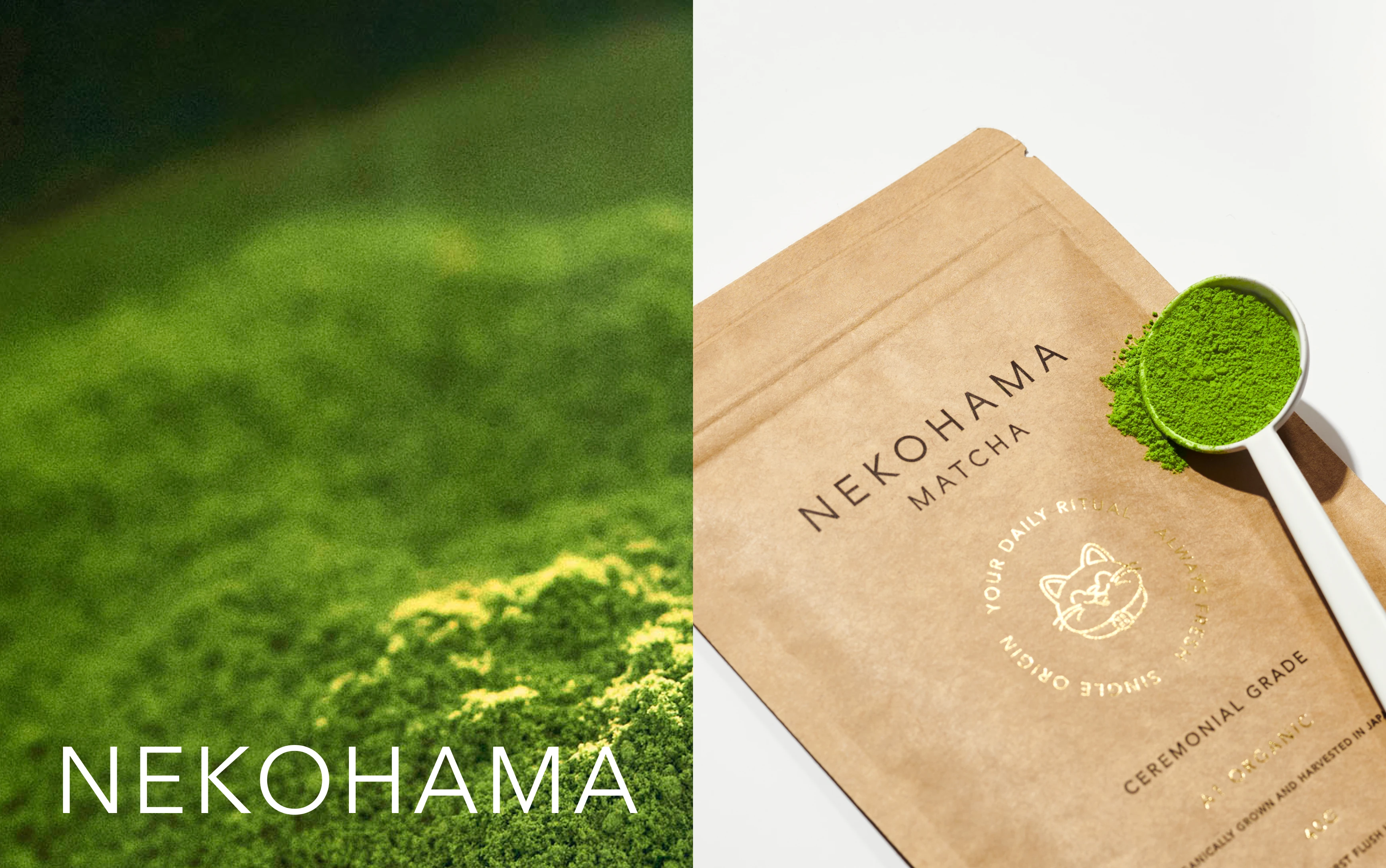
Nekohama is a premium matcha brand inspired by purity, simplicity and mindful living. It offers a fresh, modern perspective on ancient Japanese tea traditions.
I was invited to support the team with both strategy and design. My role was to look at the brand as a whole, run workshops, refine its story, and build a complete brand guide that would help them grow with confidence.
2 — The Process
We started with a deep dive into the existing brand. Through workshops and open conversations, we explored what Nekohama stood for and how it could express its roots in a contemporary way.
The idea was to respect heritage while keeping the design intentional and clear. I built the strategy first, then turned that into a visual system that felt calm, natural and precise. Every choice, from the typeface to the tone of green in the palette, was made to reflect a mindful lifestyle.

3 — The Deliverables
Full brand audit and strategic foundation
Strategy workshops and positioning
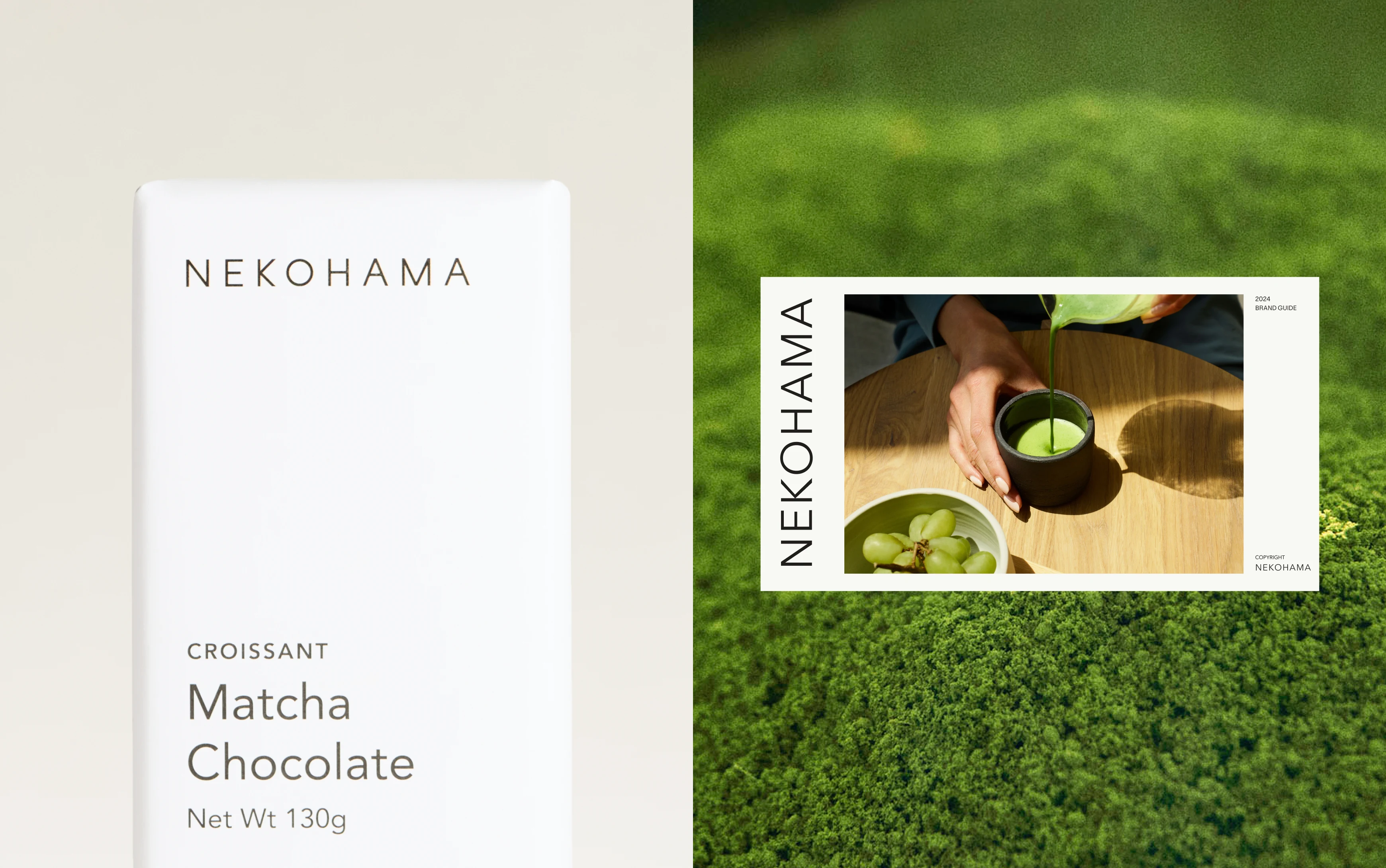
Comprehensive brand guide
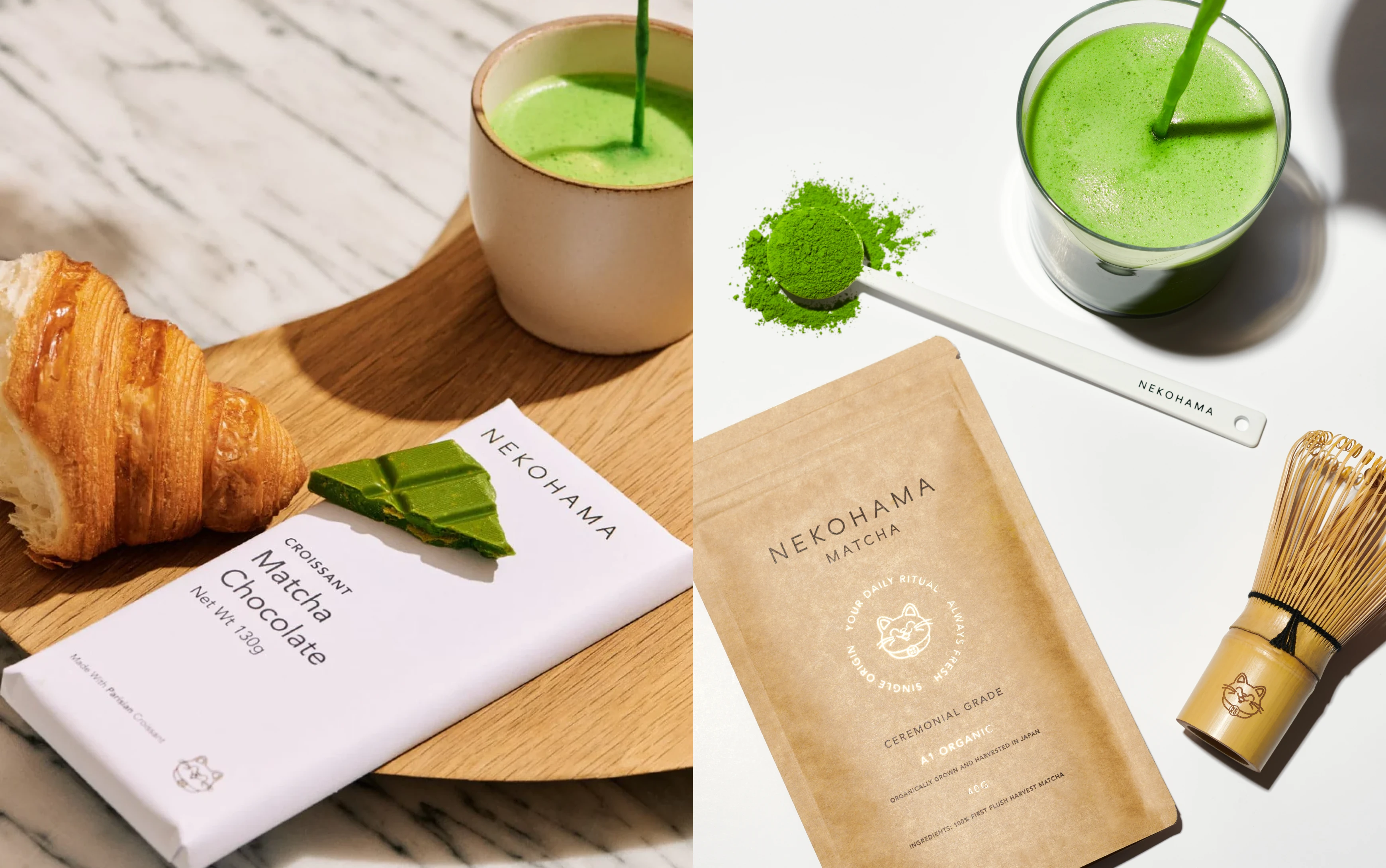
Visual identity system with logo, typography and colours
Packaging direction
Social templates and imagery guidance
Website direction
4 — Highlights and Learnings
This project showed me how rewarding it is to combine tradition with a modern design language. Working so closely with the team through strategy sessions gave the identity real depth, because it was not just about visuals but also about values and culture.
The final result is a refined brand that communicates purity and clarity, while still feeling warm and human. I really enjoyed helping Nekohama shape a voice that honours its Japanese tea roots and connects with people in today’s world.

Like this project
Posted Sep 16, 2025
Nekohama is a premium matcha brand rooted in purity, simplicity, and mindful living, offering a modern take on ancient Japanese tea traditions.
Likes
6
Views
31