YAY FRY-DAY | Brand strategy & visual identity, packaging
Lana Timmermans
1 — About the Project
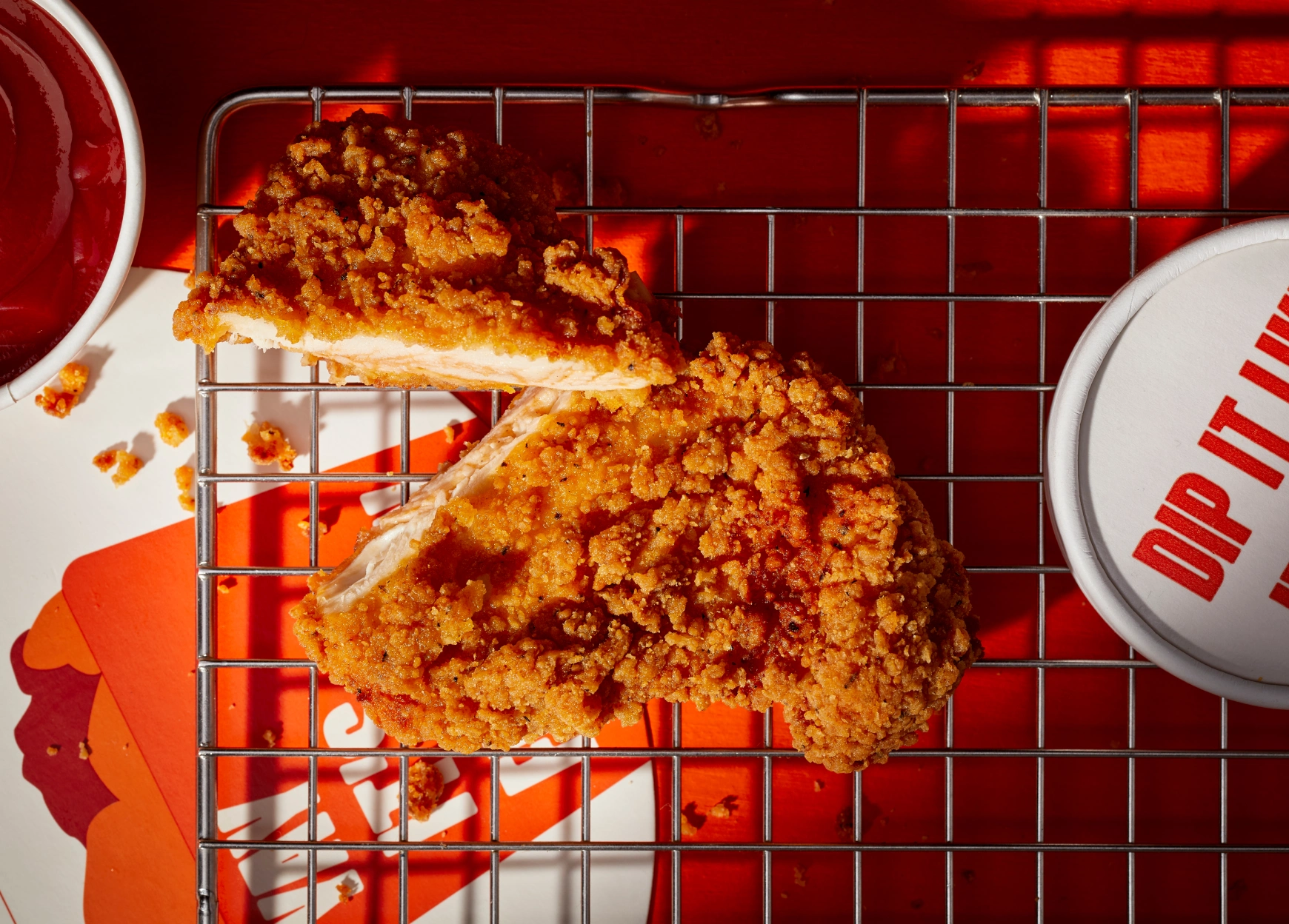
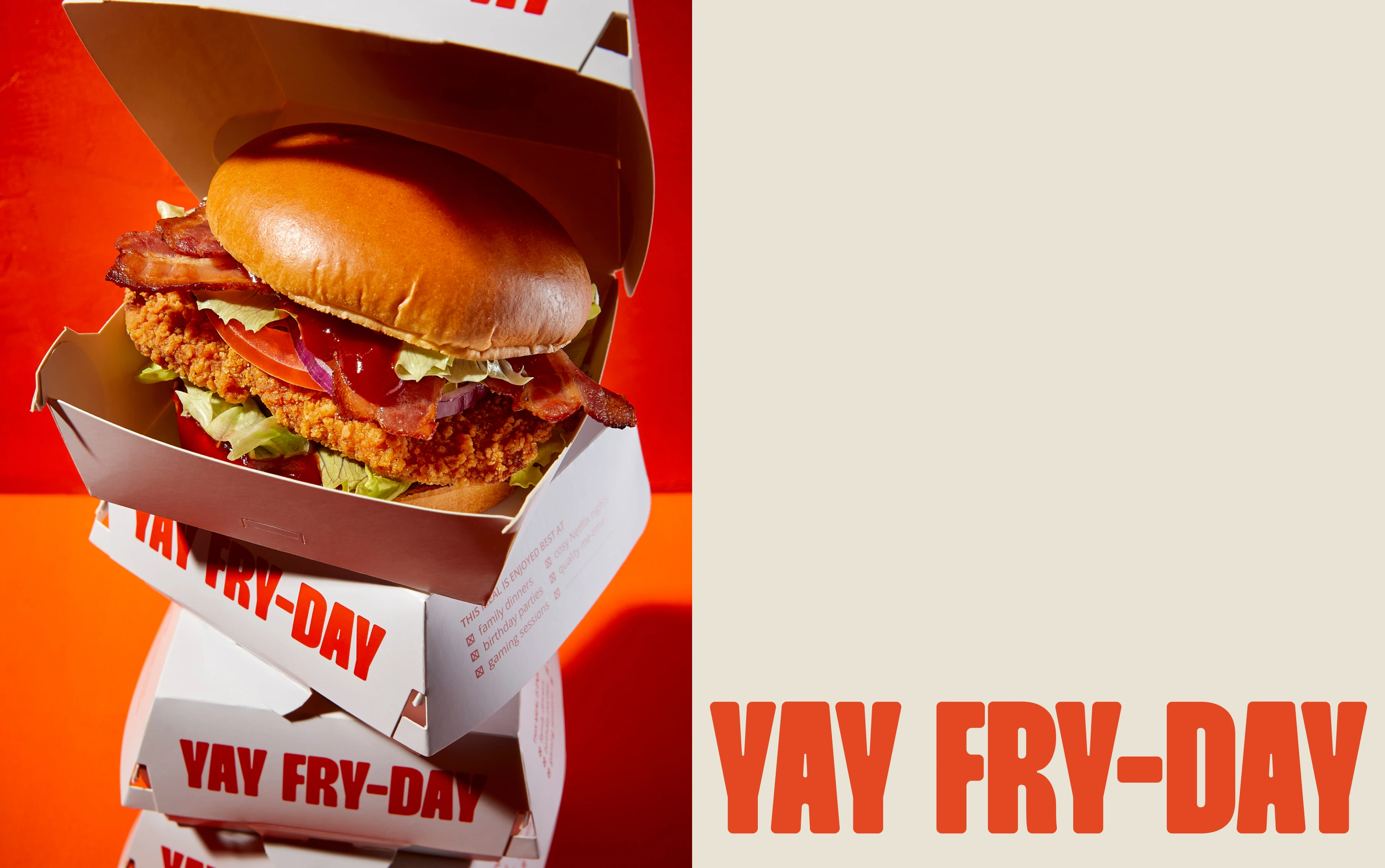
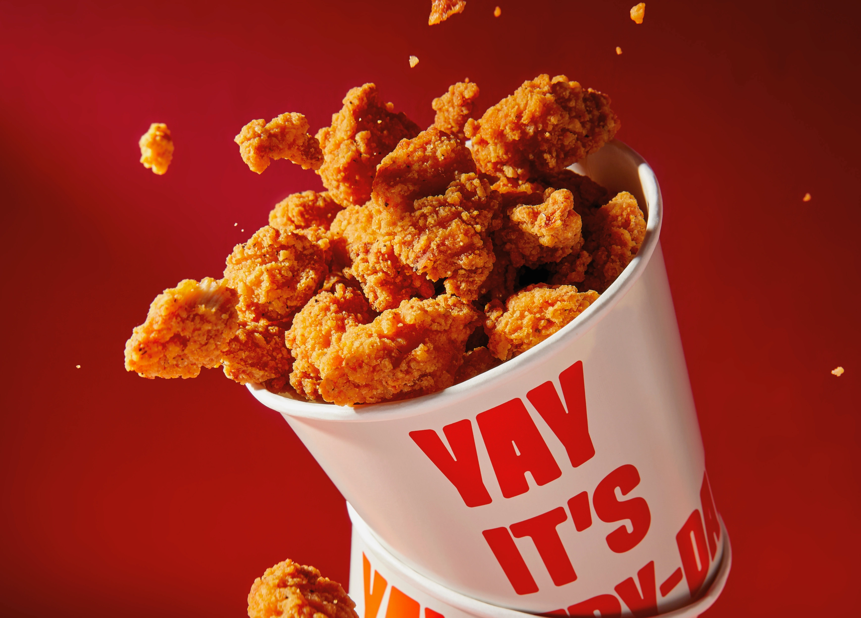
YAY FRY-DAY is a fun and flavourful food brand that wanted to capture the joy of indulgence. It celebrates everything that makes eating with friends and family so special: the energy, the laughter, and of course the crispy bites.
I was invited to help develop the brand from the ground up. That meant creating the name, defining the strategy, designing the identity, and building packaging that would stand out on a crowded shelf.
2 — The Process
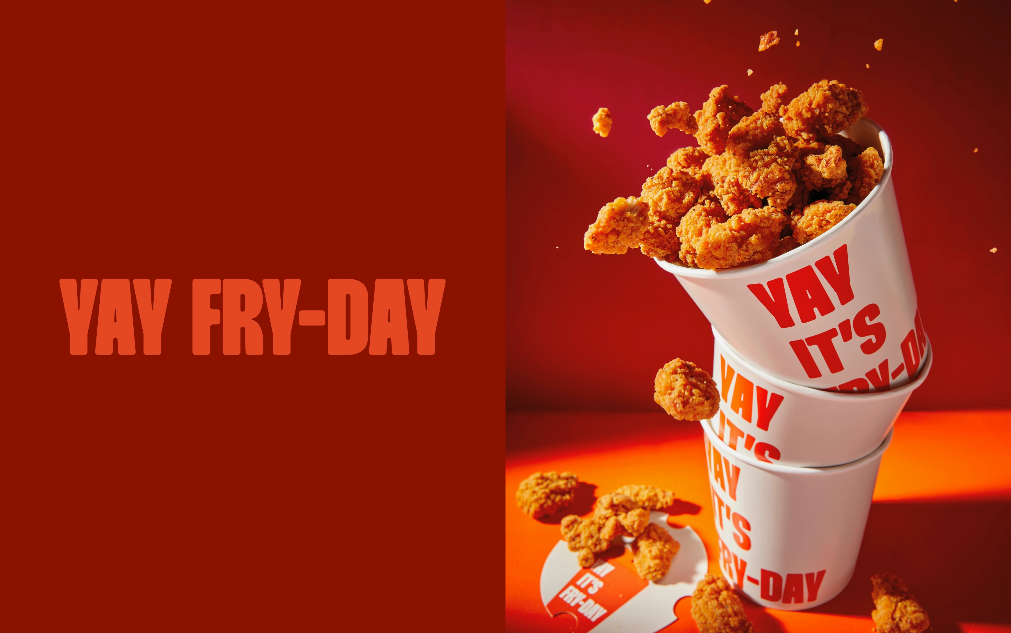
This project was about bottling up pure joy and translating it into a brand. We explored ideas around playfulness, bold colours and typography that could shout without feeling messy.
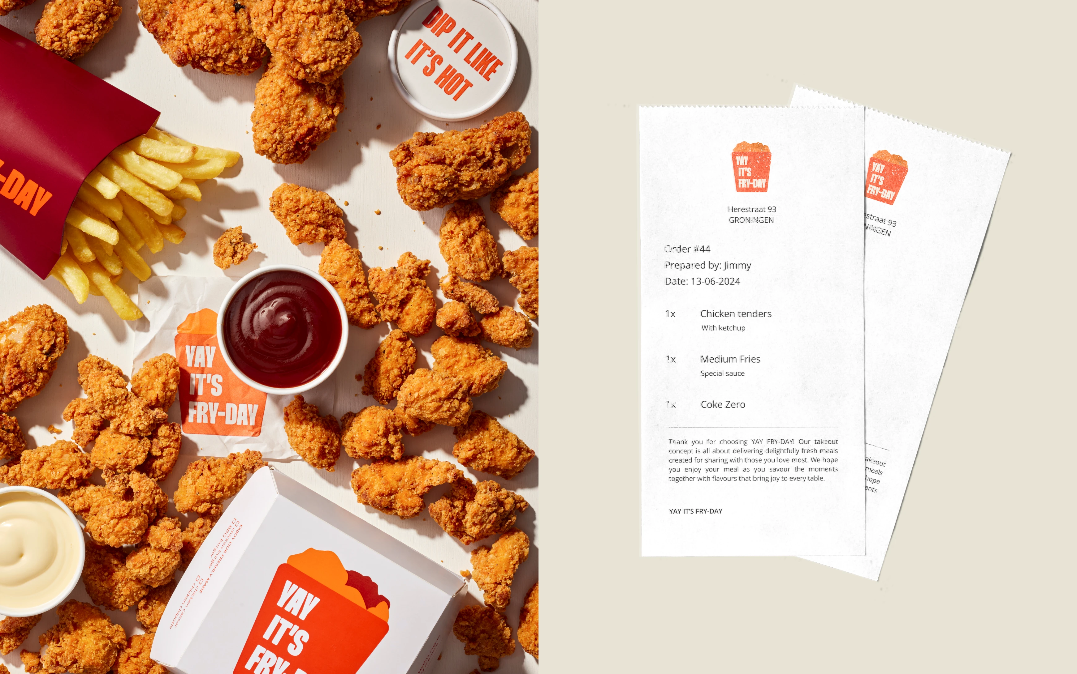
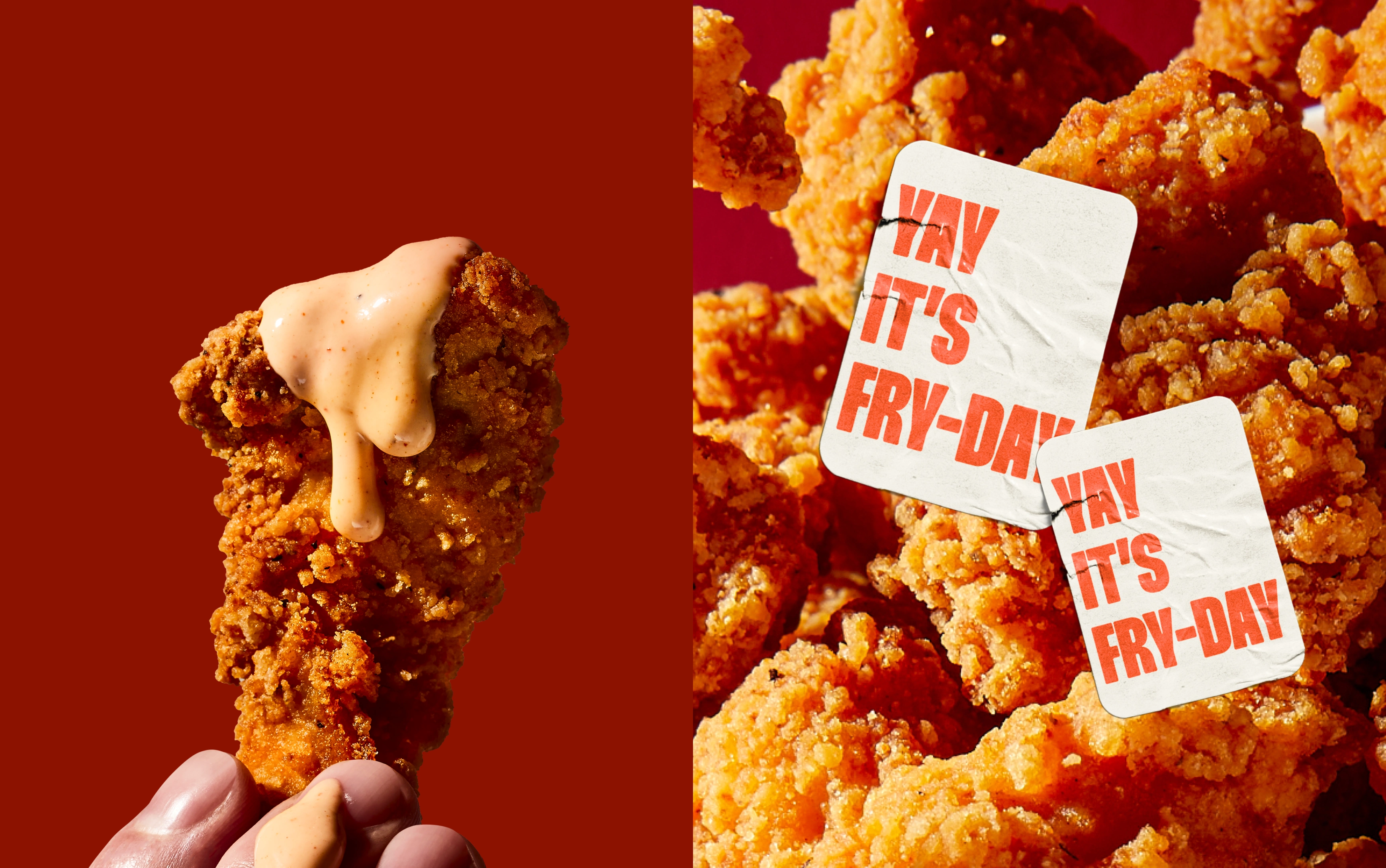
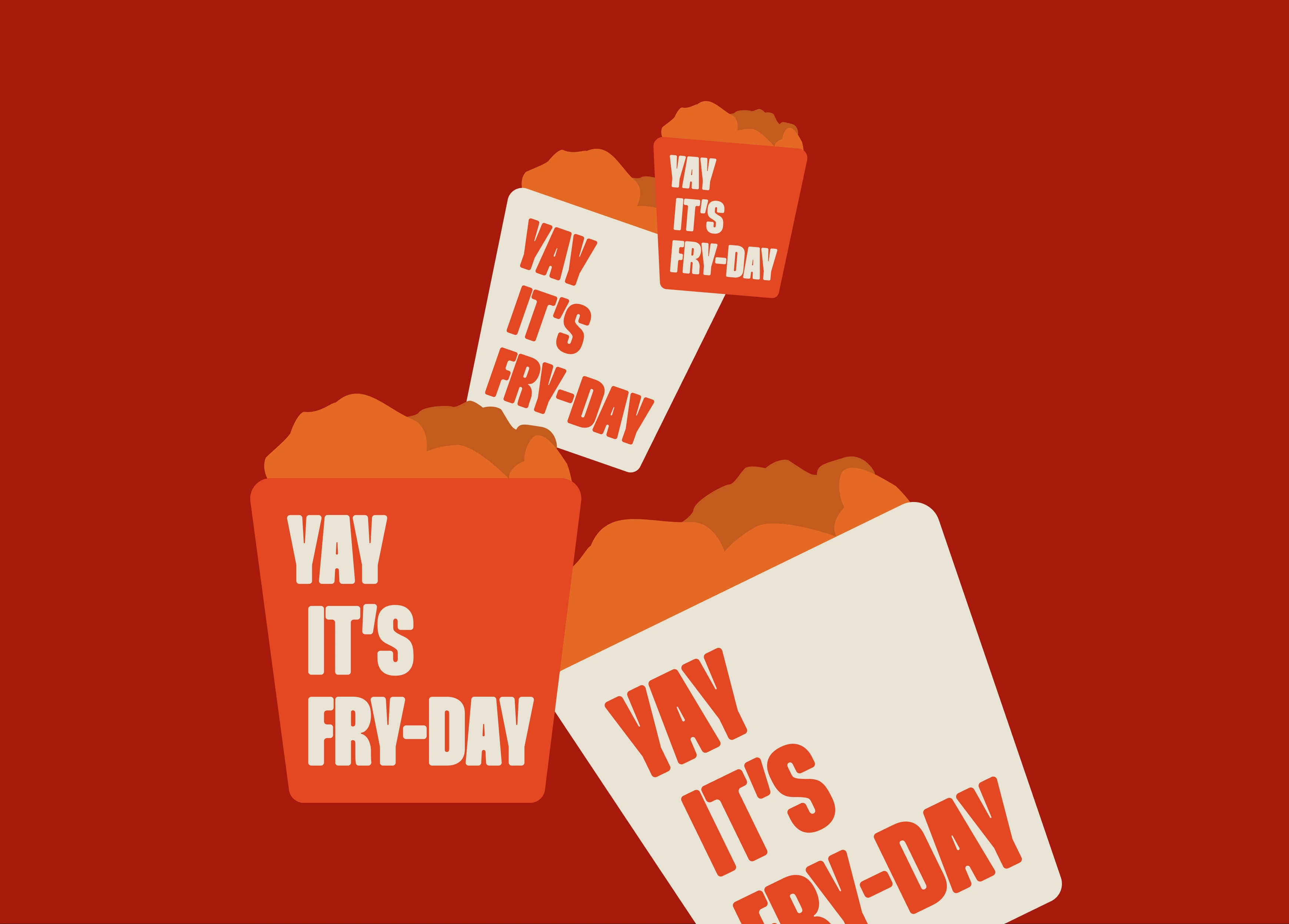
The brand name came first, setting the tone with its light-hearted personality. From there, I built a strategy that focused on connection and celebration. The design system grew around vibrant shapes, striking lettering, and packaging that was as fun to hold as it was to look at.
3 — The Deliverables
Brand name and strategy foundation
Full visual identity system
Packaging design for the product line
Visual direction, stickers and supporting assets
Brand guidelines for consistency
4 — Highlights and Learnings
What I loved about this project was the freedom to really lean into colour and energy. Not every brand can be this bold, but here it was exactly the right choice.
The result is an identity that is hard to miss. It is loud but in the best possible way, and it connects instantly with people who see it. YAY FRY-DAY taught me how much fun branding can be when you embrace the playful side of design while still keeping it purposeful and clear.
Like this project
Posted Sep 16, 2025
YAY FRY-DAY is a fun, bold, and flavor-packed food brand that celebrates the joy of indulgence and the excitement of sharing meals with family and friends.
Likes
5
Views
53