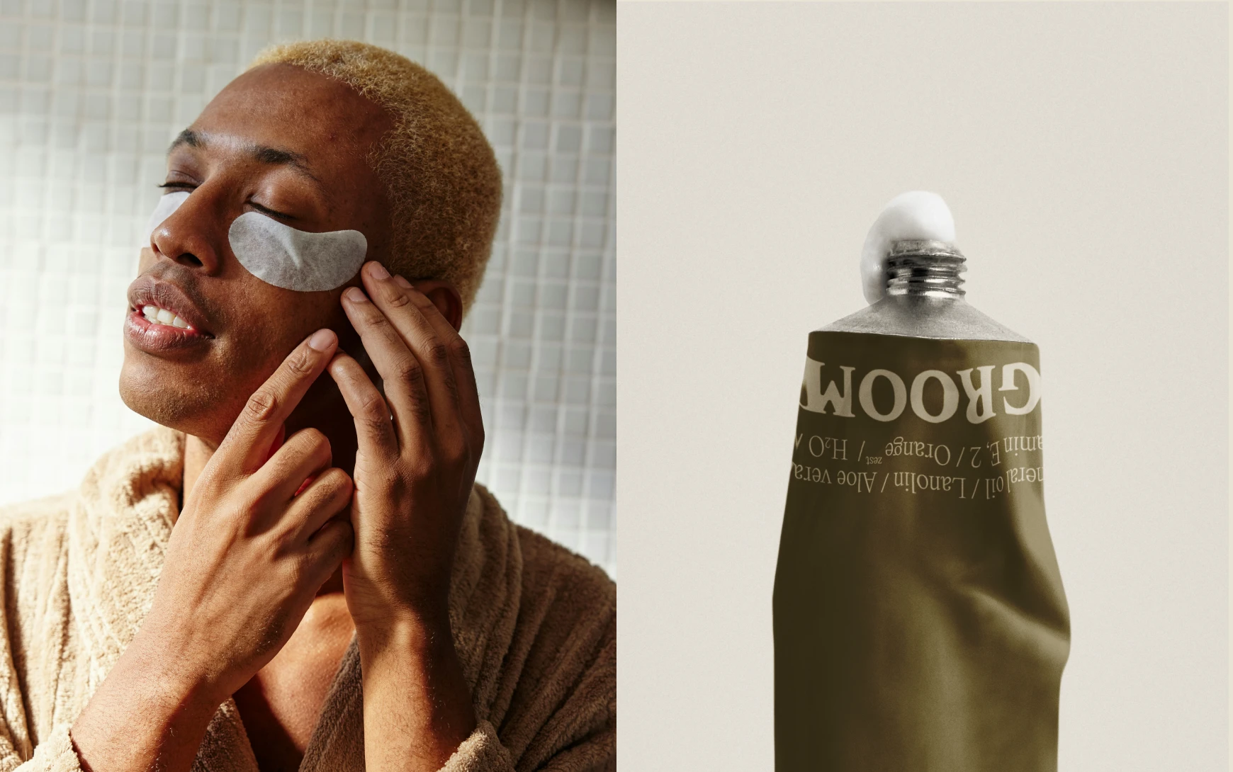
GROOM | Brand Strategy & Visual Identity
Lana Timmermans
1 — About the Project
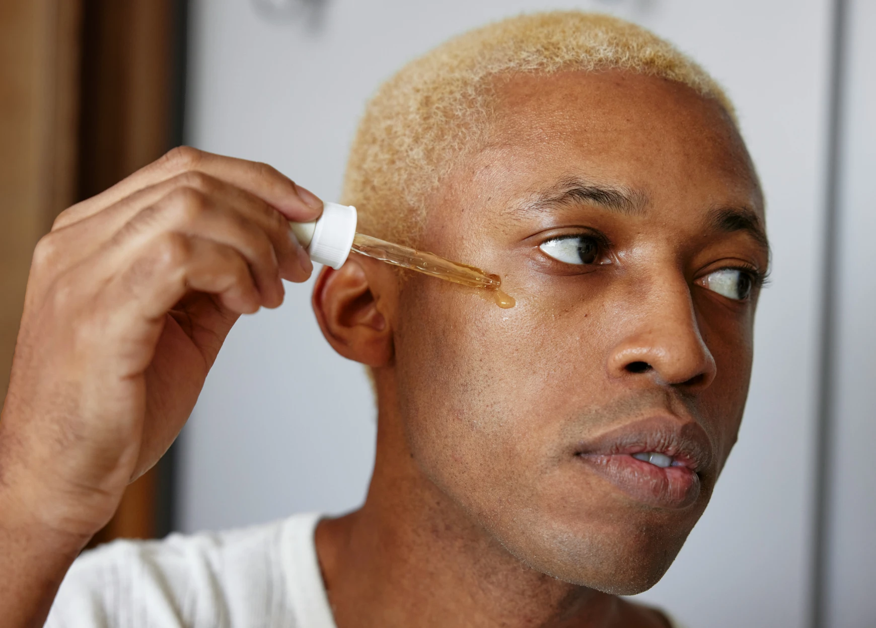
GROOM is a men’s skincare brand that wanted to take a fresh approach. A lot of men’s products look and feel the same, and the team wanted something more natural, more thoughtful, and a little more refined.
I was asked to help shape the brand strategy, create a visual identity, and design packaging that would feel both modern and down to earth. My aim was to give the brand a look and feel that people could connect with straight away.
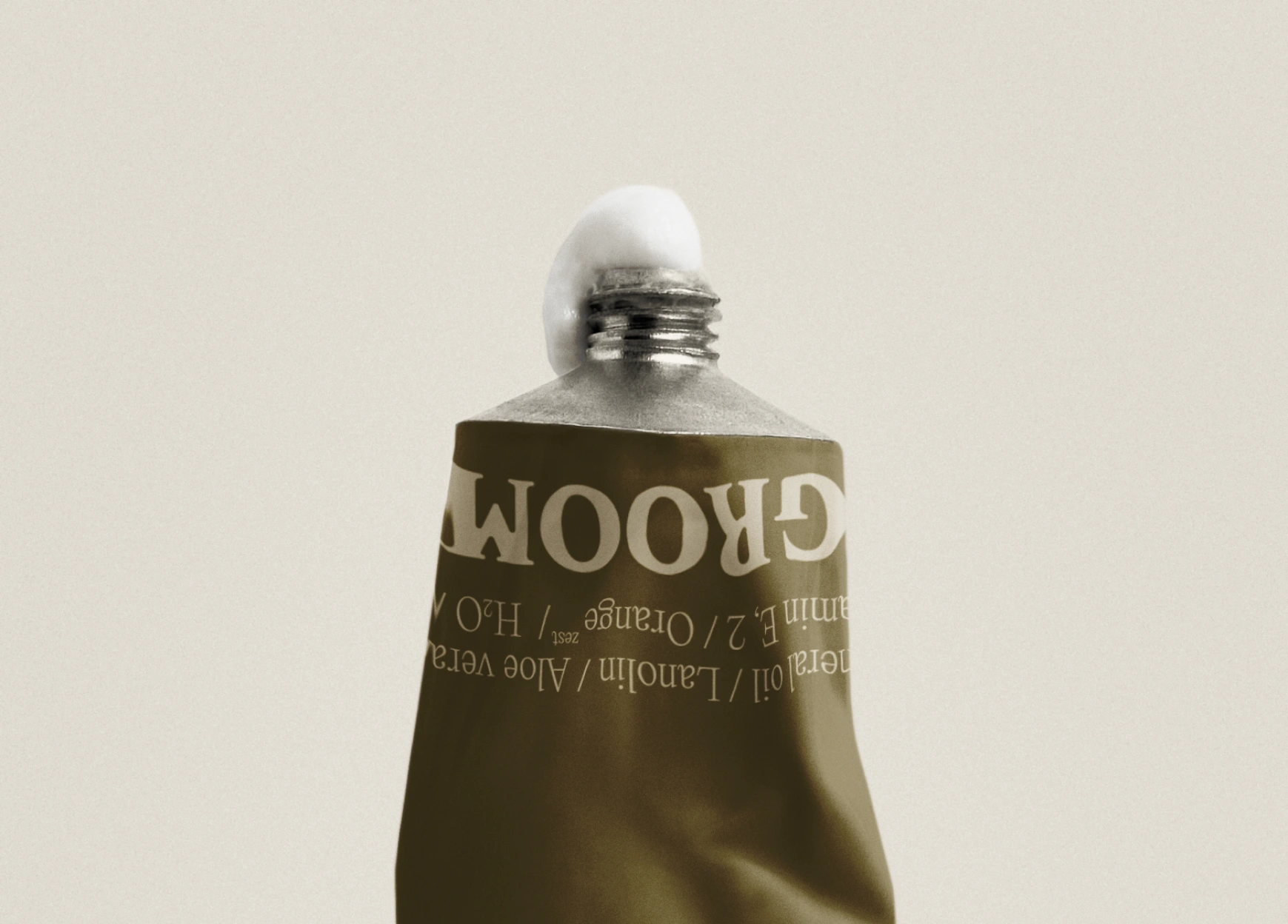
2 — The Process
We started by talking a lot about what the brand should mean to people. It was not only about design but also about how the brand would be experienced. The goal was a balance between quality and honesty, with a touch of simplicity that would set GROOM apart.
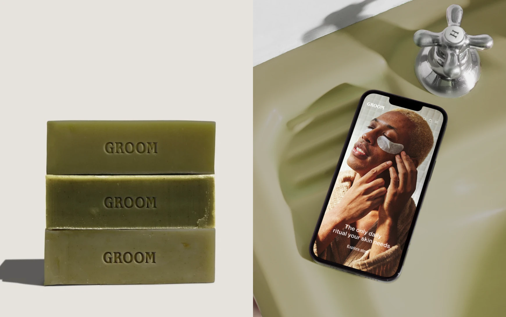
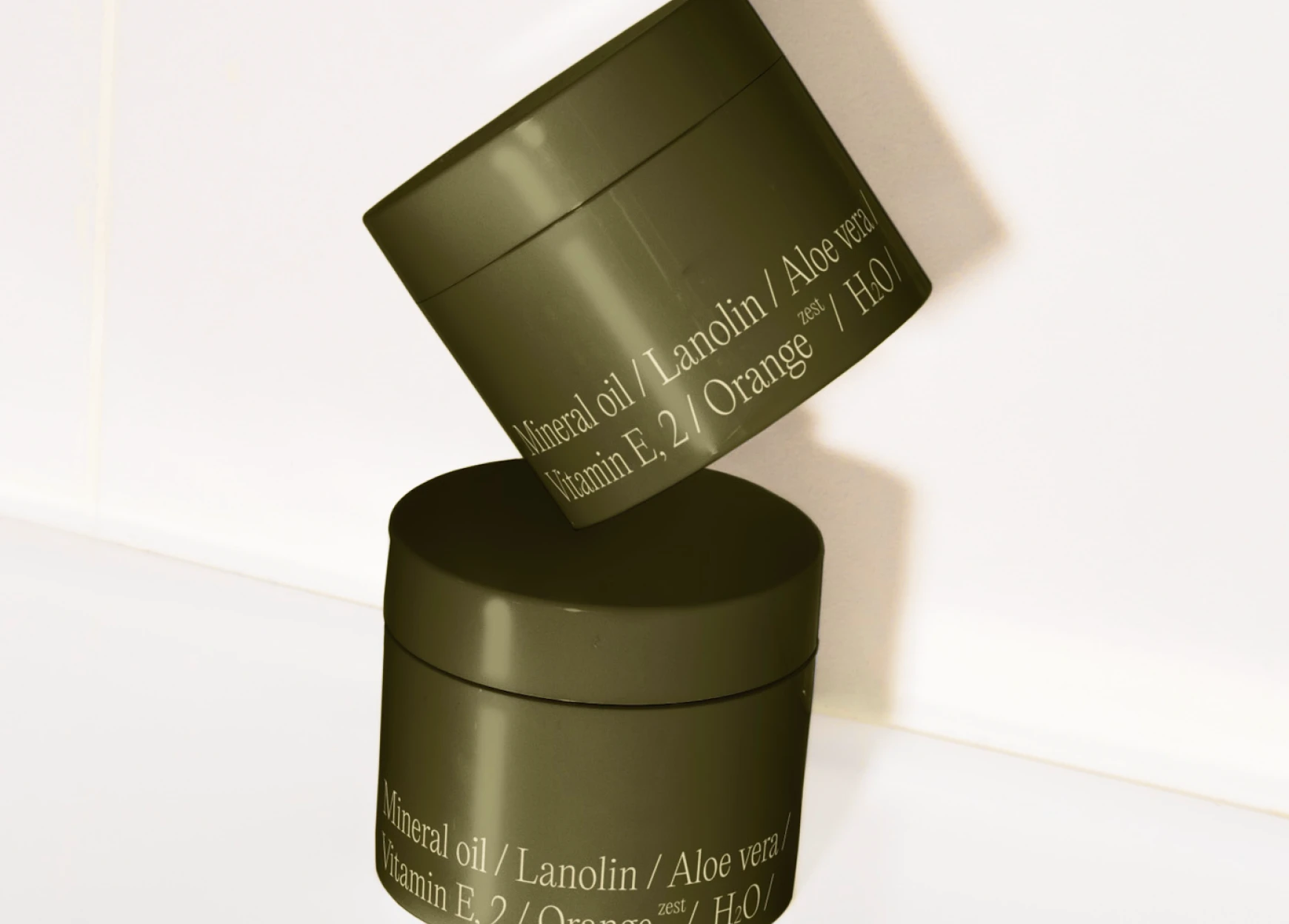
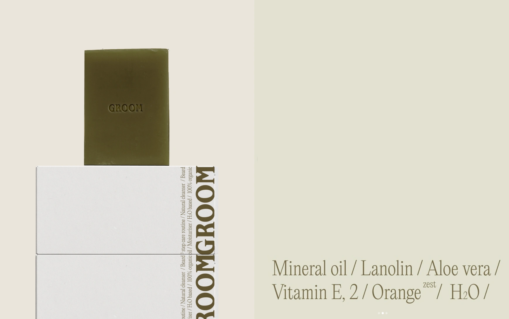
I explored palettes inspired by natural greens and warm neutrals. The typography needed to feel calm but confident. The packaging concepts were kept clean and practical, with small details to show care and attention without overcomplicating things.
3 — The Deliverables
Brand strategy and positioning
Visual identity system (logo, colours, typography)
Packaging design for the core products
Brand guidelines for consistency across all uses

4 — Highlights and Learnings
This project reminded me how powerful it is when design grows from a clear story. Once we had the strategy, the identity felt like a natural step forward.
The result is a brand that feels approachable yet polished. I really enjoyed being part of the process and working closely with the team. It was inspiring to see how thoughtful conversations turned into something visual that the client was proud to launch.
Like this project
Posted Sep 16, 2025
GROOM is a men’s skincare brand designed to break away from the sea of predictable blue-and-silver grooming products.
Likes
6
Views
63