Aki | Brand Strategy & Visual Identity
1 — About the Project
Aki is a conscious coffee bar whose name stands for All Kindness and Integrity. The mission was already strong, but the brand lacked a clear and compelling visual identity that could carry that message.
I was asked to define the brand strategy, design the identity, and create packaging that would express Aki’s values in a way that felt authentic and modern.

2 — The Process
We began by exploring what Aki stood for: kindness, integrity, and a mindful approach to everyday rituals. The goal was to reflect these values in a visual language that would feel sophisticated yet approachable.
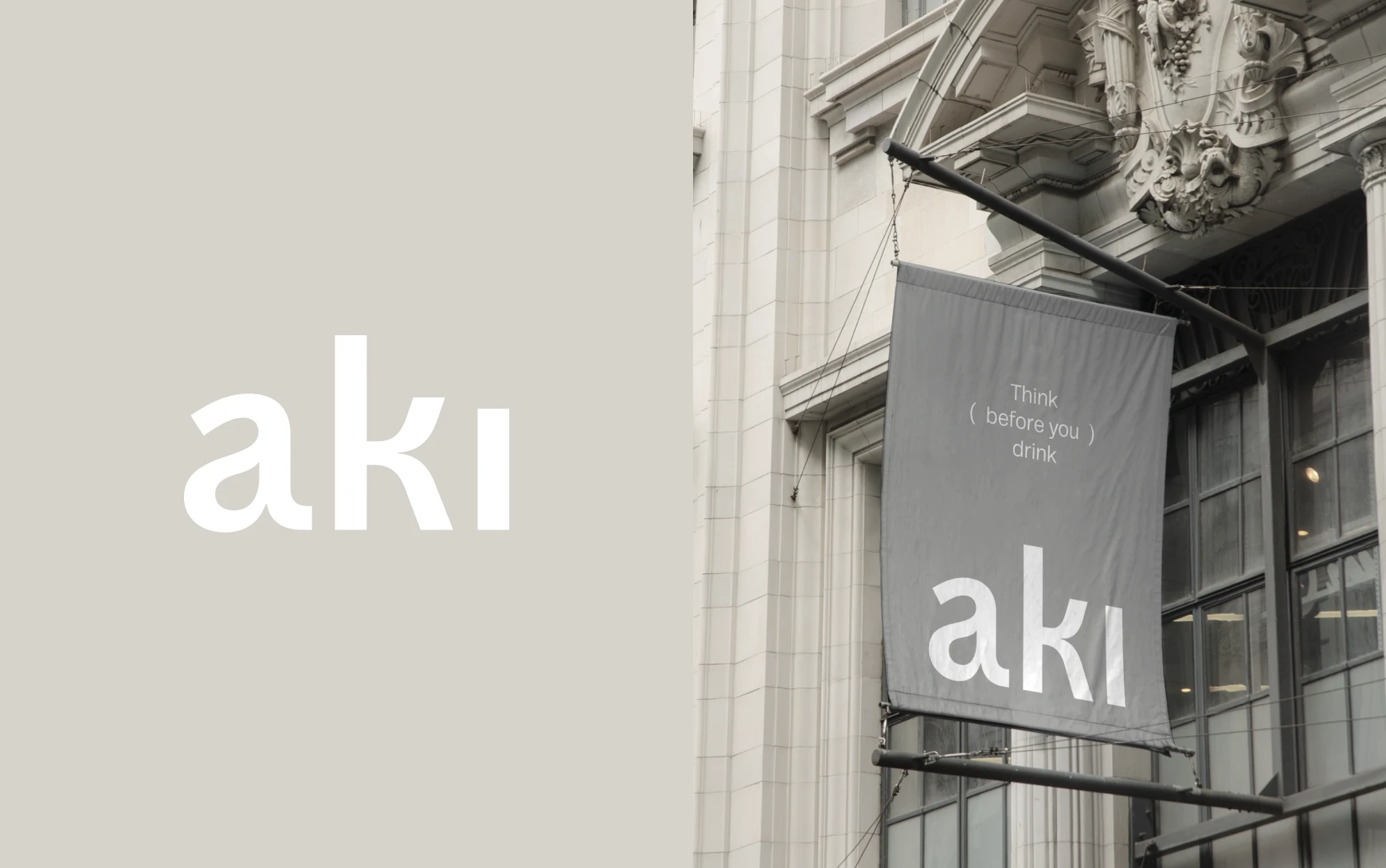
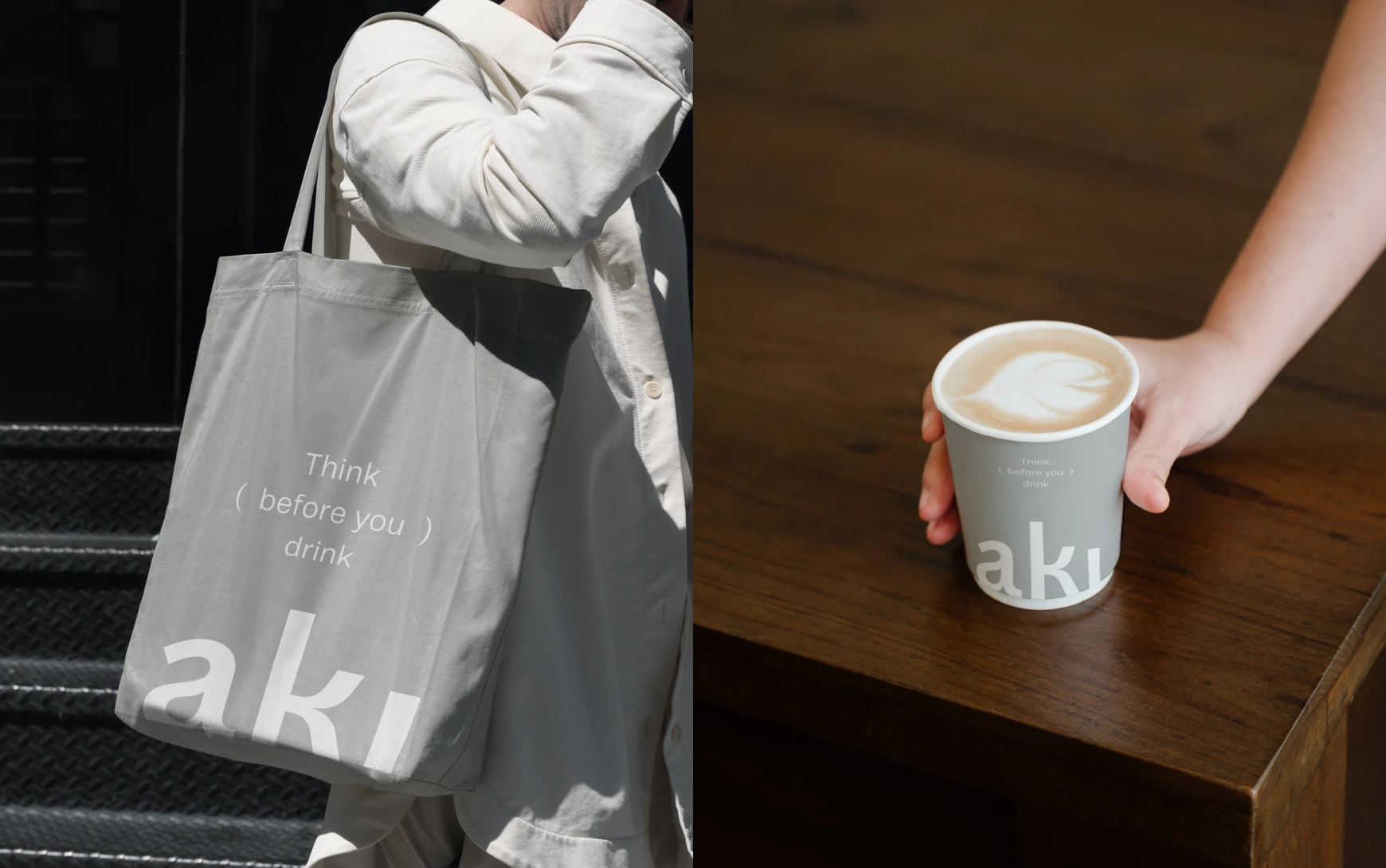
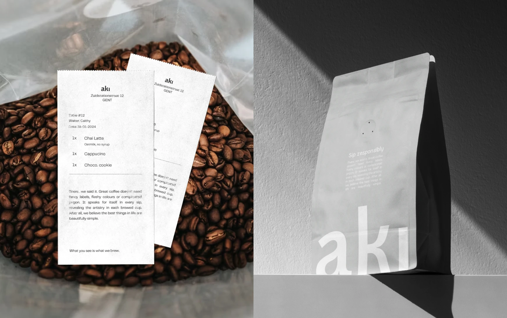
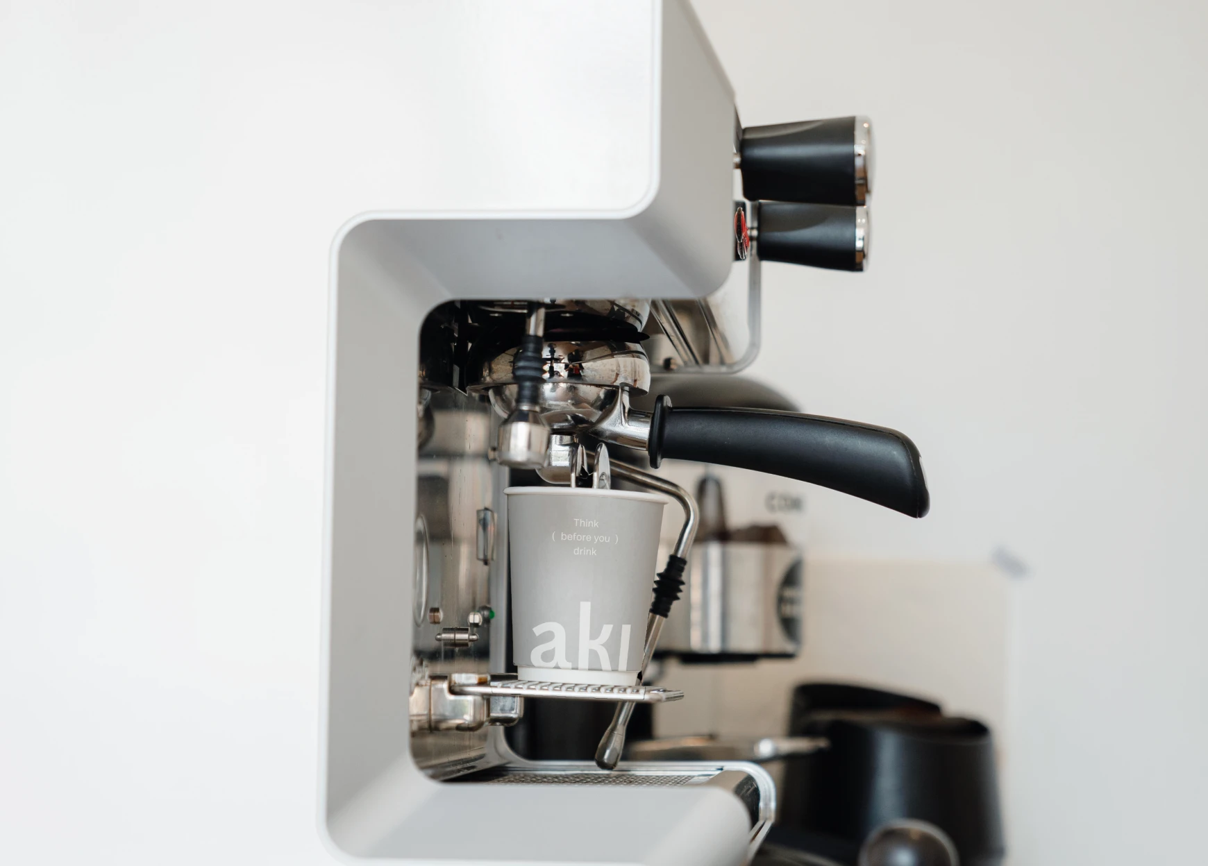
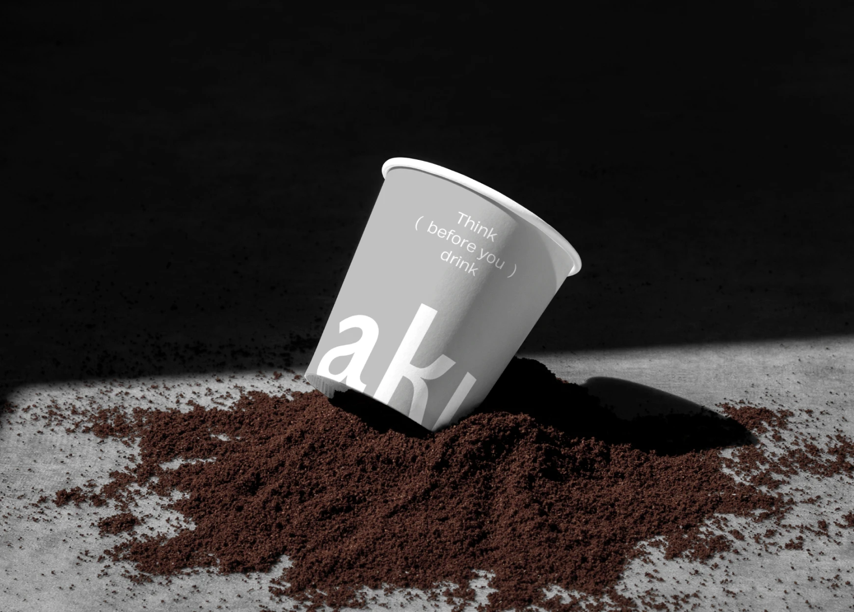
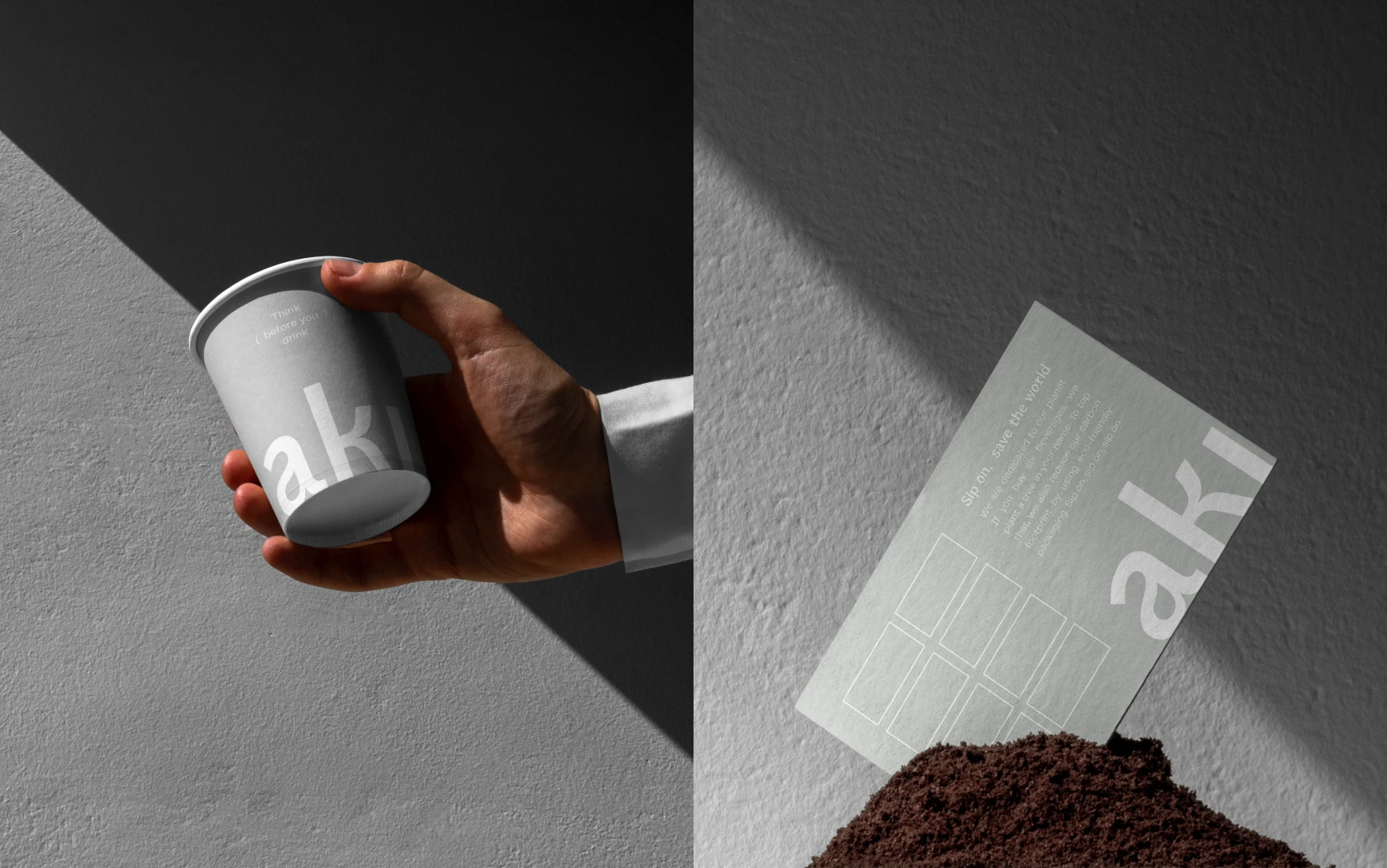
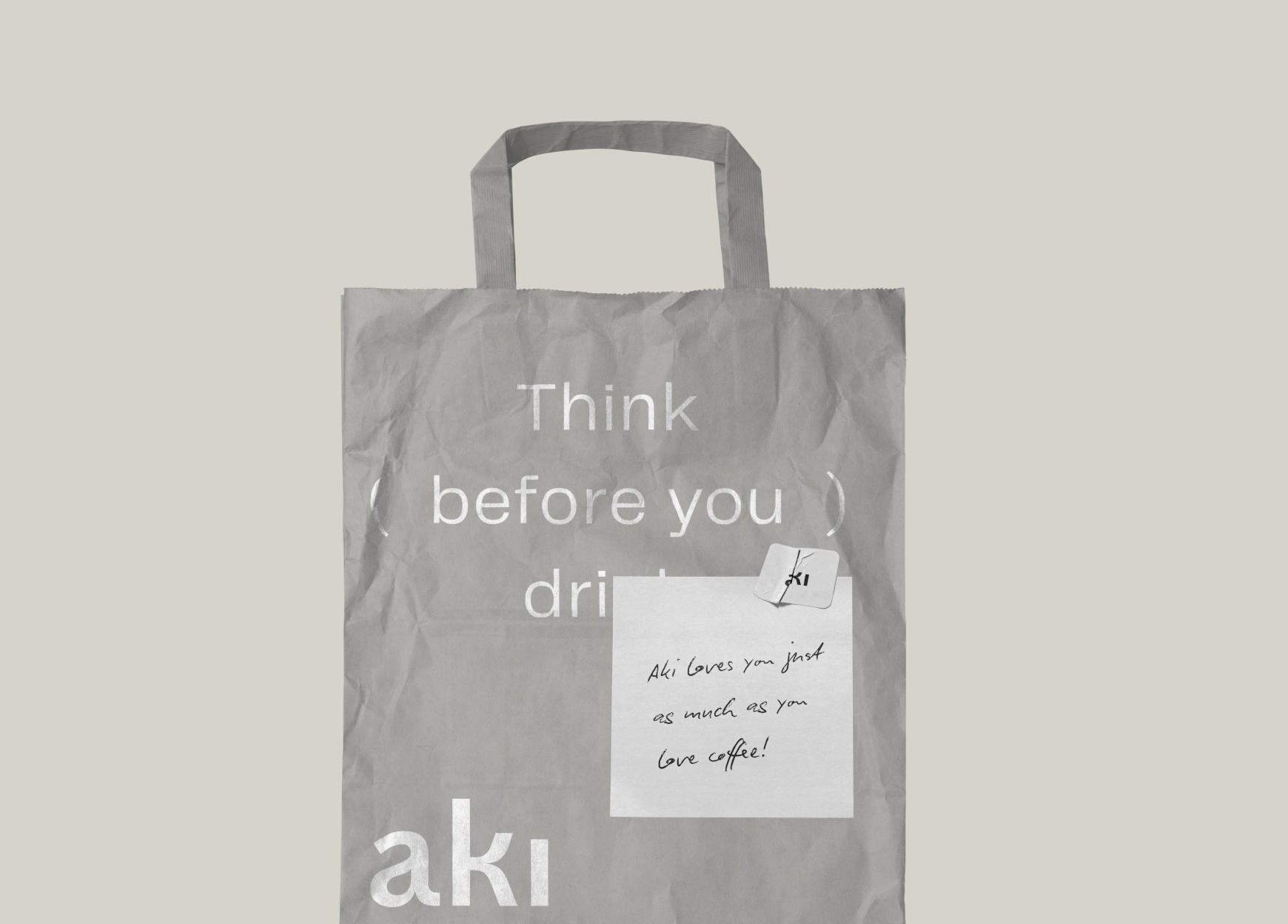
I designed a clean typographic logo and paired it with a muted, natural palette. The identity was built to be calm and understated, letting the mission take centre stage. Packaging followed the same principles, with minimal design choices that supported a conscious lifestyle.
3 — The Deliverables
Brand strategy and positioning
Full brand identity system (logo, colours, typography)
Packaging design
Guidelines for consistent application
4 — Highlights and Learnings
This project was a reminder that sometimes the most powerful designs are the simplest. By holding back and keeping the design quiet, we gave space for the brand’s mission to shine.
The result is an identity that balances eco values with a sophisticated look and feel. Aki can now communicate its story with clarity, while also fitting into the aesthetic expectations of a modern conscious coffee brand.
Like this project
Posted Sep 16, 2025
I created the full brand strategy, identity and packaging. The goal was to reflect their mindful and sustainable values in a simple, stylish way.
Likes
4
Views
8


