Furca: Product Design, Branding & Website
Introduction
Furca, a bootstrapped start-up, approached Serif Labs with a unique challenge: to revolutionize the referral management process within dental practices. The goal was to create a SaaS tool that could track and optimize referrals, ultimately increasing efficiency and revenue for dental service organizations (DSOs).
The referral management process in dental practices is currently decentralized and quite manual, leading to inefficiencies and missed opportunities. Furca had identified key pain points, including the inability to track patient contacts, missed referrals, and inefficient scheduling practices. This lack of insight results in significant revenue loss for practices, highlighting the need for a comprehensive solution.
Furca's vision was to launch an MVP with their first partner, a family-owned DSO with 25 practices across multiple states. Amelia's primary goals were to create MVP designs for the proof of concept launch and develop basic branding for use in the product and marketing materials.
My Role
I was hired as a product designer and product consultant for Furca. I integrated directly with the team, working closely with the leadership team and engineers to develop product requirements, map the user journey, and ultimately, deliver build-ready mocks, branding, and a marketing website.
User Journey Mapping

User Journey Map - Current State
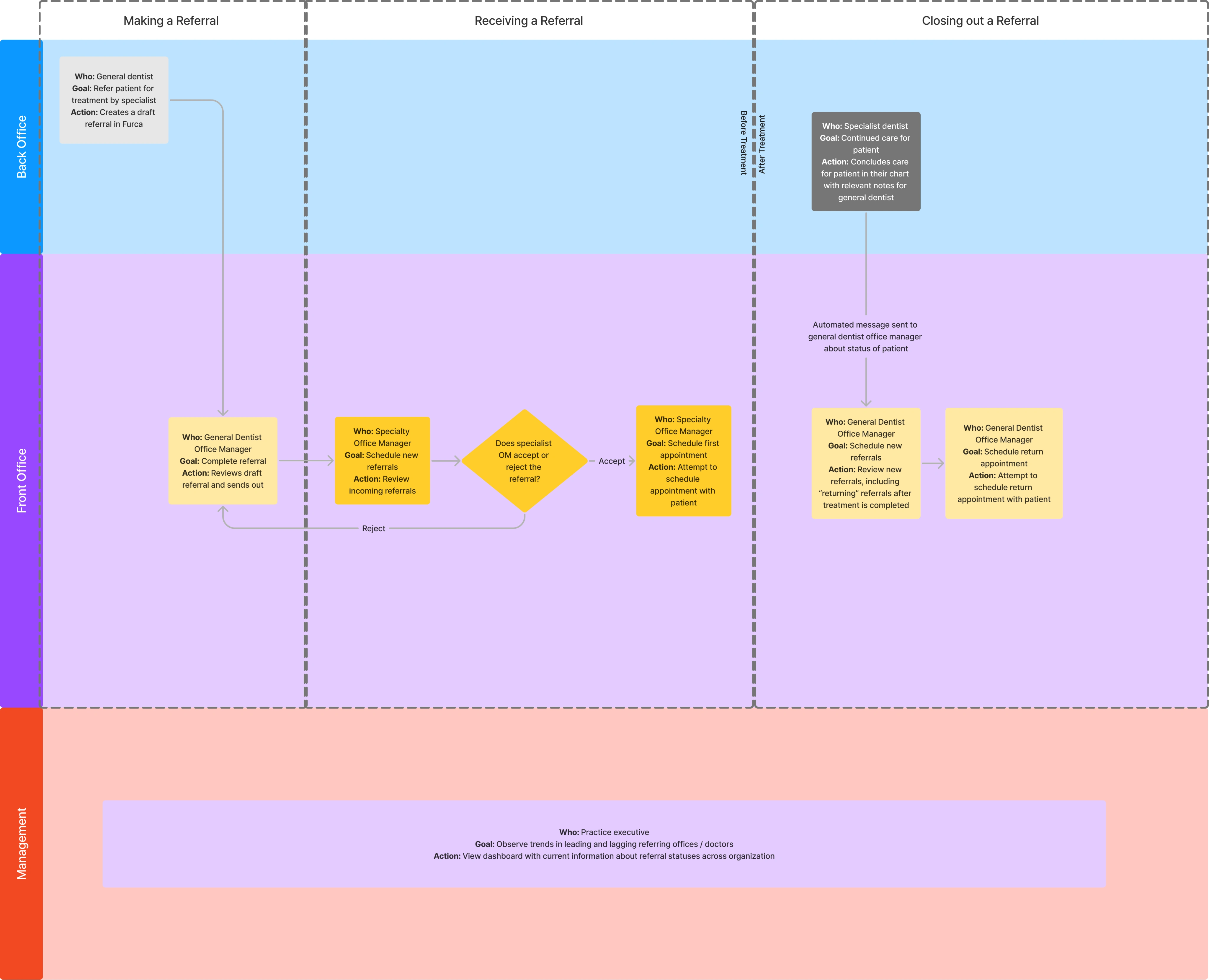
User Journey Map - Future State
When I joined the project, I began by consuming the user interviews the team had conducted, as well as the drafted product requirements document. I used this to sketch out detailed user journey maps to visualize the current and ideal referral processes. Many questions arose from this exercise, and I interviewed the two dentists on the team to help me understand where pain points existed today.
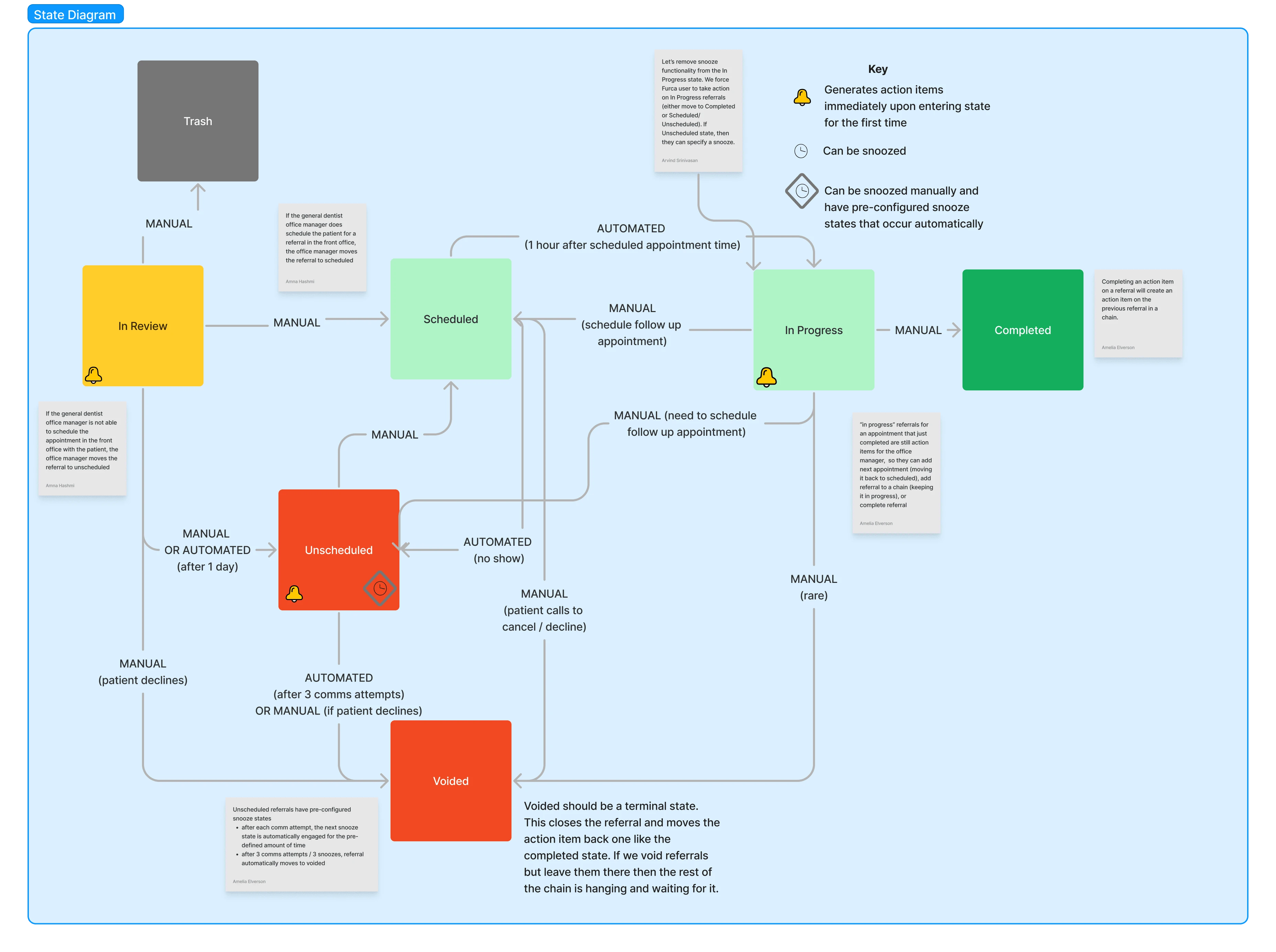
State Diagram
From these user journey maps, I worked closely with the technical team to map out a state diagram for the MVP product. This state diagram proved critical for the backend design of the new product, as well as for understanding how navigation and key decision points should be handled in the frontend. Through this process, we were able to iterate on different abstractions for what we were building - a critical tool for design, product, and engineers to communicate.
Branding & Design System Development
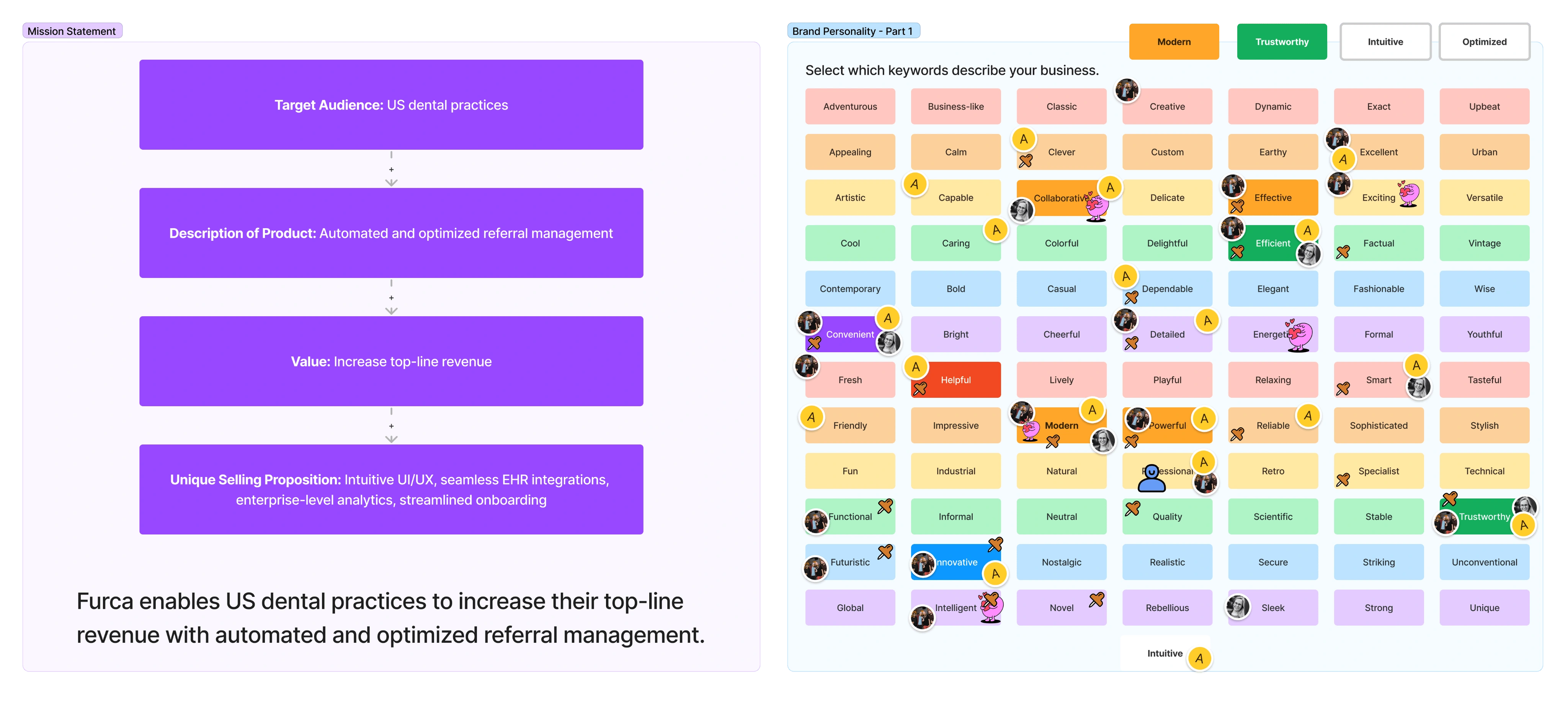
Branding Workshop: Mission Statement & Brand Personality exercises
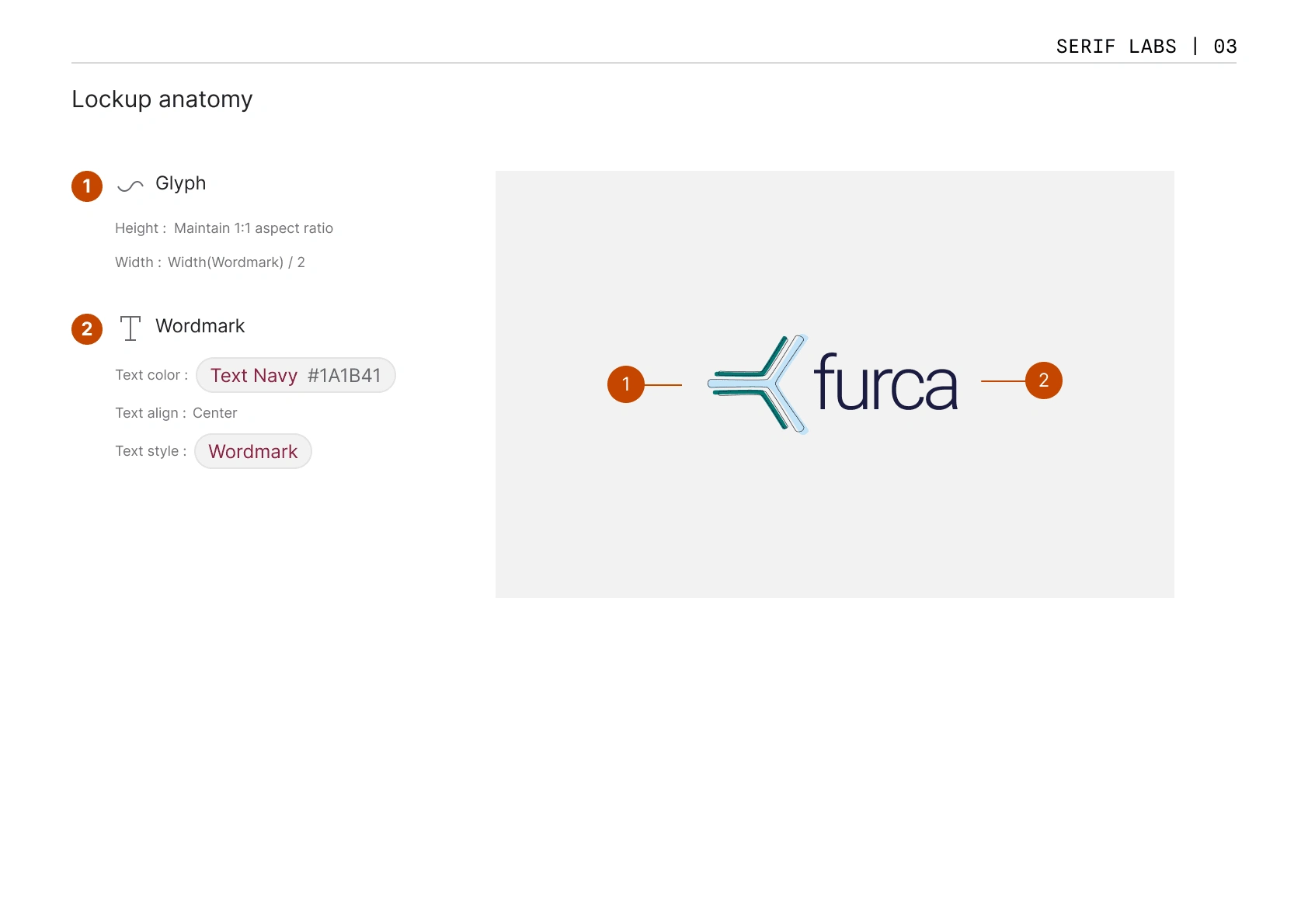
Style Guide: Lockup anatomy
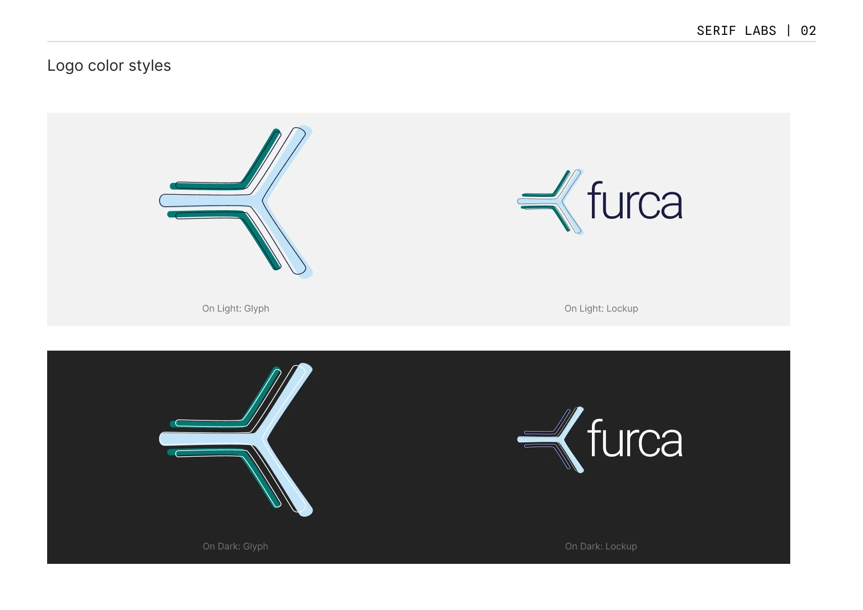
Style Guide: Logo color styles
I led a branding workshop with the Furca team to define the brand's visual identity, including the logo, color palette, and typography. The branding was designed to reflect Furca's innovative approach to referral management in the dental industry while also establishing a sense of trust and credibility with users. To maintain consistency and efficiency in design, I developed a custom design system for Furca, integrating the final branding elements to create a cohesive and recognizable brand image. This system included a set of reusable components, design patterns, and guidelines that ensured a unified look and feel across all aspects of the platform. The design system not only facilitated the design process but also allowed for easy scalability as Furca expanded its product offerings.
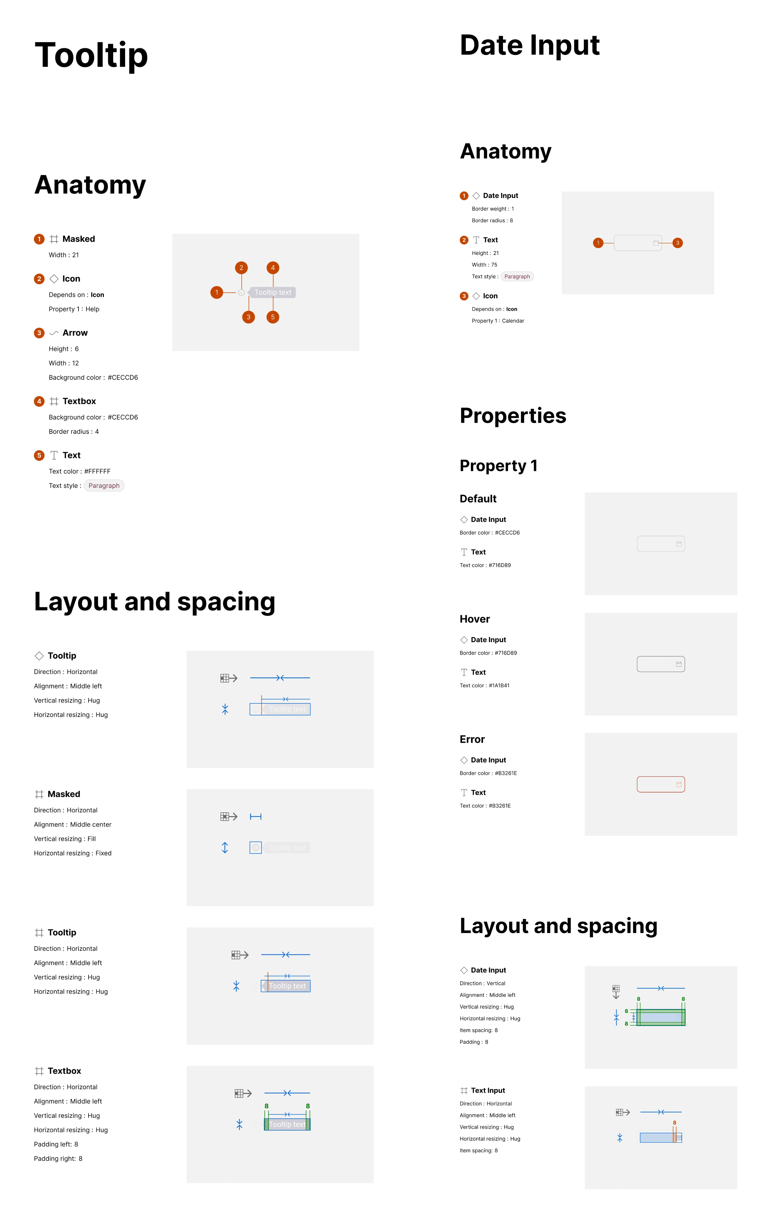
Design System Documentation: Tooltip and Date Input
MVP Product Design
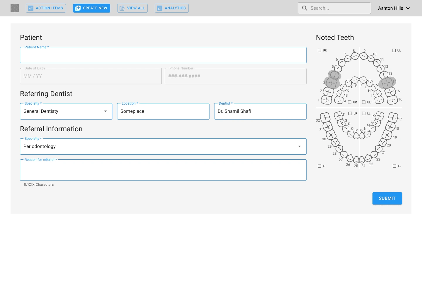
Low Fidelity: Create New Referral page
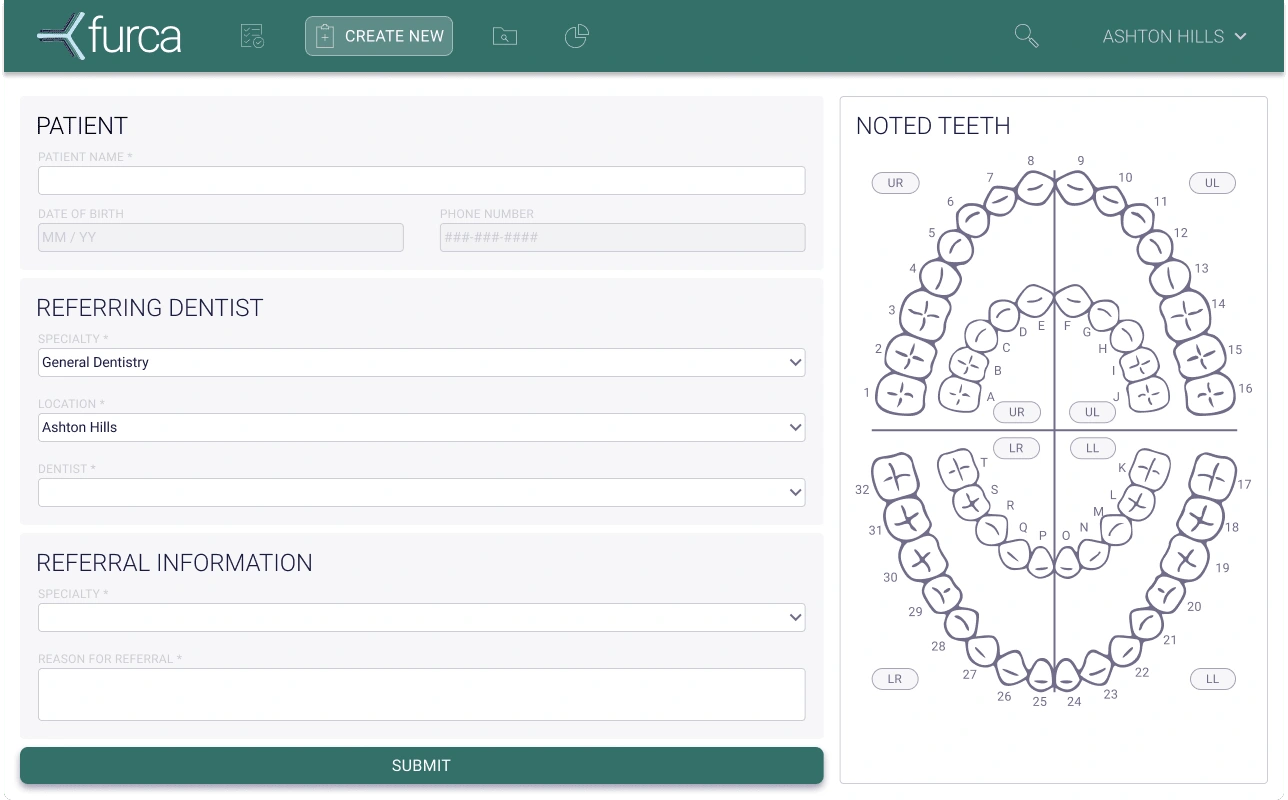
High Fidelity: Create New Referral page
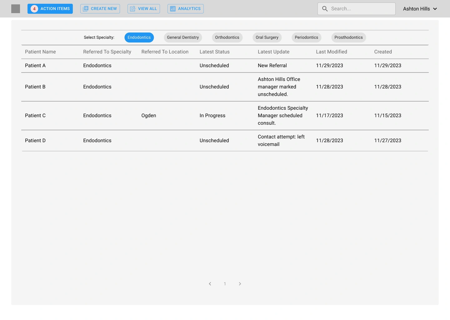
Low Fidelity: Action Items Page
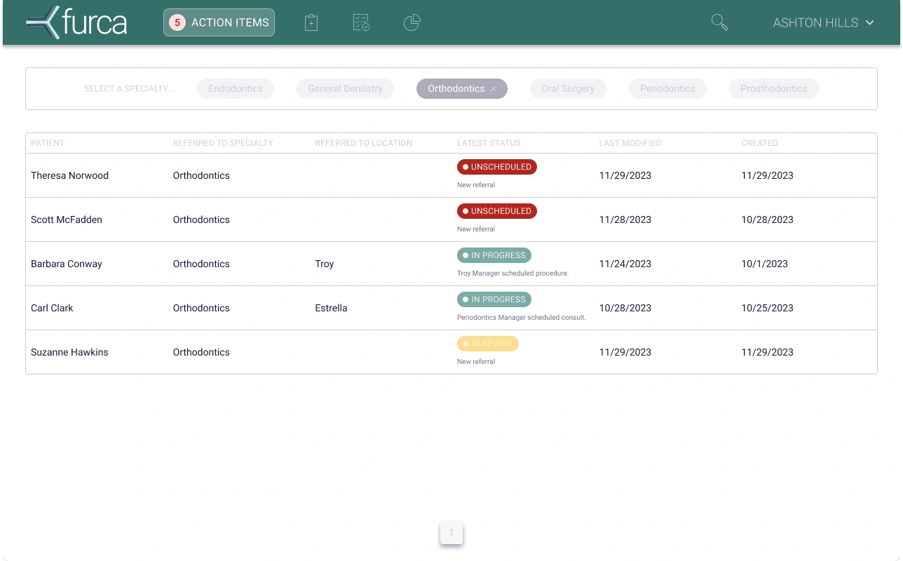
High Fidelity: Action Items page
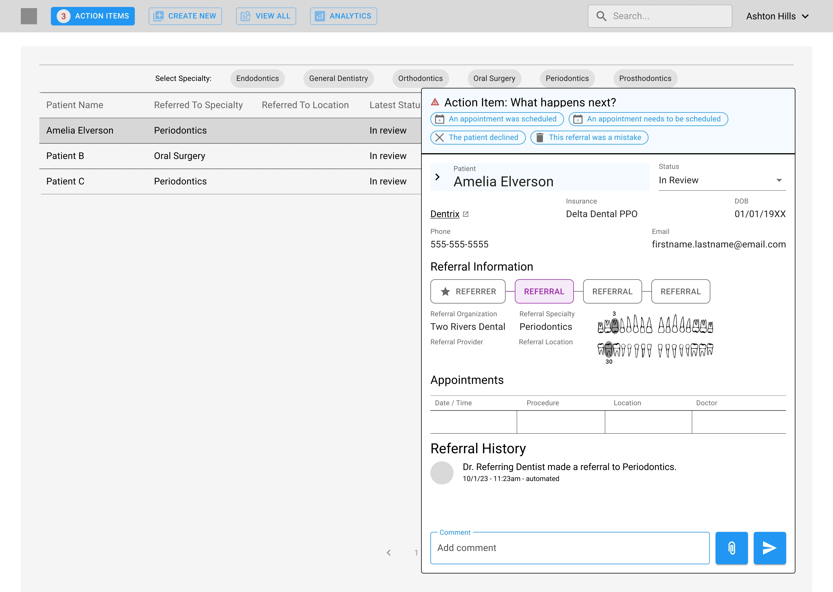
Low Fidelity: Referral Detail side panel
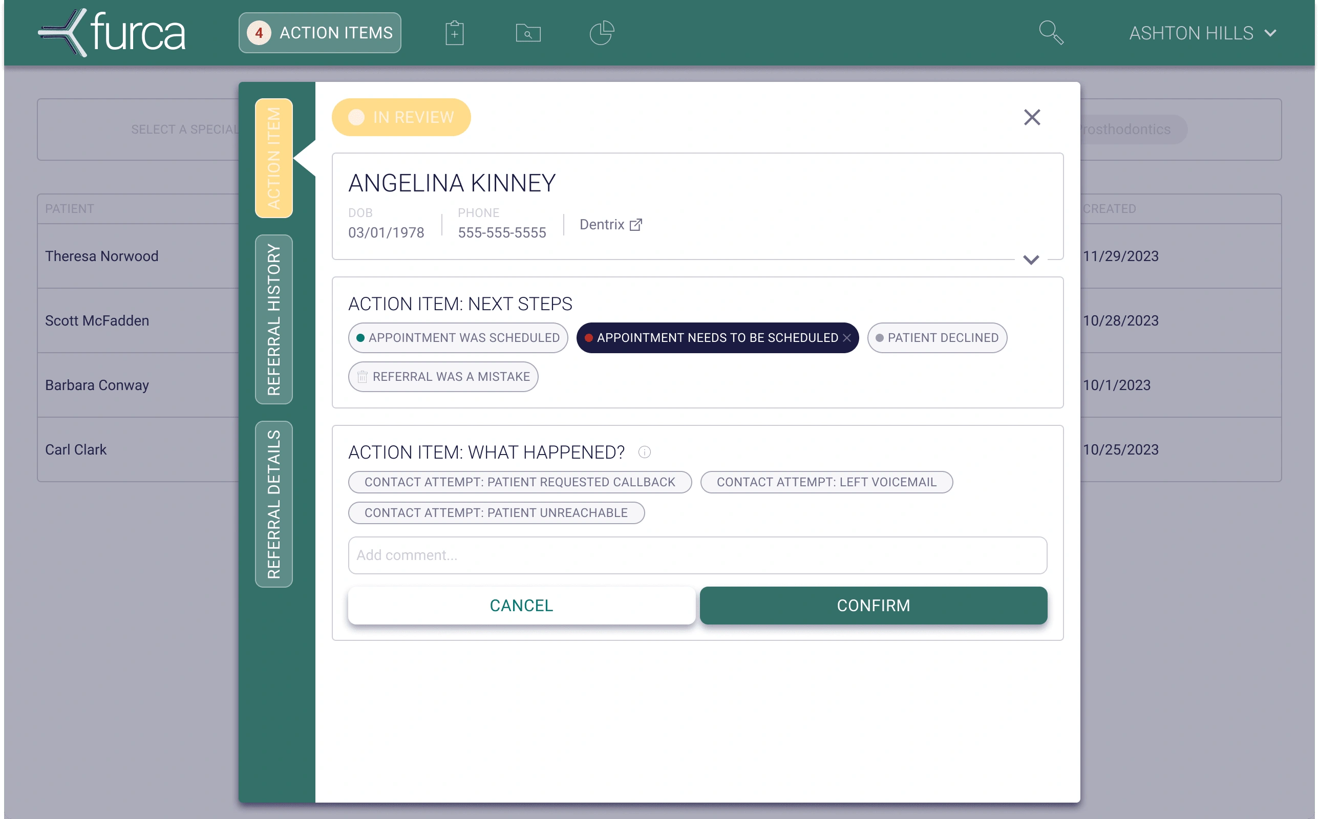
High Fidelity: Referral Detail modal
From the user journey maps and the state diagram, I developed low fidelity user flow mocks that illustrated the step-by-step interactions users would have with the Furca platform. Each screen was iterated upon and refined in collaboration with the Furca team to ensure they achieved the defined product requirements and were technically feasible. While going through this process, there were new product requirements we discovered. Having 2 dentists on the product team was extremely helpful, as I was able to get feedback quickly and continuously on designs, integrating their thoughts. The team brought early mocks to discussions with their MVP launch partner, as well as other potential customers, in order to gain additional UX feedback rapidly.
With low-fidelity mocks and branding in hand, I worked toward scaling up the fidelity and delivering eng-ready designs. My final mocks for Furca were meticulously crafted to ensure they were not only visually appealing but also technically feasible and ready for implementation. As the designs progressed, I was able to add the necessary branding elements, responsive design considerations, error states, and edge cases to ensure a comprehensive design. The final eng-ready designs were delivered with a design doc that included specifications and guidelines for the development team, ensuring a smooth handoff and implementation process.
Marketing Website
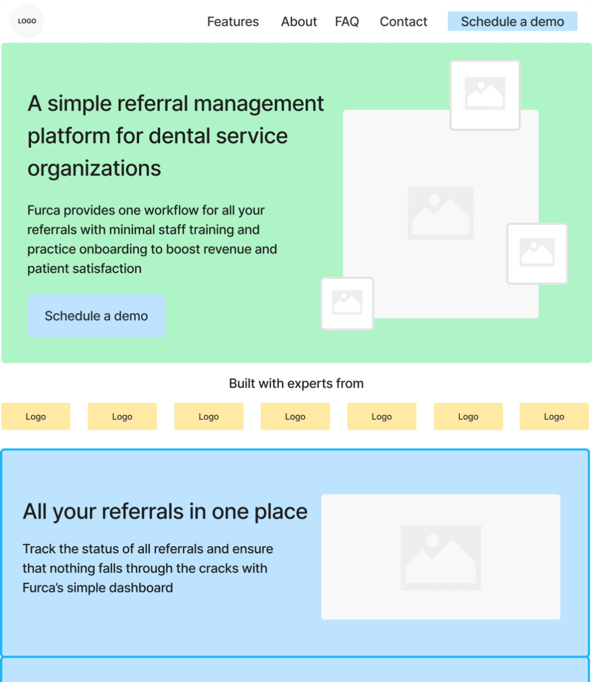
Low Fidelity: Website Wireframes
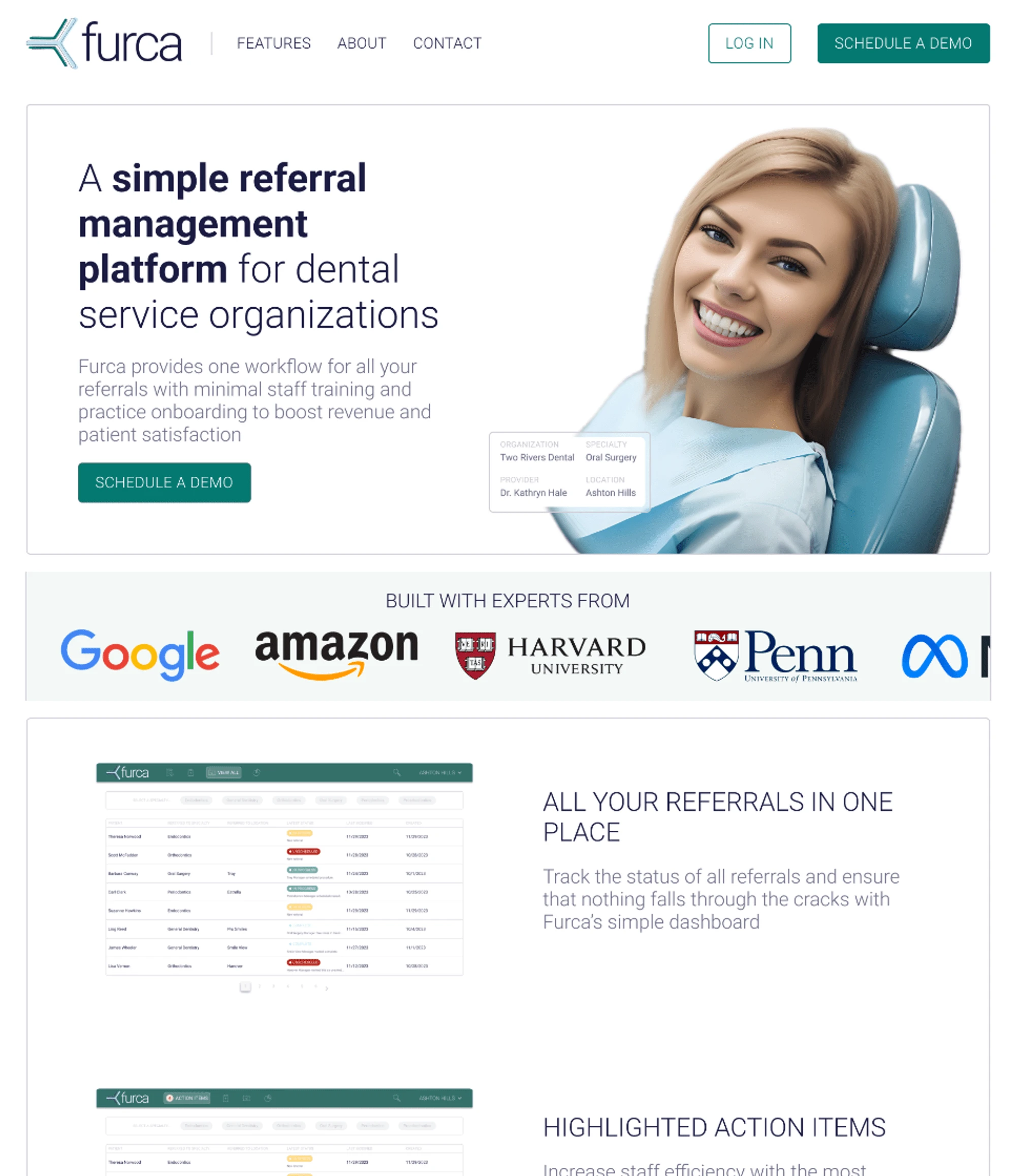
High Fidelity: Website Wireframes (note: these are placeholder graphics)
In addition to designing the platform itself, I also designed and built a skeleton marketing website for Furca. The team wanted something they could launch quickly, but update and grow with as they learned more about their target user and iterated on their value proposition. To do this, I looked at competitior’s websites to understand what the general “feel” for the industry is, and then worked with the business leadership at Furca to develop wireframes for the website. I scaled this up to high fidelity designs in Figma, before building the final website using Webflow. The website's design was aligned with Furca's branding, creating a seamless transition from marketing to product experience and helping to establish Furca as a leader in dental referral management solutions.
Results and Impact
The engagement with Furca has already begun to yield significant results and impact. With the MVP designs implementation in progress and the first DSO launch scheduled for May 2024, Furca is poised to revolutionize referral management in dental practices. The team's use of branded materials and the marketing website has already helped them attract interest from potential customers, setting the stage for additional successful launches and growth. By leveraging my UX design expertise, Furca has been able to create a user-centric platform that addresses the key pain points in referral management, and is well on their way to becoming an industry leader.
Like this project
Posted May 1, 2024
I worked closely with the team to develop product requirements, map the user journey, ultimately, deliver build-ready mocks, branding, and a marketing website.
Likes
0
Views
28


