YouTube: Payment UX Optimization
Summary
In today’s competitive digital landscape, optimizing conversion funnels is critical for enhancing user experience and driving revenue. This case study delves into the process of identifying and implementing front-end A/B experiments to optimize the conversion funnel for YouTube Premium, resulting in a substantial uplift in checkouts and revenue.
Role & Background
As a product manager on the Payments team at Google, I owned the front- and backend of the checkout process across all consumer products at Google. This included Google Play, Stadia, as well as YouTube, among others. Google Payments acts as a platform - when the user decides to make a purchase, they are passed off to the checkout flow, which the Payments team owns. We complete billing, risk checks, any compliance requirements, send a receipt, and then hand the user back to where they came from - all without the user knowing they left. This is a unified experience across Google products, which provides a lot of benefits to the user (like not having to re-enter your credit number!), but also of challenges as a platform (such as how to create a seamless user experience across the checkout process for *all* the different brands).
As the owner of the frontend experience of the checkout flow, I conducted regular UX audits across products for consistency, usability, and accessibility. In this case, I was working with YouTube to conduct a UX audit specifically seeking to **increase the overall conversion rate of the checkout funnel**. I led the UX audit, working with 2 other designers, 1 user research, 1 data scientists, and a team of 6 engineers.
Identifying Conversion Funnel Opportunities
My first step was to do a screen-by-screen UI analysis with the entire team. I brought the entire team together “design crit”-style into a conference room (engineers and data scientist included), and we walked through the journey on each screen size projected onto the big screen. I encouraged anyone on the team to call out potential opportunities, areas of friction or confusion, etc. It was a bit painstaking - but having something that we had been looking at for so long projected in front of all of our peers, clicking through step-by-step, we ended up finding *a lot* of things that might be opportunities.
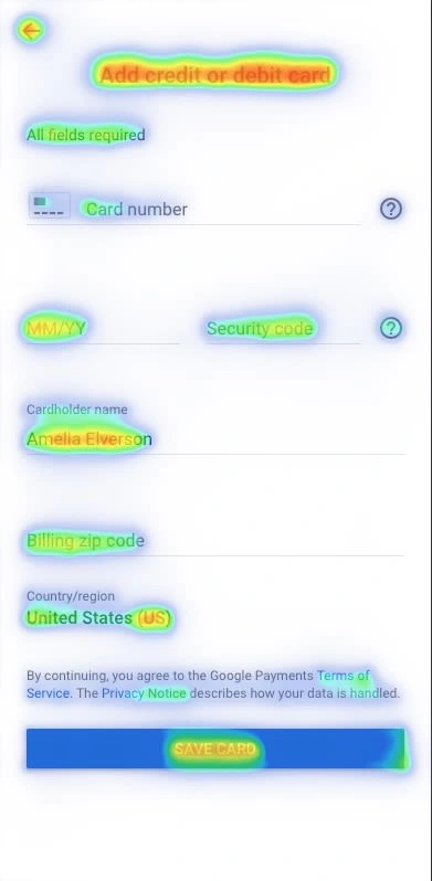
I took copious notes during this session. While I was working through this, I had my data science partner generate heat maps and funnel diagrams so that I could understand where users were falling off in the journey today, as well as what areas users were finding most and least appealing.
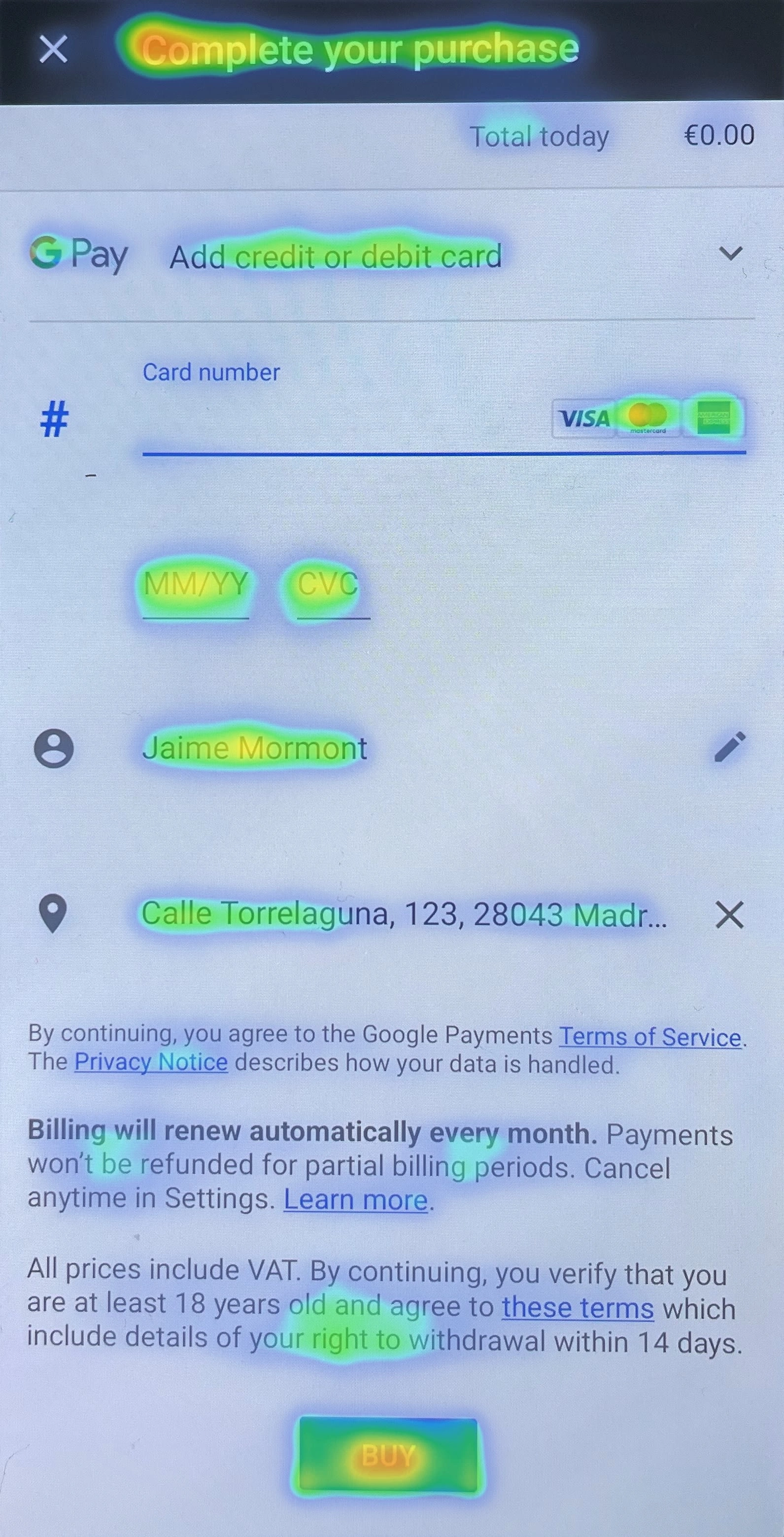
The quantitative data revealed a lot - users were really focused on things that we thought we were helpfully “hiding” by greying out. Our ideation session had also yielded some ideas about how to better use the power of the call to action button and copy, power that was very much backed up by the heatmaps.
Designing and Implementing A/B Experiments
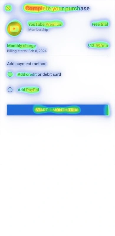
To experiement with these ideas, I created a strategy to conduct front-end A/B experiments targeting key elements of the checkout process. This included alterations in the layout, content, and visual cues within the subscription flow. Collaborating closely with the YouTube teams, designers, engineers, and data scientist, multiple variations were designed and swiftly implemented for testing.
Testing and Iteration
The A/B experiments were rigorously tested on a subset of users (one of the biggest benefits of YouTube’s ginormous userbase is being able to run multiple variations of tests at once to statistical significance in just a day or two!). We measured metrics such as click-through rates, form completion rates, and overall user satisfaction. Iterations were made based on real-time data analysis and feedback, allowing for continuous refinement of the experiments.
Results and Impact
The results were remarkable. The optimized variations from the A/B experiments led to a notable **5% conversion uplift in the US YouTube Premium product checkouts** within the testing period. That increase translated to a **$30 million increase in revenue** in the subsequent quarter. Furthermore, the enhanced checkout process not only improved conversion rates, but also garnered position feedback from users, fostering a smoother and more satisfying subscription experience. The changes we made from this process have now been **rolled out internationally across more than 100 countries and 80 languages**, as well as integrated into the Google Payments best practices for all checkout flows across the platform.
Like this project
Posted May 1, 2024
I identified and implemented front-end A/B experiments to optimize the conversion funnel for YouTube Premium, resulting in a substantial uplift in checkouts.
Likes
0
Views
17
Clients

Tanod Studios Interactive


