Vybbin 🕺🏻
A P2P SaaS platform that connects users to fun activities near them with an easy-to-use UI.
Overview
In search of new experiences, people are always looking for new places to go. With Vybbin, users can book a seat directly with activity hosts for a wide variety of fun events near them. Getting in on the party is fun, easy, and stress-free with Vybbin.
Problem
The client wanted their old website redesigned to better meet their user's needs. They had some issues with it that needed to be fixed such as
Book an activity
Message a host
Rate an activity
Find a new activity
Solution
We changed the website's design to incorporate more of the brand's colors, as well as added key features to help users interact with the site more effectively. Such as
A floating Book Seat button
Message Host button
Activity reviews section
Search new activities carousel
My Role
UX/UI Designer in a team of 5
Tools
Figma
Loom
Zoom
Timeline
6 Months
Process
User Flows
Mid-Fi Wireframes
Style Guide
High Fidelity Screens
Kick Off
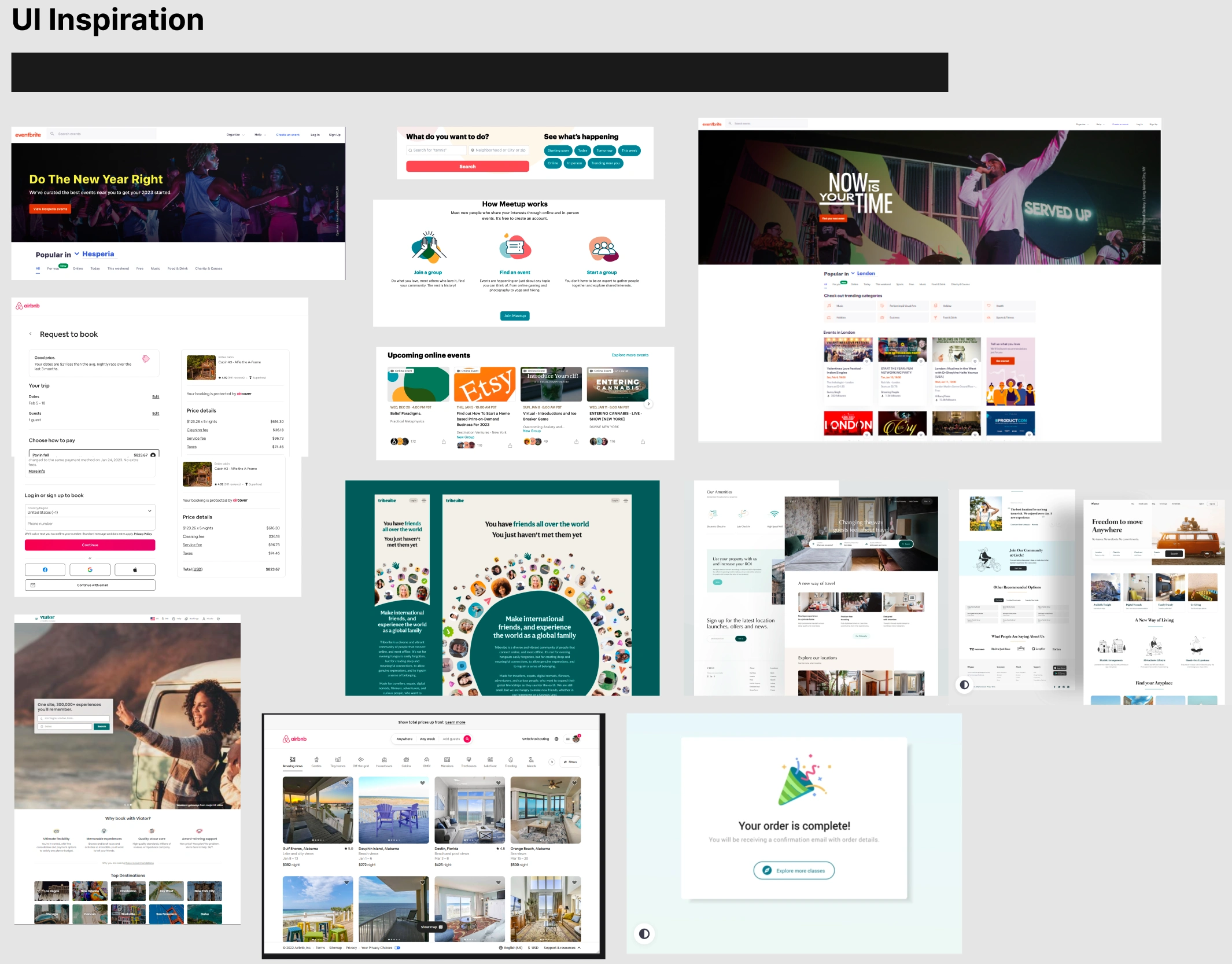
The client provided the team with a Google Drive folder containing company logos and user stories. The team was able to quickly understand the brand's goals and vibe based on the existing website. The client's main area of focus was to create UI similar to that of Airbnb, Meetup, and Eventbrite.
Research
Based on the client's desired UI design, I conducted research in that area. To gather ideas, I examined popular websites like Airbnb, Meetup, and Dribbble. Keeping the company's objectives in mind, I created an inspiration board that highlights crucial design elements that could be applied to this project.
An activity carousel
Different options to log in
Price details page
Booking confirmations page
User Stories
The User Stories were provided by the client. This helped tremendously because we were able to view the product through the eyes of the user and identify their struggles.
Once I had a firm grasp of the user's needs, I began working on sorting the stories from highest to lowest priority to create/identify fundamental values for users.
Story #1
As a user, I want to be able to sign up for the activity by clicking a pinpoint on the map.
Story #2
As a user, I want to be able to view activities based on the categories I’m interested in.
Story #3
As a user, I want to be able to have the option to sign up for an activity as a guest user or a current user
User Flows
Following the User Stories, There were three main user flows that need to be created.
I tackled User Flow #3 which allows the user to book an activity as either a guest or an existing user. By creating this flow I was able to ensure that the user had a simple and easy-to-understand process from beginning to end.
Mid-Fi Wireframes
Creating Wireframes helped us decide which features needed to be in the user interface and how much space it would take up.
I designed User Flow #3's journey, so I also created its wireframes. This was especially helpful for my team because I had a clear vision of what elements needed to be on the screens.
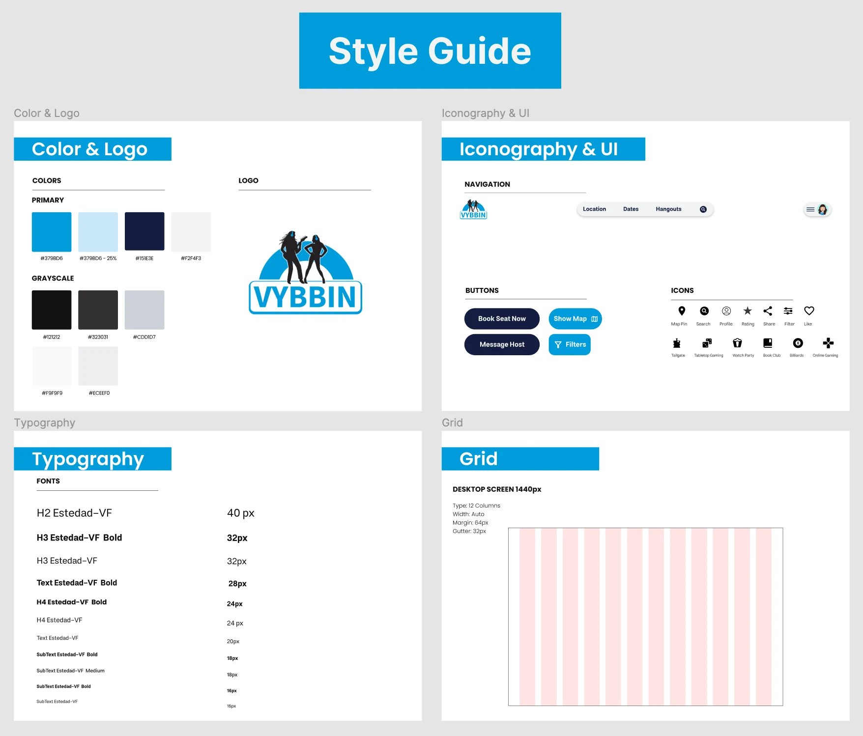
Style Guide
After designing the Mid-Fi Screens, I created a style guide that brings consistency throughout all my Hi-Fi Screens.
The brand's primary colors are blue and white so I used different shades of blue and white to bring depth while maintaining the brand's identity.
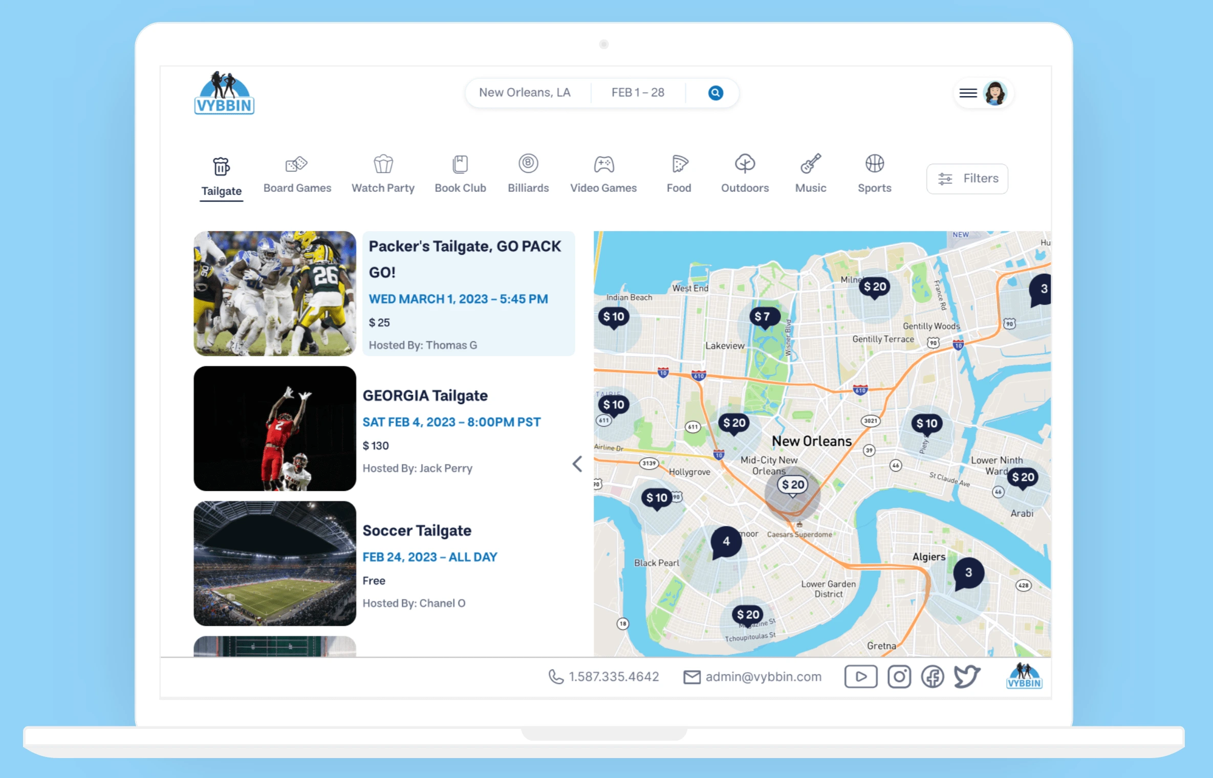
Hi-Fi Screens
Once the Style guide and Mid- Fi screens were up and running I transitioned my way to developing Hi-Fi screens. I left Hi-Fi screens towards the end of the project to ensure the brand colors and screen elements were laid out before filling the screens accordingly. Organizing the project this way led to a higher quality outcome.
Prototype
I created a prototype that linked icons such as map, book now, and activities to their respective pages, so that when users click on them, they are taken directly to those pages. This helped me get a comprehensive understanding of how all the screens work together, and also facilitated usability testing.
Client Handoff
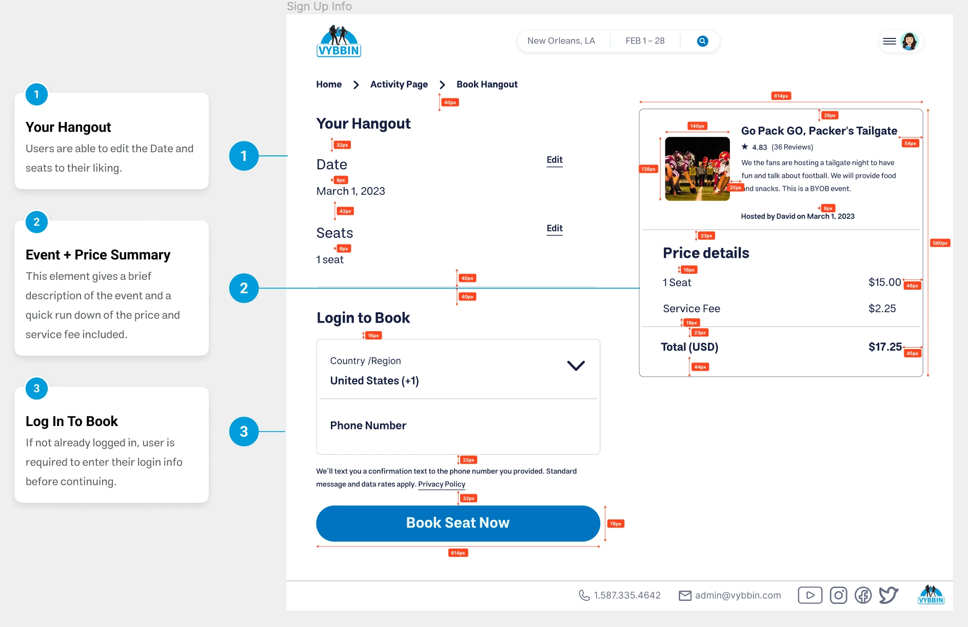
I displayed the Px measurements between each element and annotated each section of the screen. This clarifies the reasoning behind the elements and streamlines the process for both the developer and designer, leading to a higher quality end product and increased user satisfaction.
Thoughts 🤔
This project was a success because I developed strong ties and chemistry with my design team. This was helpful during the Hi-Fi screens where my team and I were able to share ideas seamlessly
Skills 🧠
My UI skills were honed in this project by creating High-Fidelity screens that not only flow with one another but are tailored to the brand's style guide and personality.
Experience 🗣
I had a strong contribution to this project focusing my efforts on User Flow #3 and navigating fellow team members to project handoff.
Like this project
Posted Aug 15, 2023
A P2P SaaS platform that connects users to fun activities near them with an easy-to-use UI.
Likes
0
Views
14

