Bibble Brand Identity
Becs Ellingham
Bibble is a passion project based on an Instagram account that had compiled a brief weekly for designers to join.
The Brief:
The brief for Bibble was to develop a visually engaging user-friendly design for their brand identity and packaging that communicates the brand's dedication to quality, comfort and style in baby essentials.
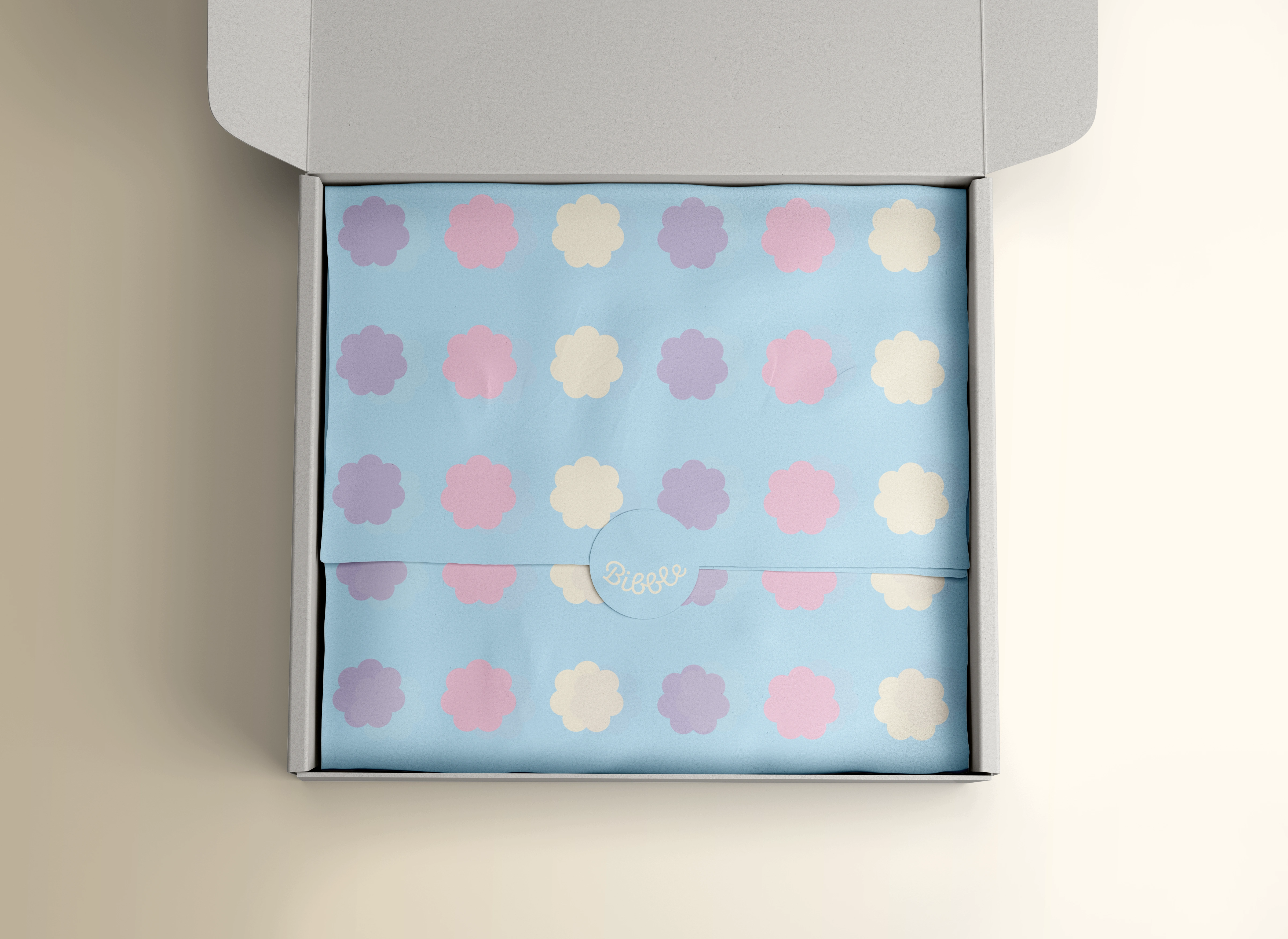
Bibble packaging and tissue paper
Target audience:
The target audience was parents and caregivers that were looking for practical, high-quality and stylish bibs that make mealtime cleaner and more enjoyable for their babies.
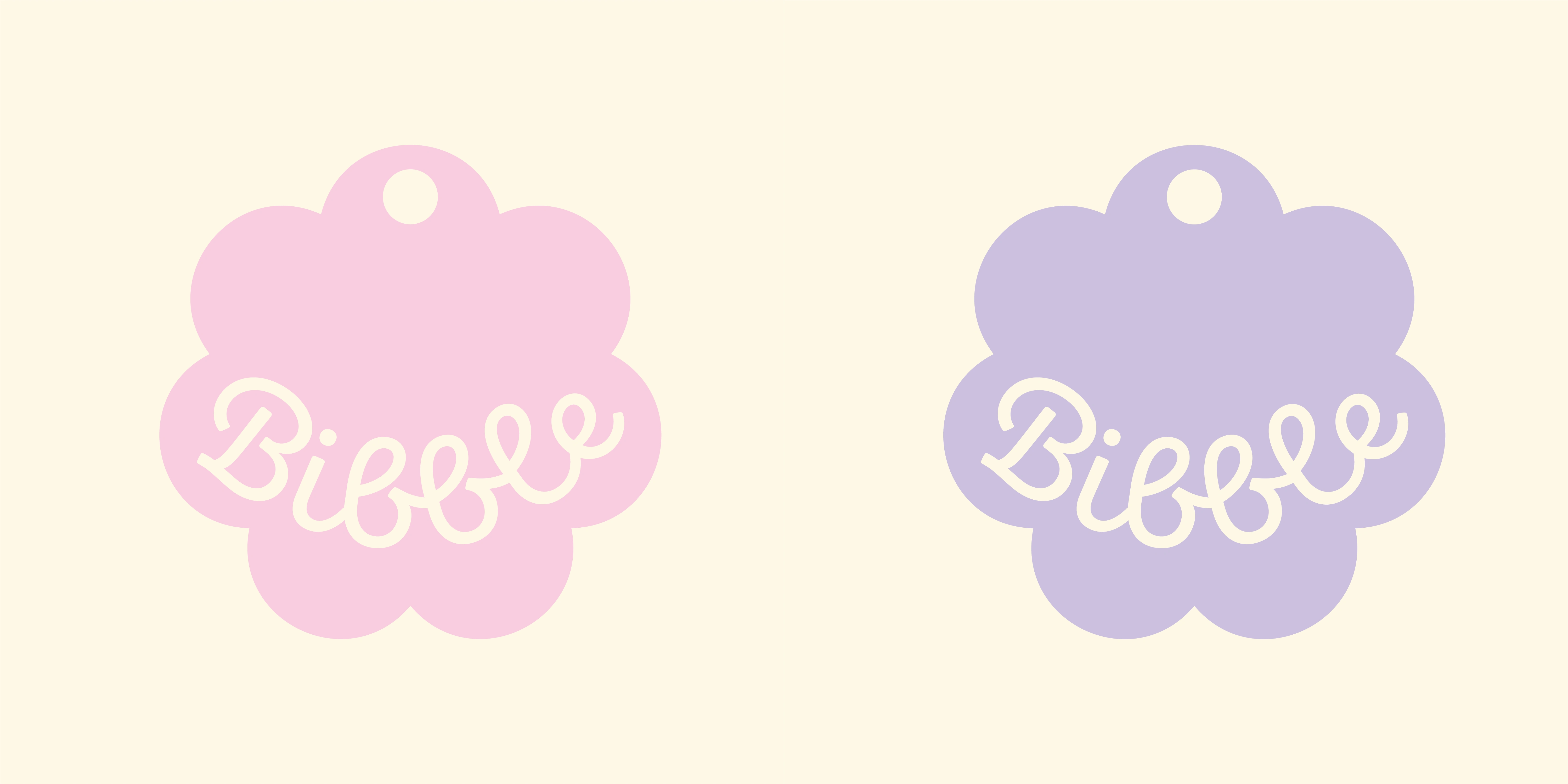
Bibble logo variations
Tone & Style:
The tone & style was soft, warm and approachable with a focus on gentle, pastel colours that convey comfort and care. The design needed to evoke a sense of trustworthiness and joy, appealing to parents who prioritise functionality and aesthetics.
Key Elements:
Logo: A soft, playful wordmark that conveys a friendly child-centred approach.
Colour Palette: Muted, pastel tones that create a gentle, soothing aesthetic.
Illustrations: Simple, charming illustrations that capture the brand's playful side, such as food, baby animals, or minimalistic patterns.
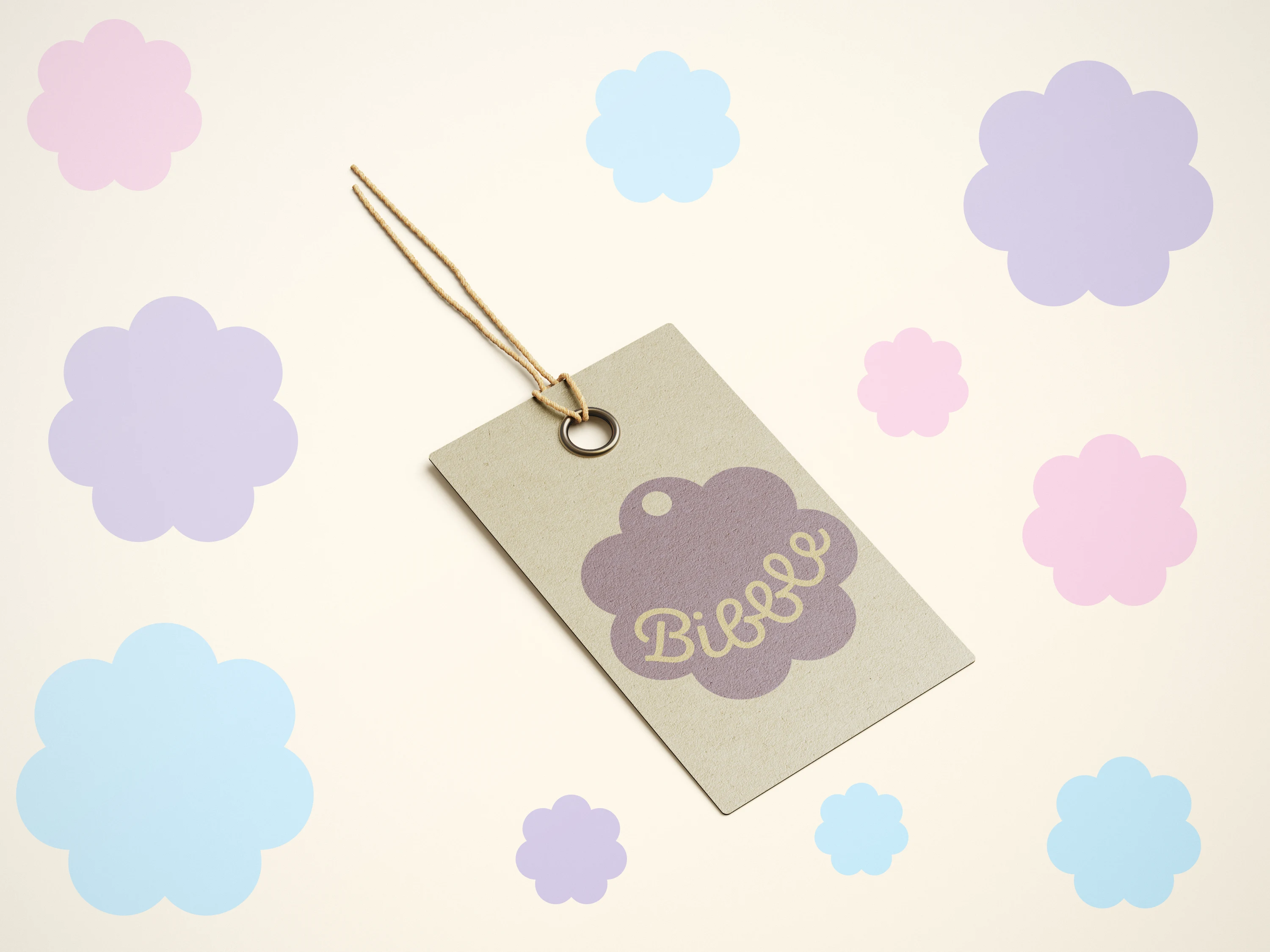
Bibble label
Outcome:
In the newly Bibble brand I incorporated minimal, charming scallop shapes in the illustrations, each with a small cut-out at the top to symbolise the shape and functionality of a bib. The soft, rounded scallops mimic the look of fabric edges and subtly conveys the brand's focus on gentleness and protection.
A connected, friendly script was used for the logo, with a smooth flow that reflects warmth and approachability. The text is also slightly curved, again mirroring the shape of a bib draped around a baby's neck, adding an extra layer of symbolism to the brand.
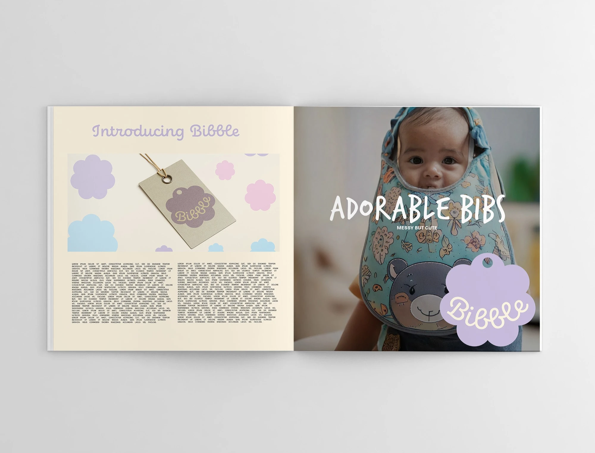
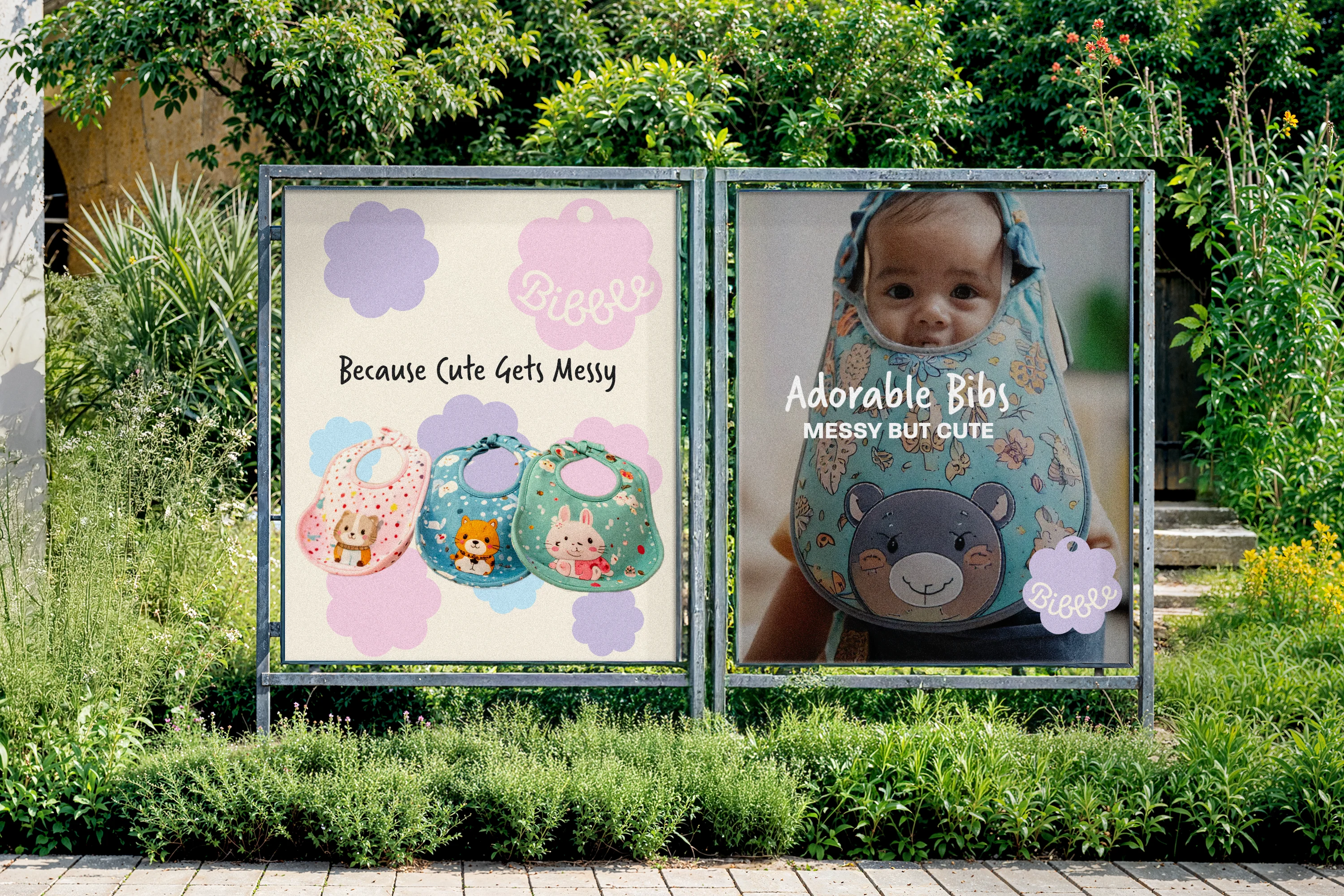
Bibble feature in a magazine
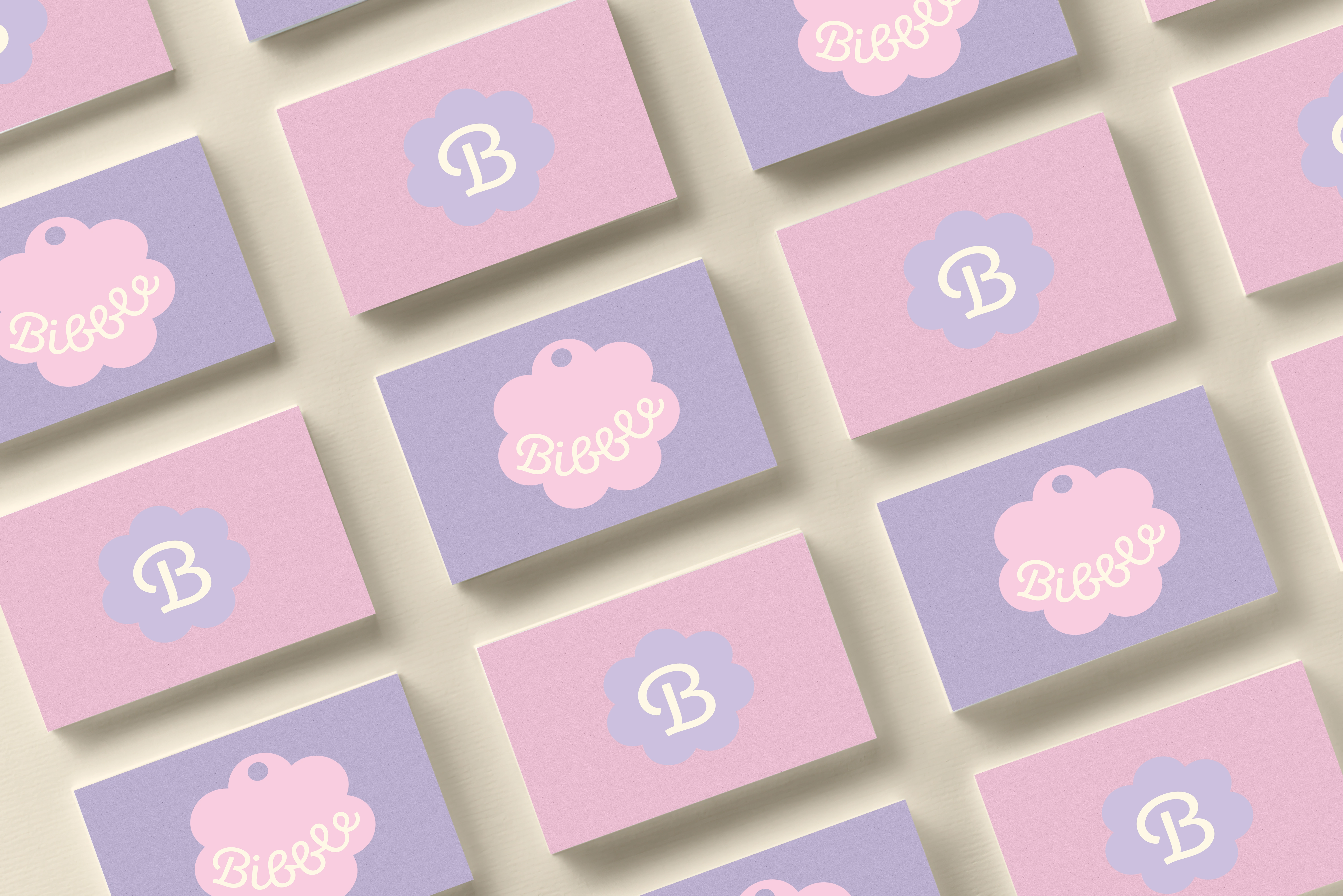
Bibble business cards
Like this project
Posted Sep 11, 2025
A brand identity created for Bibble (as a passion project), using Affinity Designer, Affinity Photo and Procreate to create the illustrations and logo.
Likes
0
Views
4
Clients
Bibble