Sipps Brand Identity
Becs Ellingham
Sipps is a passion project based on an Instagram account that had compiled a brief weekly for designers to join.
About the Brand:
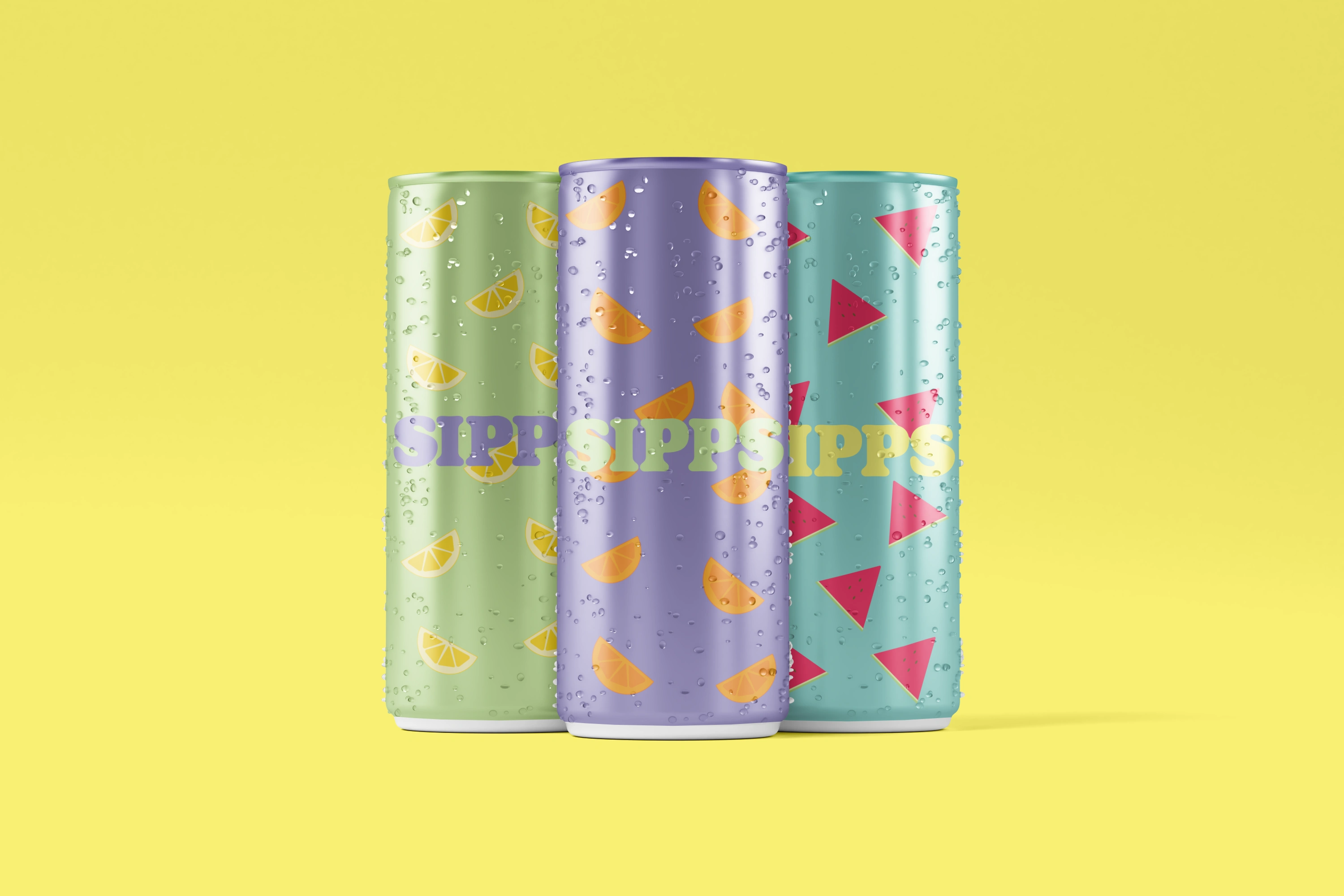
Sipps is the ultimate destination for refreshing beverages crafted with the finest natural ingredients. Offering a variety of delightful drinks, Sipps is designed to quench people's thirst whilst invigorating their senses. Each can is a testament to quality and flavour, delivering a vibrant burst of taste and a rejuvenating experience with every sip.
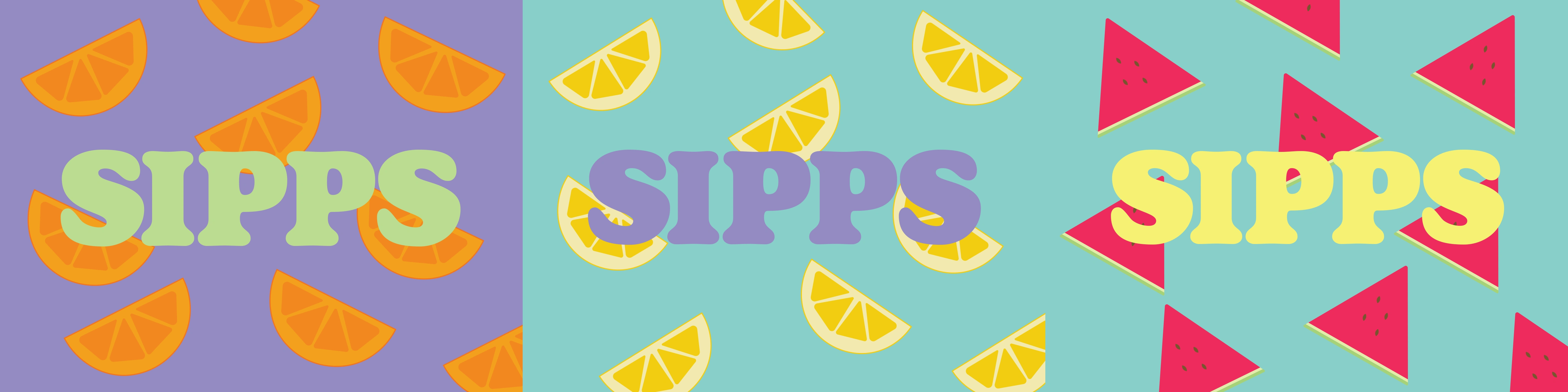
Sipps Logo Variations
Outcome:
The logo choice was simplistic, using a unicase geometric headliner font, to help create a sleek and cohesive visual identity. This allowed for the illustration to take centre stage, featuring vibrant and playful patterns of fruit slices, which was tailored to highlight each beverages' unique flavour. The patterns are arranged to be eye-catching on each of the individual packaging, with each flavour featuring its signature fruit to ensure instant recognition.
The Sipps colour palette combines vibrancy and sophistication, using a sunny yellow, a soft green, a refreshing aqua, and a rich lavender, to create a dynamic and visually appealing brand identity.

Sipps Pack of Cans
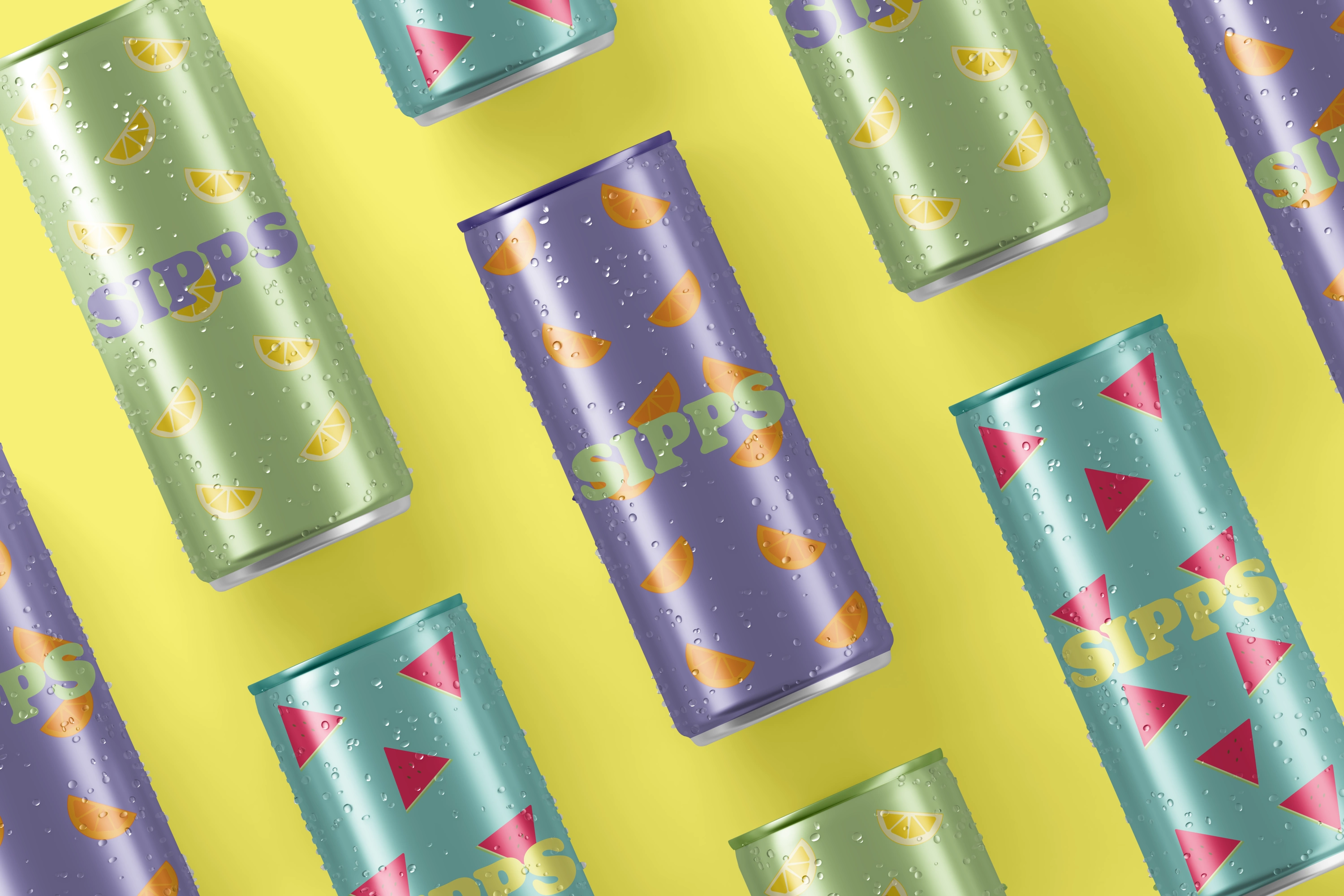
Sipps Cans
Like this project
Posted Sep 11, 2025
A full brand identity created for Sipps (a passion project) using Affinity Designer, Affinity Photo and Procreate.