Corporate website redesign - David Babijaev
Sector
HVAC manufacturerIndustrialAir curtainsResearch and development
Challenge
Redesign the experience for company customers, focusing on the way in which they browse the product catalogue, select the right product and request a quote to boost engagement on the website.
My role
User research and testing, user flow and journey mapping for different personas, information architecture, prototypes and mockup design.
Success Metrics
Decrease the average time users spend on a website looking for products and requesting price quotes. Maintain customer retention and commitment.
Understanding the existing interface
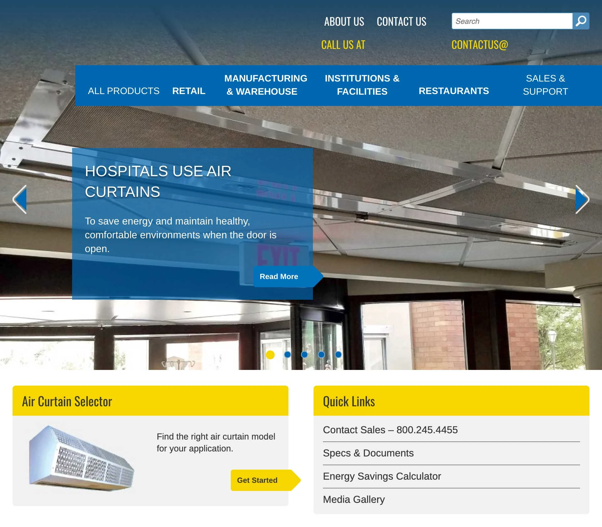
The previous version of the website had a content slideshow as the main UI element with autoplay set to on. The main menu isn’t very intuitive and had a boxed layout which caused menu items' text to wrap and expand its height and push the rest of the page down. The top part of the navigation felt redundant and had duplicated items. The brand offered a few main industries as a major part of navigation. Some important menu items were hidden under the dropdown menu and required additional user interaction. The layout is somewhat confusing and not revealing essential content that could potentially generate leads or familiarize site visitors with brands’ products and services.UI elements didn’t have enough space between them.
The content was written mainly for SEO optimization purposes rather than to be user-friendly and promote the brand.
The main CTA is to contact sales and download product specifications and documentation which creates a feeling the website is built solely for technical people who are already familiar with the product catalogue.
Design Process
Before starting my design work, I communicate with stakeholders to make sure we are all aligned on the goals of the product, overall project scope, and research on the target user. Therefore, I always set up an interview meeting between the product owners, engineers, and marketing strategy teams. I find it useful to map out the customer journey of the product and to discover the opportunity areas. Create efficient concepts, flows, and experiences.
Goals
What do you want to accomplish with the Website?
Audience
Who is the Website for?
References
What other Websites resemble what you want to have?
Rules & Limitations
Are there any rules & limitations?
Research
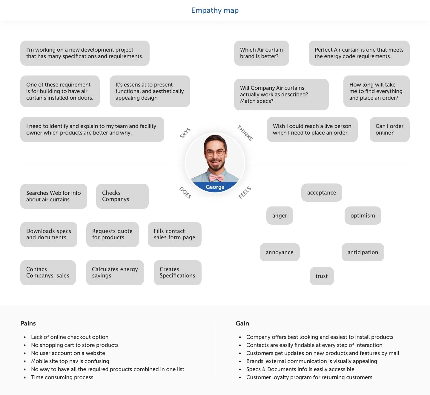
To help me understand how site visitors navigate and what factors affect their decision, I’ve conducted face-to-face interviews and Zoom calls to watch the testers while using the website. I gave them tasks and asked them to think aloud.

Persona
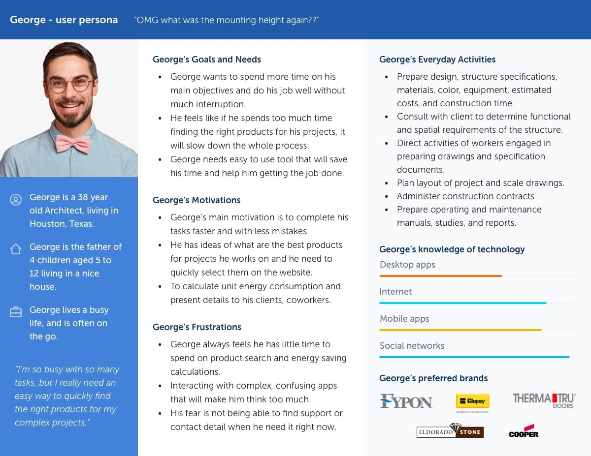
In order to understand the various types of users, I created so-called proto-personas, which are based mostly on industry knowledge and assumptions. These serve as a starting point to reflect on the needs and problems of the user and potential solutions that can be considered in developing the information architecture.
Journey mapping
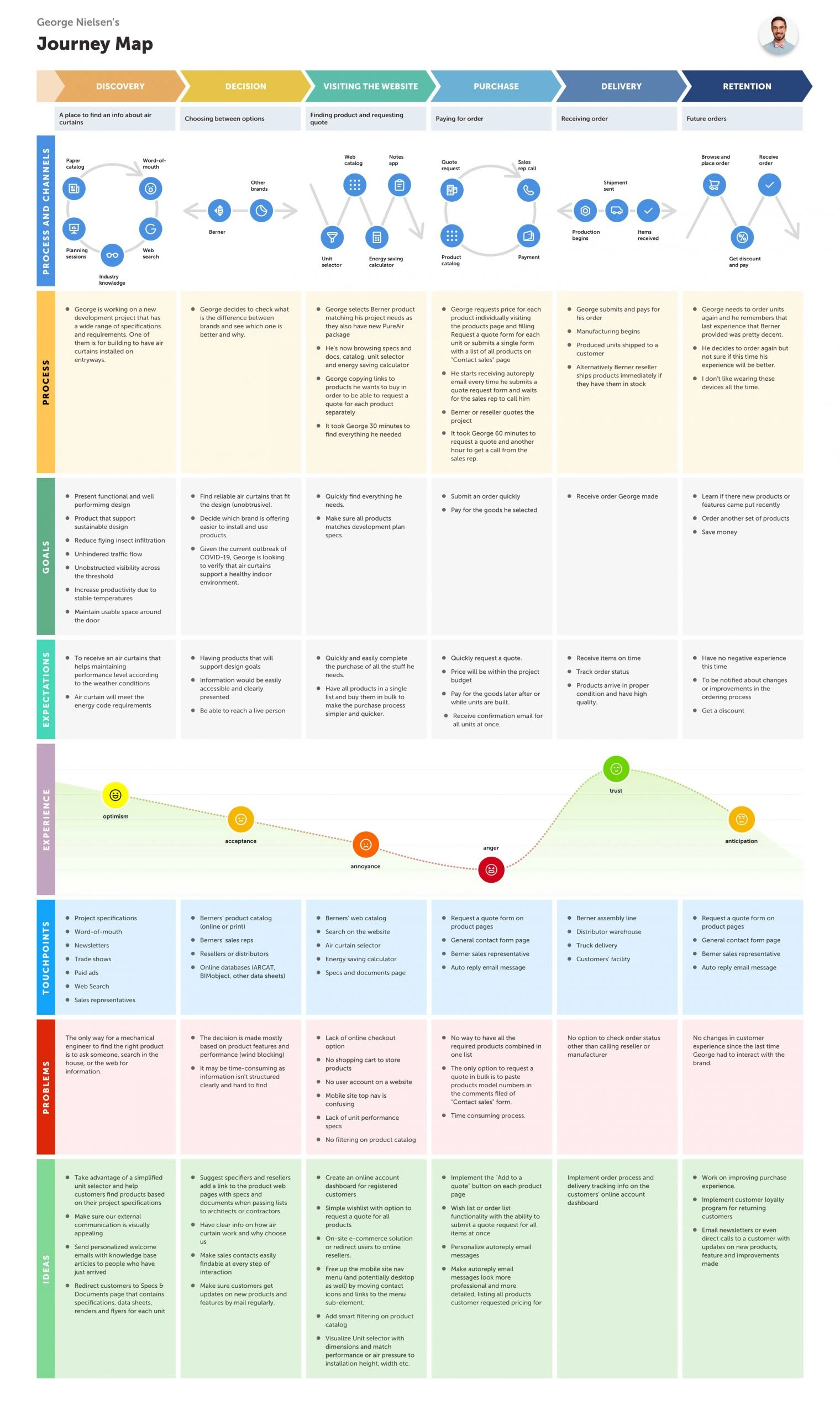
Based on the findings received from user research, I built a detailed customer journey map that shows users’ processes, goals, expectations, and emotions at every touchpoint of interaction with the brand. This helped me to outline ideas of how to improve the users’ experience and eliminate as many pain points as possible.
Information Architecture
As a standard component of the UX process, I build information architecture when building products. Determining every avenue and direction that users can take through an app or website, information architecture is much beyond just a sitemap to show what page leads where.

Prototyping
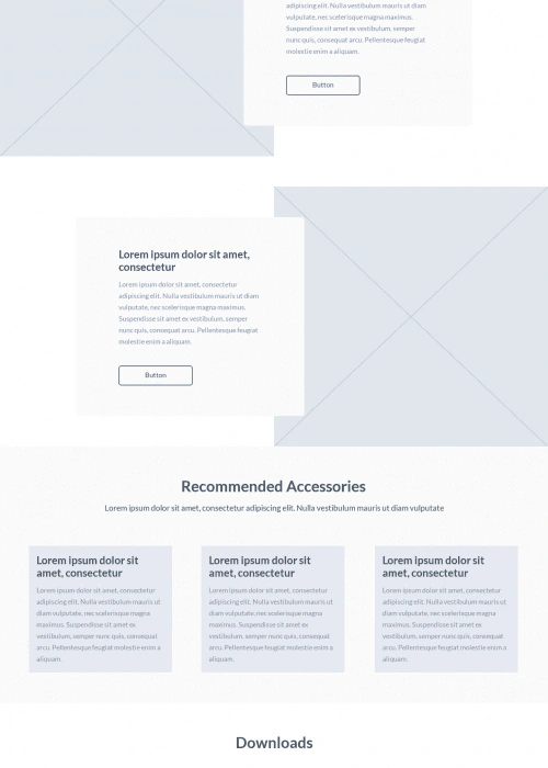
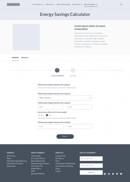
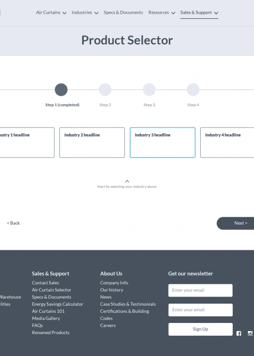
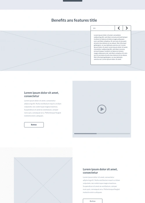
Prototypes are one of the most important deliverables and also the most fun to work on. I created them with everything from whiteboards to fancy design software.

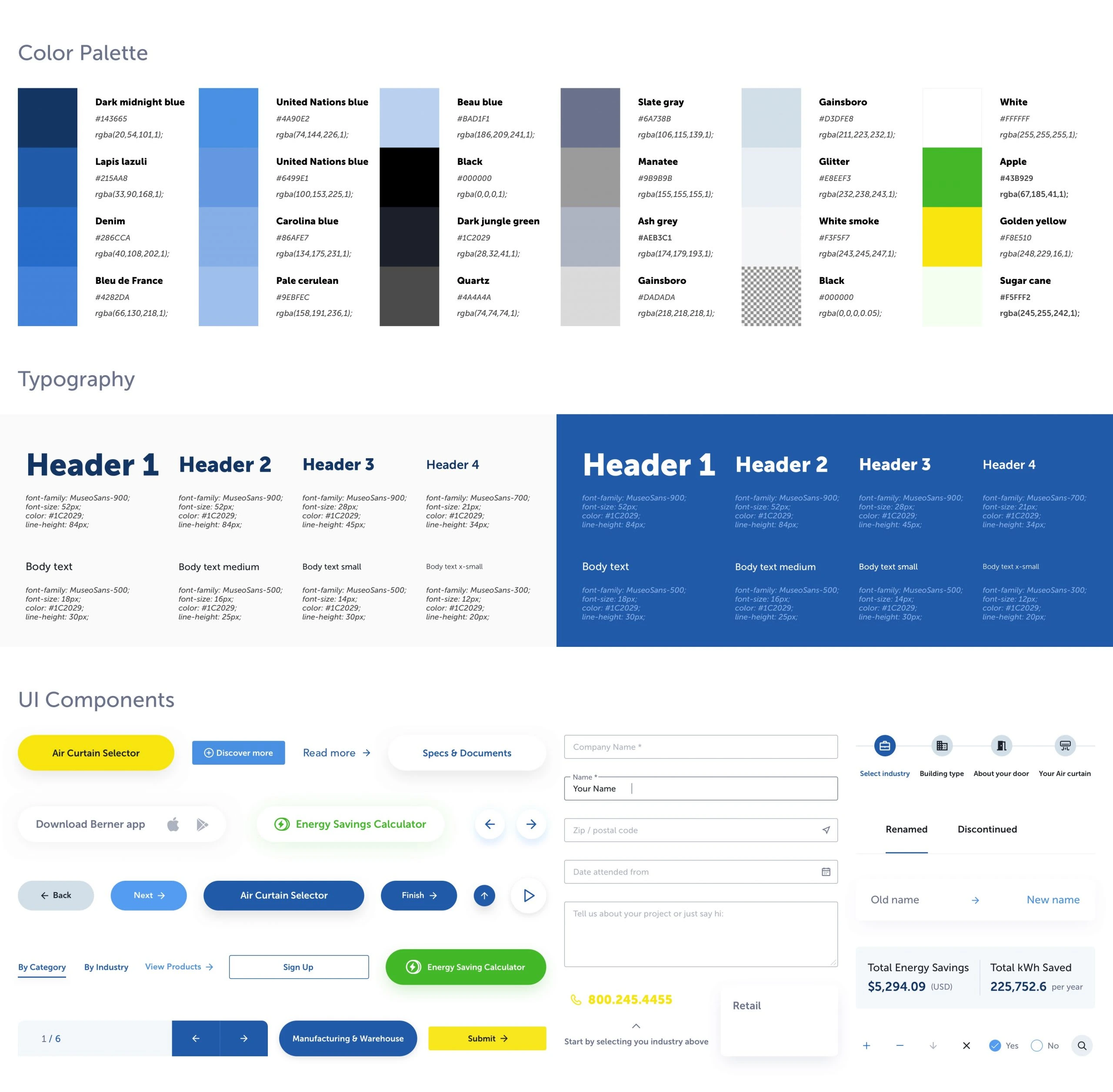
Style guides
Results and takeaways
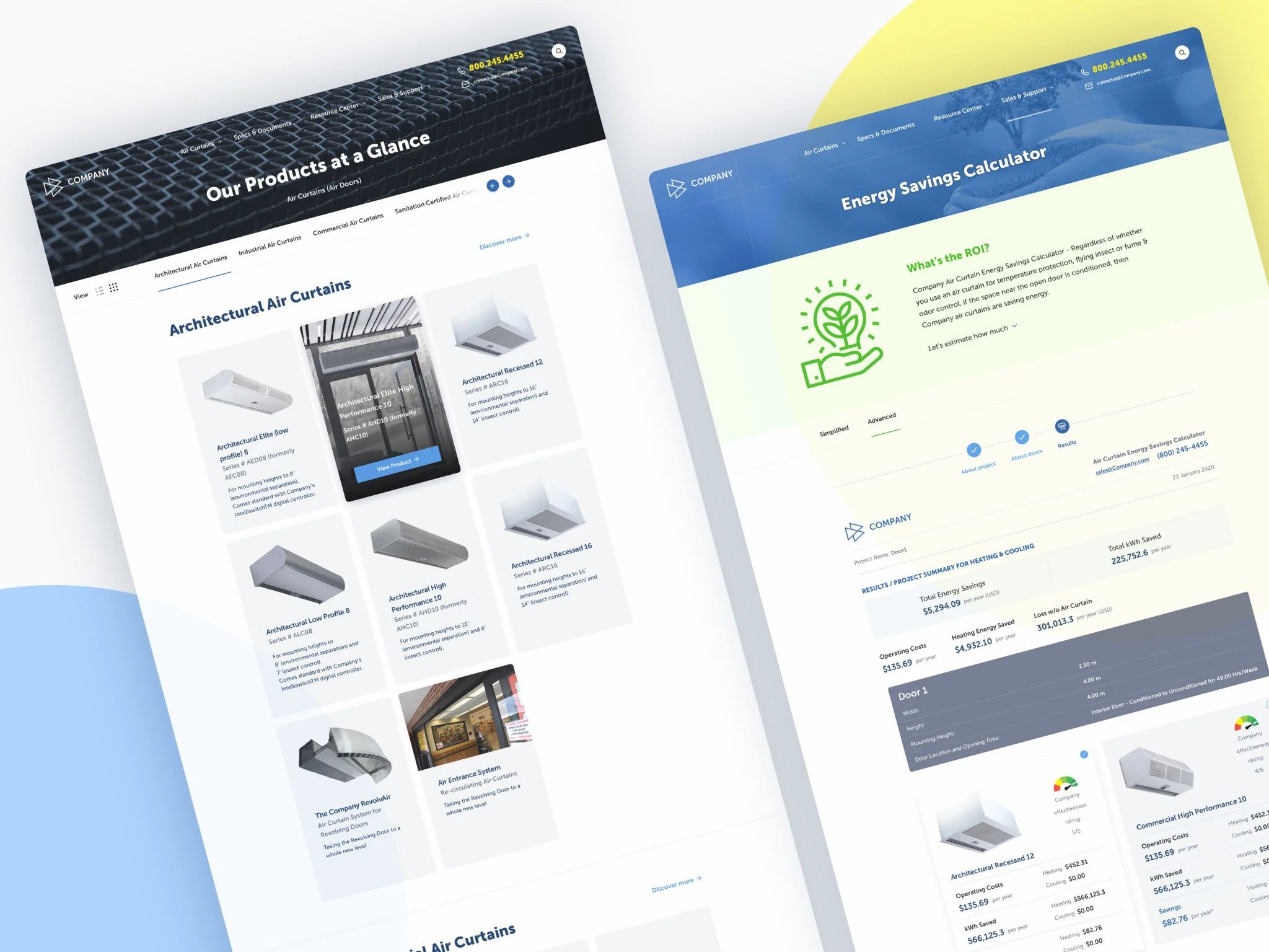
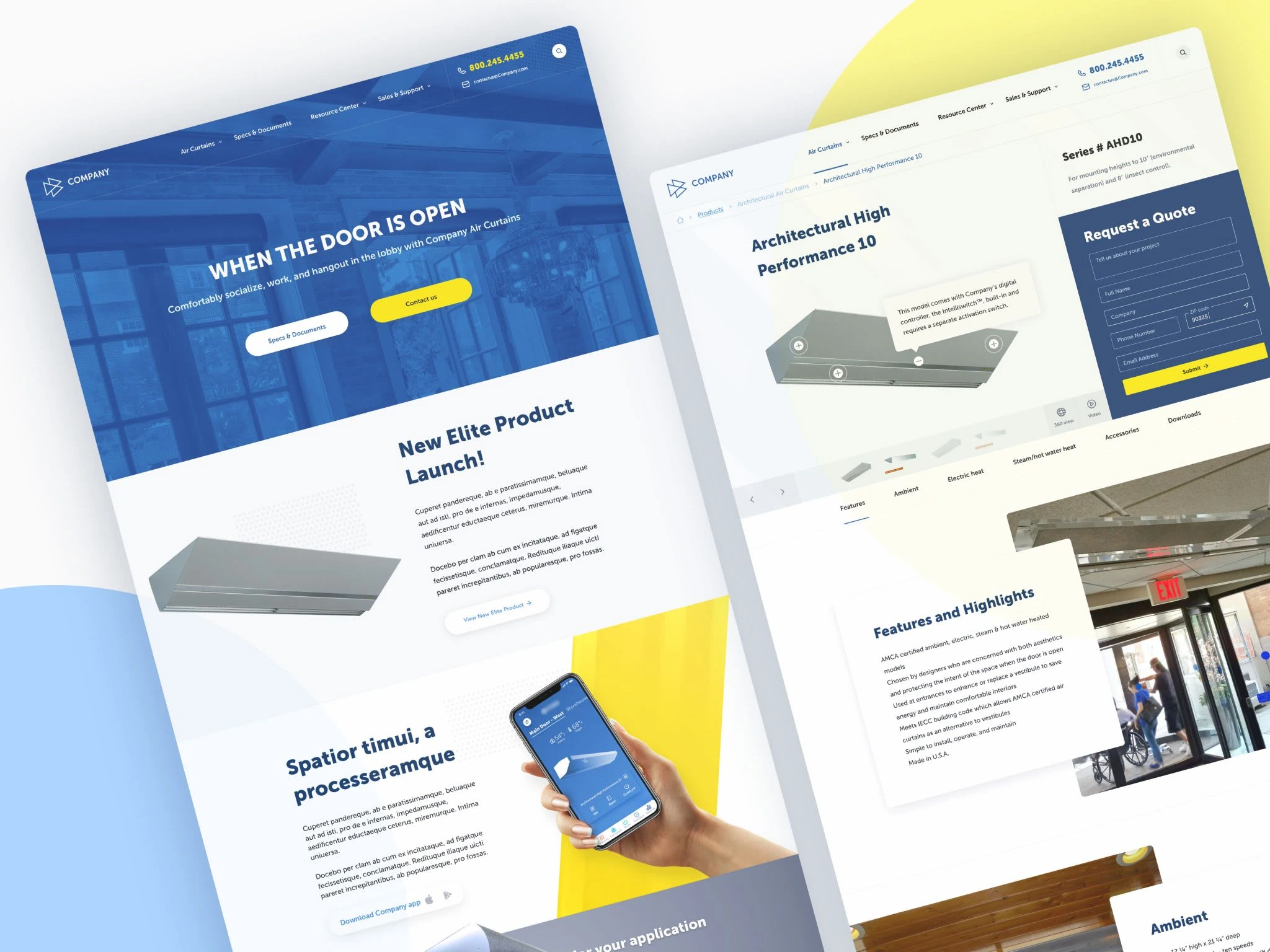
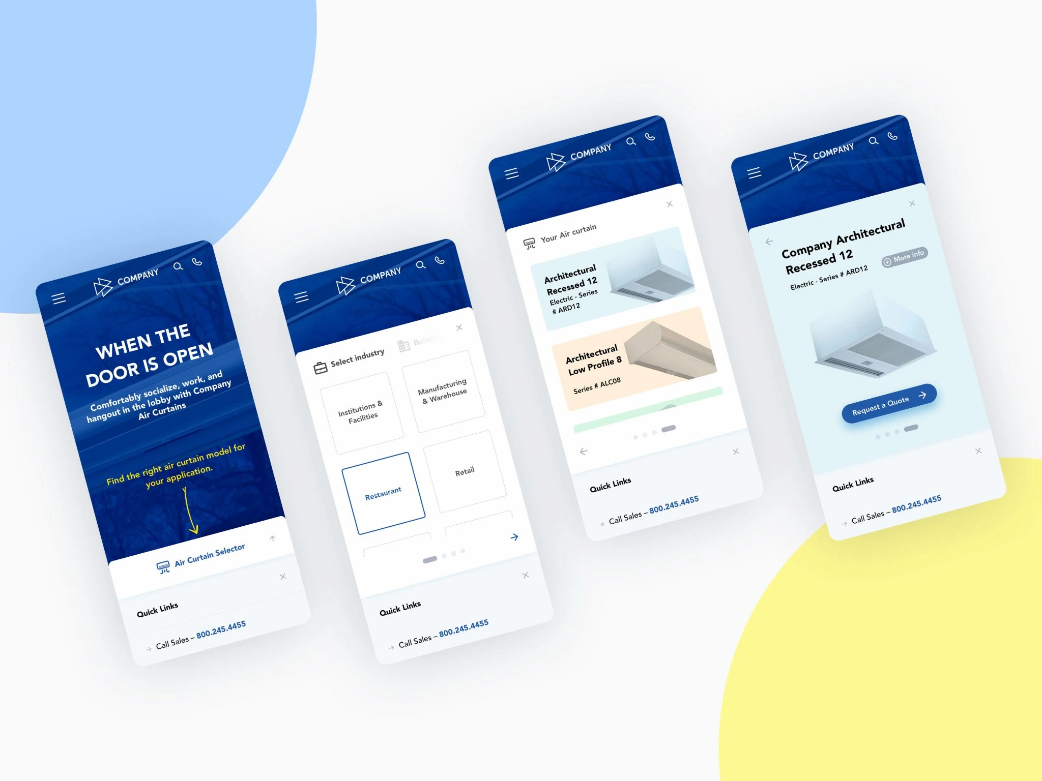
Since the launch of the new rebuild of the corporate website, we’ve seen a significant decrease in the bounce rate logged through the visitor behaviour analysis. Also, I have received positive feedback from users about the streamlined navigation through the website and better content scanability, enabling smoother and faster product searches, and saving them time and effort. Some mentioned that the website looks and feels more polished.
Like this project
Posted May 17, 2023
In this project, I undertook the redesign of a website for an HVAC manufacturer with a focus on improving the customer experience.
Likes
0
Views
100
Clients
Berner Air Curtains
