Website Design for Medical App
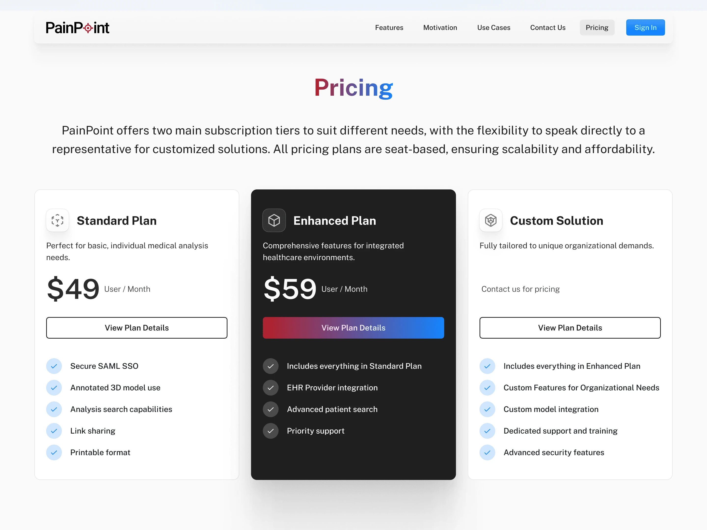
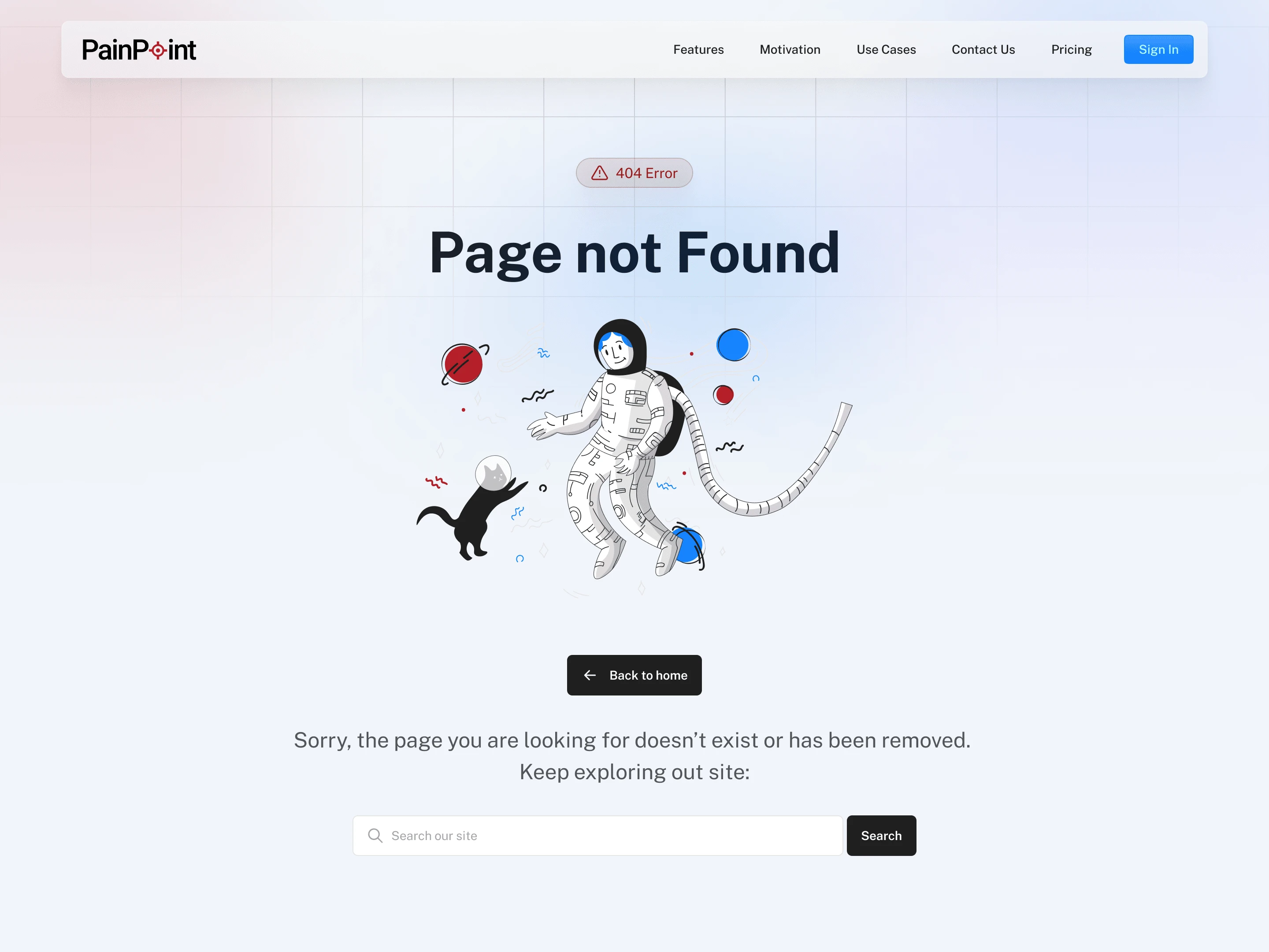
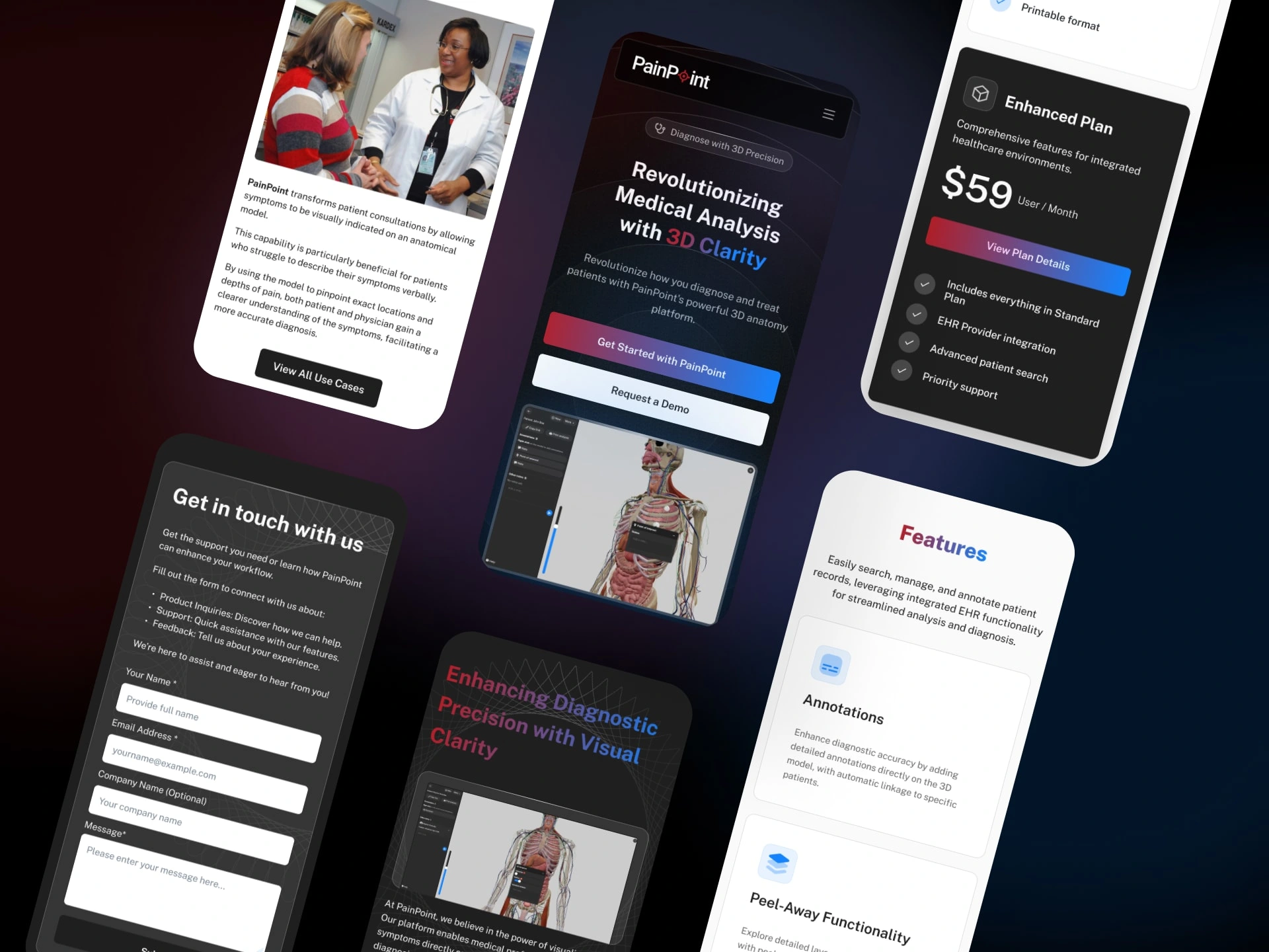
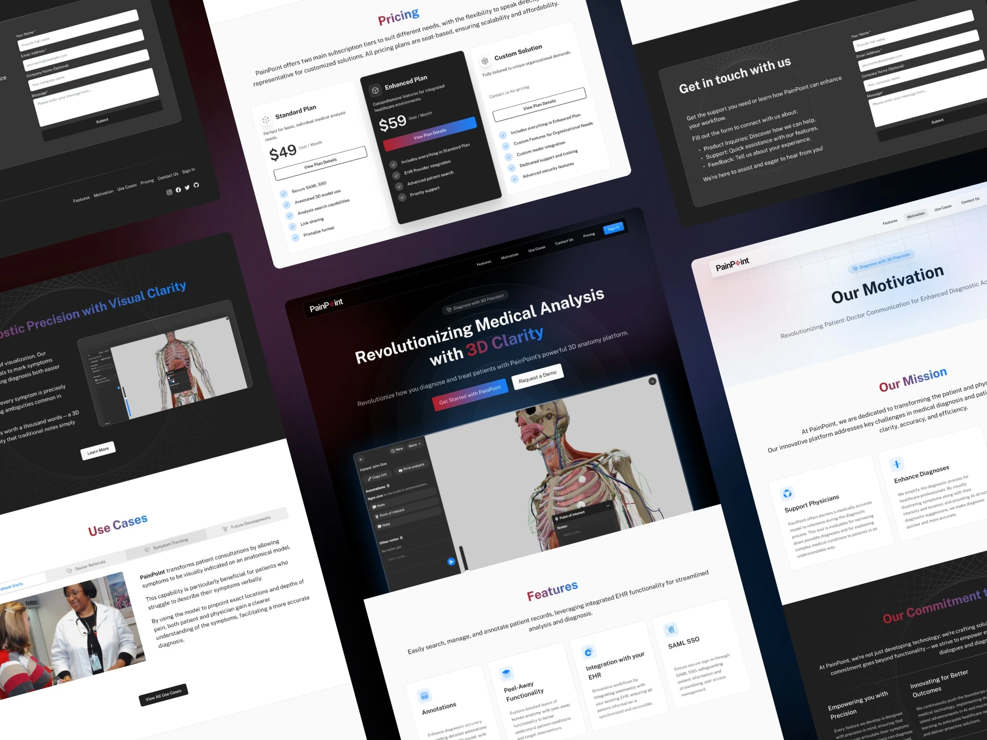
I had the opportunity to design the website for PainPoint Medical, a client's new medical software venture.
The process began with crafting detailed wireframes, evolving into interactive prototypes that underwent rigorous refinement in collaboration with the client and prospective users.
The aim was to develop a site that not only looked good but was intuitive and practically useful.
Through prototype testing and direct feedback, we've seen promising signs of a significant boost in conversion rates.
This hands-on approach to testing and iterative refinement has set us up for a successful launch,
ensuring the website will captivate and engage users right from the start.
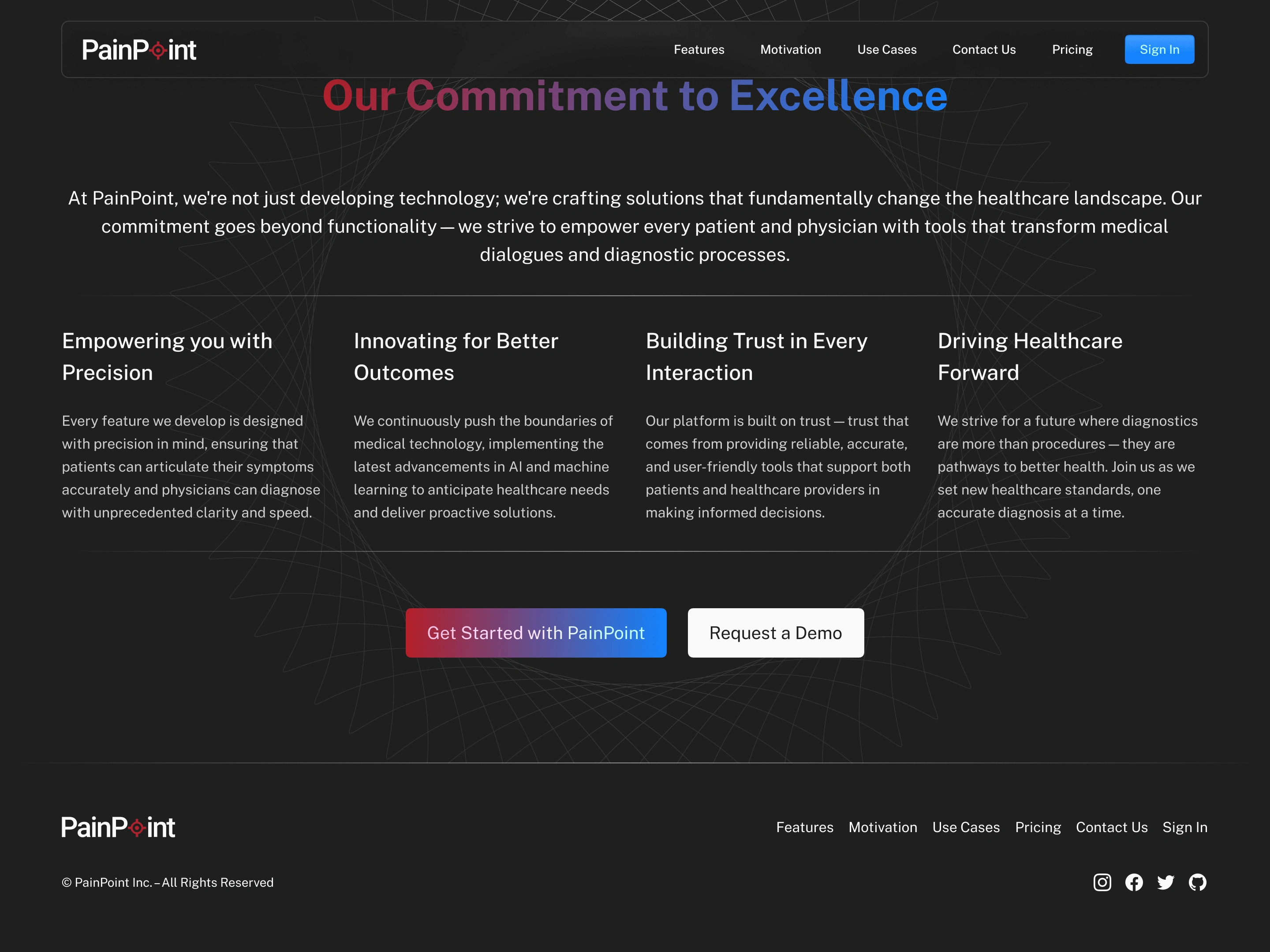
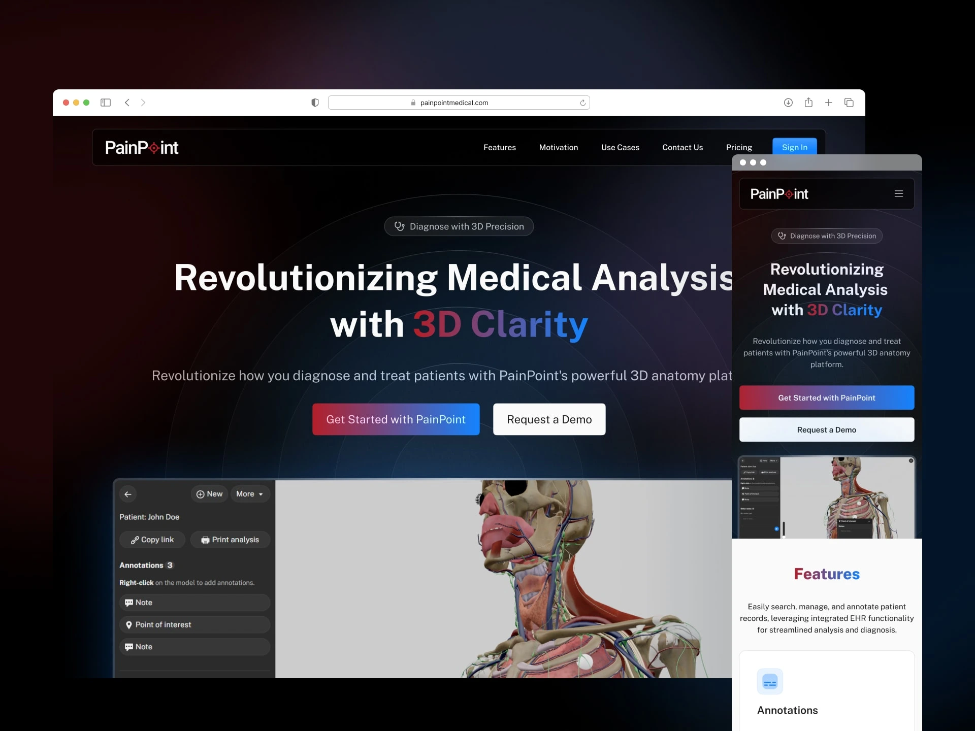
Figma prototype
Like this project
Posted May 24, 2024
Designed PainPoint Medical's website, from wireframes to interactive prototypes, boosting user engagement and conversion rates for a successful launch.

