Publisher Revenue Analytics redesign
David Babijaev
Sector
Engagement and monetization
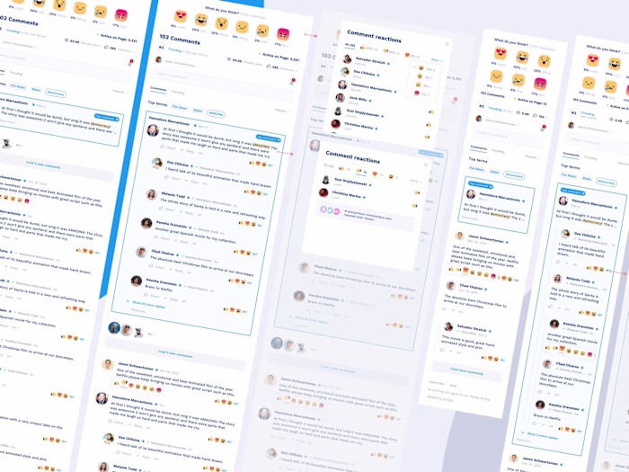
Commenting
Content Engagement
Content Moderation
Challenge
Provide publishers with a metric-based experience, with revenue split by media and ad type. Restructure the information architecture, navigation menu, and layout.
My role
As a UX designer, I was responsible for working with the existing publisher portal to redefine IA, create new experiences, UI components, and new interactions.
Success Metrics
Publishers will get vital revenue metrics based on ad types to develop a content strategy based on which content generates the most revenue.
Understanding the existing interface
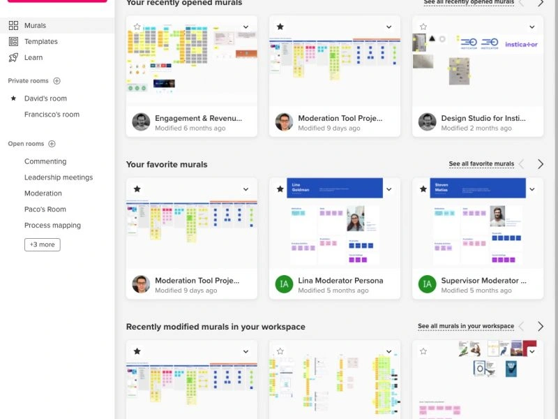
When I joined this project, users struggled to get crucial metrics to gain insight into which content generates the most revenue. All aggregate data was split into numerous categories rendered as data cards sometimes without being connected to each other within the same entity. Deeper insights were available only when users navigate each data card “View details” page losing context while leaving the main portal page. When users navigated to the “View details” page for each data card, they lost context while leaving the main portal page. Navigation was placed at the top of each page and was limited in horizontal space, preventing adding new menu items as needed.
Design objectives
Publisher Portal 2.0 is a complete redesign of the current portal with a new navigation architecture and new revenue reports. Allow access to the new portal and the features being rolled out while still letting customers see and access their current production data and reports.
Research and analysis
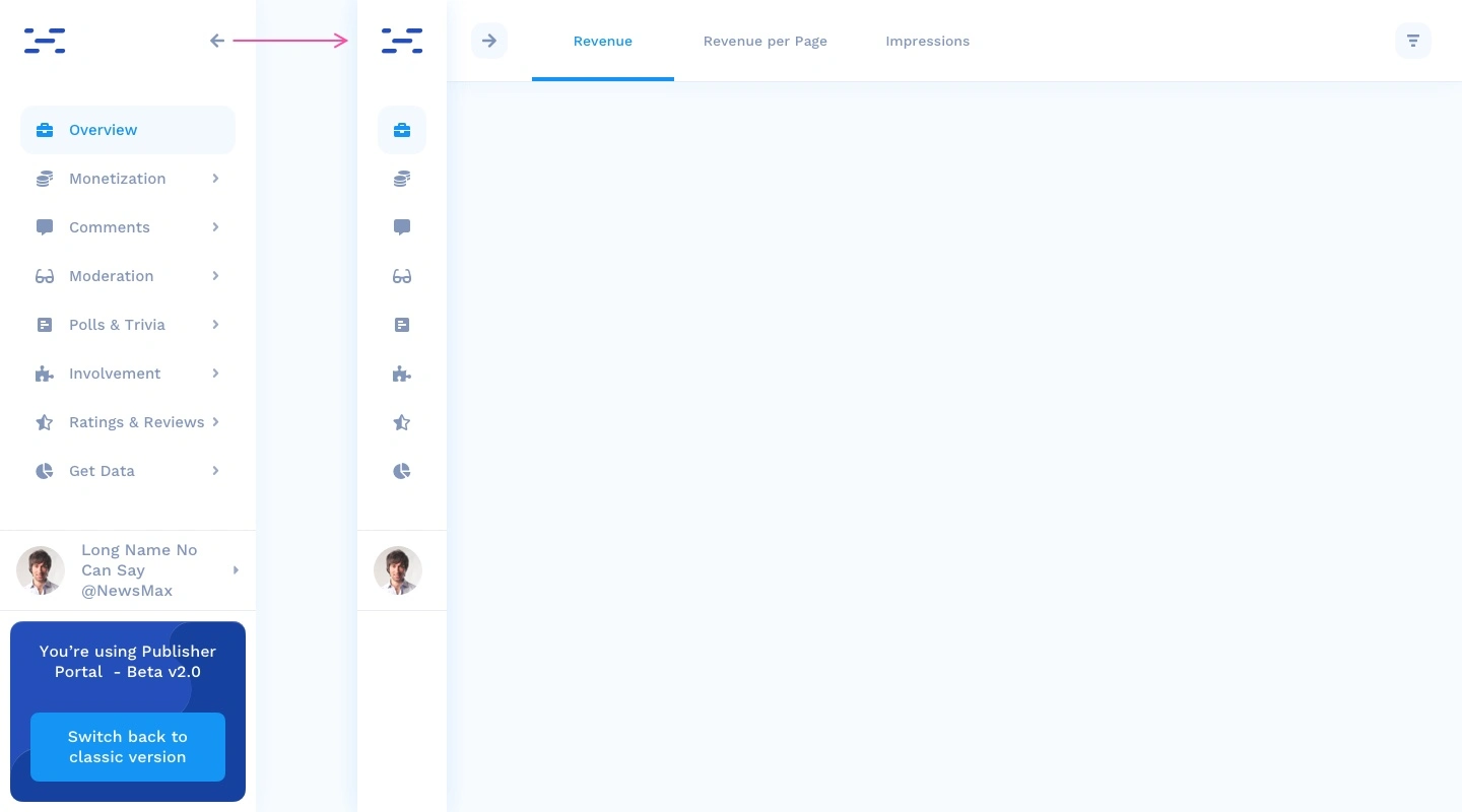
Before jumping into the redesign of a new information architecture and navigation system, I found more reason to relocate the navigation bar from the top to the left. The trend behind drawer nav menus became apparent after running a short competitor analysis.
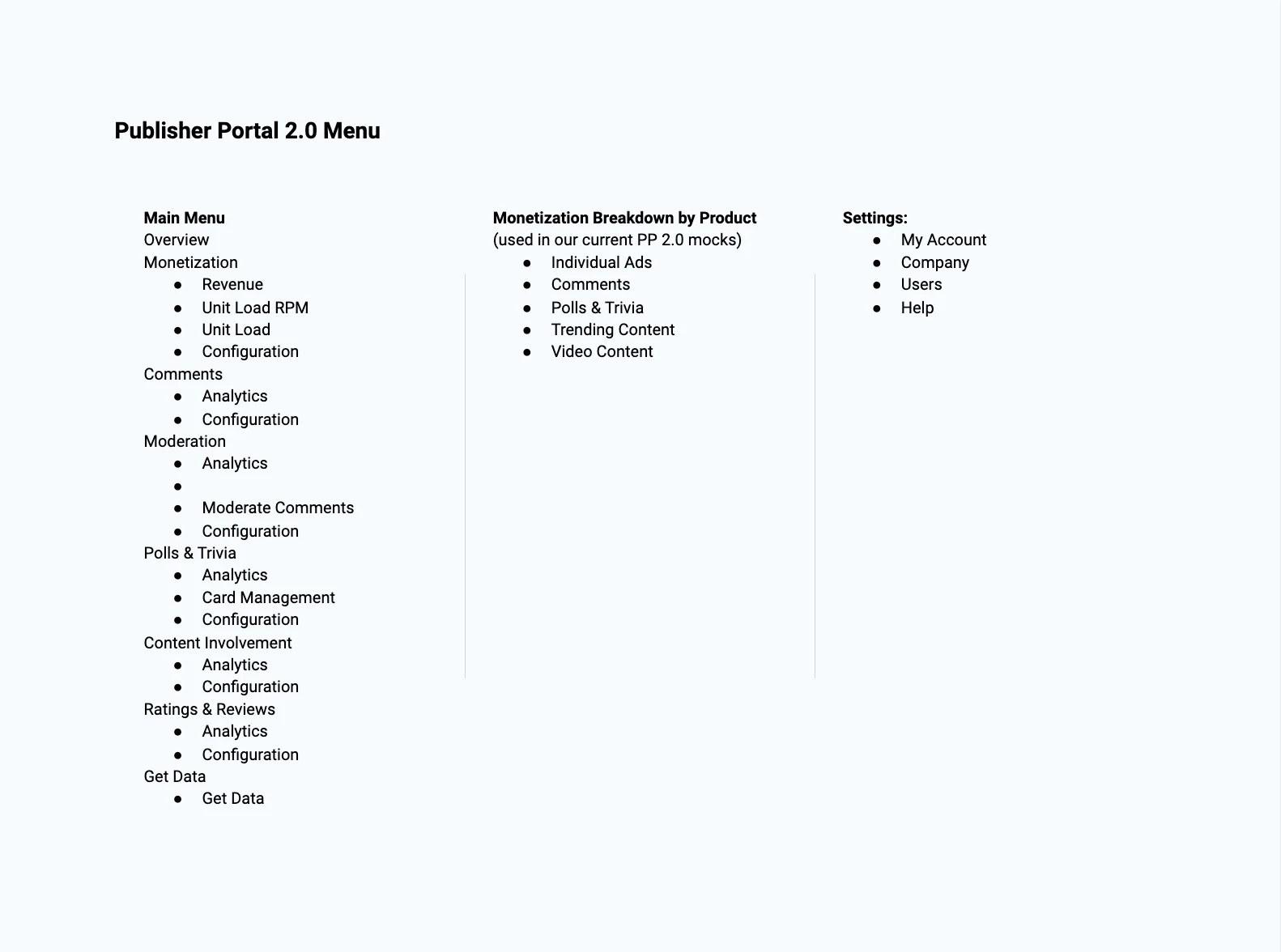
Information architecture
I had to design a new IA map for the new menu structure so that everyone in the team would be on the same page with the changes.
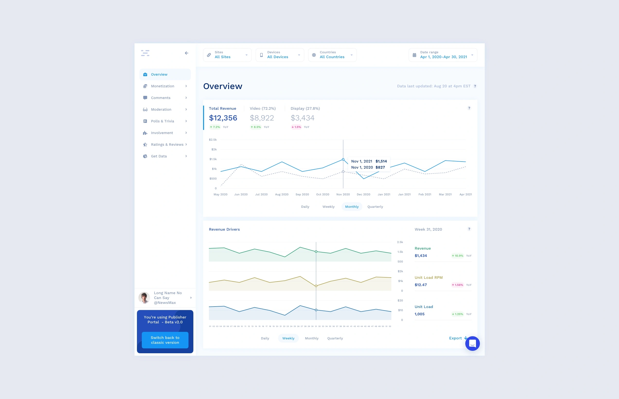
Navigation redesign
A number of whiteboarding sessions, wireframes, UI designs, testing sessions, feedback, and iterations enabled me to validate ideas with internal and external teams. This resulted in the menu moving to the left and becoming vertical, which allowed new items to be added without restriction. I also made the menu bar collapse to a smaller size, leaving only icons visible. This feature added some room for content on the right side of the screen.
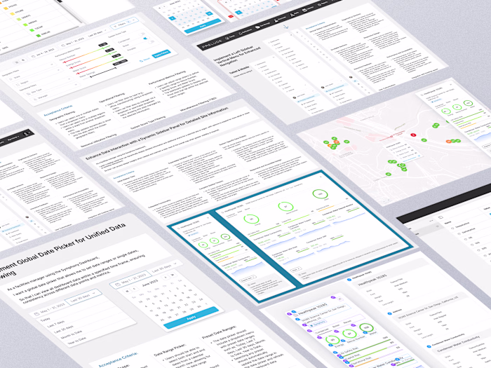
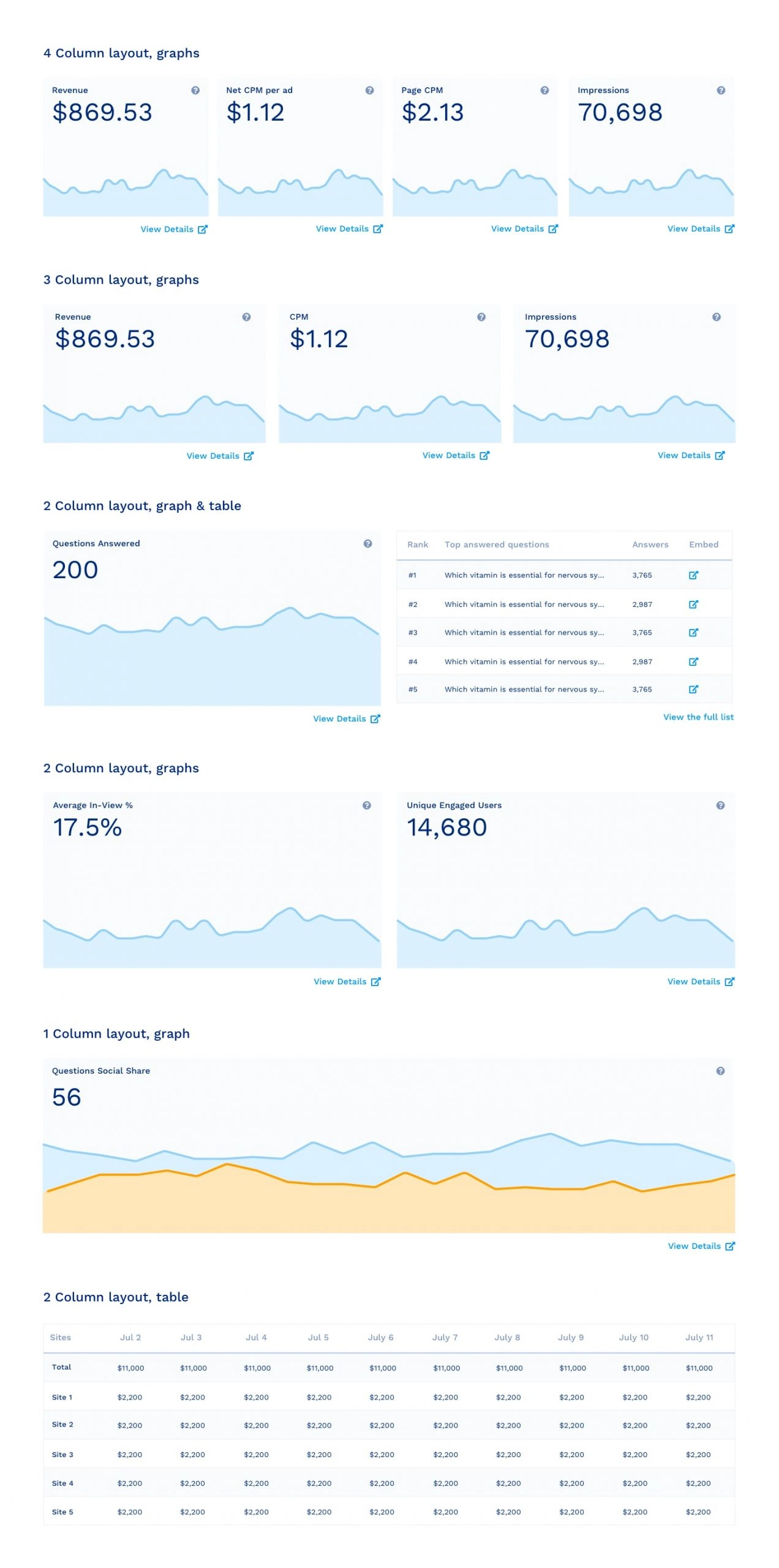
Revenue Overview UI
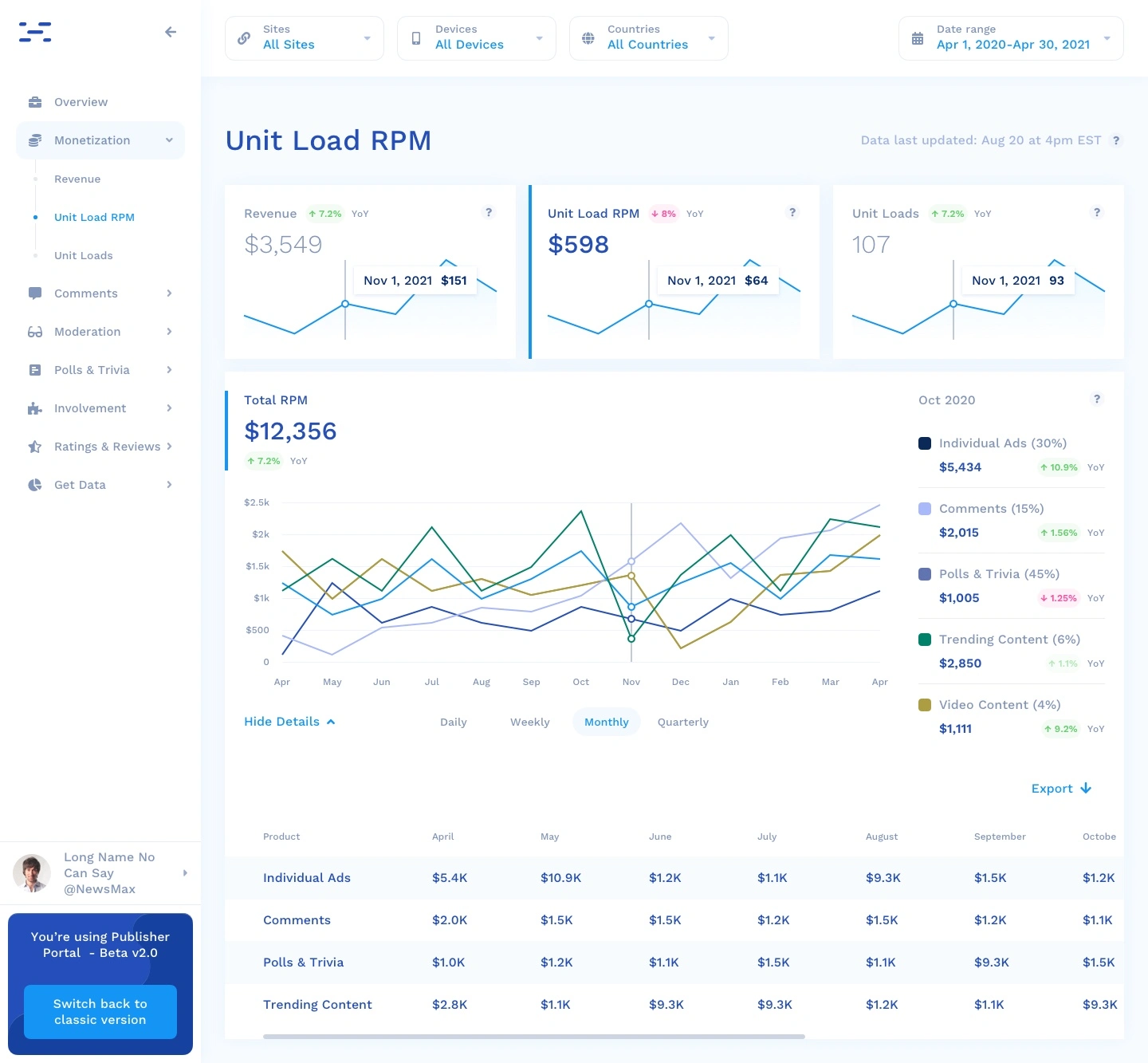
At the top of the page for each of the revenue reports (Revenue, Unit Load RPM, and Unit Loads) I show 3 small cards that take the width of the page that will show context across each of the revenue drivers so the user has context. Chart data is rolled up Daily, Weekly, Monthly, and Quarterly.
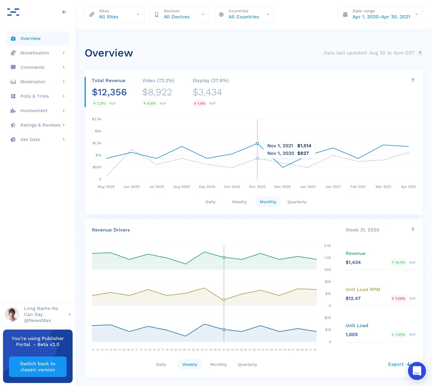
Revenue Cards
At the top of the page for each of the revenue reports (Revenue, Unit Load RPM, and Unit Loads) I show 3 small cards that take the width of the page that will show context across each of the revenue drivers so user has context.
Revenue and Unit loads reports
By providing more real-time insights into most essential metrics, we encourage users to return regularly to check for updates. The unit Load RPM tab will have the same reports as Revenue but will substitute Unit Load RPM for revenue and contain RPM at the top of the graph as it won’t break it down by Video or Display. Display the small cards at the top of the page as described above. The Unit Load tab will have the same reports as Revenue, but it will show only the overall unit loads at the top of the graph since we won’t break it down by Video or Display. I used stacked bar charts for data that is additive and can be totaled. Some multi-line charts are used when aggregate data are measured in different units on parallel axes.
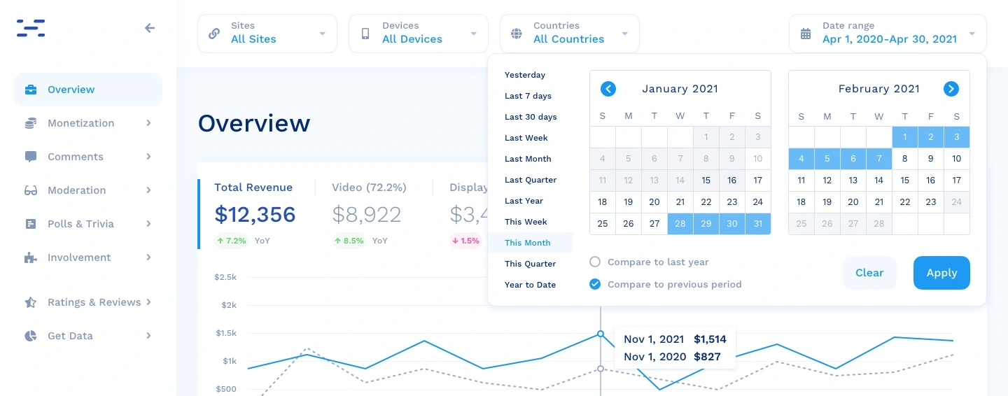
New date picker
I redesigned the date picker UI to include new time range presets. Users need to be able to select from some default shortcut calendar timeframe and pick custom date ranges:
Past
Yesterday
Last 7 days
Last 30 days
Last Week
Last Month
Last Quarter
Last Year
Current
This Week
This Month (default)
This Quarter
Year to Date
I also added an option to select comparison period:
Compare to last year
Compare to previous period
Results and takeaways
In order to deliver this project, I developed the following:
A final review presentation to the engineering and design team, director of design, PMs, and the VP of product.
Worked with the Engineering team to confirm that it fits their current working architecture
Interviewed the team as the product was being developed.
This has resulted in a look and feel that is not only professional but also colorful and playful; a component library that can be leveraged when building out new pages; and usability improvements that make hierarchy and tasks more clear and easier to perform.
Like this project
Posted May 17, 2023
Publisher Revenue Analytics redesign Sector Engagement and monetization Commenting Content Engagement Content Moderation Challenge Provide publishers with a me…