HAPI Foundation Nonprofit Website Redesign
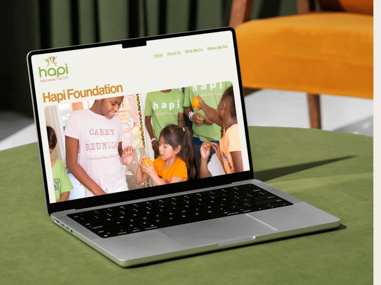
HAPI Foundation provides healthcare and enrichment for low-income children in several managed apartment complexes throughout the USA. It had an outdated website on a proprietary website that was not responsive and did not reflect the liveliness and success of their programs.
I wanted to create a more immersive, story-driven experience to highlight the changes HAPI brings about. Rather than focusing on the organization, we led with a narrative that highlights the problems. That way, HAPI's outcomes seem more relevant and relatable.
The homepage comparison below shows the new emphasis (right).
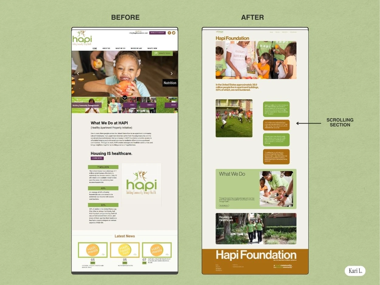
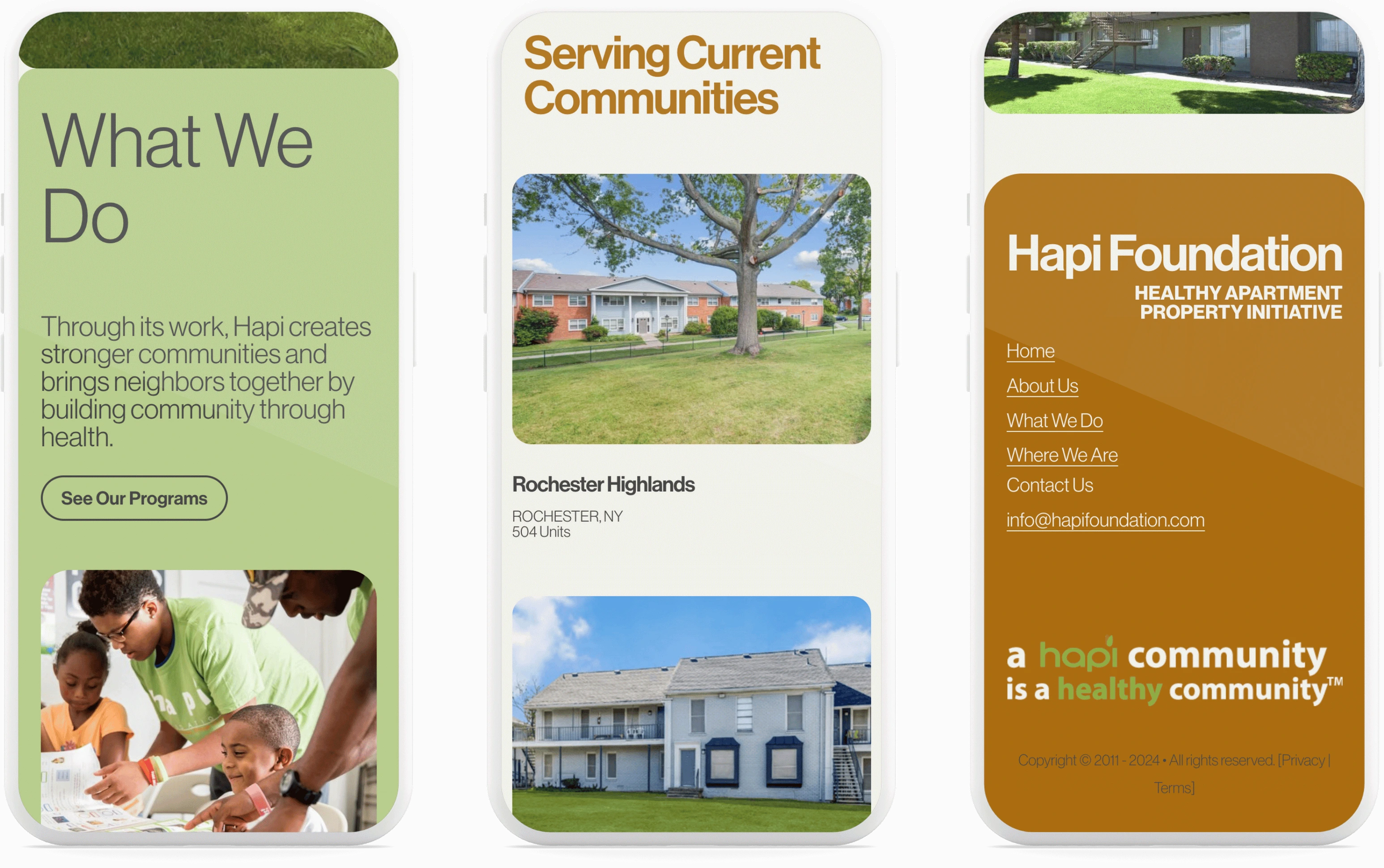
The modern redesign features color-blocking, large typography, and scrolling sections. We simplified the navigation and did away with sub-pages. It is now much easier for interested parties to navigate the information. And with the foundation's properties and current activities displayed with side, colorful images, HAPI Foundation's mission is matched in visuals.
Here's what HAPI's founder had to say after working together:
"I was pleasantly surprised with the ease, professionalism, artistic and technical capability, and speed at which Kari executed our project. She was extremely professional and met all deadlines. Kari provided clear instruction and made the process simple. I will definitely hire her for future projects."
- Jane Lorin, HAPI FOUNDATION

Let's work together to tell your story! Message me to begin.
Like this project
Posted Sep 26, 2024
Website redesign for a local nonprofit using a story-driven approach
Likes
0
Views
11


