
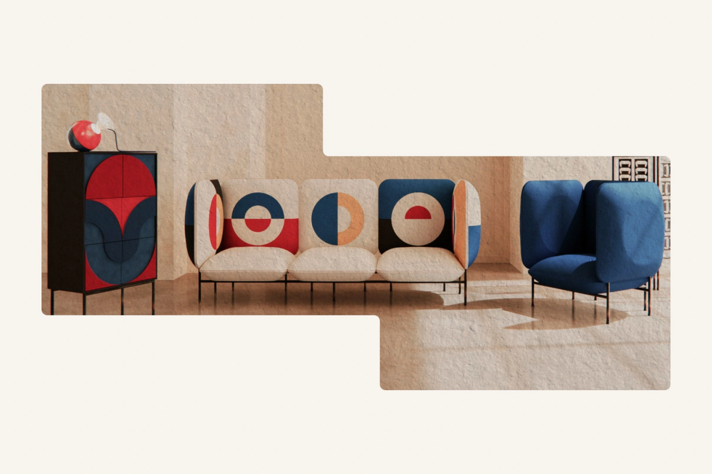
Context
Formiture had to explain the studio, make delivery and returns easy to find and guide 3 buyer groups to checkout: businesses furnishing a space, families updating a home and individuals looking for a standout piece.
Role: Product Designer — research, IA, UI, moderated testing and handoff
Team: solo
Platform: responsive web
Timeline: 6 weeks, from brief to tested handoff
Research
A 5W breakdown — who, what, where, when, why — sorted the market into 3 customer groups, then persona work turned those groups into people with needs, values and goals.
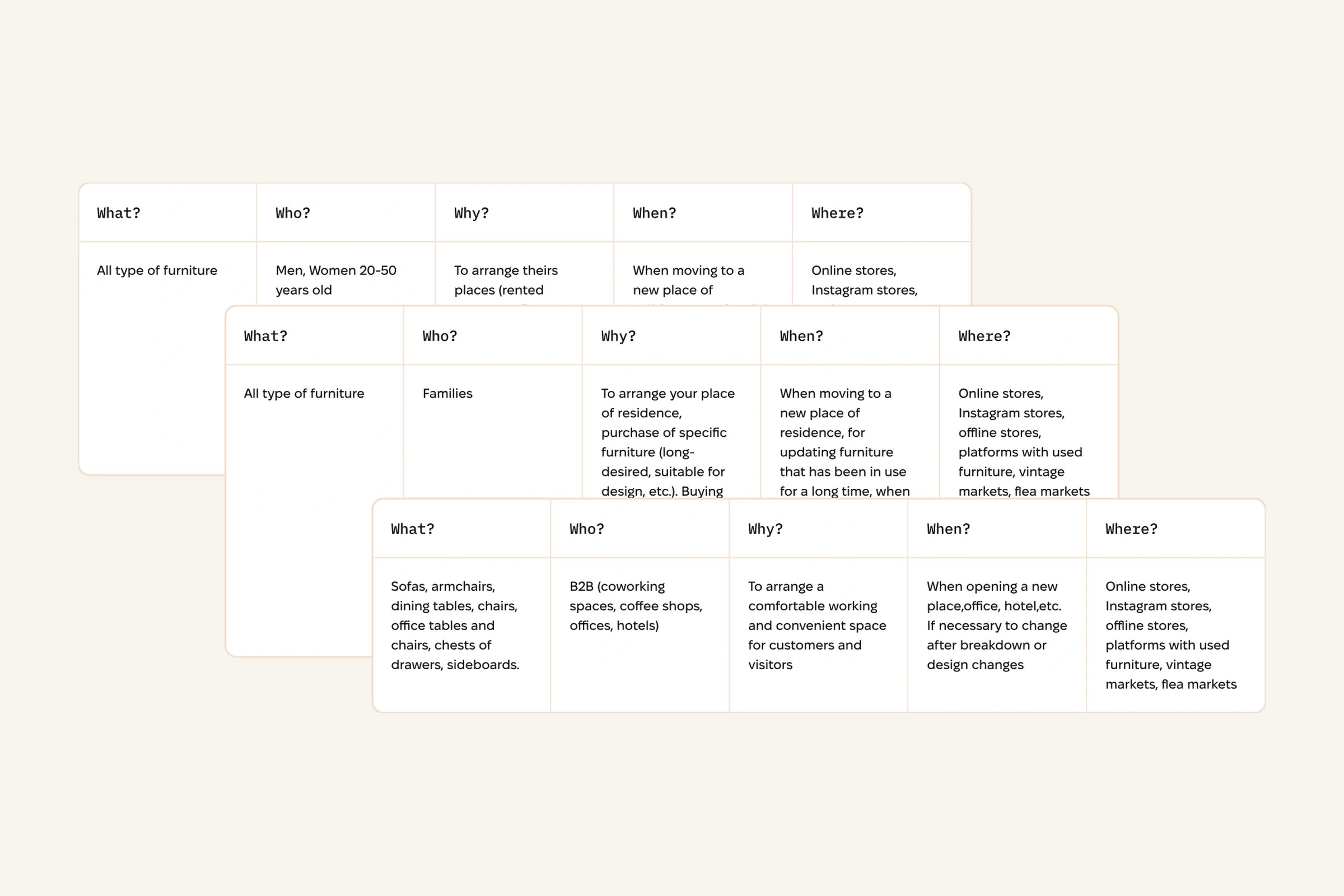
The 5W breakdown, one table per customer group
I compared 3 competitors across must-haves, useful extras and standout features. This showed what every store needed and where Formiture could be different.
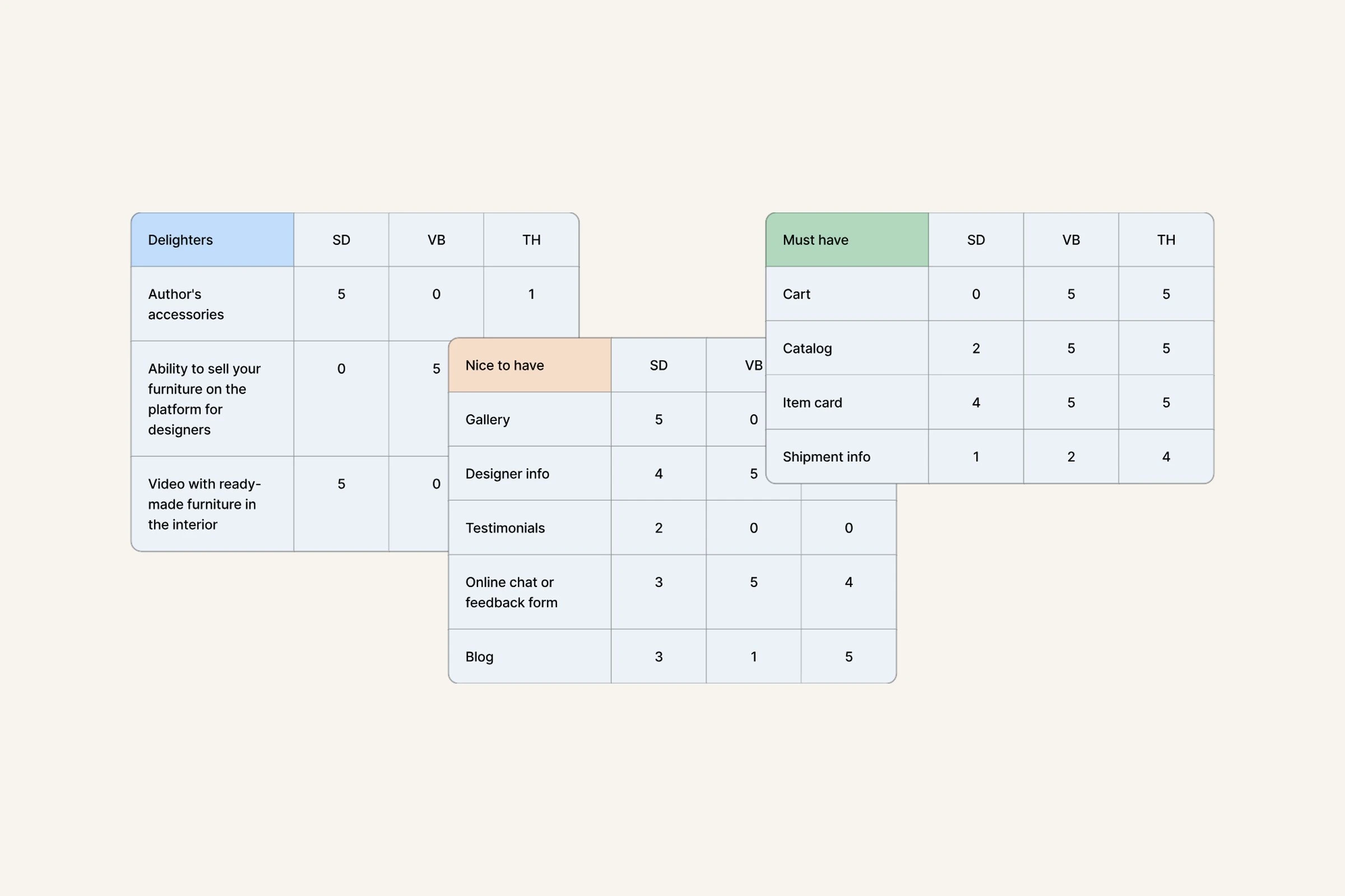
Must have, nice to have, delighters — scored across 3 competitors
A Nielsen heuristic review surfaced the risks worth fixing before development, each scored by severity.
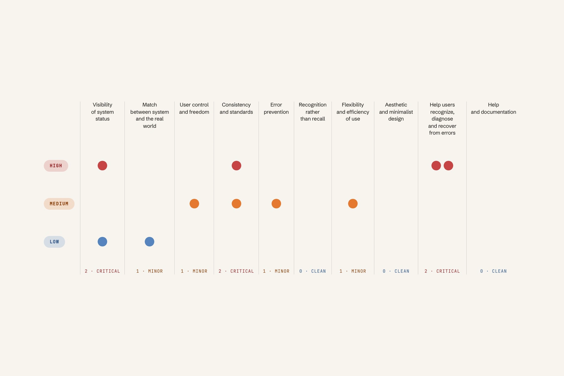
Heuristic evaluation — issues found per heuristic, by severity
Structure
I mapped every step from landing on the site to finding furniture and completing an order, so the navigation had a clear job at each point.
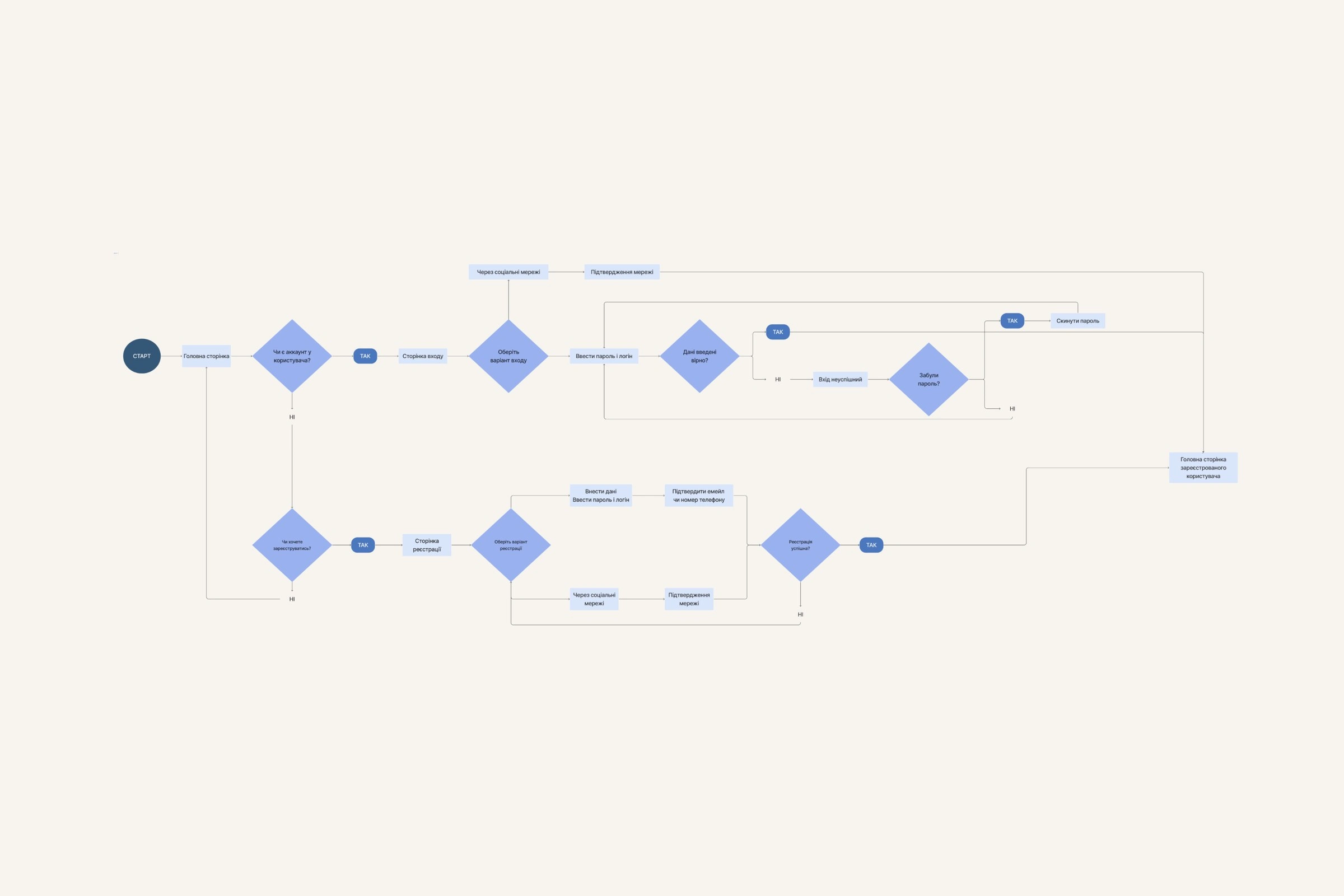
Entry, sign-in and recovery paths
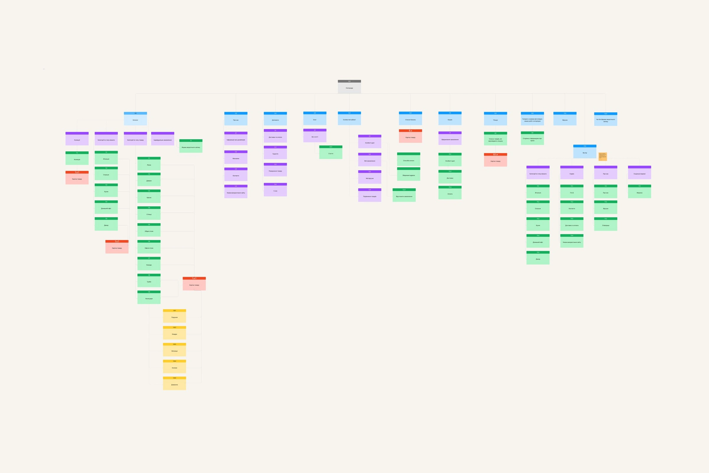
How every section and page connects
Hi-fi wireframes for every page gave stakeholders a realistic enough preview to judge the structure and settle it before a single decision about colour.
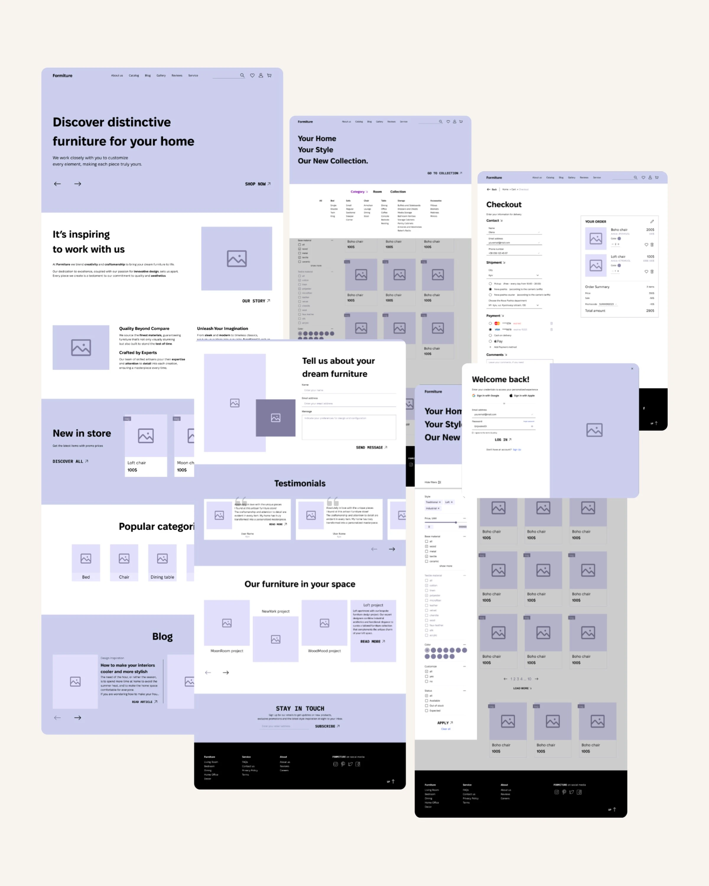
The hi-fi wireframe set the usability test ran against
Testing
A moderated walkthrough checked whether a first-time visitor could find one specific chair and finish the order.
The task: find a Boho chair, add it to the cart, check out and confirm the order.
The hypothesis: people may struggle to find a specific furniture type if categories are unclear and filters are too limited.
The measures: steps to order and post-task satisfaction.
Testing flagged one real risk: people can stall mid-search if the categories and filters sit in the wrong place — most of all when they arrive hunting one specific type of furniture.
Visual design
I paired classic craft with a modern storefront: minimal layouts, geometric type, strong contrast and large product photography.
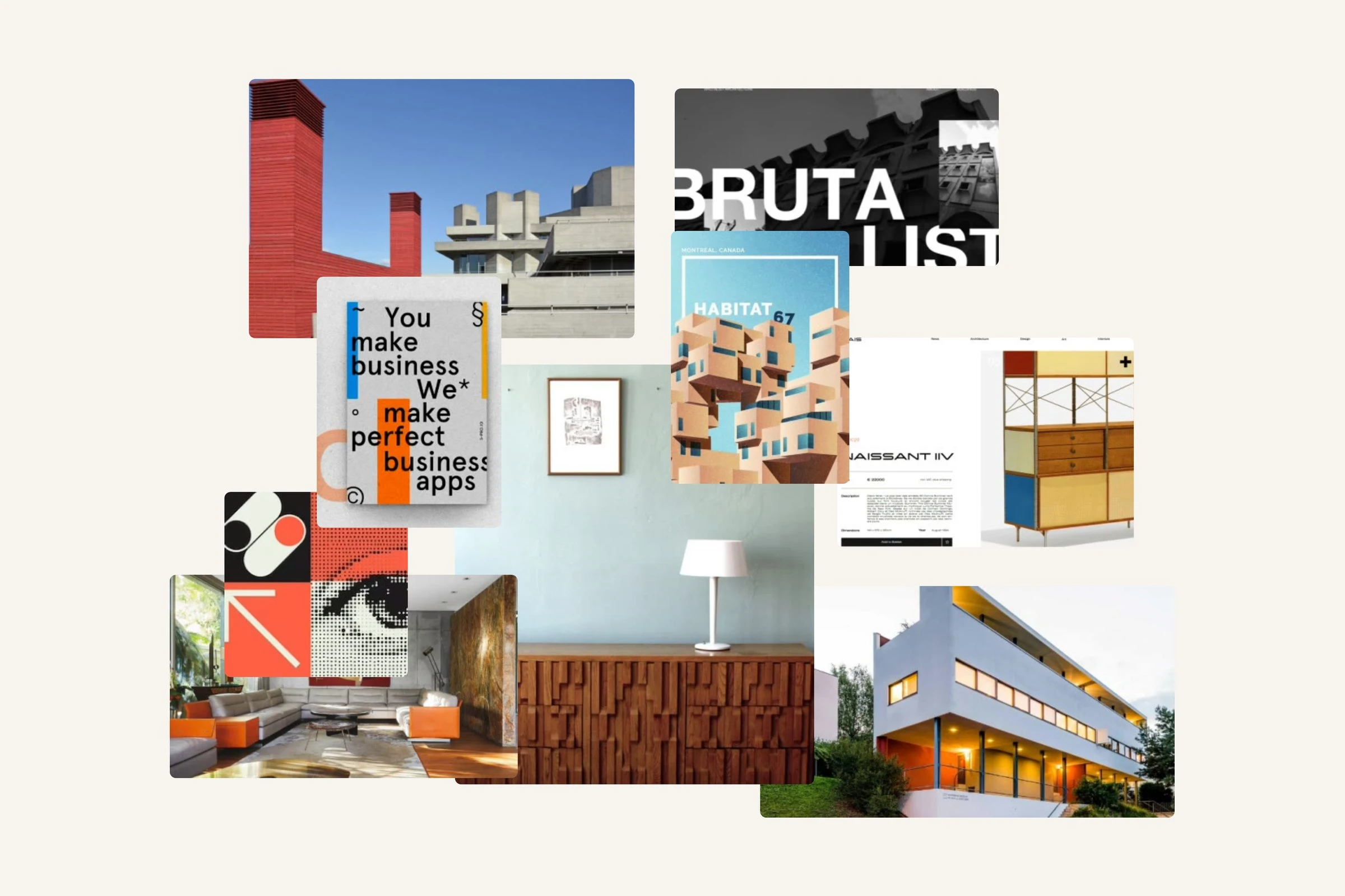
Moodboard — classic craft, modern storefront
IBM Plex Mono is technical and geometric, so it carries the headings. Fixel Display reads well at small sizes, which is what specs and product information need, so it carries the body. 2 grounds and 2 accents keep the palette short so product photography carries the colour.
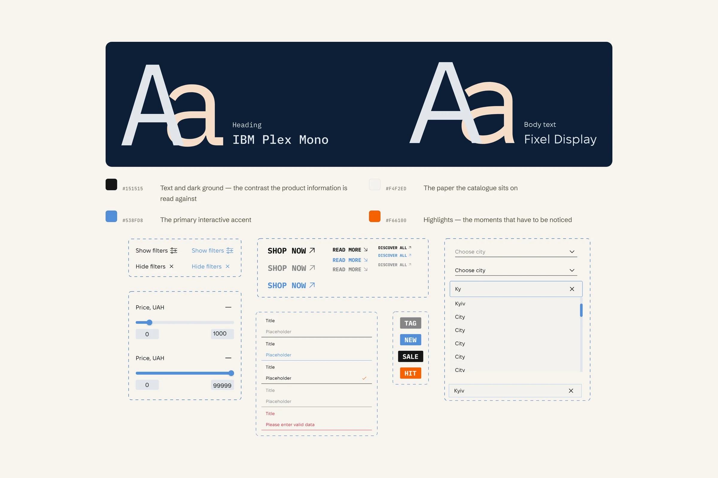
Type, palette and the UI kit: filters, ranges, buttons, fields, tags and the city picker
Prototype
I linked the purchase path in Figma — catalogue → product page → cart → multi-step checkout → order confirmation — and used that prototype for moderated usability testing and client review.
Homepage — hero
New collection → catalogue with filters
Product page — switch a variant and add to cart
Checkout → order confirmation
Sign up and sign in
Outcome
Delivered as a responsive Figma file: sitemap, flows, hi-fi wireframes, UI kit and linked prototype. Components are named for handoff — product cards, filter sidebar, checkout accordion sections and PDP tabs.
A moderated walkthrough exposed category and filter friction before development; no post-change metric was recorded.
0 likes · 0 views · Nov 9, 2026
A furniture shop for people who compare before they buy, with a checkout that shows one step at a time.
