Website for SeemaS Platform

Ilya Kret
1 collaborator


SeemaS: Website for an AI Platform in Tax & Valuation
SeemaS brings several AI products for valuation, transfer pricing and international tax into one platform. Together with the lead designer, I worked on the website structure and visual direction, with the goal of making a complex, expert-level product easy to understand for CFOs and advisory teams.
Role: Product Designer: website structure, visual design, motion
Tools: Figma, Spline, Claude
Industry: Accounting & Tax
Client: SeemaS, Inc.
How we approached it
Starting from the reader. CFOs and consultants don’t buy “AI”; they buy confidence in their numbers. We worked with the product team and domain experts to decide what each page has to prove and in which order.
A story in four steps. The sitemap follows how buyers evaluate a tool: what the platform is, which product fits their task, why the team is credible, and how the work gets done from data to report. Shared page templates keep products consistent while each one tells its own story.
From direction to a live site. After the visual direction was agreed, we designed the graphics, 3D visuals and motion.
The website
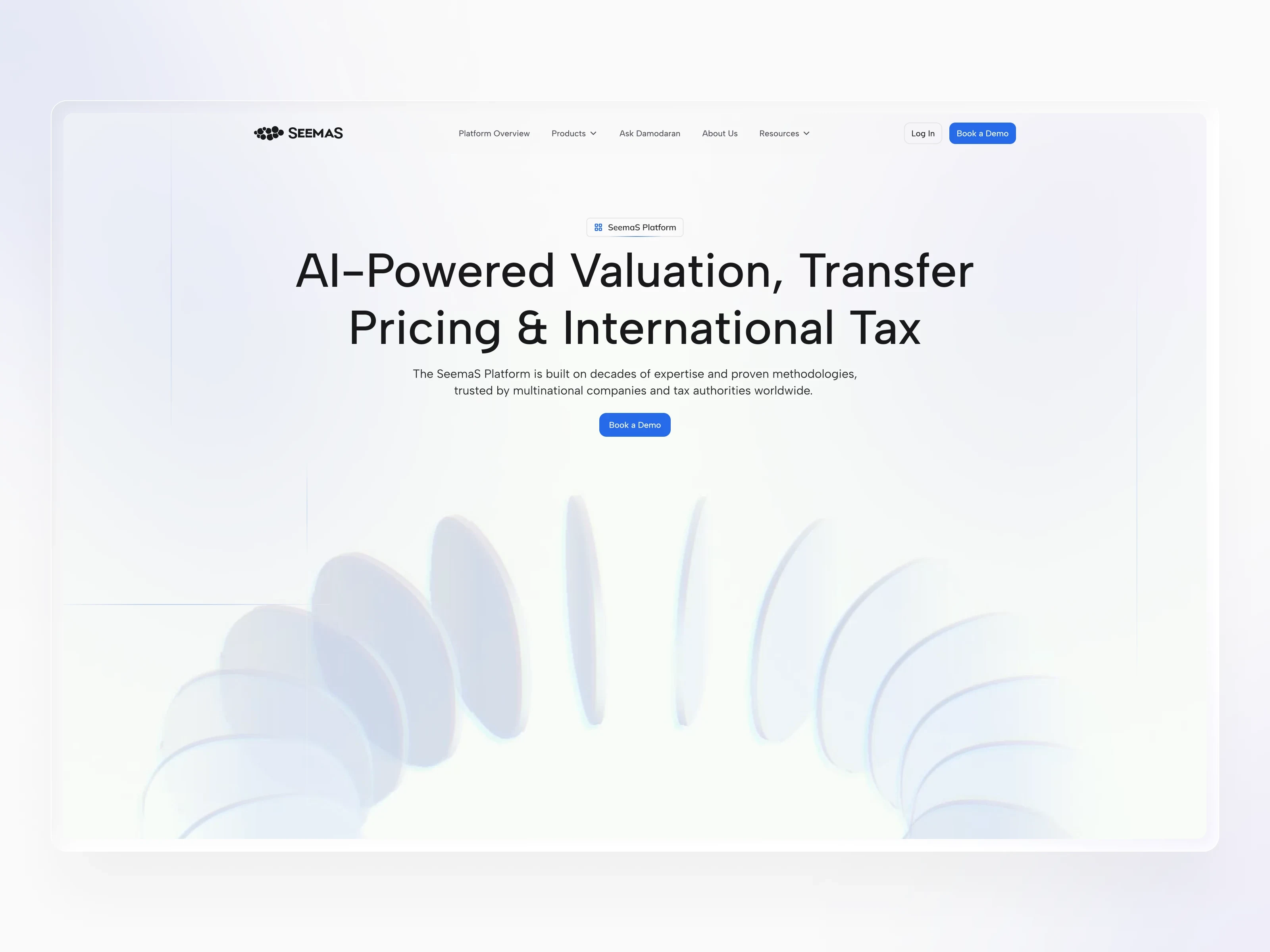
Clear paths for different buyers
Research into the market, the product and the questions buyers ask shaped a persona and the information hierarchy. The homepage introduces SeemaS as one platform, each product gets its own page, and every route leads to “Book a Demo”.
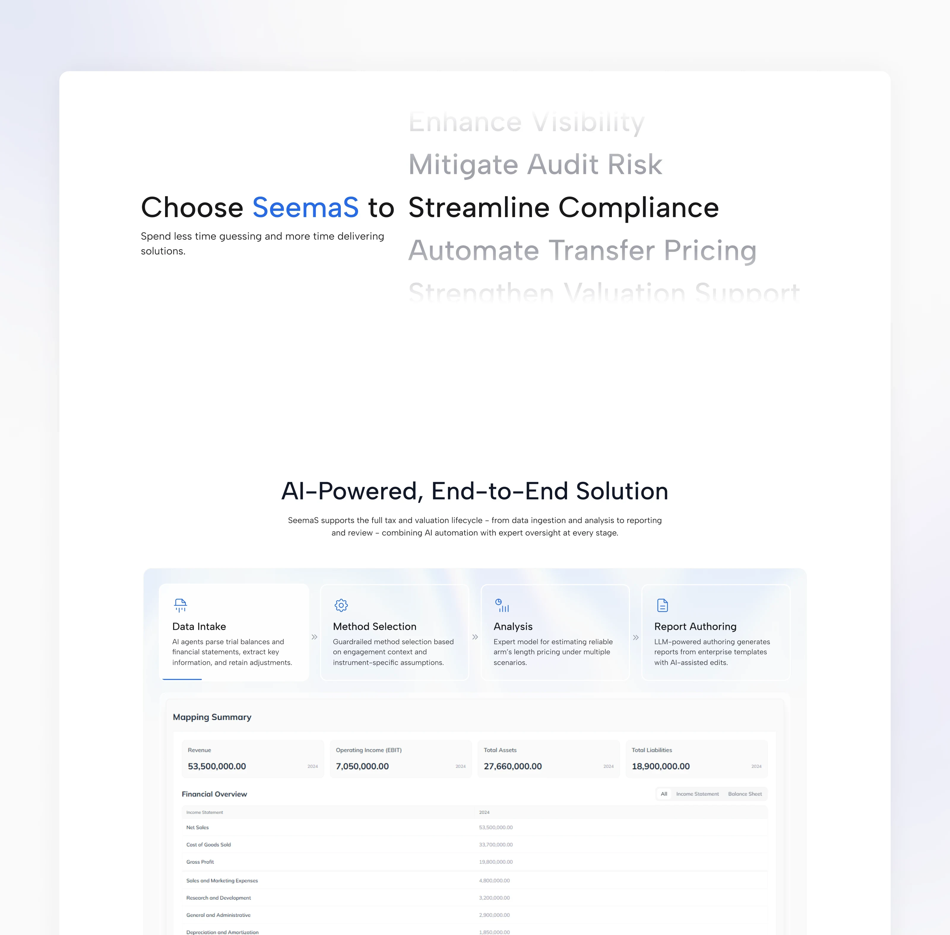
The product, shown step by step
Instead of static screenshots, tabbed animated demos walk through the real workflow: data intake, choosing a method, running the analysis and authoring the report. Each step pairs one short explanation with the matching product view.
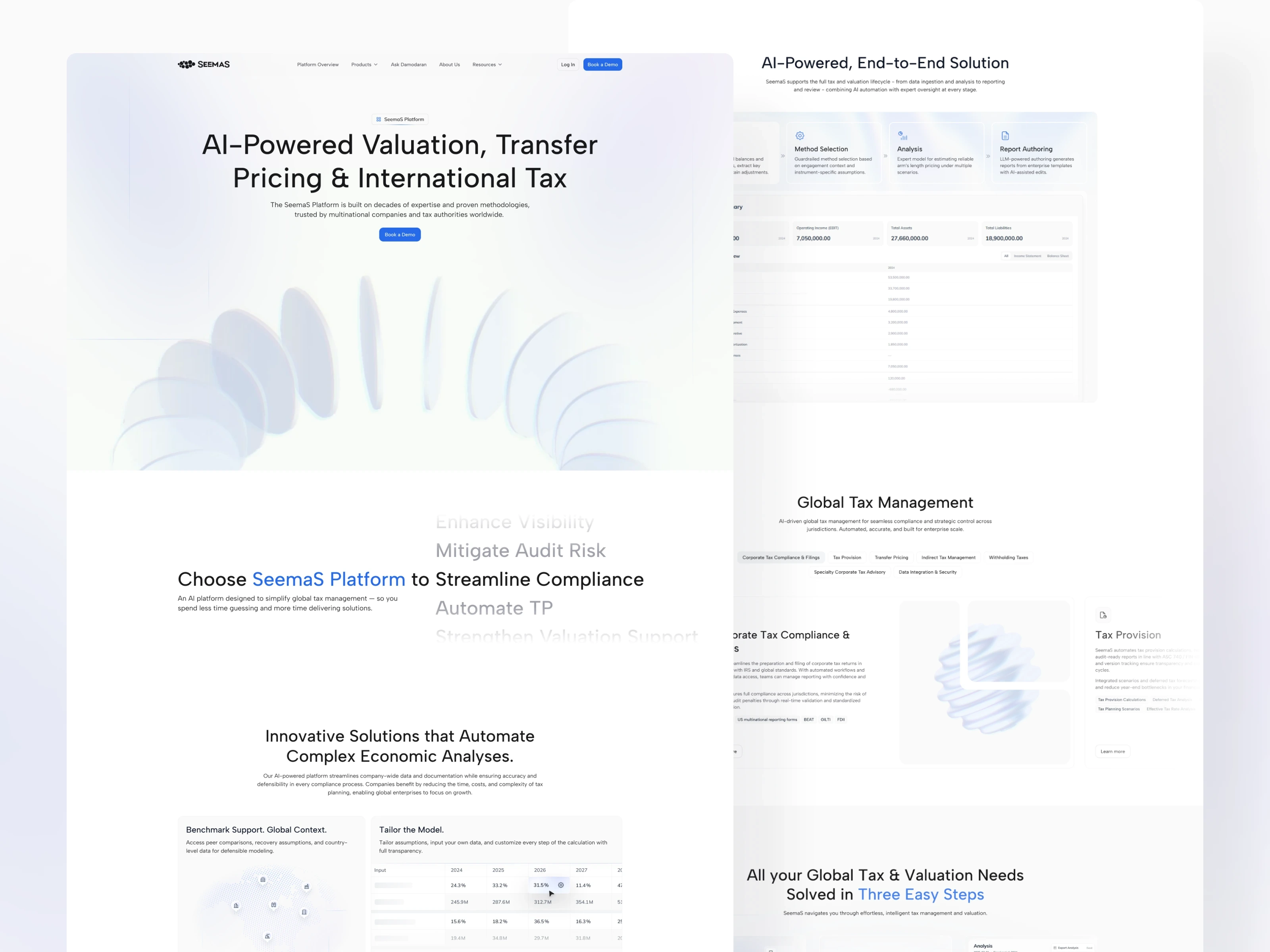
A visual language for serious data
The style had to feel precise and trustworthy without looking cold. Custom motion and 3D elements carry the brand beyond the interface and repeat across all product pages, so the site feels like one system.
Making the differences visible
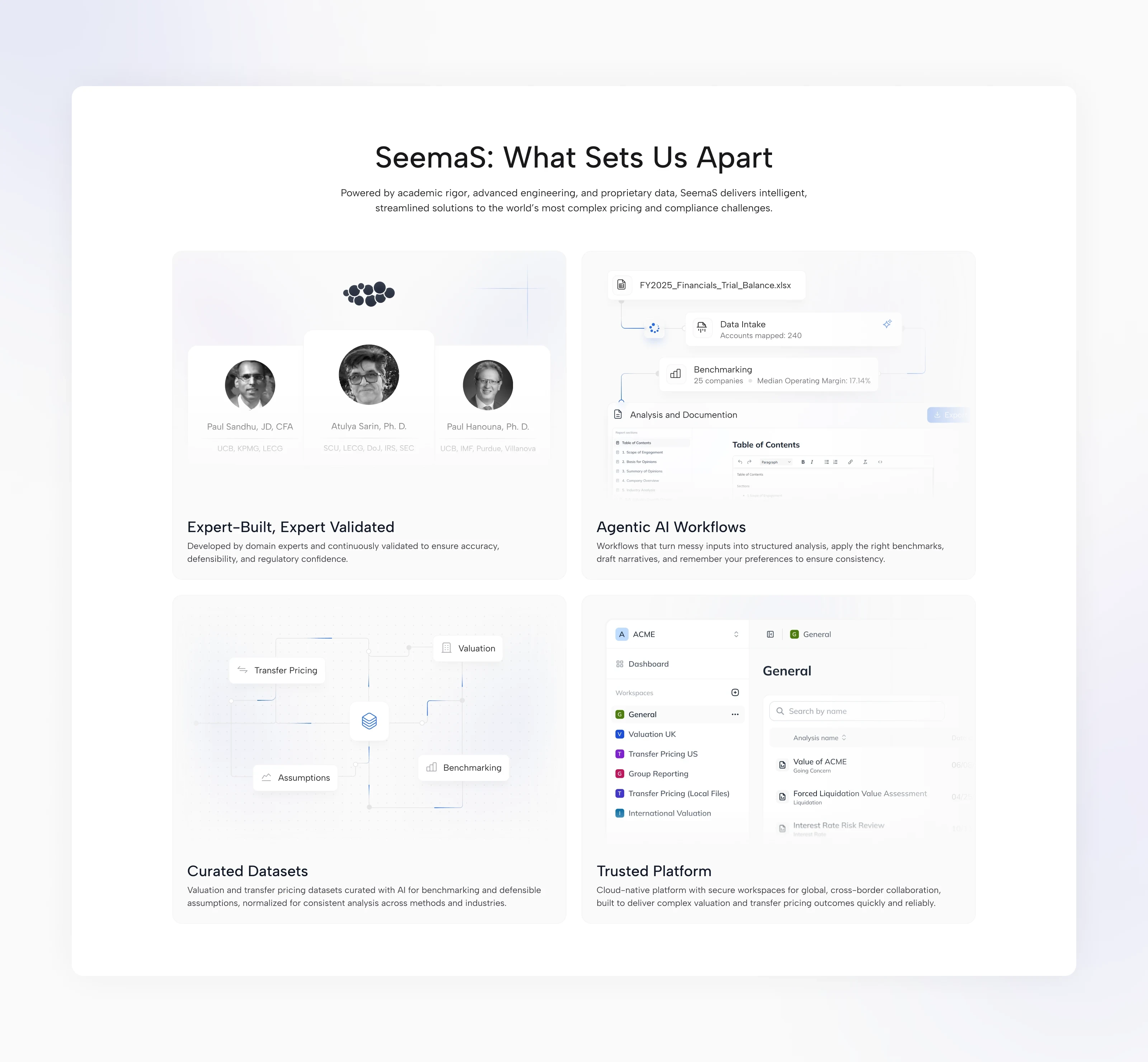
A bento grid brings together the four strengths: domain expertise, AI workflows, curated datasets and collaborative workspaces. Every card combines a piece of real interface with a simple visual explanation, so the benefit is clear at a glance.
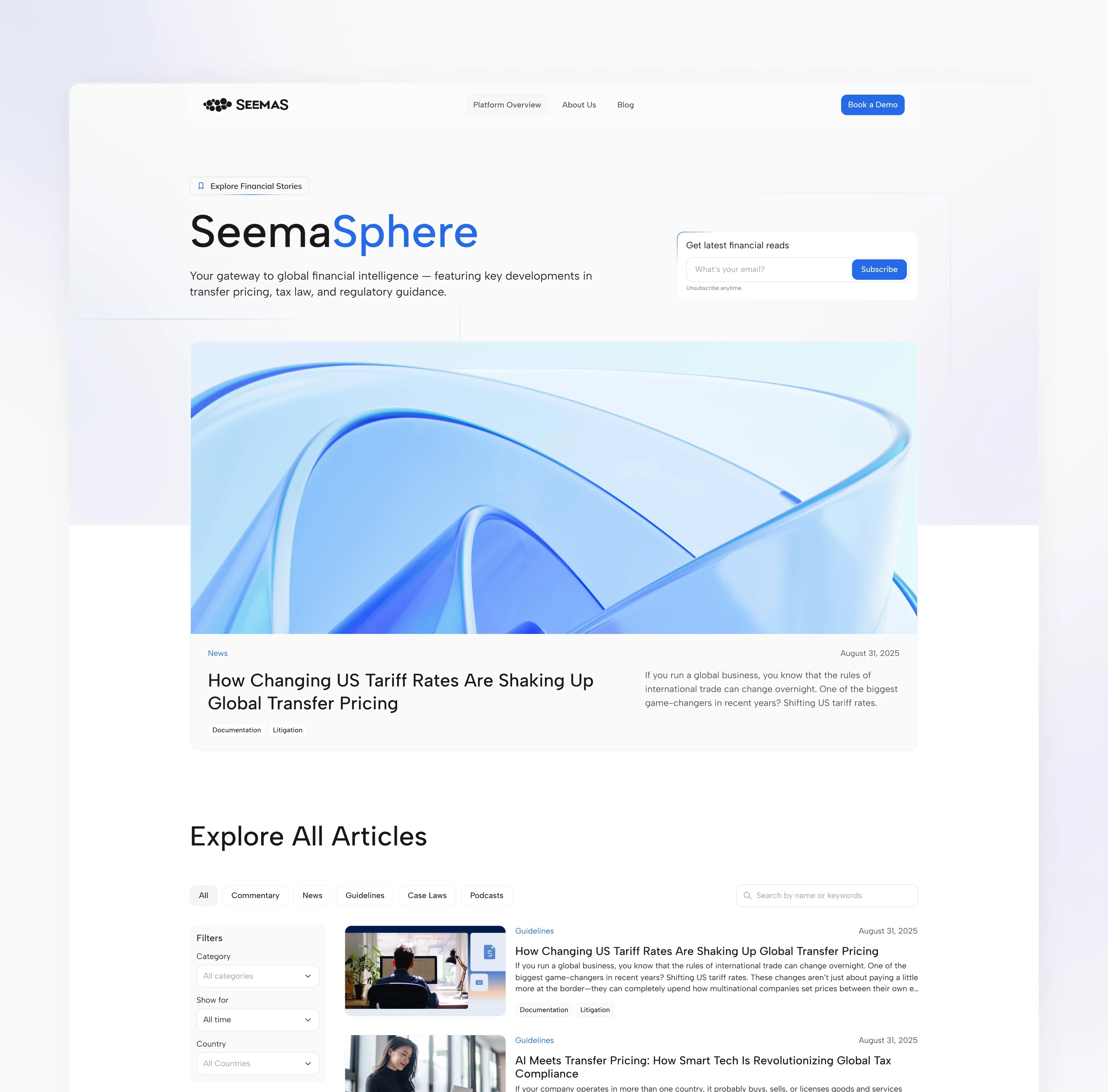
SeemaSphere: a blog the expert can run alone
The Framer CMS blog has search, categories and filters. To keep it alive without a designer, we built a custom Claude skill helps the transfer pricing expert who writes the articles: it creates covers in the brand style, fills in the CMS fields and prepares content for publishing.
Motion with a purpose
Scroll animations, section transitions and animated graphics introduce ideas one at a time and give long pages a steady rhythm.
Built for every screen
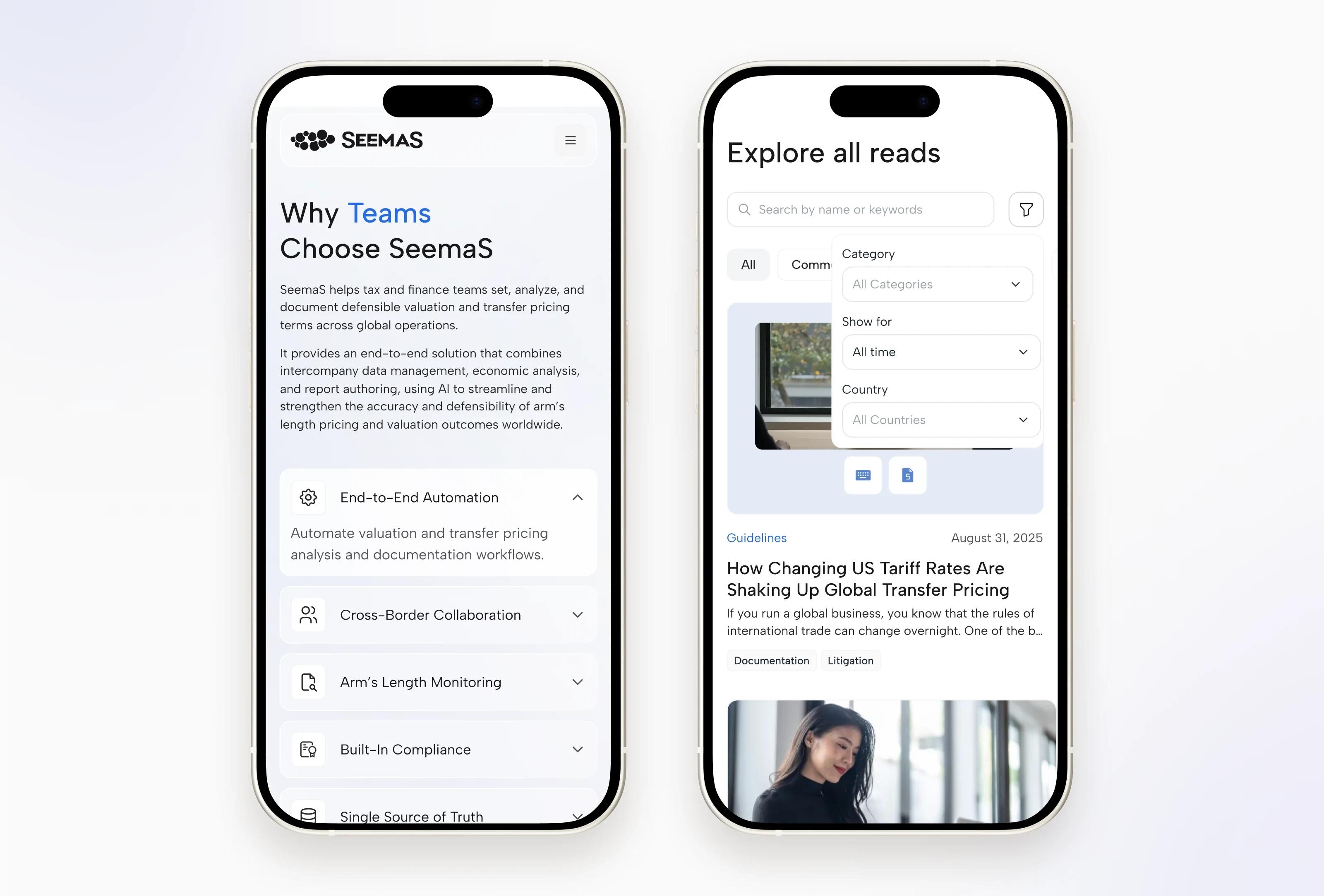
All pages were adapted for tablet and mobile, keeping demos, bento cards and tables readable on small screens.
A system the team can keep using
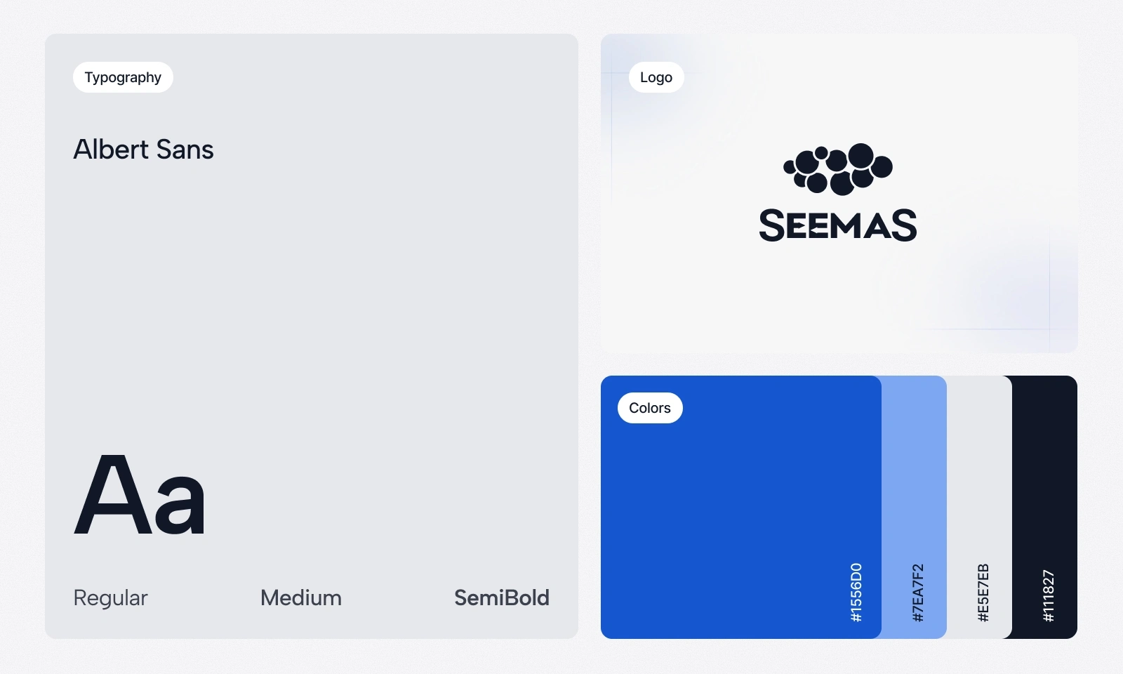
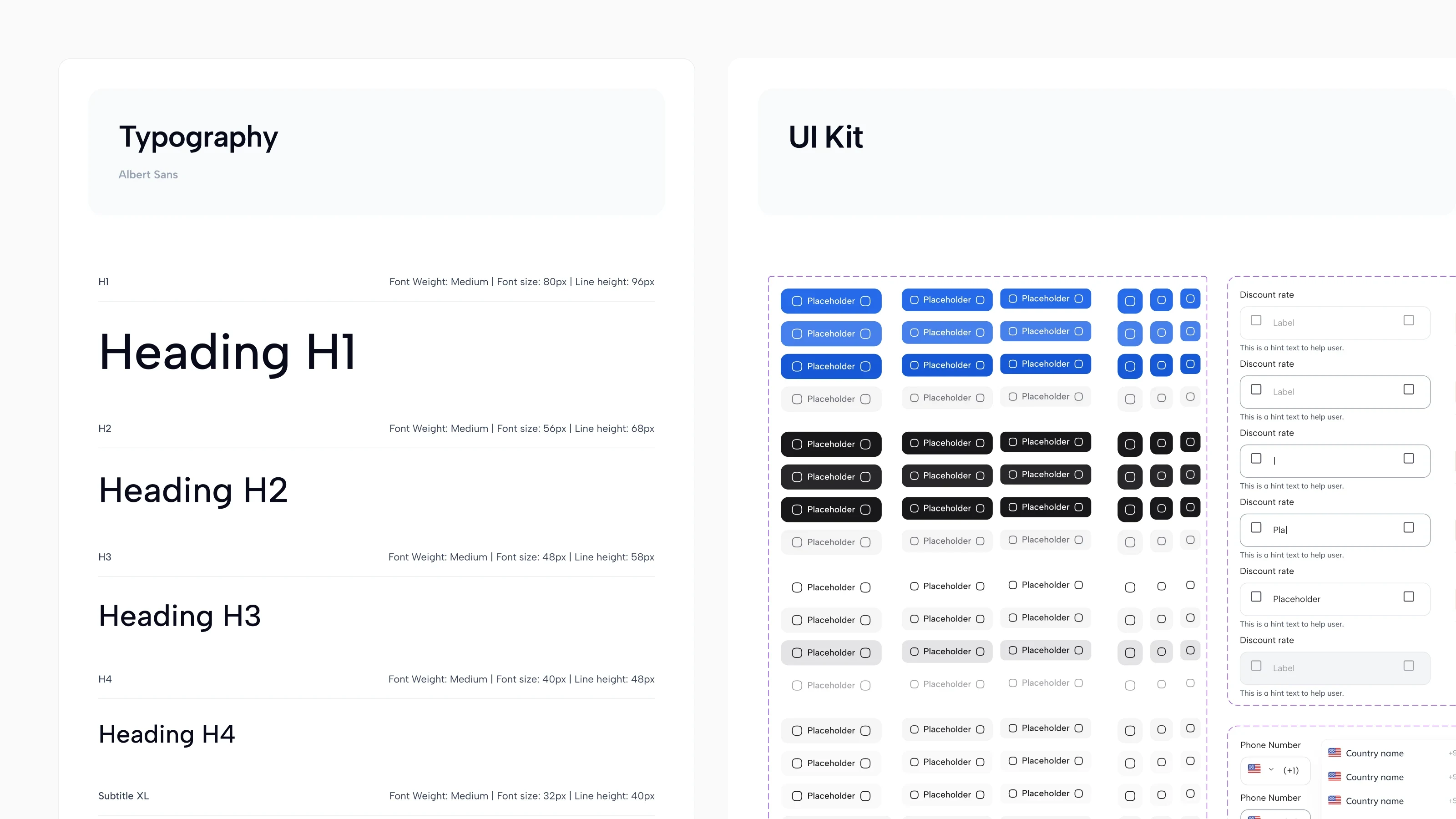
The foundation is Albert Sans, a blue-led palette, cool neutrals and generous spacing. Typography, reusable components and interaction states are documented in a UI kit shared by the Framer build and the engineering team, together with QA and a base for future pages.
Outcome
The launched site brings SeemaS’s products, platform demos and expert content into one place. Reusable product pages and the CMS blog let the team grow the site without starting from scratch. We worked with developers on performance, implementation and QA of the responsive layouts and motion, and new client demo sessions were scheduled after launch.
Like this project
Posted Oct 16, 2026
Designed a website for SeemaS, making complex AI financial products accessible to CFOs and advisory teams.
Likes
0
Views
0
Clients
SeemaS, Inc.
Collaborators