Fern - AI Platform and Website Redesign

View completed workusefern.ai
Fern — Redesigning an AI product and its website
Product and website design for an AI platform that helps agencies understand client relationships, identify risks, and decide what to do next. I worked as part of a two-designer team, contributing to the redesign from audit to final polish and taking ownership of the design system.
Client: Fern
Role: Product Designer
Scope: UX audit, navigation, core product screens, visual design, design system, responsive behaviour, and website design.
The starting point
Fern brings information from everyday client communication into one place, helping agency leaders monitor relationship health and account teams investigate issues and follow up.
The team already had a working backend and an early interface built quickly with AI coding tools. The underlying functionality was there, but the experience needed a considered design: clearer navigation, better information hierarchy, consistent interactions, and a visual style that reflected the brand.
The website needed a similar rethink. It was functional, but the structure and presentation needed to explain the product more clearly and guide visitors towards booking a demo.
My role
I worked as the second hands-on designer alongside first designer, the founder, and the developer. I helped explore design directions, evaluate UX alternatives, and refine the product through to the final interface details.
My work focused on the client portfolio overview, the individual client page, navigation, and parts of the task experience. I was responsible for building the design system with variables and tokens. On the website, I contributed to the audit, section structure, typography, and graphics explaining product features.
The platform
From audit to a clearer structure
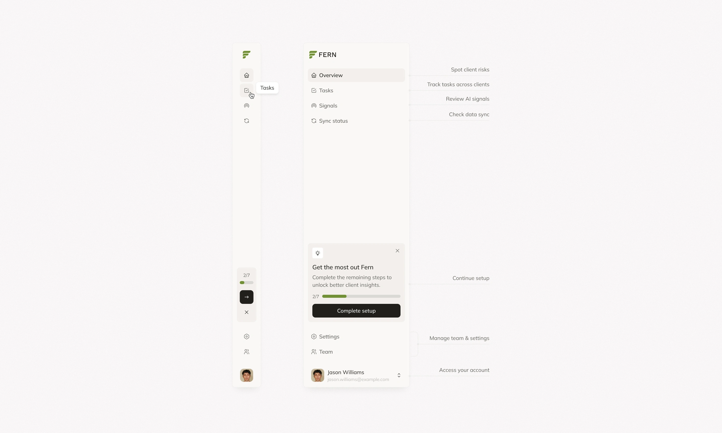
I contributed to the audit of the early product, looking at how users moved between the dashboard, individual clients, signals, and tasks. The main design challenge was connecting these views into a clear sequence: review client health, understand a signal, and act on it.
I proposed ideas for reorganising the navigation and explored UX variations with the team. We worked towards a structure that kept portfolio-level work distinct from the details of an individual client, with consistent paths between them.
Clients overview
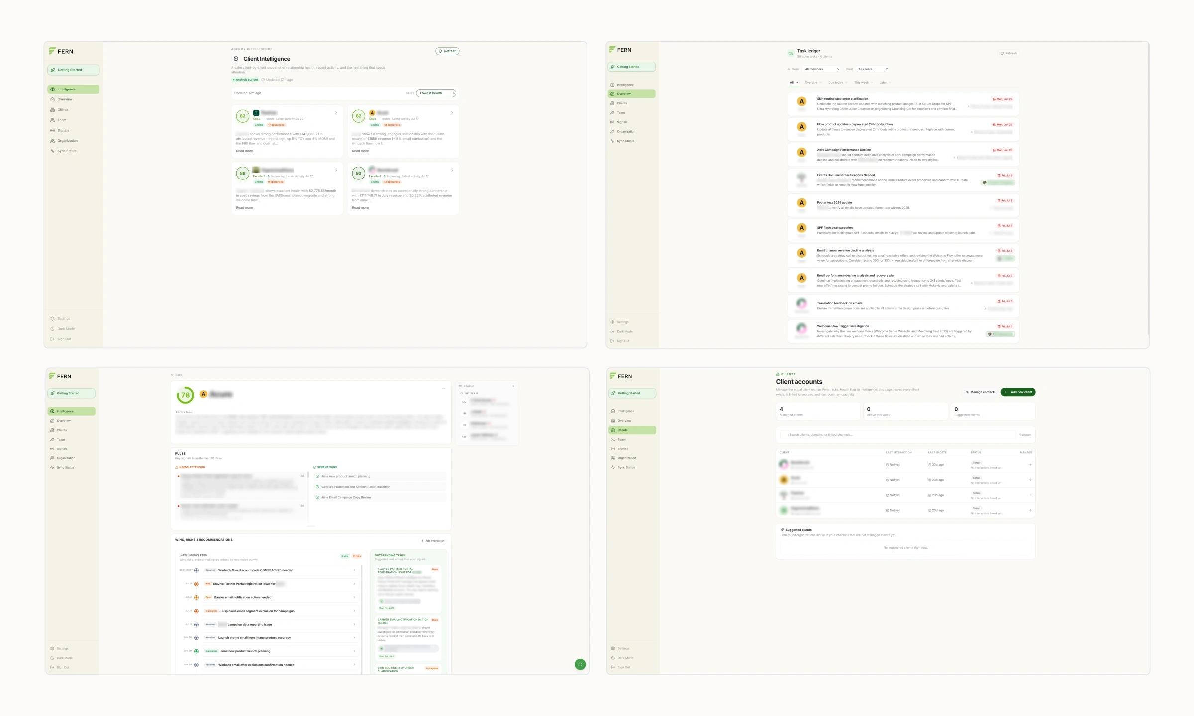
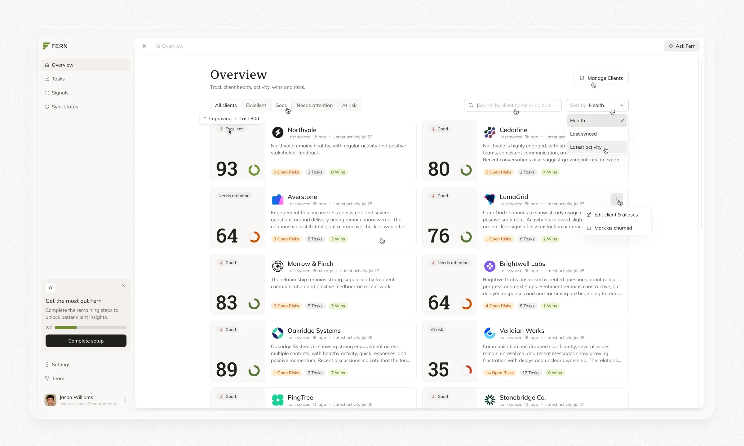
I worked in detail on the clients overview, exploring ways to organise relationship health, risks, tasks, and wins so teams could compare clients and decide where to look first.
I refined the layout and information hierarchy and helped with filtering behaviour. Health-based filters, search, and sorting helped users narrow the view, while the client rows kept the key signals visible. The aim was to make the portfolio easy to scan without losing access to the detail behind each assessment.
A more organised client page
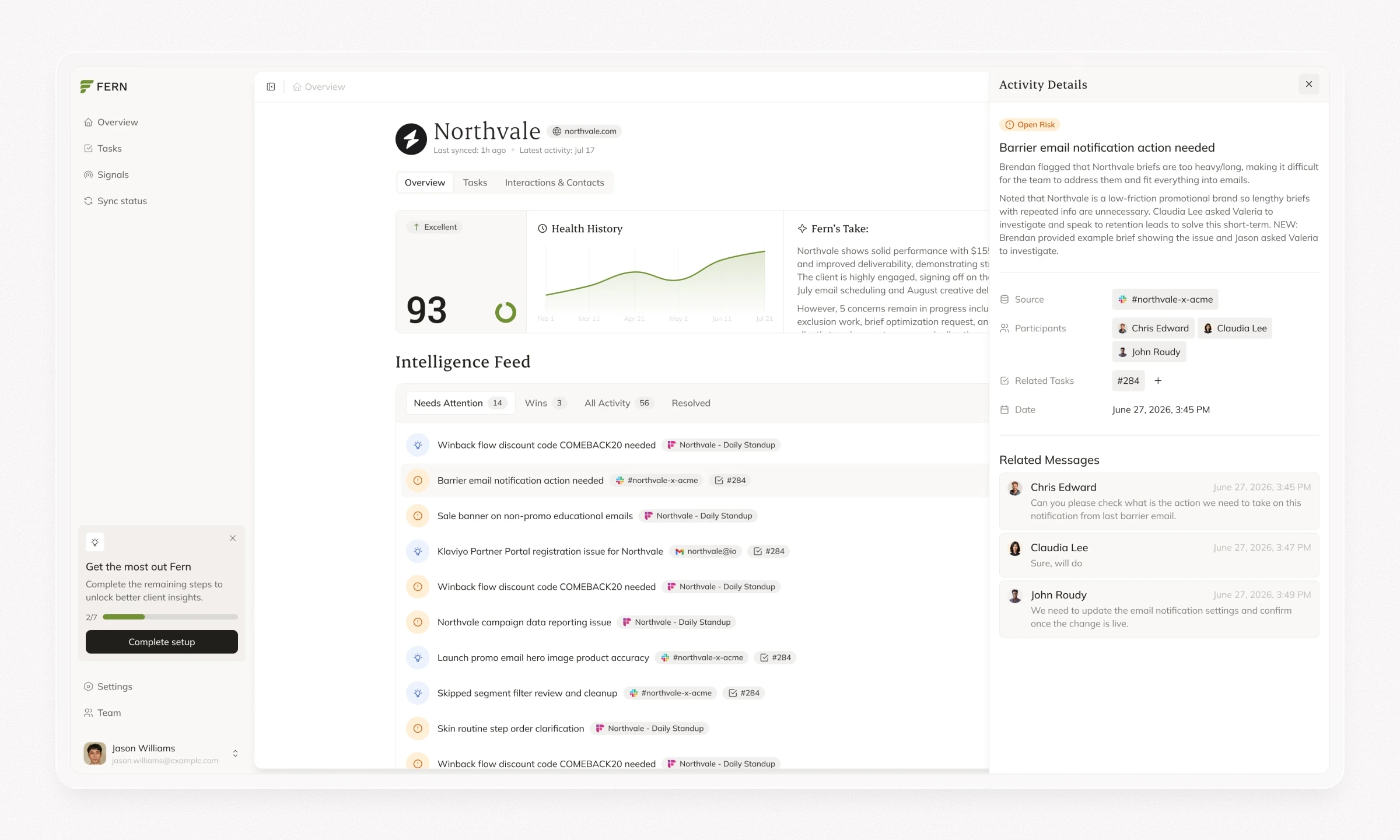
On the individual client page, I focused particularly on the upper section and tab navigation. I explored how to present the client's health assessment and summary before users moved into the intelligence feed, tasks, or interaction history.
The tabs gave these different types of information a predictable place within the client page. I refined their hierarchy and relationship with the page header, helping the team keep navigation clear as the interface became more detailed.
Connecting signals with tasks
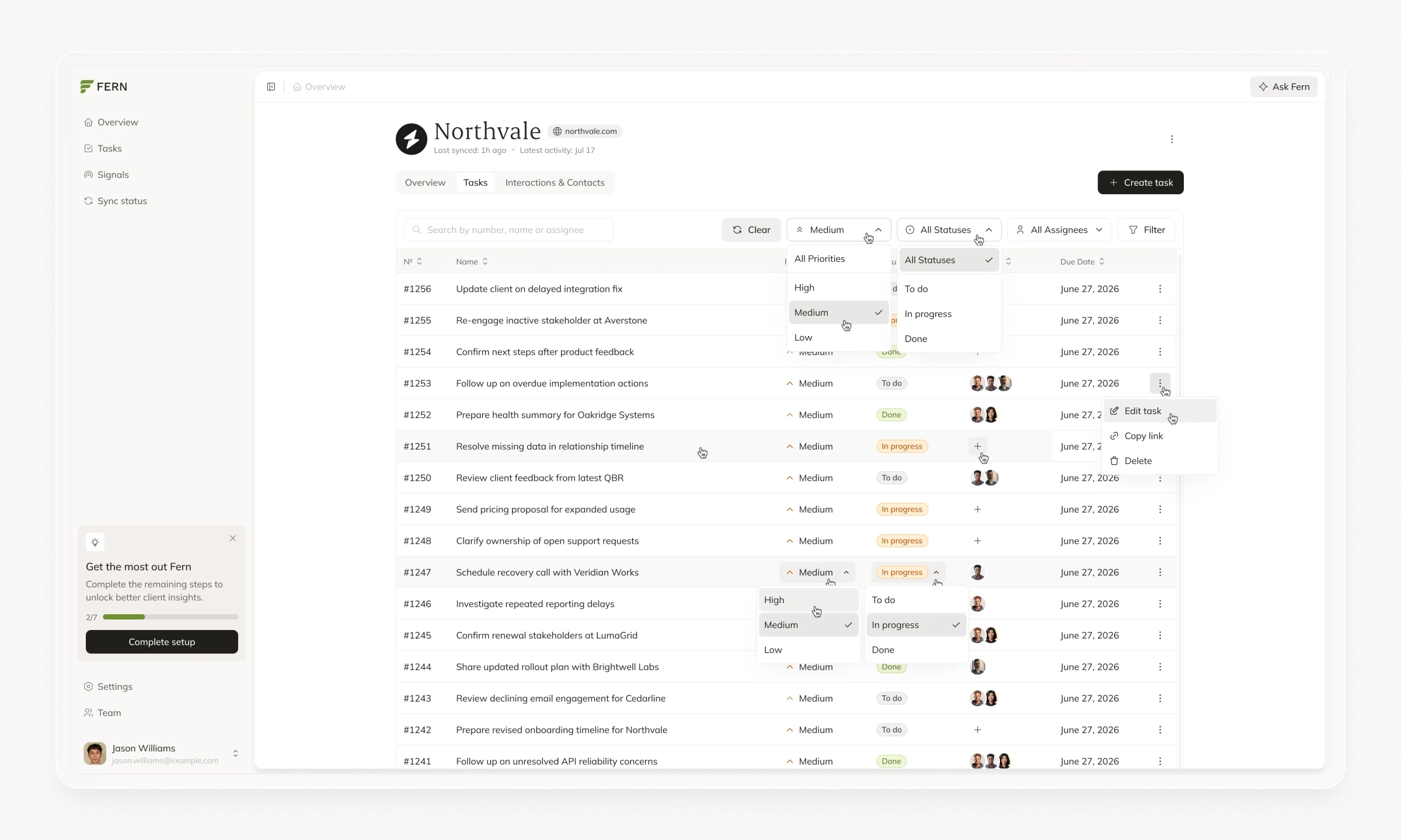
I helped refine the task management flows, filtering, and task details. This included how users reviewed follow-ups, updated task information, and moved between a task and its related client context.
The task detail panel brought the description, related activity, and change history together, alongside controls for priority, status, assignees, and due dates. My contribution focused on making these controls and details consistent with the rest of the platform.
States, edge cases, and breakpoints
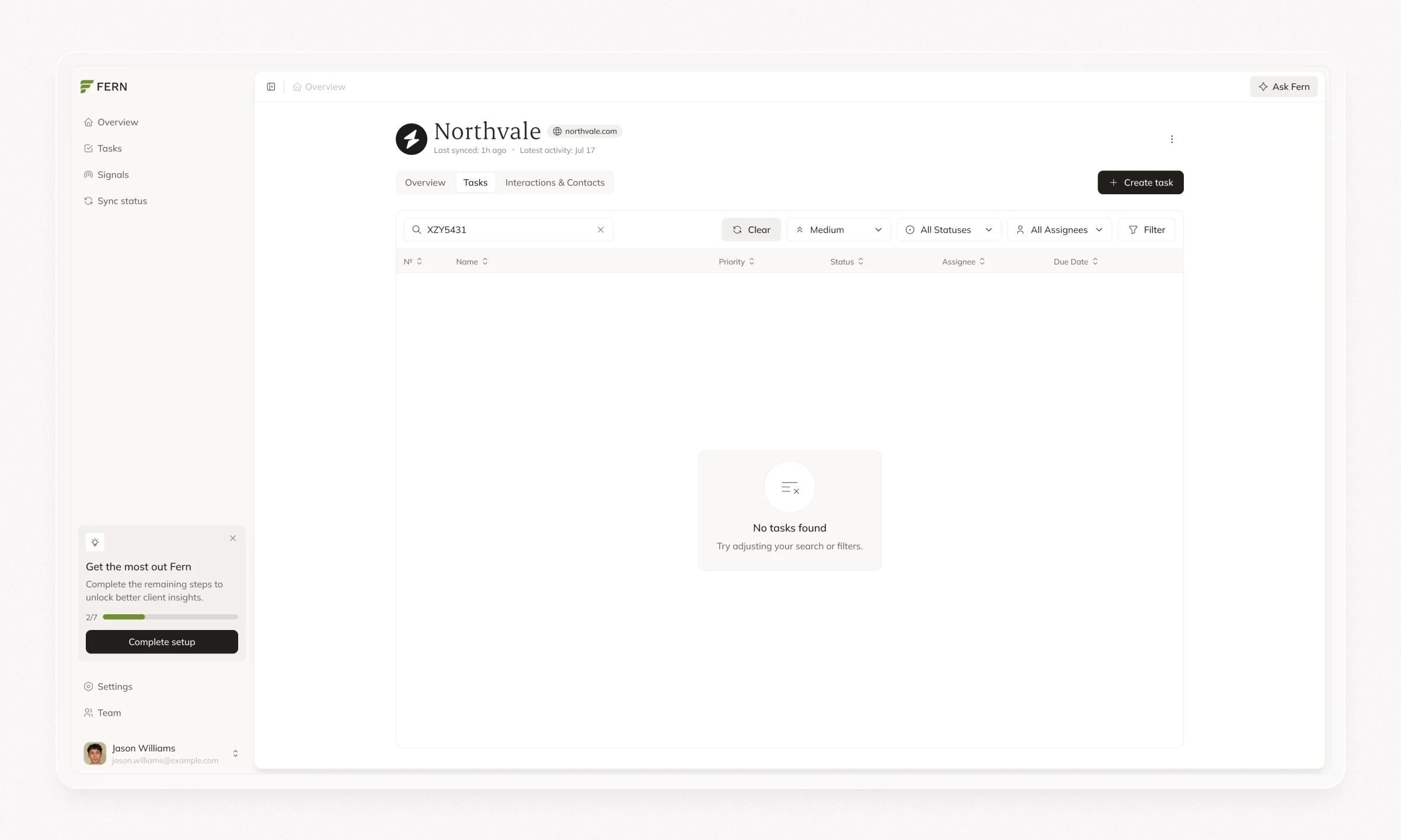
I worked through component states, edge cases, and layouts across different breakpoints, carrying the design beyond the ideal populated screen.
This included refining how dense information, navigation, and controls behaved as the available space changed, and resolving interface details before handoff.
Design system
A visual style built around the brand
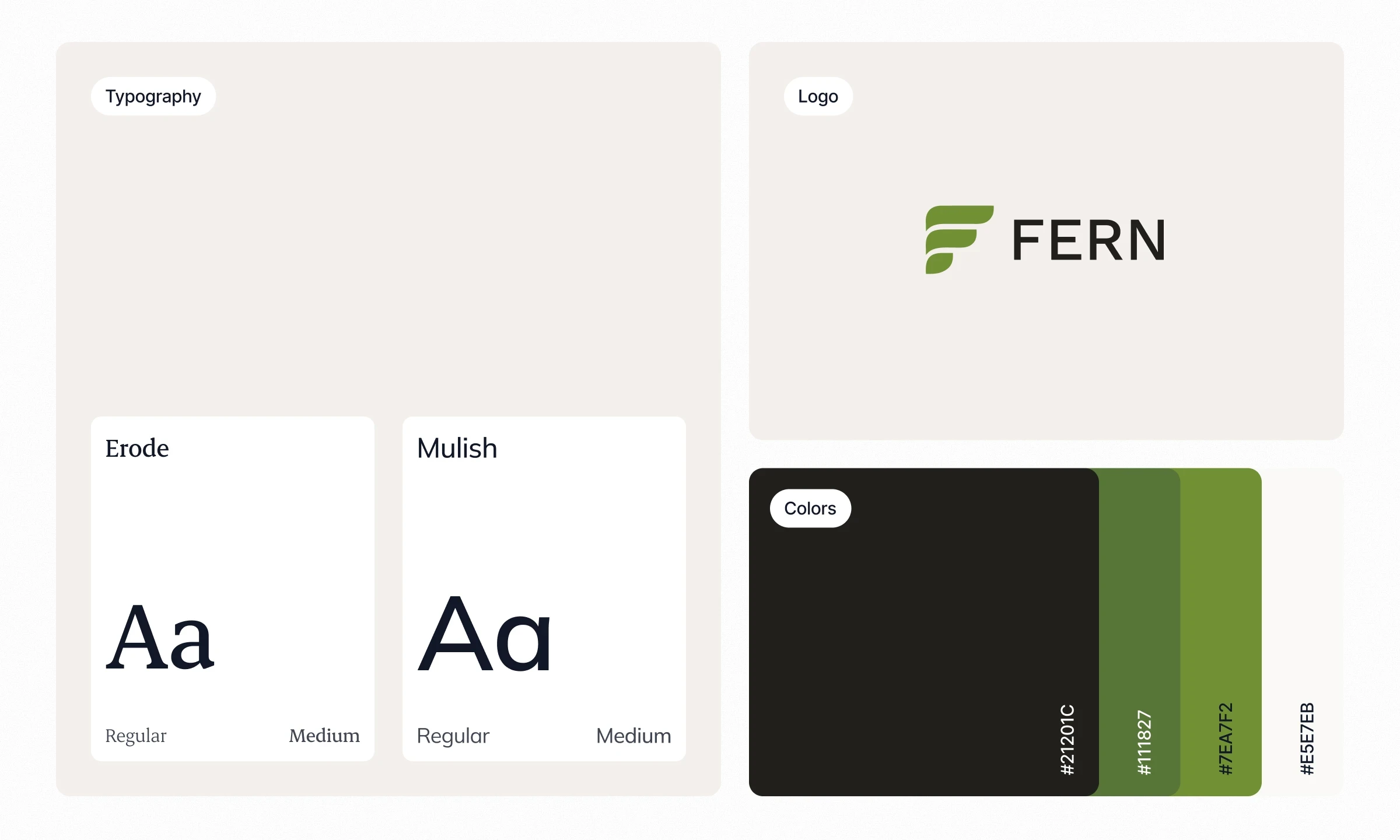
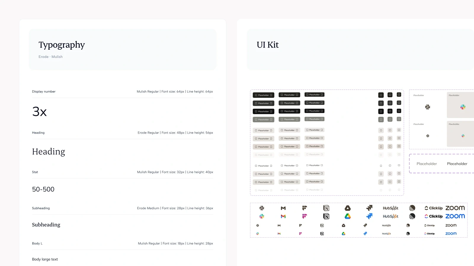
I developed a distinctive interface style aligned with Fern's brand, refining typography, colour, hierarchy, and recurring UI patterns. The direction needed to give the product its own character while keeping client data and actions easy to read.
I carried that style into a reusable system, so it could be applied consistently across the product.
Variables, tokens, and reusable components
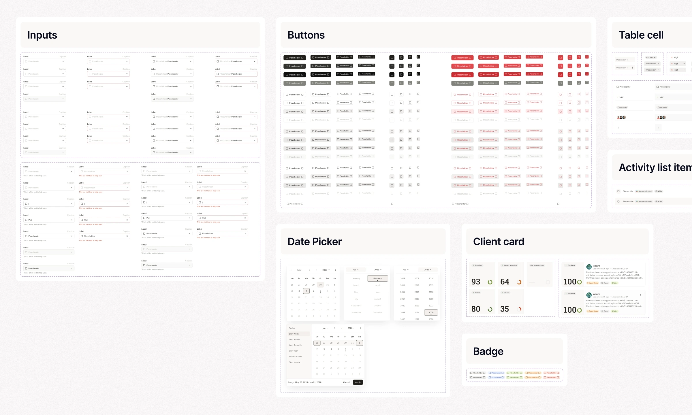
I built the design system around Figma variables and component-based colour tokens, with reusable patterns for navigation, tables, cards, health states, charts, forms, and feedback.
I defined component variants and states and accounted for edge cases and different screen sizes. This gave the team a shared set of design rules for building and refining the interface.
The website
Reorganising the story
I contributed to the website audit and helped rethink the order and grouping of sections. We organised the story around the client management problem, Fern's capabilities, and the next step of booking a demo.
The existing copy provided a starting point. My contribution centred on how the content was structured and presented, helping visitors move from an introduction to the product into more specific features.
Product features shown through graphics
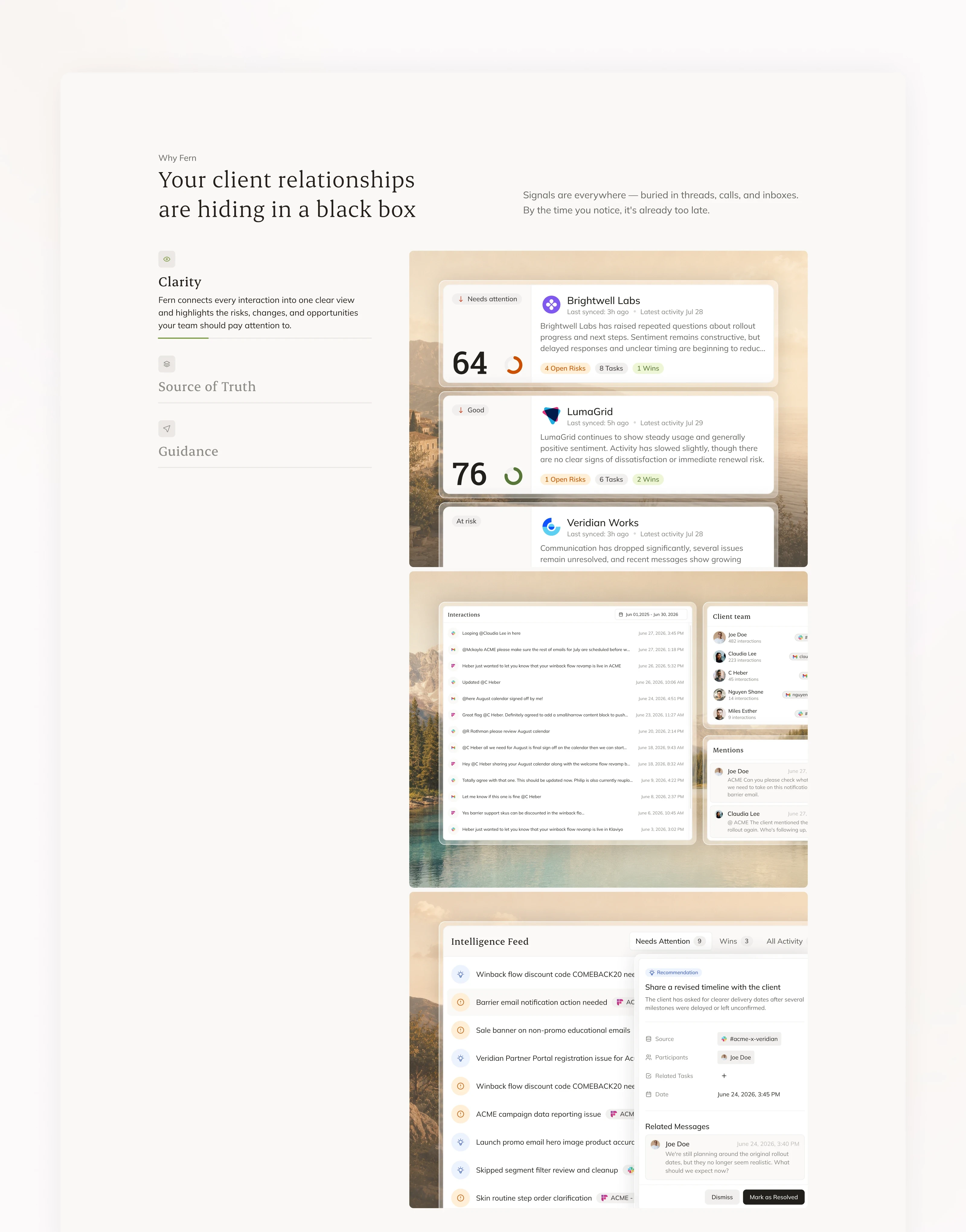
I designed graphics to explain Fern's capabilities through recognisable interface details. Client summaries, relationship signals, tasks, and health indicators gave visitors concrete examples of what the platform does.
These visuals supported the tabbed explanations and bento feature section, connecting short descriptions with relevant product examples and carrying the app's visual language into the website.
Typography and visual direction
I worked on the website's typography, refining the hierarchy between headlines, descriptions, and supporting content.
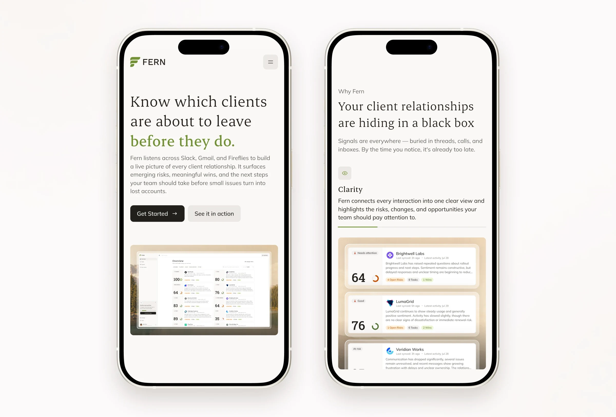
Cream backgrounds, serif headlines, muted green accents, and natural imagery gave the site a warmer character. I helped develop the typographic treatment within this direction, keeping the content clear across sections with different levels of detail.
Outcomes
The redesigned core flows and design system were implemented quickly, giving Fern a consistent interface and a reusable foundation for further development. My work on variables, tokens, and components supported that implementation alongside the team's work on the core product experience.
The website was developed and launched with a clearer narrative, refined typography, and custom product graphics. The founders and early customers responded positively to the updated experience.
Fern remains in beta and early production, with a broader launch in preparation. The team continues to refine the product using feedback from agency professionals working with real client relationships.
1 like · 5 views · Oct 28, 2026
Redesigned AI platform's product and website for improved UX and brand alignment.