Designing Sheepy 2.0 for Enhanced User Engagement

Ilya Kret


Sheepy 2.0: a companion you don’t want to let down
Sheepy is a digital wellness app with a virtual sheep that reacts to your phone habits. Version 2 is built around one simple loop: the less you scroll, the better your sheep feels.
Role: Product Designer
Platform: iOS and Android
Scope: product concept, UX flows, UI, states and component updates
Year: 2025
The starting point
Most screen-time apps show numbers and expect people to act on them. Knowing you spent five hours on your phone rarely changes what you do tomorrow.
The goal for this version was to make the cost of scrolling felt rather than read, and to keep the experience kind enough that people come back after a bad day. Three principles guided the work:
One loop. Every screen connects back to the sheep’s wellbeing.
Feel it, don’t read it. The result of the day is visible at a glance.
Friction with kindness. It should be harder to give in, but no one should feel ashamed.
What changed in V2
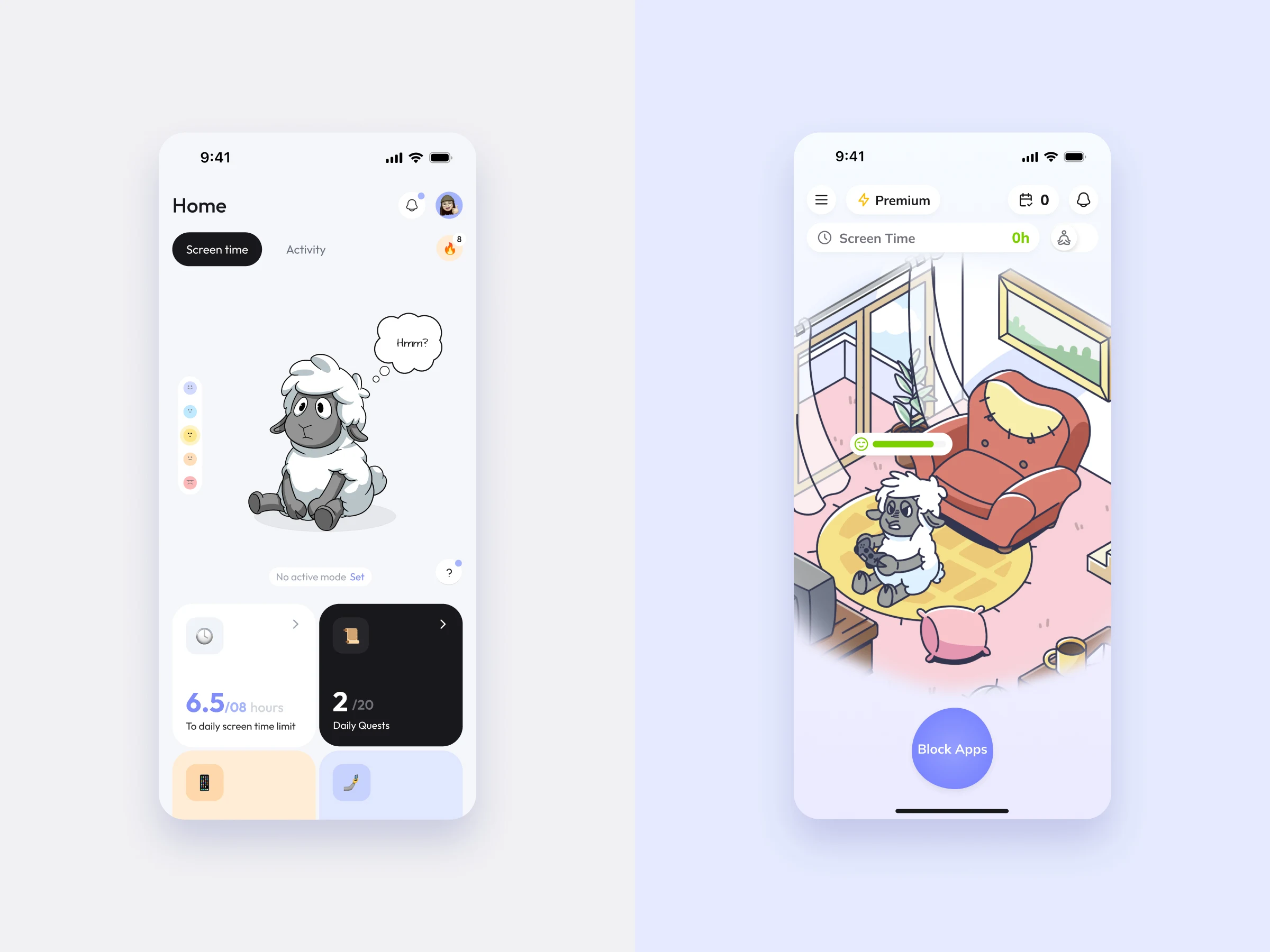
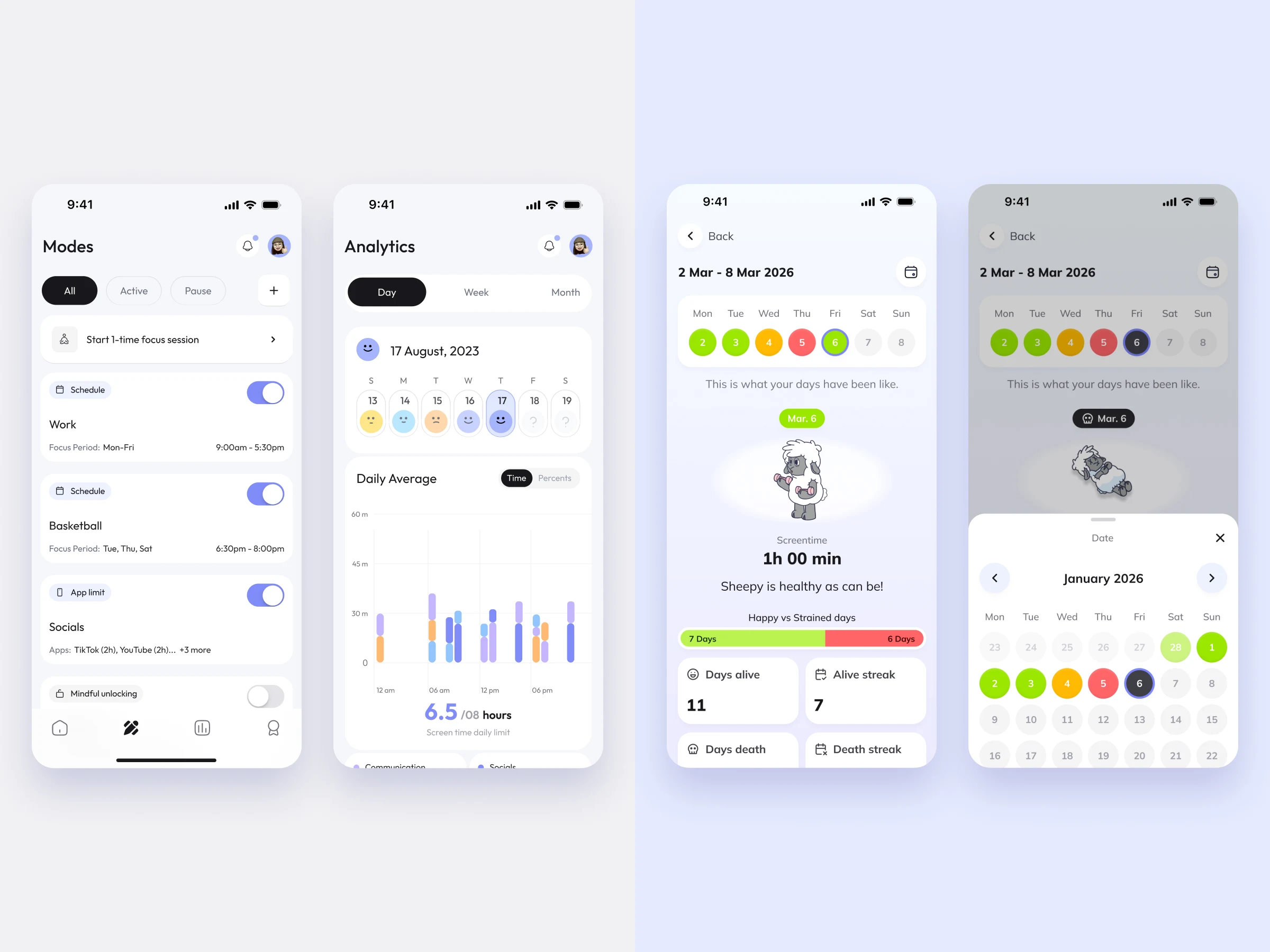
The first version was a toolkit. Home was a dashboard with four metric cards, two tabs and a mood scale, and control lived in Modes: schedules, app limits, mindful unlocking and focus sessions, each with its own setup. Progress was tracked in an analytics section with hourly charts and categories.
Version 2 keeps the purpose but removes most of the decisions. Home became the sheep’s room with a single action, Block Apps. Modes became one blocking sheet with a few durations, plus a separate night mode. Analytics became a calendar where each day is simply the sheep’s state. The sheep moved from the side of the product to its centre: it is now the feedback, not a decoration next to it.
Onboarding as a story
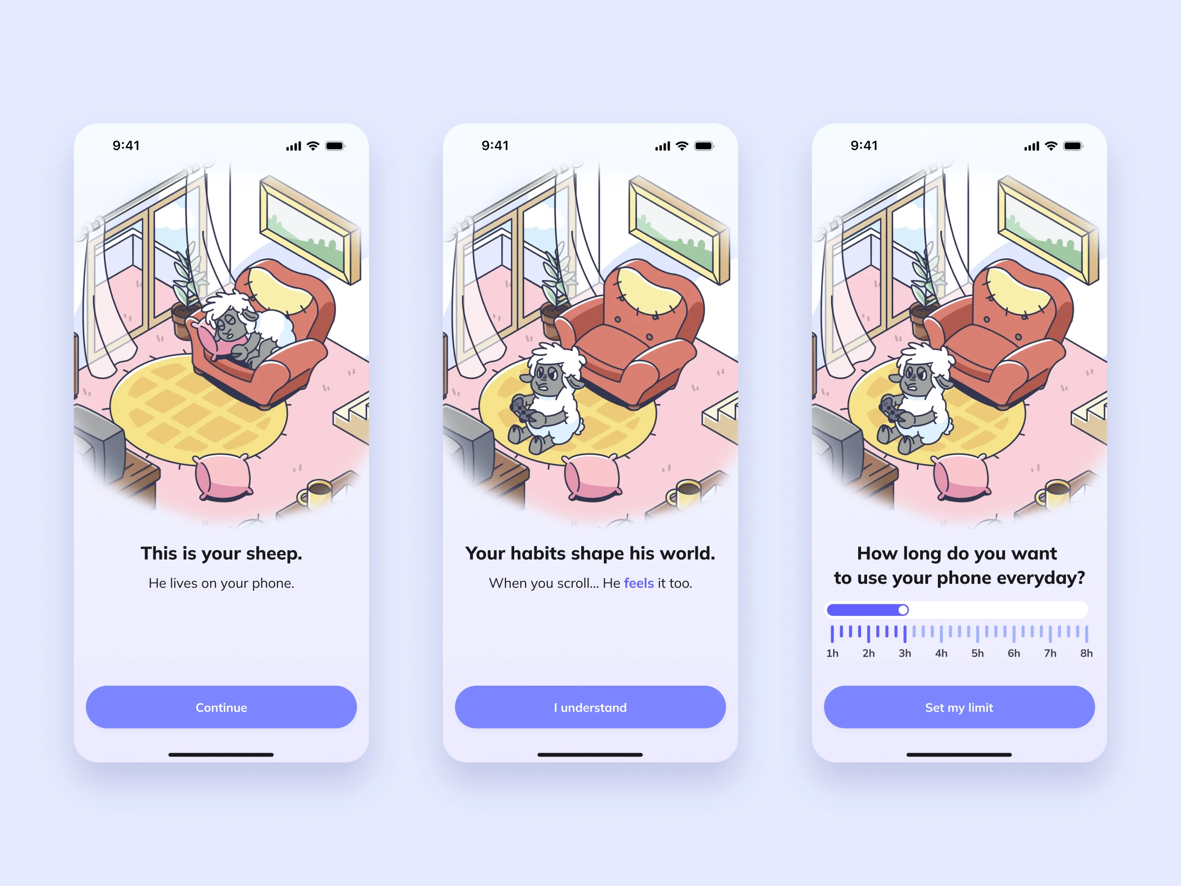
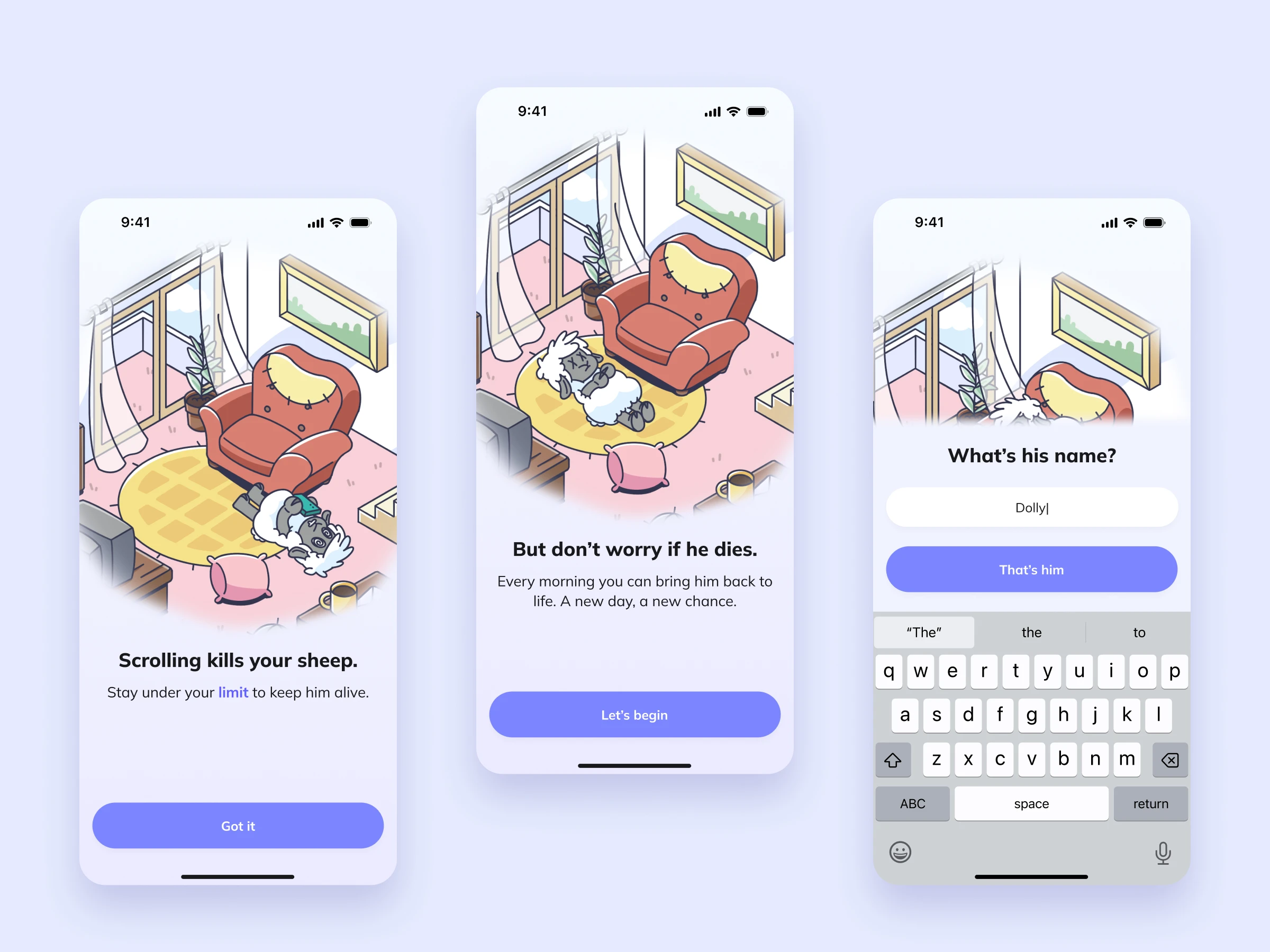
Onboarding tells the rules of the app as a short story. You meet your sheep, learn that your habits shape his world, and find out what happens if you scroll too much. The daily limit is set with a single slider in the middle of the story, so it feels like part of the deal rather than a settings form.
The story ends on a promise, “A new day, a new chance”, to set a supportive tone before anything goes wrong. The last step is naming the sheep: once he has a name, he is no longer a mascot but someone you are responsible for.
The first check-in
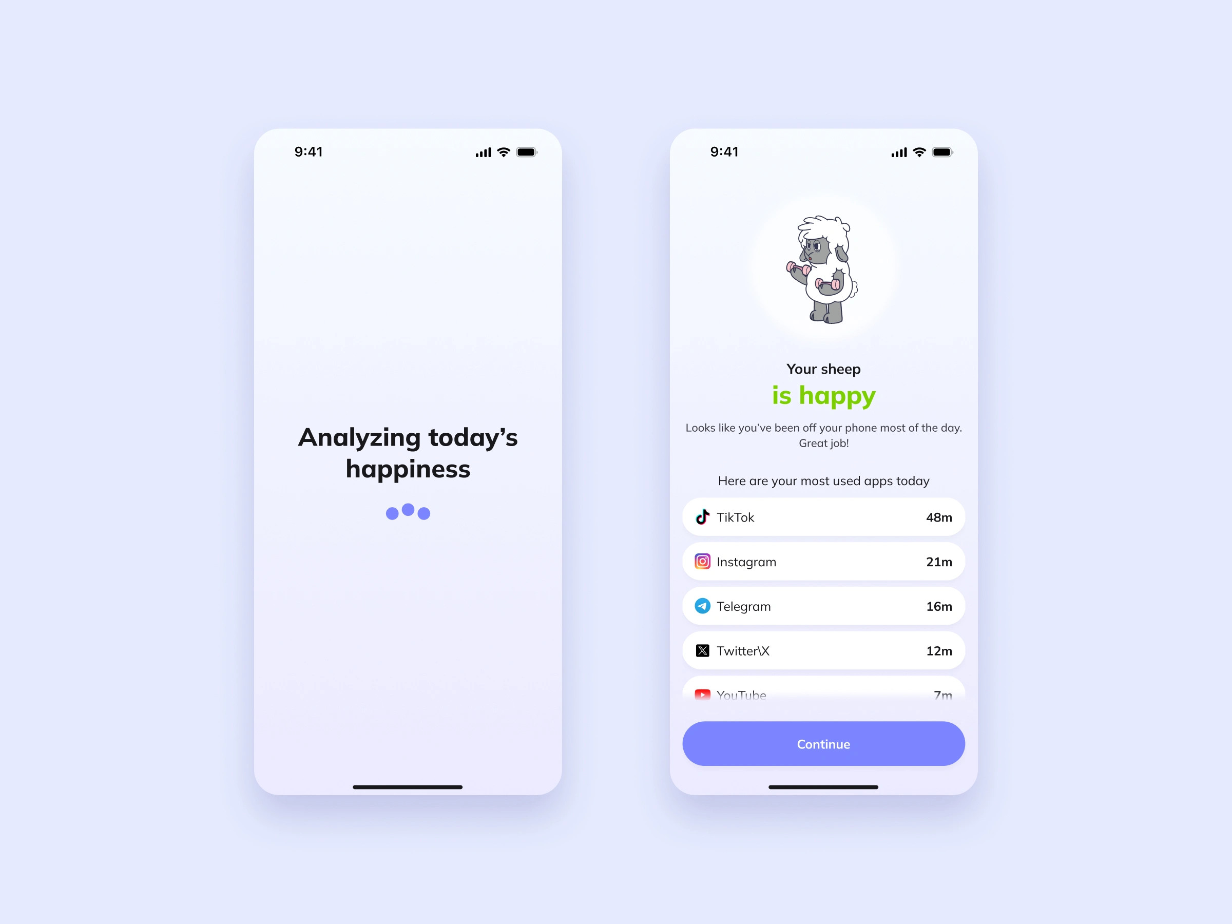
Right after onboarding, Sheepy analyses today’s screen time and shows the result as the sheep’s mood: happy, struggling, barely hanging on or dead. Each mood has its own illustration, colour and a short line, followed by the apps that took most of the day.
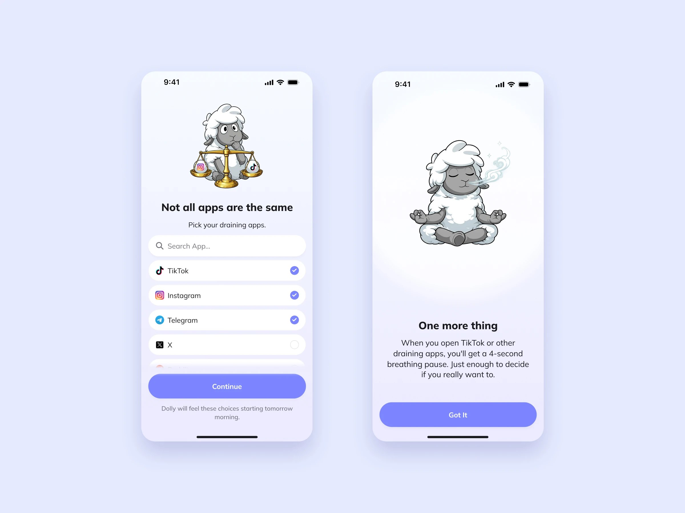
Then people choose their draining apps. Not all screen time feels the same, so only the apps they pick affect the sheep. The last screen introduces the breathing pause: a 4-second breath before a draining app opens, enough to notice the habit before it takes over.
Home and daytime blocking
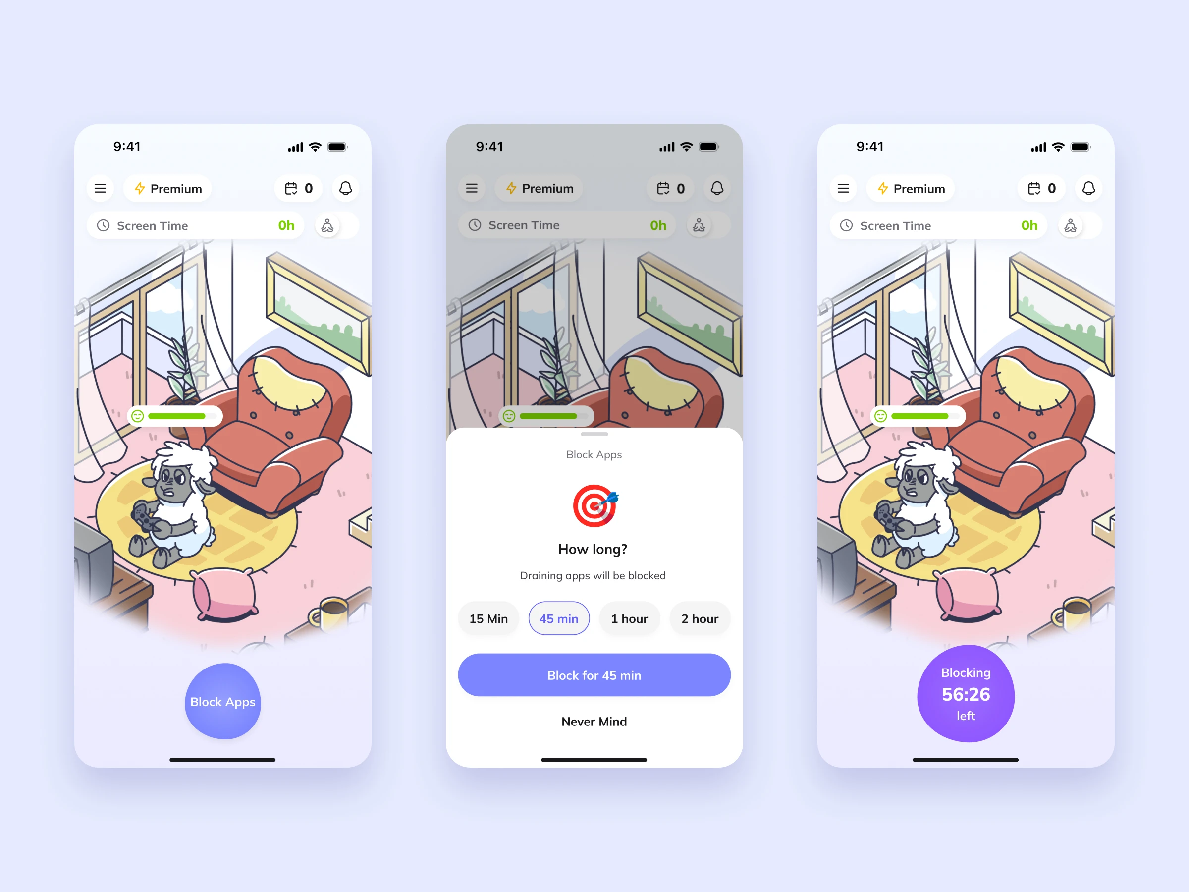
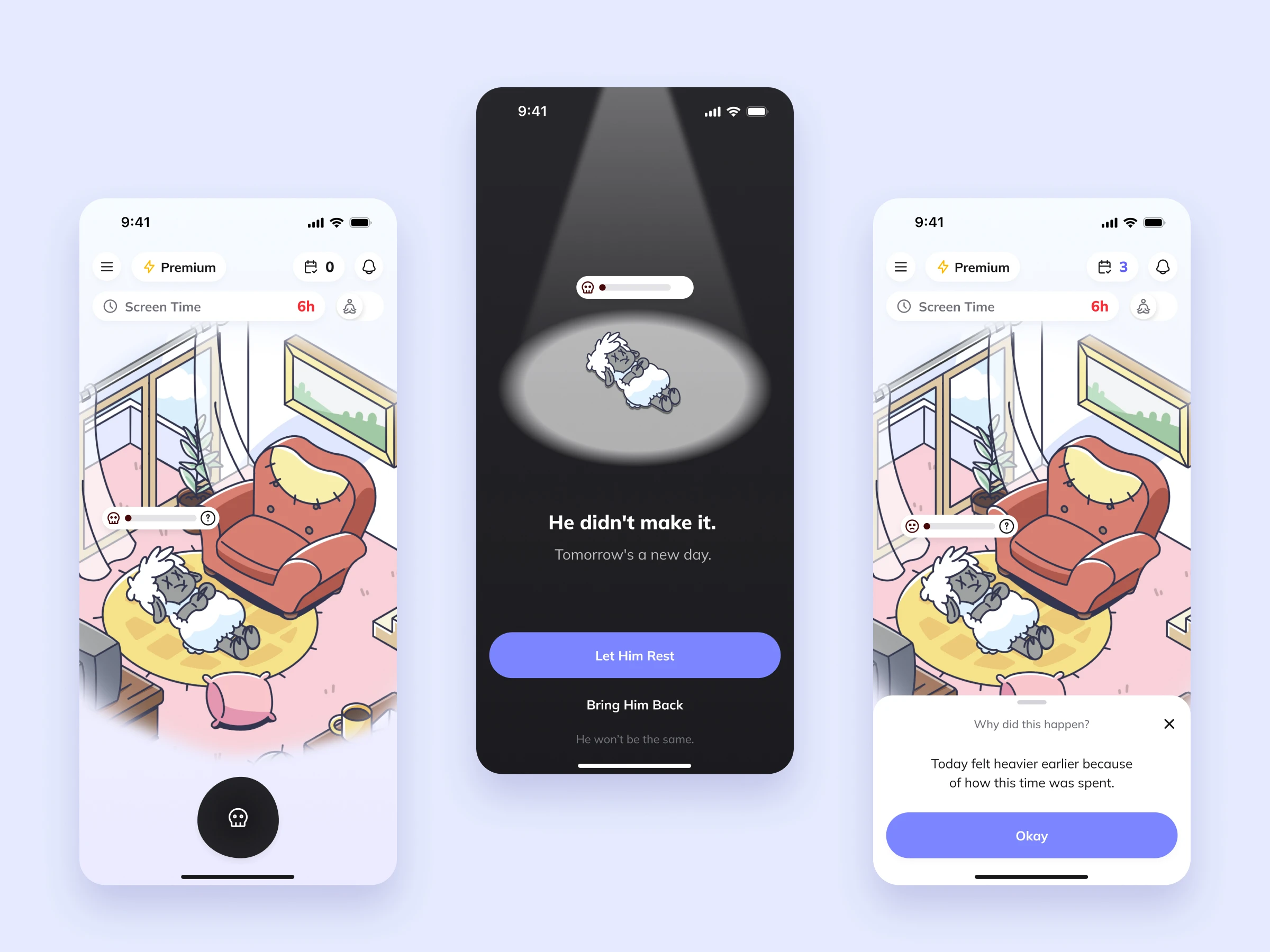
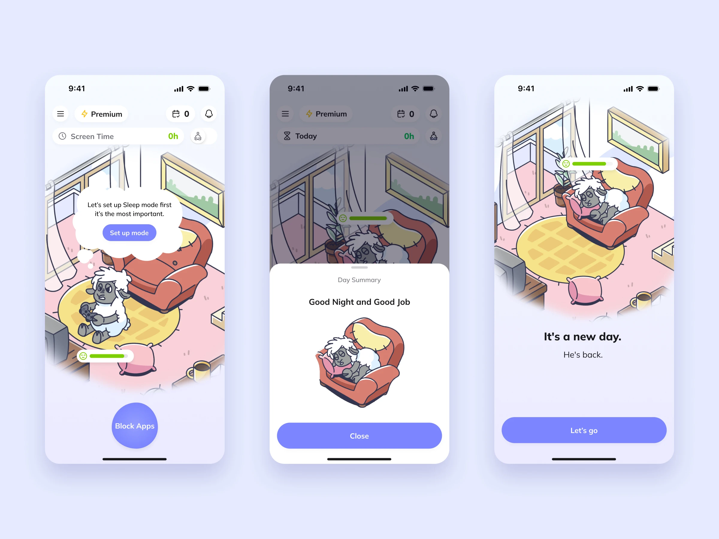
Home is the sheep’s room. The state of the room and the sheep is the daily feedback, so you can tell how the day is going without reading a number.
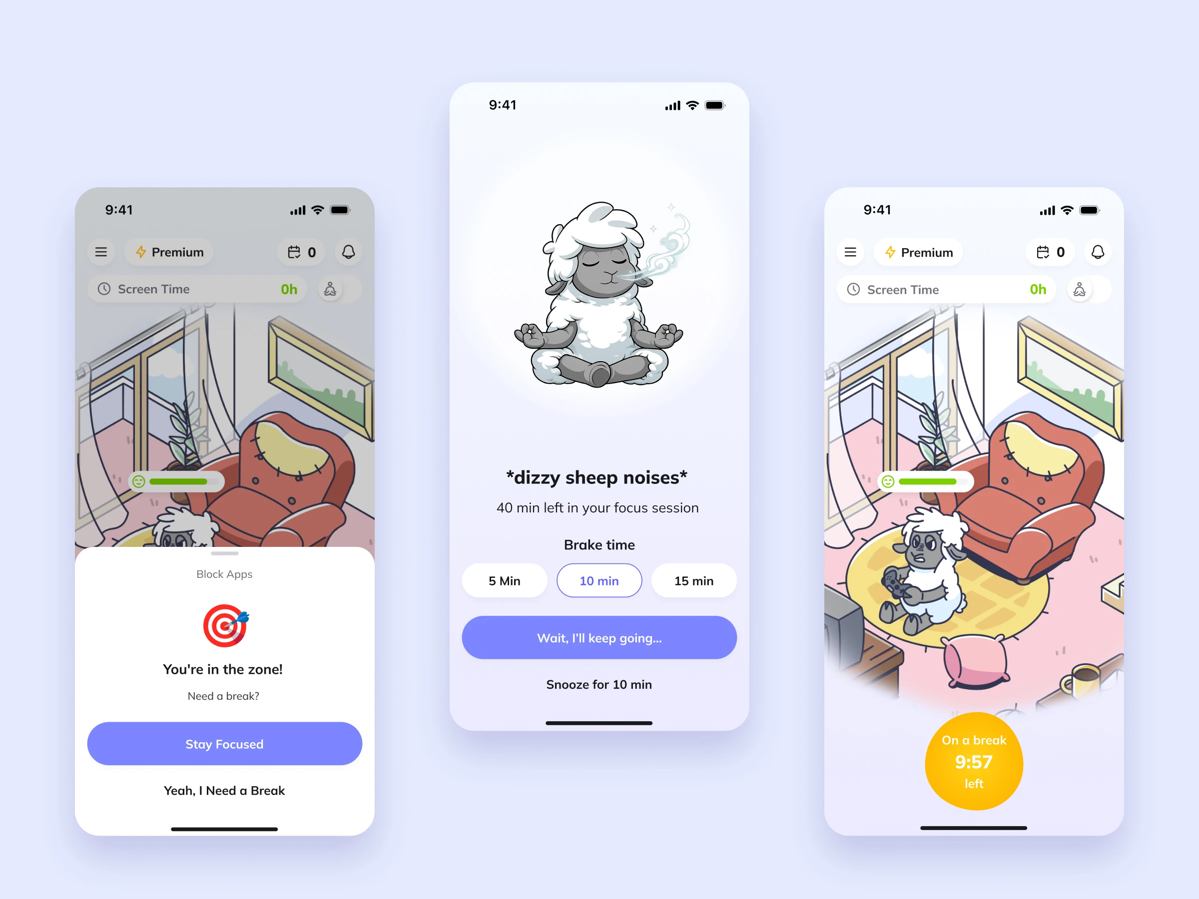
Blocking takes two taps: choose how long, from 15 minutes to 2 hours, and the countdown moves onto the main button. If you try to leave early, Sheepy asks first, with “Stay focused” as the main action and “I need a break” as the secondary one. A break is always short: 5, 10 or 15 minutes. During the break the button turns yellow and counts down, so it is clear the pause will end and the session will continue.
Night mode
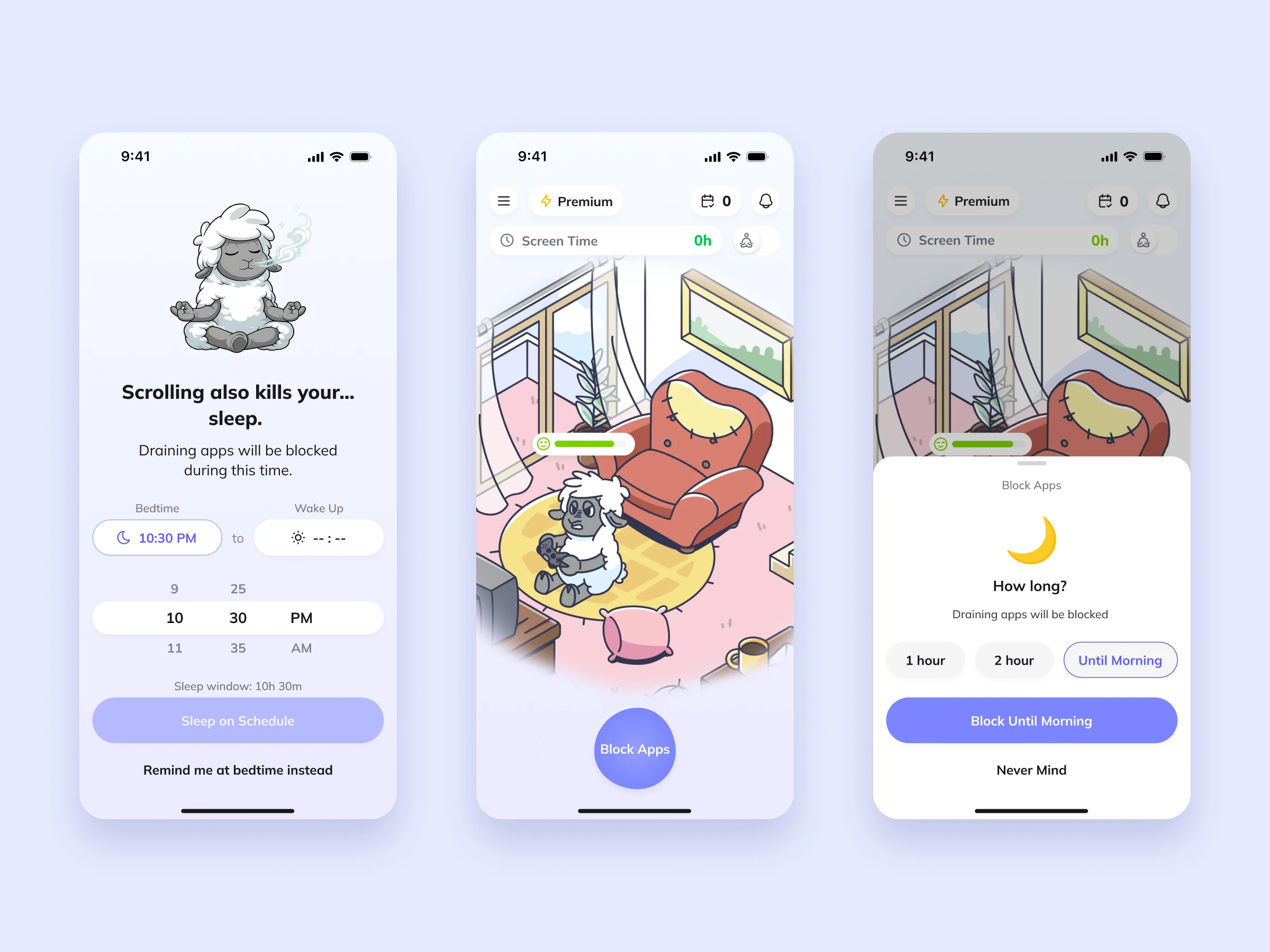
Late-night scrolling does the most harm, so sleep has its own flow, introduced with the line “Scrolling also kills your… sleep.” People set bedtime and wake-up time once and see their sleep window.
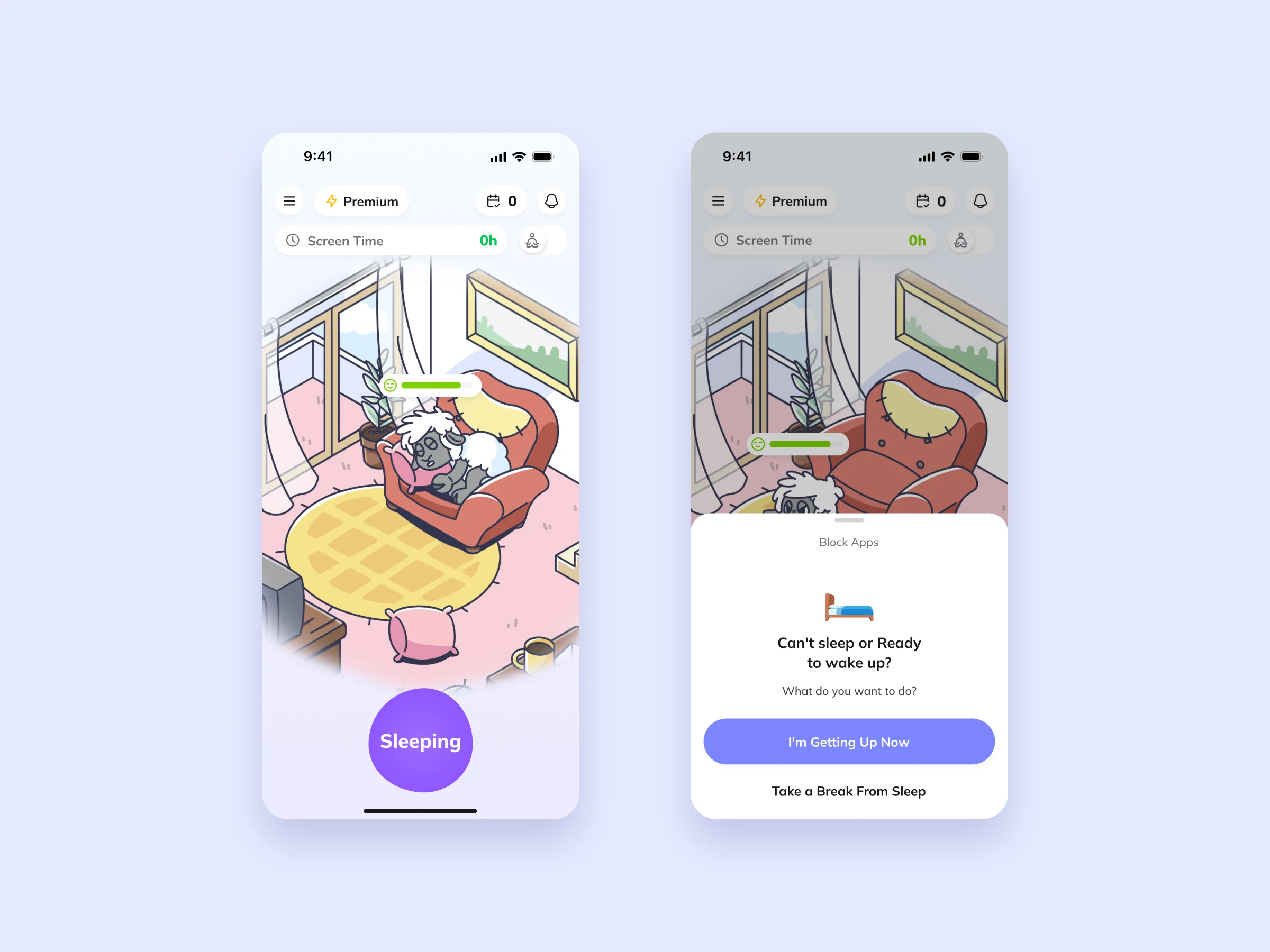
At night, the same blocking pattern offers an “Until morning” option and Home switches to a sleeping state. If someone wakes up early or can’t sleep, they can choose between “I’m getting up now” and “Take a break from sleep”, so a restless night doesn’t count as a failure.
When the sheep dies
If the day goes badly, the sheep dies, and Home shows it straight away. This is the emotional core of the product, so the tone had to stay warm: “He didn’t make it. Tomorrow’s a new day.”
People can let him rest and start fresh in the morning, or bring him back right away. Bringing him back comes with a note that he won’t be the same, so revival is a choice with a cost, not a free undo. A short “Why did this happen?” explains the outcome in one sentence and links it to how the time was spent, without blame.
Calendar and streaks
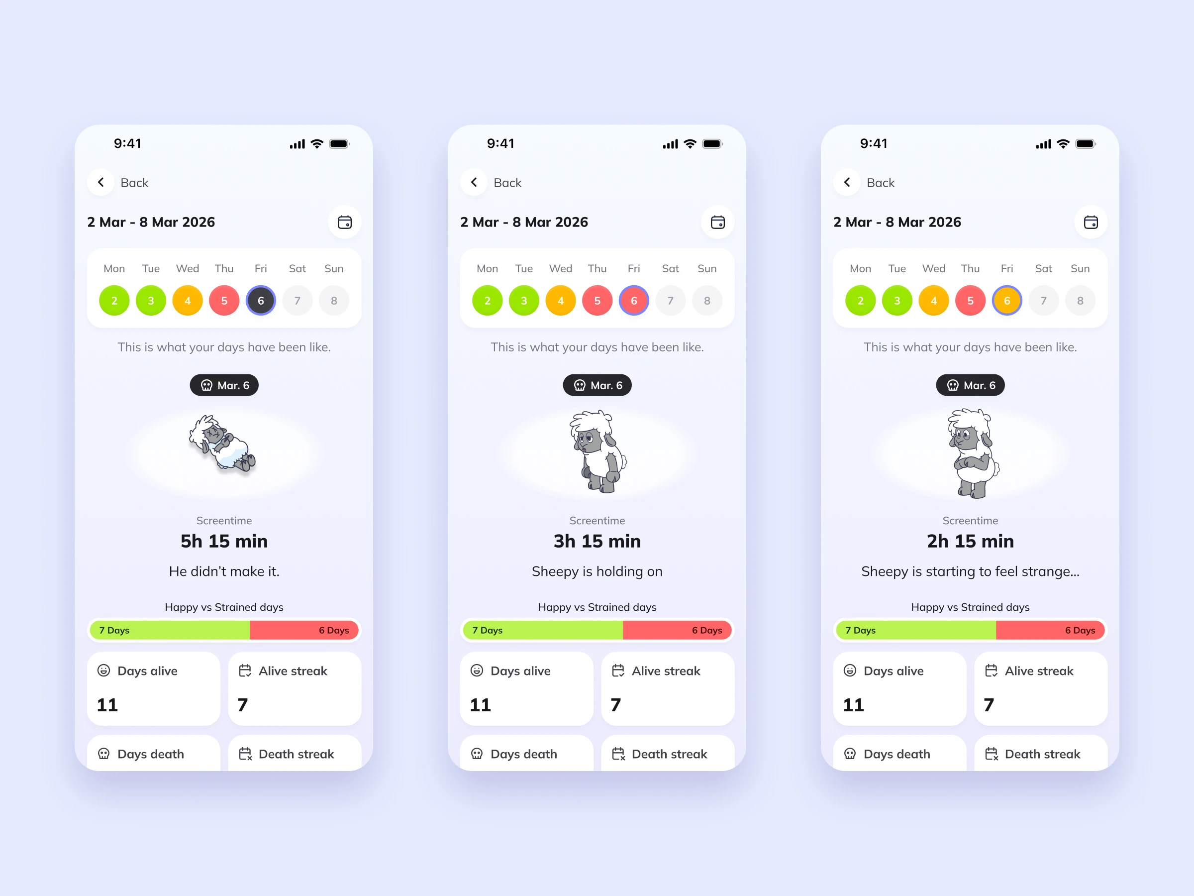
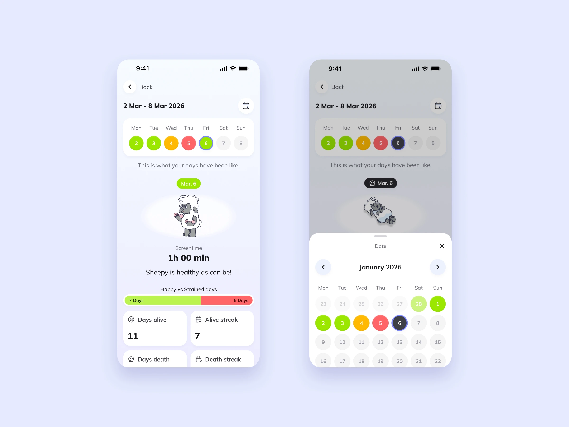
Each day in the calendar is a coloured dot that matches the sheep’s state. Tapping a day shows the screen time and a short status, from “Sheepy is healthy as can be!” at one hour to “He didn’t make it.” at more than five.
Below the week, happy versus strained days, alive streaks and death streaks give a long-term picture without a single chart. A date picker opens older weeks.
Settings and personalisation
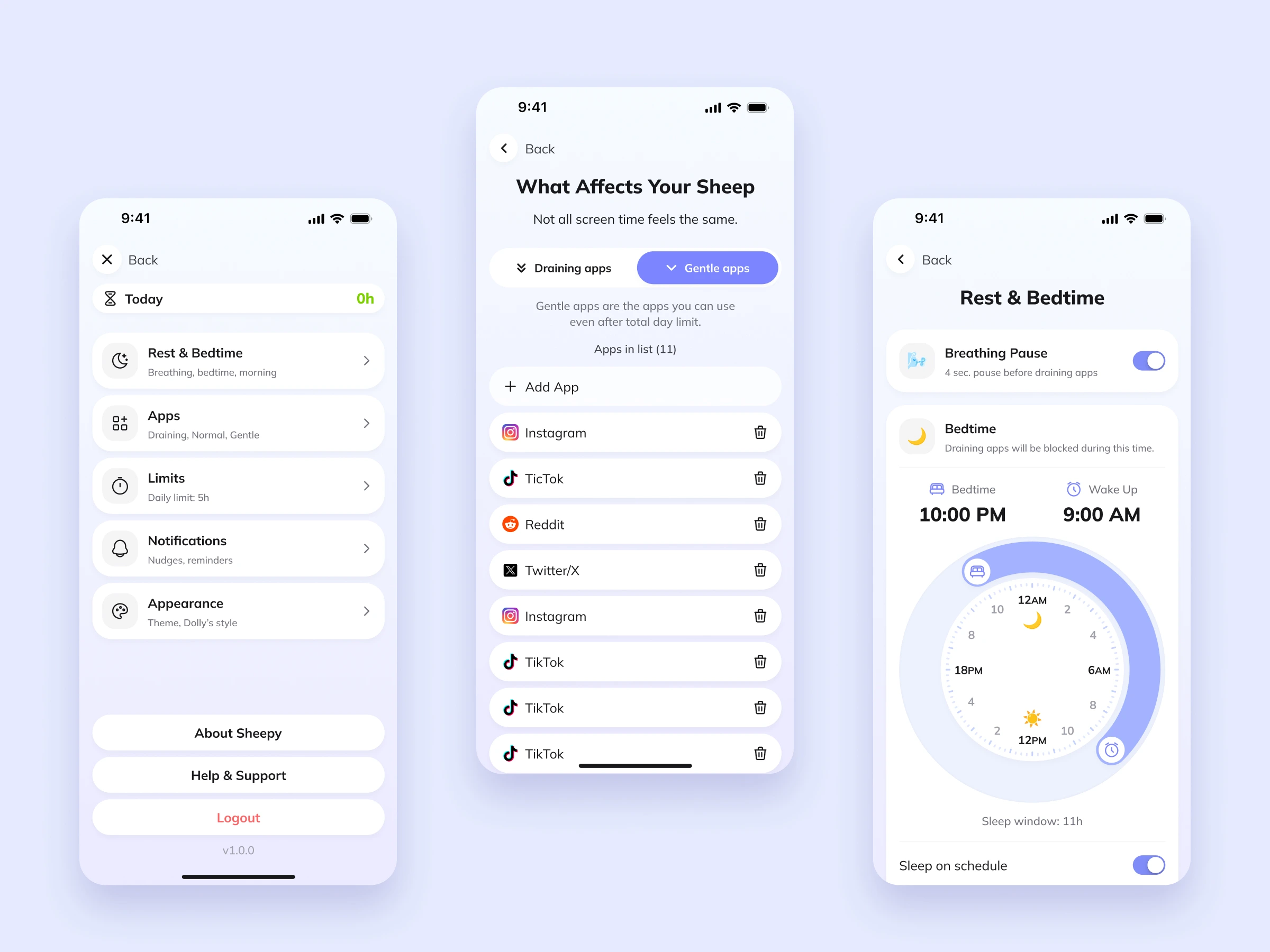
All settings fit into one short menu: Rest & Bedtime, Apps, Limits, Notifications and Appearance.
“What Affects Your Sheep” splits apps into draining and gentle. Gentle apps stay available even after the daily limit, so the app never blocks what people actually need. Rest & Bedtime combines the breathing pause and the sleep window on one screen, with a clock dial that makes the night easy to read.
Sheepy talks back
Small moments keep the relationship alive. The sheep speaks on Home to suggest the next step, such as “Let’s set up Sleep mode first, it’s the most important.” The day closes with a short summary, and every morning starts with “It’s a new day. He’s back.”
Visual style
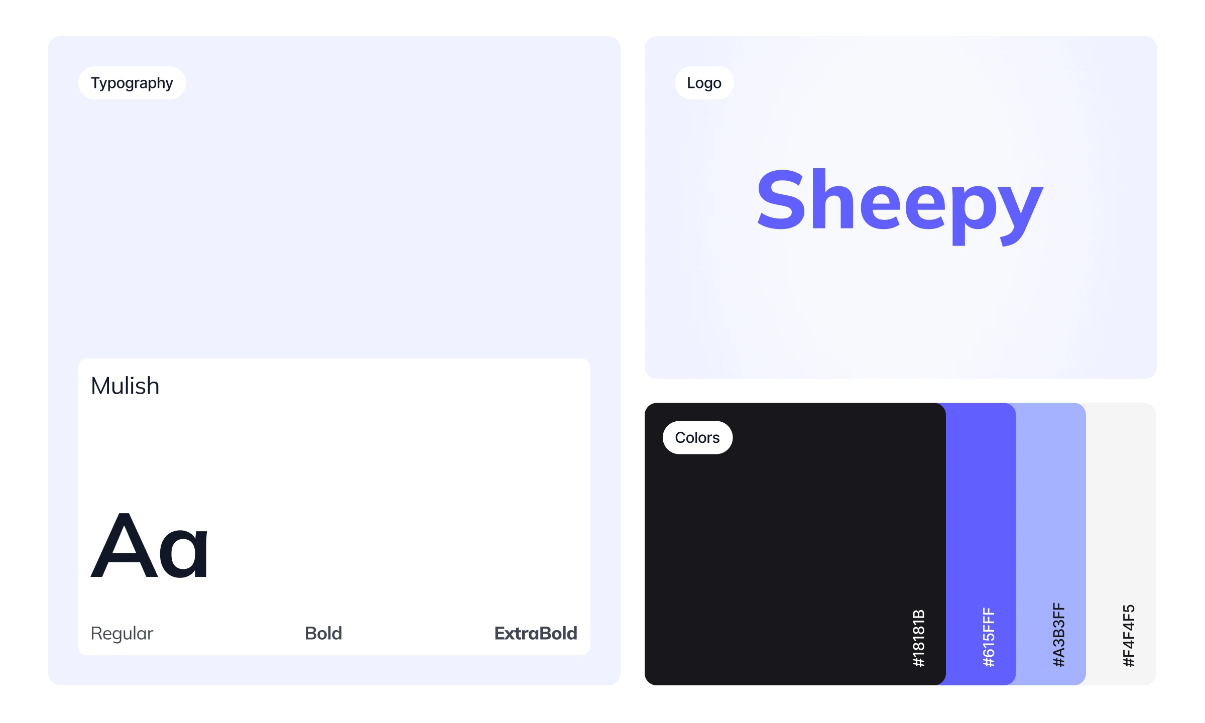
The illustration carries the emotion: the room and the sheep set the mood, while the interface stays light and calm, with one purple primary action per screen.
A traffic-light palette (green, yellow, red and black) marks the sheep’s state the same way in the check-in, on Home and in the calendar, so one colour always means one thing.
Takeaways
A clear loop is easier to remember than a list of features. People understand the whole app from the first screen of onboarding.
Consequences need a way back. Death works as a motivator only because every morning offers a new chance.
Friction works best when it is gentle. A breath, a question or a short break slows people down without making them feel judged.
Like this project
Posted Oct 16, 2026
Designed Sheepy 2.0, focusing on emotional user feedback to improve digital wellness.