SeemaS Platform

Ilya Kret
1 collaborator


SaaS • FinTech • Enterprice • Startup • AI Workflows • Design System
SeemaS is an enterprise AI platform for financial advisory firms. It brings valuation, transfer pricing, global reporting, tax compliance and regulatory work into one product. I joined while the MVP was still in progress and, together with the lead designer, took the product through launch and a full rebuild for Platform 2.0.
Role: Product Designer
Scope: product UX/UI, information architecture, AI interactions, design system, implementation support
Team: founders, domain experts, product managers, engineers
Timeline: Nov 2024 – Jul 2026
Client: SeemaS, Inc.
Where we started
When I joined, the core idea and the first workflows already existed, but the MVP was still being shaped. The task was to turn expert methods for valuation and tax into a product that a real team could use every day, and then to rebuild it as the platform grew.
What made it hard
Every analysis type needs its own inputs, methods and outputs, and specialists expect that depth. At the same time, people needed one predictable way to find their work, move through an analysis, read the results and share them. On top of that, AI output had to be transparent enough for professionals to check it and sign it off.
Who we designed for
We built the structure around three jobs people do on the platform: preparing analyses, reviewing the work of others, and managing who collaborates on what. Each screen answers which of these jobs it serves.
From first concepts to the MVP
We moved from quick wireframes to high-fidelity concepts and reviewed them with founders, domain experts and engineers. Mapping the full journey, from data intake to the final report, showed where the product needed shared patterns and where each analysis type had to stay unique.
Finding your work: workspaces and navigation
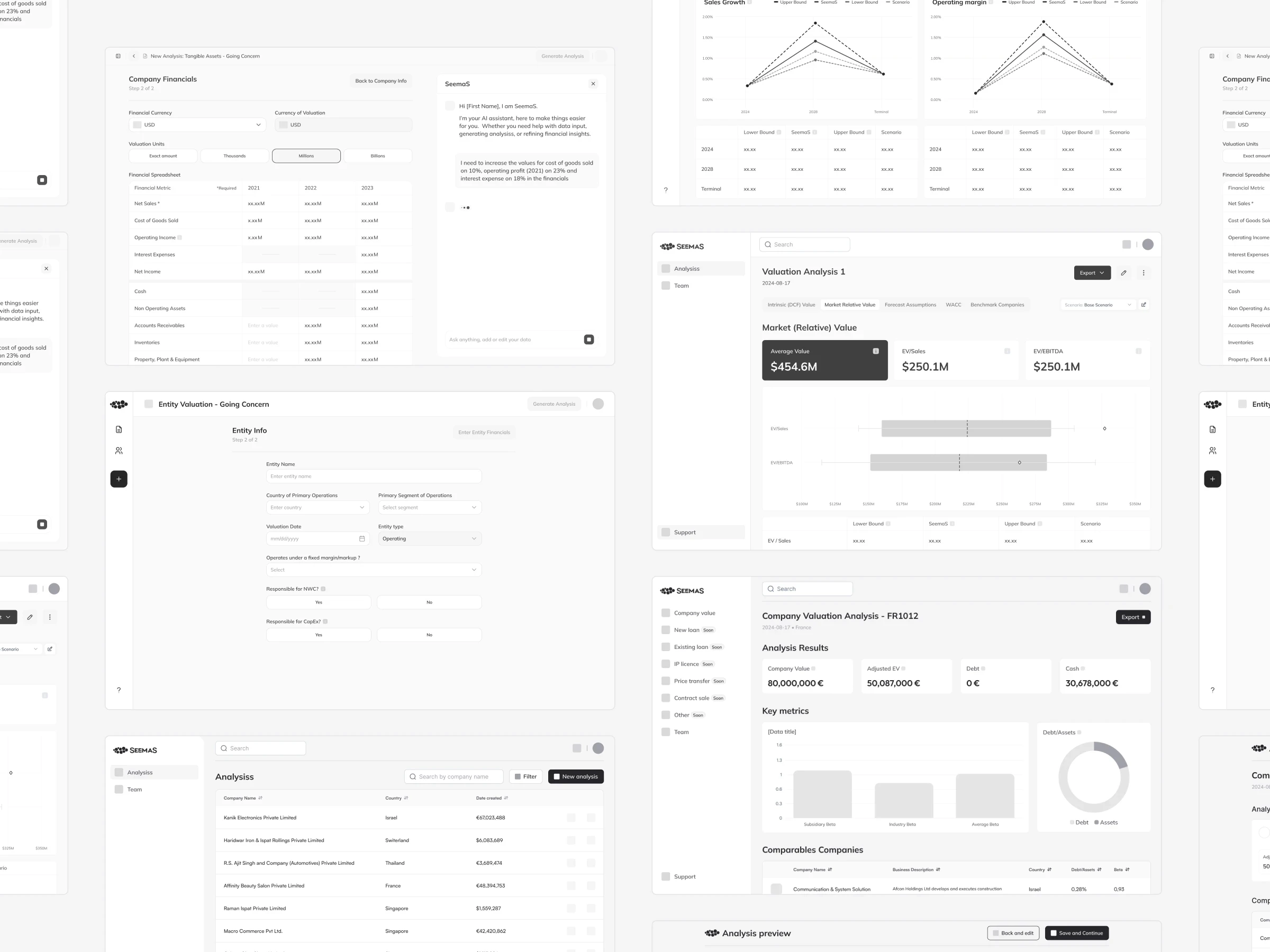
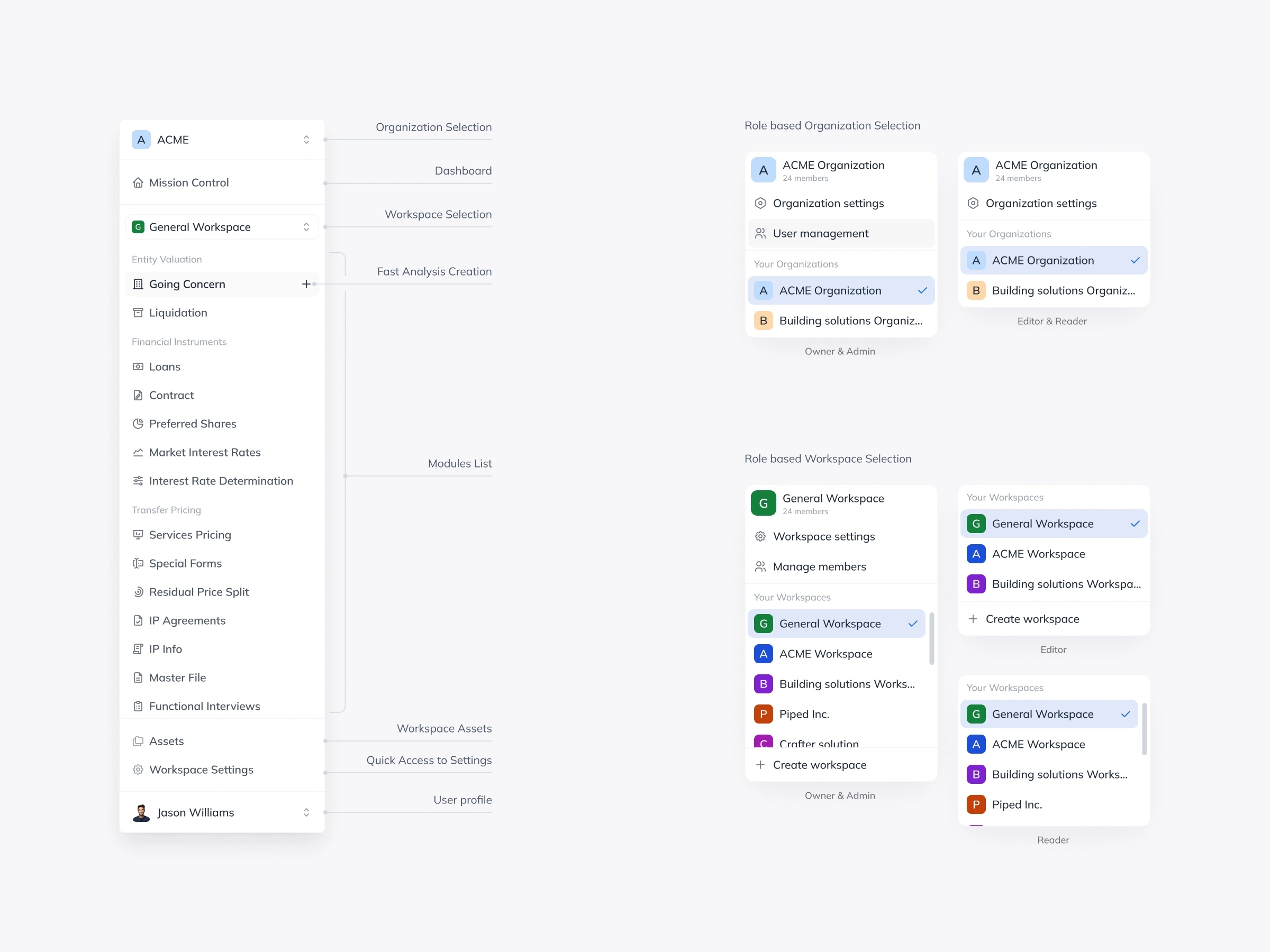
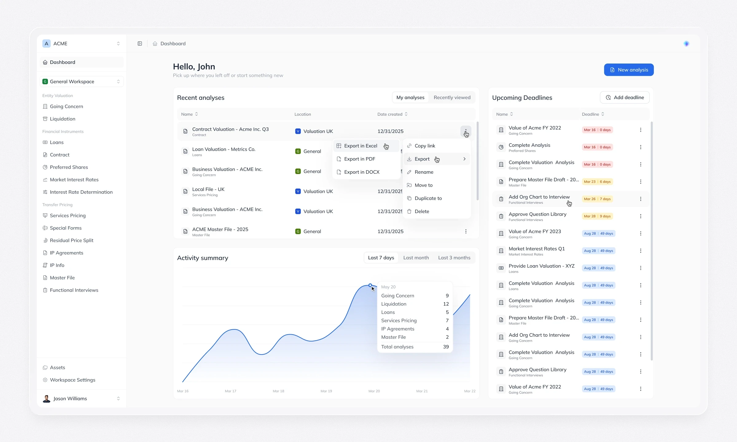
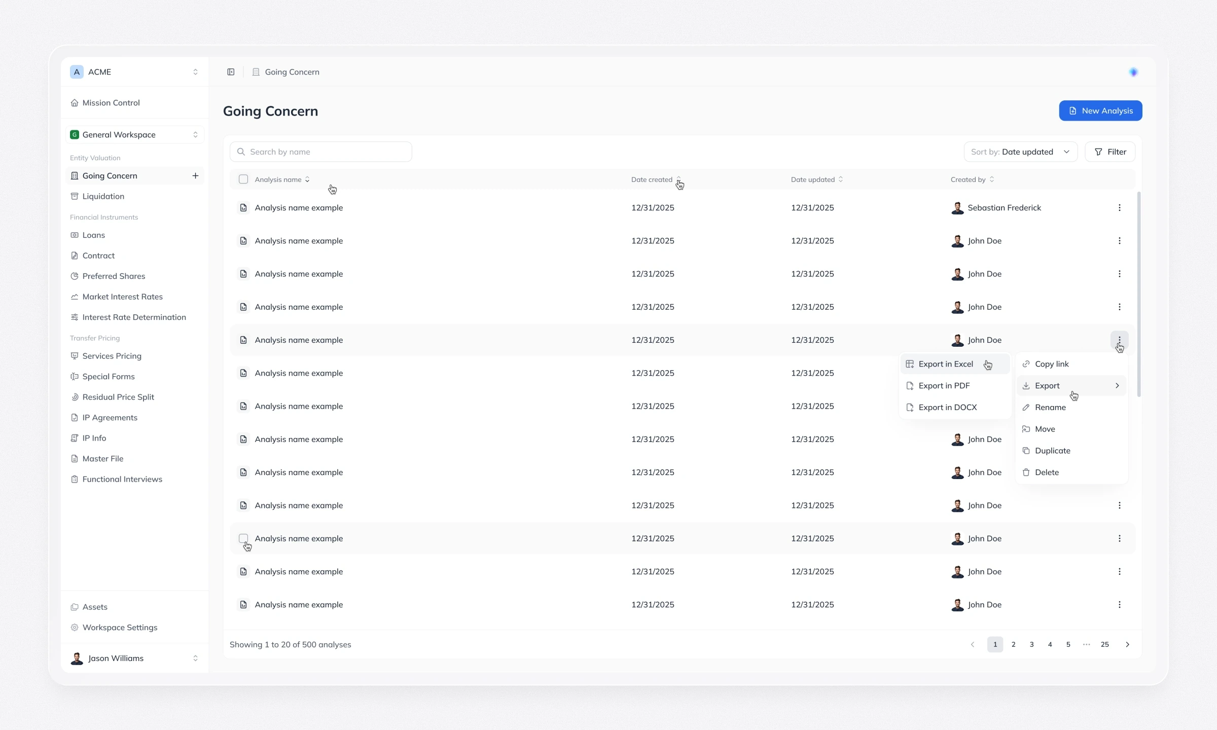
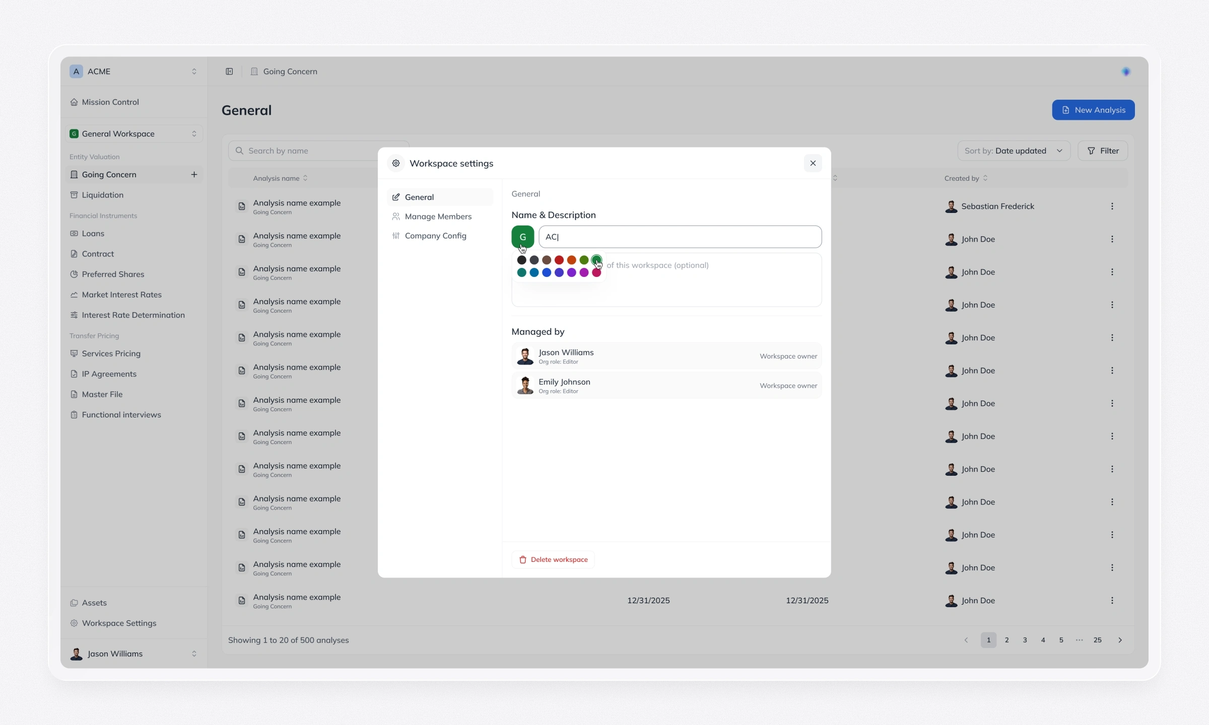
As more products were added, the original flat list of analyses stopped scaling. We reorganised the platform around organisations, workspaces, a personal dashboard and module views, with Admin, Editor and Viewer roles at both organisation and workspace level. Contextual shortcuts help people start a new analysis from wherever they are.
Getting data in: intake and mapping
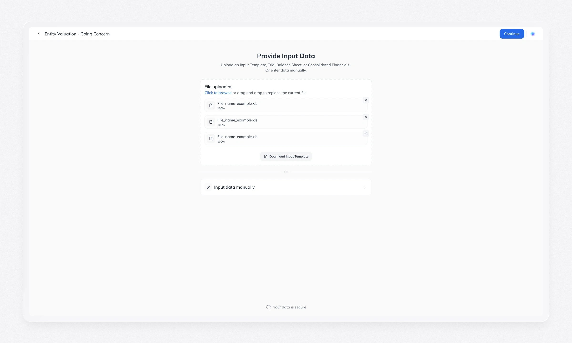
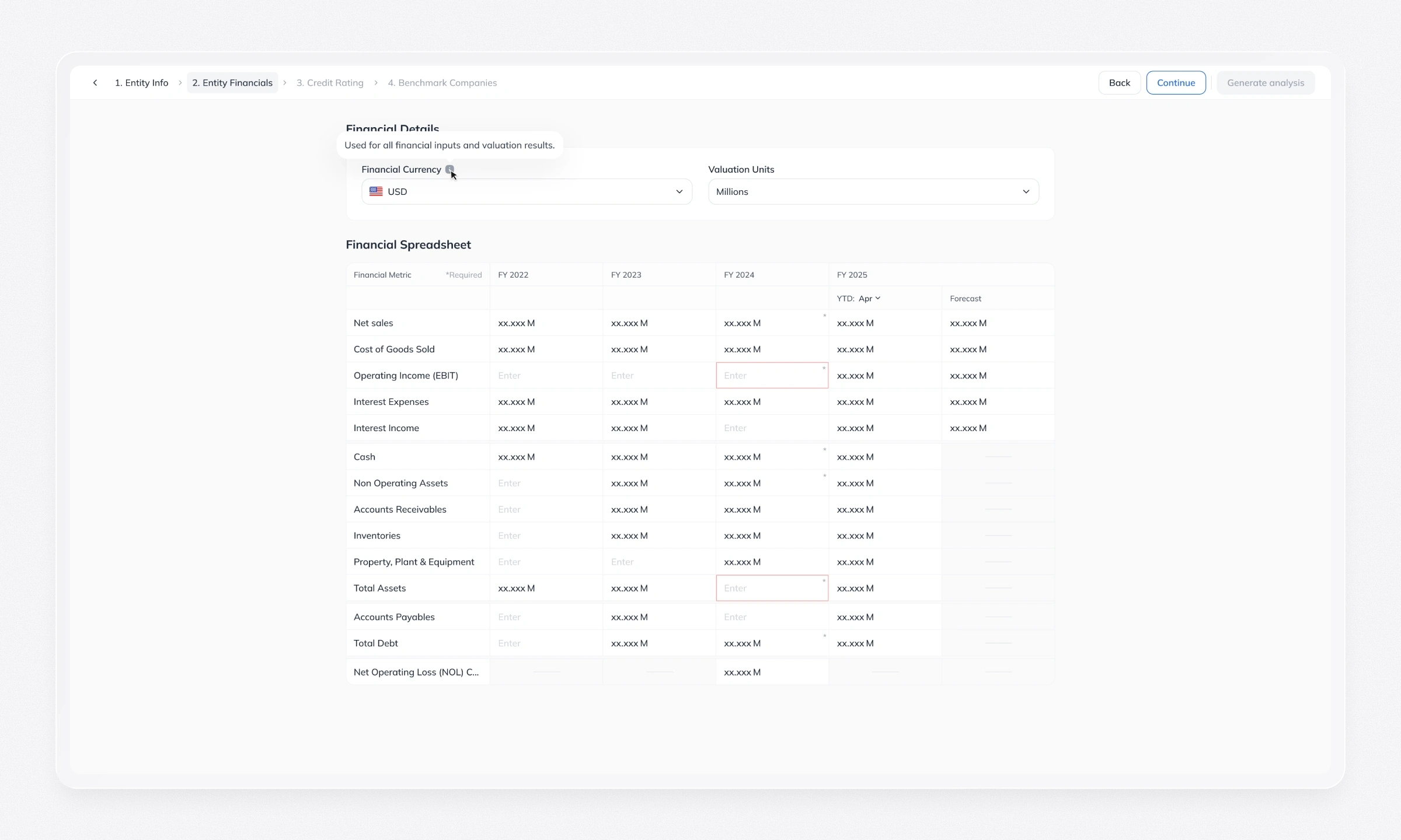
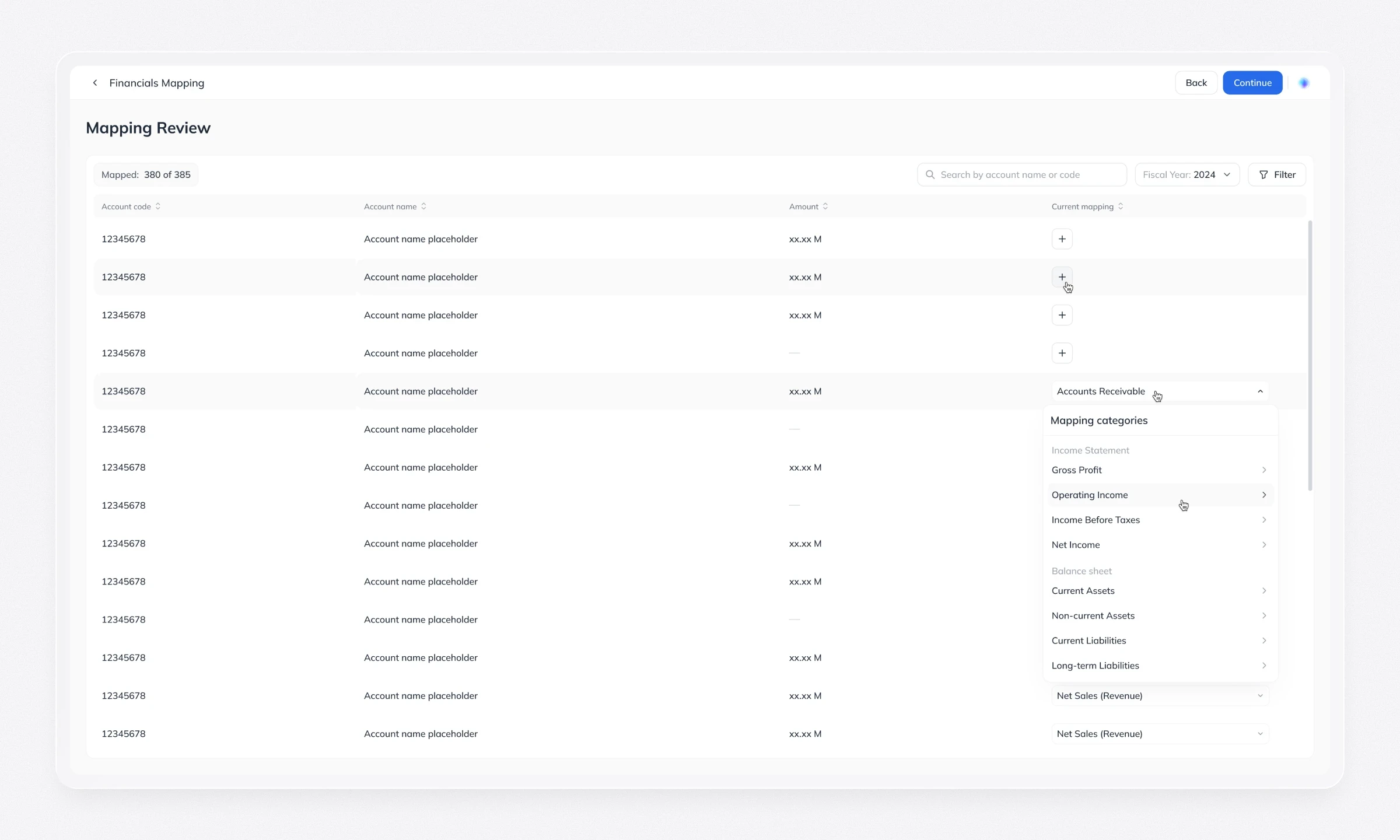
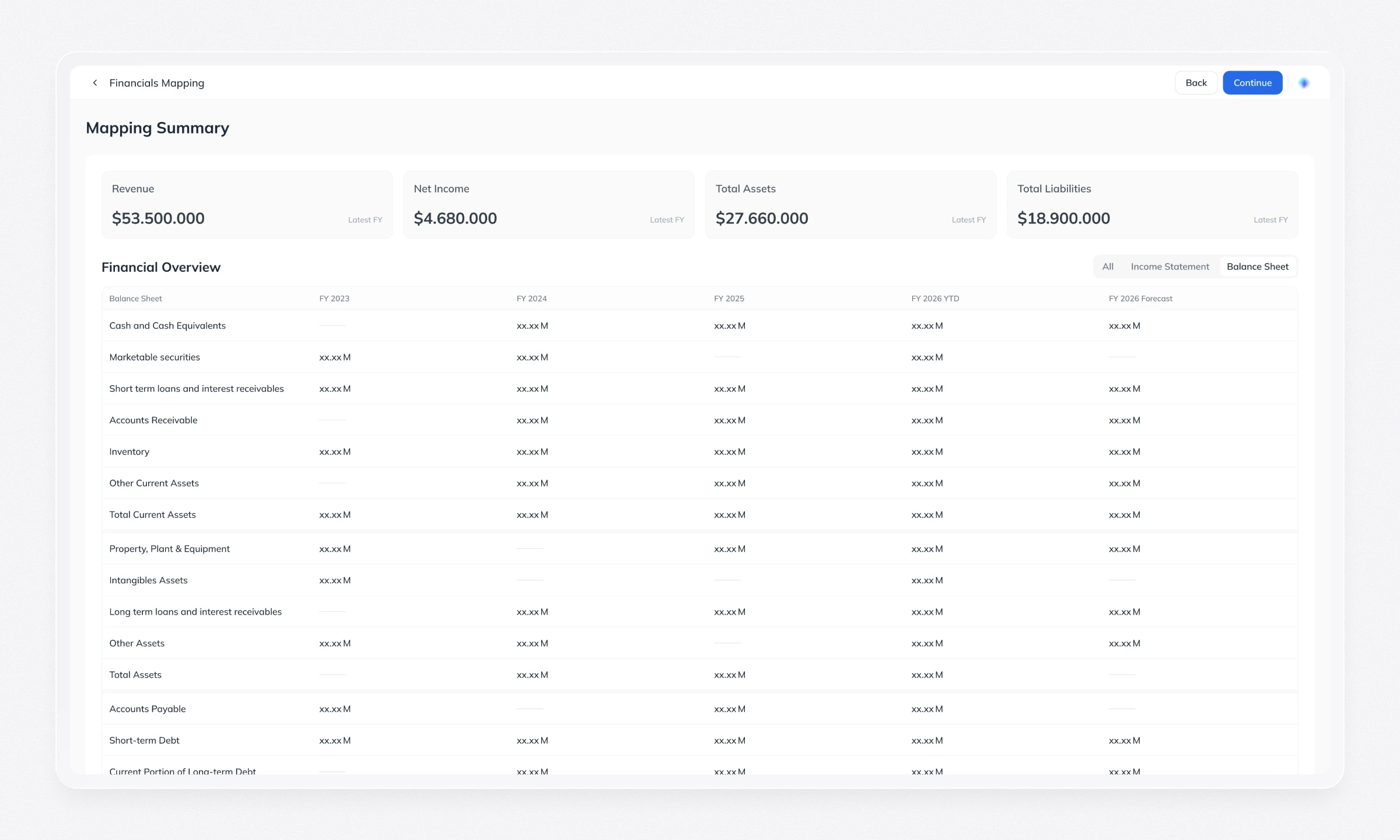
Each analysis has its own intake screens with three ways to add data: manual entry, file upload and AI-assisted extraction. Before anything is calculated, people see the AI-suggested data mapping and can correct it, so the expert stays in control of the inputs.
Reading the results
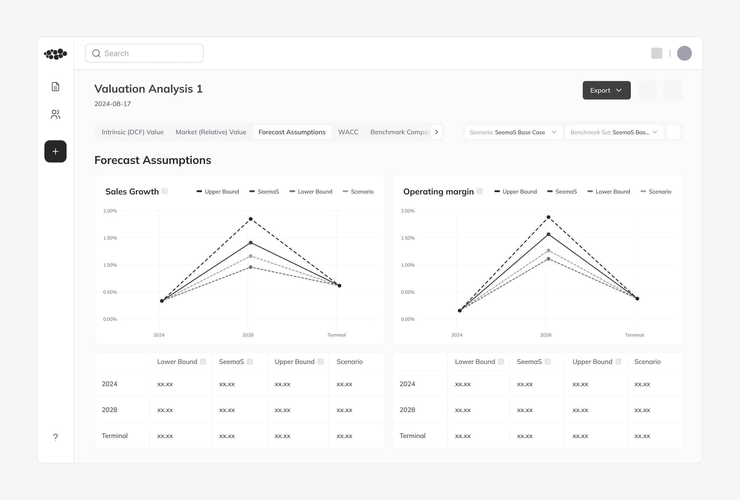
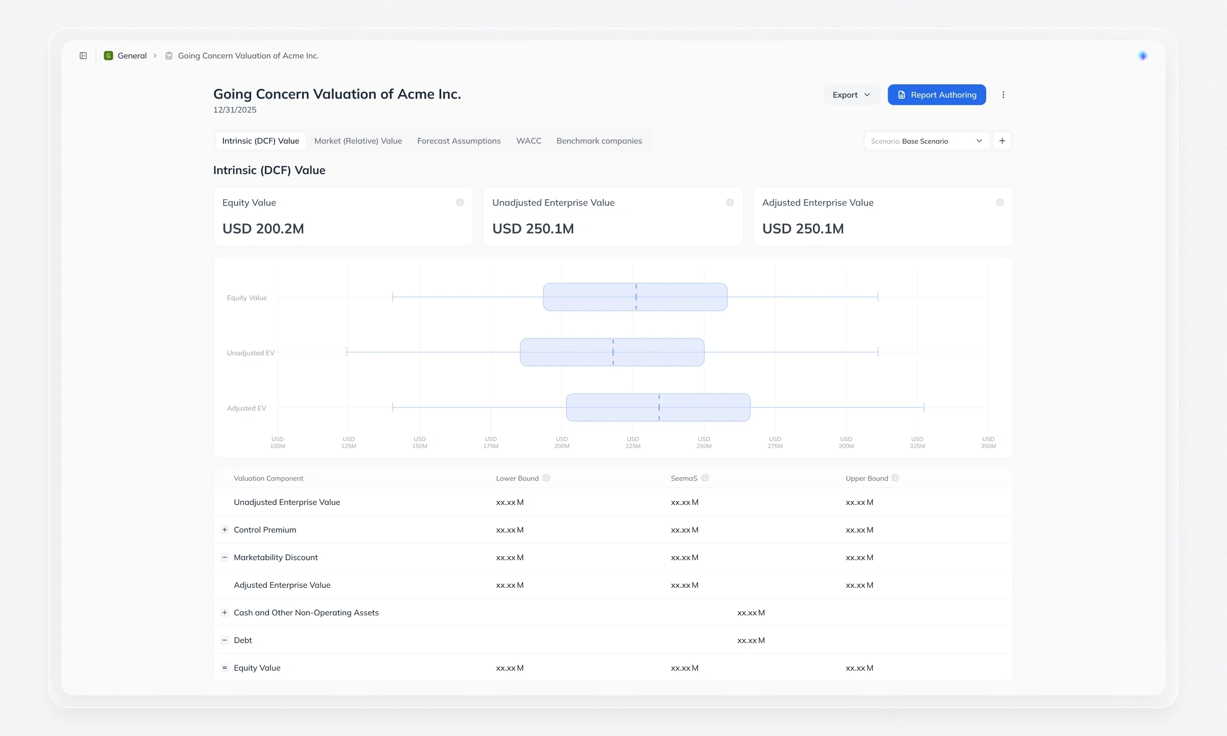
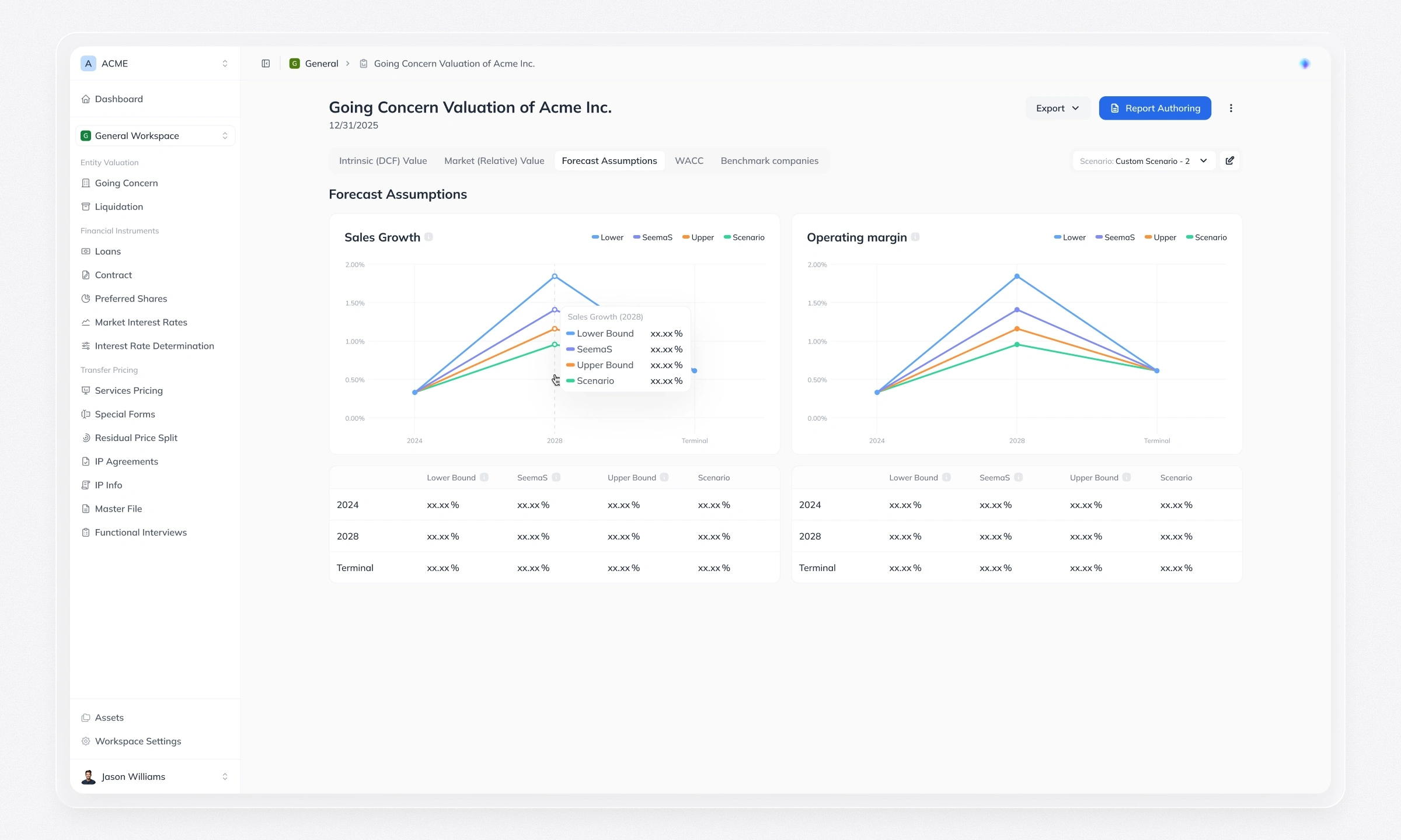
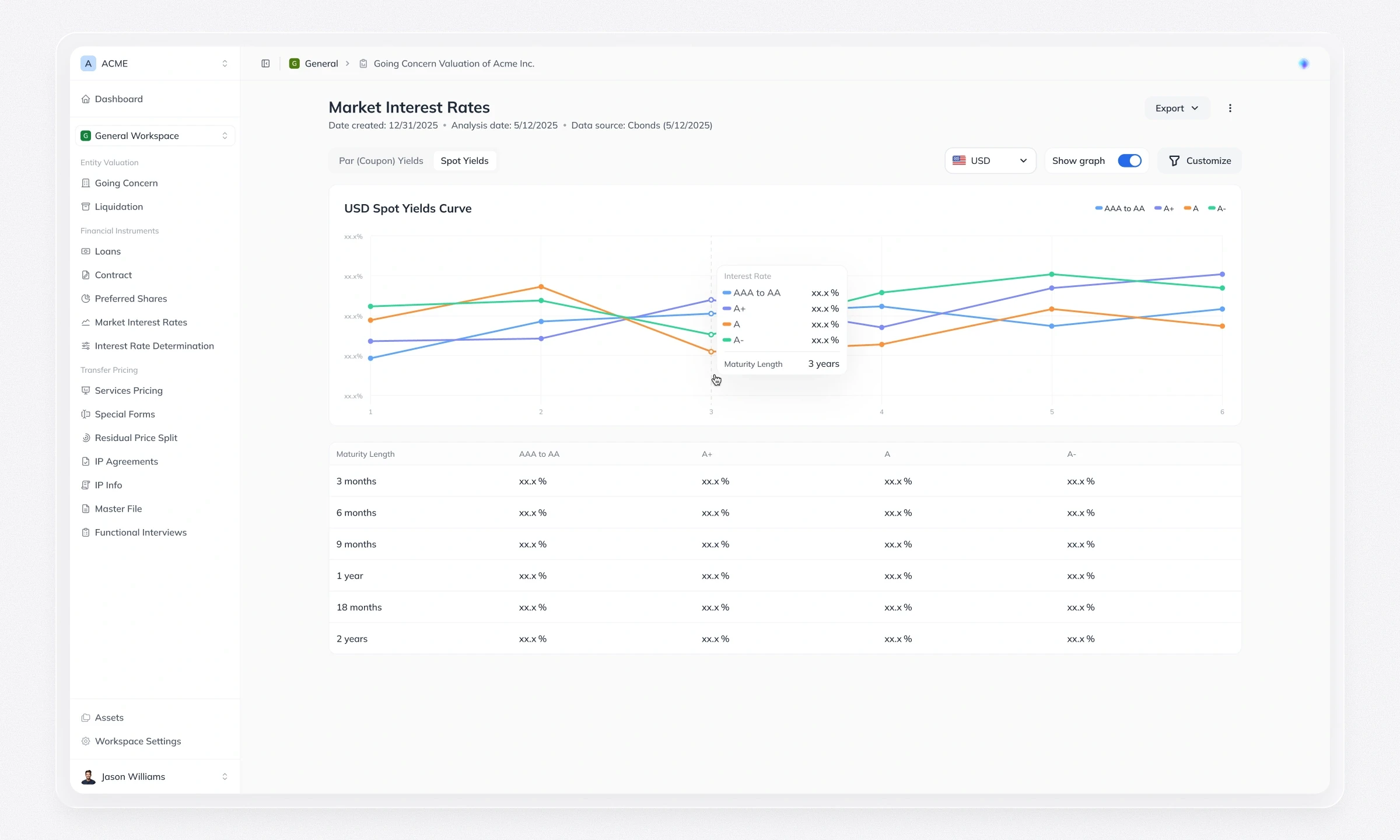
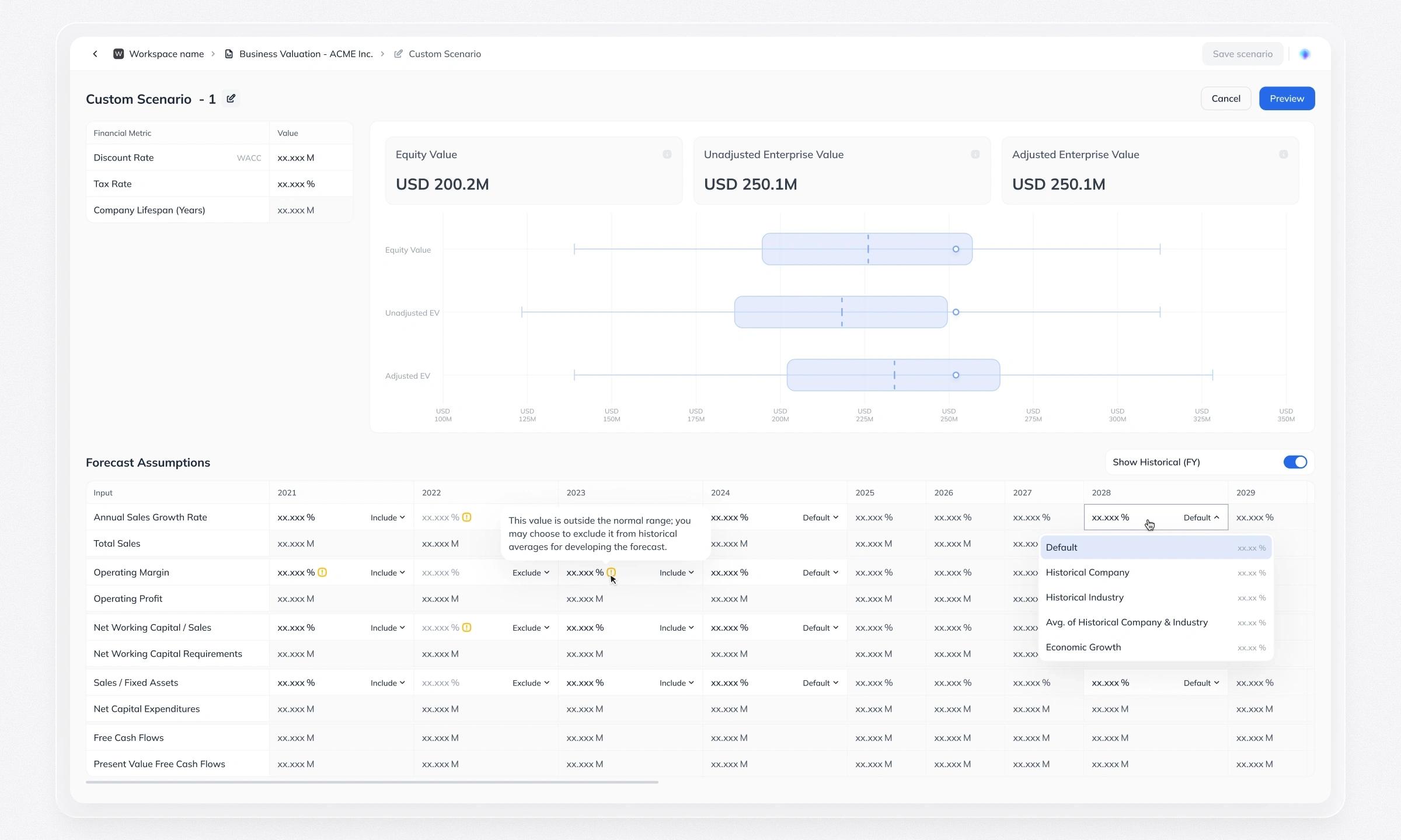
Charts, tabs and detail views let experts go from the headline number down to the data behind it. Feedback from domain experts led us to redesign the range chart as a candlestick-style view showing the lower bound, the scenario value and the upper bound at once.
Working together: Collaboration and sharing
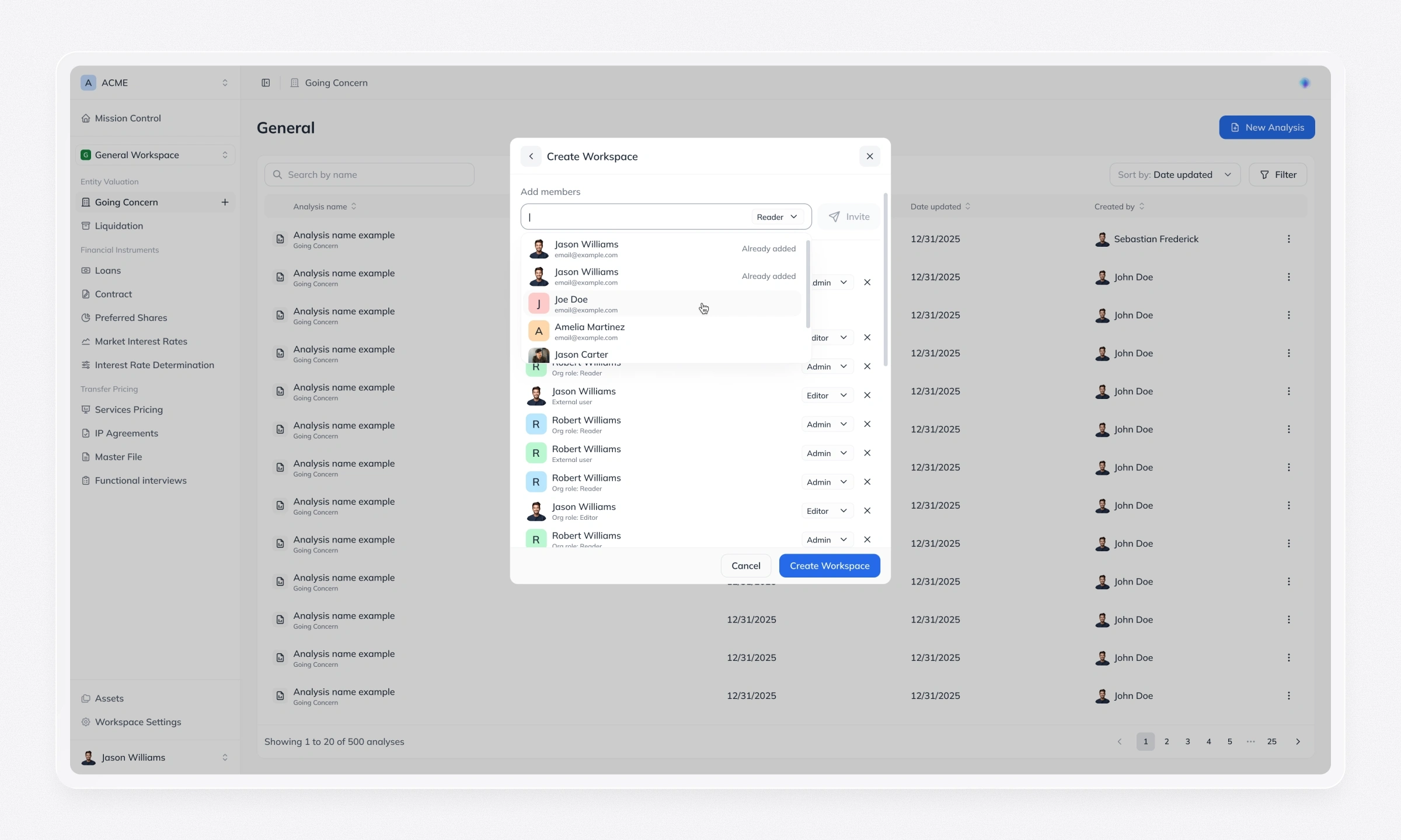
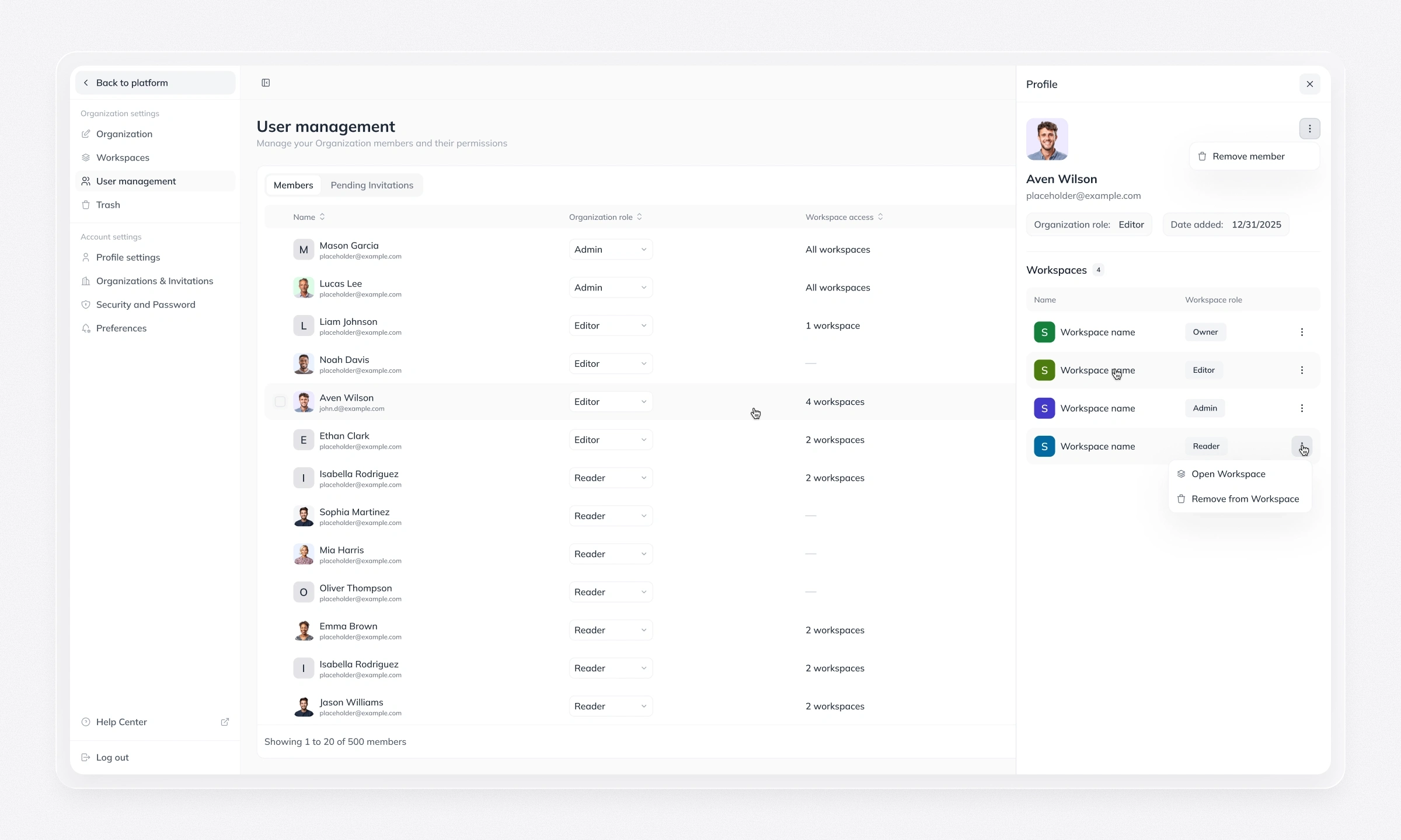
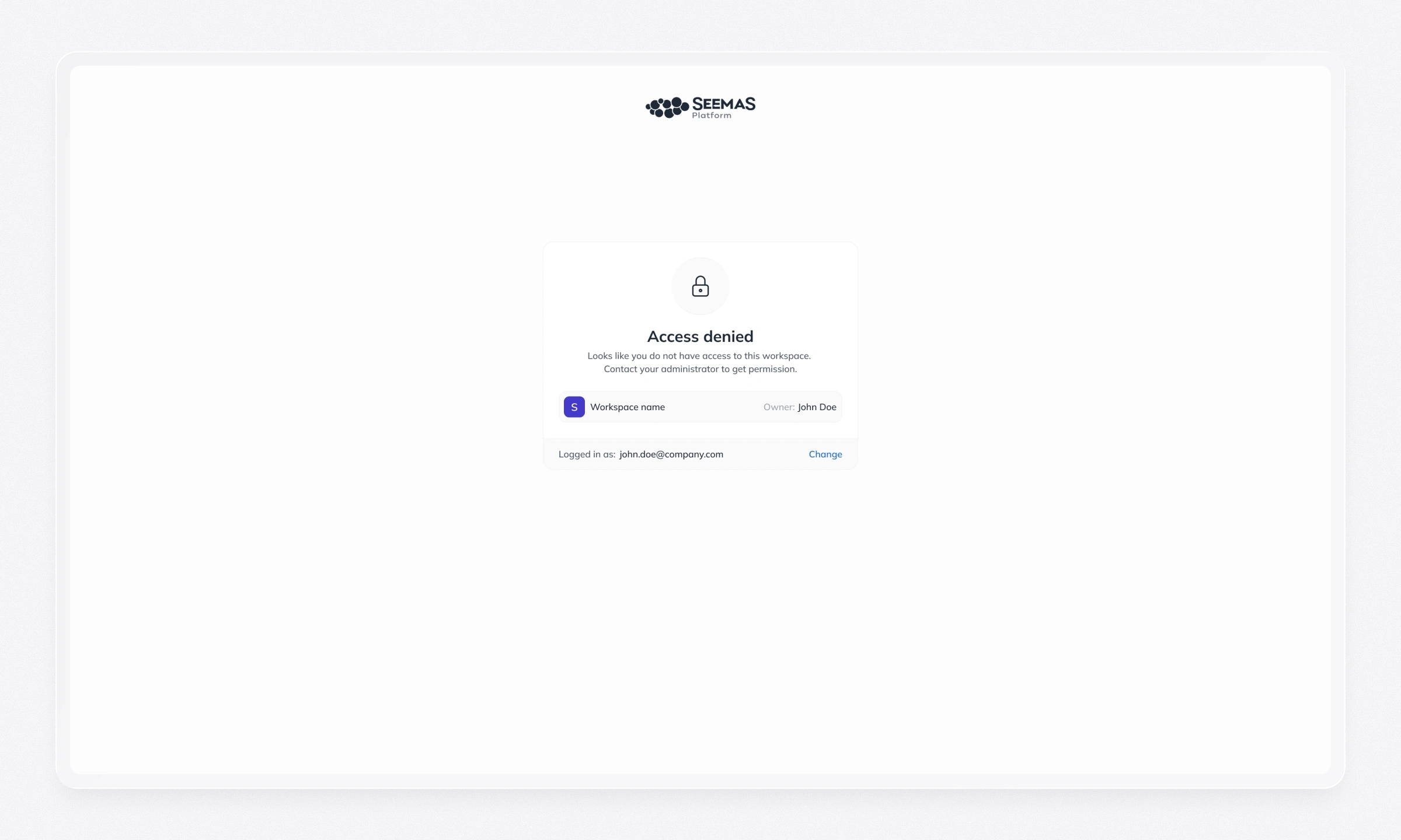
An invitation flow with role assignment brings colleagues into a workspace. For sharing a single analysis with someone outside it, we chose protected sharing links, so access is always deliberate and visible.
Functional Interview
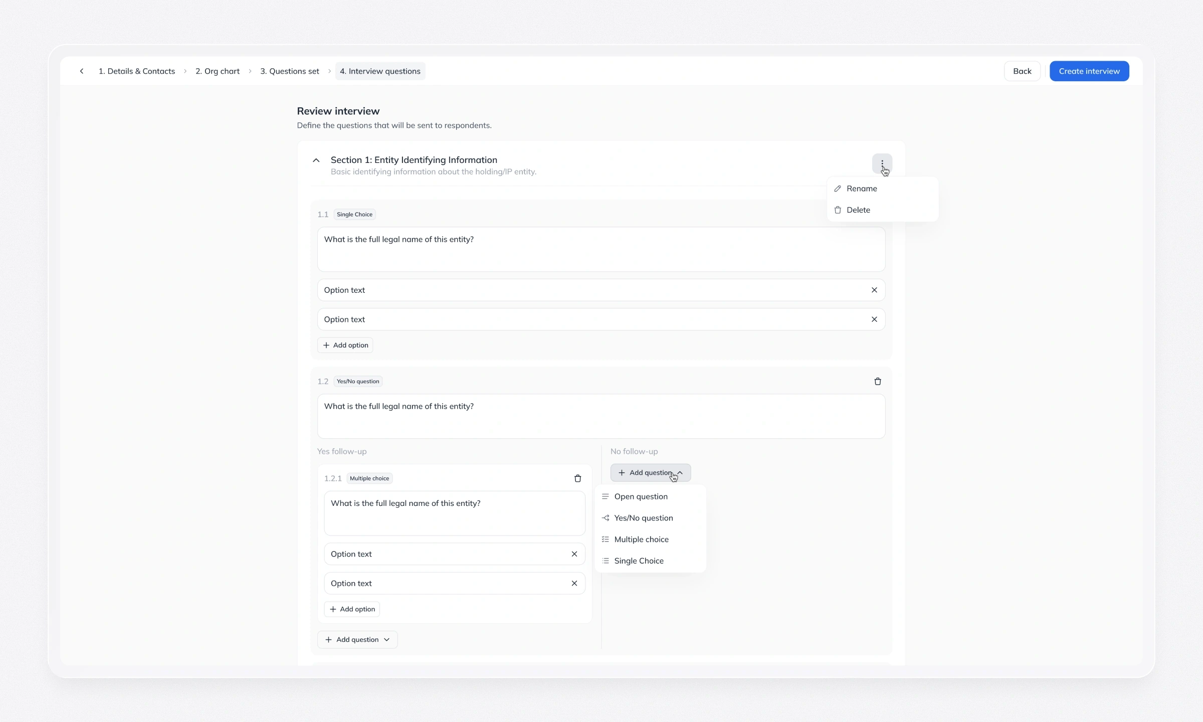
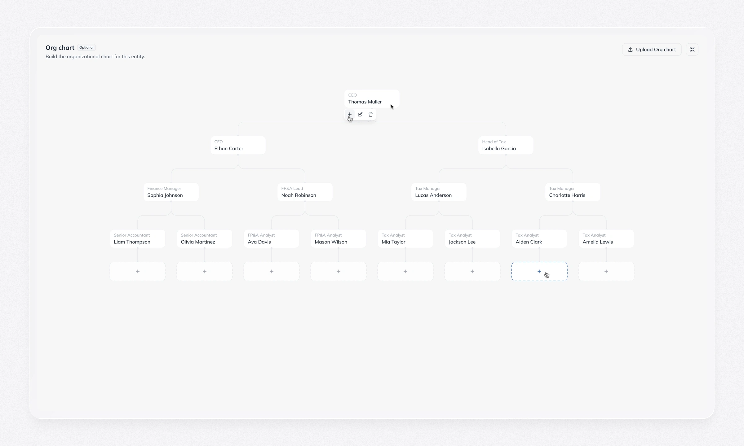
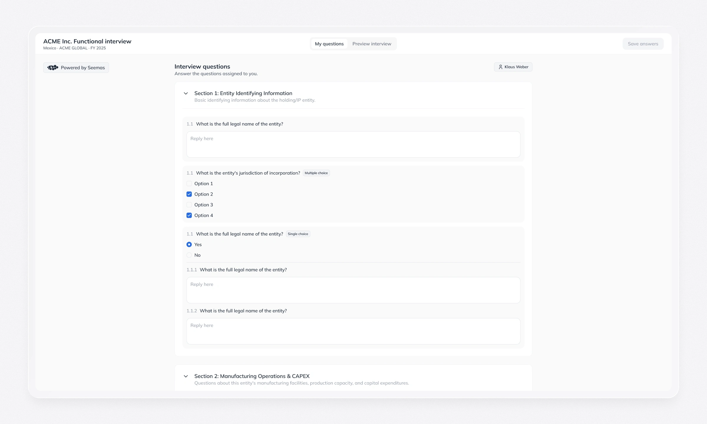
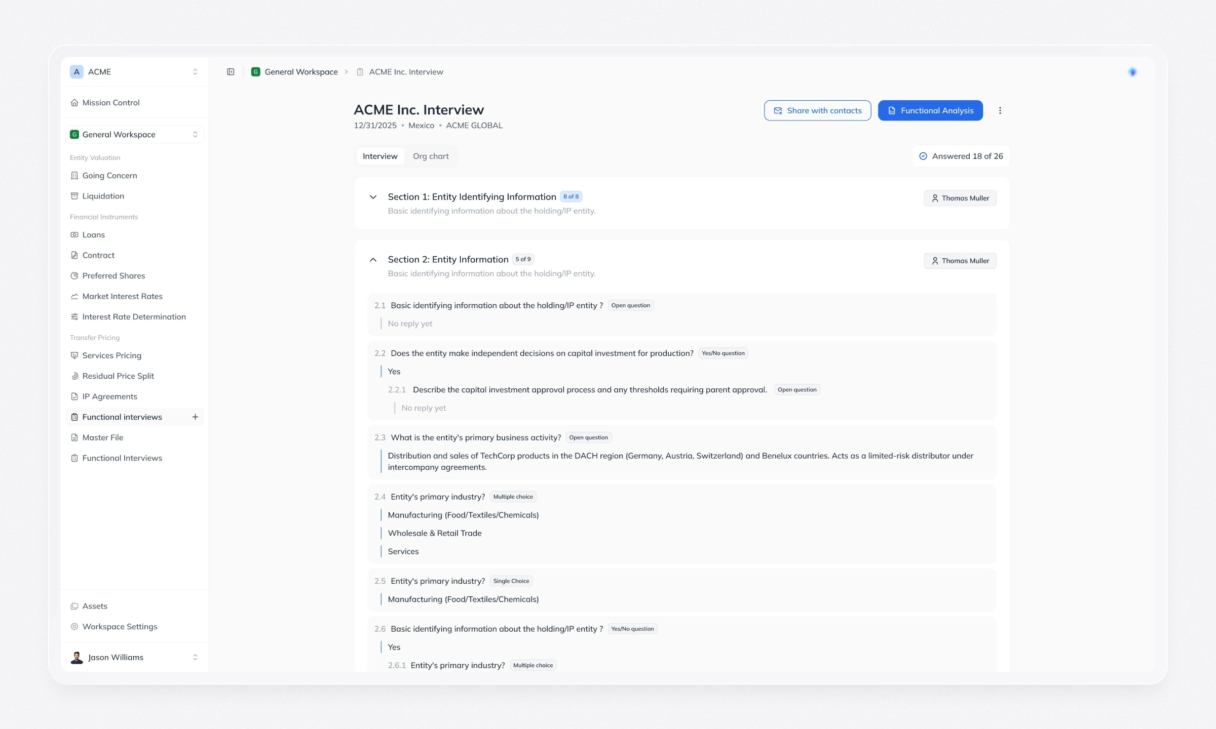
Some analyses depend on information from people across the client’s company. This flow connects three roles: the author builds the interview with an org chart, the entity contact assigns respondents, and respondents answer without creating an account.
Writing the report with AI
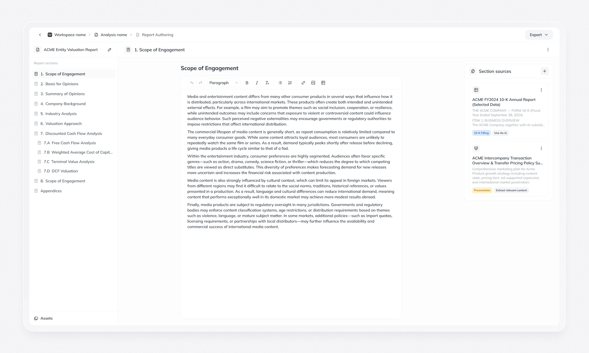
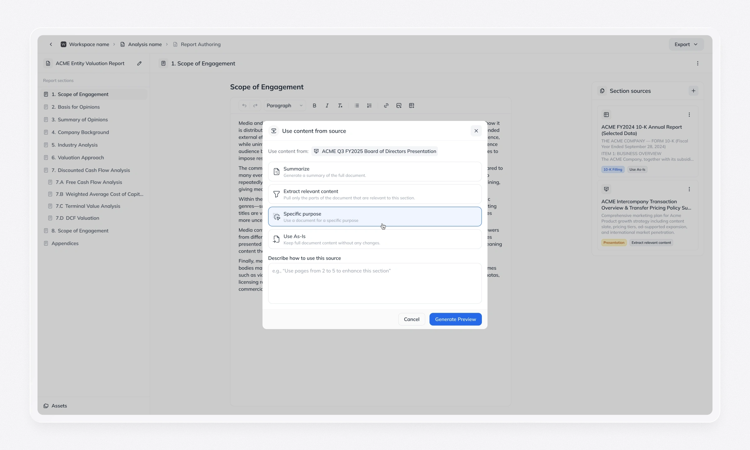
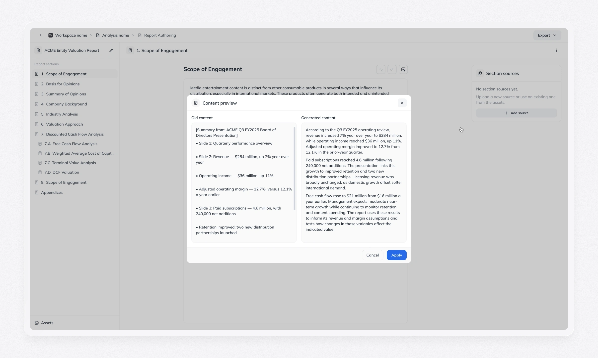
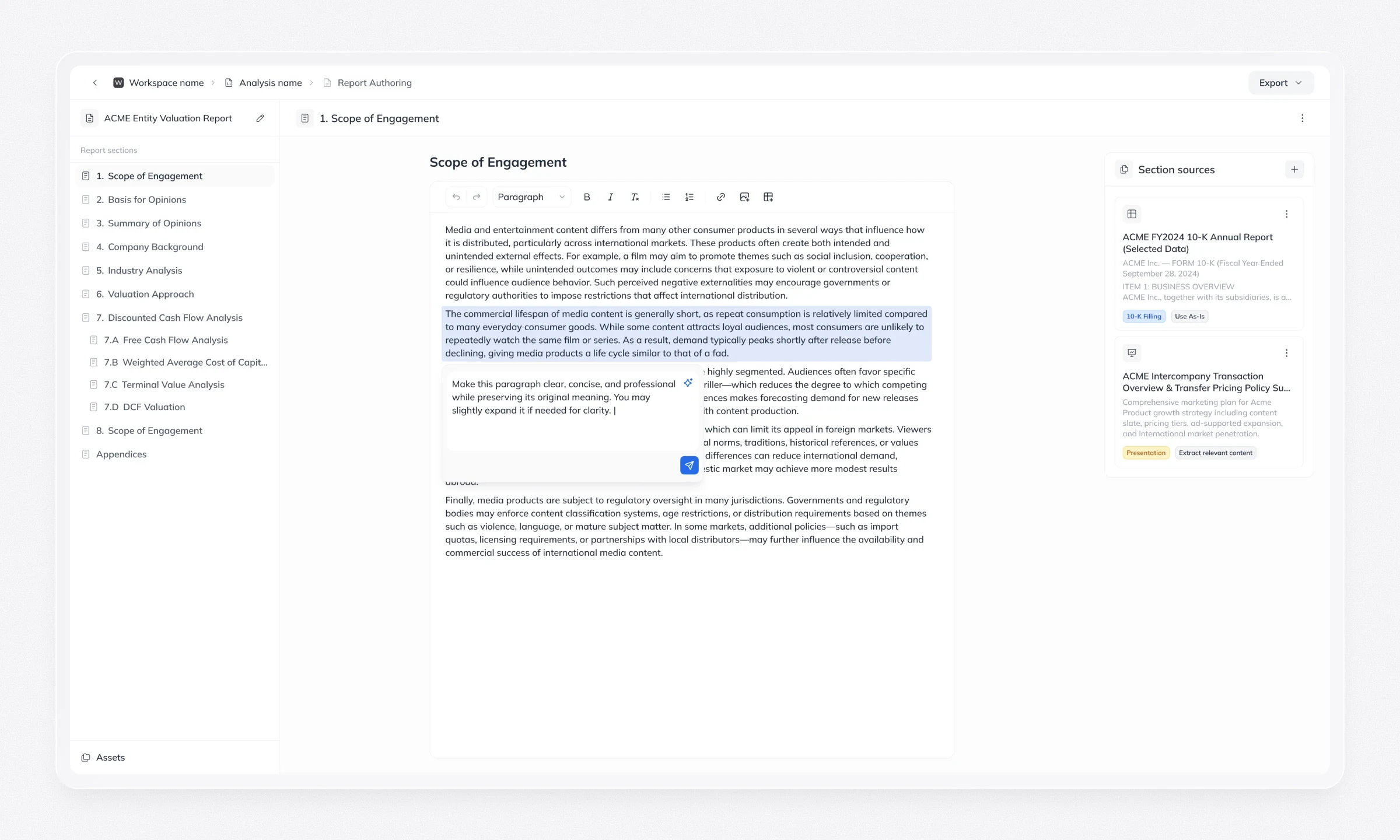
The built-in editor combines templates, section navigation and source files with AI drafting and revision. Every AI change appears as a Before/After comparison, and comments and export are part of the same flow. The AI suggests; the expert decides.
One system for the whole platform
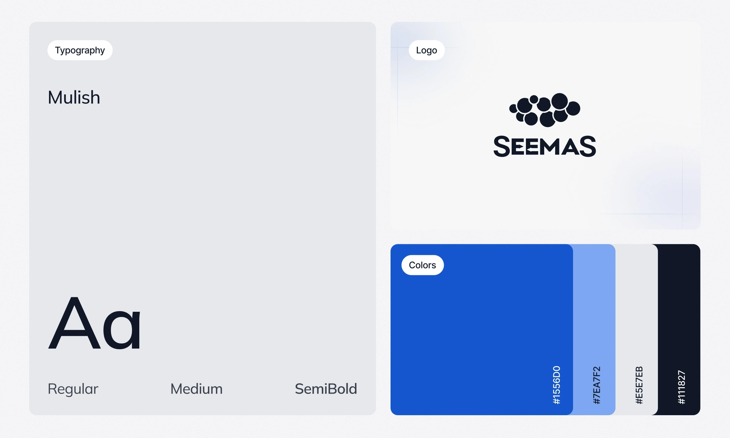
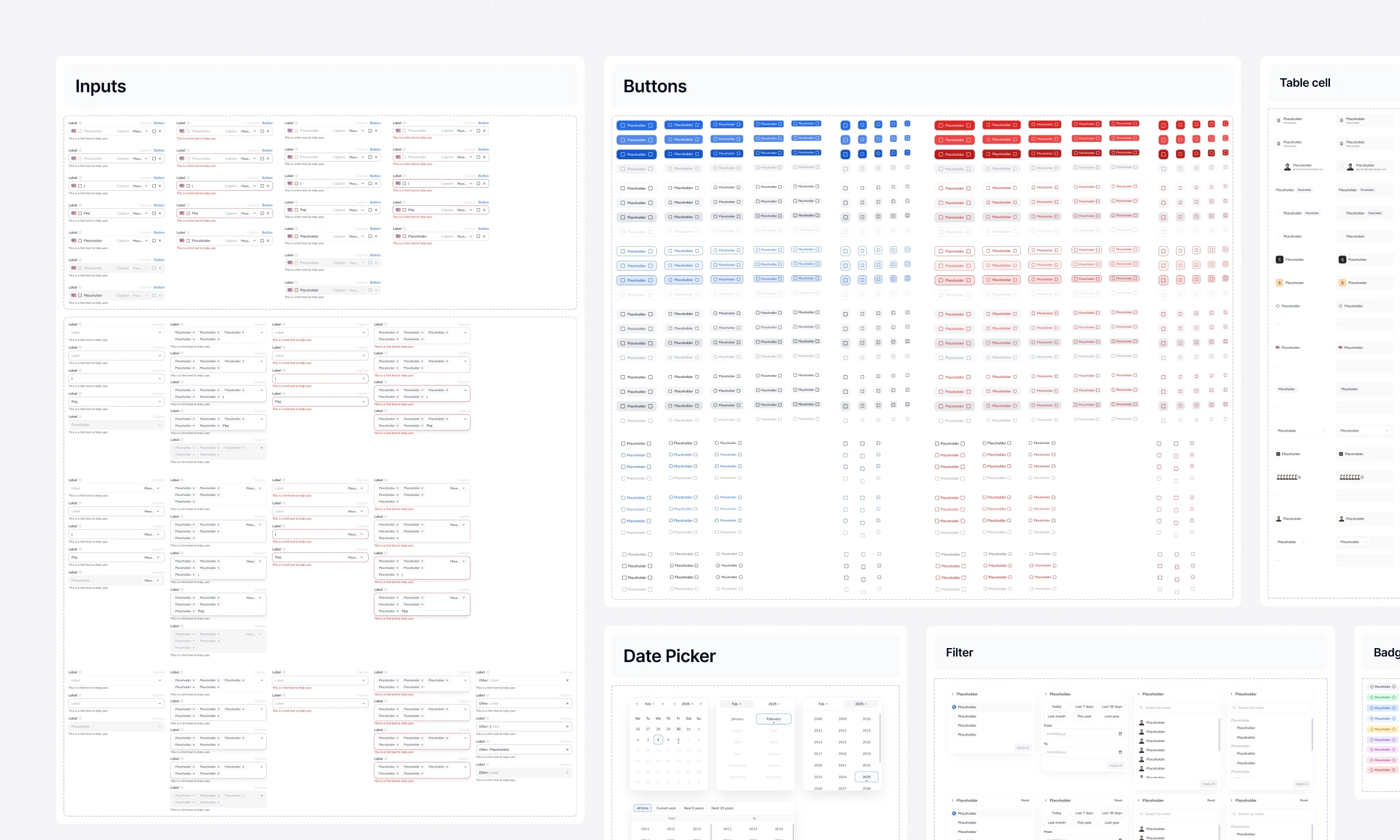
As the product grew from a single MVP flow into several modules, the design system became the thing that kept it feeling like one product. It defines the platform’s structure, interaction patterns, visual language and responsive behaviour, so the experience stays consistent across modules, user roles and screen sizes.
What it covers. Global navigation, core user flows, analysis screens, intake workflows, settings, AI chat, reporting, collaboration and feedback states (empty, loading, error and success).
How it’s built. A published Figma library shared across the platform’s product files, with colour, text and effect styles as the visual foundation. Components carry the variants and behaviours each module and role needs, so a table, a form or an AI suggestion looks and behaves the same whether it appears in valuation or in transfer pricing.
Responsive rules. Layouts adapt between smaller and larger desktop screens, with clear rules for how navigation, side panels and data-heavy views reflow.
Built with engineering. We developed the system together with the engineers. Interactions, edge cases and layout changes were documented in annotated Figma files, and design QA before each release checked that the shipped product matched the intended behaviour.
What it changed. Shared patterns made new workflows faster to design and to build: a new module started from proven components instead of a blank page, and the team kept the system as the base for further development.
Product delivery
The team launched the MVP and later Platform 2.0. My work established the navigation, analysis, collaboration, and reporting experiences across a growing product, with a design system and documentation to support continued development. Feedback from domain experts and users informed further iterations after the initial designs.
Outcomes during my time with SeemaS:
Raised $4M and gained enterprise traction.
Enterprise demos that led to new contracts, including Paramount.
Unified design system supporting modules and shared workflows.
Improved organization and collaboration through workspaces and focused sharing capabilities.
Like this project
Posted Oct 16, 2026
Designed SeemaS AI platform's UX/UI from MVP to Platform 2.0, enhancing collaboration, navigation, and reporting experiences.
Likes
0
Views
1
Timeline
Nov 1, 2024 - Jul 1, 2026
Clients
SeemaS, Inc.
Collaborators