Allo | Marketplace with 7M monthly visits

View completed workallo.ua
About Allo
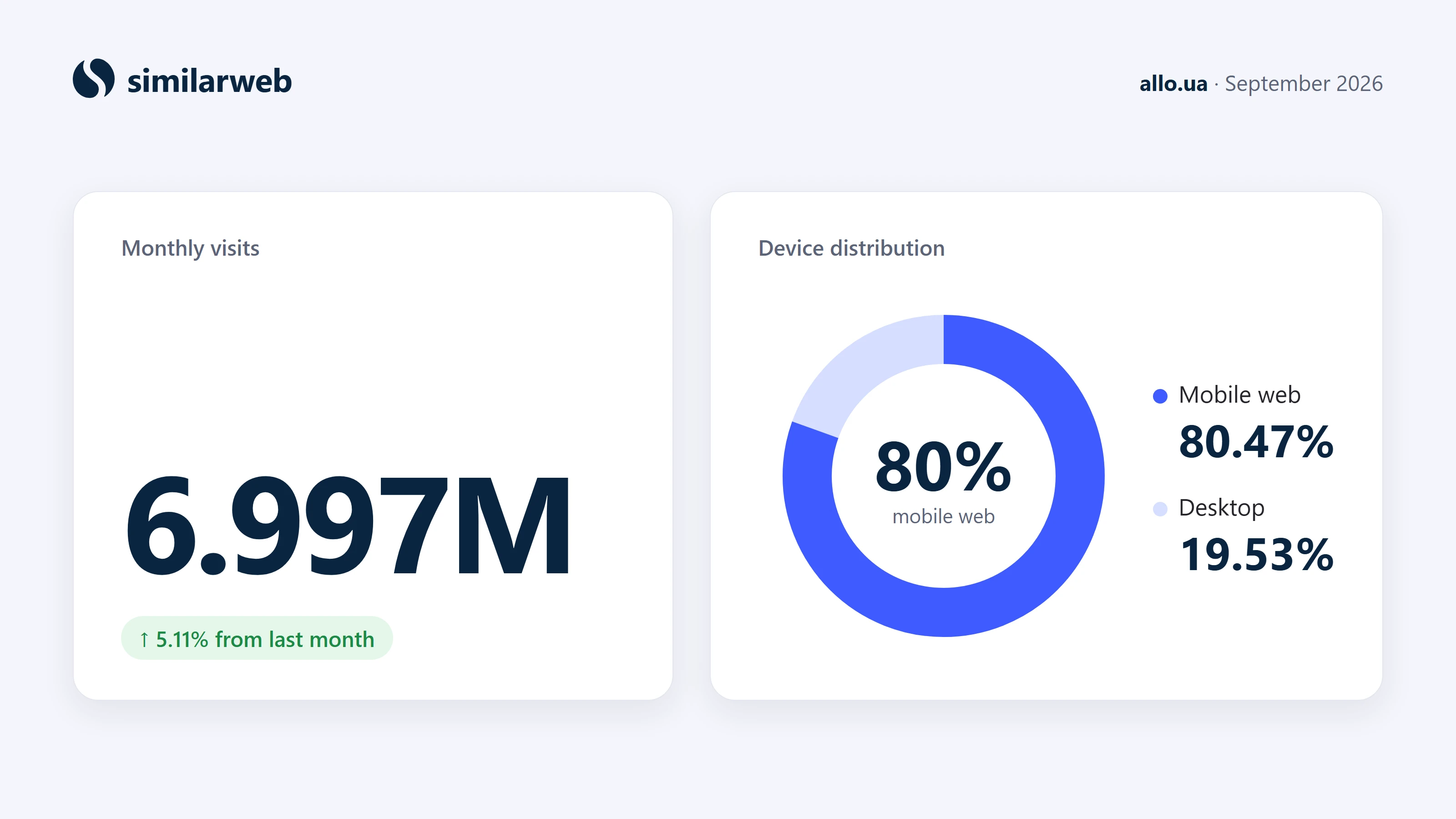
Allo is a Ukrainian online marketplace where products are sold both by Allo and by its partner stores. In September 2026 the site had about 7 million visits a month, and 80% of them came from mobile web.
I joined Allo in 2021 as a sales expert. After more than two years on the shop floor I moved into design.
My work at Allo
As a UI/UX designer I worked on:
Cross-sell
Product page redesign: several concepts
Promo block on the product card
Product reviews
Price block
Partner store page
Checkout
Mega menu
Specs for the outsourced development teams, in close work with business analysts
Cross-sell: Where the idea came from
Accessories and services carry a high margin, yet far fewer customers bought them than I expected. I set myself a goal: make add-ons a natural part of buying a main product, without slowing the purchase down.
My starting point came from sales. On the shop floor, the most effective habit was also the simplest: ask what the customer needs alongside the main product. When sellers who never did it started, their add-on sales nearly doubled. I wanted the website to ask the same question.
The starting point
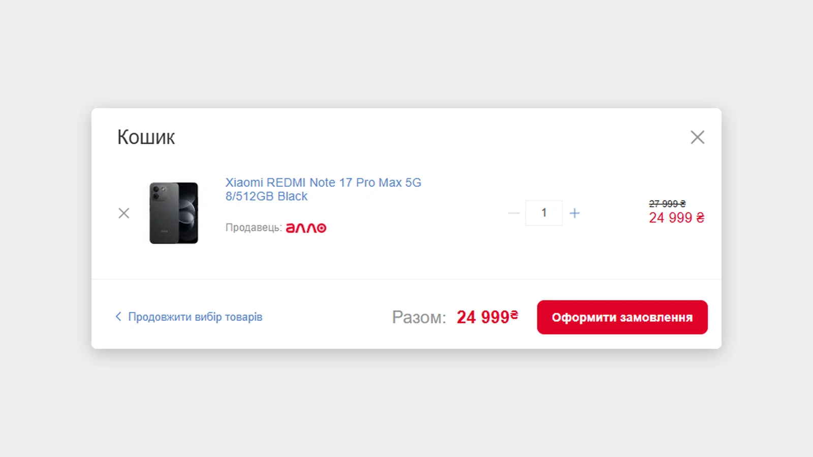
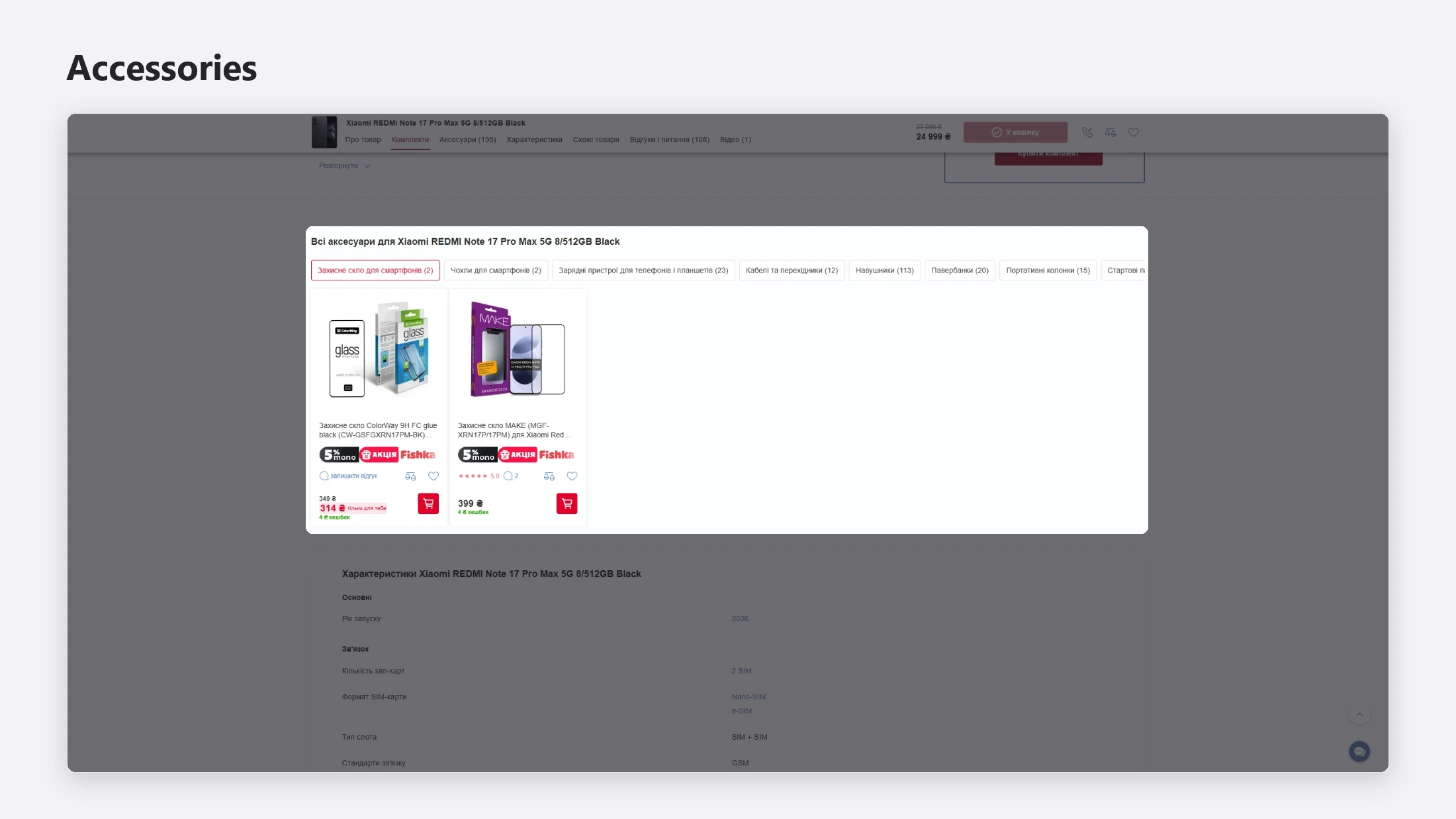
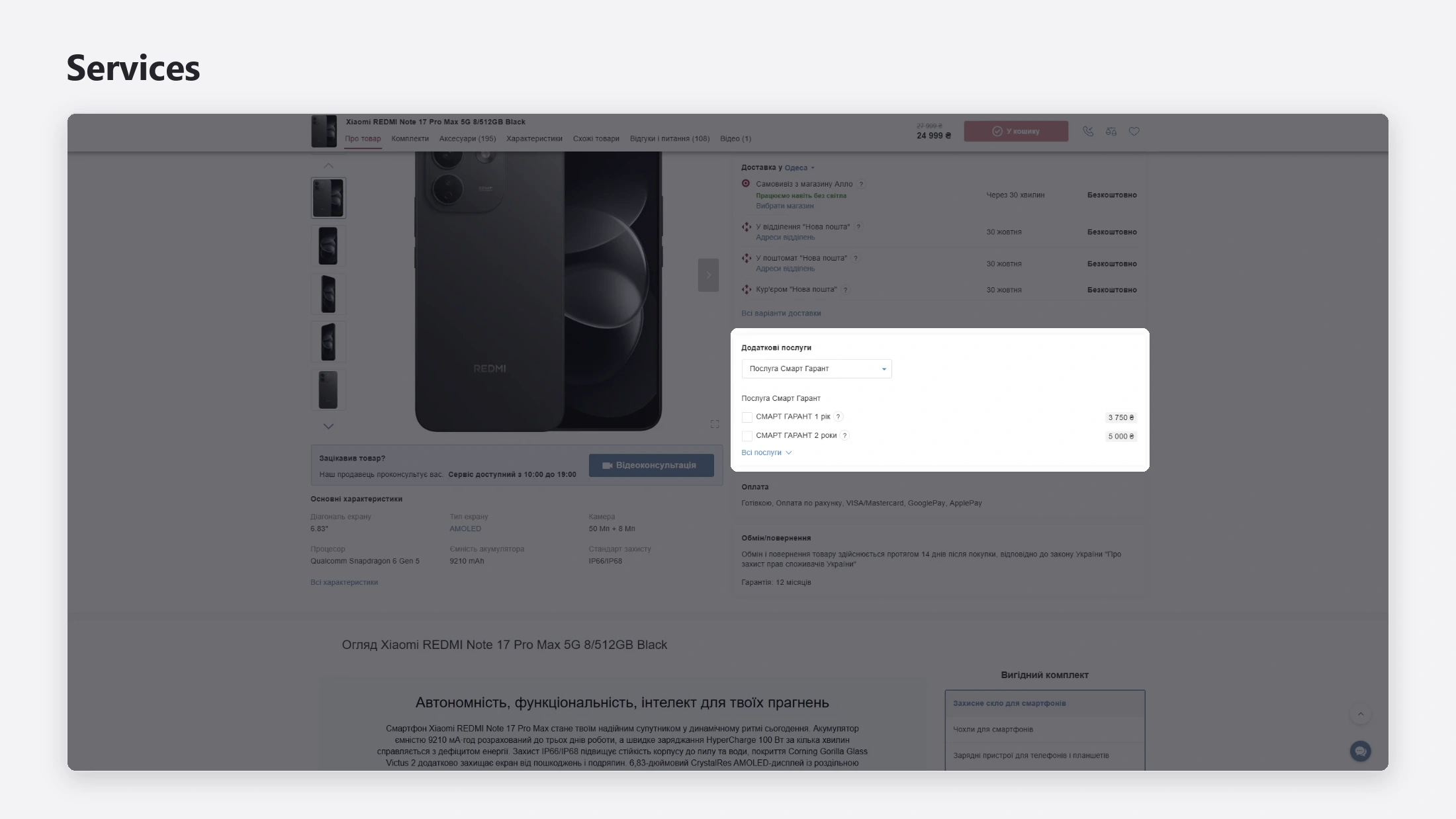
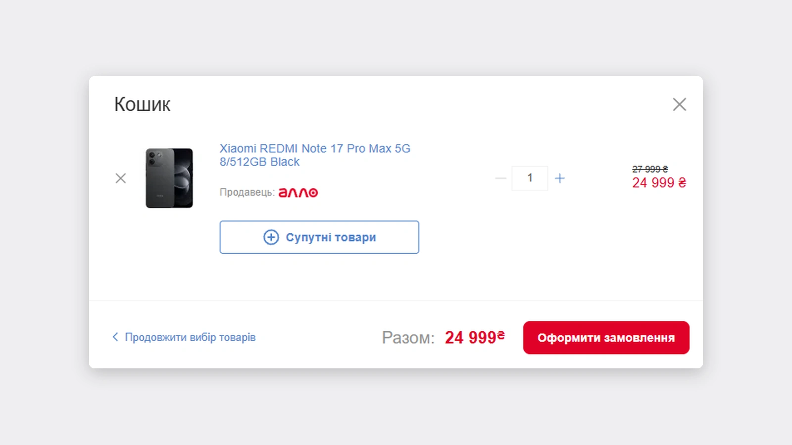
After a customer pressed "Add to cart", the cart opened immediately. Accessories and services lived lower on the product page, as two separate blocks, and the cart had no way back to them.
Research
I started with Google Analytics and Smartlook.
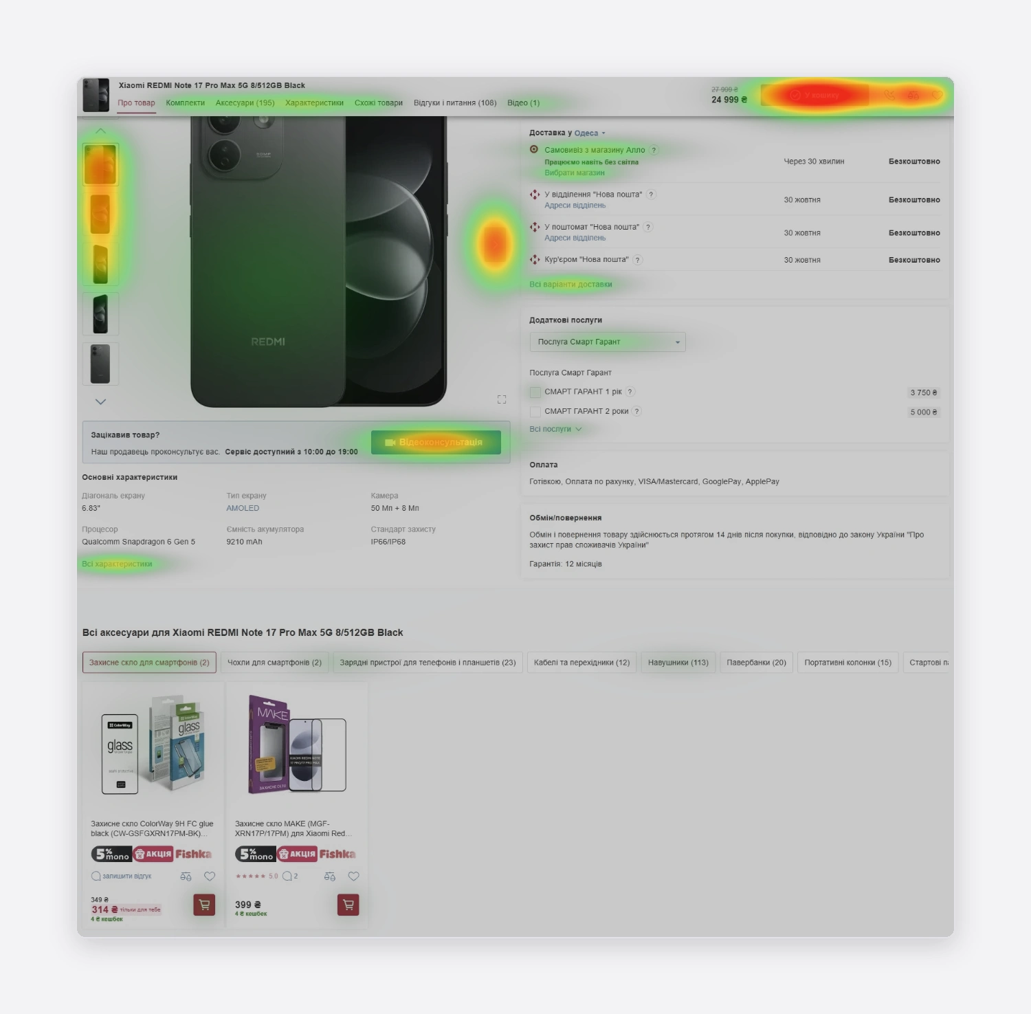
Heatmaps and a funnel.
I built a funnel for the add-on blocks: product page → click on an accessory or service → added to cart → purchase. Together with the heatmaps, it showed low engagement with both blocks, accessories and services.
Sessions.
I filtered Smartlook recordings for people who left the cart right after adding a product. Many of them went on to look for accessories to the main product, which meant they had to leave the cart to do it. A second funnel traced the same path: product page → cart → cart closed → another product page → checkout.
Two problems came out of this:
Add-ons were hardly noticed on the page.
The cart opened too early, so customers left it to keep shopping.
The solution
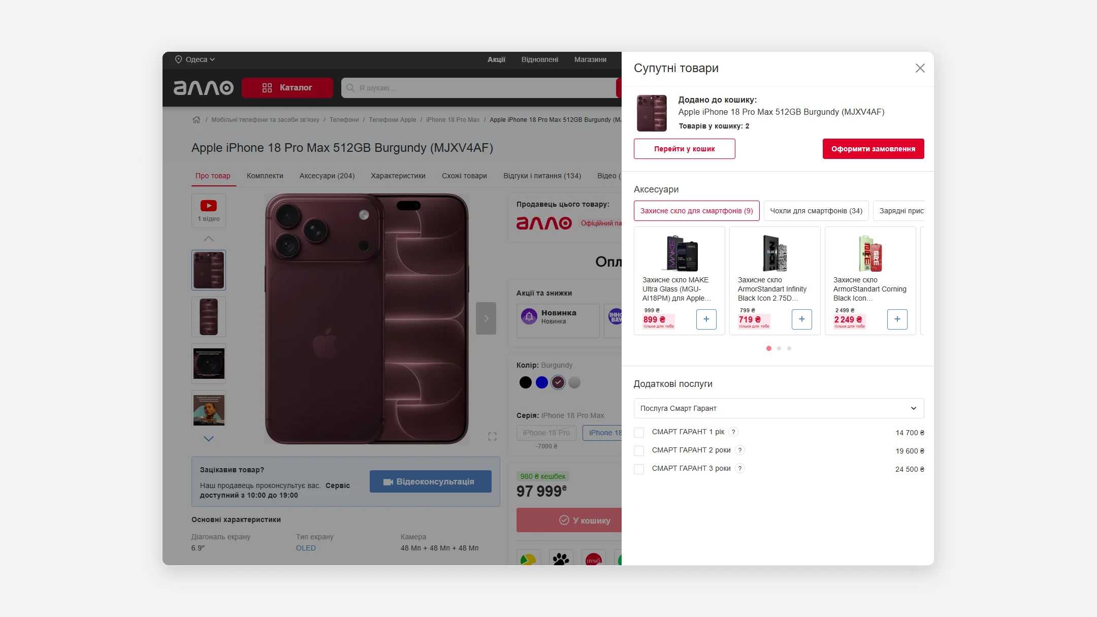
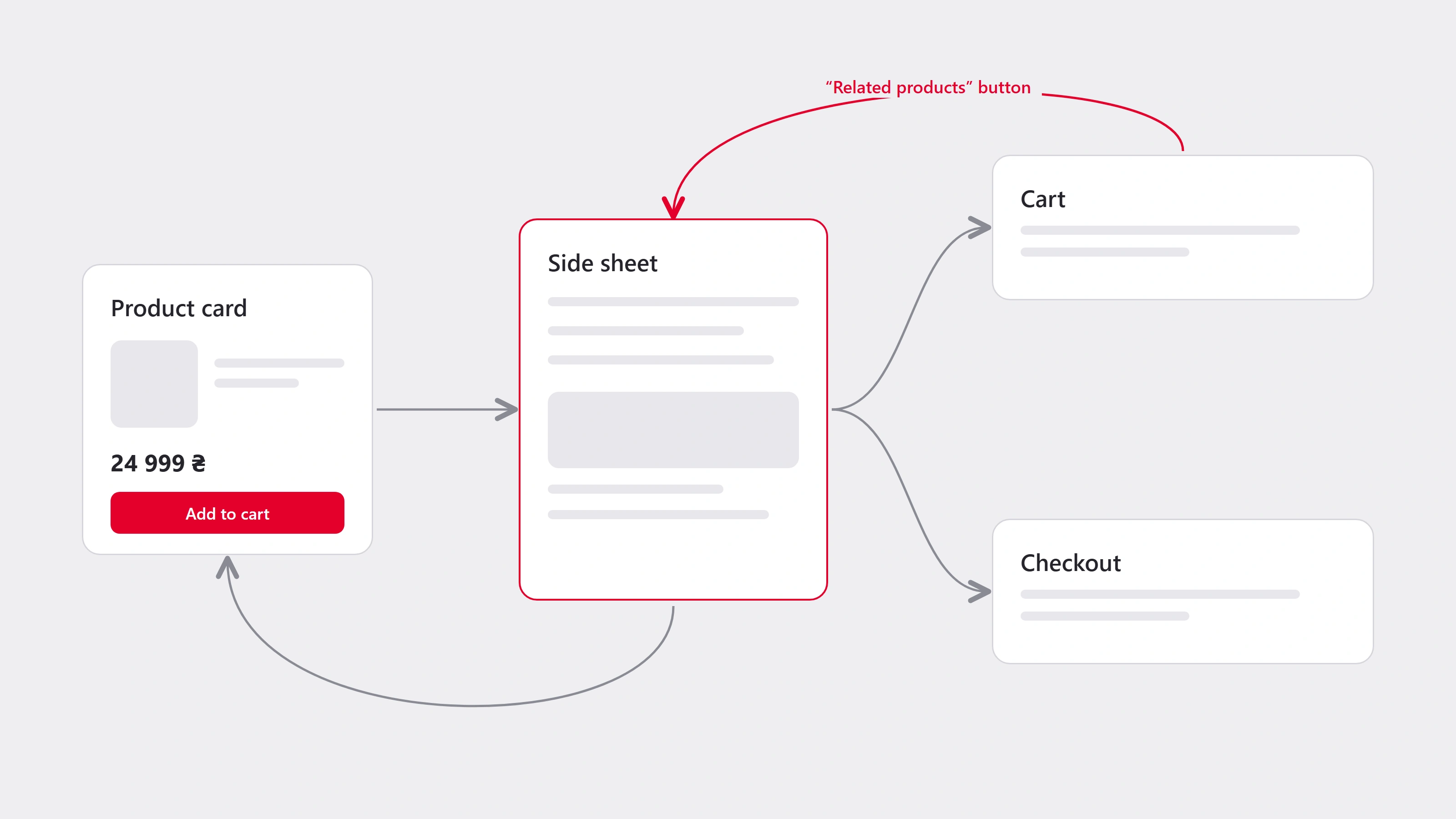
Instead of opening the cart straight away, the site now shows a side sheet between "Add to cart" and the cart itself.
It does three things:
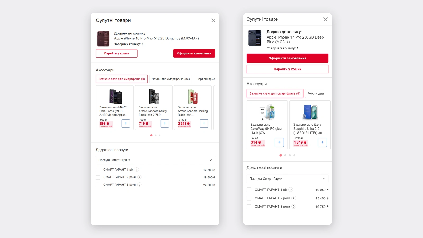
Confirms the add. The product, "Added to cart", and the number of items.
Gives three paths. Open the cart, go straight to checkout, or close the sheet and stay on the page.
Offering related products and services. Accessories grouped by category, each card with a quick "add", and services with checkboxes below.
The cart got one extra button, "Related products", which opens the same sheet. A customer can close it, change their mind, come back from the cart and add one more thing without returning to the catalog. I kept the cart light on purpose: it needs room for products and services, and the intermediate "added" state made the sheet the right place for the offer.
On mobile
80% of Allo's visits come from mobile web, so the same sheet works on a narrow screen: actions are stacked, accessories become a swipeable carousel with page dots, and services stay below.
Measuring success
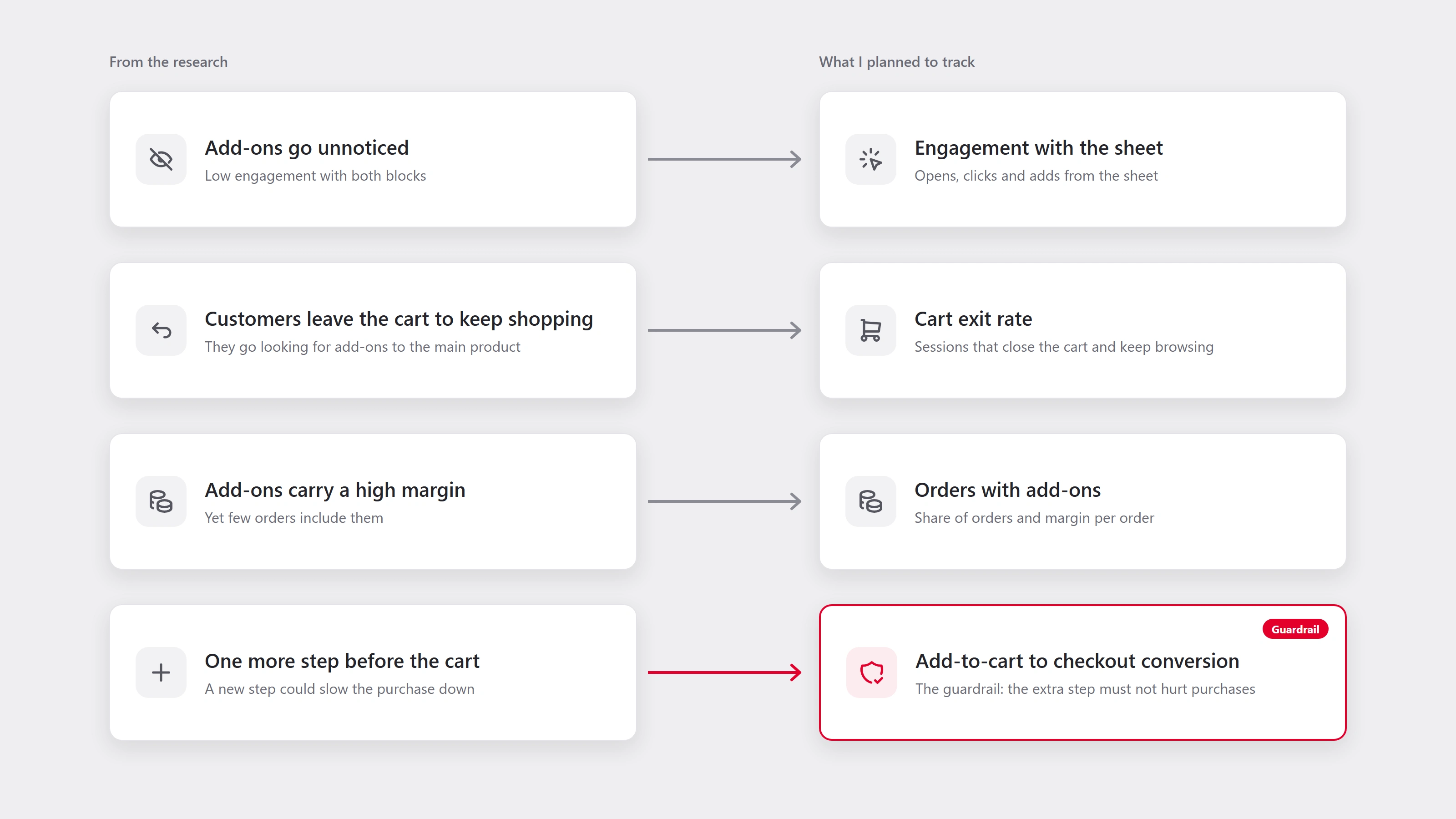
Every metric was tied to a problem found in the research. The extra step before the cart carried a risk of its own, so I added a guardrail: the conversion from "Add to cart" to checkout must not drop.
Shipped
The side sheet went live following my design, within the Allo design system of that time. I had left before the release, so I never saw the dashboards myself. Colleagues told me it landed well: the team got praise and the numbers went up.
1 like · 3 views · Oct 28, 2026
UI/UX enhancements for Allo Marketplace to boost sales and user engagement.