ANS Australia: The Australia to PNG corridor

Will Derman



Twelve services across two countries
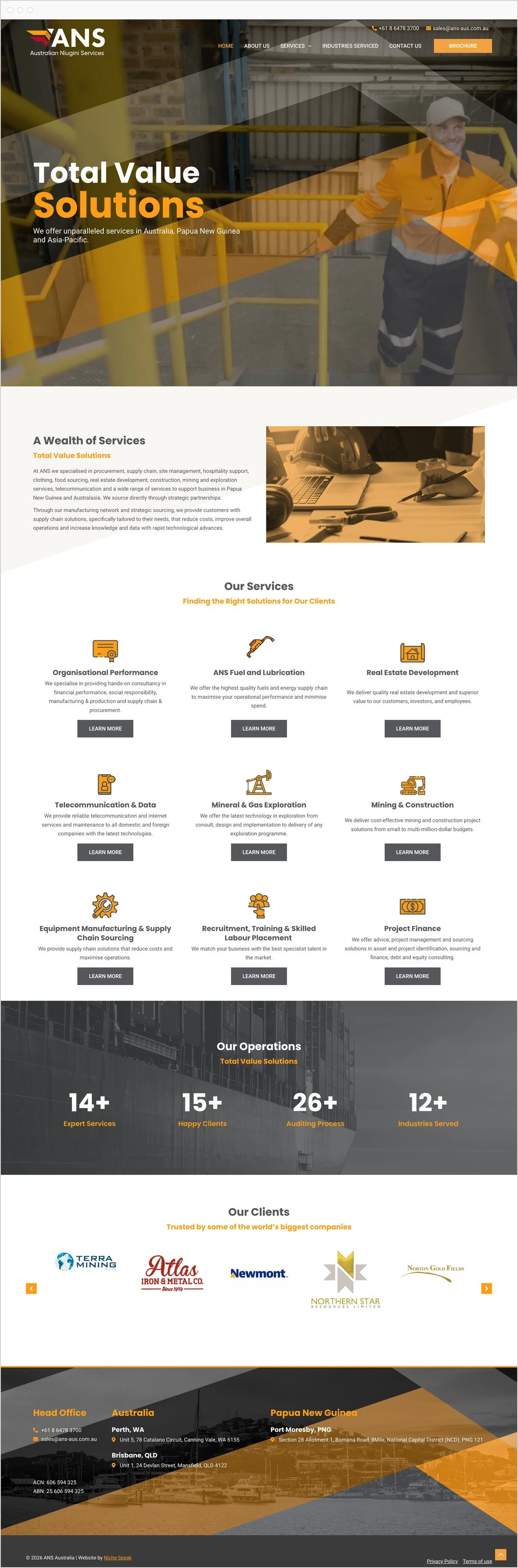
Most visitors come for one of twelve services. The site keeps the other eleven in view without getting in its way.
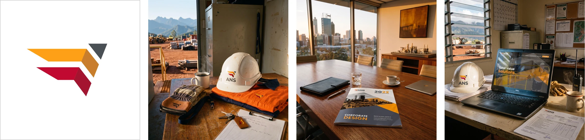
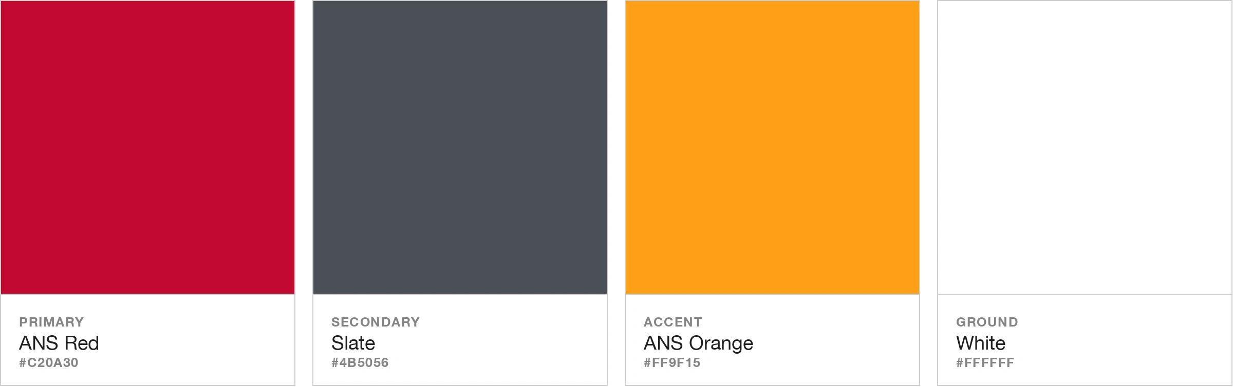
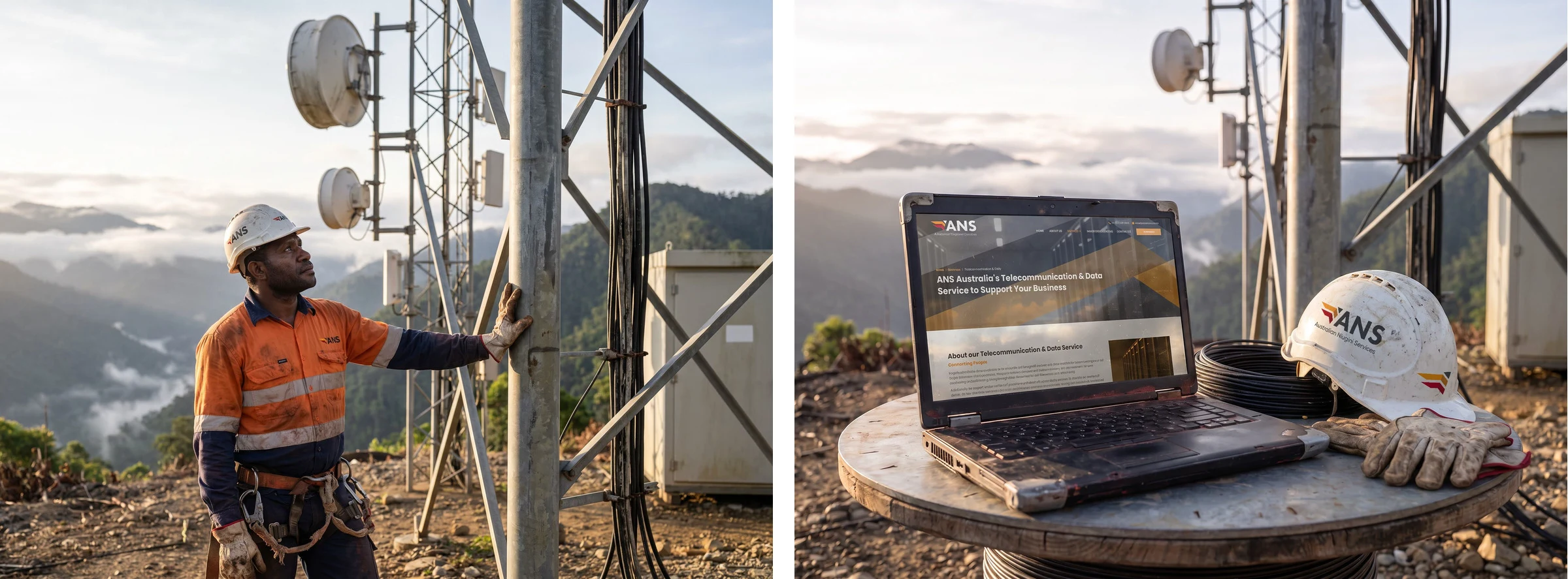
ANS supplies telecoms, energy and mining operations in Australia and across into Papua New Guinea, from Port Moresby, Darwin, Brisbane and Perth. I designed the logo, and designed and built the site. Orange and red belong to Papua New Guinea and slate to Australia, so the palette names the route before the mark does.
The mark, applied
Colour and type
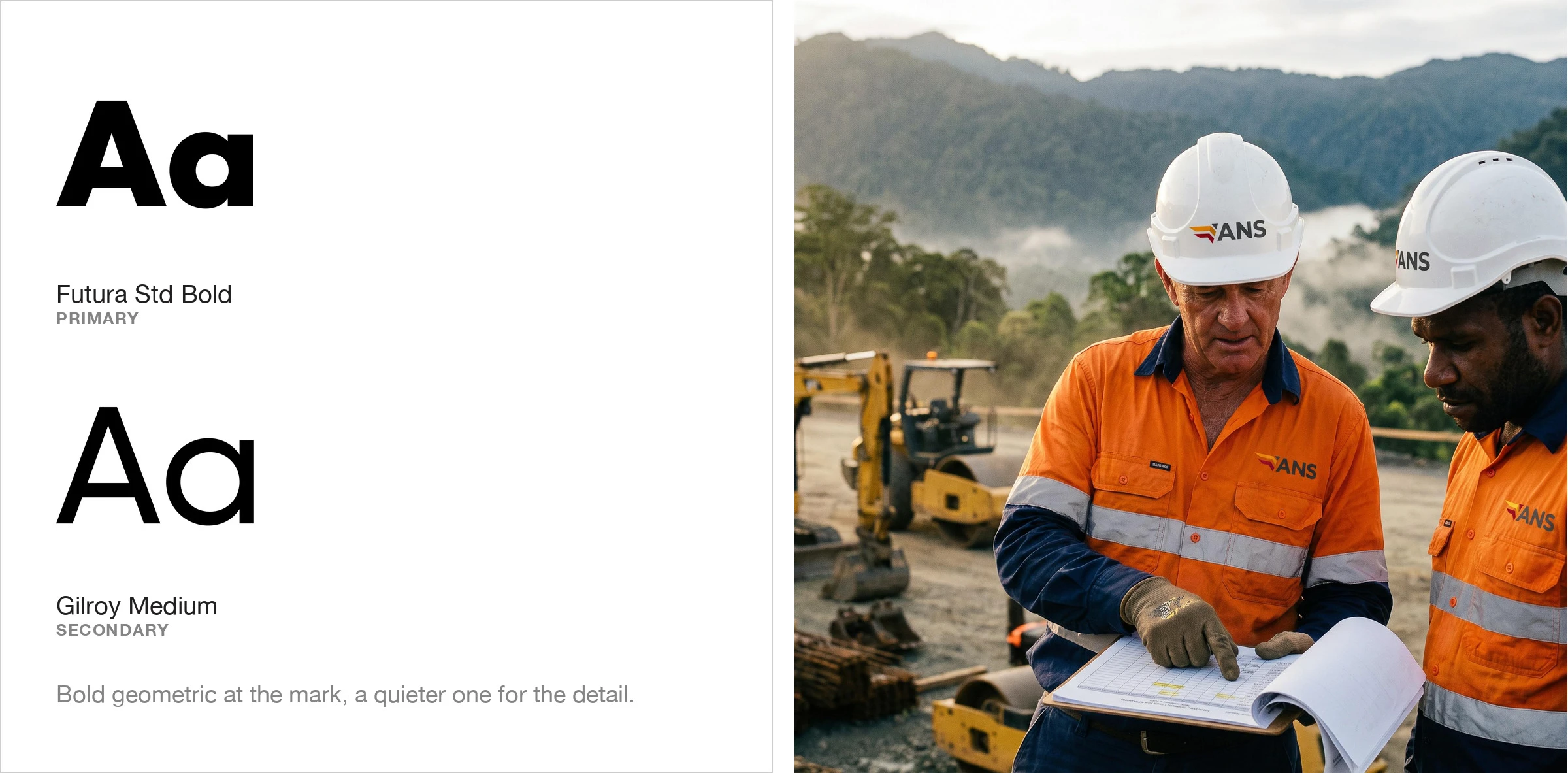
Telecoms, construction supply and procurement, all running between two countries. The mark holds the route steady while what travels along it changes.
The website
All twelve sit in one grid on the opening screen beneath the line Total Value Solutions, so you take in the breadth without anyone having to explain it. Each has a page of photographs from real sites: data centres, cranes, drilling rigs. All four offices are on the contact page, three in Australia and one in Port Moresby.
In context
A single route, a dozen services, and one mark that carries the lot.
Like this project
Posted Sep 13, 2026
Logo and website for a supplier running twelve services between Australia and Papua New Guinea, with every service in view on the first screen.
Likes
0
Views
2