Social Link: A portal for care shifts

Will Derman


Find the shift before you read the pitch
The mark keeps out of the way. What matters is the person turning up, not the business that booked them.
Social Link, a UK care agency, sells to two audiences on one site. A carer wants shifts within travelling distance; a care provider wants enough confidence to hand over a vacancy. Neither should have to read past pages written for the other. I designed the brand identity and the job portal, and built the site.
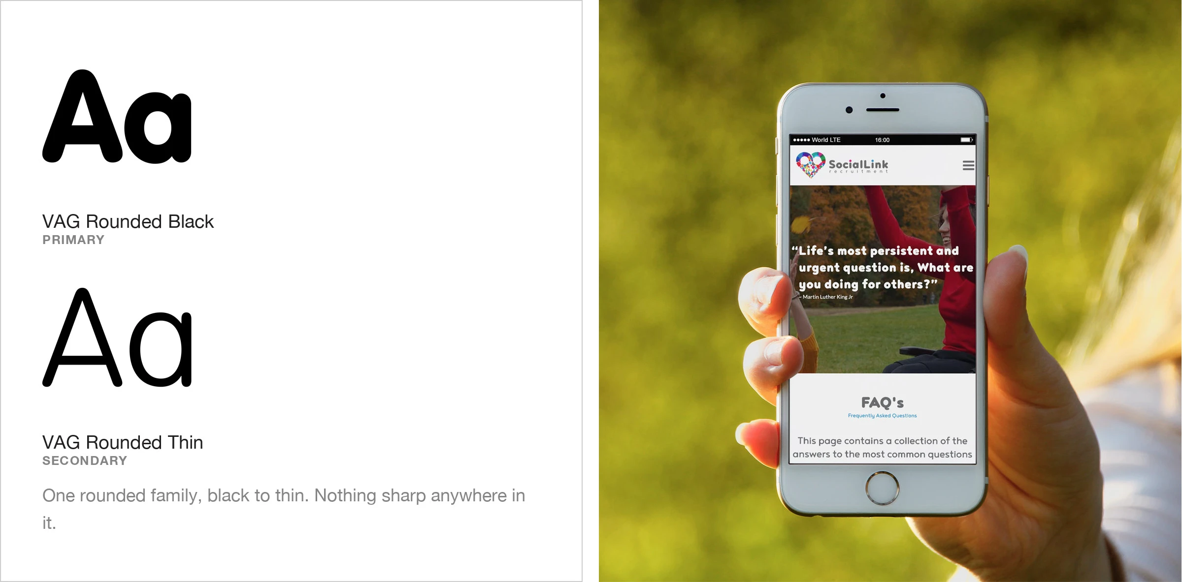
Colour and type
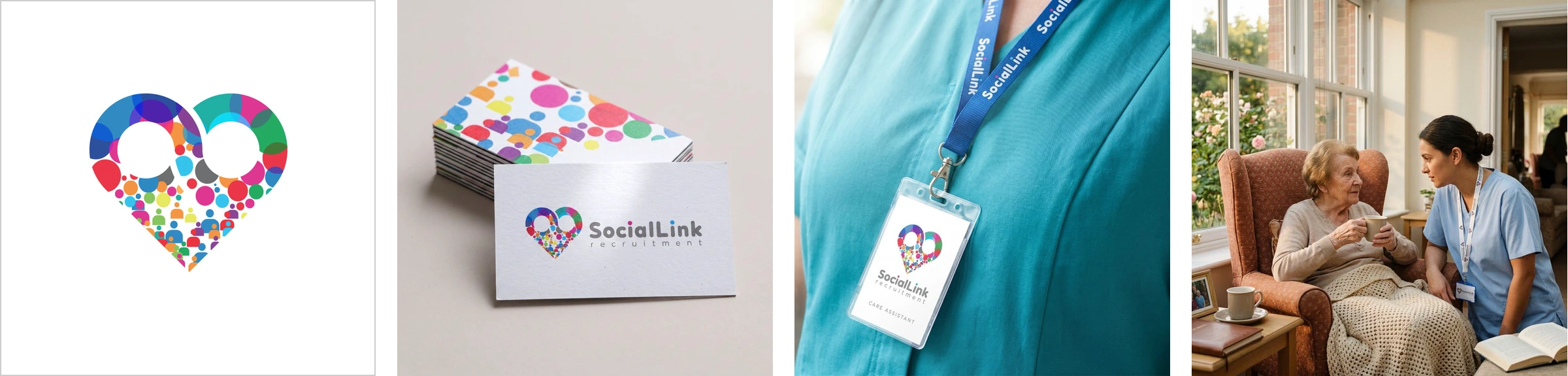
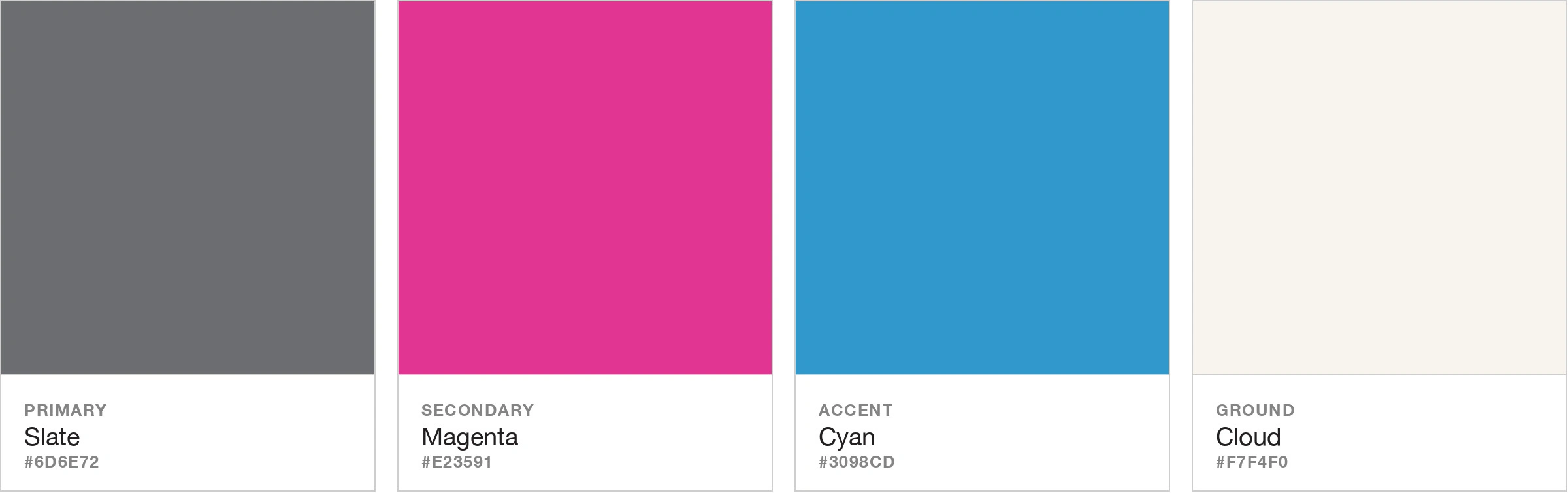
Agencies in this field tend to advertise how big they are. This identity works the other way: the dots stay separate colours, because the people never merge into one either.
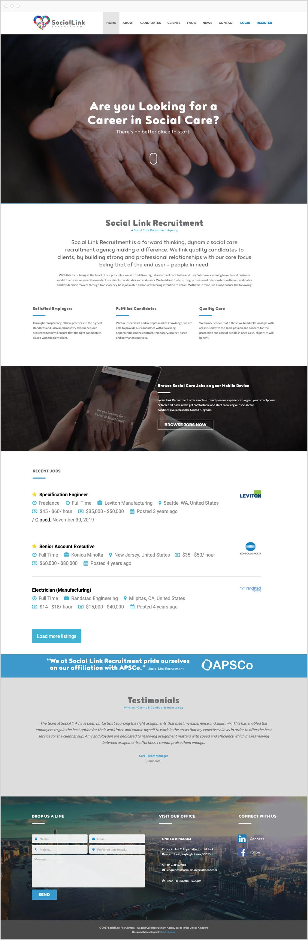
The portal
Open work appears as pins on a map of Britain, sorted by role, with filters above them. Distance is answered before a single sentence is read. The lettering is rounded at every weight, with no sharp corner anywhere in the set. The About page opens on the mission, then the APSCo membership.
The work
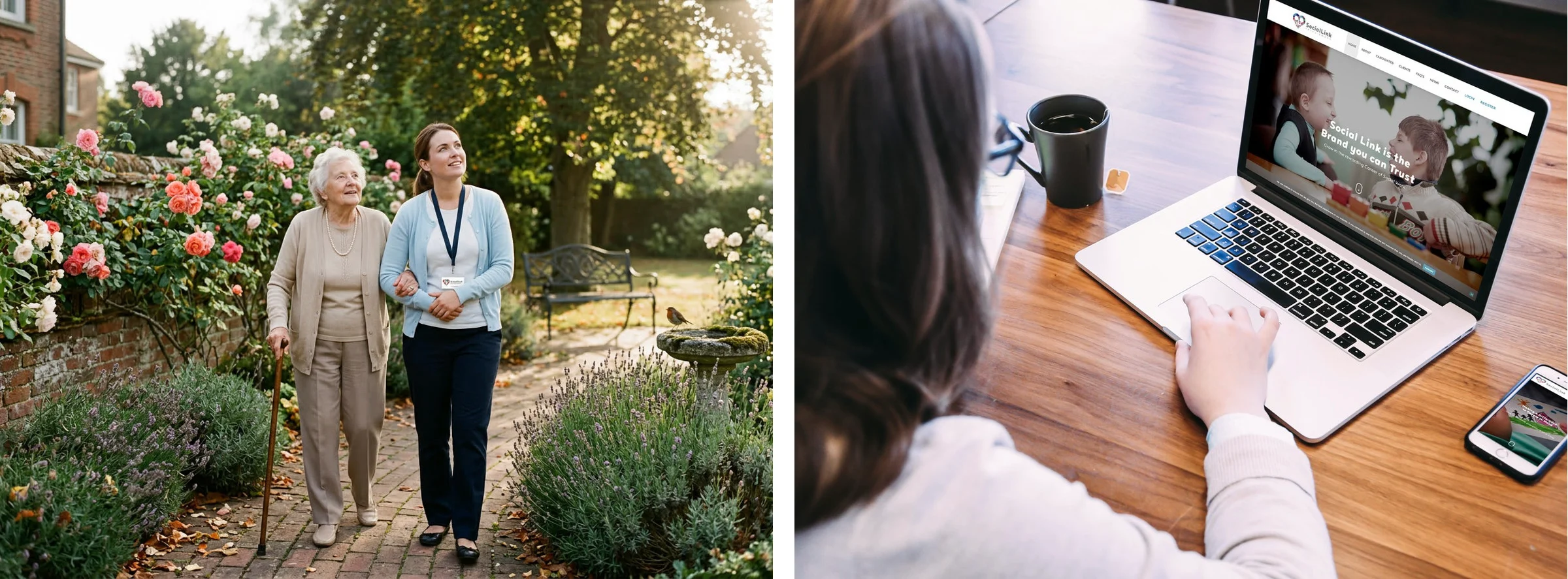
Each booking comes down to one home and one night that cannot go wrong.
Like this project
Posted Sep 13, 2026
Brand identity, job portal and build for a UK social care agency: carers see open shifts on a map before reading a word, and employers get their own way in.