Hostendo - A Hosting Brand That Doesn't Look like Hosting
Smarkety 👨🏻💻
The European hosting market has a serious design problem. Open up the websites of most GDPR-compliant server providers and you'll find the same thing every time: blue and white color schemes, stock photos of data centers, corporate buzzword soup, and interfaces that look like they haven't been touched since 2009. For a category that is supposed to power the most ambitious digital products in the world, the visual language is embarrassingly behind.
Hostendo wanted to change that. A brand new European hosting provider targeting young professionals, founders, and freelance developers, people who grew up with Stripe, Notion, and Apple, and who flatly refuse to work with products that look like legacy enterprise software. They had the infrastructure: GDPR-compliant servers, NVMe SSD storage, 99.9% uptime SLA, transparent pricing. What they didn't have was a brand, an identity, or a single pixel of digital presence. They came to me with nothing to show for it yet.
The brief was deceptively simple: build everything from scratch, and make it feel like the hosting provider you actually want to log into.
The Strategic Tension: Security Meets Disruption
Before any design work began, I needed to solve a fundamental strategic problem. Hostendo's positioning required two things that are almost opposites by design.
On one hand, they are entrusted with mission-critical data. Clients are handing over the infrastructure their entire businesses run on. The brand needed to project military-grade stability, European data sovereignty, and absolute reliability. No room for feeling experimental or flimsy.
On the other hand, their target audience, founders, developers, creative agency owners, are digital natives who actively reject the authoritative, corporate aesthetic that traditionally signals those qualities. They want speed, dark mode, clean UI, and a brand that speaks their language without corporate jargon.
The design challenge was bridging "Bulletproof European Infrastructure" with "Agile Silicon Valley UX." I defined the core project mantra early: disruption requires a foundation of absolute stability. Every decision after that was made through that lens.
Identity System: The Logo and Its Dual Personality
The Hostendo wordmark is a purely typographic logo. No icon, no symbol, no abstract mark. Just the name, but carrying a very deliberate internal tension.
The letterforms are set in extreme condensed weight. Thick, monolithic, almost brutalist in their mass. This was intentional: a hosting provider must project immense stability, and the sheer visual weight of the letterforms communicates that before anything is read. They feel unshakeable, like a server rack. They don't move.
But the logo's defining feature is the sweeping curved crossbar on the opening 'H'. While the vertical pillars are rigid and structural, the crossbar breaks the grid with a deliberate swoop. It introduces youth, agility, and the slightly cheeky personality of the brand without compromising the overall stability of the mark. It visually breaks the rules just enough to signal that this is not your grandfather's hosting provider.
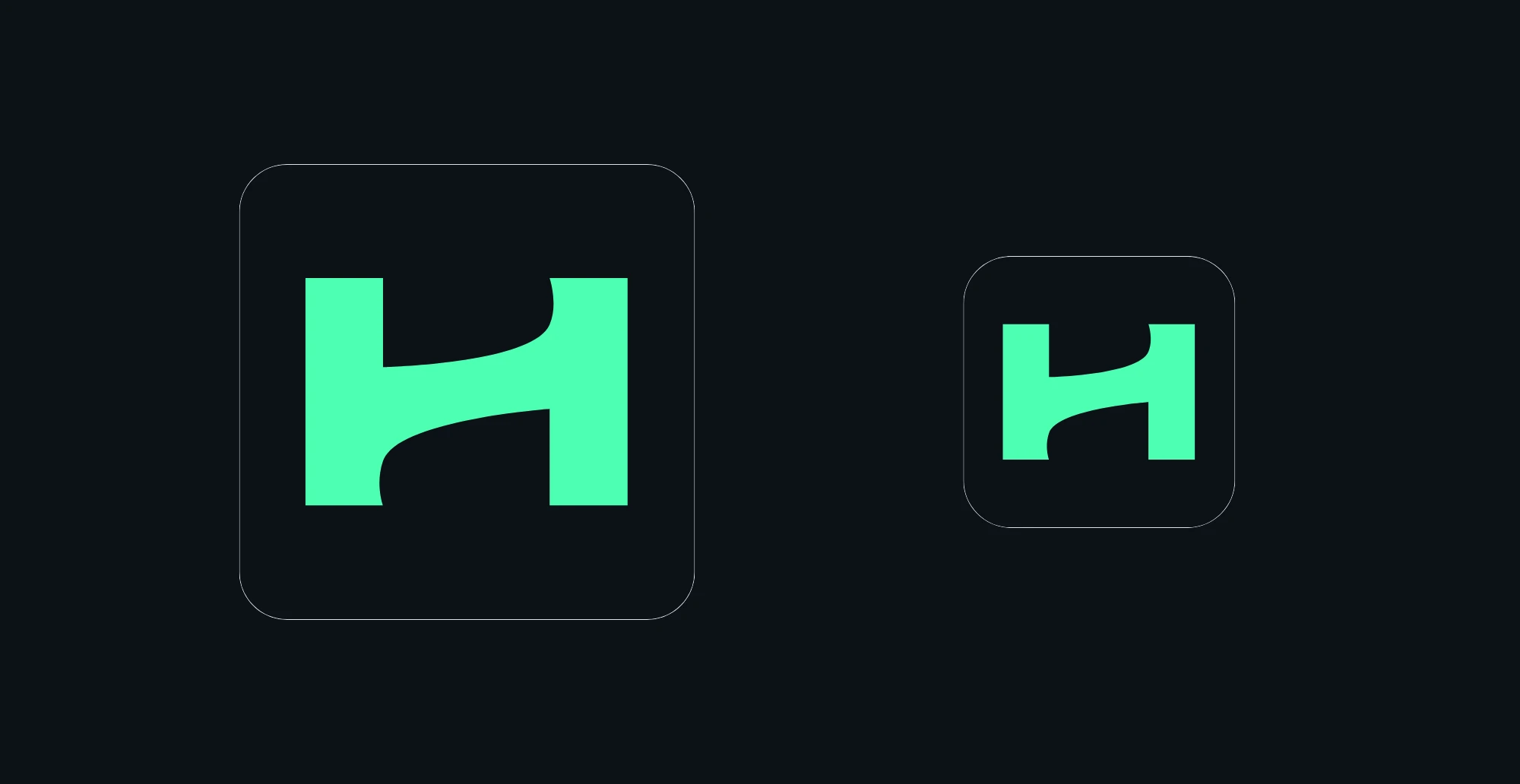
The same logic carries through to the favicon and avatar system. At 16×16 pixels, a full wordmark becomes illegible. I established the standalone 'H’ mark. Thick pillars, curved crossbar intact. In Cyber Green. It retains the full brand personality even at the smallest scale.
Typography: The Shout and the Whisper
The typographic system is built on a deliberate contrast between two voices that each do a specific job.
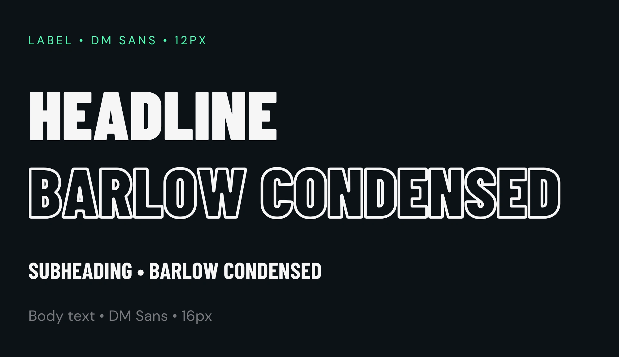
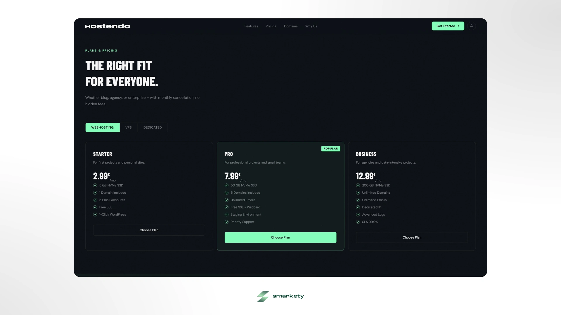
Barlow Condensed carries all H1 and H2 headlines, set in weights between 700 and 900, always uppercase. I selected it because it is inherently loud, tall, structural, and aggressive in a way that commands attention. When you pair extreme weight with the Cyber Green accent color, the result is a brand that shouts its most important messages without apology. Pricing metrics, server statistics, and uptime numbers all use Barlow Condensed extra bold, making data feel powerful and definitive rather than buried in a table.
DM Sans handles everything else: body text, navigation, UI labels, subheadings, support text. It is clean, humanistic, and exceptionally readable on dark backgrounds. Where Barlow shouts, DM Sans whispers. The contrast between the two creates a typographic hierarchy that is legible at every level and distinctly non-corporate in character.
Color Architecture: Midnight and Neon
The color system is the most immediate signal that Hostendo is different. There are two core colors and each one carries a specific meaning.
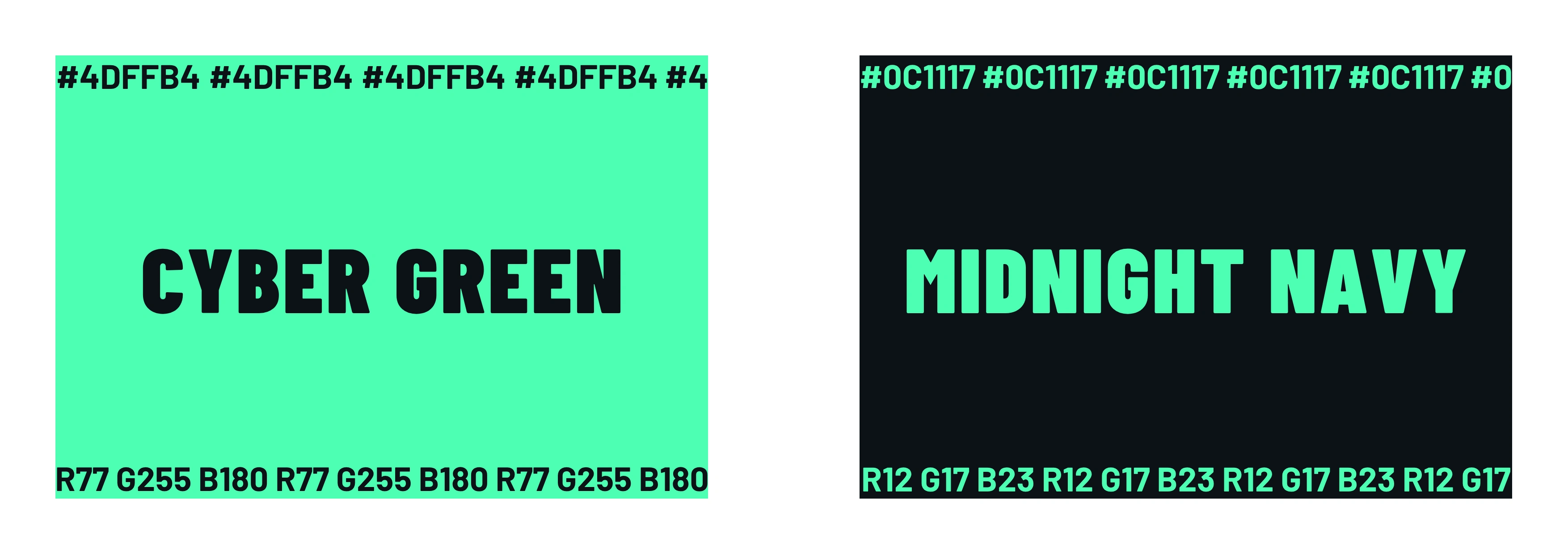
Cyber Green (
#4DFFB4) is the pulse of the brand. It cuts through the dark background with maximum visual contrast, pulling the eye immediately to call-to-actions, success states, and primary statistics. It represents the brand's energy and its refusal to be boring. When placed on the Midnight background, it creates the exact tension between security and disruption that the brand positioning requires.Midnight Navy (
#0C1117) is the primary application background. Darker than slate, cooler than pure black, deeply technological. I chose it over pure black because pure black flattens everything and loses the subtle depth that makes a dark interface feel premium rather than heavy.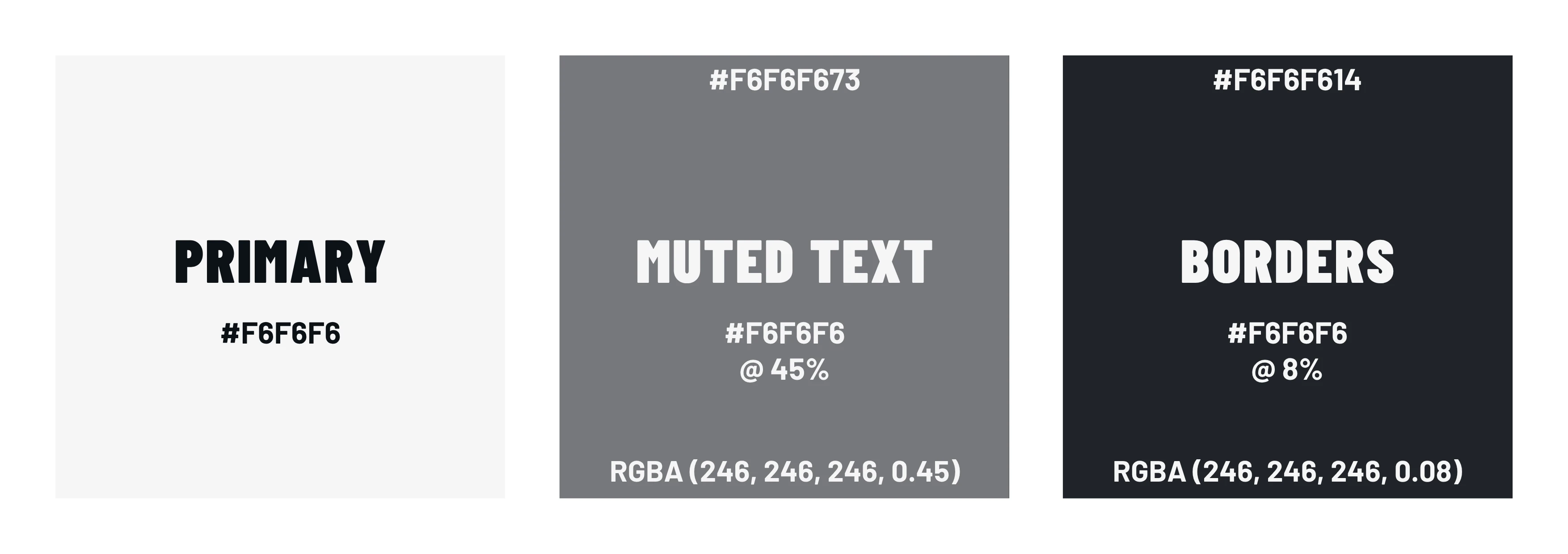
For text scales, I defined a custom off-white system based on opacity rather than flat hex values. Primary foreground at
#f6f6f6 for headings and core UI elements, muted text at rgba(246, 246, 246, 0.45) for secondary descriptions and navigation links, and borders at rgba(246, 246, 246, 0.08). Translucent enough to create separation without adding visual weight.Graphic Language: Texture, Glass, and Glow
A dark color system lives or dies by the quality of its surface treatment. Flat dark backgrounds look cheap. The difference between a premium dark interface and an amateur one is texture, layering, and light.
I implemented three graphic techniques that work together to create the Hostendo surface quality.
The first is a global SVG fractal noise overlay set to 4-5% opacity across the entire application. Using a CSS
feTurbulencefilter at baseFrequency: 0.75 with four octaves, the noise prevents the dark backgrounds from reading as flat, giving the interface a tactile, matte-plastic quality that feels considered and premium rather than just dark.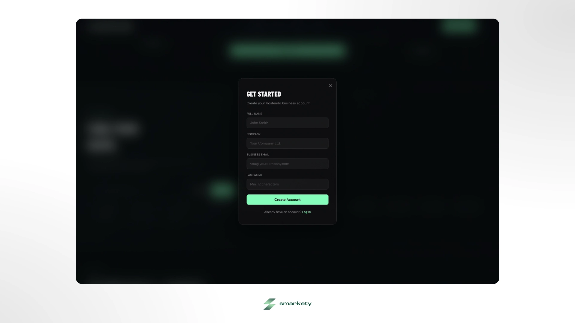
The second is glassmorphism, but restrained. UI cards use translucent
rgba borders at 8% white opacity and minimal background fills at 4%. Hover states increase border opacity to 25% and background to 7%. The depth is created by layering, not by heavy solid grays. This keeps the interface feeling airy while maintaining clear component separation. The technique is complemented by subtle backdrop blur on floating elements.The third is ambient glow. Behind key elements, the hero headline, featured pricing cards, primary CTAs, I placed extremely soft radial gradients using
rgba(77, 255, 180, 0.06) at 0% fading to transparent at 65%. The effect is subliminal: the user doesn't consciously register the glow, but it draws their eye precisely where it needs to go. It adds a touch of sci-fi luxury without becoming theatrical.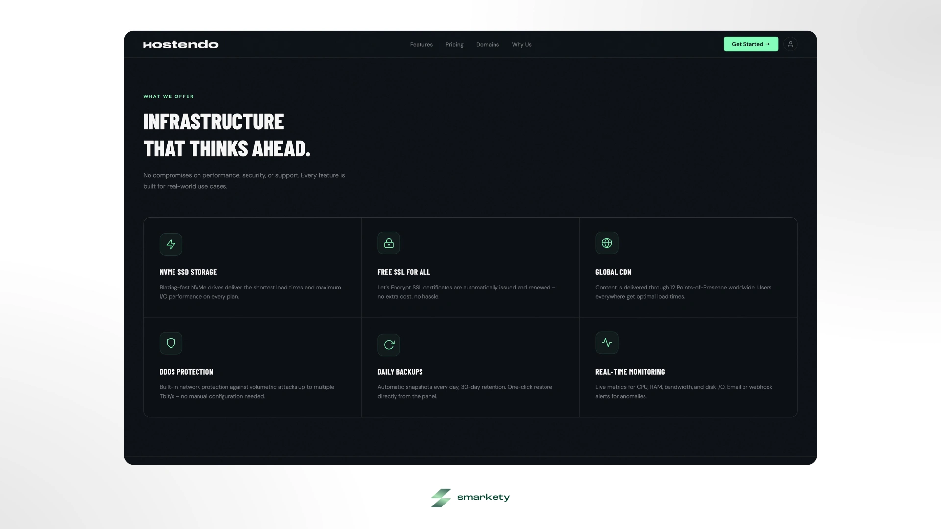
Iconography completes the graphic language: monoline stroke icons at 1.5px, unfilled, mechanically precise. The thinness of the strokes creates a deliberate counterpoint to the thick Barlow typography: delicate detail alongside structural mass.
The Tone of Voice
A brand system without a content strategy is only half built. I drafted tone of voice guidelines to ensure the copy matched the visual identity, because a beautifully designed interface with corporate buzzwords destroys the credibility you built visually.
The tone of voice I defined: plain, confident, slightly cheeky. Not corporate: "We provide mission-critical synergistic enterprise infrastructure solutions.” But also not silly. The Hostendo voice is like the smartest engineer in the room who doesn't need to dress it up. "Your Web. Your Rules." "No hidden fees." "Cancel monthly." Speak plainly, cut the jargon, and let the product do the talking.
Building a brand for a hosting startup that needs to compete with legacy giants from day one with no existing trust, no existing audience, and no existing visual language, is exactly the kind of zero-to-one challenge I live for. Let's build something beautiful together that completely outshines your competitors.
Like this project
Posted Jun 8, 2026
Dark mode, neon green, zero compromise. Brand identity and web design for a European hosting startup that wanted to look nothing like its competitors.