Turning a Boring Shop into a Loud E-Commerce Brand - Cosgo
Smarkety 👨🏻💻
Turning a Boring Shop into a Loud E-Commerce Brand: The Cosgo Rebranding
The Spark: Why "Playing it Safe" No Longer Works in Furniture Retail
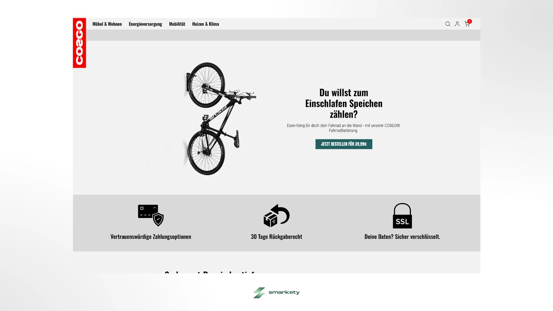
The furniture market is incredibly predictable: endless wood textures, safe serif typography, and overly formal communication. When the German brand Cosgo approached me, it was completely obvious that this standard playbook wouldn’t work for them. Cosgo sells massive, ultra-fluffy beanbags, cozy sofas, and quirky lifestyle products like tricycles or indoor bicycle mounts.
Their target audience? "Generation Chill”: Gen-Z and Millennials who have zero interest in stiff minimalism. Instead, they’re looking for absolute comfort paired with a healthy dose of rebellion.
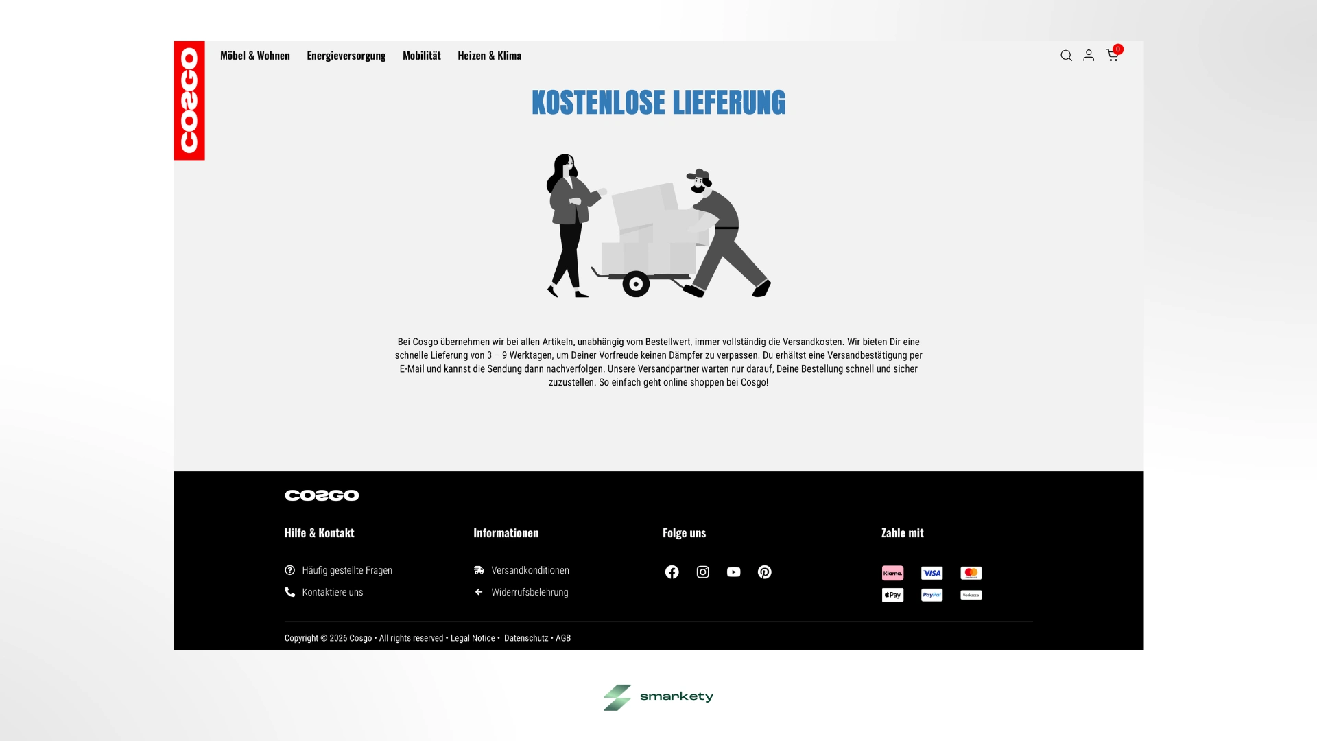
The starting point was a fundamentally solid, but visually and architecturally a standard Shopify store. The setup was far too rigid and the design too "vanilla" to convey the cheeky, youthful brand persona that the founders had in mind. Cosgo needed a total visual glow-up and a vastly more flexible technical foundation. My mission was to act as the Lead Product Designer, developing the entire rebranding concept from scratch and subsequently building the e-commerce experience into a fully customized WooCommerce shop.
The Game Plan: Disruption with Comfort
To make the brand stand out in a sea of generic competitors, I engineered a highly opinionated Digital Design System built around extreme contrast, massive typography, and brutalist UI decisions. I wanted the shop to feel like hanging out with your loudest, most unapologetic friend who immediately asks why you're still sitting on a hard wooden chair.
1. Color Engineering & Contrast Rules
The color palette needed to demand immediate attention without destroying the UX.
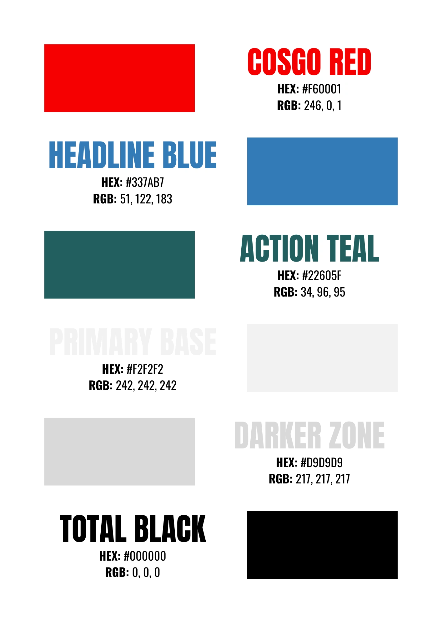
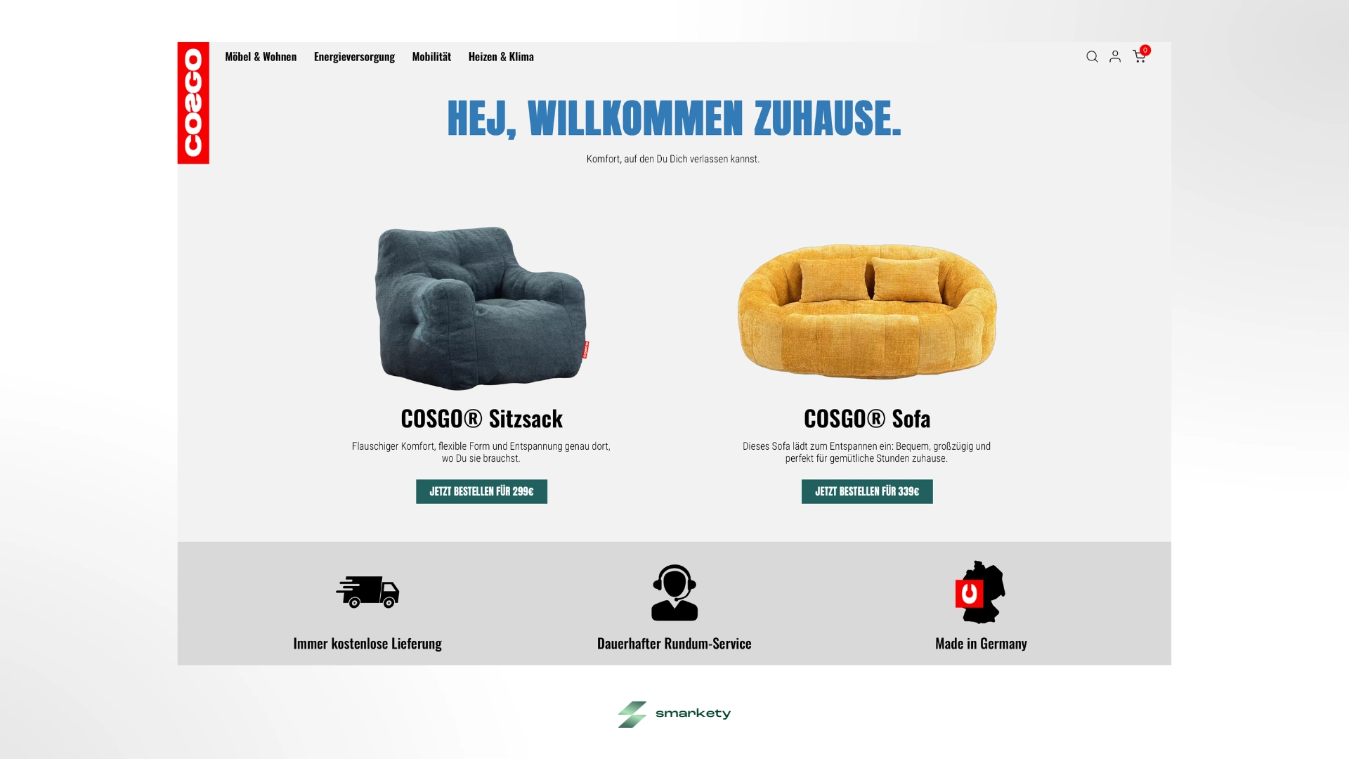
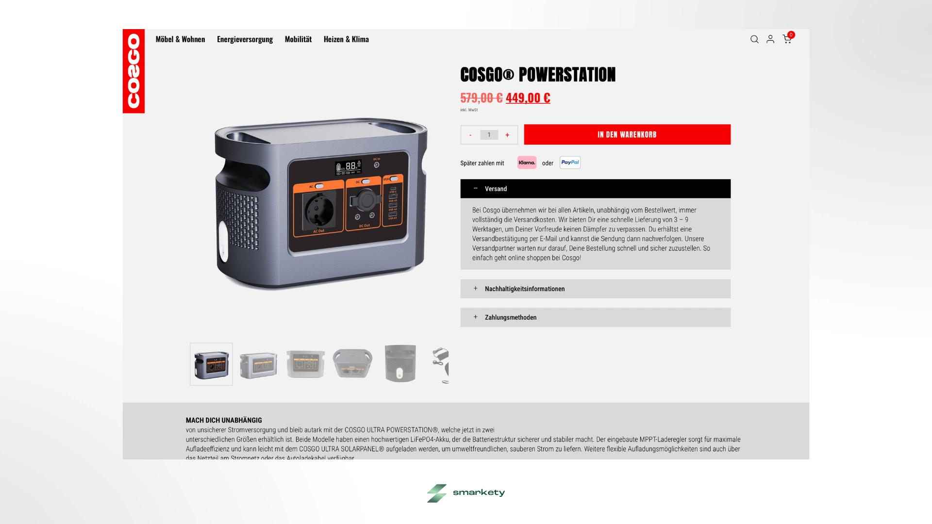
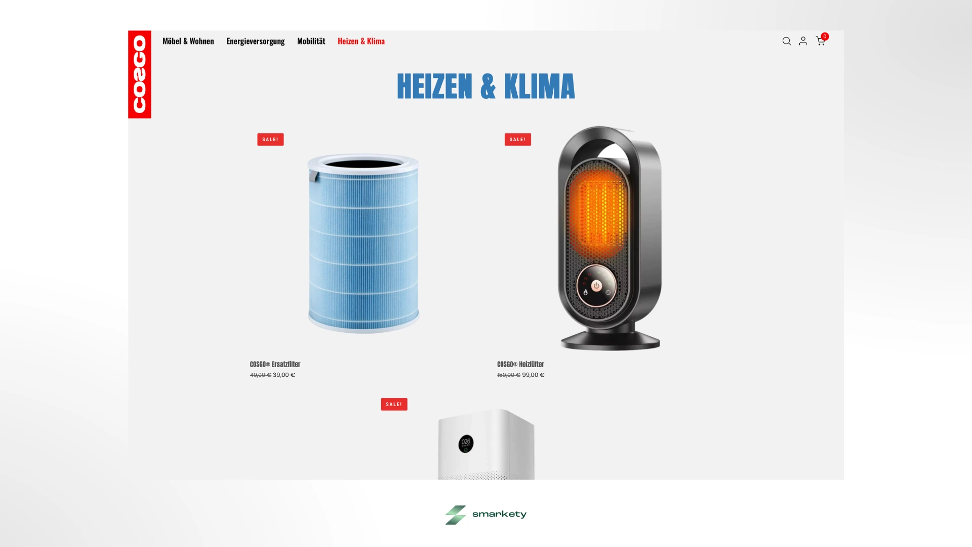
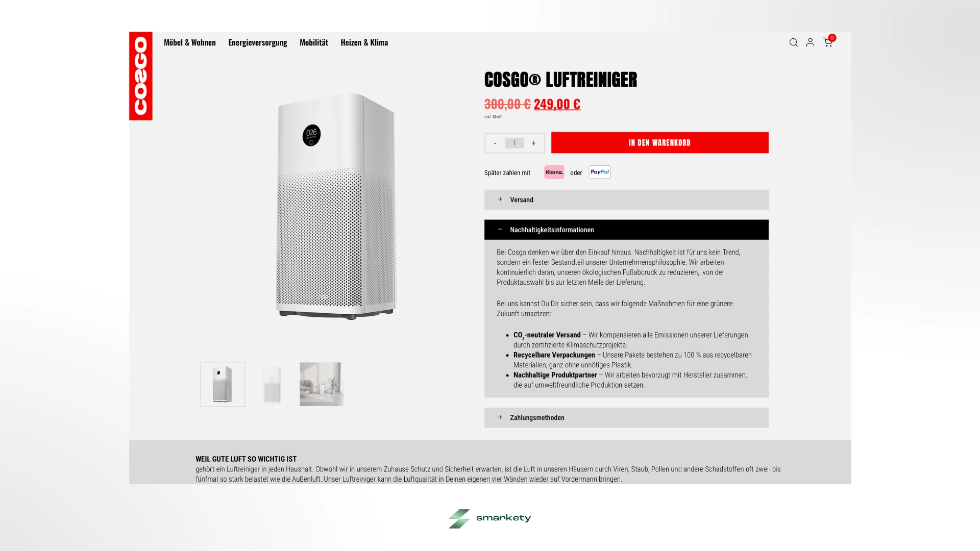
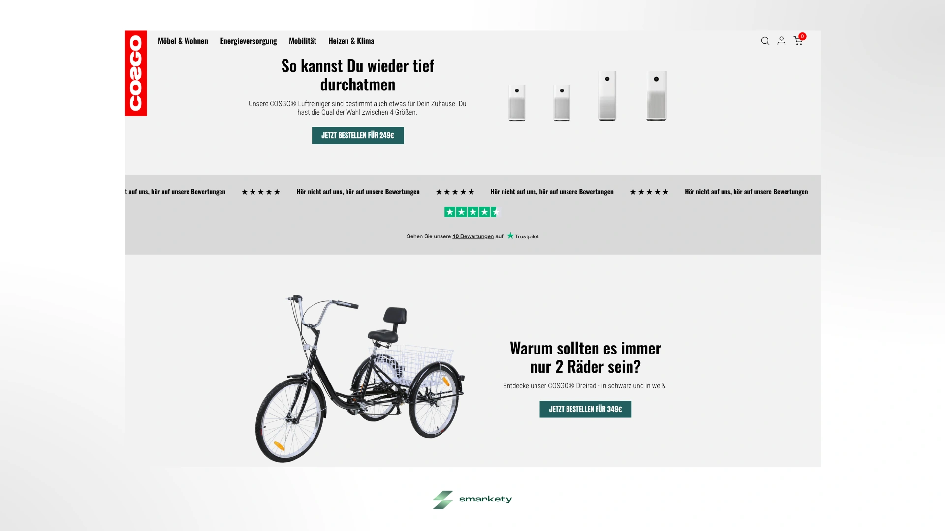
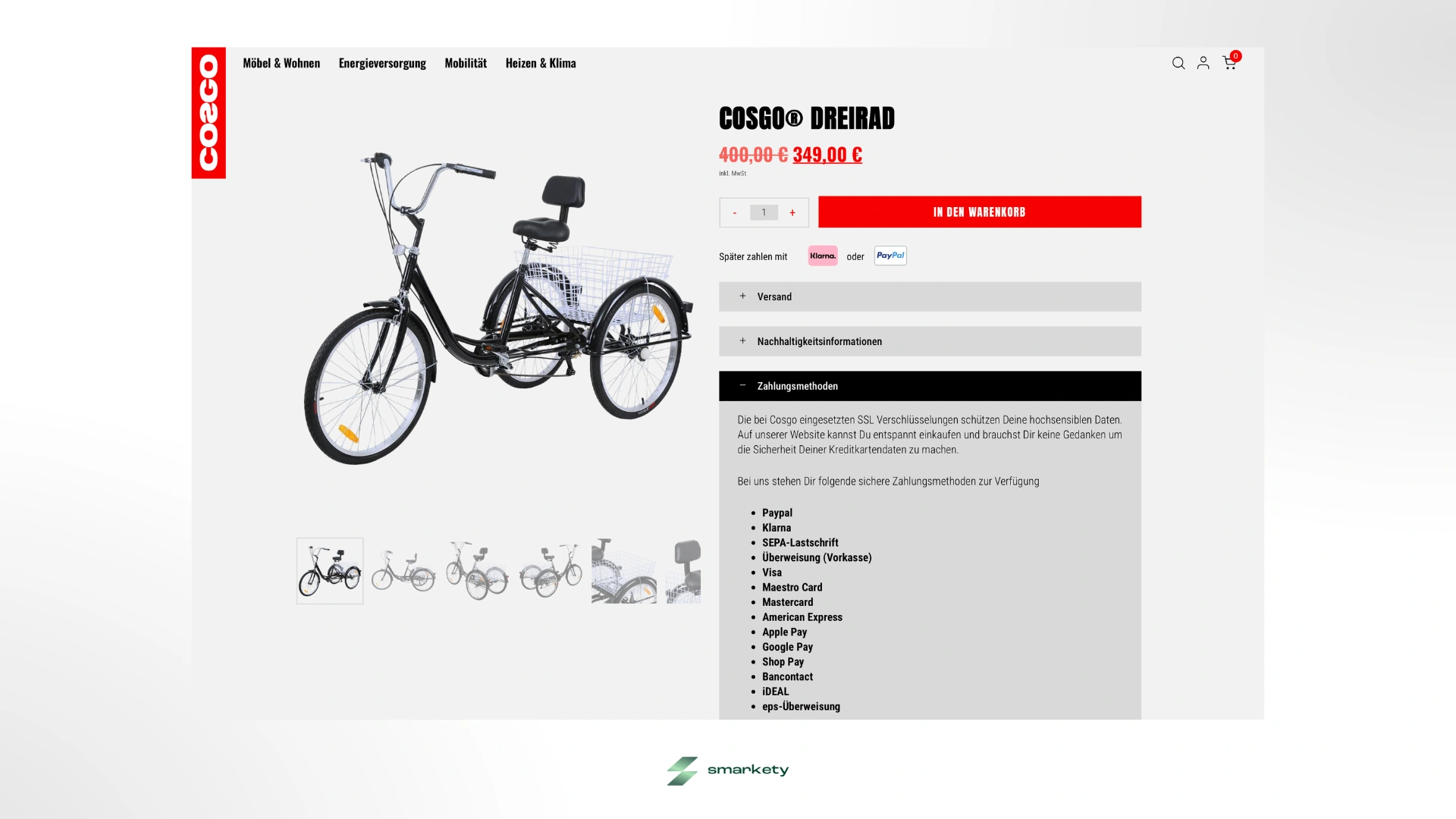
High-Contrast Accents: Sitting on top of this foundation is the aggressive Cosgo Red (#F60001), which is strategically balanced by a reliable, cool-toned Headline Blue (#337AB7).
Macro-Conversions: Every single Call-to-Action was assigned a deep, premium Action Teal (#22605F), making it incredibly prominent without getting lost in the brand's red noise.
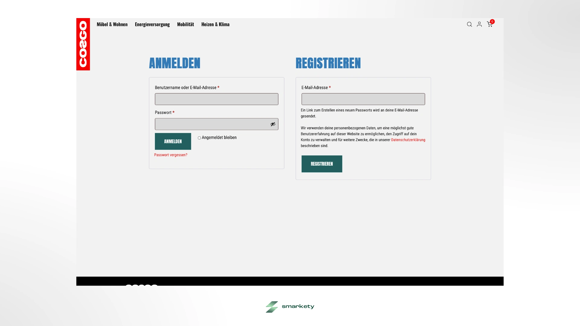
The Brackground: To eliminate the exhausting "digital stare" on screens, I established technical grays (Primary Base #F2F2F2 and Darker Zone #D9D9D9) as the foundational backgrounds.
Ink Black: For body text, I entirely avoided the soft dark-grays standard in modern web design. I used unapologetic Total Black (#000000). Solid, highly legible, and perfectly anchored.
2. Loud, Condensed & Proud - The Typographic Hierarchy
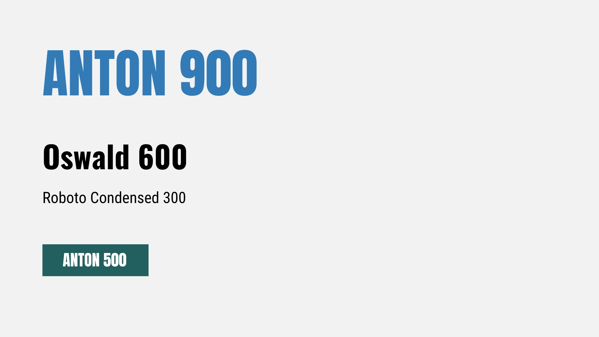
Cosgo’s typography was built to shout. No soft edges, no whispers.
Anton (The Shout): A thick, massive H1 font that I deliberately locked into uppercase to create absolute visual dominance for punchy headings.
Oswald (The Structure): Used for the H2 and H3 hierarchy layers to bring geometric order and sharpness back into the UI.
Roboto Condensed (The Talk): A highly space-efficient body font that supports the aggressive headlines without fighting them for attention.
3. Breaking the Grid: The Unconventional "Label" Logo
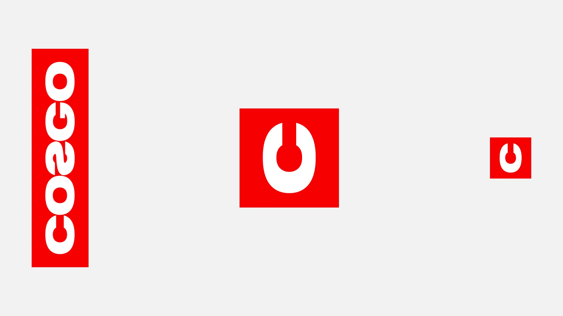
The logo is bold, uppercase, and impossible to ignore. It is heavy, grounded, and unapologetic. The massive lettering directly reflects the massive comfort of the products. Even the 'S' is deliberately mirrored (COƧGO), a subtle but intentional disruption of traditional typography. But its true power lies in how it disrupts the digital experience. In a digital world where almost every e-commerce logo sits horizontally within a confined header, I chose to break the grid entirely.
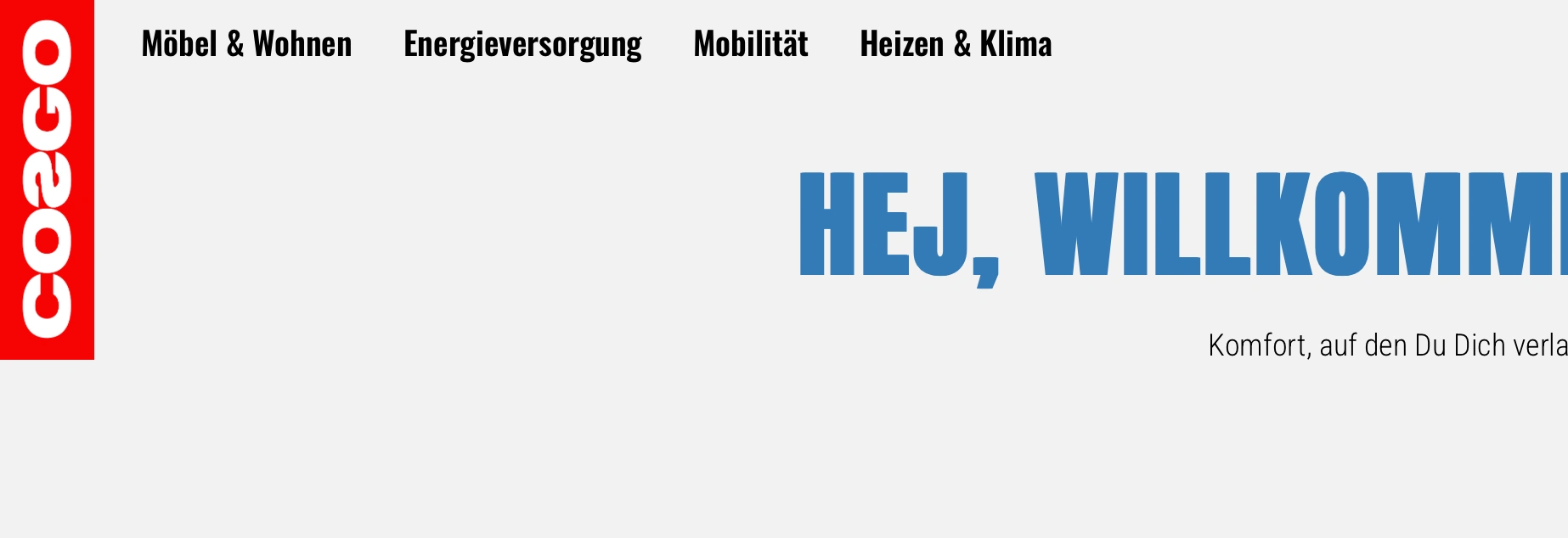
Vertical Identity: The logo is positioned in a portrait orientation, anchored in the top-left corner. It’s the first thing you see because it defies every expectations of web layout.
The Overlap: Instead of being contained within the navigation bar, the bold red block protrudes downwards, cutting through the header’s baseline. This creates an immediate visual tension, signaling that this brand doesn't fit into standard boxes.
The Digital-to-Physical Bridge: This isn't just for shock value. It’s a direct digital translation of the physical labels sewn onto Cosgo’s beanbags and sofas. By making the logo look and behave like a product tag, I have created a tactile connection: the website itself feels like a high-quality product, "sewn" together with the same attention to detail as the furniture.
4. Brutalist UX & Hard Edges
Cosgo's actual products (like their giant beanbags) are extremely soft. To create a compelling visual tension, I designed the brand elements to be completely rigid. The UI library follows a strict zero border-radius rule. Buttons, banners, and product cards are blocky, structured, and brutalist. No playful pills, no drop-shadow floating bubbles. Just solid, dependable geometry.
5. Cheeky Copywriting & Voice
The visual design couldn’t be loud if the text was whispering. Working closely with the founders, I established a cheeky copywriting framework and tone-of-voice. To truly disrupt the German market, I had to dismantle its traditional formality. While the competition clings to the distant, stiff German “Sie" (formal, distant "you"), I established a voice that is exclusively informal. By using the personal German “Du" (informal, peer-to-peer "you"), I removed the corporate barrier and addressed the customers as peers rather than 'leads'. The resulting communication is brutally direct, highly confident, and - most importantly - delivered with a smirk.
The Migration: Escaping Shopify into WordPress Freedom
The boldest design is useless if the underlying shop platform restricts the execution. While Shopify had served Cosgo well initially, the platform's constraints became a massive liability as the brand vision evolved. I guided the full migration to WordPress and WooCommerce, driven by three critical factors:
1. Absolute Technical Control
WooCommerce allowed me to fully customize the entire shopping experience, from building complex, highly-detailed product pages, down to the exact flow of the checkout or implementing special content features. Shopify's native limits for growing stores and custom features were entirely bypassed.
2. Uncompromised Branding & Design
To bring the rigorous brutalist design system to life, I needed complete front-end freedom. By writing custom HTML and CSS code atop WordPress, I avoided the structural limits of "hacking" Shopify themes. Every sharp corner, every pixel of typographic spacing, and every high-contrast UI block rendered flawlessly.
3. Scalable Cost Control
As revenue grows, Shopify quickly becomes expensive due to compounded transaction fees and a heavy reliance on paid third-party apps. Moving to an owned Wordpress infrastructure meant they pay for solid hosting and essential plugins, giving Cosgo far better margins to scale flexibly.
The result is a blazing-fast, visually explosive e-commerce front-end with near-zero friction that Cosgo actually owns.
The Reaction: From First Click to "Add to Cart"
The rebranding of the Cosgo shop delivered the definitive visual glow-up that their fantastic product catalog deserved. Through this uncompromising identity redesign and the technical migration from Shopify to WooCommerce, Cosgo positioned itself as a loud, confident player in the D2C furniture segment.
The combination of screaming massive typography, courageous color rules, and brutalist UX design created a crystal clear conversion path. Users don't get lost anymore; the brand experience pulls them in completely, and those massive teal- and red-colored "Add-to-Cart" buttons do exactly what they were designed to do: convert.
I transformed an uninspired online shop into a brand you simply cannot ignore. Are you ready to move from "playing it safe" to a brand that demands attention? Let’s build something extraordinary together!
Like this project
Posted Jun 8, 2026
Transforming a standard Shopify store into an unapologetic brand. A complete visual glow-up and system migration for Germany's most rebellious furniture shop.