Safely • Designing a Health Insurance Startup for Digital Nomads
Smarkety 👨🏻💻
Safely: Building a Health Insurance Brand That Feels Like a Lifestyle App
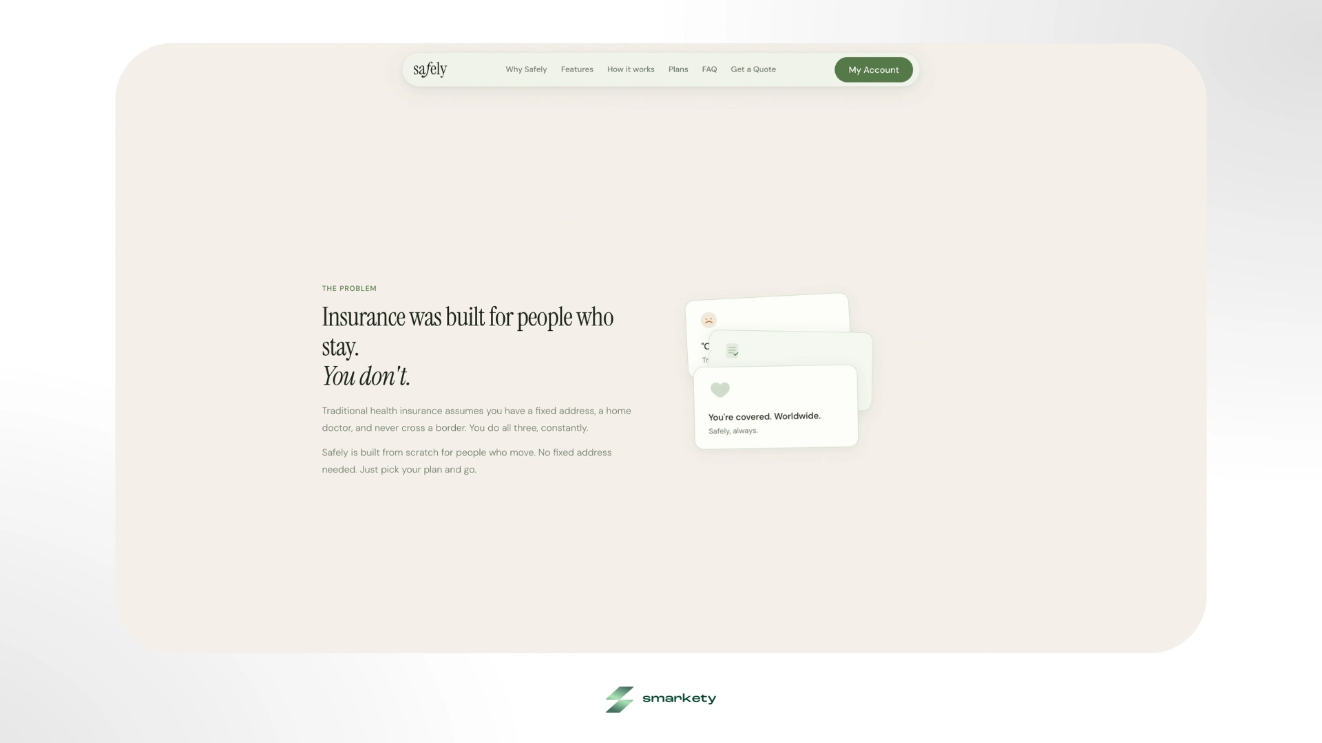
The founders of Safely had a genuinely brilliant product on their hands: global health insurance designed from the ground up for digital nomads, remote workers, and globetrotters. Coverage in over 175 countries, direct hospital billing, 24/7 human support. The kind of product that actually solves a real problem for a generation that lives out of a backpack.
But when they came to me, there was no brand at all, just a brilliant product with nothing to show for it yet. No existing trust to fall back on, no visual language to build from. The challenge was building from zero, while completely side-stepping the visual language of an entire industry. Traditional insurance aesthetics are rigid, complex, and sterile. For a target audience that actively rejects that kind of institutional energy, looking like every other insurance company was never an option. They needed a ground-up holistic design system that felt like a modern consumer lifestyle app from day one, and not a legacy corporate portal.
The brief was clear: build the entire brand identity and digital presence from scratch and make it feel like it belongs next to the apps their users already love.
The Strategic Foundation
Before touching Figma, I spent time researching the digital nomad demographic, their visual preferences, their relationship with trust signals, and why traditional insurance aesthetics fail them so completely. The core insight was straightforward: this audience is allergic to complexity and formality. They don't have time for 50-page PDF policies or sluggish legacy interfaces. They need information fast, presented beautifully, and structured so that even a complicated topic like international health coverage feels approachable.
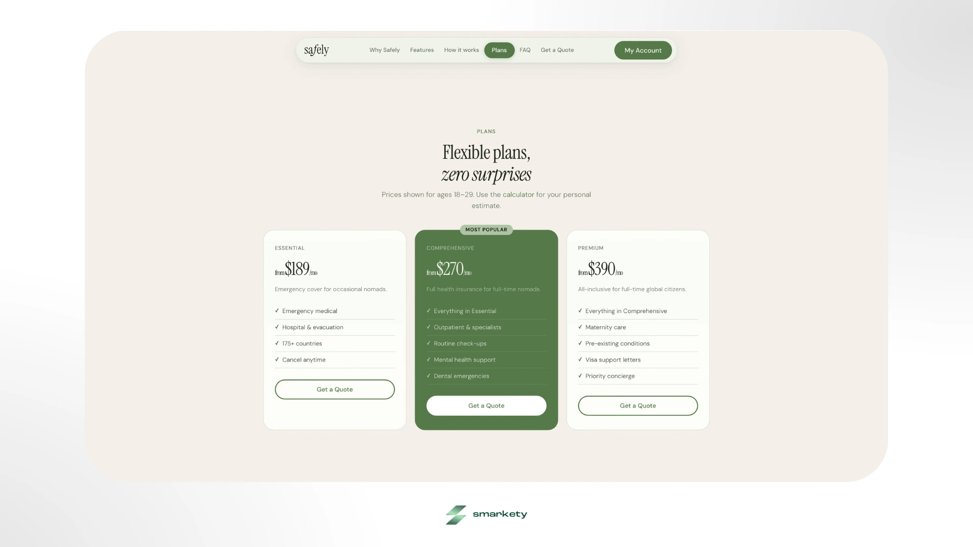
That insight shaped every single design decision that followed. I defined three hard constraints for the entire project: the experience had to be flawlessly mobile-responsive (this demographic browses almost exclusively on iOS), it had to communicate premium quality within the first scroll, and it had to frame pricing with complete transparency. No hidden asterisks, no confusing tiers.
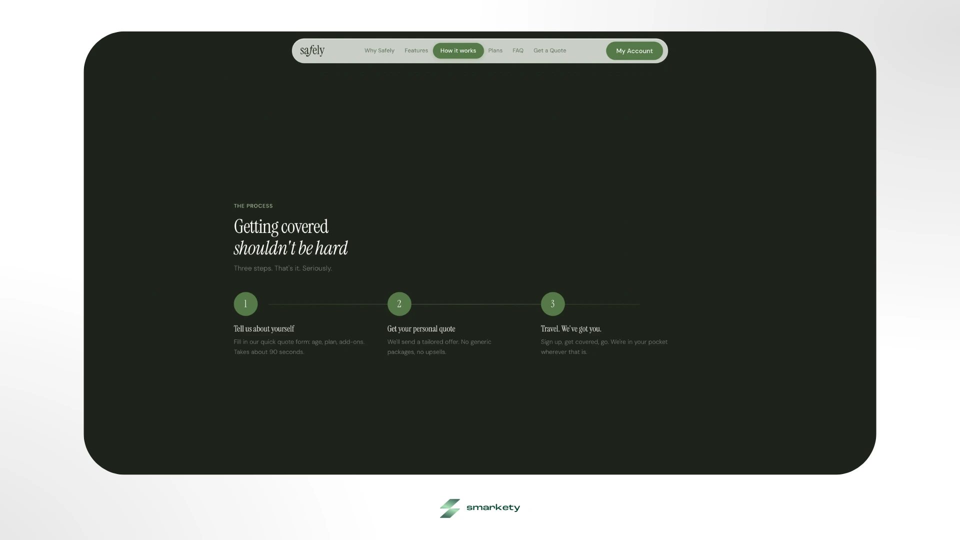
I structured the build into four phases: Discovery, Foundation, Identity, and Component Architecture. Rather than jumping straight into pixels, I needed the strategic layer to be airtight before anything visual was created.
Identity System: The Logo and What It Means
The wordmark decision came early and it was deliberate entirely lowercase. This was a strategic rejection of the authoritative uppercase logos that define legacy insurance corporations. Lowercase signals approachability, it signals that the brand is built for a Gen-Z and Millennial audience that has grown up with Spotify, Notion, and Airbnb - not Allianz.
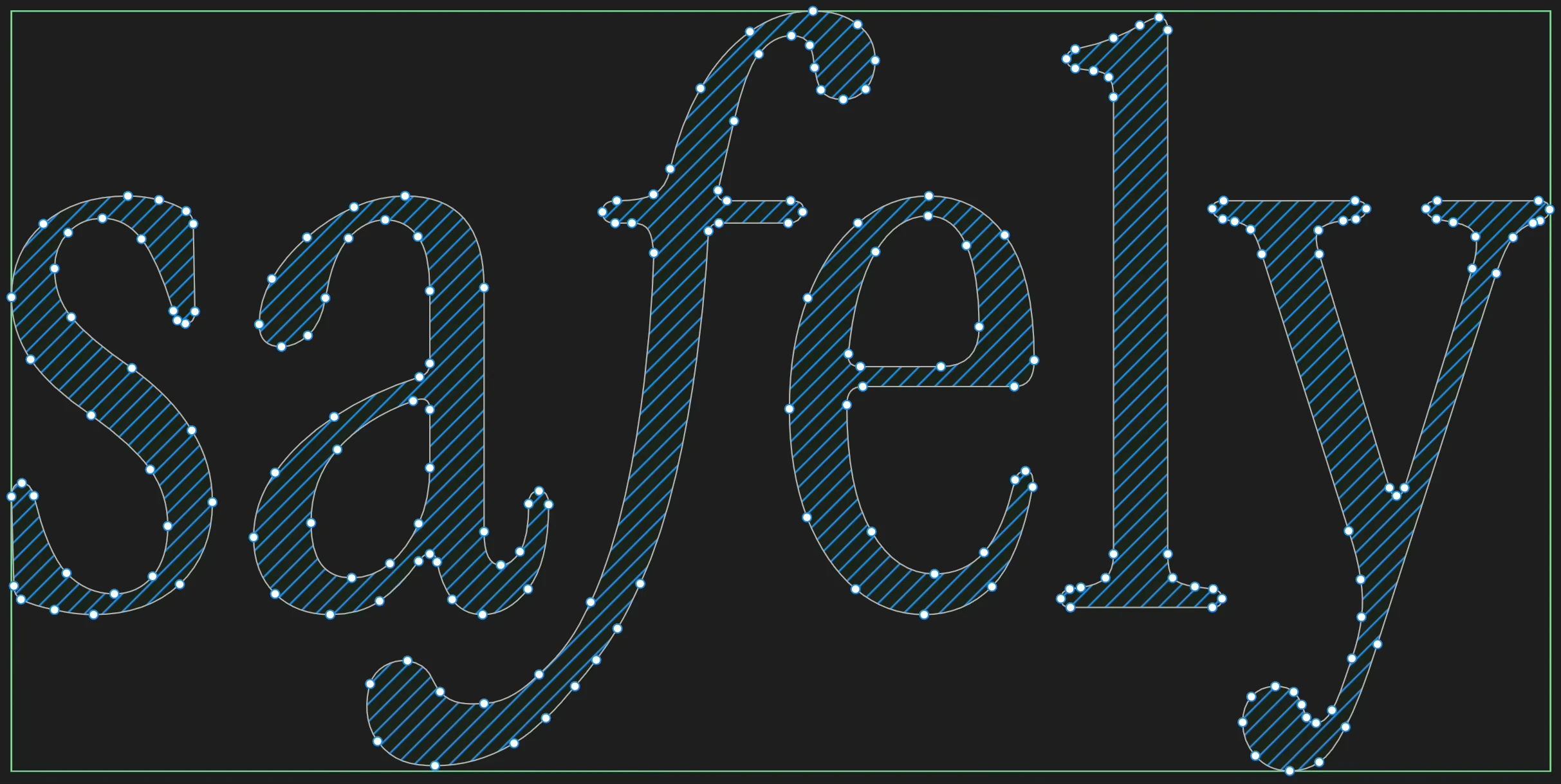
The centrepiece of the logo is the cursive f in the middle of "safely." I designed it to feel fluid, almost as if it's mid-flight, which is exactly the point. It's a visual metaphor for the core user: always moving, always crossing borders, never anchored to one place. The f carries that symbolism without ever being literal about it. It's the kind of detail that most users won't consciously register, but it's working on them nonetheless.
Clear space rules, favicon adaptations, and a strict set of logo don'ts were all documented and handed off as part of the full brand guidelines, ensuring the identity stays consistent as the team grows. (Available on request)
Color and Typography: Designing Trust Without Sterility
The color strategy is where the brand really breaks from the industry convention. I completely avoided hospital whites and corporate blues. Instead, I anchored the entire palette in organic sage greens and warm beiges. Colors that communicate safety, health, and growth, but without the cold clinical associations that white carries in insurance contexts.
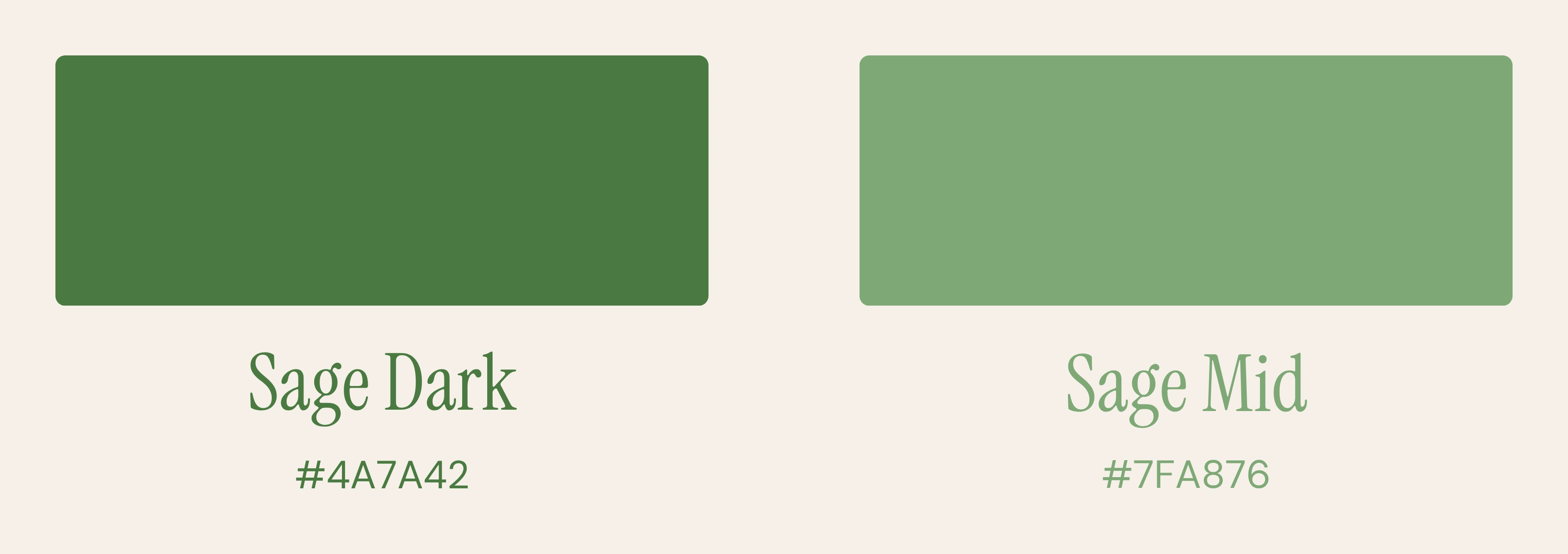
The primary palette runs from Sage Dark (
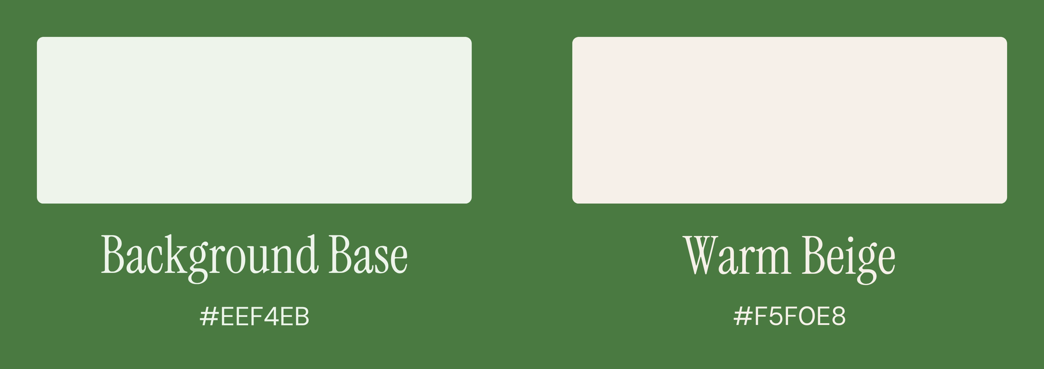
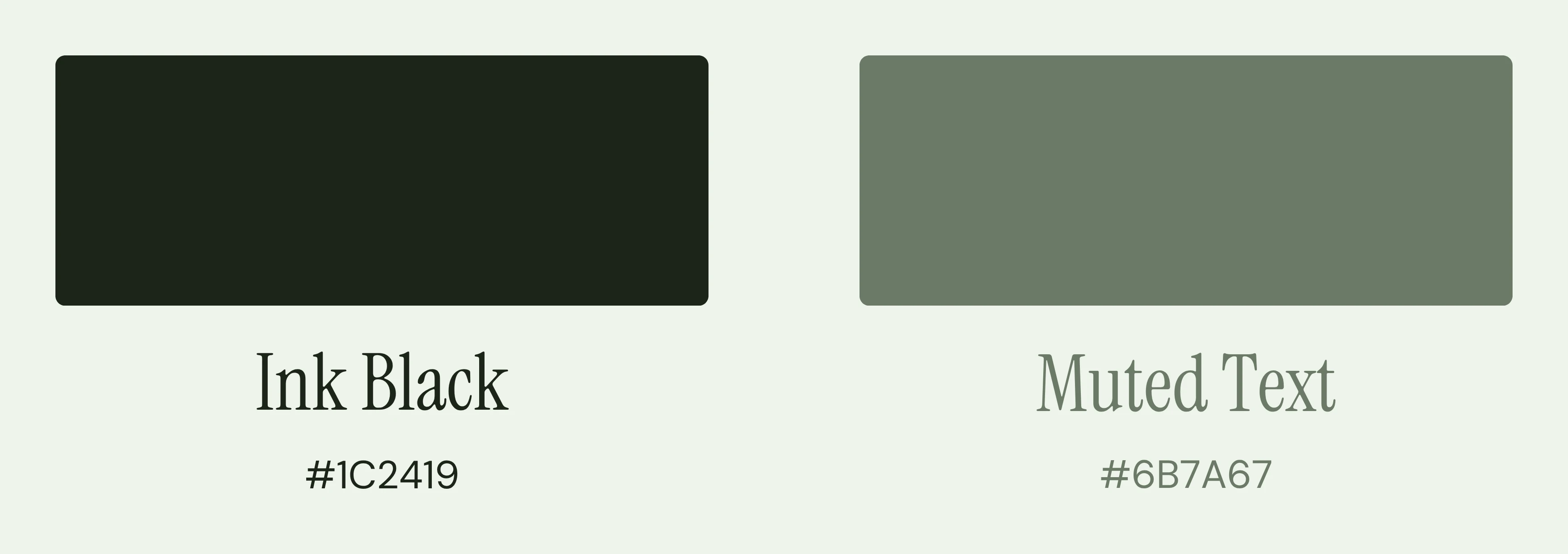
#4A7A42) for buttons and high-contrast UI elements, through Sage Mid (#7FA876) for borders and active states, down to a warm Background Base (#EEF4EB) with a subtle green tint that soothes the eye during long browsing sessions. Secondary sections use a warm beige (#F5F0E8) to create soft visual breaks down the page. Even the primary text color, which I named "Ink" (#1C2419), is a deep organic green rather than absolute black, because absolute black felt too harsh against the warm palette. A Muted Text tone (#6B7A67) rounds out the system, used for body text, subtitles, secondary text, and subtle UI labels on light backgrounds, establishing the readable yet unobtrusive layer beneath the primary Ink color.On dark backgrounds, headings use pure white (
#ffffff) for maximum contrast, while body text shifts to rgba(255, 255, 255, 0.6), a semi-transparent white that adapts naturally to any dark surface while maintaining comfortable readability.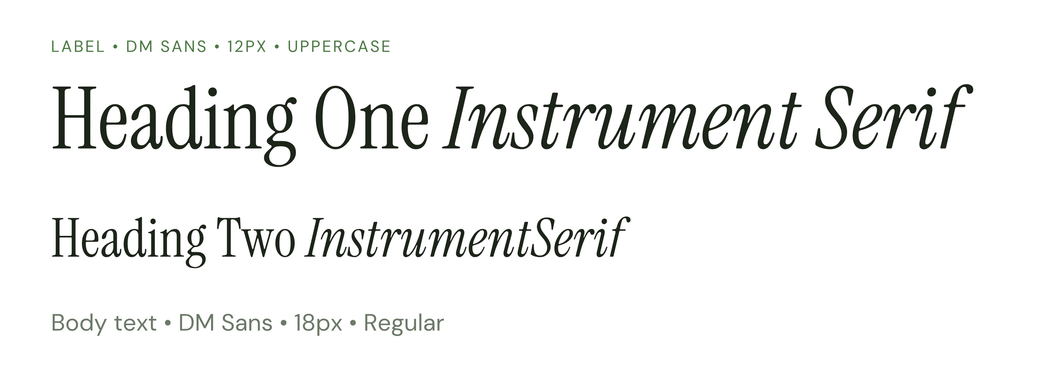
Typography follows the same philosophy. I paired Instrument Serif for headlines with DM Sans for body text. A classic-meets-modern combination that creates editorial authority in the headings while remaining completely legible and digital-native at the paragraph level. The typographic hierarchy was documented in full, from H1 down to metadata labels.
UI Design: From Brand System to Living Interface
The design system was built to be translated directly into code; not just to look good in a Figma presentation. Every component in the library had a clear purpose and a clear CSS token behind it.
The structural shape language is built entirely around the pill form: fully rounded buttons, navigation bars, tags, and cards. I chose this because it feels frictionless and modern, and because it reinforces the brand's core message: safe, smooth, and without sharp edges.
For interface depth, I implemented a liquid glassmorphism technique on the floating navigation and key feature cards (
backdrop-filter: blur(24px) saturate(1.6)) creating an airy premium feel without making the interface feel heavy. The hero section combines this navigation treatment with the signature sage CTAs and the Instrument Serif headline to establish the brand's visual language immediately on load.Two UI components deserve specific mention. The pricing engine is a fully interactive calculator with slider-based inputs, designed to demystify insurance math entirely. Instead of showing static price tables that users have to decode, the calculator gives them a real-time personal estimate. The second is the rotating ring to represent the over 175 country names of global coverage. Clean, performant, and visually striking.
The iconography system blends CSS-animated emojis on the feature cards with inline SVGs at key moments, all driven by pure CSS
@keyframes animations (float, pulse, bounce, wiggle, spin) to make the interface feel alive and responsive without any JavaScript overhead.Voice, Tone, Content Strategy
A brand identity is only half the deliverable. I also defined the content strategy and voice guidelines, because a beautifully designed interface with the wrong copy tone destroys the trust you built visually.
The brief I gave: Friendly, Not Formal. Smart, Not Complex.
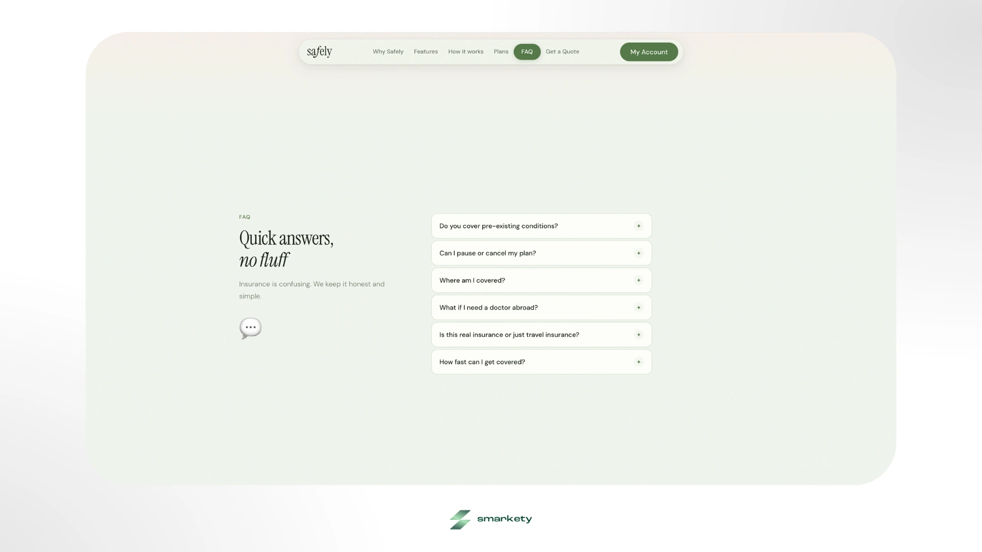
The brand voice should read like a knowledgeable travel companion, someone who actually understands your situation, not like a legal disclaimer. I implemented content formatting rules that rely heavily on bullets, bold emphasis phrases, and short punchy sentences rather than the long legalistic paragraphs that dominate traditional insurance companies.
I wrote the full CSS token architecture myself covering background tones (
--bg, --beige, --white, --card), borders (--border), the complete sage green scale (--sage, --sage-l, --sage-d), and typography colours (--ink, --mid, --muted), to ensure the design translated to pixel-perfect frontend code without any interpretation errors.The identity also scales beyond digital. I designed the brand system with physical touchpoints in mind like member cards and welcome packets, so the visual language holds up whether it's on a phone screen or a printed onboarding kit.
The Outcome
By shifting from an authoritative, corporate structure to an approachable and organic paradigm, Safely now has a brand identity that actually matches the energy of its product and its users. The visual system is the first thing working to build trust before a single word is read.
If you're building a startup that needs to earn credibility fast and stand out from a category that hasn't changed its visual language in decades, this is exactly the kind of work I do. Let’s build something exceptional that doesn’t just look good, but also makes an impact.
Like this project
Posted Jun 8, 2026
Insurance feels cold. Safely doesn't. Full brand identity and web design for an insurance startup made for digital nomads. Built from scratch in a few weeks.
Likes
2
Views
5