Sulfur Coworks Branding Guidelines Manual
Shubham Aggarwal
Sulfur Coworks – Designing a Brand That Feels Like a Creative Catalyst
The Challenge
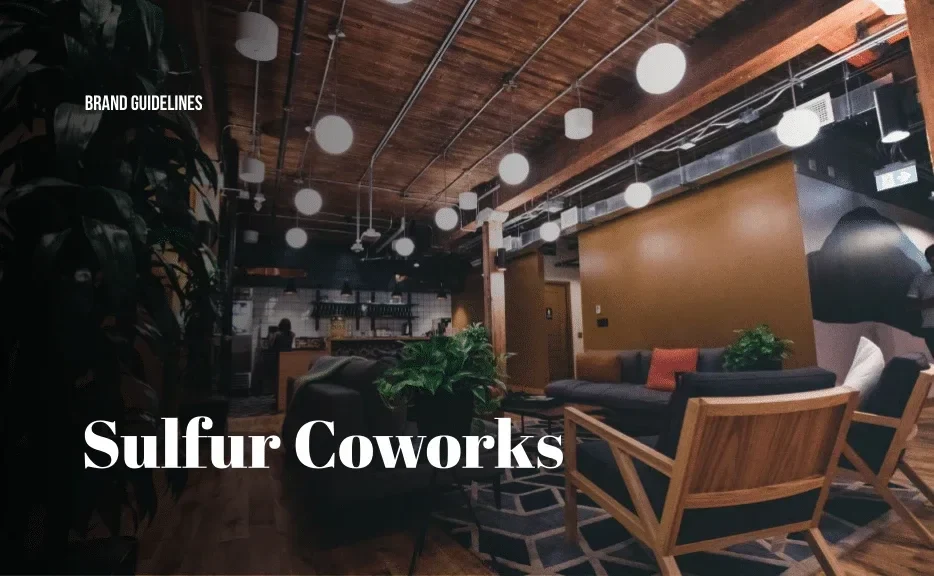
Sulfur Coworks came in with a solid name—but zero brand narrative, visuals, or cohesive identity. As a new coworking space targeting freelancers, startups, and local creators, they needed to differentiate from the generic "white wall, coffee shop vibe" of other shared spaces.
The brand had to feel creative, charged, and collaborative—but also grounded enough to attract professionals and early-stage teams.
My Role & Execution
1. Visual Identity Design
Crafted a logo system inspired by chemical symbolism and creative reaction—playing off the "Sulfur" element to suggest ignition, flow, and energy.
Designed both primary and secondary logos for signage, digital, and merchandise applications.
Created a modular identity grid to allow for future expansion across sub-brands (events, café zone, etc.).
2. Color, Typography, and Atmosphere
Built a bold yet approachable color palette—leaning into deep teals, energized yellows, and subtle neutrals to balance play and professionalism.
Selected clean, geometric typefaces that felt modern but not sterile.
Designed graphic motifs (dots, connectors, energy flows) to echo collaboration and motion within the space.
3. Brand Applications Across Mediums
Designed print materials: business cards, info sheets, desk tags, flyers, onboarding kits.
Created digital assets for website, social media templates, and presentation decks.
Advised on in-space branding: wall art suggestions, signage specs, and ambient design elements to build a cohesive vibe.
4. Brand Manual & Implementation Guide
Compiled a visual identity guide covering logo usage, color codes, type hierarchy, and layout examples.
Provided flexible templates for the in-house team to roll out consistent marketing over time.
Outcomes & Results
The brand identity gave Sulfur Coworks a recognizable, professional visual language right from launch.
Helped the space attract a creative-forward community—freelancers, designers, early SaaS founders—who resonated with the brand tone and energy.
Early members referenced the branding as a reason for trust and connection, creating a strong first impression.
The visual system scaled easily across event promotions, internal signage, and local sponsorship collaterals.
Why It Still Matters in My Portfolio
Sulfur Coworks is a great example of how spatial brands aren’t just logos—they’re environments, energy, and expression. This project reflects how I translate a static name into a full-spectrum identity that can be seen, felt, and remembered.
From white walls to brand world—Sulfur went from zero to “I want to work here” within weeks.
If you’re building a physical or hybrid experience (coworking, wellness, hospitality), I can shape the brand that defines the space—and scales beyond it.
Like this project
Posted Mar 27, 2025
Sulfur coworks is your new office space to hustle in Bangalore area. We created an identity and USP for them to stand out from existing competition.
Likes
0
Views
5
Timeline
Mar 3, 2018 - Ongoing