
IN COLLABORATION WITH: Mark Dusseau (Website Dev.) + Pablo Pinto (Copywriting)
Background
Retreat & Recharge is a fictitious Retreat for Freelancers. It is a place they can relax with like-minded people after having been cooped up inside for so long from the Pandemic. No computers are allowed on the premises as a way for people to find inspiration outside of screens and try new activities while disconnecting from the grid.
Design Decisions
Colors: chosen to give off a bohemian vacation vibe
Logo: font was customized by me to have more refined features while also being organic. Inside the R's & A's negative space there are outlines of people that represent the community at the retreat.
Logo Mark: the abbreviation for Retreat & Recharge just happens to be R&R which stands for rest & relaxation. The second R is flipped so that the "people" inside the negative space are looking at each other. The frame on the outside represents a camera shot, to capture all the fun memories one will have on the retreat.
Icon: is a palm tree made up of battery-like rounded rectangles to visually represent "recharging"
Mood Words
Artistic, Boho, Laid-Back, Casual
Deliverables
Logo
Logo Mark
Icon
Color Palette
Typography System
Website Mockup
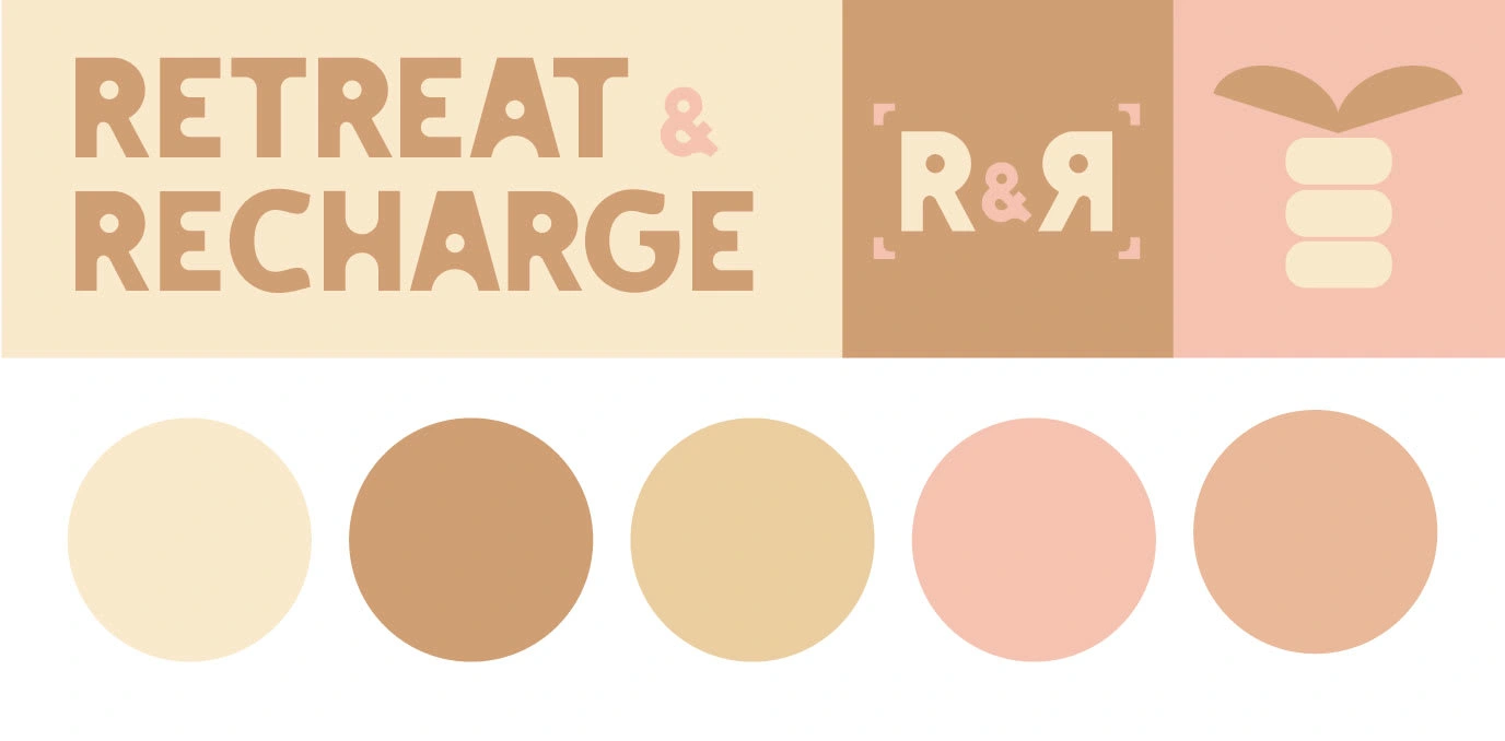
Logo, Logo Mark, Icon, Color Palette
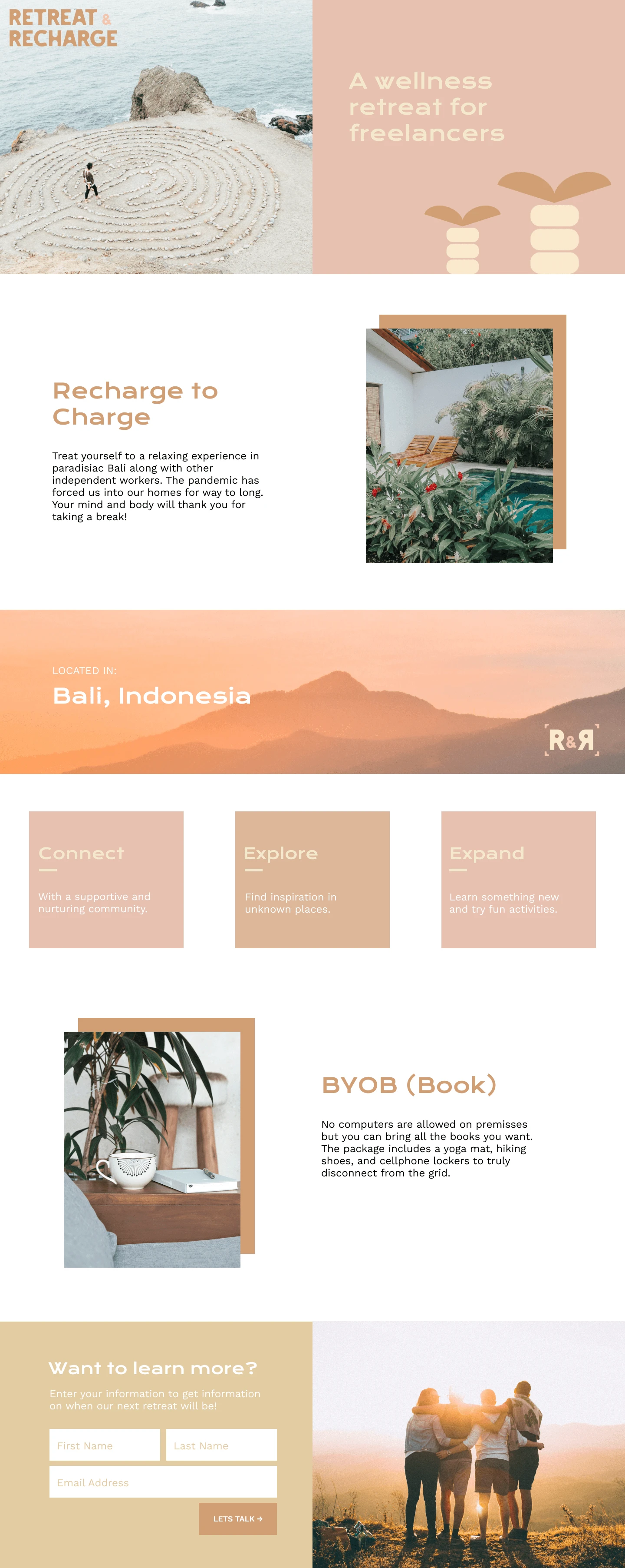
Website Mockup
0 likes · 90 views · Jun 17, 2021

