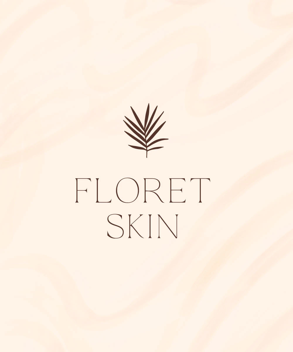
Floret Skin
Sami Walthall
Background
Floret Skin is a feminine clean skincare brand. Floret believes that women shouldn't have to be at a spa to have a carefree and therapeutic experience. They seek to make their users feel beautiful, feminine, and empowered. This is a high-end brand and they want their users' experience to feel memorable and effortless.
Design Decisions
The logo features a brand mark of a hand-drawn fan leaf to represent the therapeutic experience one gets from using their products. The logo font is using a skinny san-serif font that is both feminine and elevated. Boho colors are representing the exotic beach vibes to make you feel like you are in paradise.
Mood Words
Feminine, Effortless, Carefree, Elevated, Therapeutic
Deliverables
Primary Logo
Secondary Logo
Brand Mark
Pattern
Color Palette
Typography System
Packaging Design
Print Collateral

Primary Logo
Secondary Logo
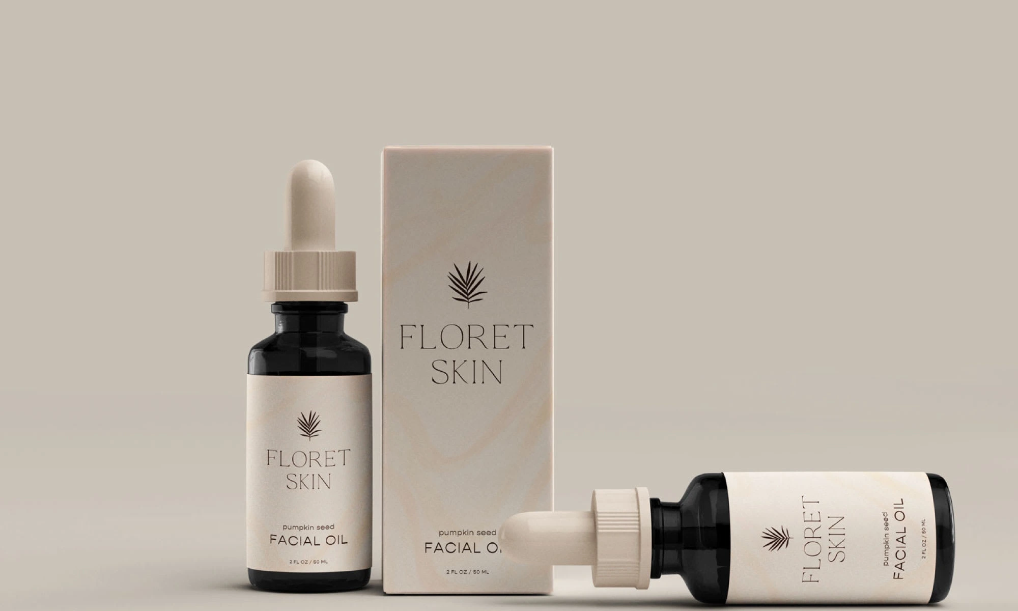
Packaging Design: Facial Oil + Box
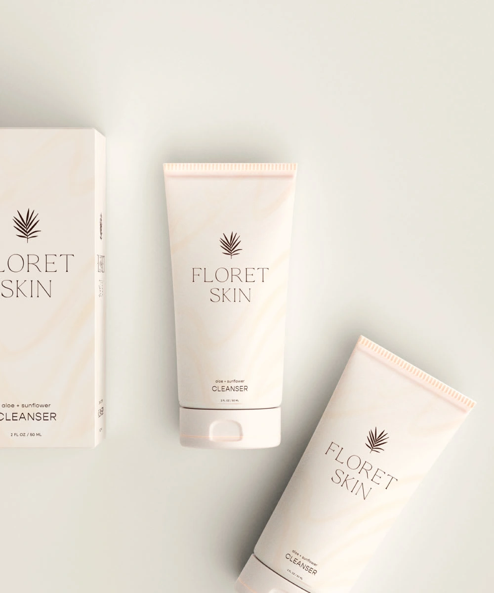
Packaging Design: Cleanser + Box
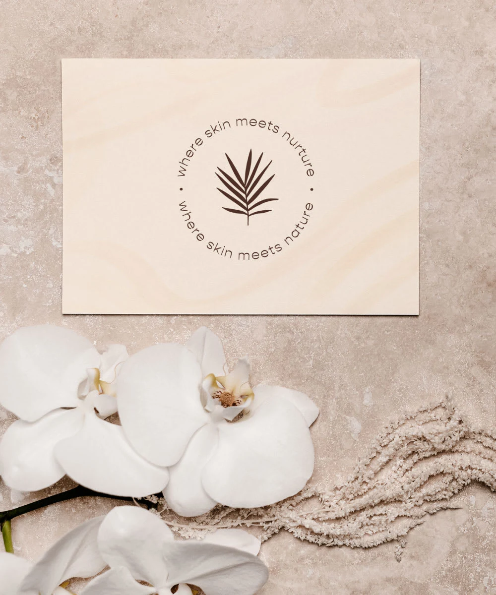
Brand Mark
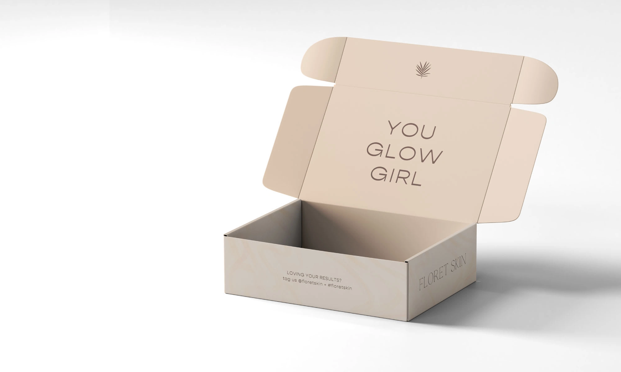
Packaging Design: Shipping Box
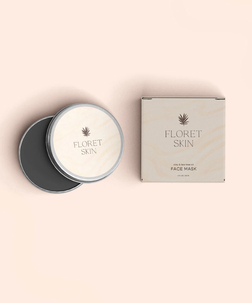
Packaging Design: Facemask + Box
Like this project
Posted May 25, 2021