LeafLit Rebranding Project
Jonathan Swanson
SmoKingBuds transform into LeafLit
SmoKingBuds approached me seeking a complete rebrand for their cannabis accessories shop. They were clear about their business model: selling accessories and apparel, not cannabis directly. The client needed a new name and logo that would better represent their brand identity and target audience.
Naming Process
After brainstorming several options, we landed on LeafLit - a clever combination that works on multiple levels:
Leaf: Slang term for marijuana
Lit: Modern slang meaning "cool" and referencing the action of lighting
LeafLit: Also evokes "leaflet" - information and pamphlets
The name perfectly captures the essence of their business while being memorable and versatile.
Design Evolution
First Design
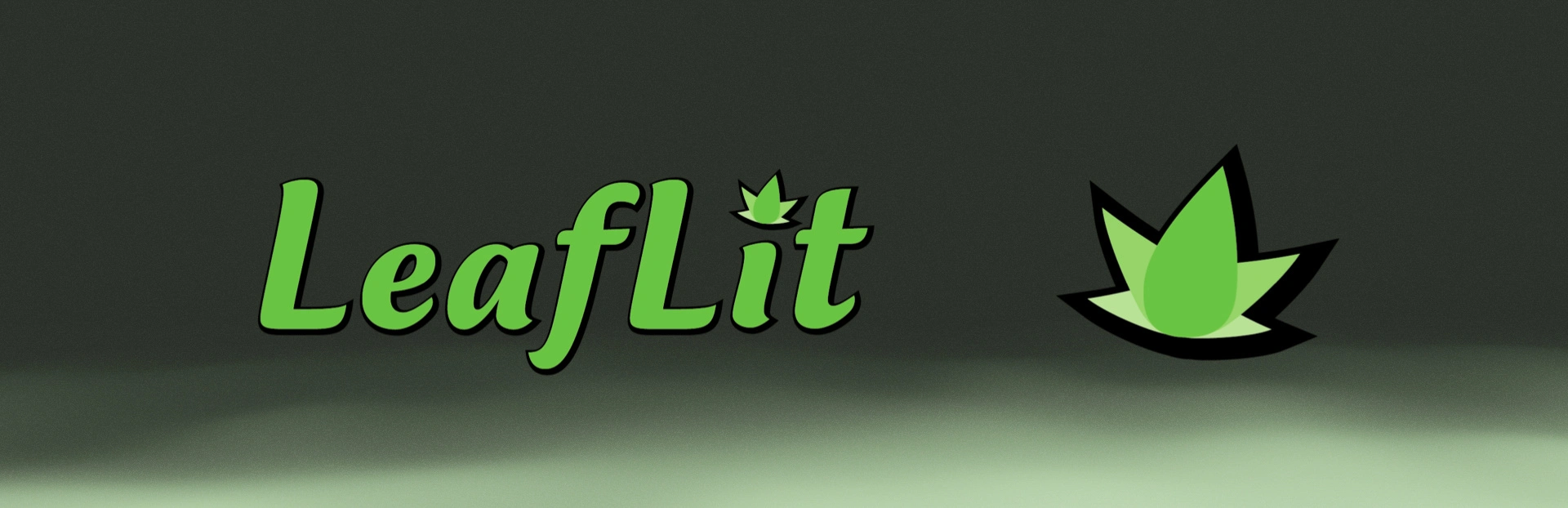
First Concept: Corporate Approach
The initial logo design featured a clean, bold aesthetic with a custom icon replacing the dot on the "i". The icon combined a leaf and flame element, creating a sophisticated, corporate feel.
Client Feedback: "Too corporate feeling"
Lesson Learned: Corporate sophistication wasn't the right direction for this brand.
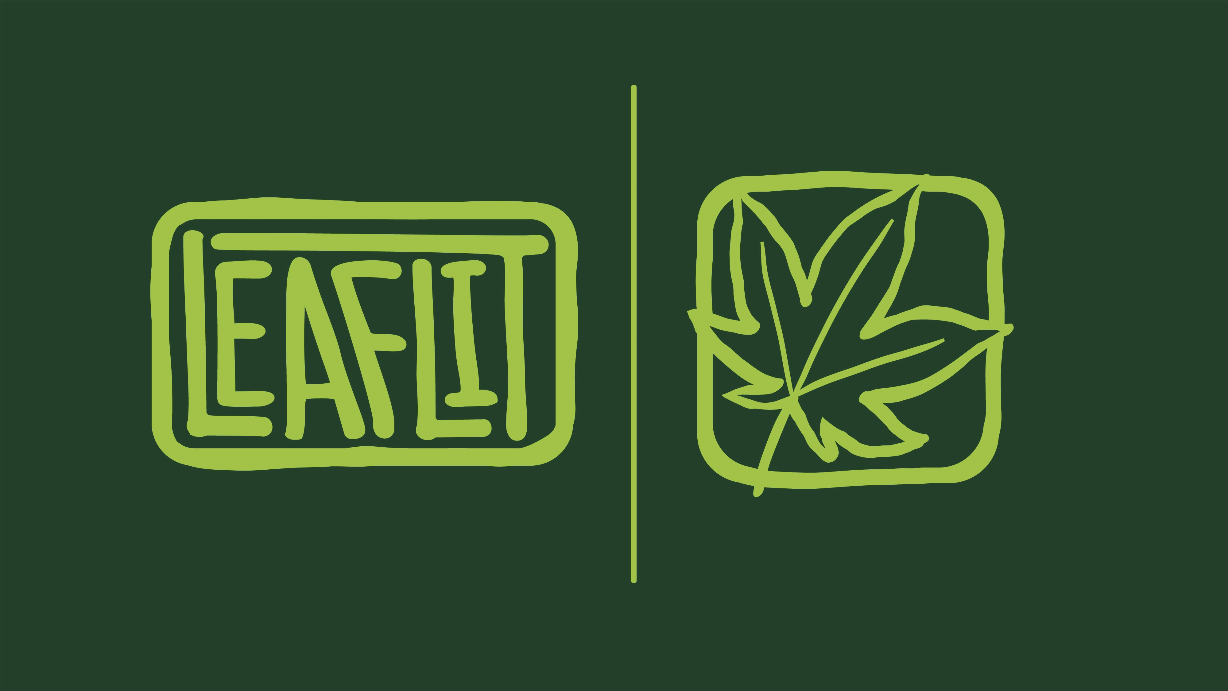
Final Design: Skater Vibe
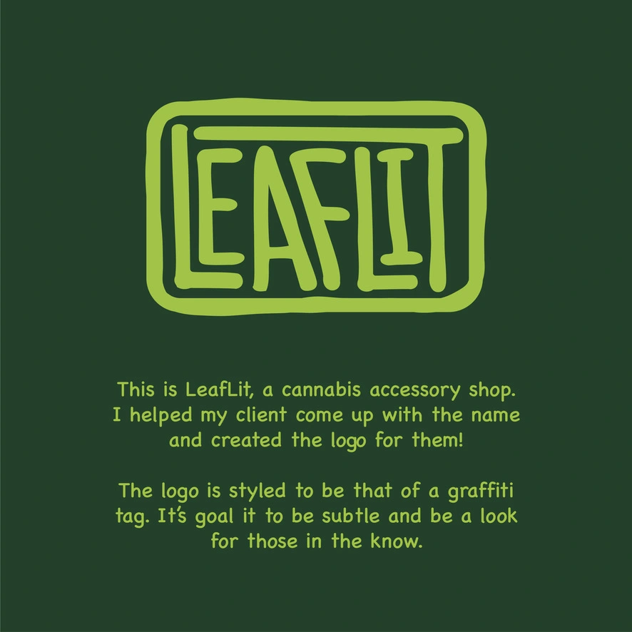
Final Tag Style
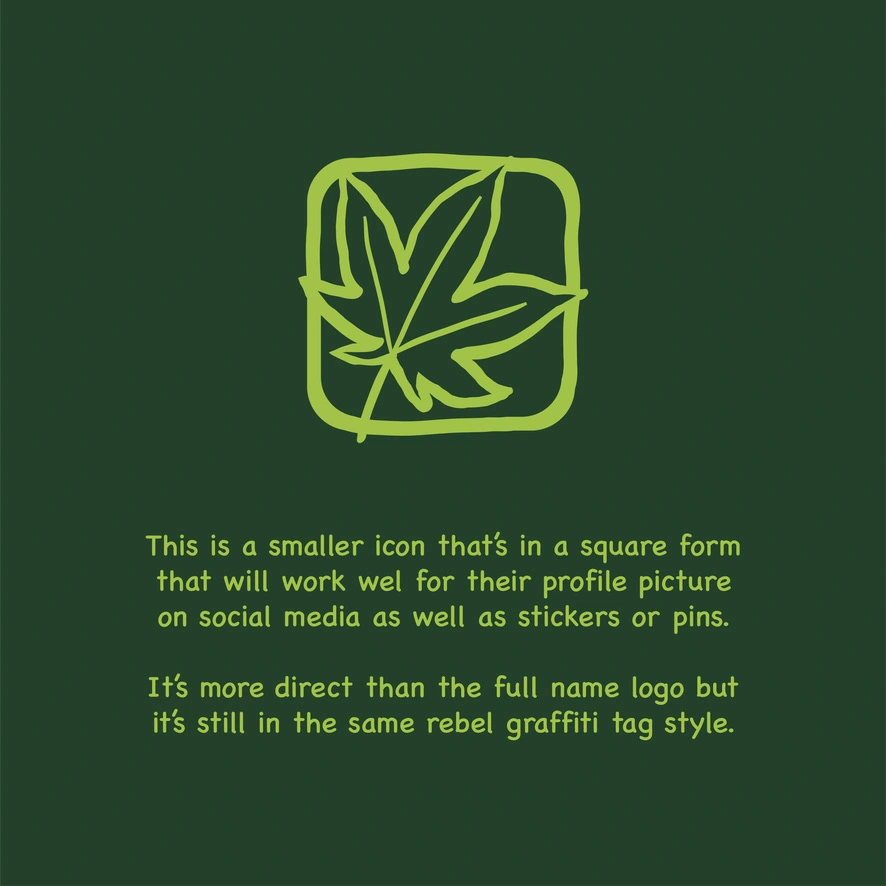
Tag Style Icon
After deeper consultation, I discovered the client wanted a skater aesthetic. This led to a complete redesign approach:
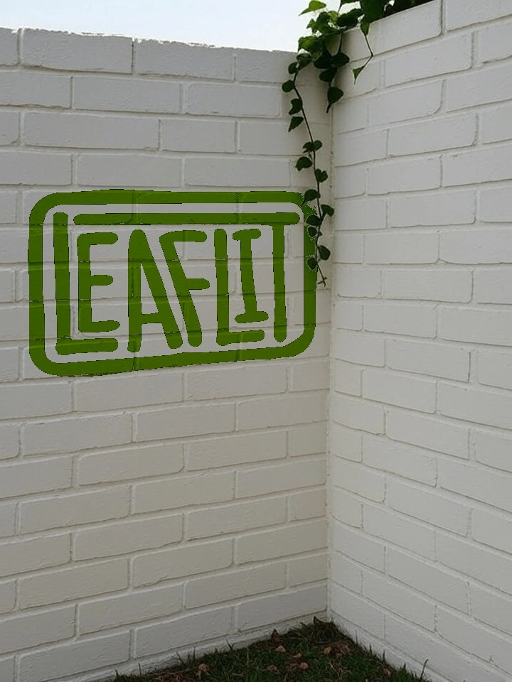
Tag Logo: Designed to feel like quick spray paint
Leaf Icon: Separate icon in the same street art style
Dimensional Consistency: Both elements designed to work well on their trays using the same dimensions
Key Success Factors
1. Client Collaboration
The project succeeded because of open communication and understanding the client's vision. What they initially described and what they actually wanted were different.
2. Design Flexibility
Being willing to completely pivot from a corporate aesthetic to a street art style was crucial. The first design wasn't wrong - it just wasn't right for this client.
3. Understanding the Audience
The final design creates an "if you know, you know" feeling - perfect for the cannabis accessories market where subtlety and insider knowledge are valued.
Final Result
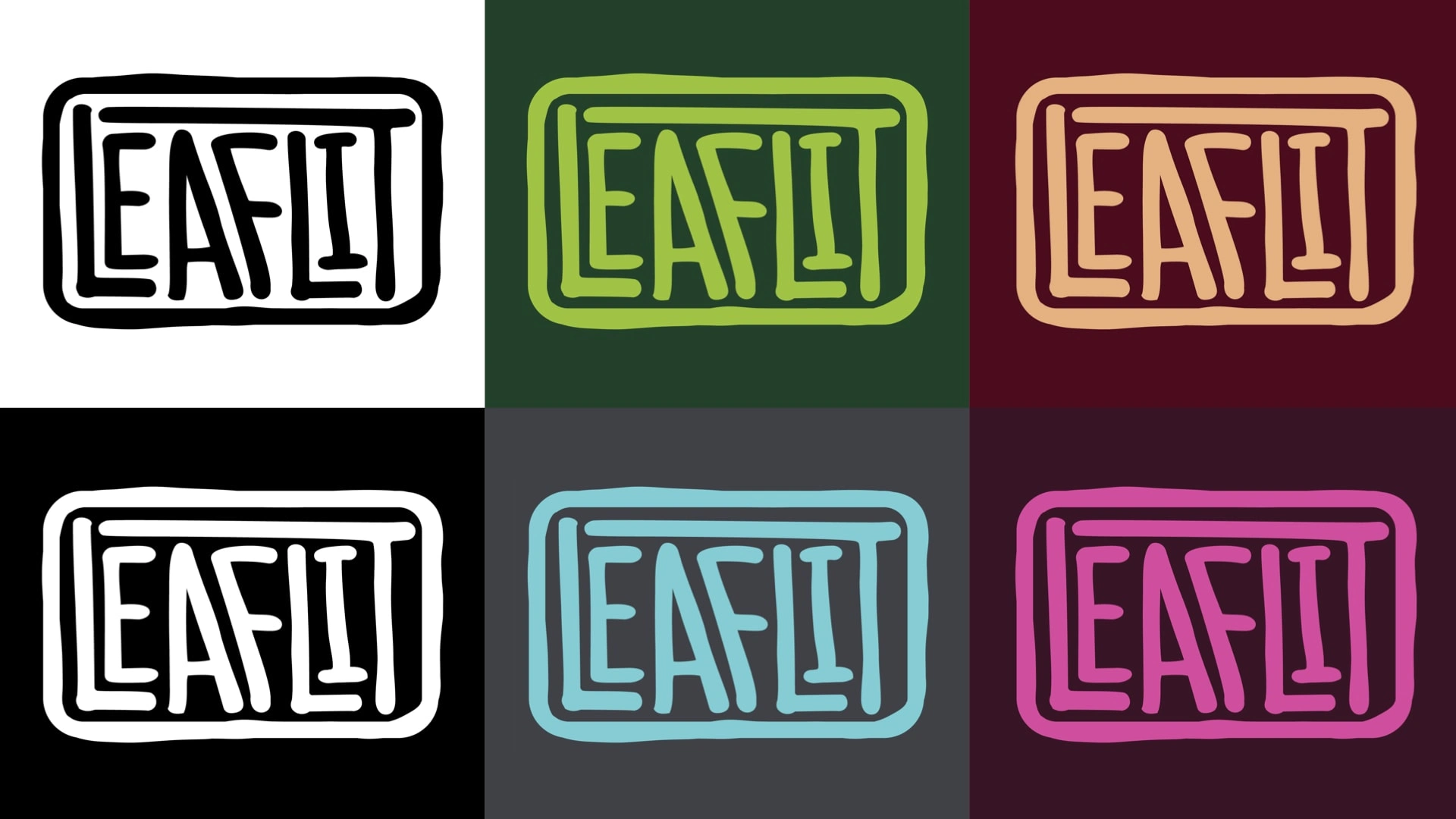
Color variations

The client loved the final design! It captured the authentic, street-level aesthetic they were looking for while maintaining brand recognition and versatility across their products.
Key Takeaways
For Designers:
Listen to your client's feelings, not just their words
Be prepared to completely redesign if needed
Understand the difference between what a client says and what they want
Design for the client's vision, not your own preferences
For Clients:
Be specific about the feeling you want to convey
Trust the design process and be open to iterations
Communicate not just what you want, but how you want it to feel
Conclusion
This project demonstrates the importance of truly understanding your client's vision and being flexible enough to pivot when needed. The LeafLit rebrand succeeded because we listened to the client's feedback and adjusted our approach to match their authentic brand identity.
Remember: It's their company, not yours. Your job is to bring their vision to life, even if it means starting over completely.
Like this project
Posted Aug 21, 2025
Rebranded SmoKingBuds to LeafLit with a skater vibe logo and name.
Likes
1
Views
15
Timeline
Apr 10, 2023 - May 10, 2023