NaturaLuxe Packaging Design

Jonathan Swanson


Nature Meets Luxury: Crafting the NaturaLuxe Packaging in Adobe Fresco
As a designer, there is a specific challenge in branding natural products. You have to communicate an earth-friendly message without losing the feeling of a premium, high-end experience. For my latest project, NaturaLuxe Hand & Body Lotion Soap, I wanted to bridge that gap between botanical authenticity and luxury retail aesthetics.
To achieve this, I leaned into the fluid and expressive power of Adobe Fresco. Here is a look at how this design moved from a digital canvas to a print-ready layout.
The Vision: Botanical Minimalism
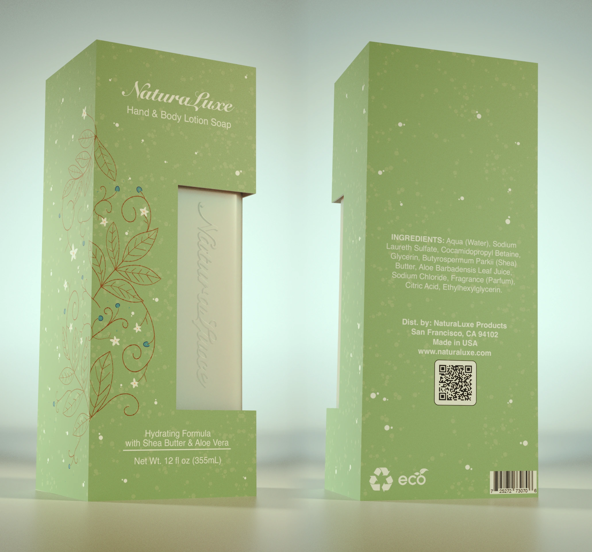
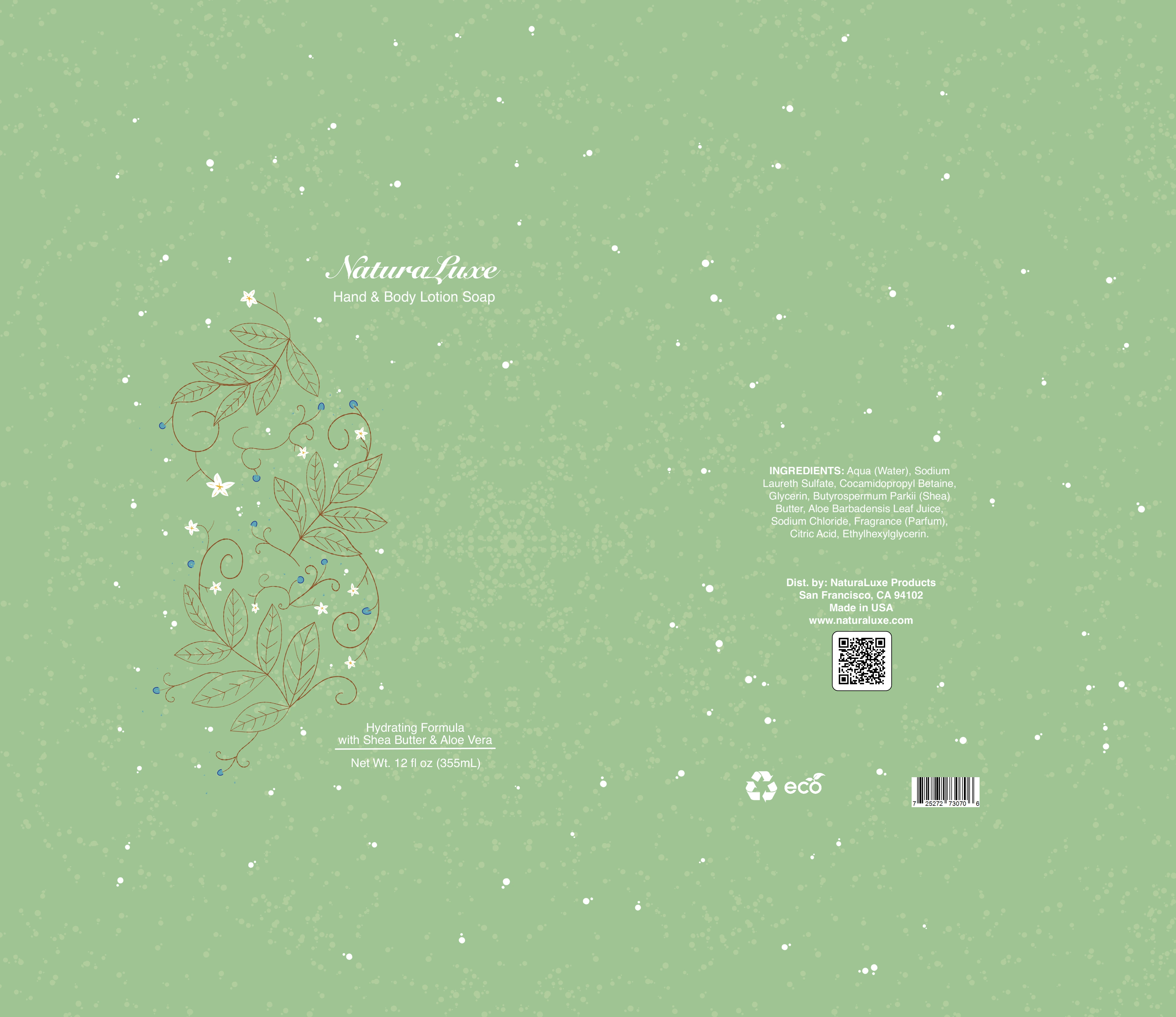
The goal for NaturaLuxe was a concept I call botanical minimalism. I chose a muted sage green base to evoke a sense of calm and organic origin. To ensure it felt like a luxury item, I paired that earthy tone with elegant script typography and a structured layout. This allows the product, visible through a custom die-cut window, to remain the focal point.
Illustrating with Soul in Adobe Fresco
The centerpiece of the front panel is the delicate botanical line art. While I could have used standard stock assets, I wanted the illustrations to feel hand-drawn and unique to the brand.
Using Adobe Fresco on the iPad, I utilized the Vector Brushes to create the leaf and flower motifs.
The Workflow: I used vector brushes so that the art remains infinitely scalable. This is crucial for packaging where the design might be resized for different product volumes.
The Texture: Fresco allowed me to add subtle grit and splatter textures to the background. This gives the packaging a tactile, organic quality that mimics the feel of recycled paper.
From Canvas to Press: The Print-Ready Layout
Designing a beautiful image is only half the battle. Packaging must be functional and technically perfect for the manufacturer. Once the creative elements were polished in Fresco, I moved the assets into a structured layout designed for production.
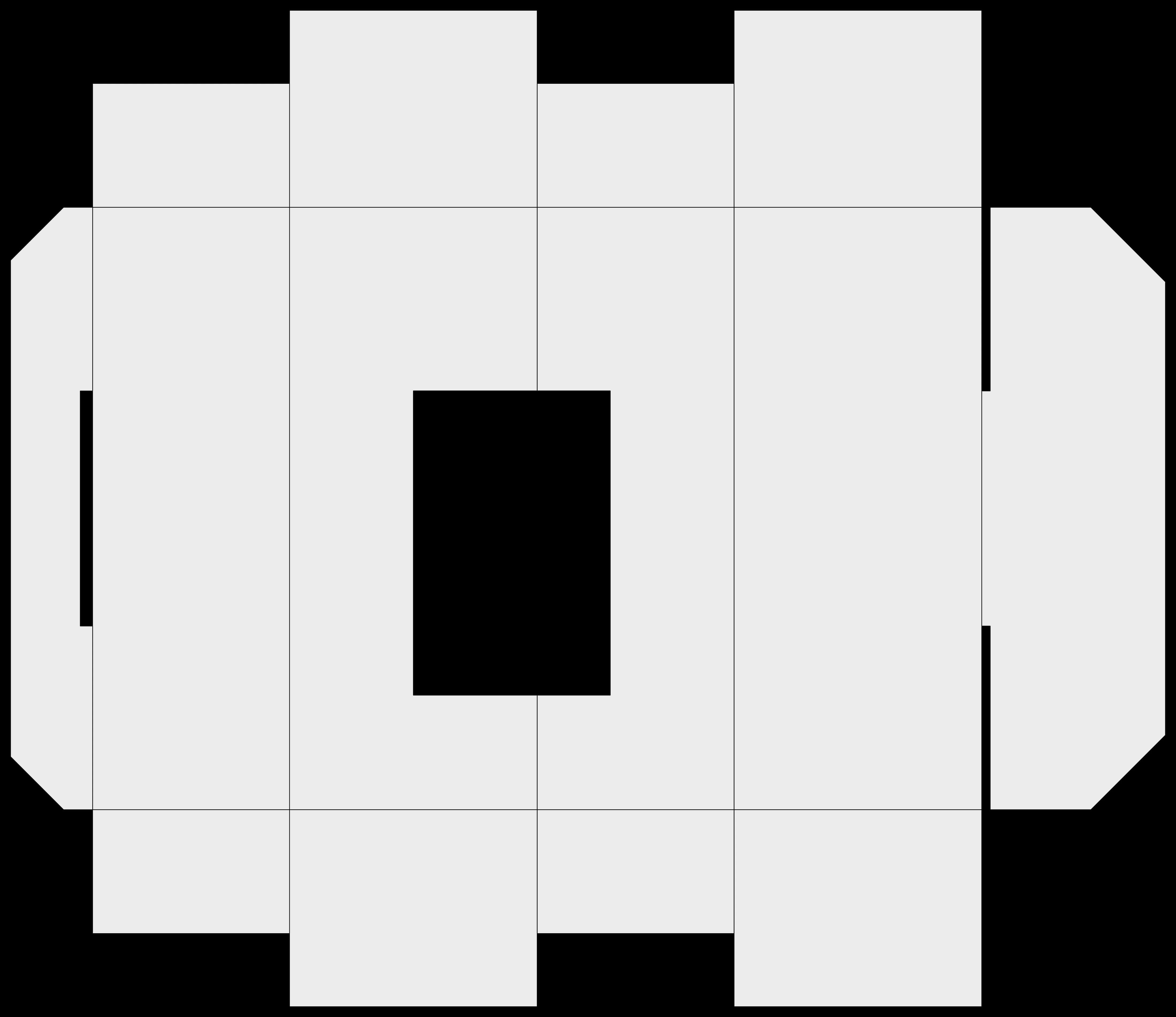
1. The Die-Cut and Geometry
The design features a sophisticated rectangular window. In the final print file, I established a precise Dieline layer set to a non-printing spot color. This ensures the manufacturer knows exactly where to cut the cardboard to frame the metallic product inside.
2. Typography and Information Hierarchy
For the NaturaLuxe logo, I chose a high-contrast script that feels classic. On the back panel, the priority shifted to legibility. I used a clean sans-serif for the ingredients and distributor information. This ensures the package meets regulatory standards while maintaining a clean appearance.
3. Technical Specifications
To make this layout press-ready, I focused on three key areas:
Color Space: I converted all tones to CMYK to ensure color accuracy during the printing process.
Bleeds and Safety: I extended the background texture beyond the trim line to prevent white edges from appearing after the box is folded.
Vector Integrity: Because I used Fresco’s vector tools, the barcodes and QR codes remain perfectly crisp for retail scanning.
The Result
The final design for NaturaLuxe feels intentional. It tells the consumer that the product inside is gentle, high-quality, and environmentally conscious. By combining the artistic freedom of Adobe Fresco with the technical rigor of a print-ready layout, I created a package that looks just as good on a bathroom vanity as it does on a store shelf.
Project Specs:
Software: Adobe Fresco (Illustration) and Affinity (Pre-press Layout)
Style: Botanical Minimalist
Key Features: Custom Die-cut window, Vector Illustrations, and Eco-certified labeling.
Print Ready
Layout
Like this project
Posted Feb 9, 2026
Designing NaturaLuxe: From Adobe Fresco art to a professional, print-ready layout.