Artistic Product Label Design for Candles

Jonathan Swanson

Artistry in Negative Space: Designing the Product Labels for Broken Lamp Candle Co.
The Creative Brief and Project Objectives
When I partnered with Broken Lamp Candle Company to develop their product labels, the goal was to create a visual identity that felt as handmade as the candles themselves. The client wanted a minimalist approach that utilized a simple, one-tone color palette. My primary challenge was to take a standard candle jar and transform it into a piece of gallery-inspired art through the label design alone. We wanted to move away from traditional, cluttered labels and instead embrace a sophisticated aesthetic that prioritized texture and negative space.
Concept Development: The Artistic Paint Stroke
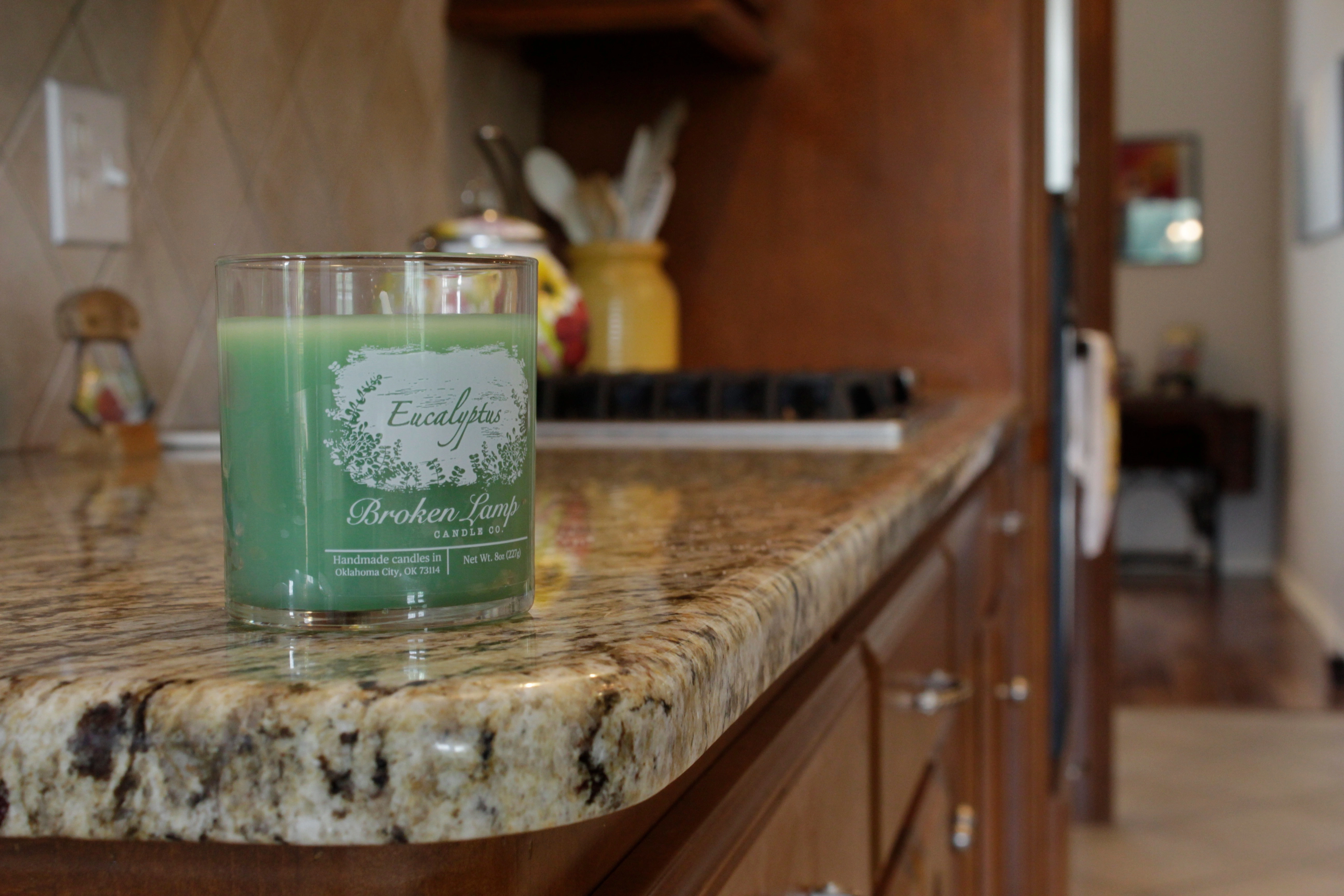
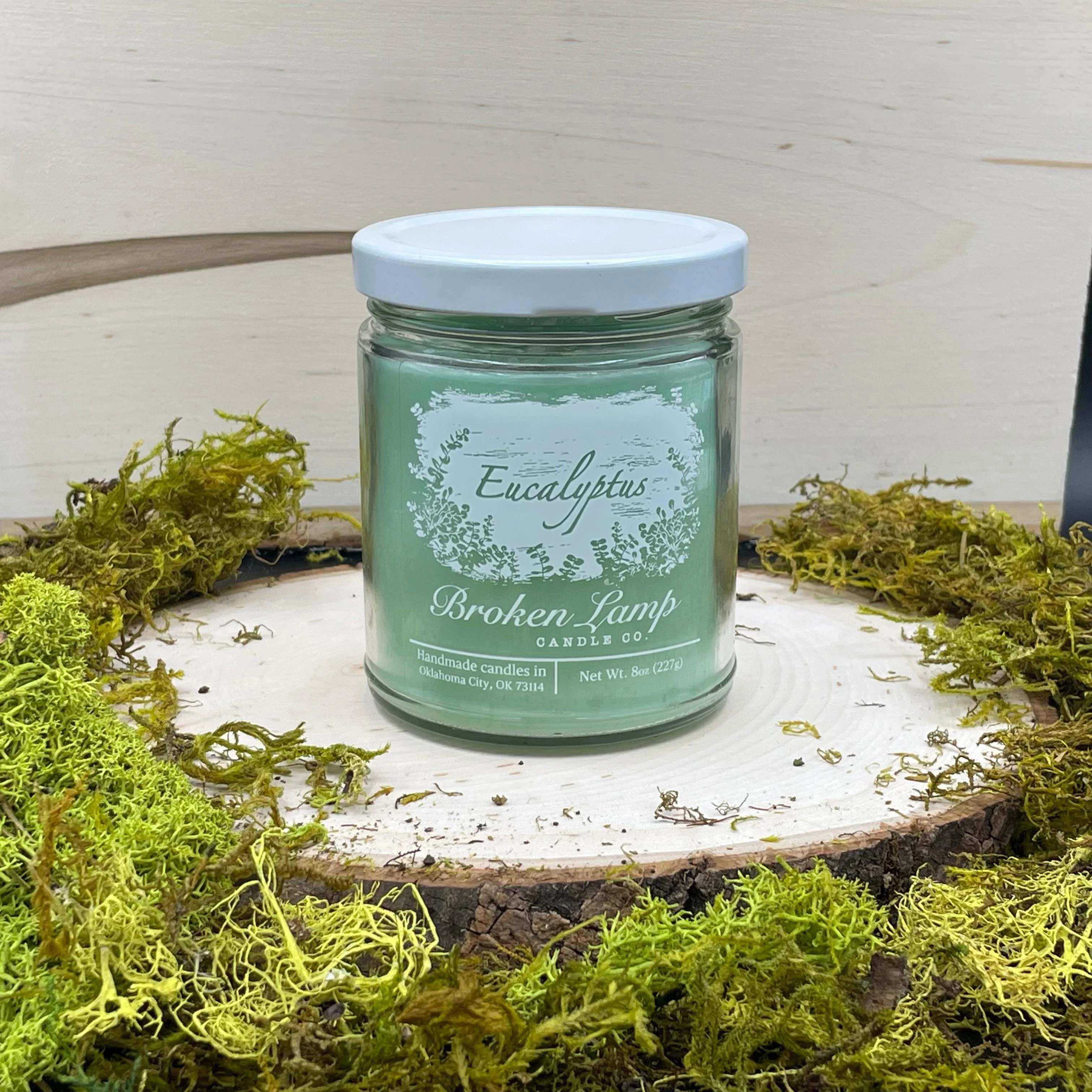
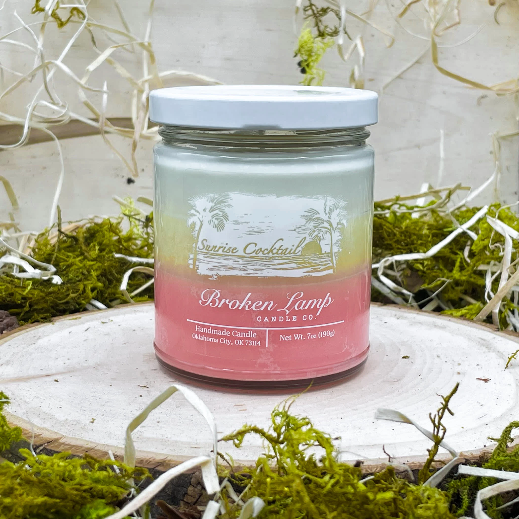
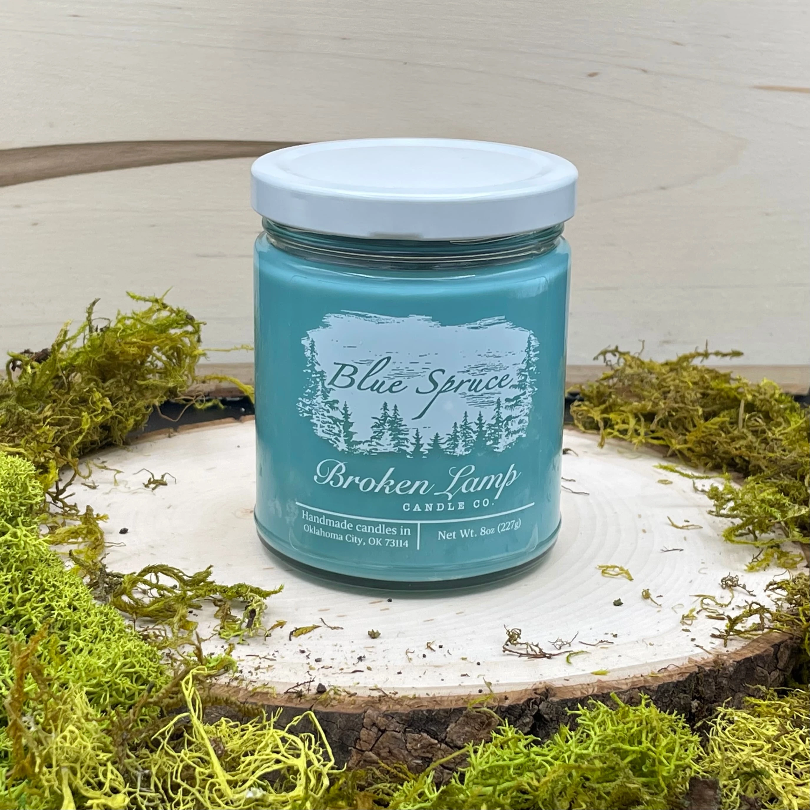
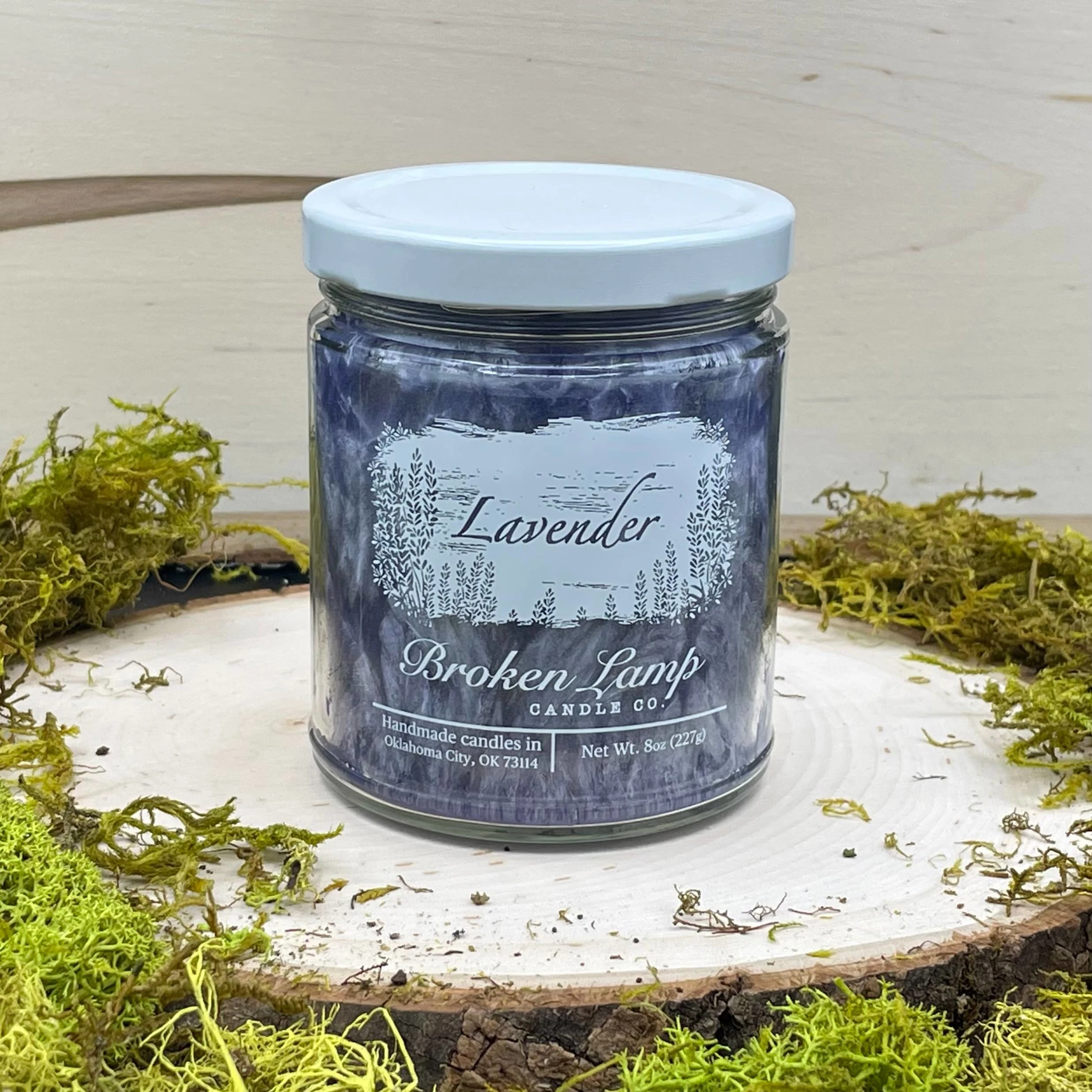
The core of my design thought process was to deliver a feeling of raw artistry. To achieve this, I developed a signature motif centered on a textured paint stroke. Each label features a bold, organic blotch of ink that looks as though it was hand-painted directly onto the glass. This singular tone of ink provides a heavy, grounded anchor for the brand identity.
Instead of treating the label as a surface to print on, I treated the paint stroke as a solid block of material that needed to be sculpted. I meticulously "carved" the scent names and botanical elements, such as the spruce trees and floral accents, out of the paint stroke itself. This technique allowed the design to feel carved from a single source rather than layered with multiple colors.
Integrating the Product: The Role of Negative Space and Wax Color
One of the most critical aspects of this design was the intentional use of negative space. By carving the illustrations and typography out of the dark ink, I created windows within the label. This allowed the physical color of the candle wax to become a functional part of the design.
For the Blue Spruce scent, the deep forest-green wax fills in the negative space of the trees and lettering, giving the label a rich, natural depth. For the Vanilla scent, the creamy off-white wax shines through the carved paint stroke, providing a soft contrast that complements the warmth of the fragrance.
This interaction ensures that the label is not just a sticker placed on a jar, but a design that is completed by the product inside. The candle wax provides the secondary color, making the entire package feel cohesive and multidimensional. The design is literally empty until the jar is filled with the product.
Strategic Compliance and Technical Layout
A designer’s role extends beyond the purely aesthetic. I worked closely with the client to advise them on the necessary legal requirements for candle packaging. It was vital to include specific data such as the net weight and the manufacturing origin in Oklahoma City without compromising the minimalist beauty of the artwork.
I integrated these elements into the lower portion of the label, treating the text with clean, modern typography that balances the organic nature of the paint stroke above it. By carefully managing the hierarchy of information, I ensured that the product labels remained fully compliant with industry standards while maintaining a high-end, boutique appearance.
The Final Result
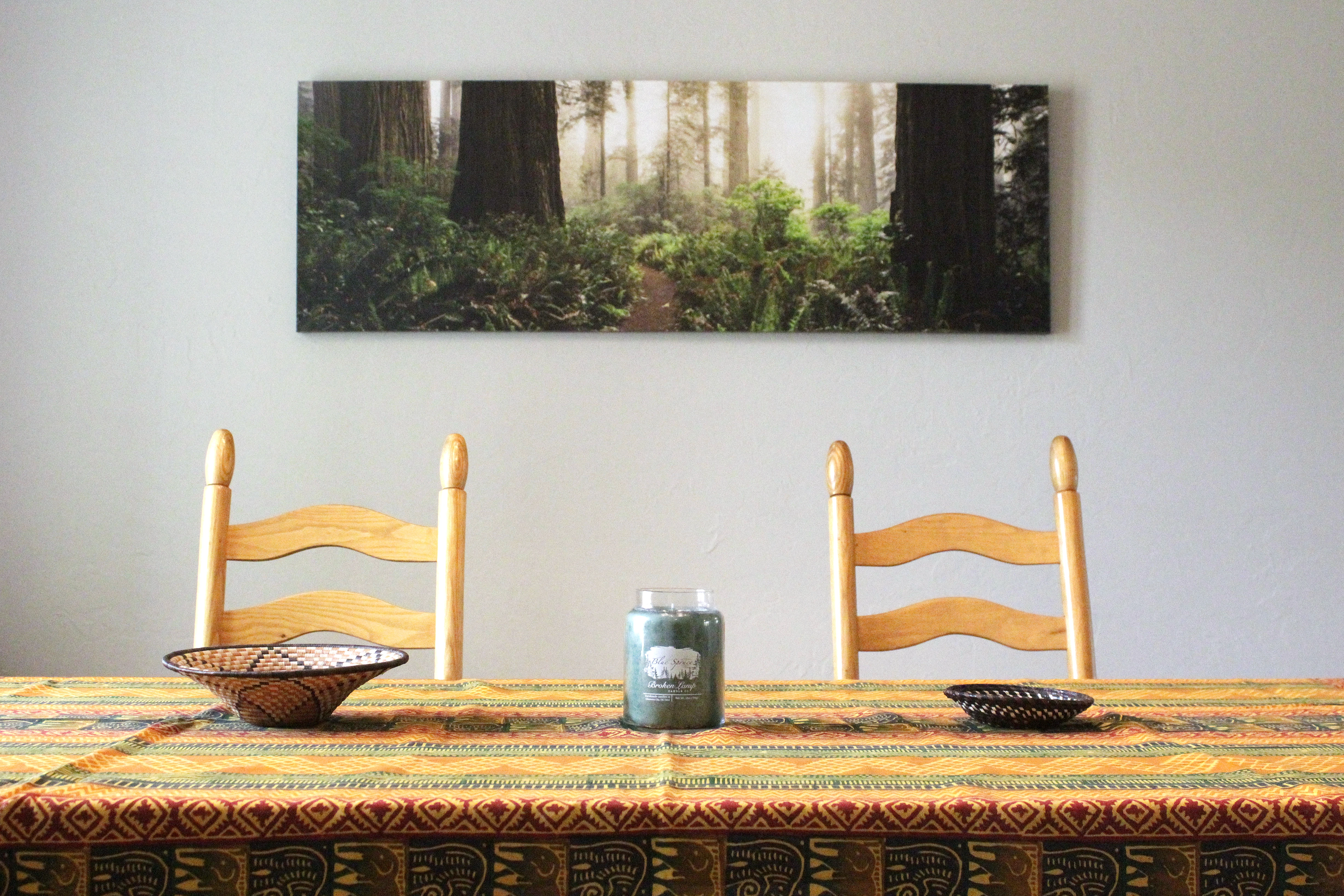
The finished product labels for the Broken Lamp Candle Co. collection represent a perfect harmony between branding and the physical product. By utilizing the negative space to showcase the candle wax and focusing on a single-tone painterly aesthetic, we created a jar that stands out on any shelf. The result is a premium, artisanal look that communicates the quality of the fragrance and the care put into the handmade process.
Like this project
Posted Feb 10, 2026
Designed artistic product labels for Broken Lamp Candle Co., integrating negative space.