
Celvana is a premium red light therapy brand launching in the US. The market is split between a few expensive brands and hundreds of identical, unbranded panels, so the identity had to make a research-driven buyer trust Celvana as a real company, without looking cold and medical.
Logotype
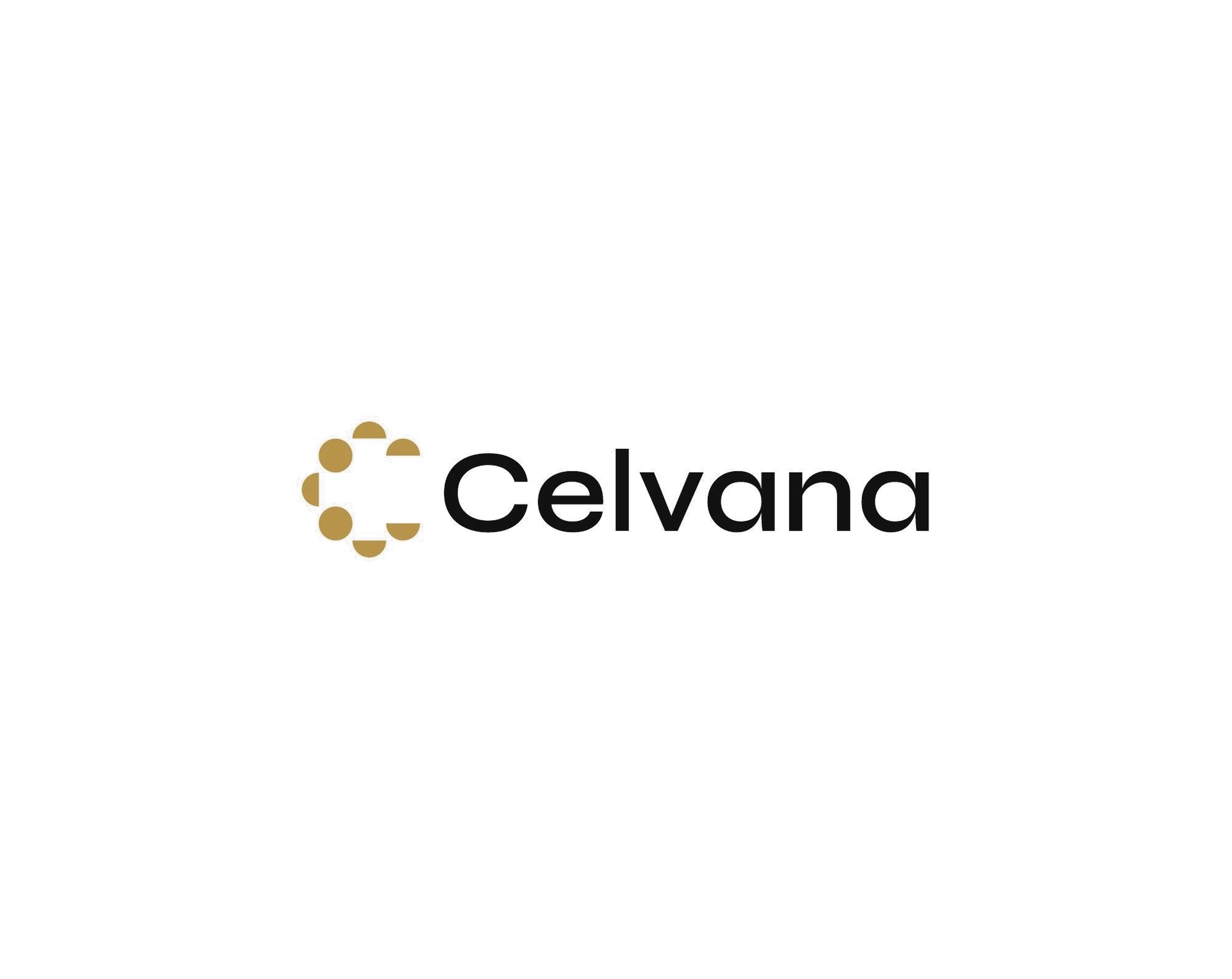
A calm, geometric wordmark with a symbol made of points of light.
Symbol
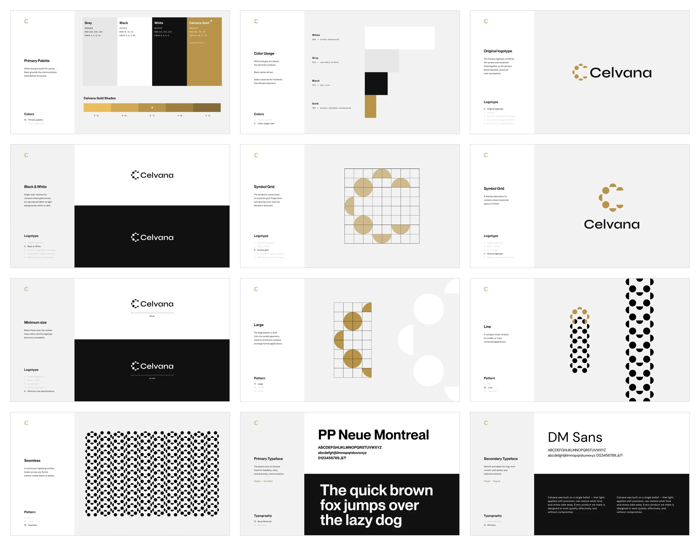
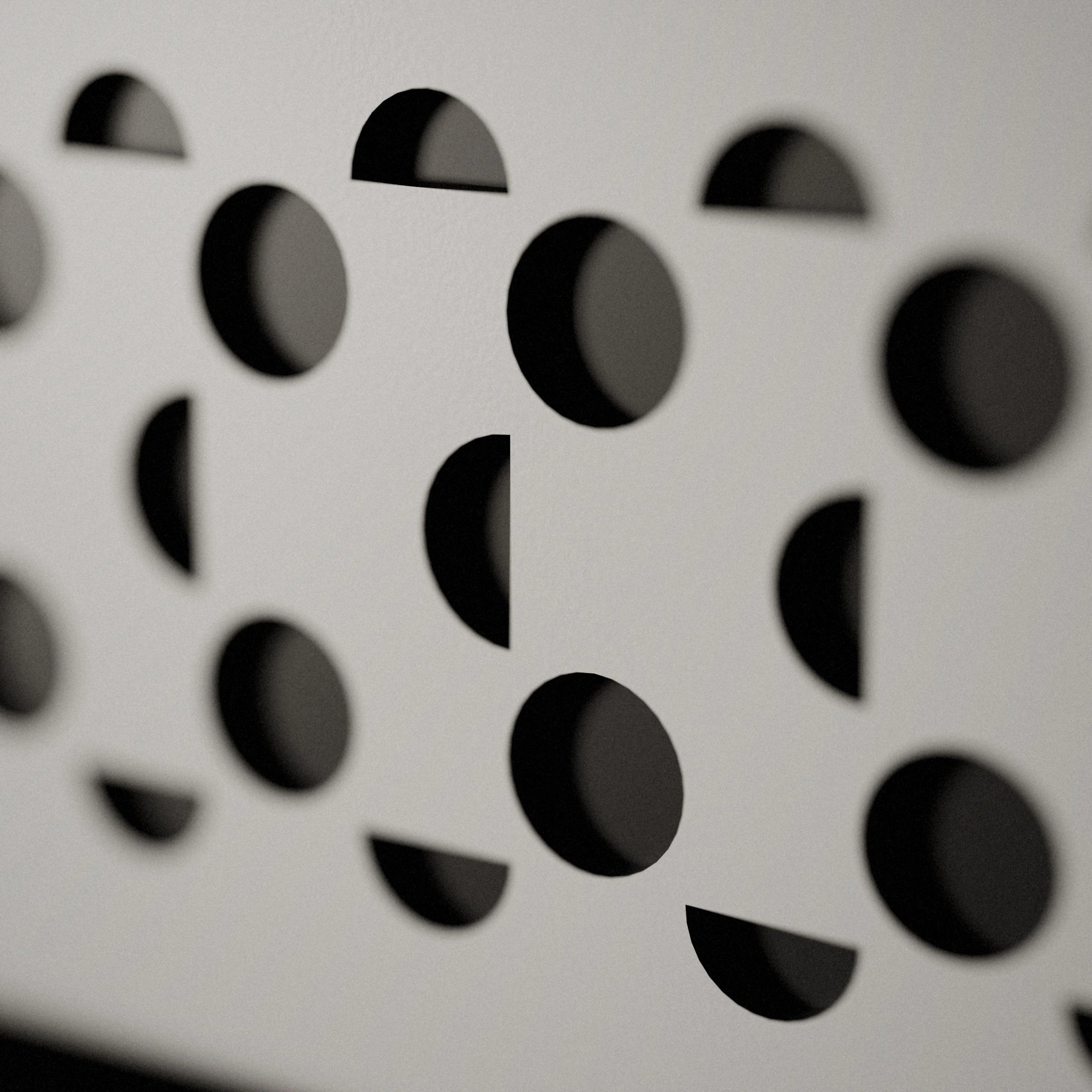
Built on an 8 × 8 grid: circles cut into halves, like LEDs switching on across a panel.
Colours
Charcoal, white and one warm gold, instead of the clinical blue or loud red the category usually reaches for.
Typography
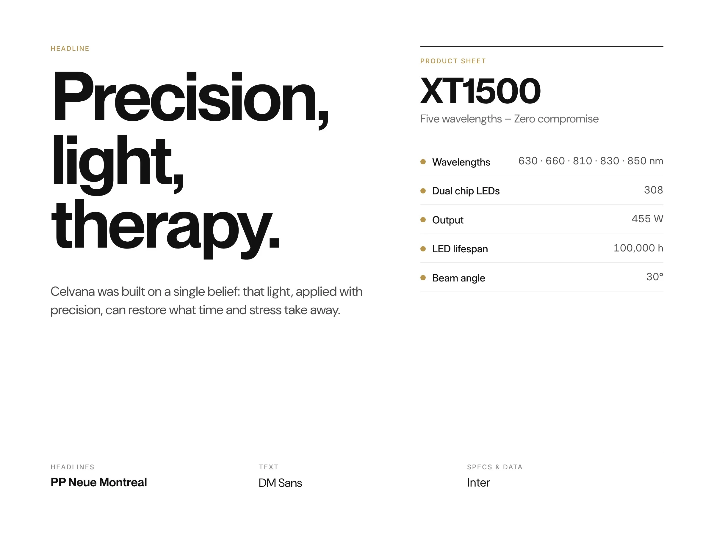
PP Neue Montreal for headlines, DM Sans for text, Inter for technical specs.
Pattern
The symbol geometry grows into a family of patterns for packaging, product and print.
Brand guidelines
Delivered as brand guidelines with logo files, colours, type, patterns and usage rules.
On the product
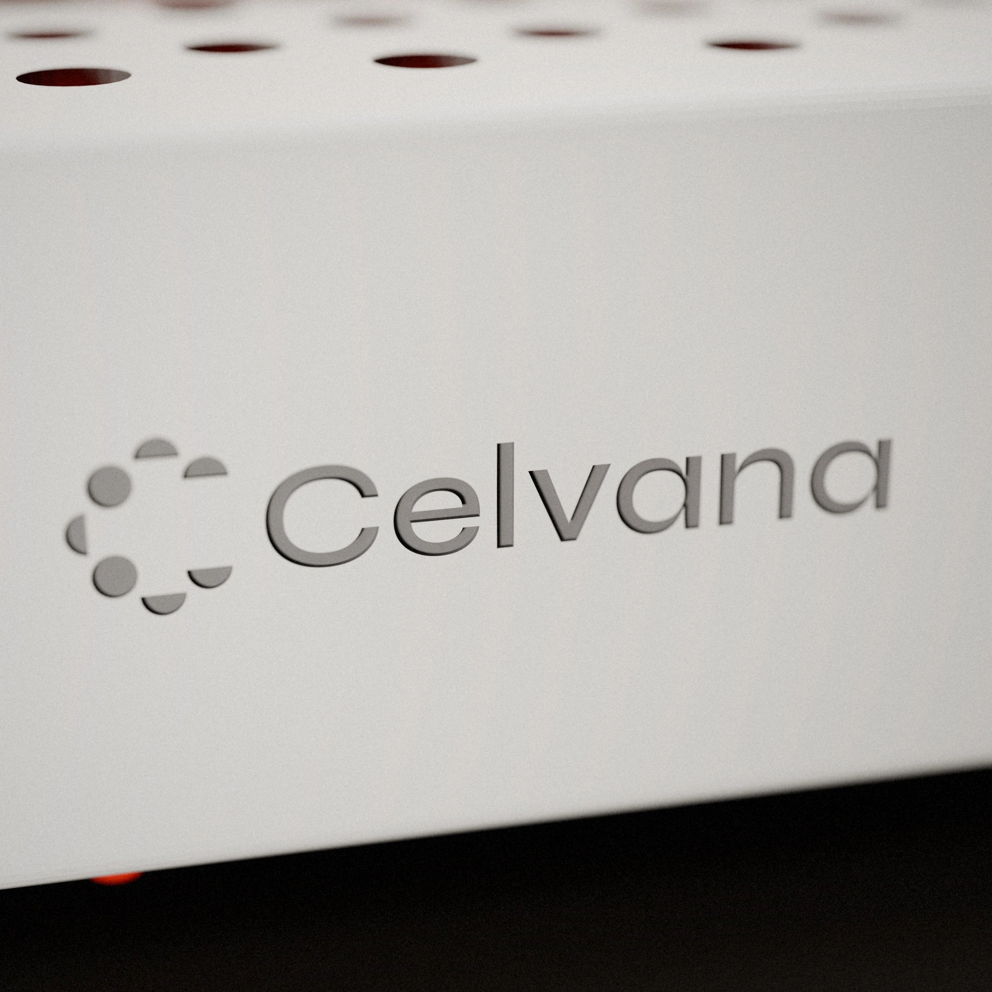
On the XT1500 panel: perforation on the front, the pattern and logotype on the sides.
Logotype engraved into the housing.
The perforation, lit from inside.
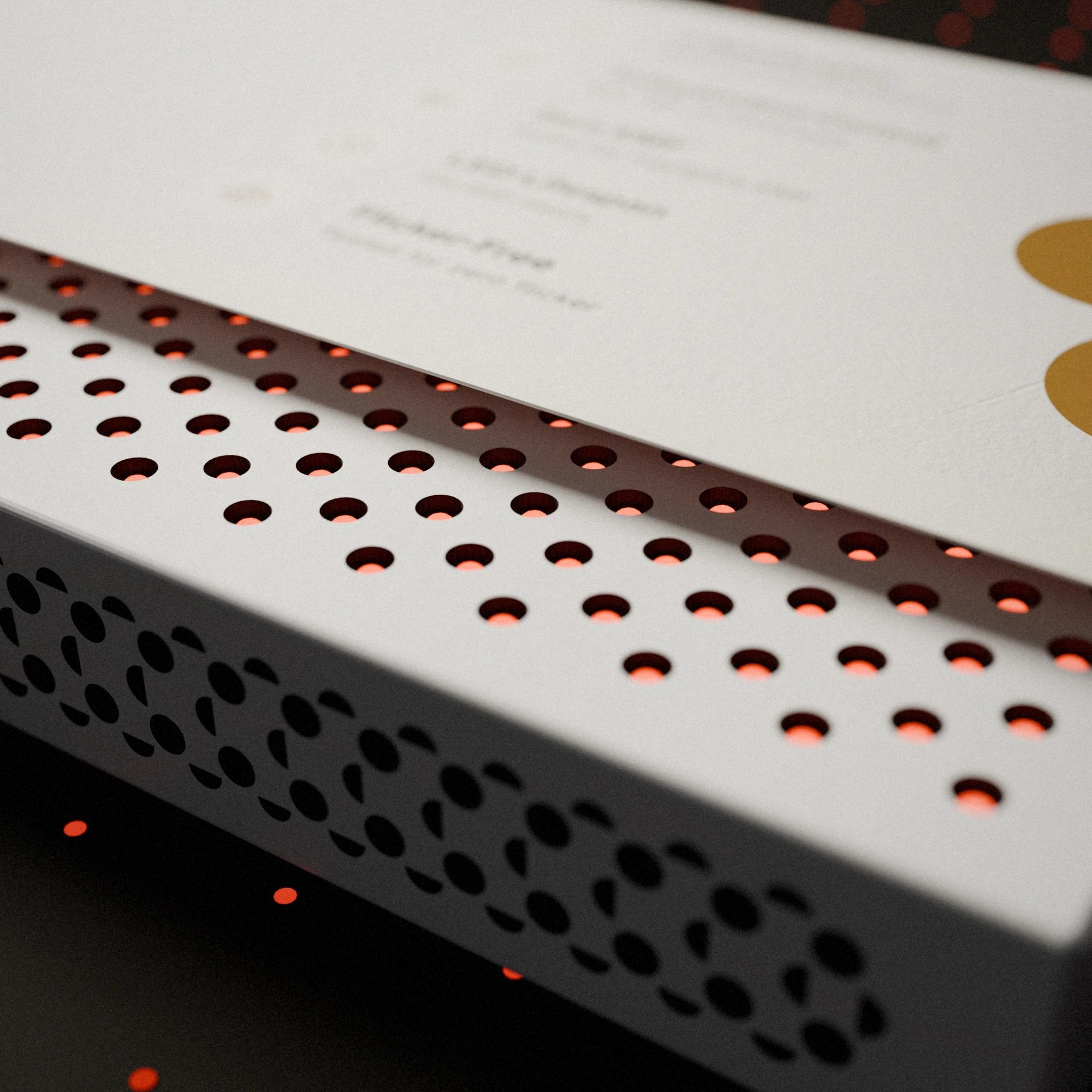
The die-cut pattern.
The XT1500 packaging is shown in a separate project
1 like · 24 views · Oct 25, 2026
Brand identity for Celvana, a premium red light therapy brand launching in the US: symbol, wordmark, colours, type, patterns and guidelines.
Timeline
Mar 16, 2026 - Mar 27, 2026
Tags


What the client had to say
Great experience working with Nikas in my brand identity journey. He provided constant communication and creative suggestions that aligned with my vision and delivered a fantastic outcome! Great :)

Nick Melissas
Mar 27, 2026, Client