
FlameSpins needed a logo that feels energetic and easy to remember. The answer became a small flame with a personality.
Finding the character
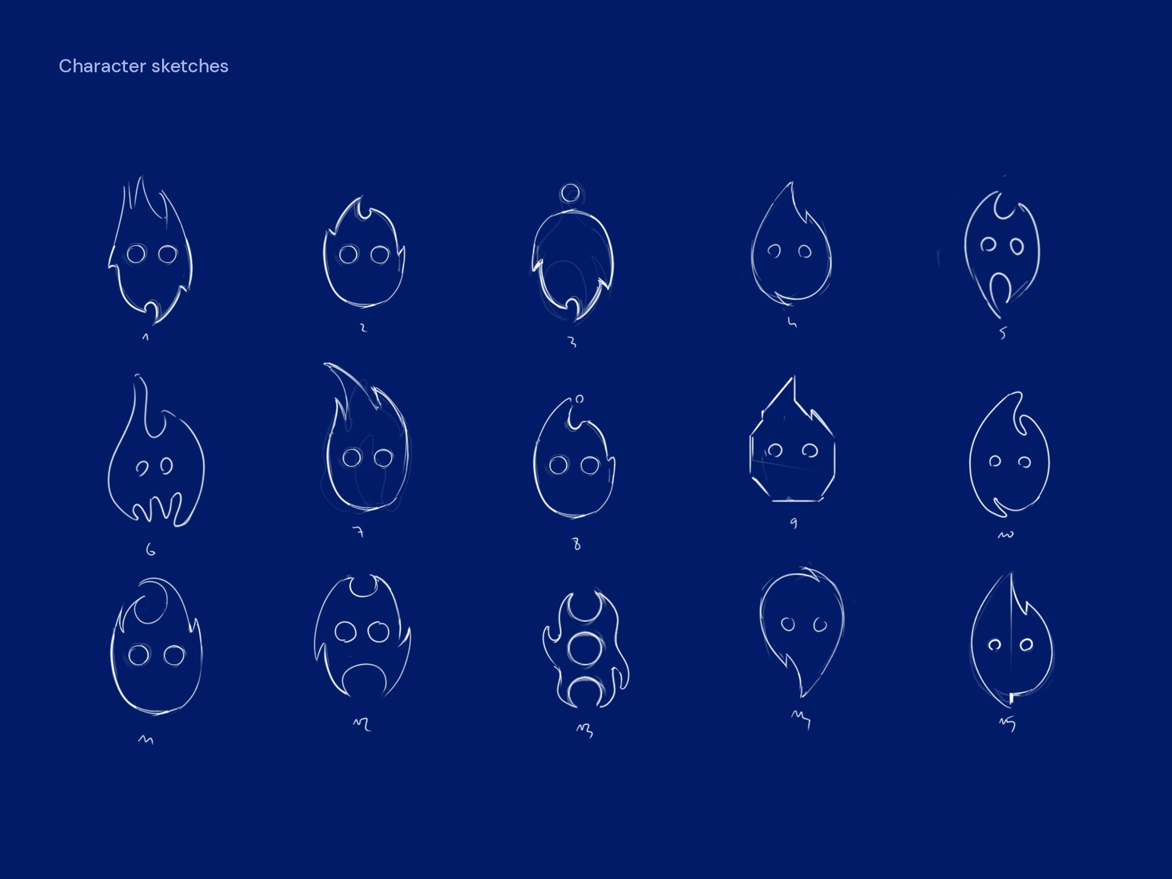
Fifteen hand-drawn variations to find the right shape and expression for the flame.
From sketch to symbol
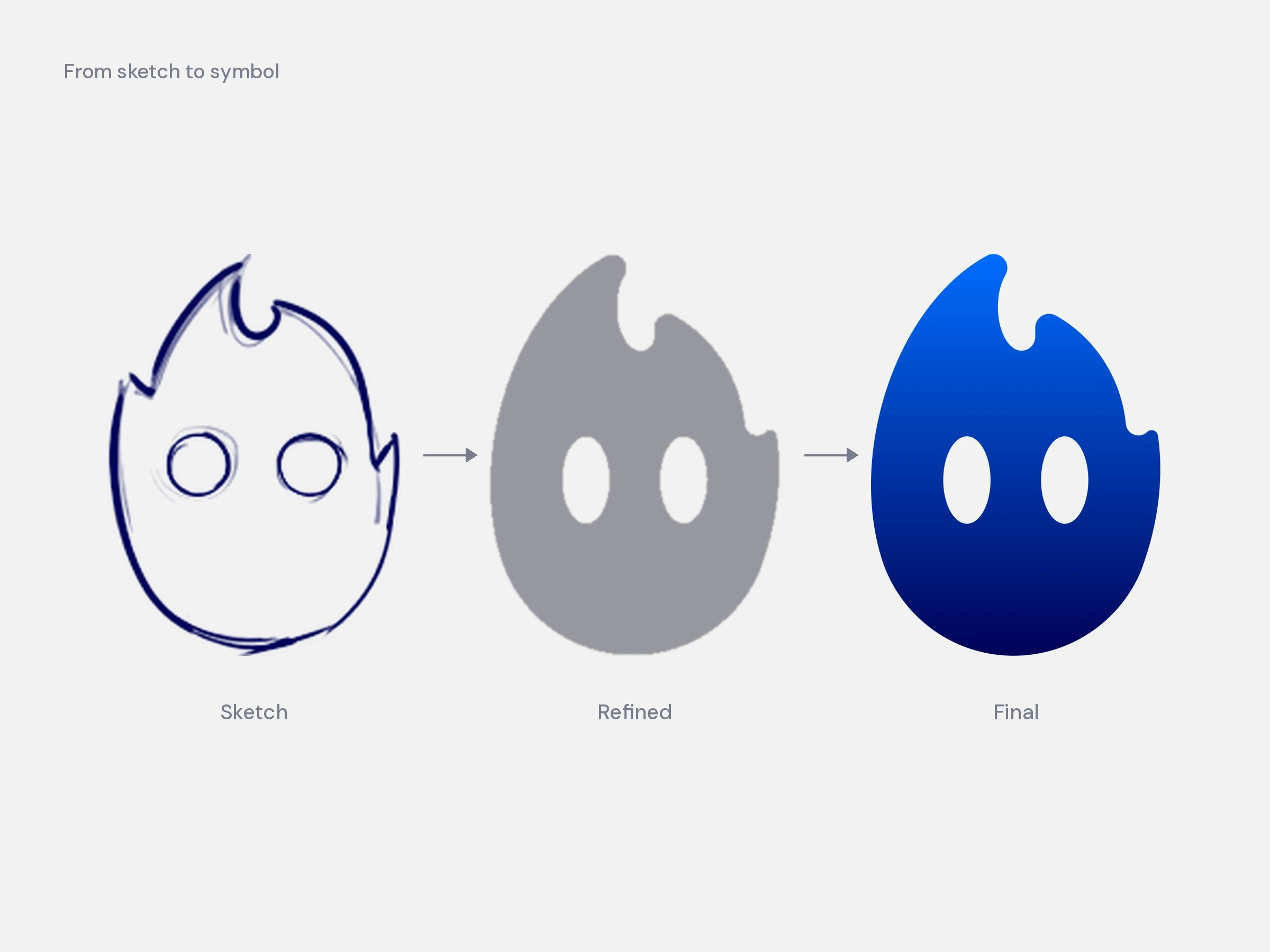
Sketch number two was refined into a solid shape, then redrawn as a precise vector.
Symbol
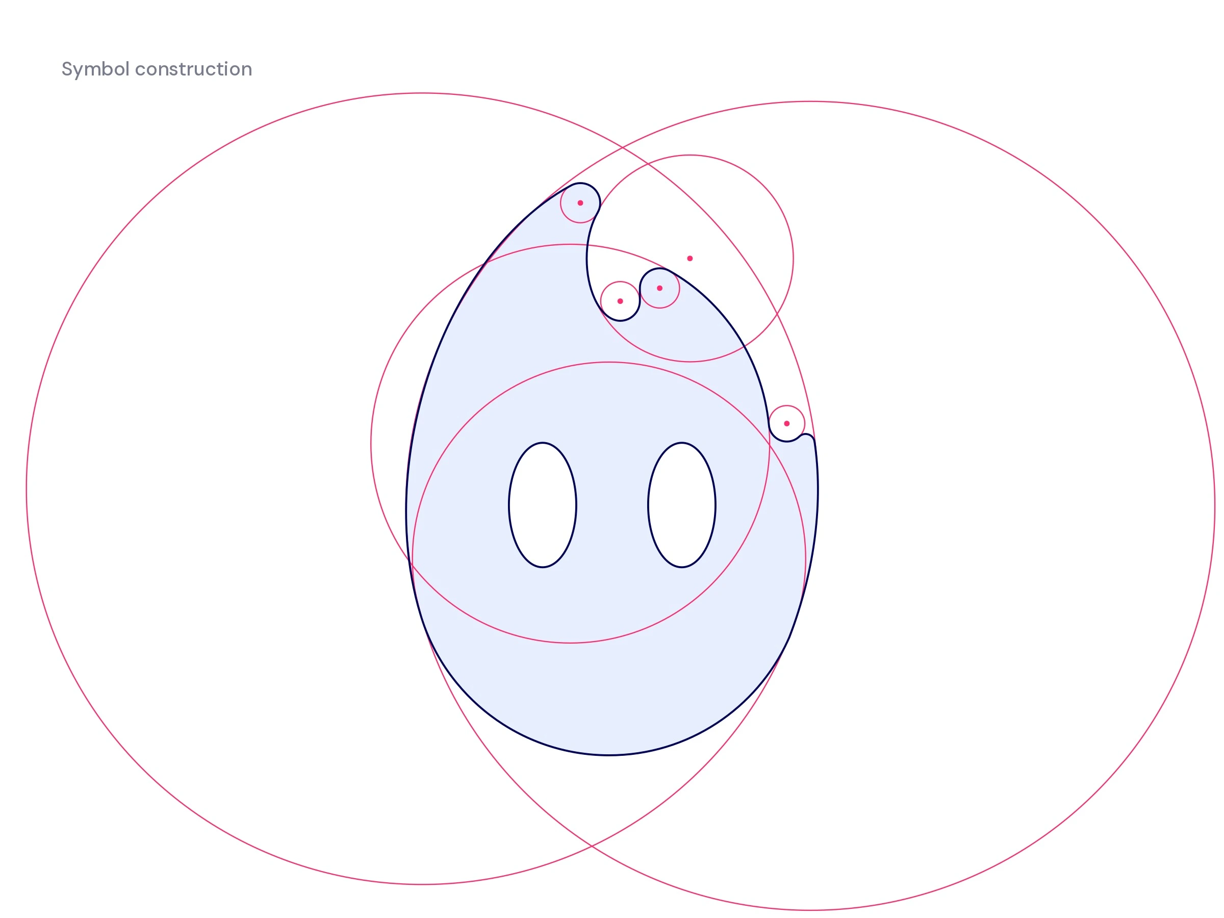
Every curve of the flame is drawn from a circle, so the shape stays smooth and balanced.
One mark, two lockups
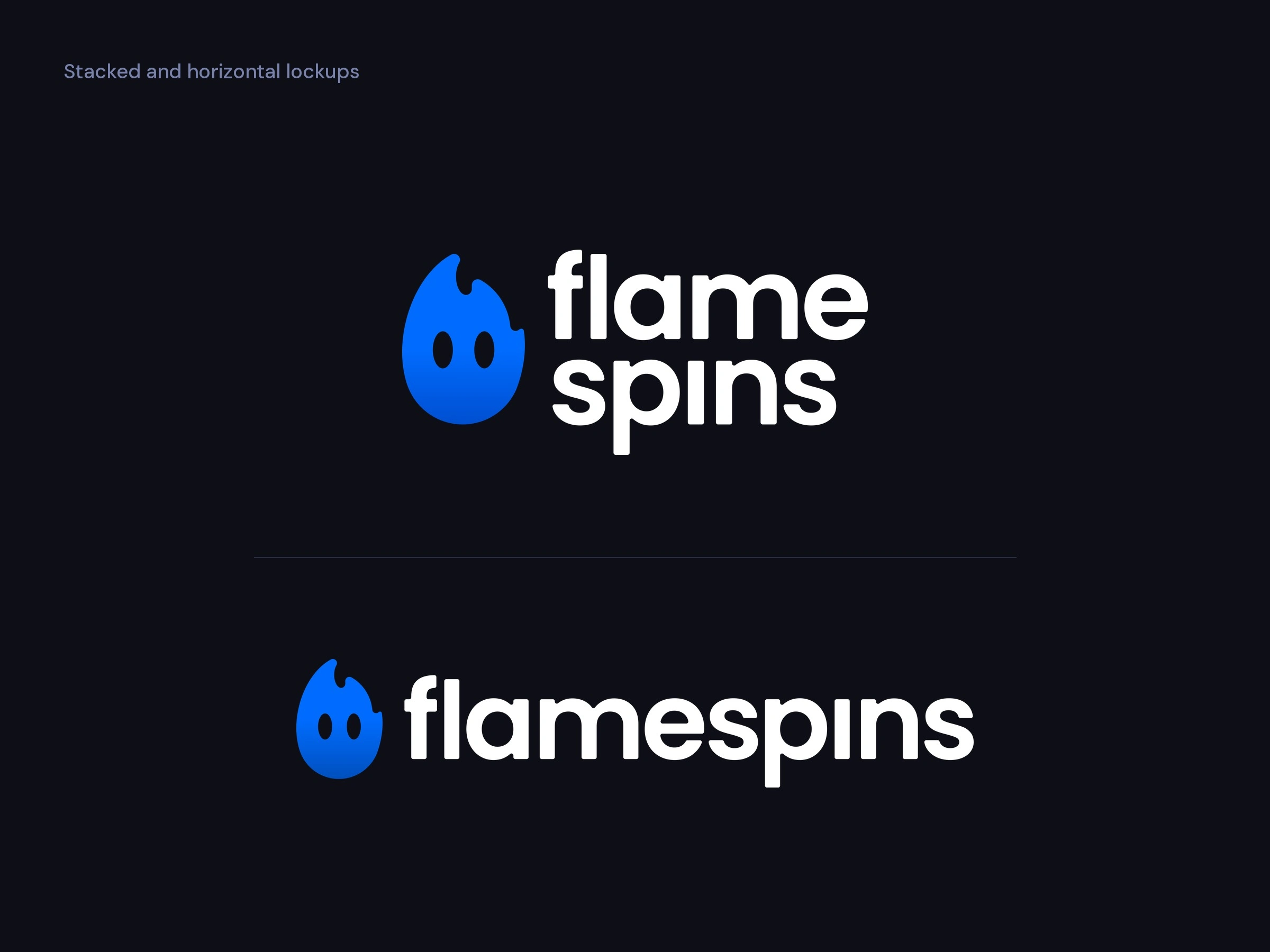
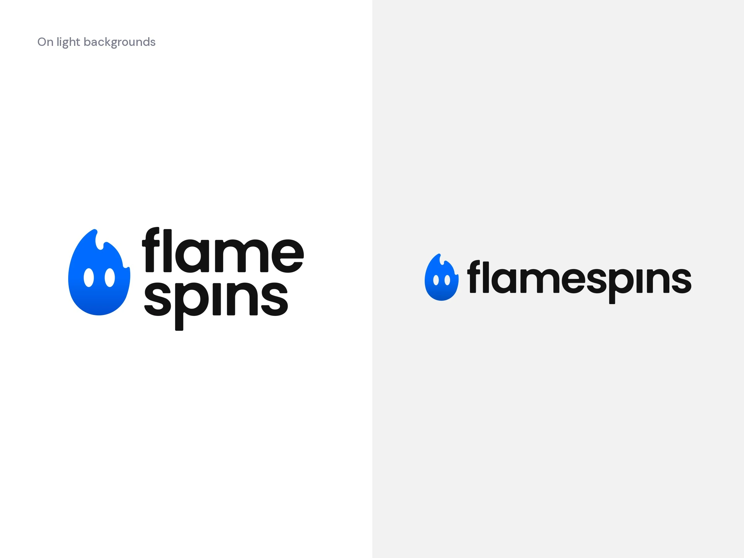
A stacked version for square formats and avatars, a horizontal one for headers and UI.
On light backgrounds the wordmark switches to black, the blue symbol stays the same.
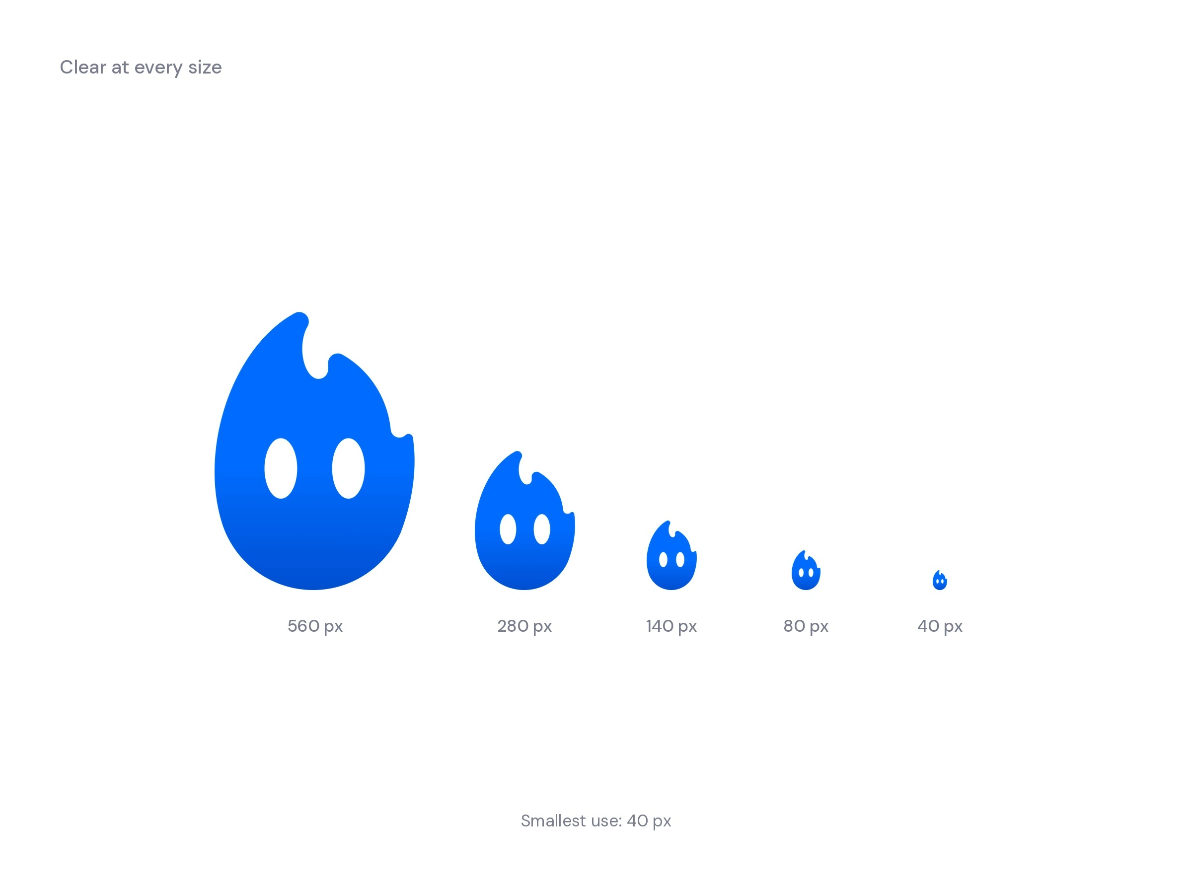
Clear at every size
From large signage down to 40 px, the smallest size the symbol is used at.
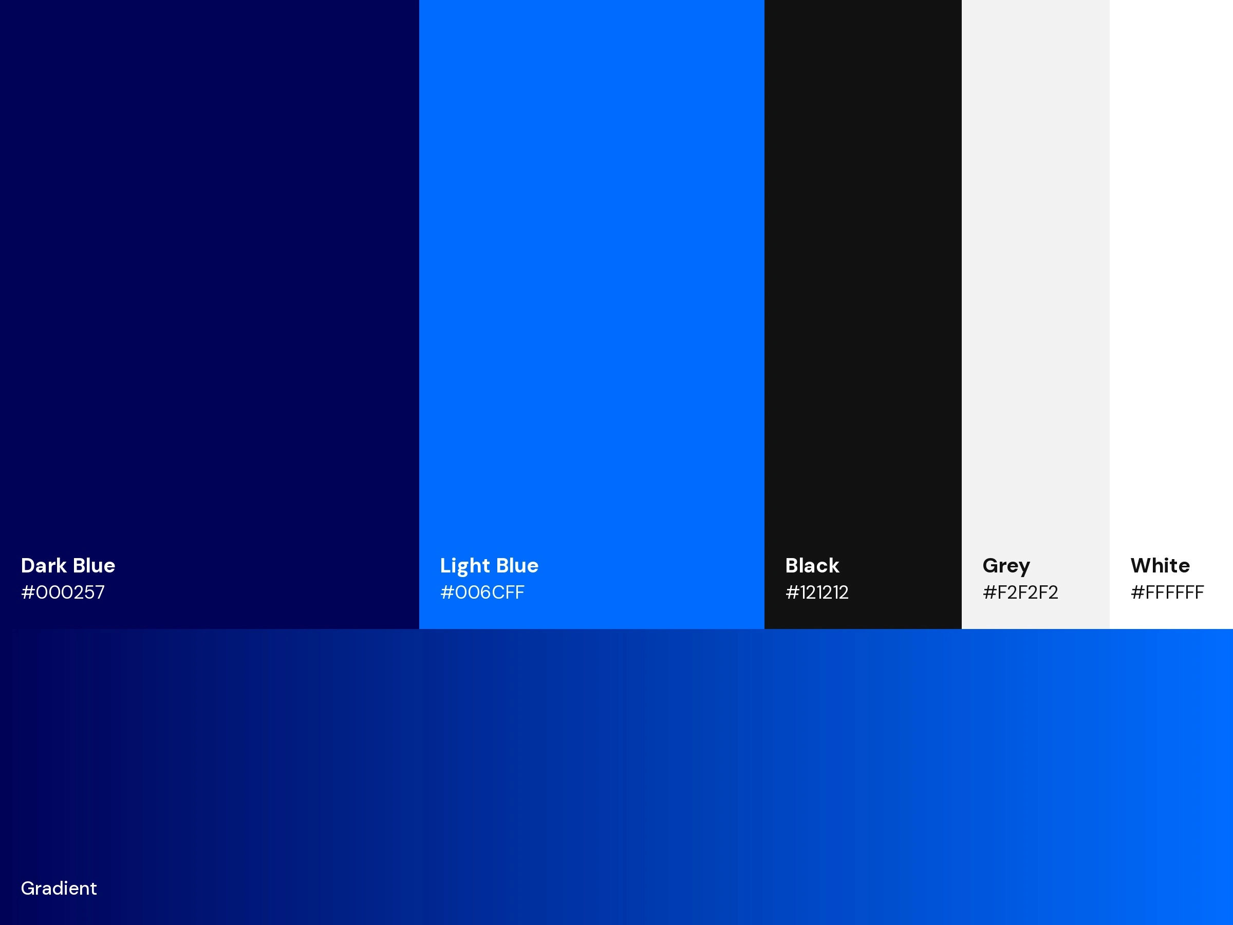
Colours
Deep blue (#000257) and bright blue (#006CFF), with black, white and grey for balance.
Motion
The symbol moves like a real flame: the base stays still while the tip flickers upward.
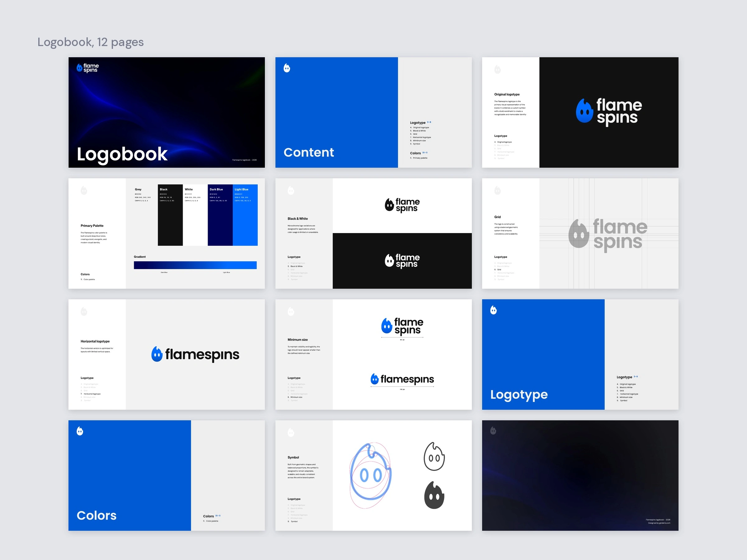
Logobook
Delivered as a 12-page logobook with all logo versions, grid, minimum sizes, symbol and colour palette.
Concept mockups
Concept renders of how the mark could live in the real world, starting with a neon sign that flickers on.
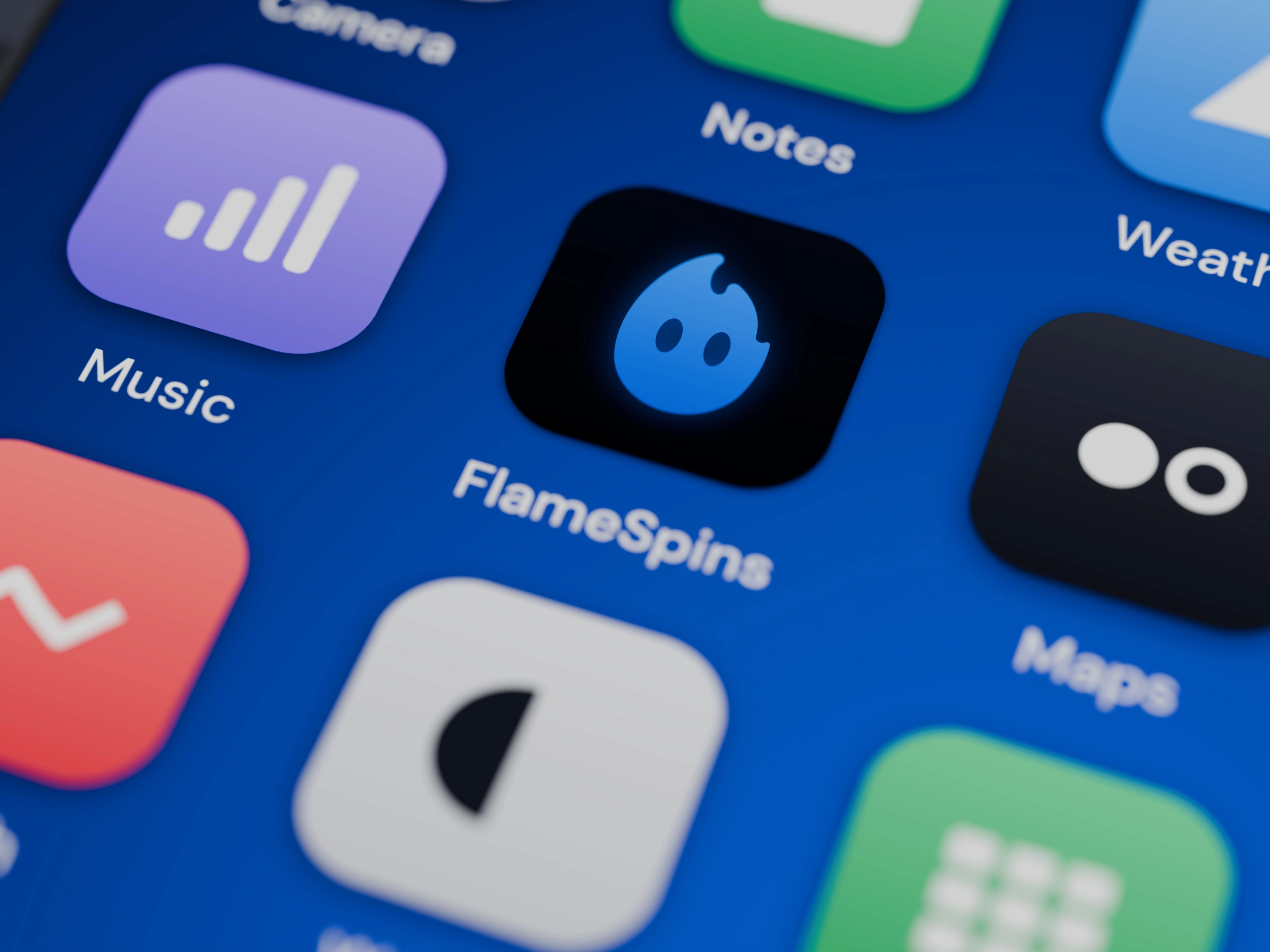
As an app icon on a phone home screen.
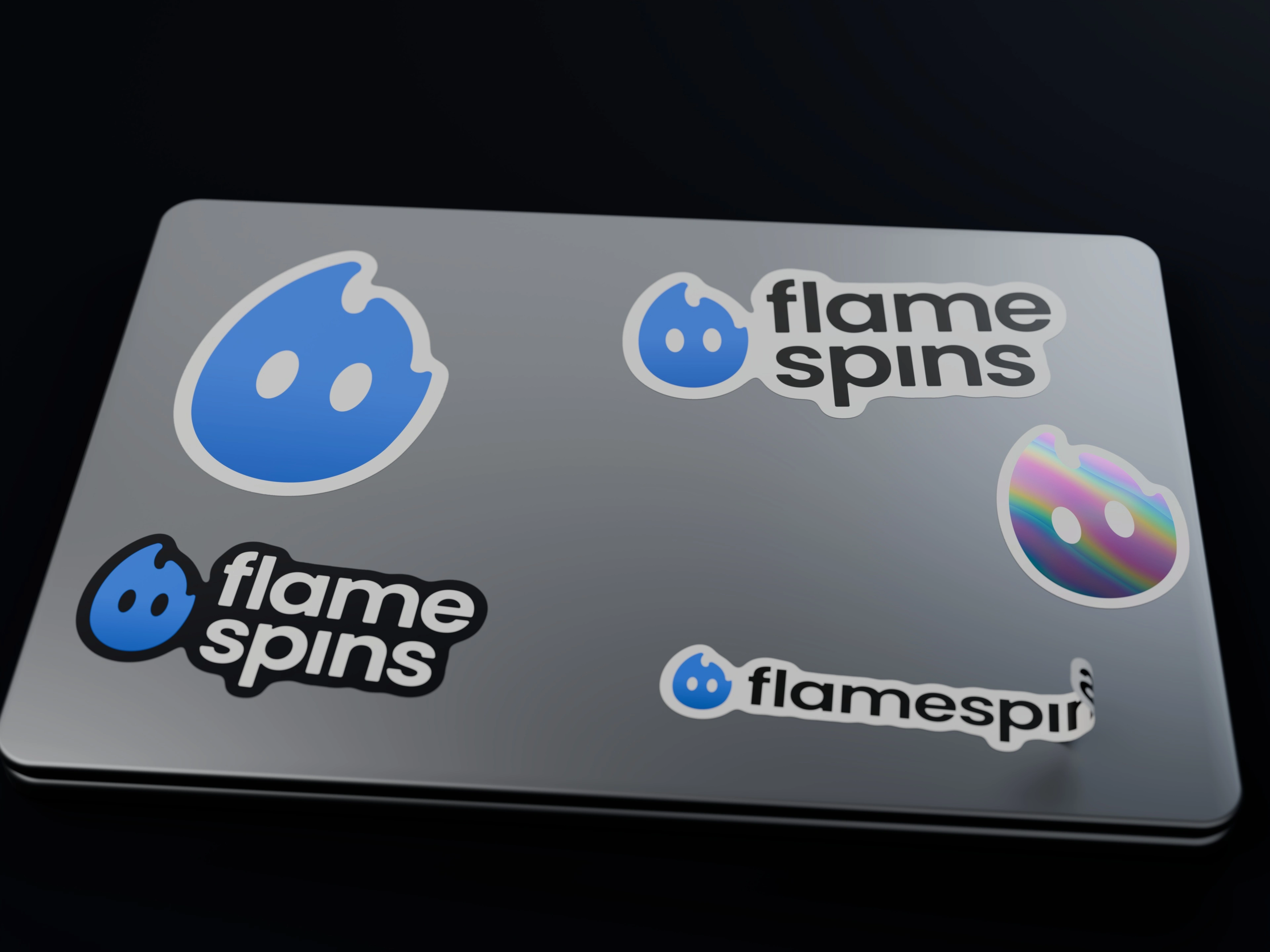
Stickers in the standard lockups, plus a holographic flame.
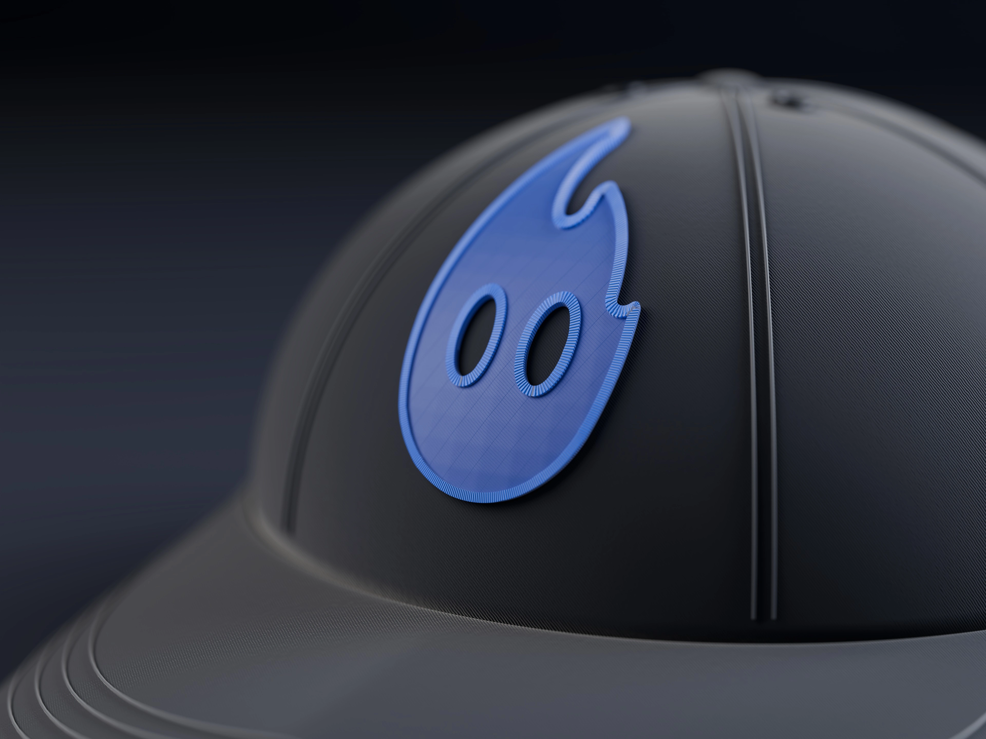
Embroidered on a cap.
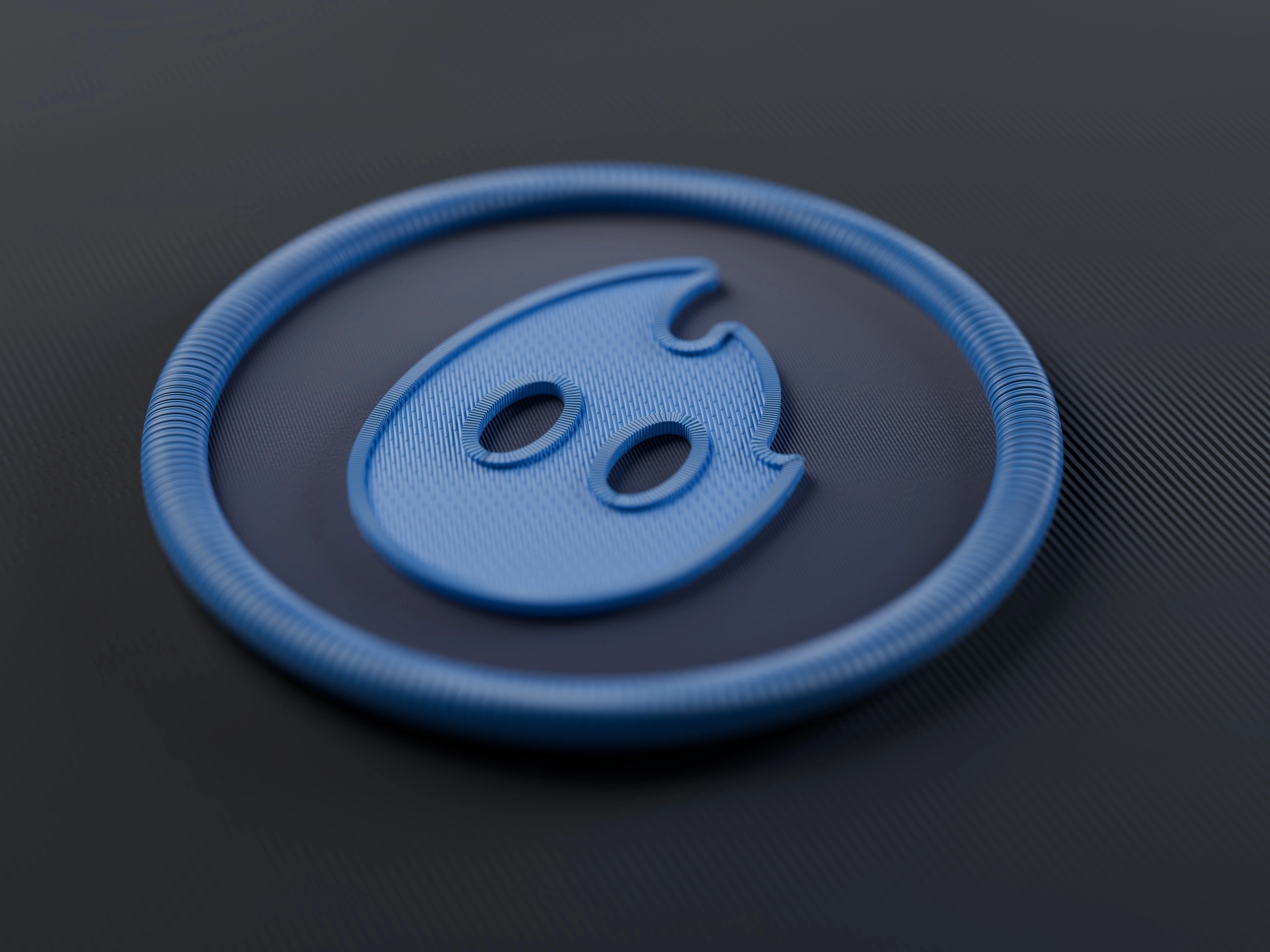
As an embroidered patch.
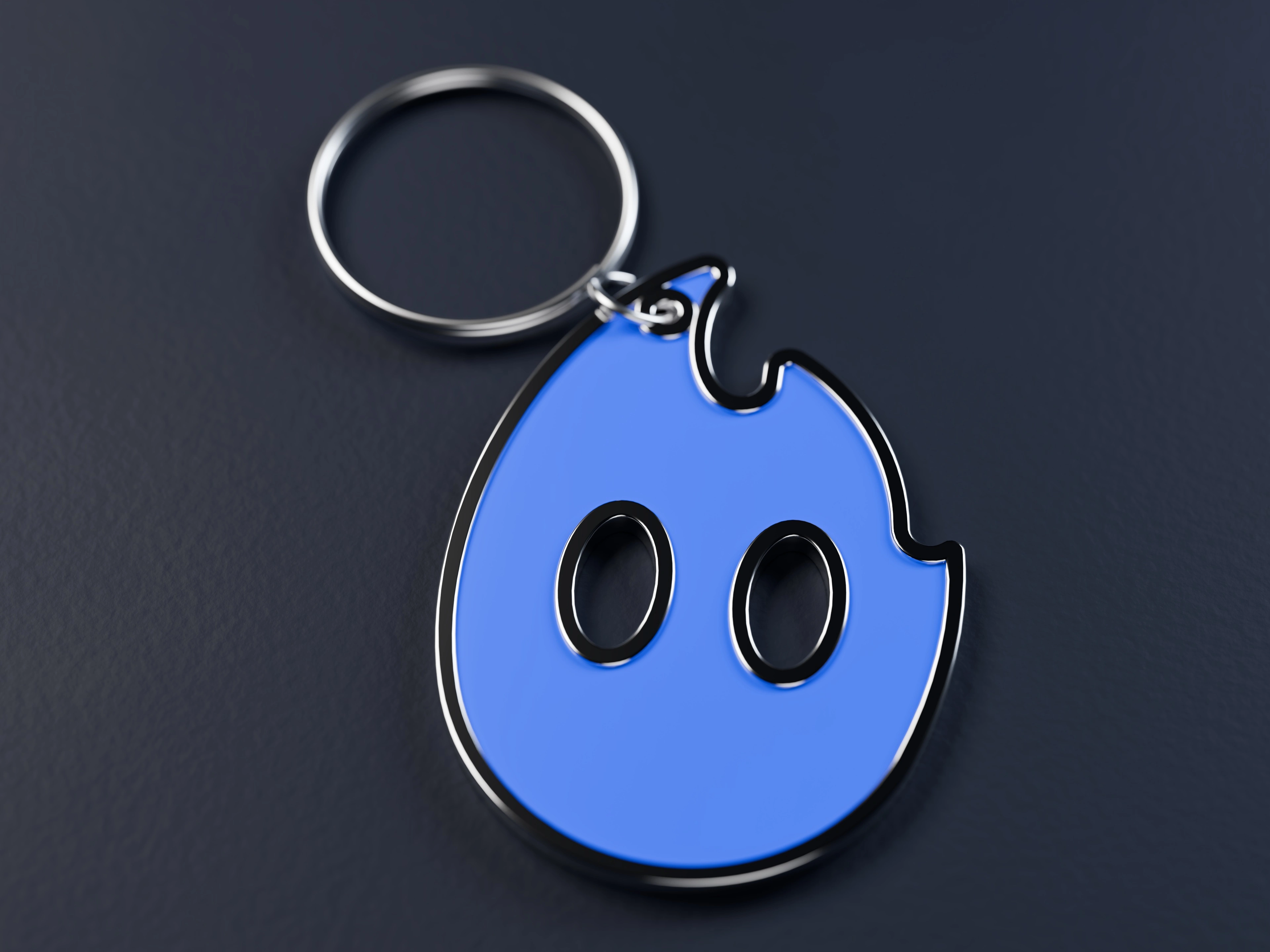
As an enamel keychain.
2 likes · 11 views · Oct 25, 2026
Logotype, symbol and logobook for FlameSpins: a friendly flame character with a bold wordmark, built to work from app icon to billboard.
Timeline
May 4, 2026 - May 29, 2026


