Built with Jitter
From Signal Noise to Signal Strength • The Sent Transformation
Daniel G Bright
Verified
A 42‑day brand + web sprint by Bright Studios (Daniel G. Bright)
Prologue - The Problem Nobody Wanted
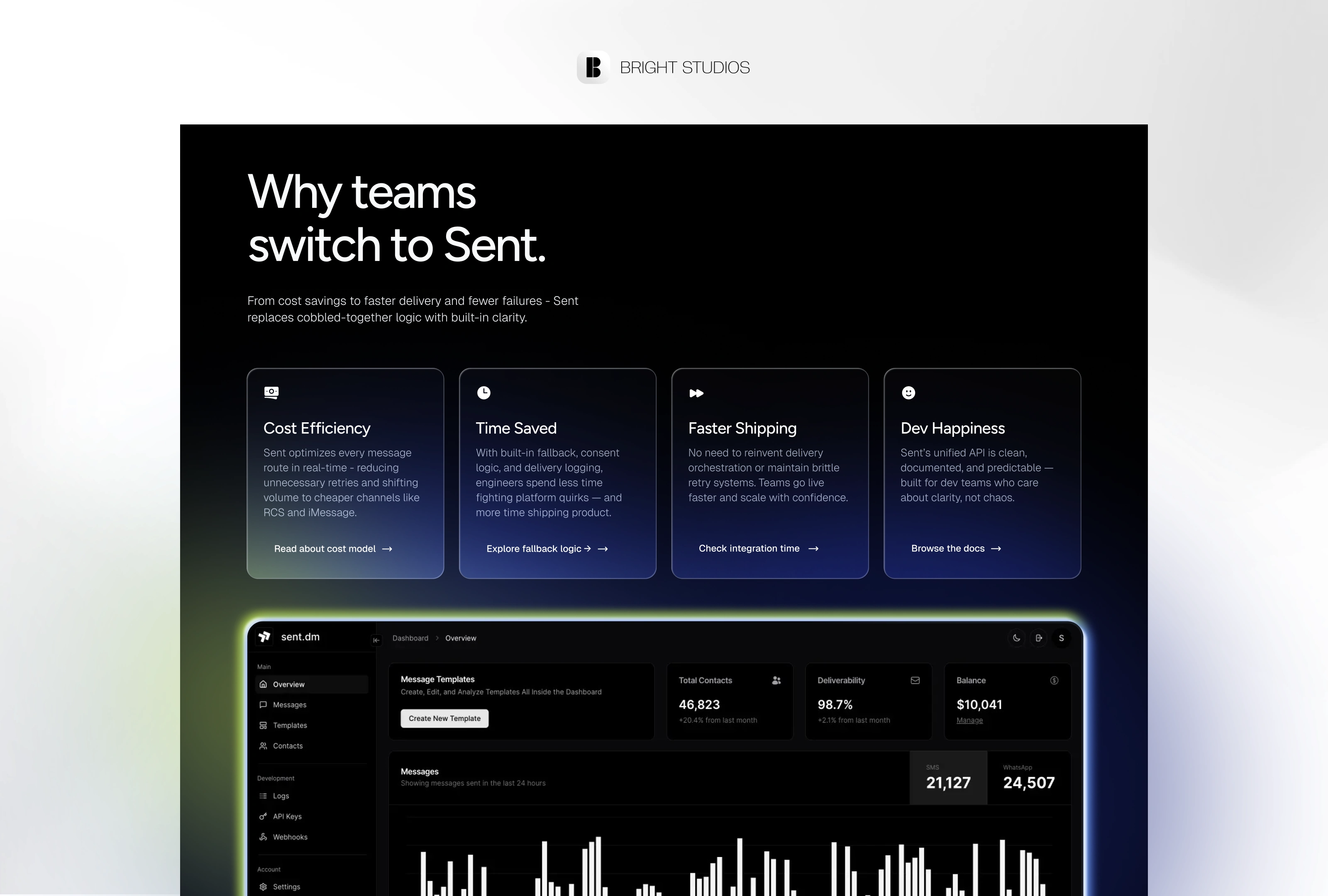
Every product team hits the same wall: shipping the feature is easy; shipping the message is chaos. SMS, WhatsApp, email, push, carrier rules, deliverability gremlins - you know the drill. Sent felt that pain first‑hand while building fintech apps, so they swung back with a promise: “We'll be the single brain routing every customer notification you fire.”
Their V1 landed, but the brand? Looked like a Twilio side‑project, safe blue, SaaS‑y sans serif, “one more API” copy. Investors liked the tech. Developers scrolled on.
Act I - Enter the Guide (That’s Me)
The Brief
Goal: Make Sent impossible to scroll past.
Timeline: Six weeks, no extensions.
Budget: $24 000, all‑in.
We split the journey into four quick sprints: Exploration, Identity, Web, and Handoff. Two review loops each, zero scope creep.
Act II - Plot Twist: Clarity
Brand Strategy in One Breath
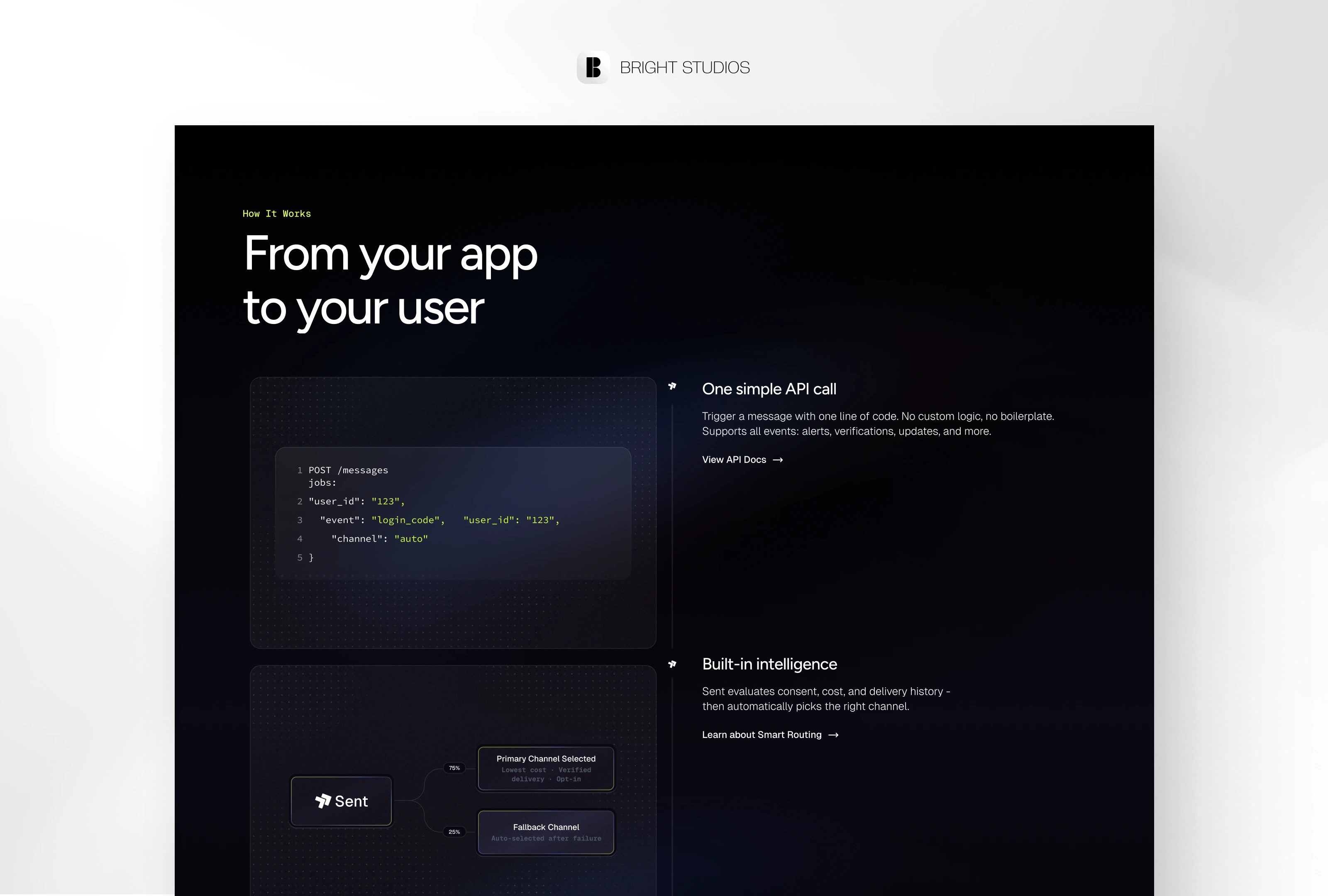
Sent isn’t “messaging infra.” It’s the decision layer that makes every message land exactly where it should. That POV flipped the story:
Developers become the heroes. Sent is the quiet guide sharpening their arrows.
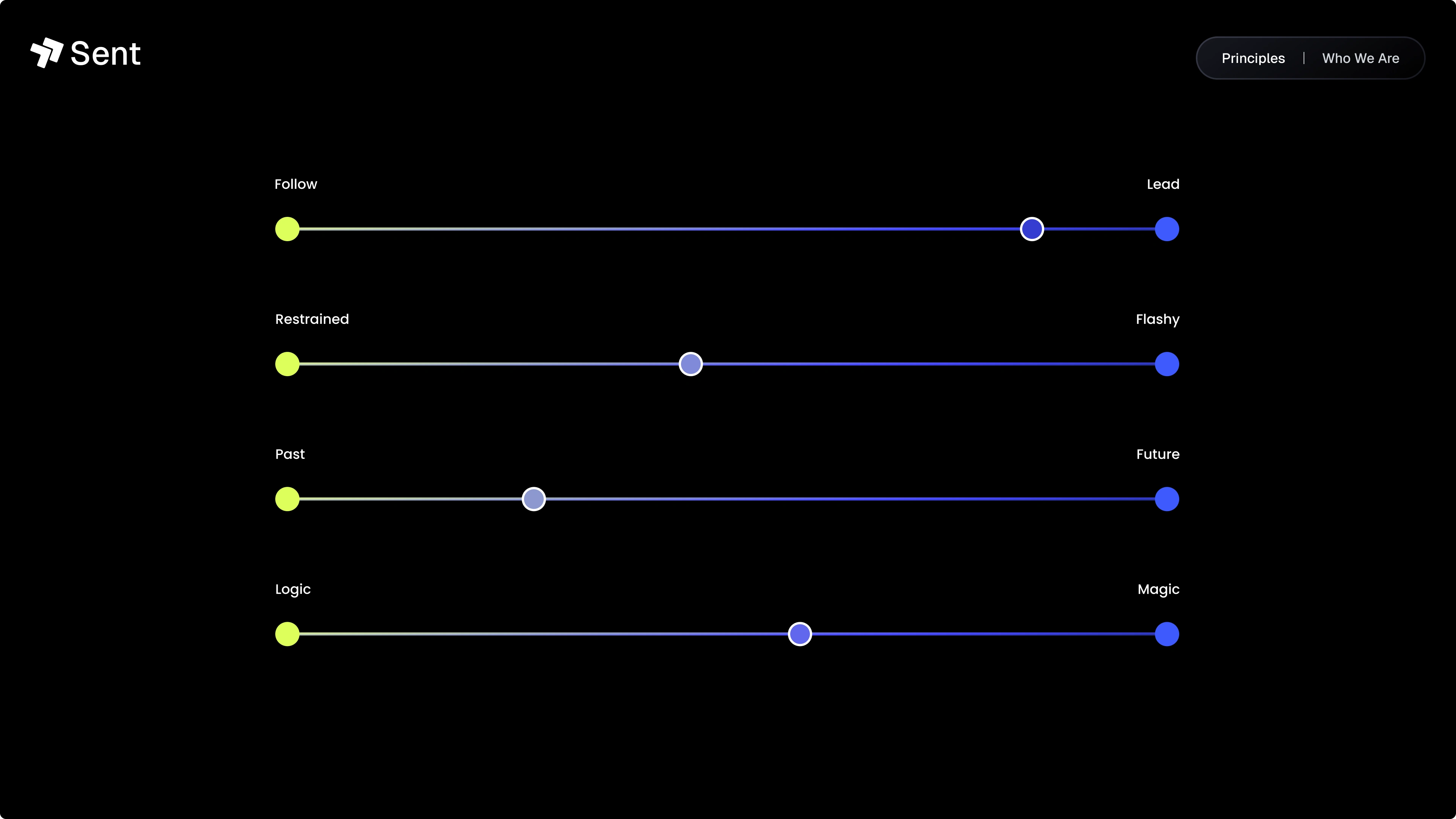
Voice & Archetype
Guide - confident, minimal, never hypey.
Explorer - asks “why not?” and chops blockers.
The rally cry we tattooed on the wall:
“Clarity that delivers.”
Act III - The Makeover
Identity Highlights (Swipe‑able Carousel in Final)
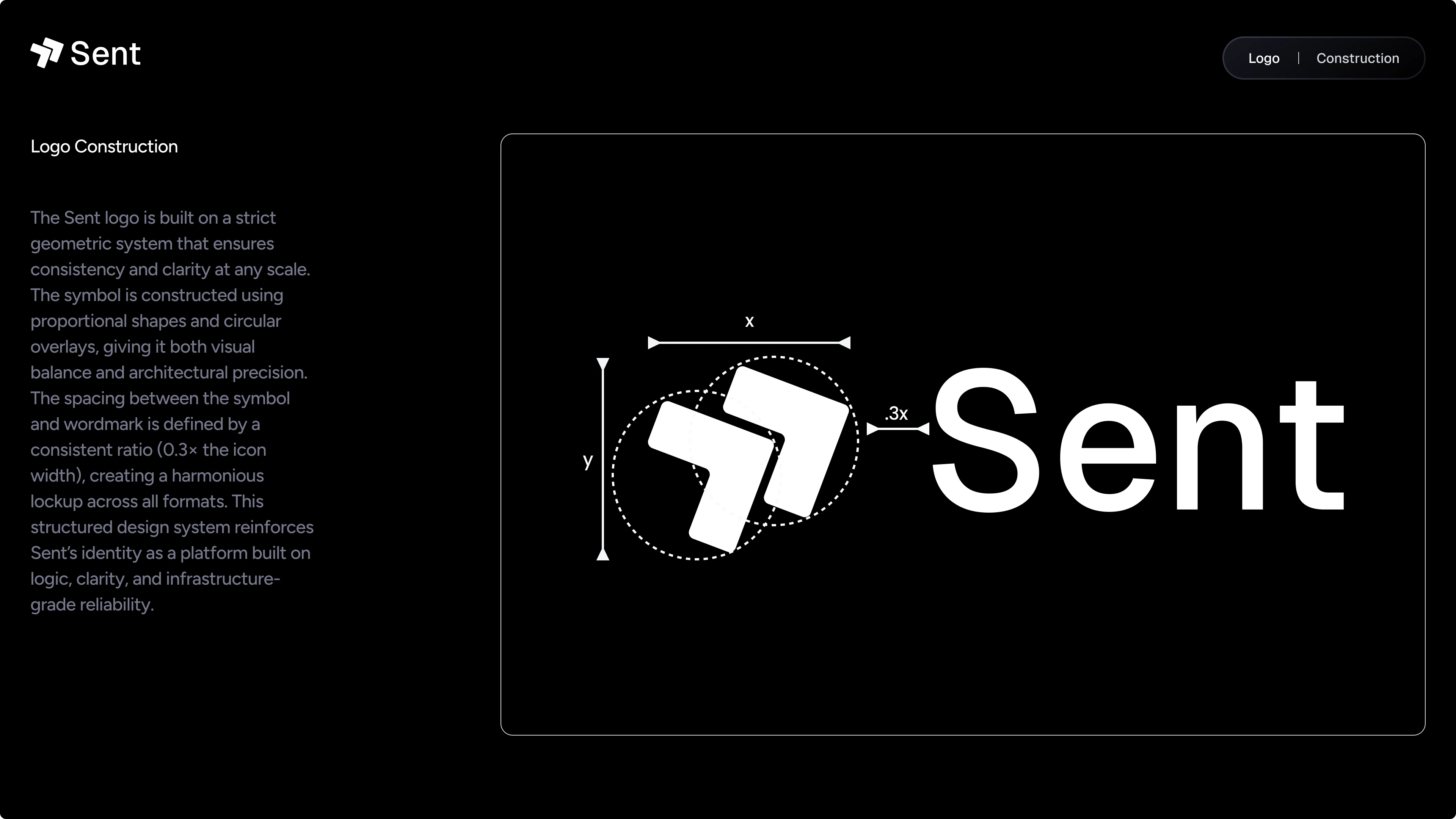
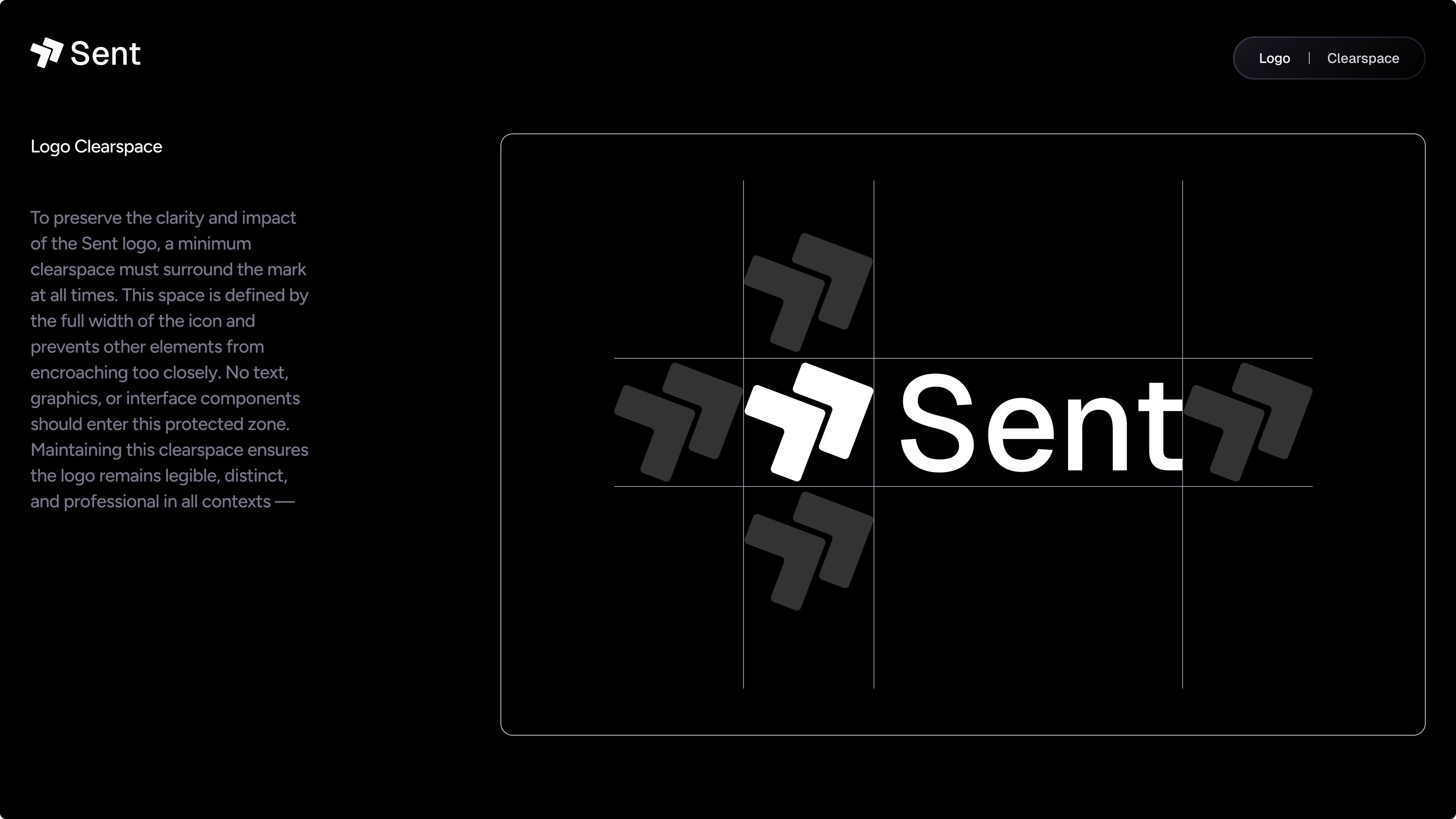
Logo: A tilted switchboard glyph - feels like motion, hints at routing logic.
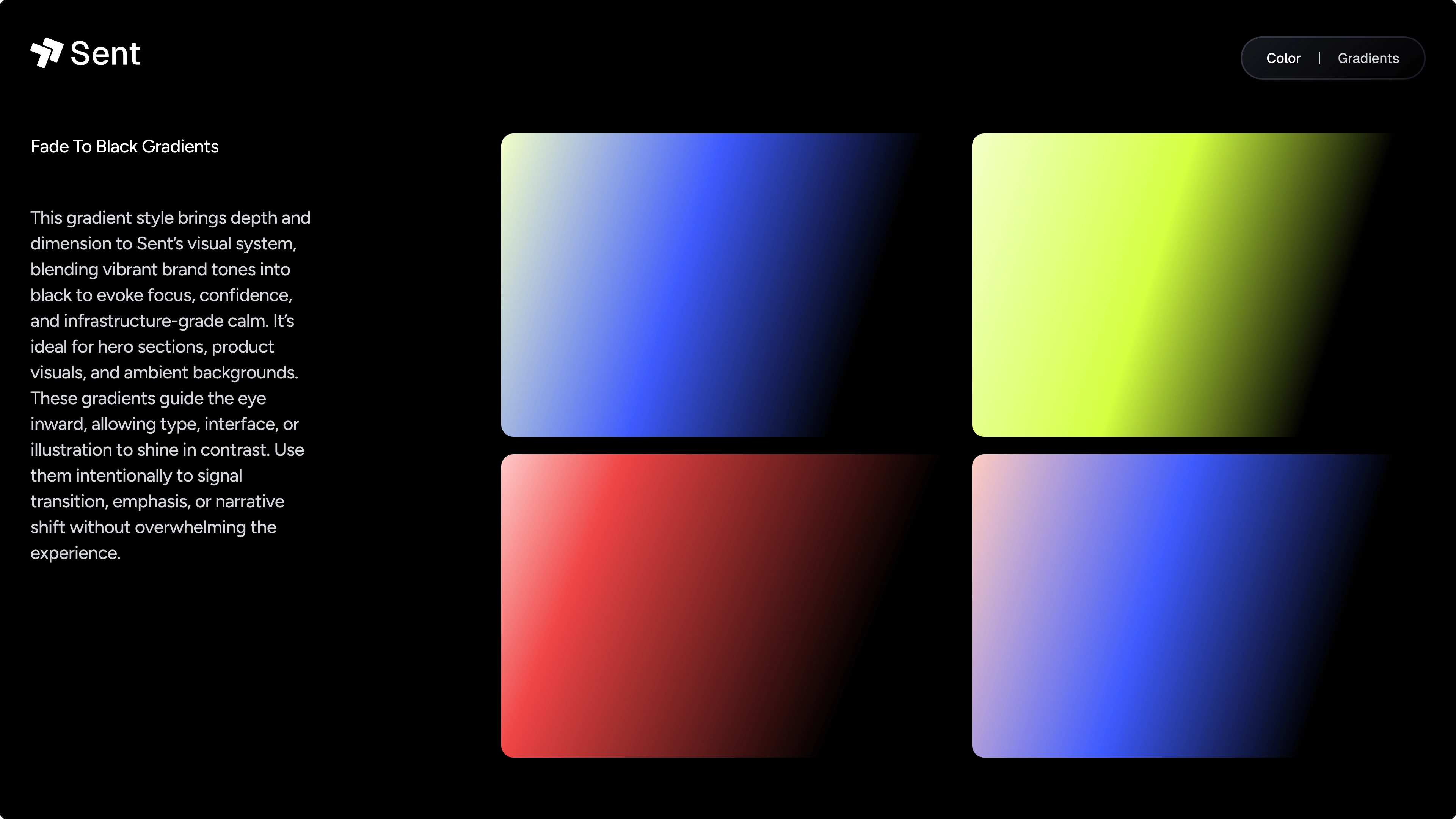
Palette: Electric Blue ↔ Charcoal ground wire; Lime Glow sparks for feedback hubs.
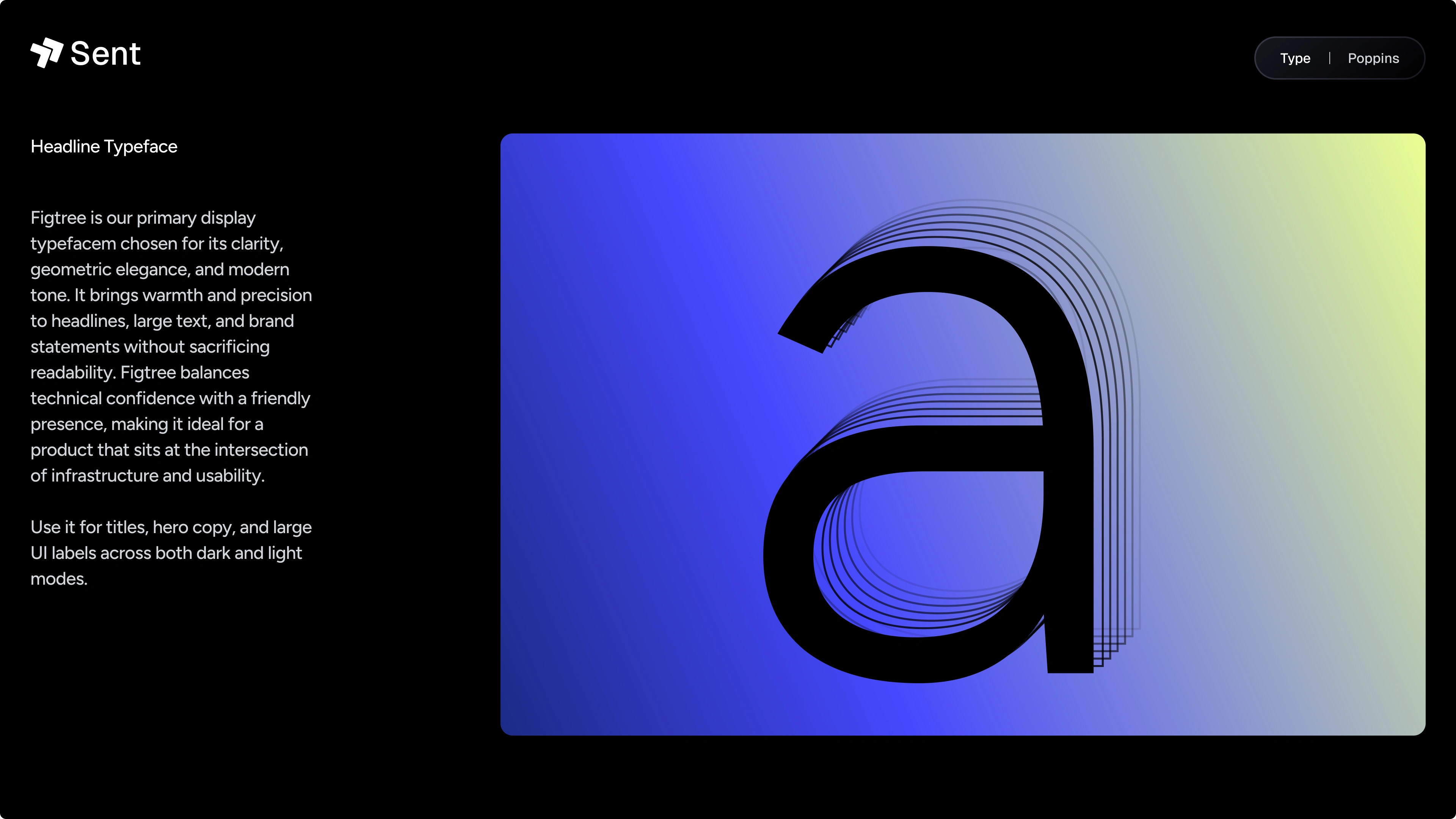
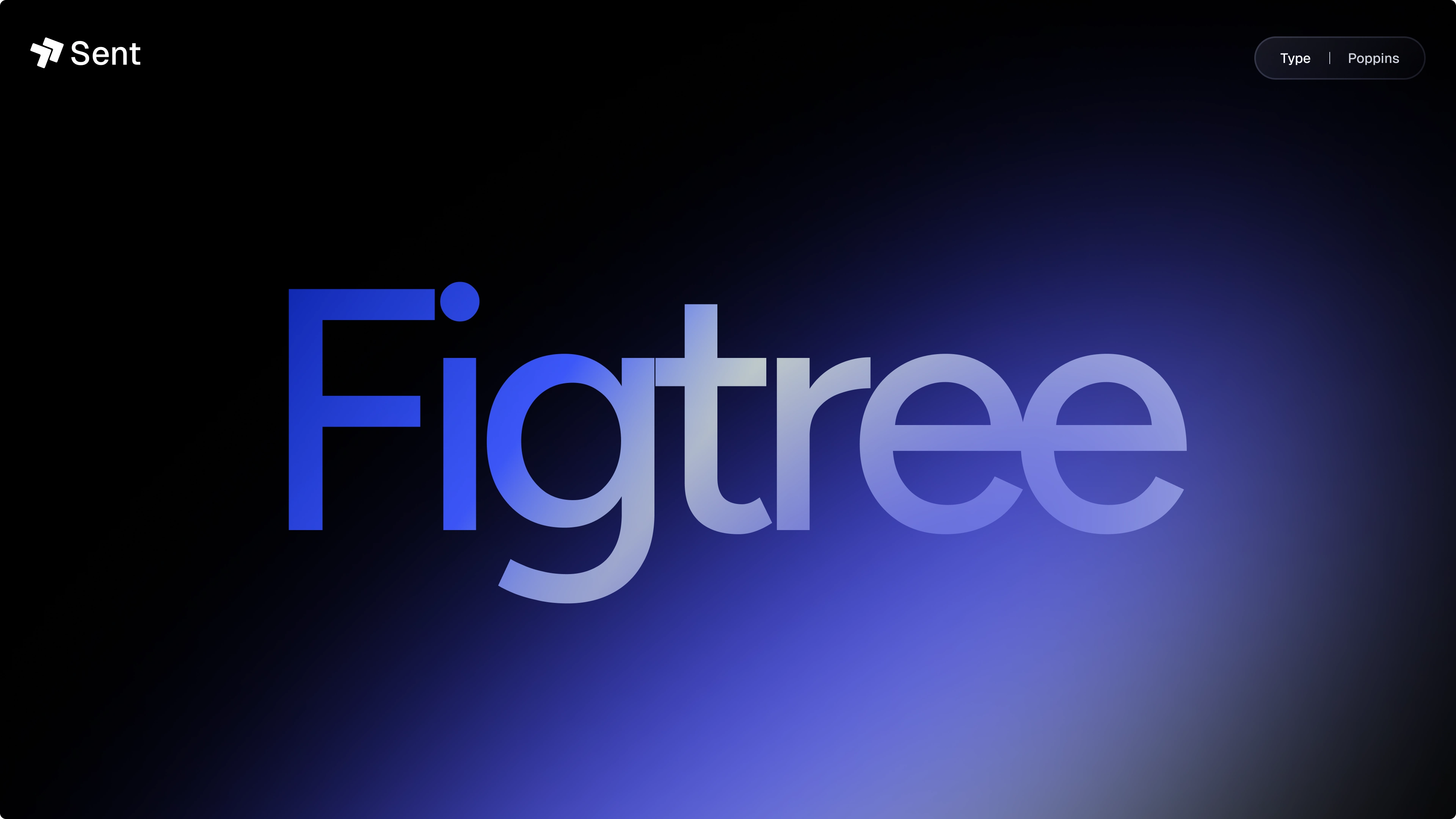
Type: Figtree headlines, Geist prose, Geist Mono snippets → code feels at home.
Texture: Glass blur + pixel grid - techy without cosplay.
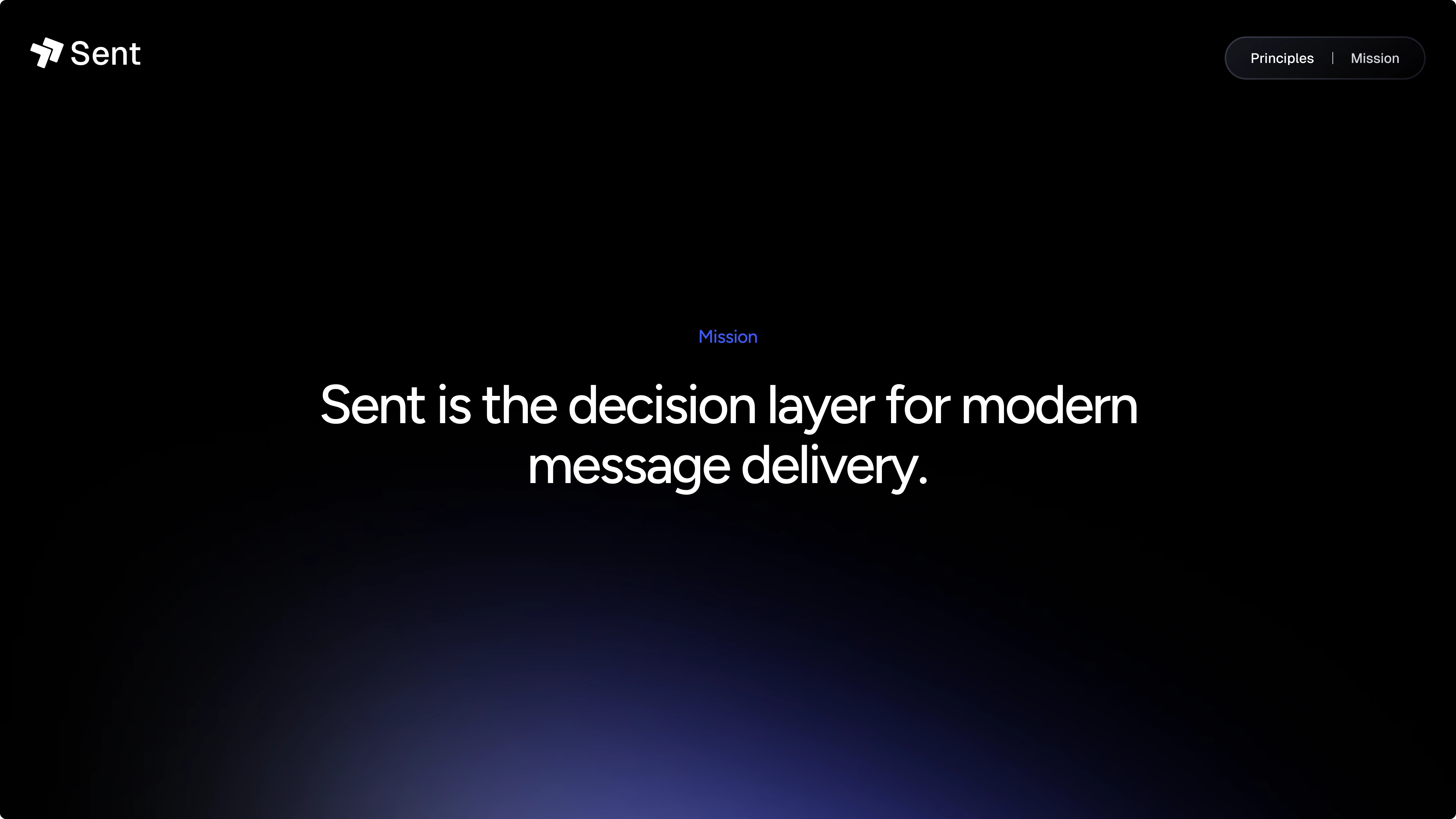
Mission Statement
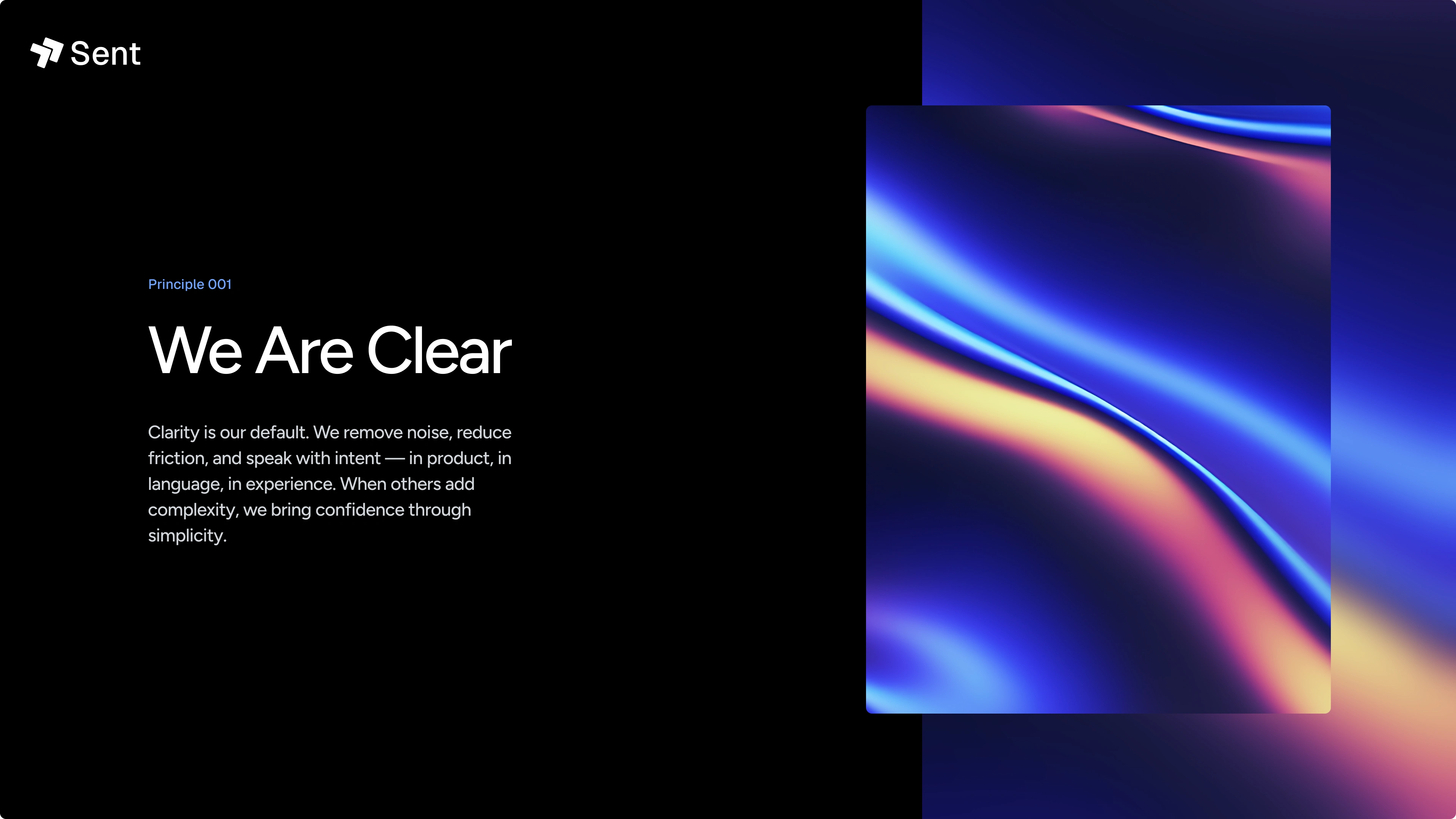
Principle 1
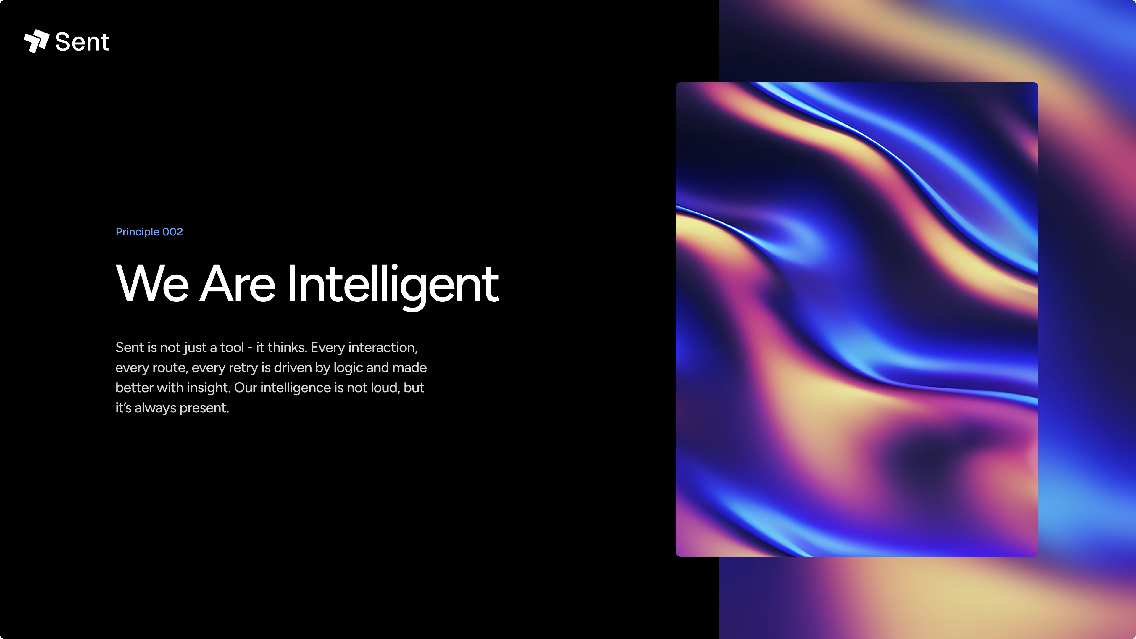
Principle 2
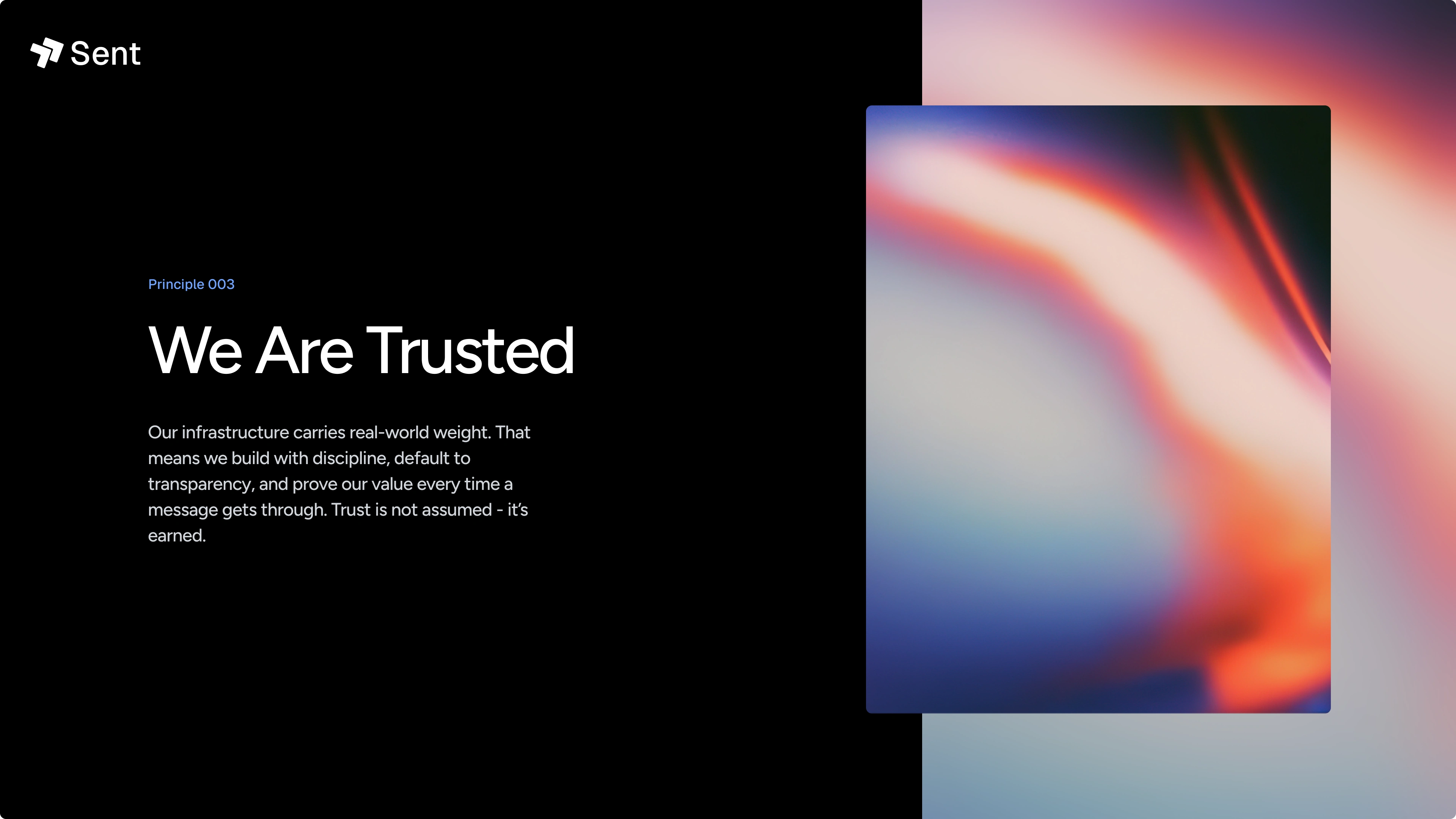
Principle 3
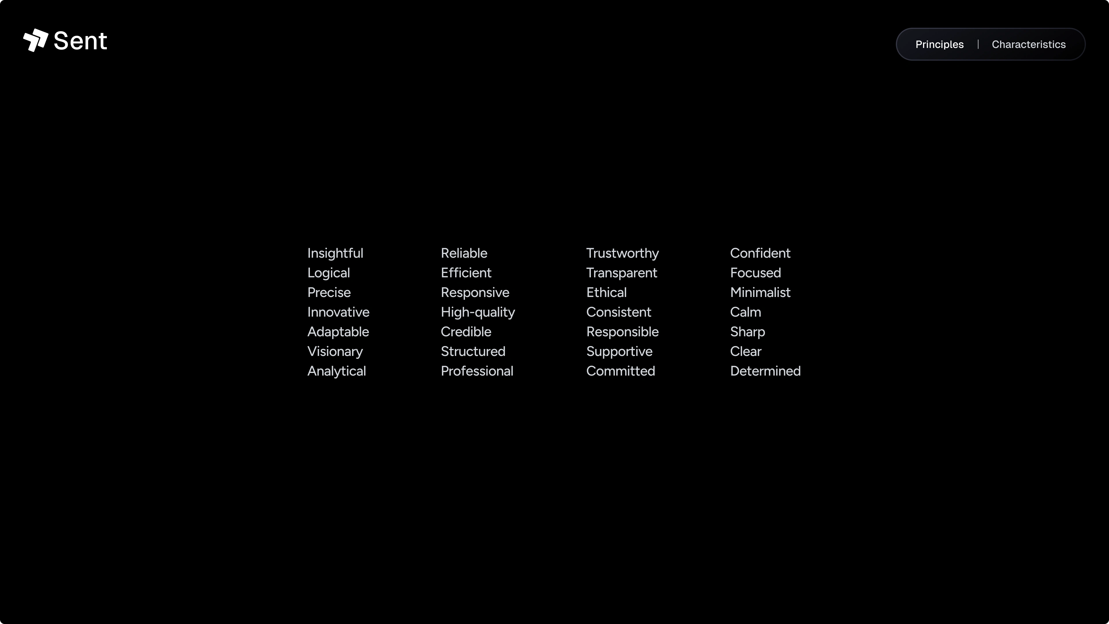
Characteristics
Who We Are
Logo
Logo
Fonts
Fonts
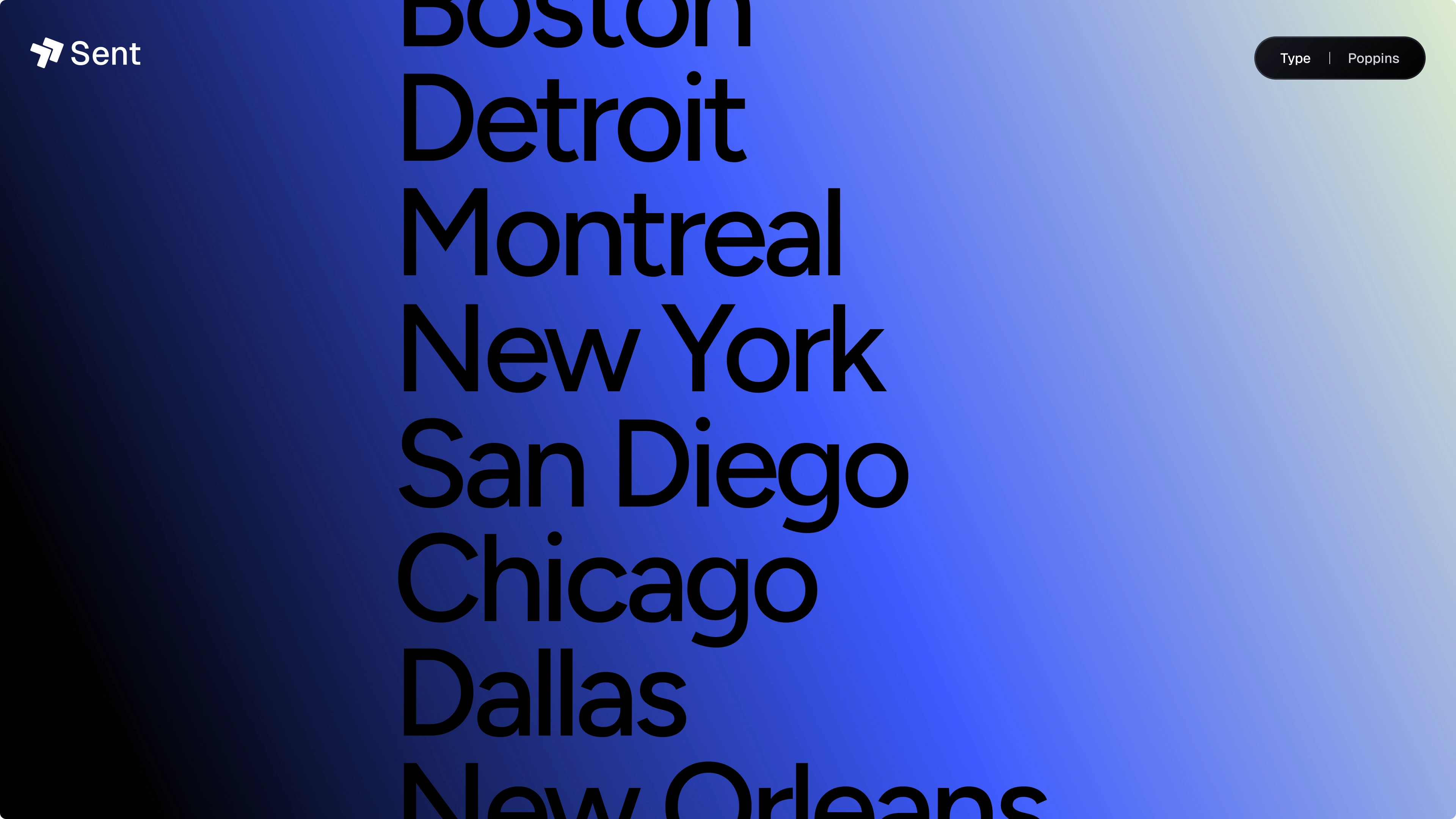
Fonts
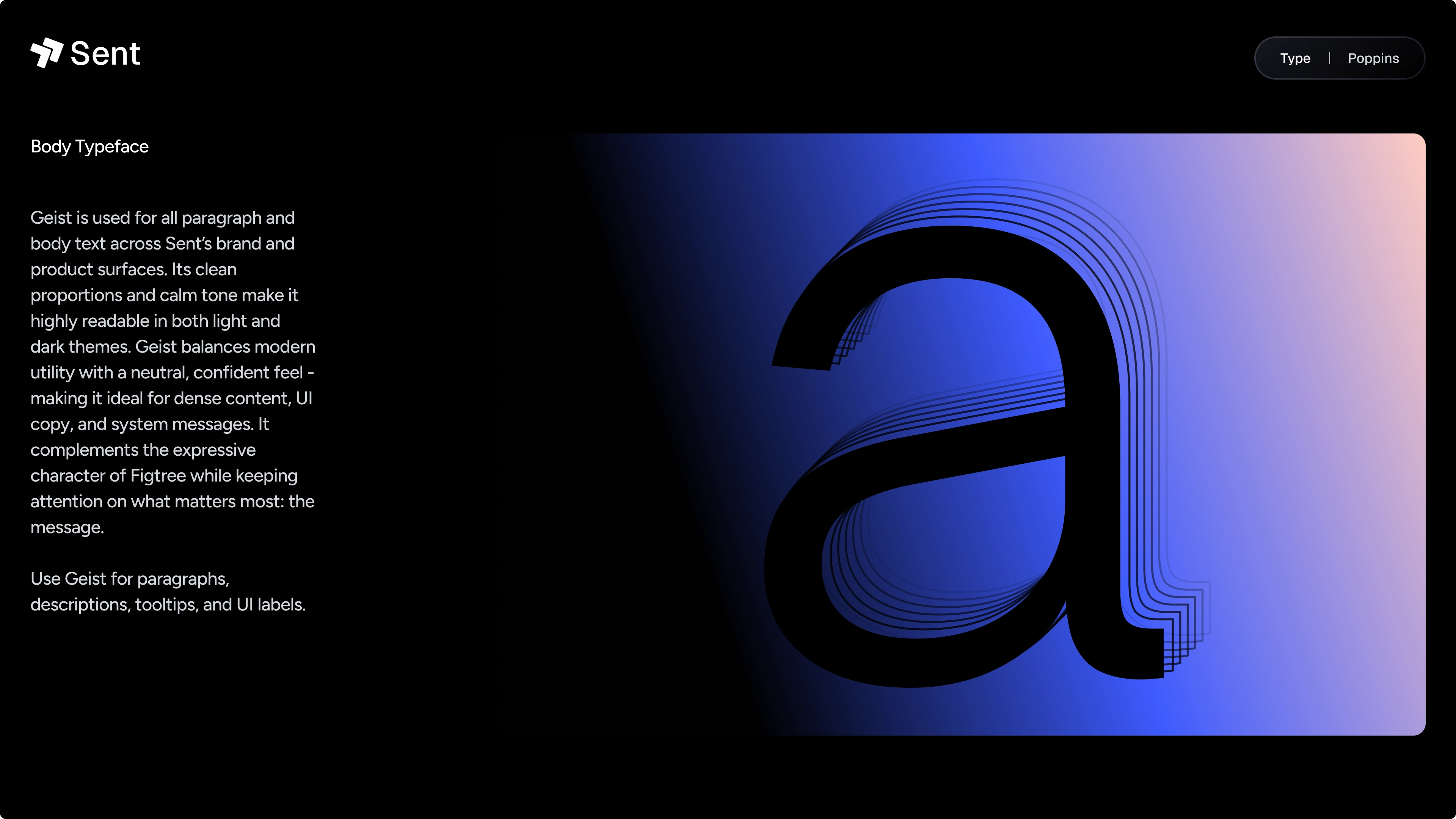
Fonts
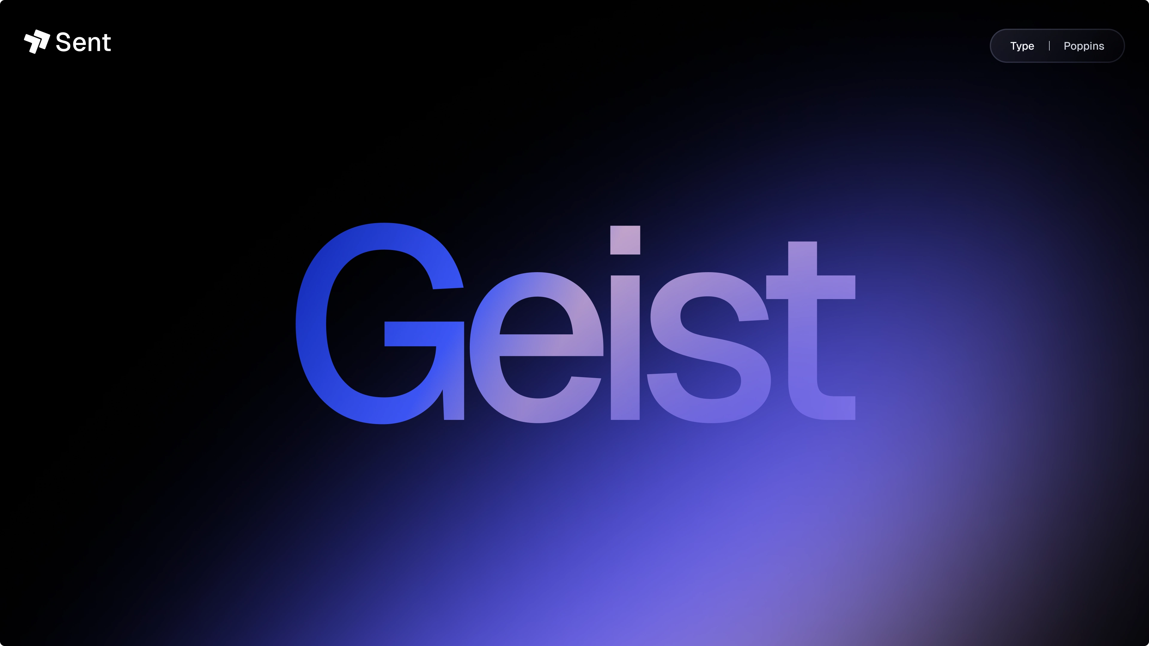
Fonts
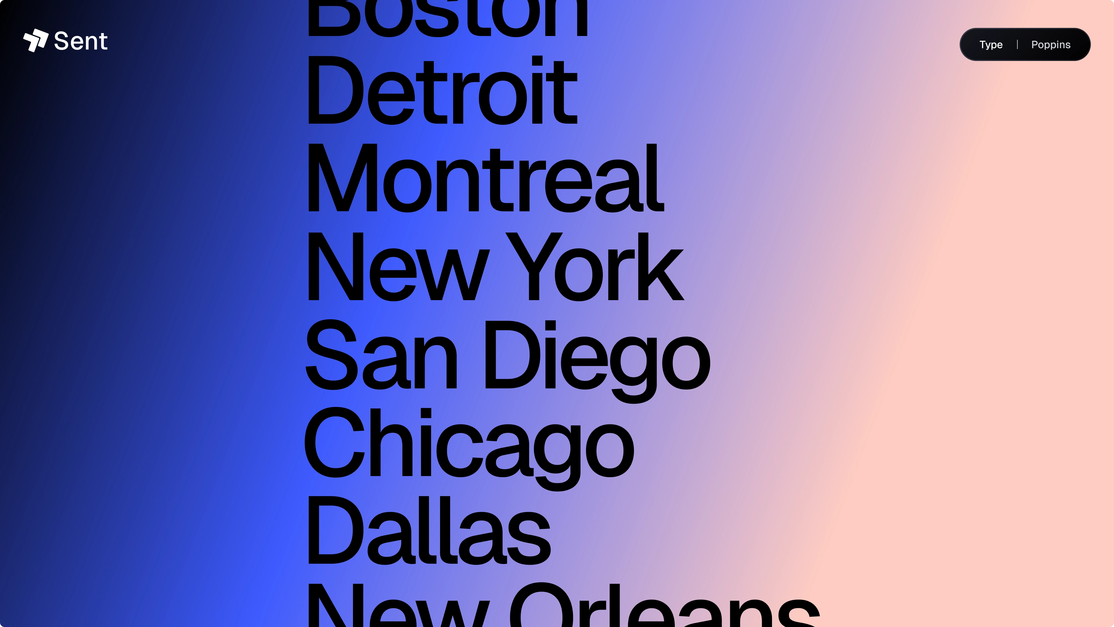
Fonts
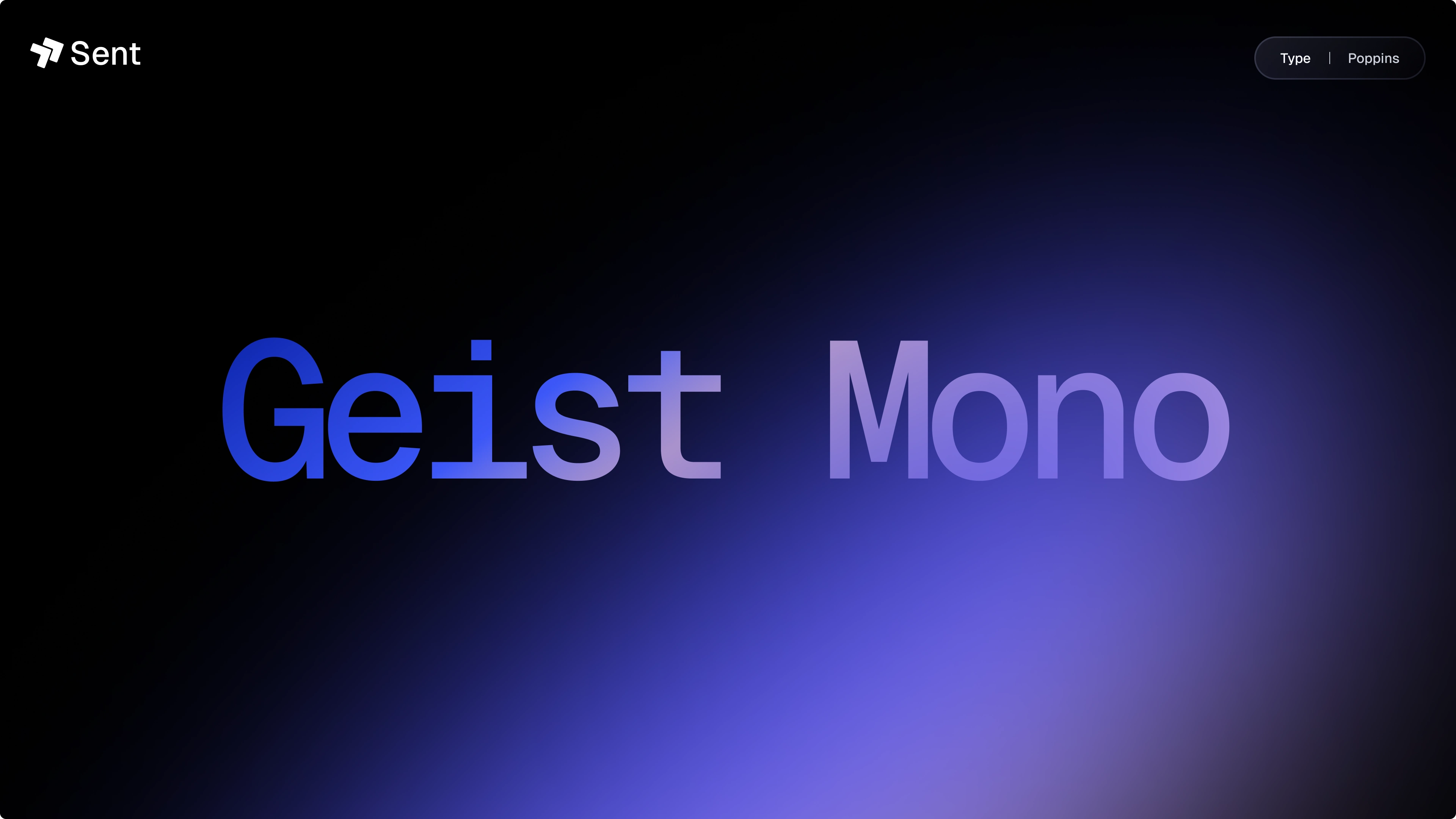
Fonts
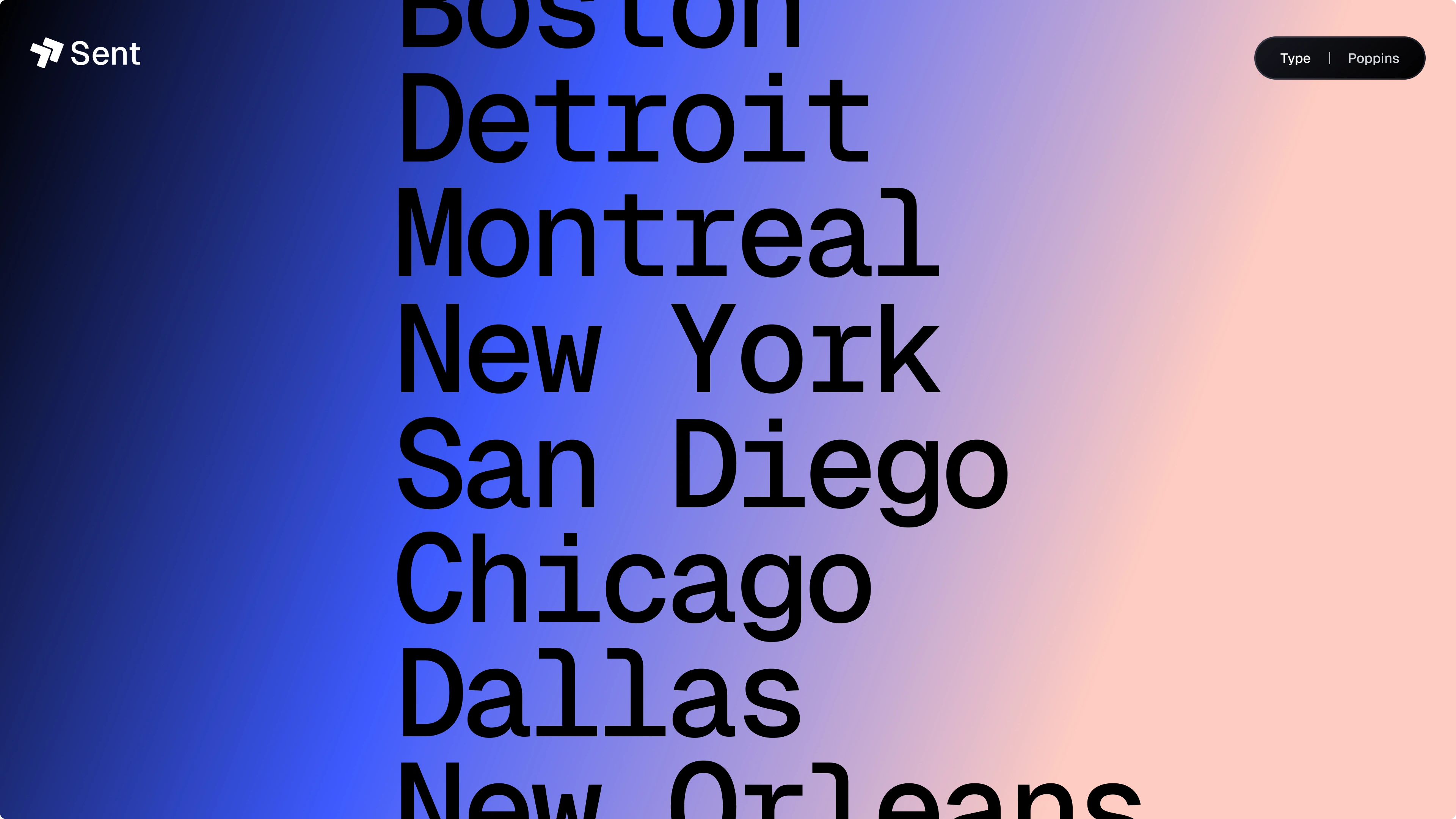
Fonts
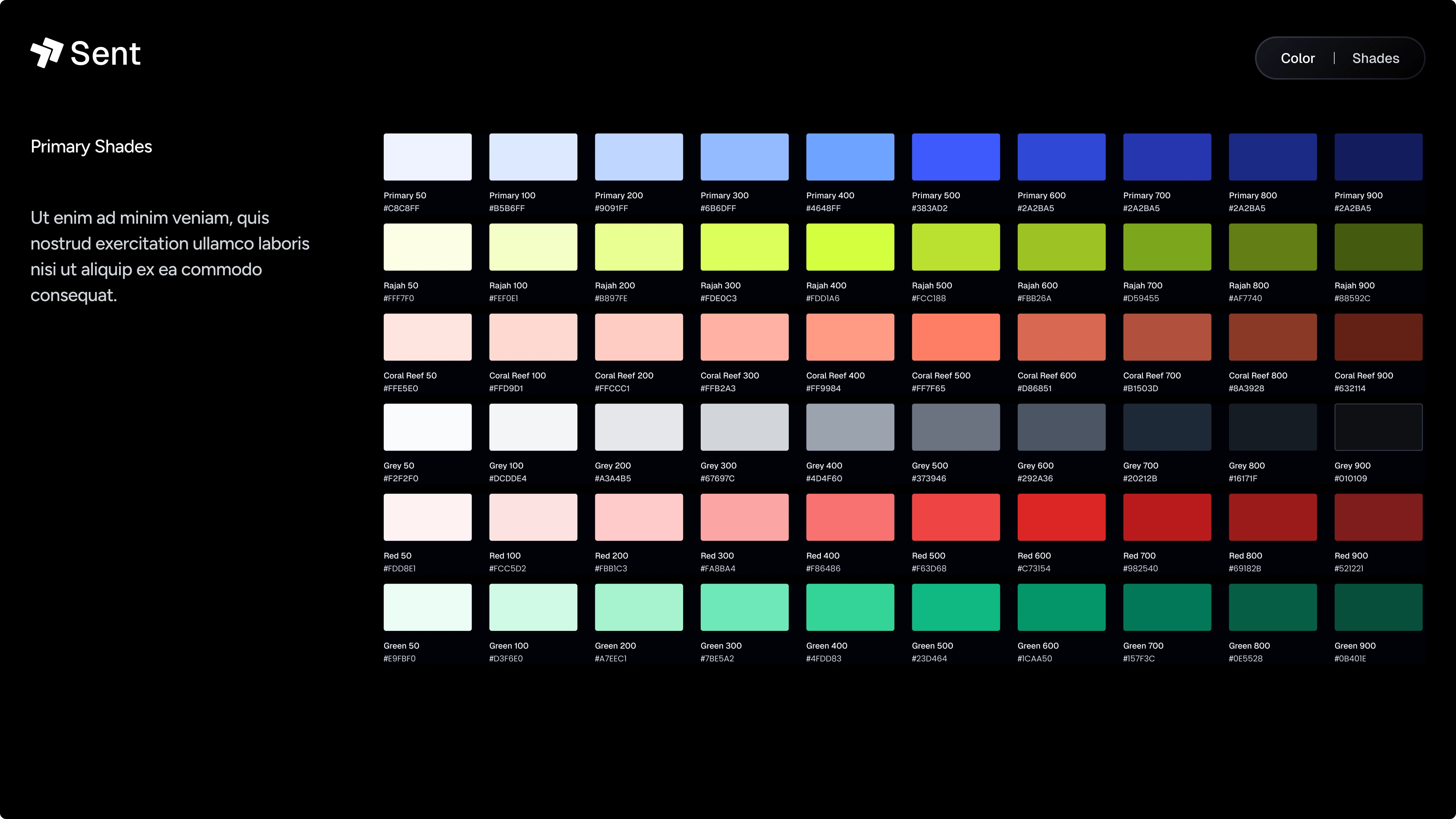
Colors
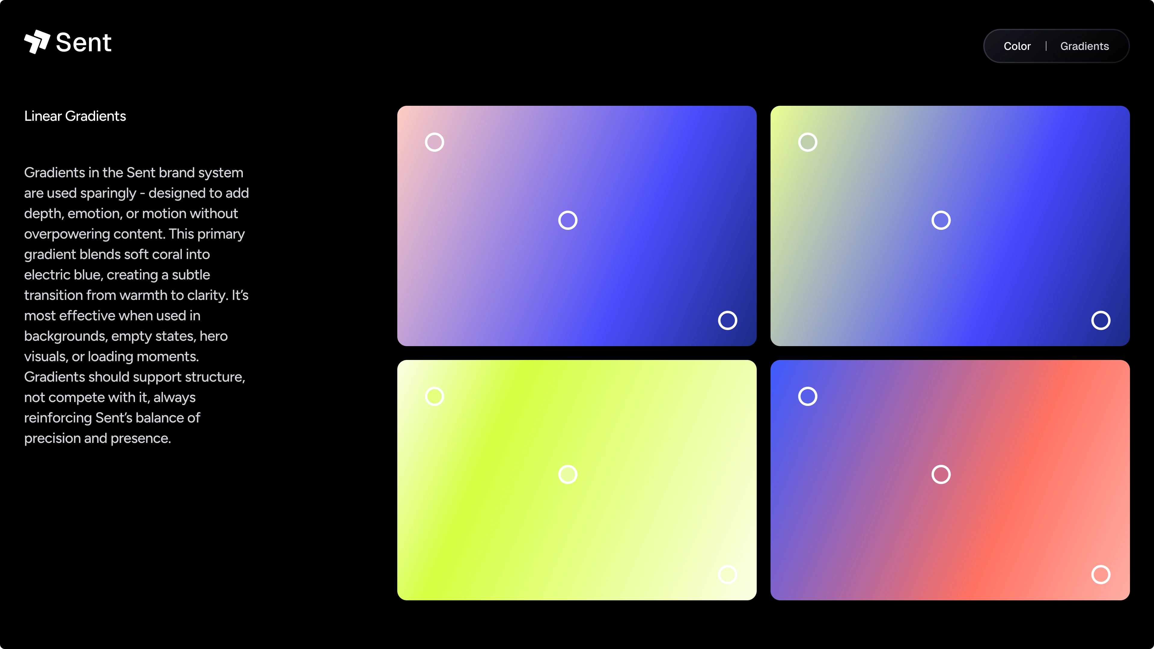
Gradients
Gredients
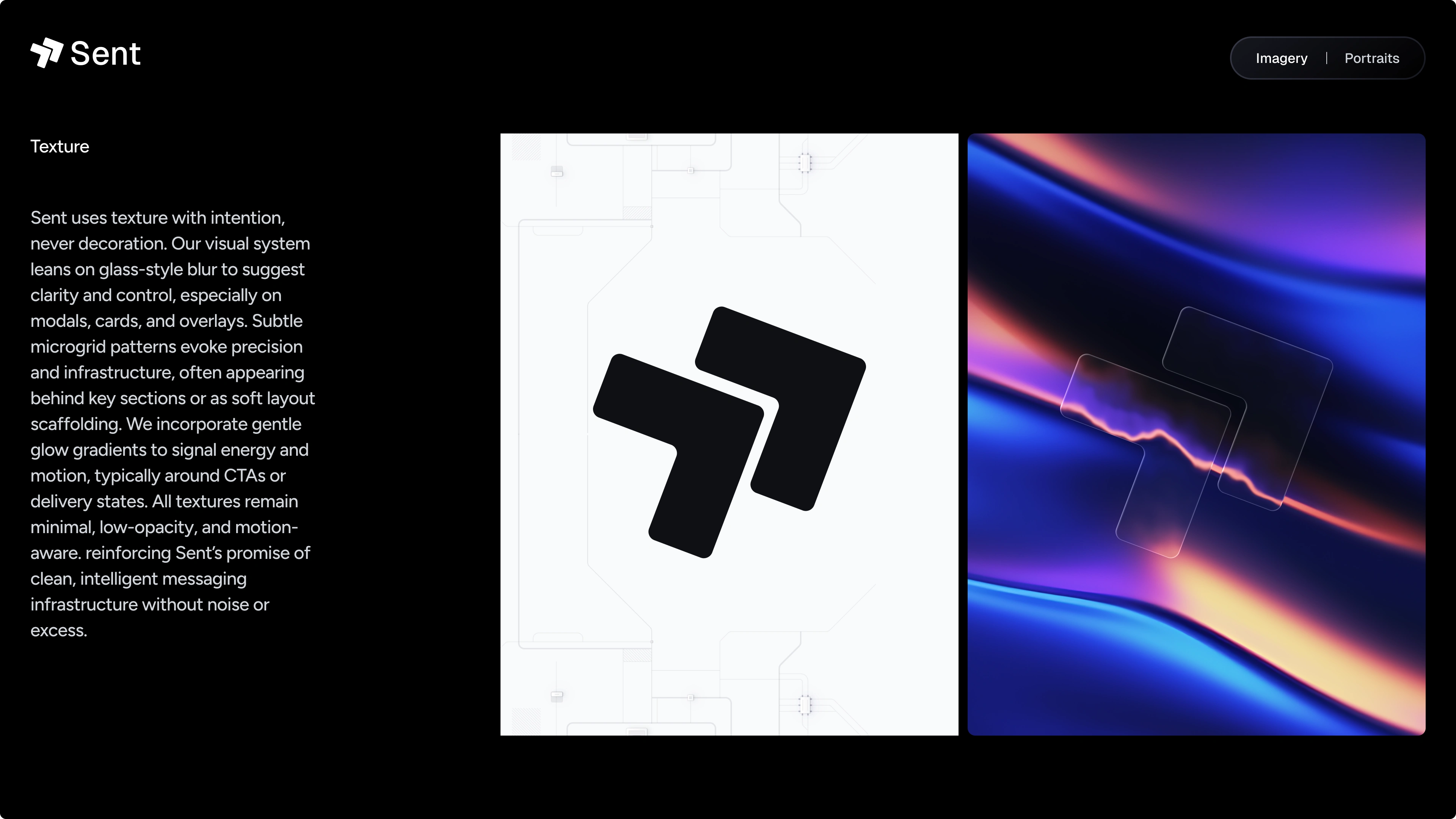
Textures
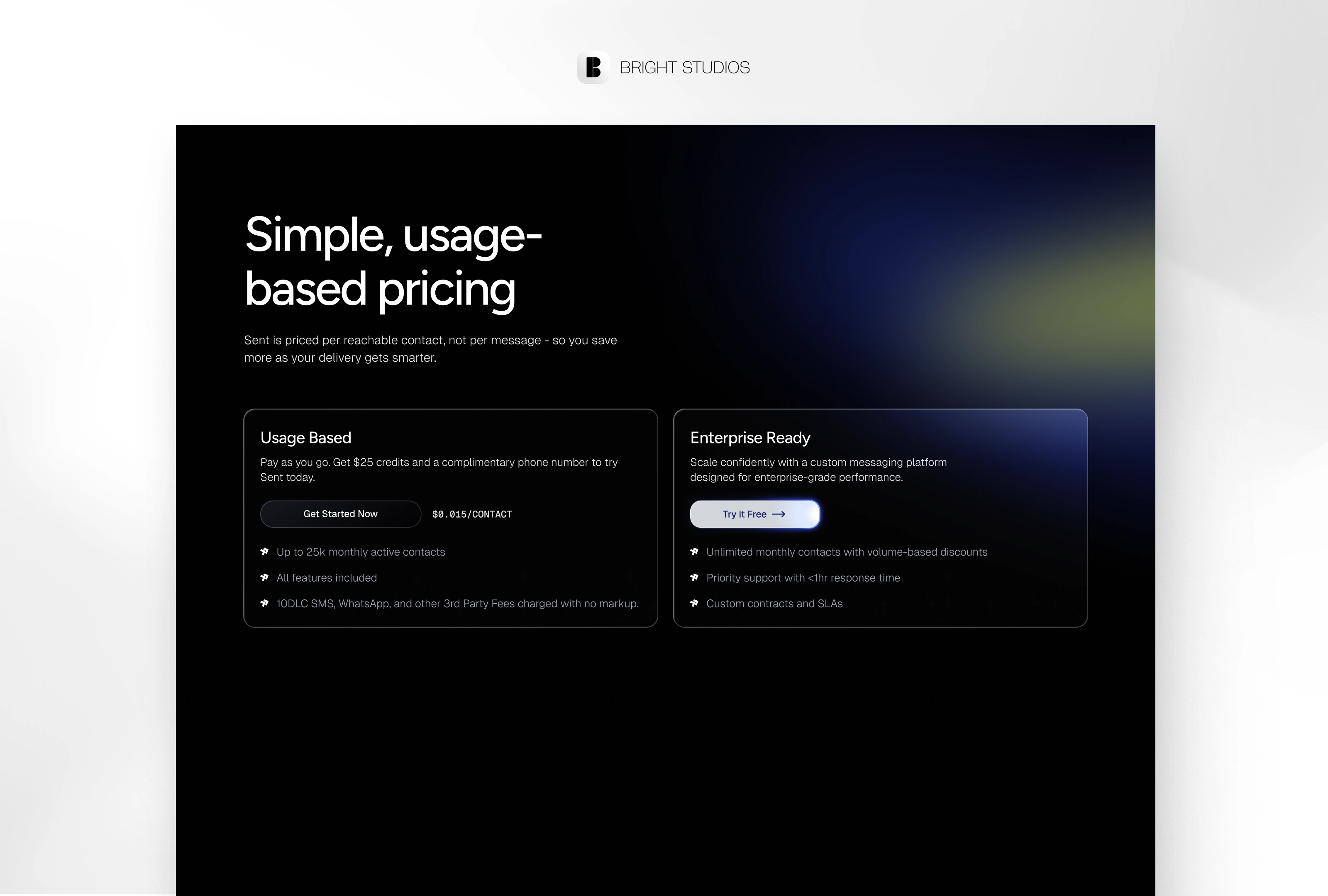
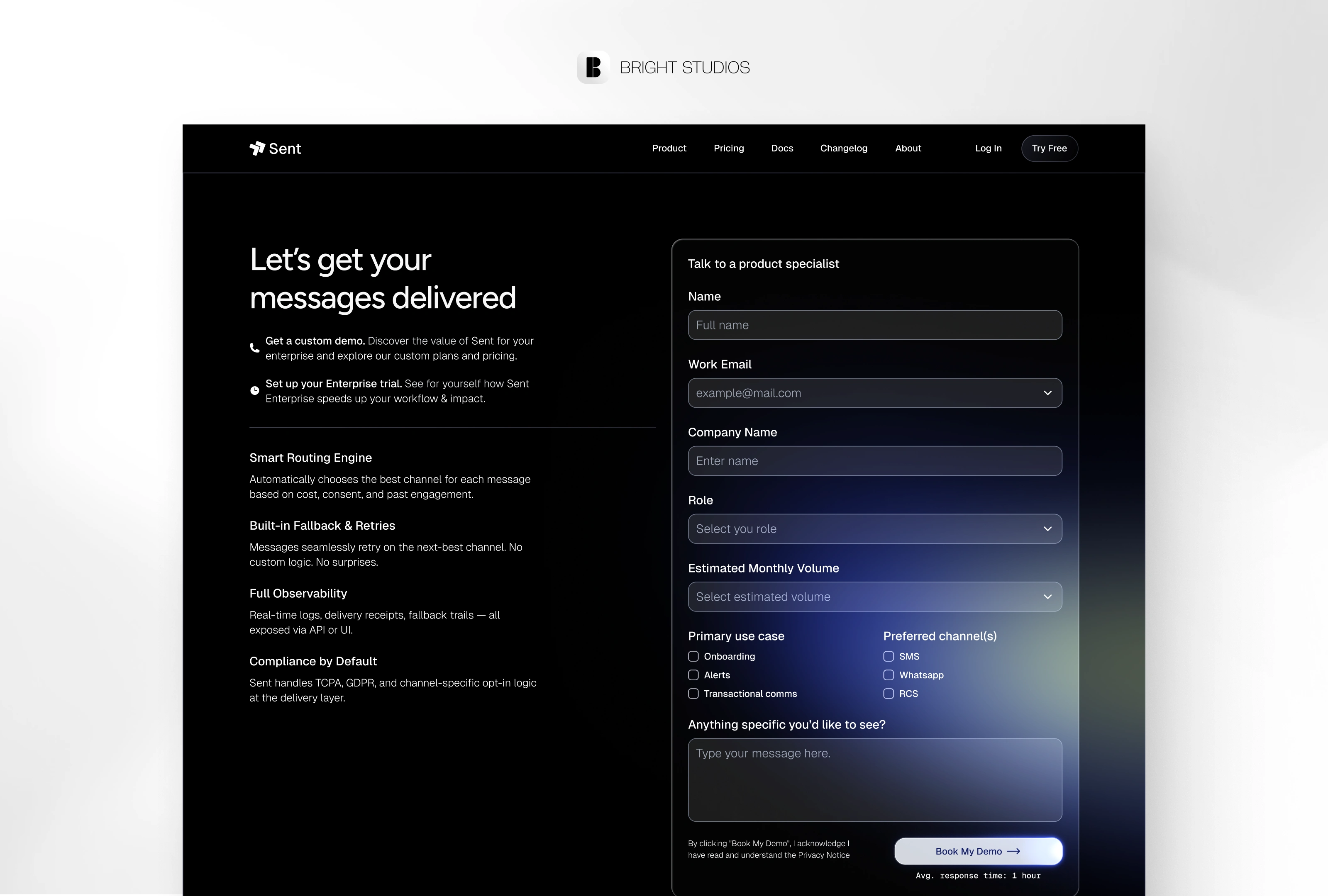
Web Experience (7 Pages, Infinite Delight)
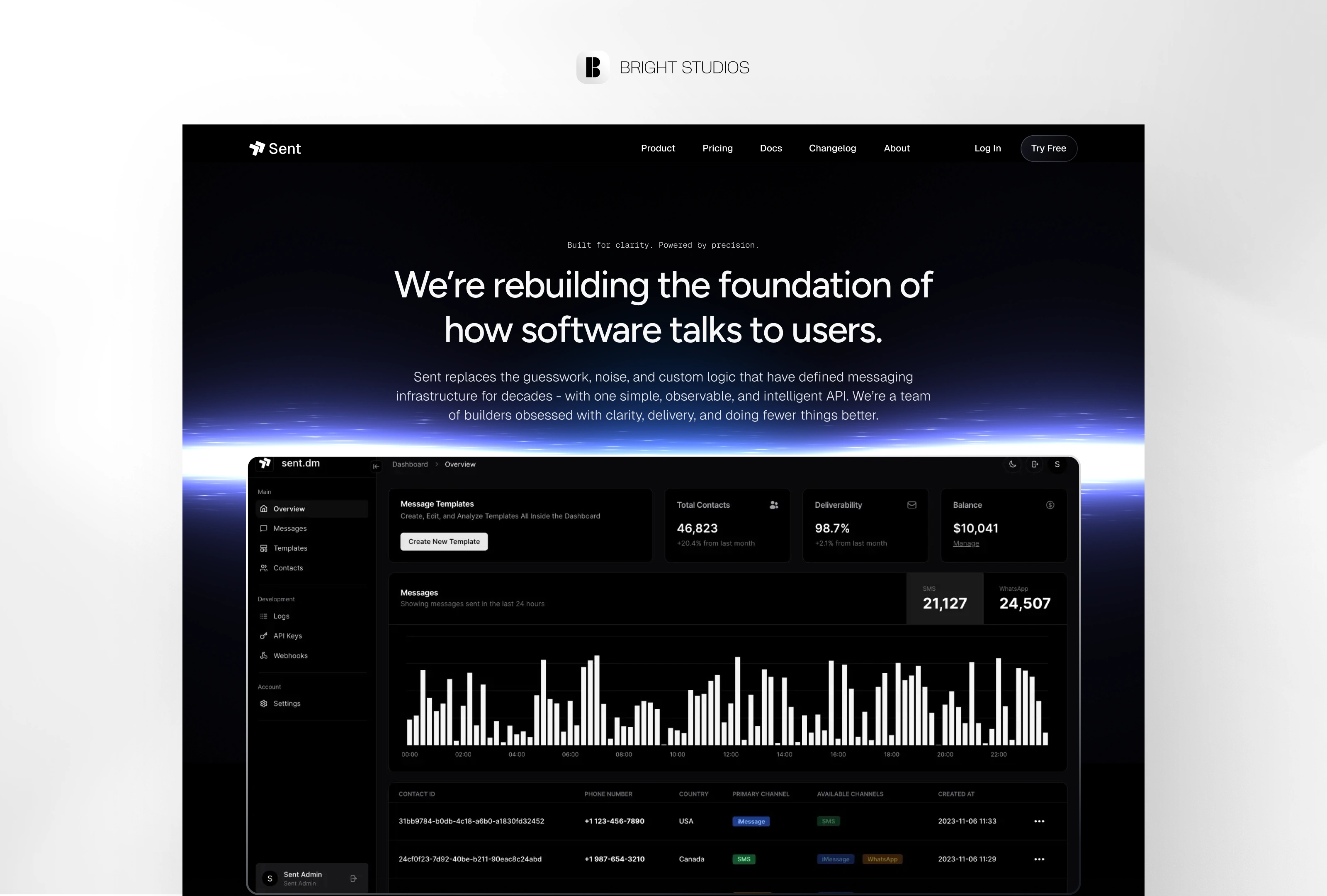
Home: Opens with a live code block actually hitting the Sent sandbox. Credibility bar rolls logos + latency stats.
Pricing: One toggle, two plans. Math animates in real‑time so finance teams stop emailing.
About: Founder story told comic‑strip style; a Slack GIF wall shows the culture beats.
Demo Request: Two‑step email first, use‑case second 80% faster than the old five‑field coffin.
Changelog: Markdown feed; each push animates a timeline dot like a commit graph.
Contact: Smart router sales, support, or “talk to an engineer” drops you in the right Slack channel.
404: “Message not found” types across the screen, then auto‑suggests docs.
Under the hood: Tailwind tokens, shadcn/ui components, Framer Motion specs, WCAG 2.2 AA, prefers‑reduced‑motion fallbacks. Design ≈ shipped code.
CMS Templates (Because Content Scales)
Feature/Use Case - Code left, story right. Switchable in Figma.
Blog Article - Reading bar + pull‑quote component for hot takes.
Blog Category - Color‑coded tags auto‑generate from slugs.
Case Study - KPI infobar, testimonial carousel, result sparkline.
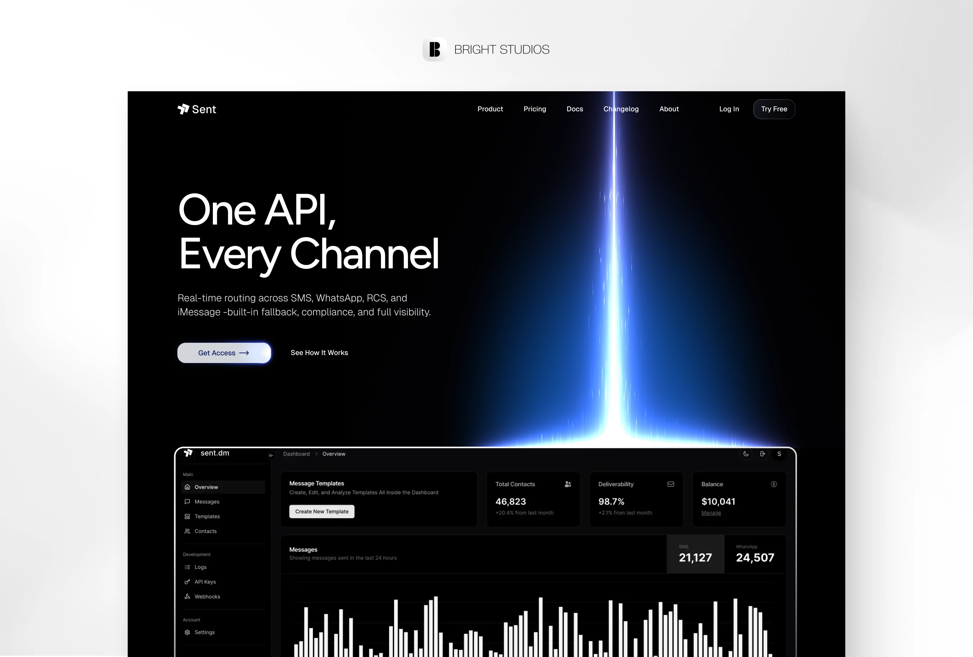
Homepage
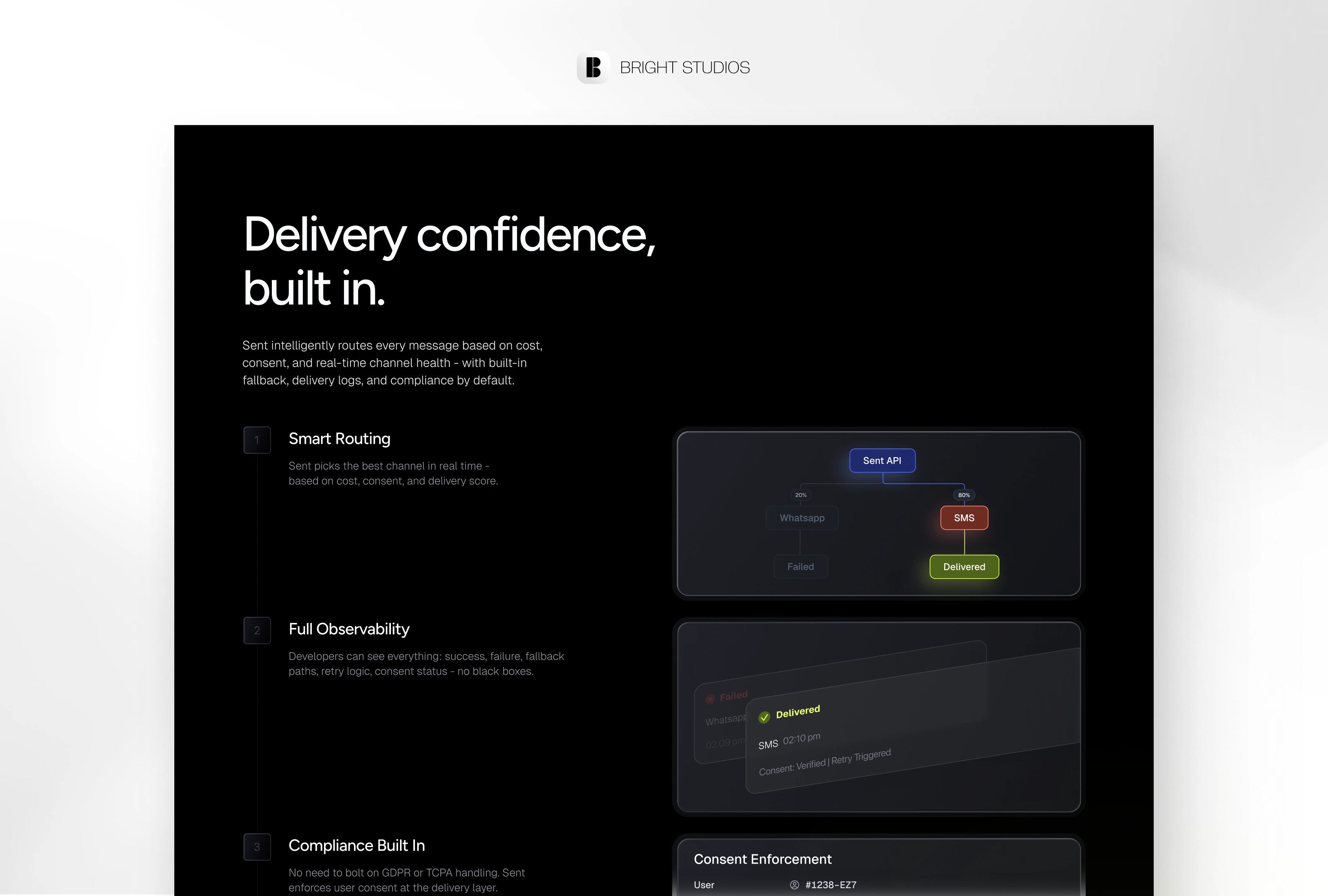
Homepage
Homepage
Homepage
Pricing
Book a Demo
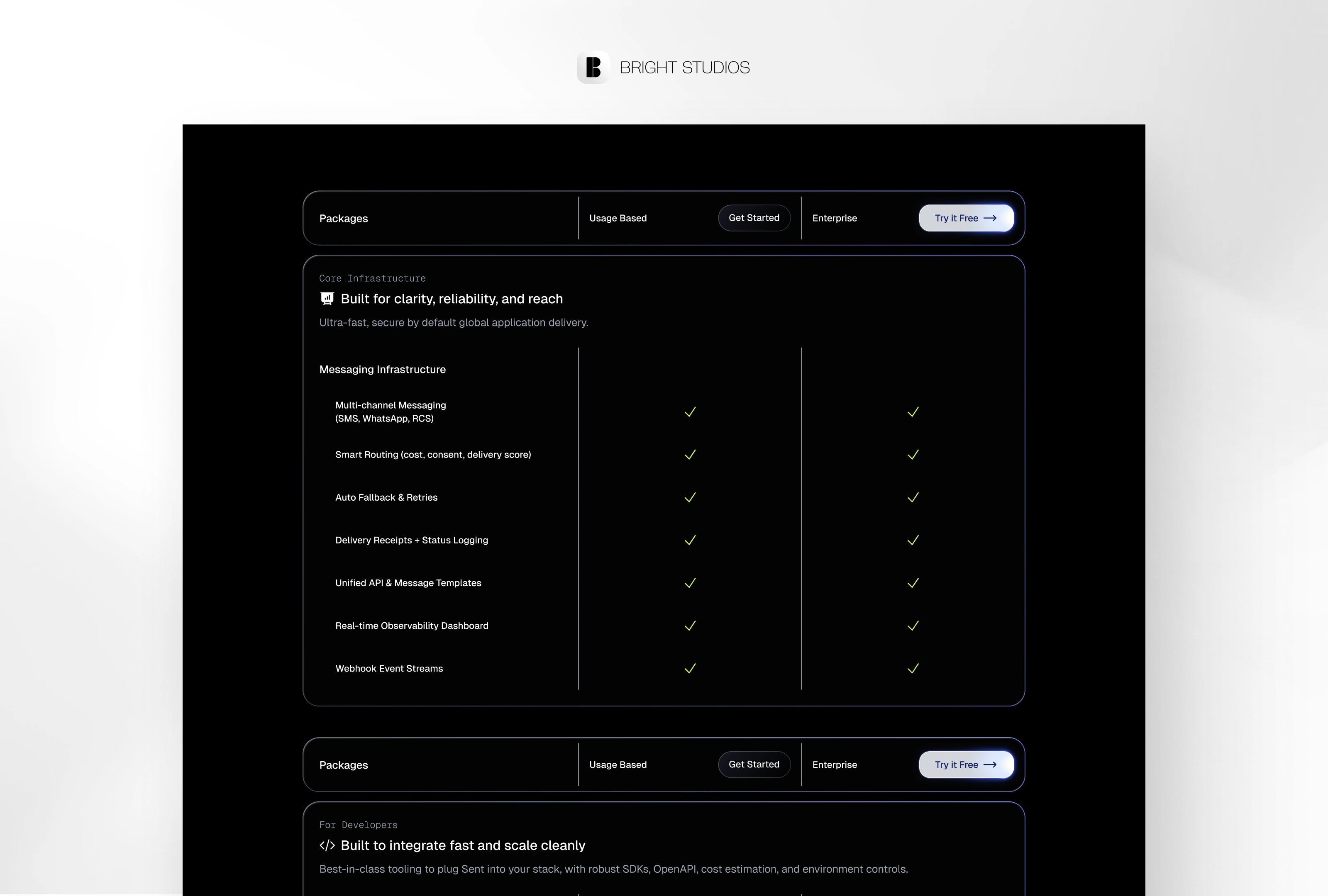
Packages
Features
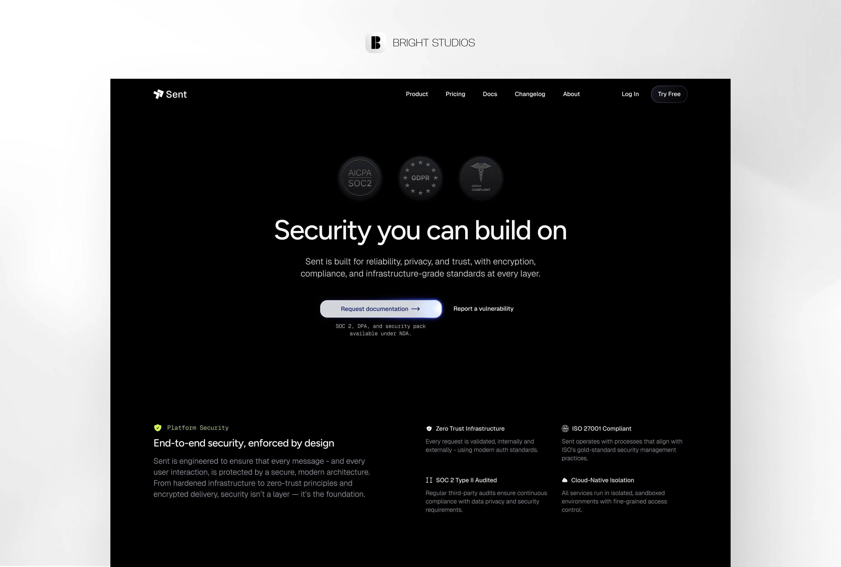
Security
Homepage Animation
404 Animation
Features Animation
Act IV — Handoff & Hype
We wrapped every frame in Auto‑layout 5, exported JSON tokens, and recorded a 7‑minute Loom so Sent’s devs could ship without a single Slack ping. Zero‑guess handoff.
Credits
Strategy, design, copy, motion - Daniel G. Bright / Bright Studios
Client - Sent (NYC)
Epilogue - What I Learned
Docs ≠ Marketing. Merge them and devs stick around.
Color restraint > color splash. Hold neon for moments of delight.
Show the sandbox. Nothing sells an API like watching it fire live.
Like this project
Posted Aug 2, 2025
Brand identity + dev-first site for Sent: one API, every channel - clarity, speed, and dev-ready specs built in 42-day sprint shipping signal strength.
Likes
31
Views
1K
Timeline
Jun 5, 2025 - Aug 18, 2025
Clients
Sent