Built with Framer
The AdGency • Bold Redesign & Framer Build
Approve request to show earnings
View
Daniel G Bright
Verified
Project Overview
When Bernhard from The AdGency approached me, he had just gone through a rough experience with another designer who failed to capture the essence of the brand he was trying to build. He wanted a fresh start — a website that not only looked sleek and professional but also captured his agency’s bold, creative energy. That’s where I came in.
The Mission
The AdGency is a marketing and branding agency targeting business owners who want to level up their brand and bring in more clients. The goal of the website was crystal clear:
Create a strong new visual identity
Build trust with potential clients
Drive consultation bookings and close deals
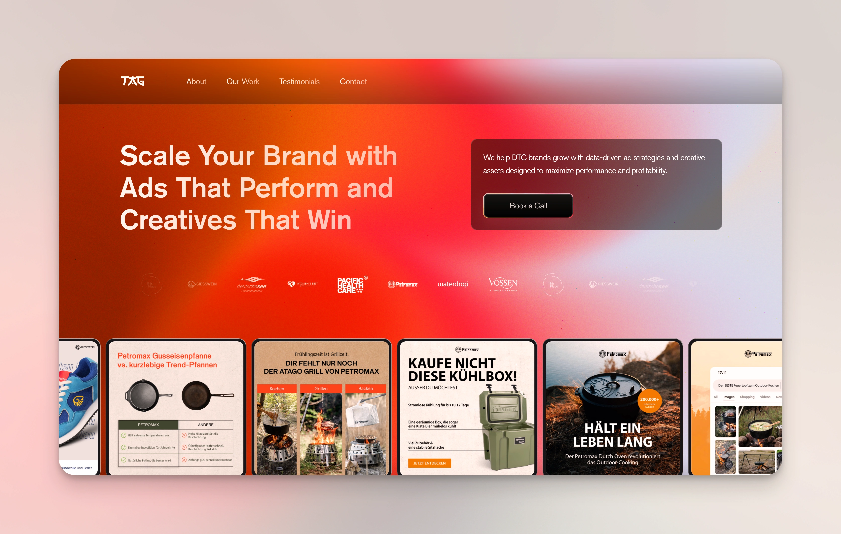
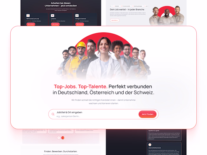
Hero Section
The Process
Bernhard already had a rough brand identity in place — some ideas, colors, and a general direction. My job was to take that and shape it into a living, breathing digital presence. Together, we defined a look that was both:
Sleek and bold – think sharp like a samurai sword.
Armored with personality – dark tones paired with bright, eye-catching colors that feel professional but still punchy.
We collaborated closely throughout the process — two rounds of feedback and constant communication that honestly felt like a great partnership from day one. There was trust, clarity, and a mutual goal to make something awesome.
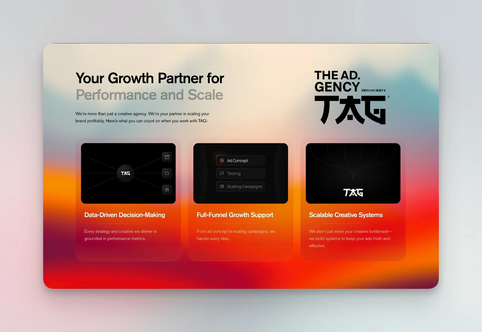
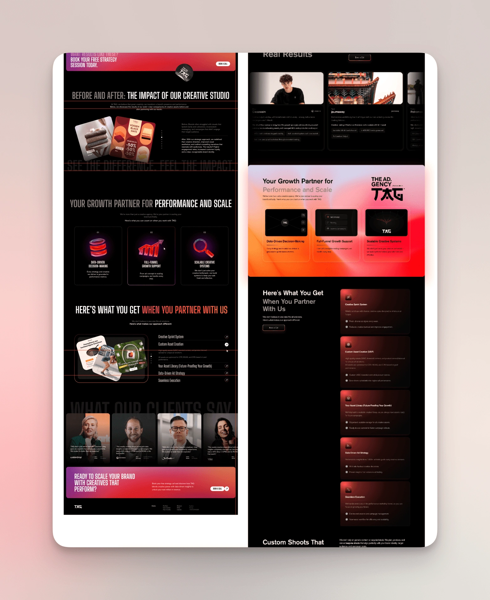
My Favorite Section
Design & Build
I designed and developed the entire site in Framer, focusing on:
A strong hero section to grab attention right away.
Clearly outlined services and a compelling case study section.
CMS integration for dynamic content like policies and case studies.
Clean transitions and a bold UI that stands out without being overwhelming.
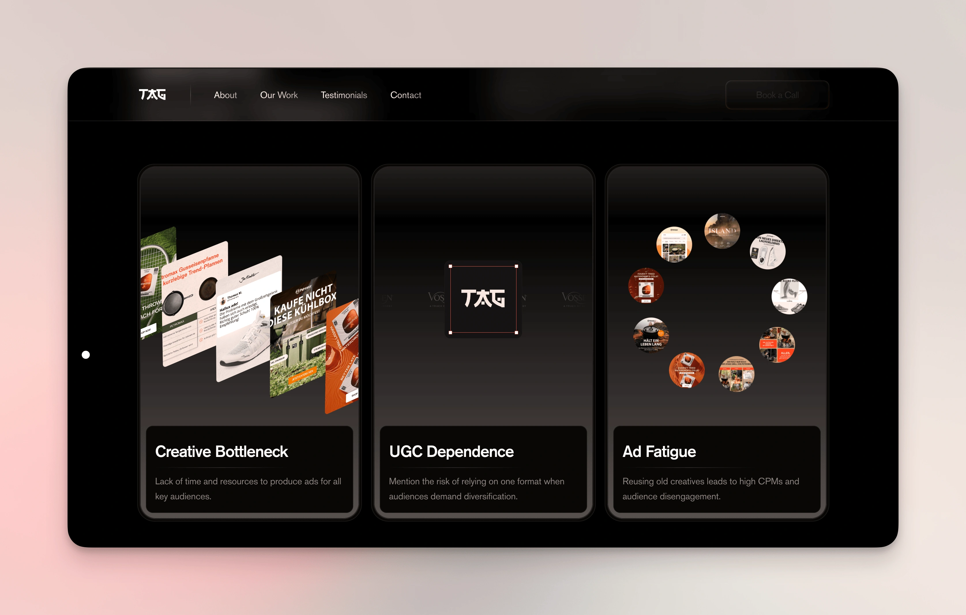
Features
Design Breakdown
Once we had the brand direction nailed — bold, sleek, and subtly aggressive in a samurai-meets-modern-marketing kind of way — the visual language followed naturally.
We used a clean, dark-toned base to give the site a premium feel, and layered it with high-contrast accent colors for energy and attention. Think: sharp typography, bold statements, and layouts that slice through the noise (pun intended). The goal was clarity with punch.
Subtle animations and transitions were used to create a sense of flow — like the brand is always moving, always pushing forward. We wanted the experience to feel dynamic without being flashy.
From a structural side, everything is modular and scalable. Whether it’s the case studies or the blog section, the CMS setup allows for smooth content management and future expansion without needing a rebuild.
Before & After
Before we started, the AdGency had already tried working with another designer. Unfortunately, the result didn’t reflect the agency’s true identity — it was too basic, lacked edge, and didn’t capture their personality or strengths.
The old site felt generic and flat. It didn’t convert, it didn’t feel premium, and it definitely didn’t feel like a brand built for modern marketing leaders.
Our redesign changed that. We made the website feel like the AdGency: sharp, confident, and high-converting. It’s now a place that not only tells their story — it shows it.
From the first screen to the contact form, the site now supports their core goals: booking calls, closing deals, and making the brand unforgettable.
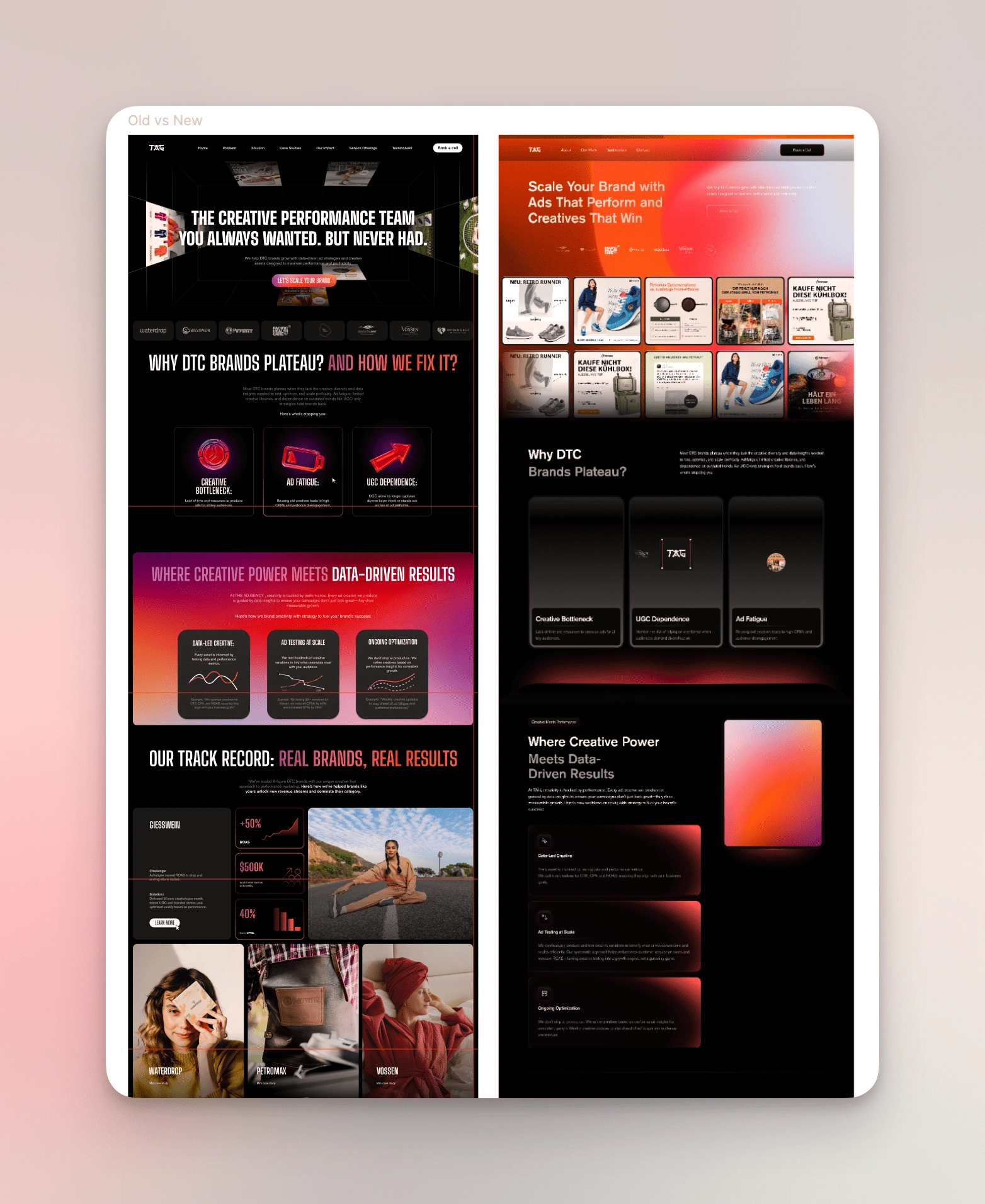
Old vs New 1
Old vs New 2
Timeline & Delivery
Originally, the timeline was more open-ended — but we ended up wrapping everything up almost a month early. The project only took three weeks from start to finish, which was a win for both of us.
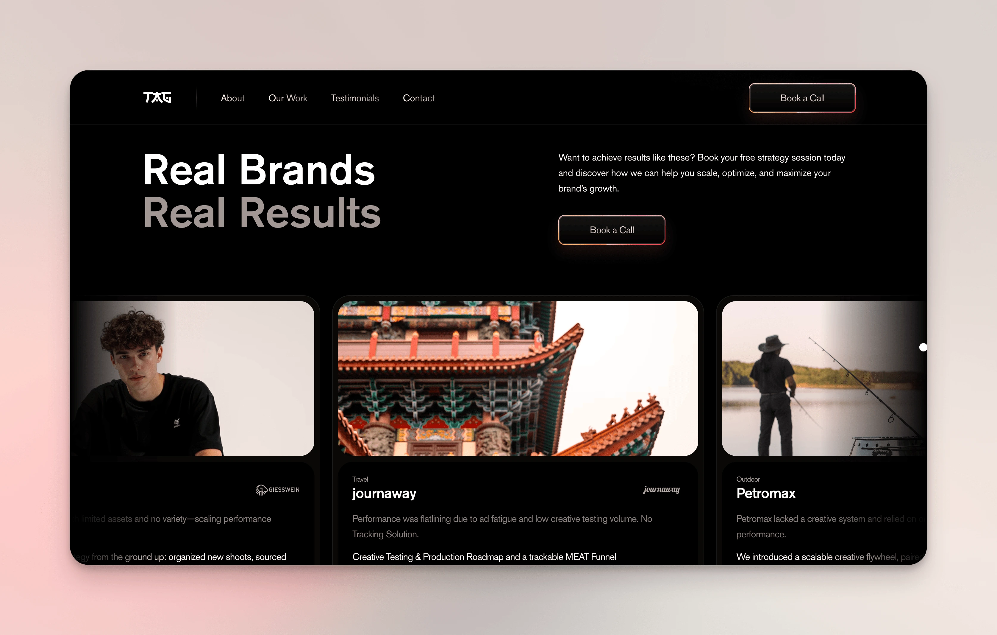
Case Studies
Results
While it hasn’t officially launched yet, the internal feedback has been amazing. Bernhard was super happy with how it all turned out — and honestly, so was I. After everything he’d gone through with his previous designer, it meant a lot to give him a site he was proud to show off.
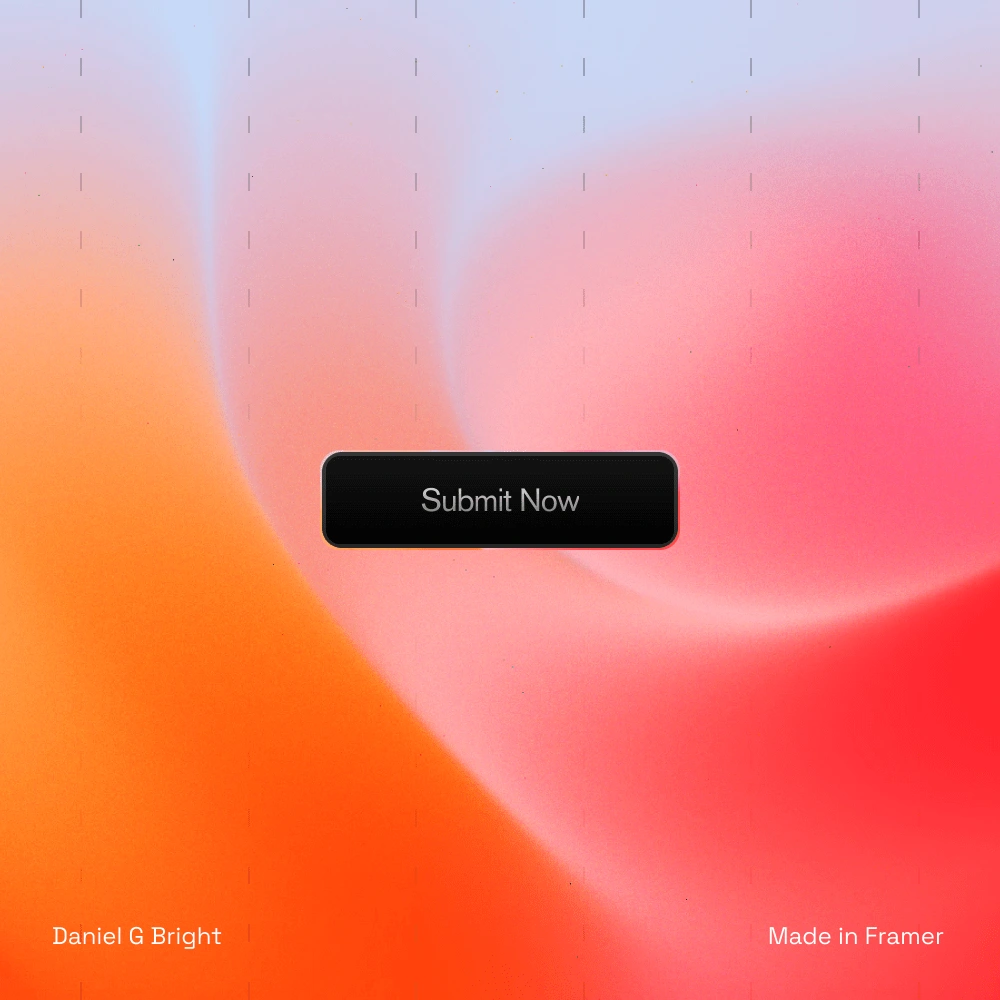
Button Design
Like this project
What the client had to say
Working with Daniel was amazing. He understood the assigment and made sure we align on everything in the project. Def. Looking forward to the next one with him!
Bernhard Trogrlic, THE AD.GENCY
Mar 31, 2025, Client
Posted Apr 1, 2025
I helped The AdGency turn a rough start into a sleek, confident site that reflects their brand and drives real results with clarity and personality.
Likes
18
Views
835
Timeline
Mar 17, 2025 - Mar 31, 2025
Clients
THE AD.GENCY