Built with Framer
Bright Studios • The studio site I always wanted
Daniel G Bright

Overview:
I’ve worked with dozens of startups, helping them look sharper and launch smarter. But when it came to my own studio, I knew I had to raise the bar. I didn’t just want a portfolio, I wanted a website that felt like Bright Studios. Something that would reflect the kind of work we do, how we think, and the founders we love working with.
So I treated the site like I would any client project. Strategy first. Design second. No fluff. No recycled templates. Just a clean, confident site that works as hard as we do.
The Challenge
I didn’t want another agency site that screams “design studio” but says nothing. I wanted something personal but professional. Strategic but playful. A site that’s easy to update, quick to load, and fun to scroll. but still communicates value fast. It needed to show our process, highlight real projects, and get founders to book a call, all without feeling like a sales pitch.
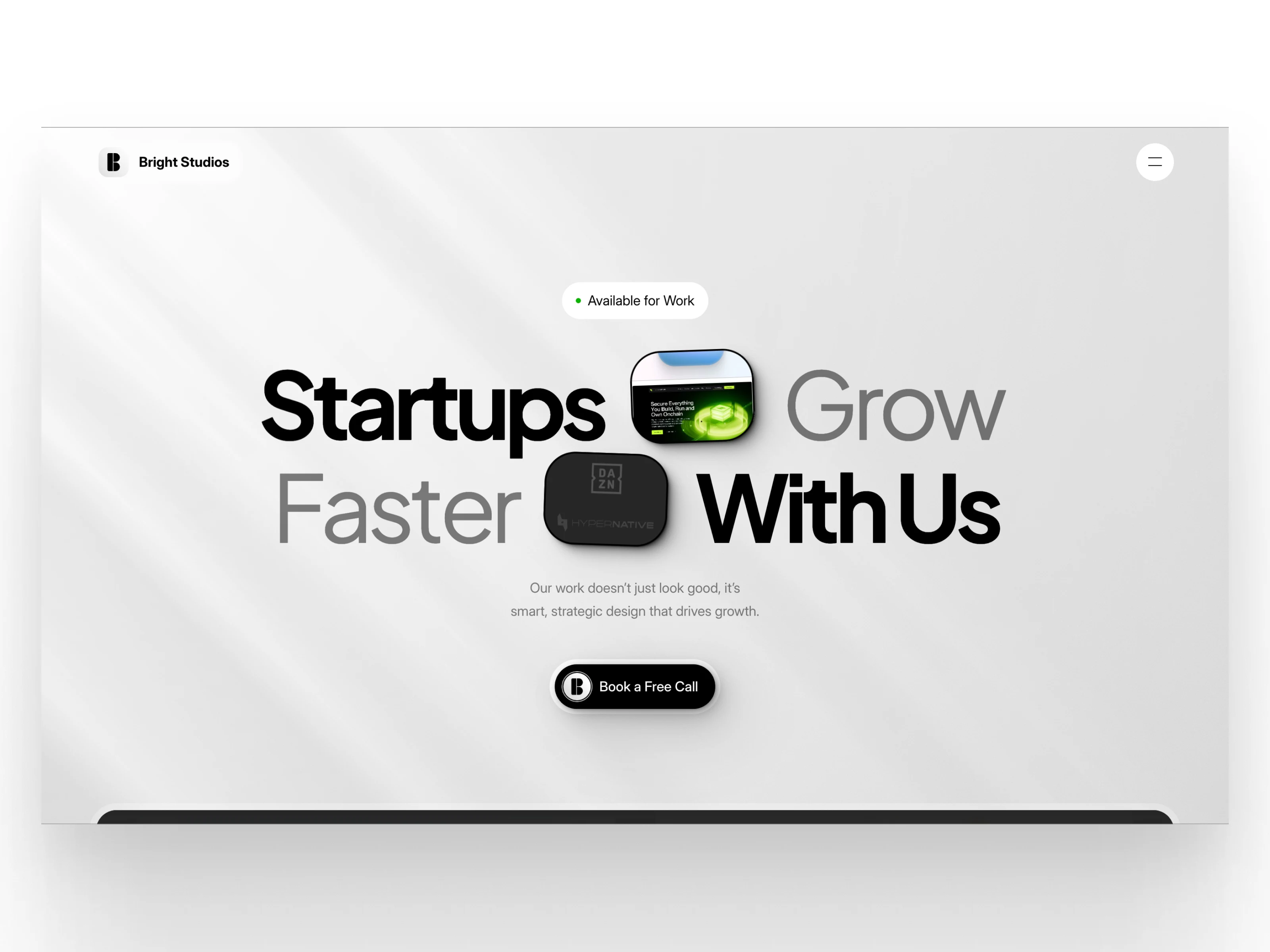
Hero
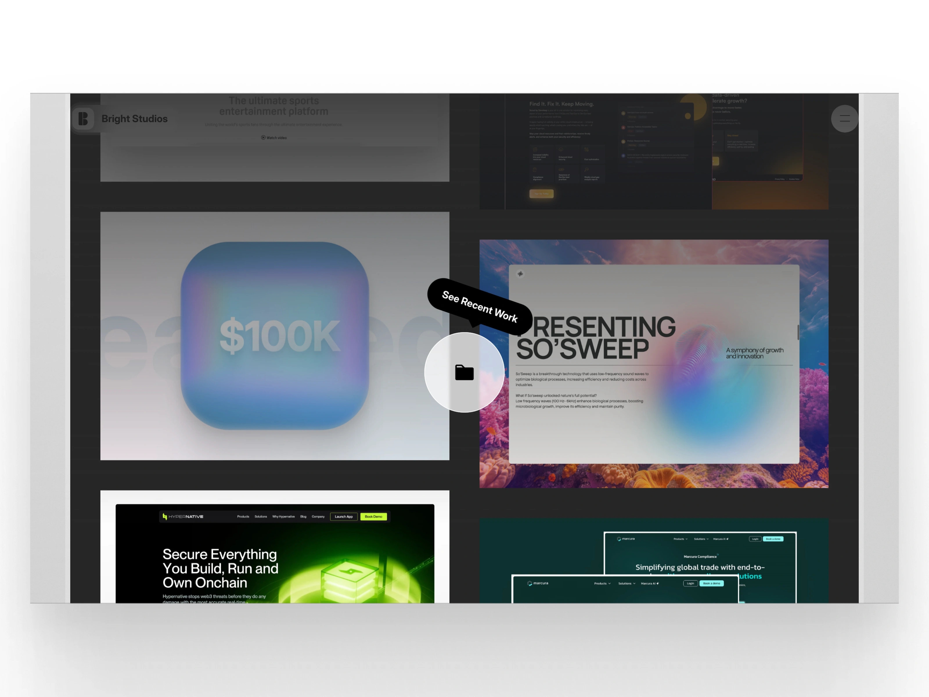
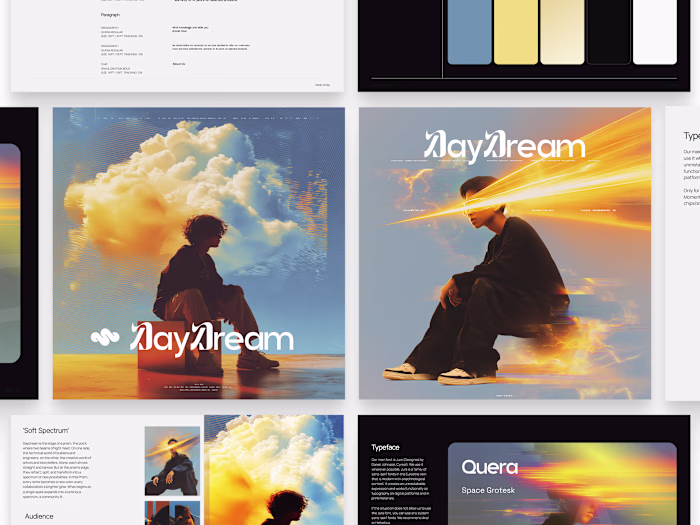
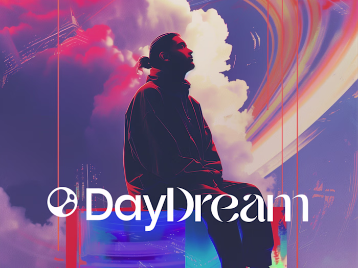
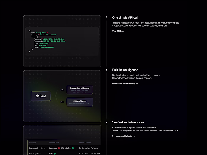
Recent Work
The Solution
I built the entire site in Framer, combining clean structure with a bit of personality. I kept the palette minimal, leaned into soft gradients and type treatments, and focused the flow around real user actions, like checking out case studies or booking a discovery call.
I also made space to share a bit of the human side of the studio: who’s behind it, what we value, and what it’s actually like to work with us. Everything was designed to feel light, modern, and clear. The end result is a studio website that speaks for itself.
Quick Note
This project was also a reminder to treat your own brand with the same love and clarity you give your clients. It’s easy to push your own stuff to the bottom of the list, but Bright Studios deserved better. So I made the time. and I’m really proud of how it turned out.
Final Thoughts
Since launching, the site’s done exactly what I hoped it would. It brings in the right kind of projects. It shows our work, but more importantly, it shows how we work. And every time I share it, I feel like it represents us fully. Mission accomplished.
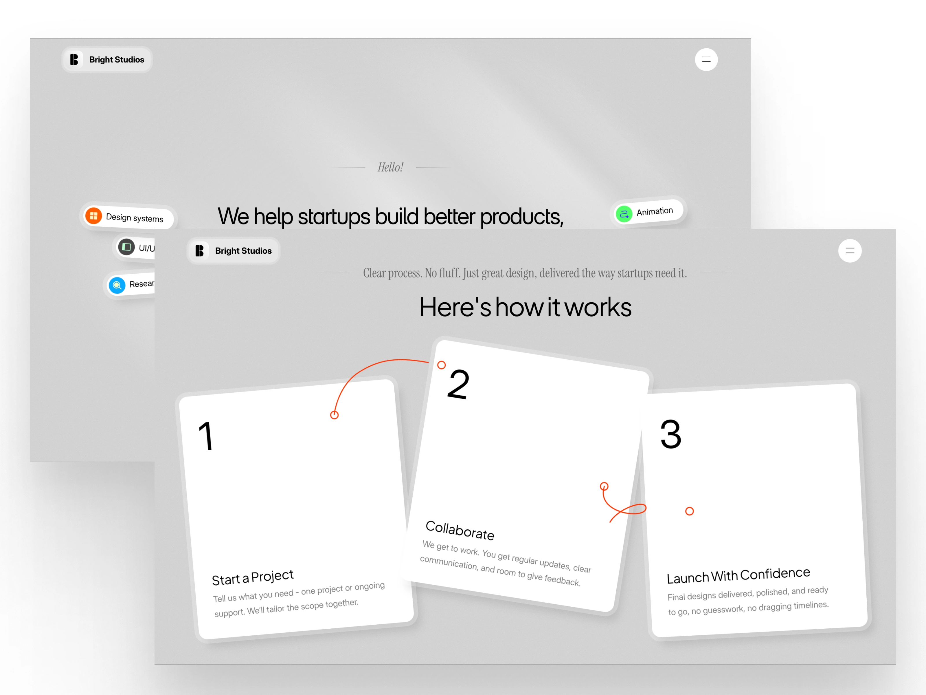
How it Works
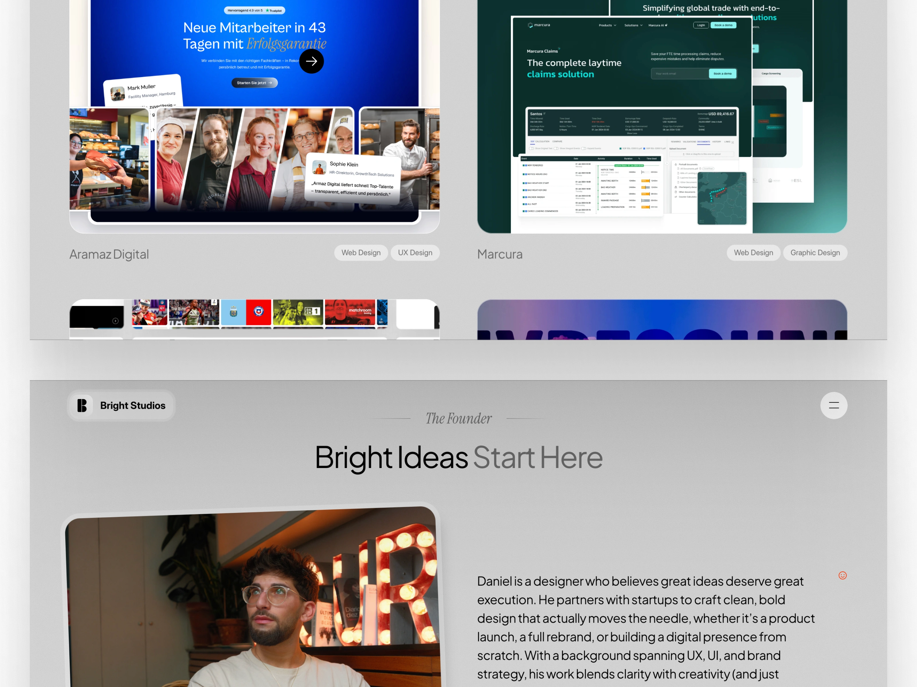
About
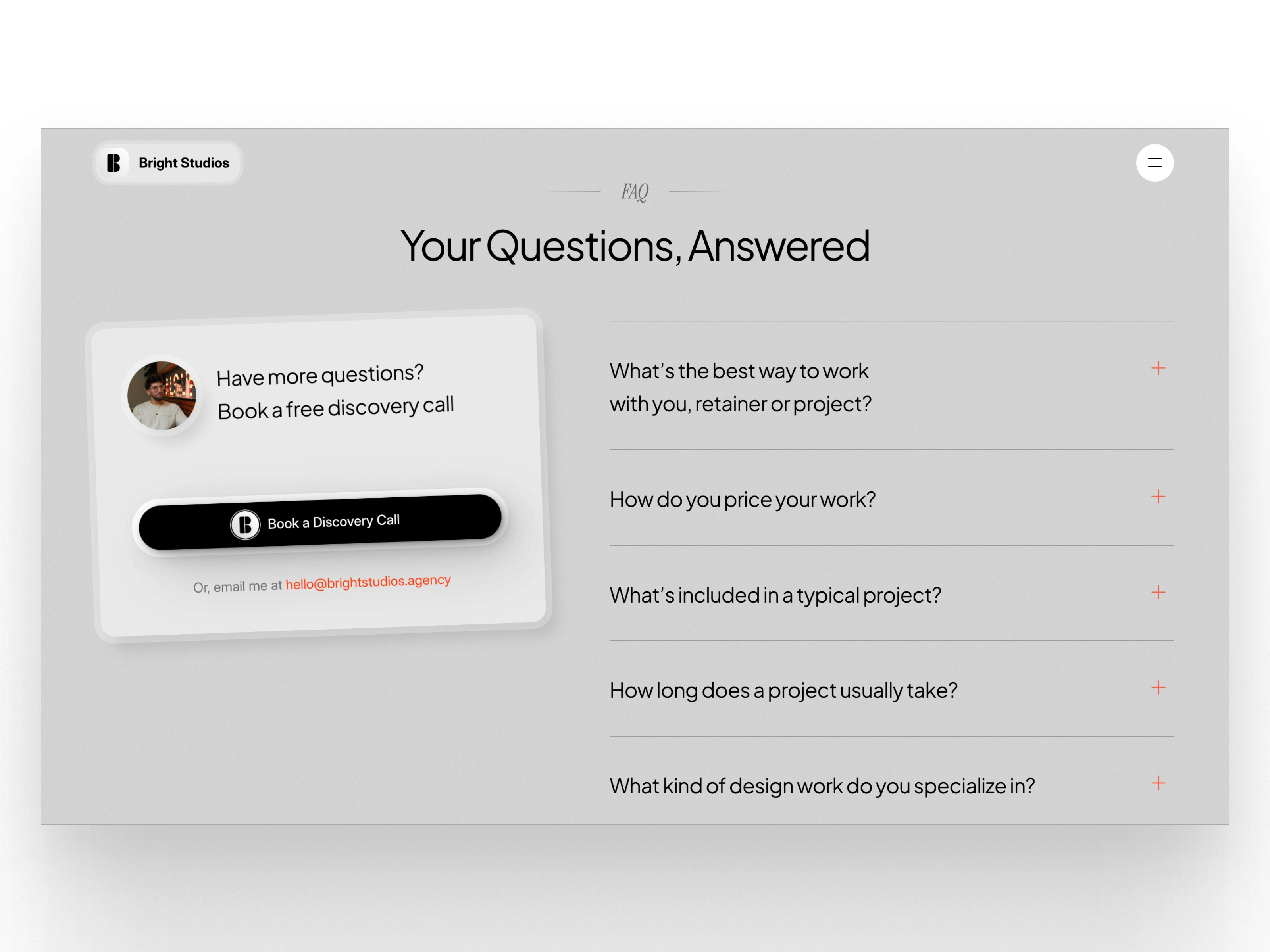
FAQ
Like this project
Posted Jun 5, 2025
I’ve worked with dozens of startups, helping them look sharper and launch smarter. But when it came to my own studio, I knew I had to raise the bar.
Likes
6
Views
503
Clients
BrightStudios®