Built with Jitter
Flex • Redesigning the Future of Moving & Storage
Daniel G Bright
Verified
Setting the Scene
When I first heard about Flex, I was hooked. Their pitch wasn’t “a better moving company”, it was “infrastructure for moving, built like Uber.”
That’s a big promise. But when I looked at their site and flows, the story wasn’t matching the vision. The homepage was functional but generic, the flows felt clunky, and the unique value of Flex (trailers, no surge, systematic reliability) wasn’t coming through.
That’s where I stepped in: to give Flex a design system, voice, and website experience that could carry their ambition.
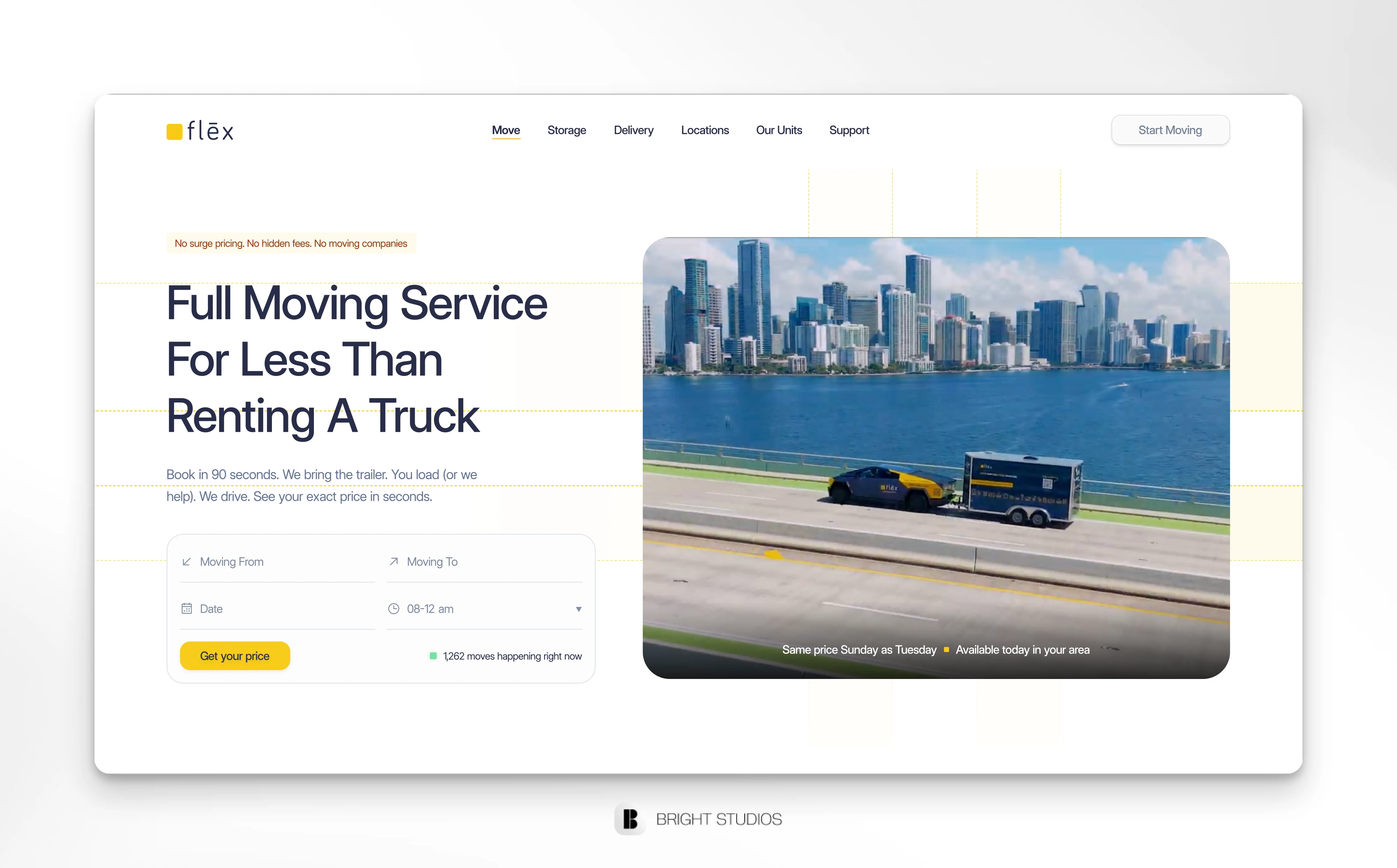
Move Page Hero
What We Wanted to Achieve
Make Flex feel like a tech company, not a mover.
Show the difference in a way that’s self-evident.
Simplify the experience: less explaining, more “of course this works.”
Redesign the booking flows to feel fast, visual, and mobile-first.
Finding the Right Voice & Look
The founders made it clear: no fluff, no hype, no cheesy moving-company clichés.
The brand needed to speak with quiet confidence. Not “trust us, we’re reliable,” but “Your items arrive when scheduled.”
Visually, I drew inspiration from Uber, Flybox, and clean SaaS sites: bold typography, systematic grids, purposeful motion. Yellow + Navy became the anchors, energy and trust - with white and gray giving breathing space.
Features
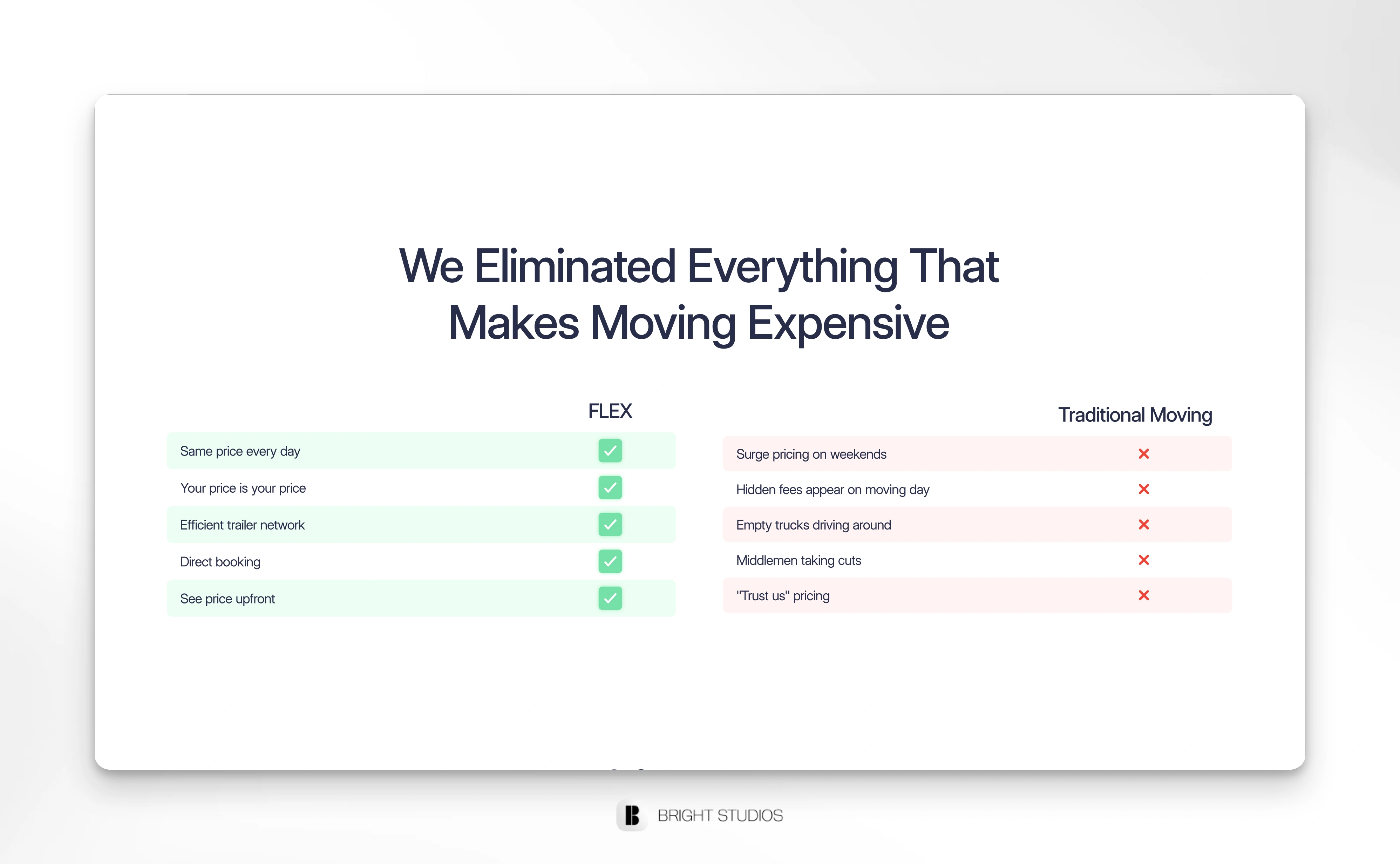
Comparison
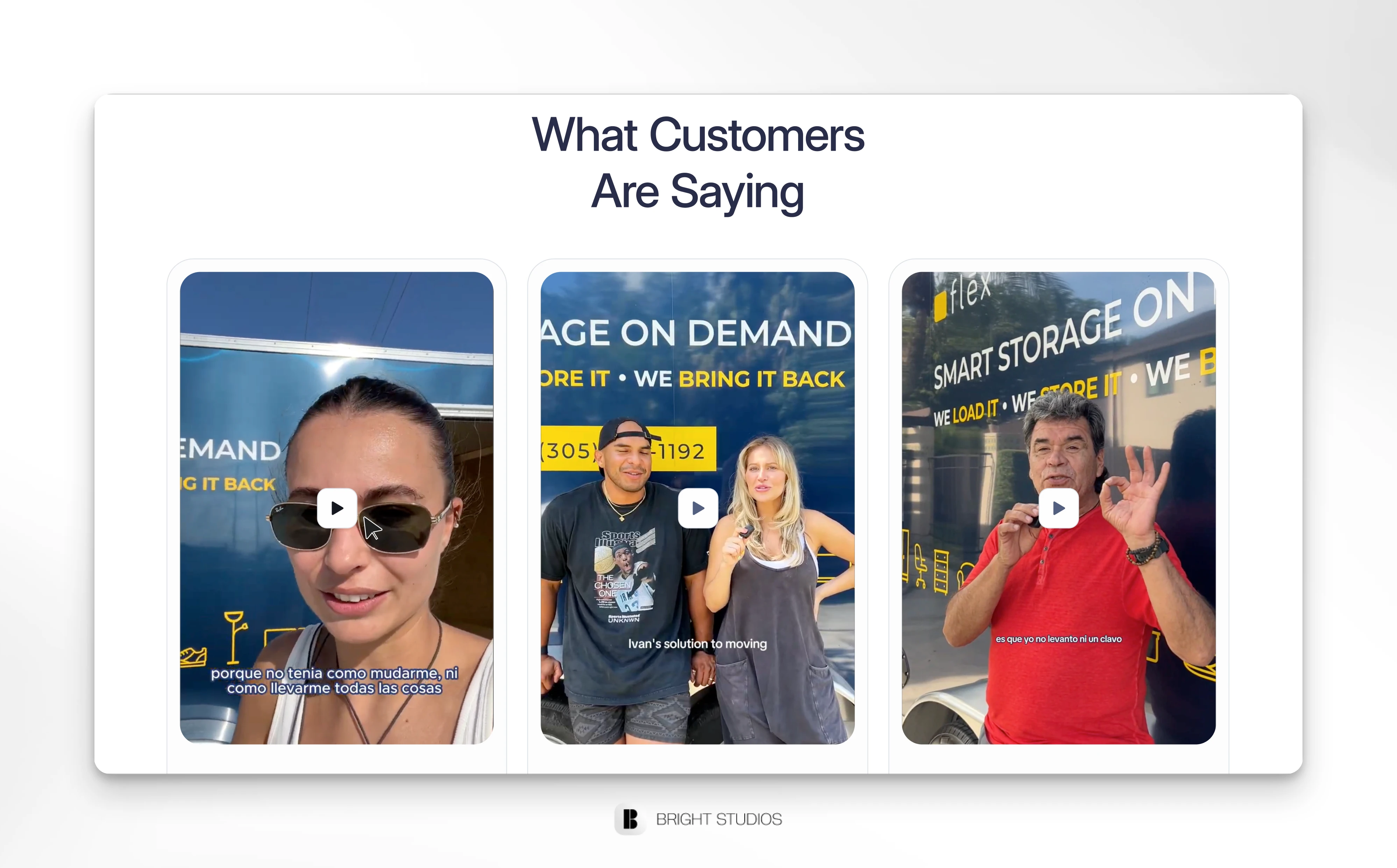
Some client reviews
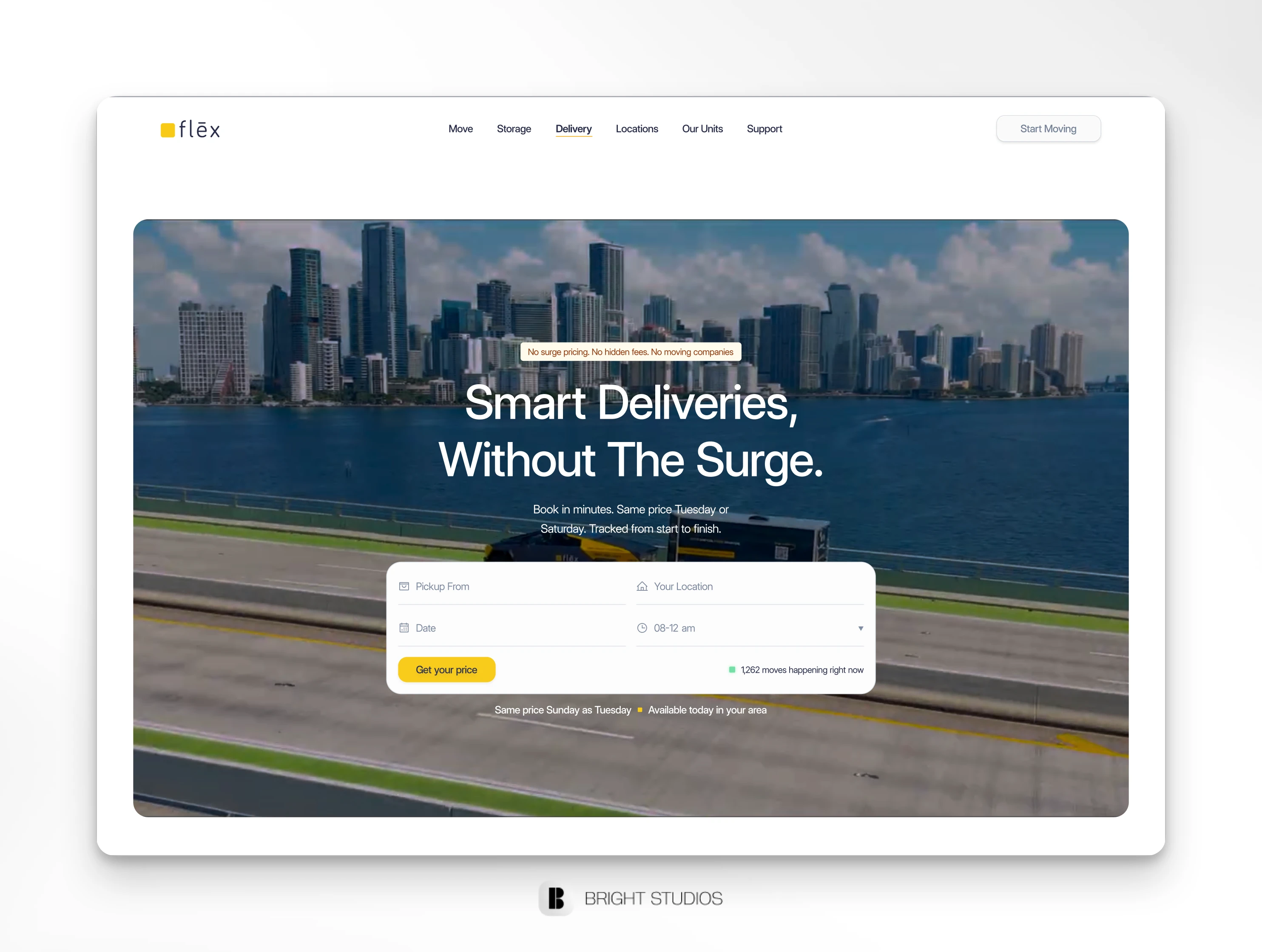
Redesigning the Homepage
The homepage is where we set the tone.
The old one buried the value. The new one worked like a story:
1. Hero with instant booking widget.
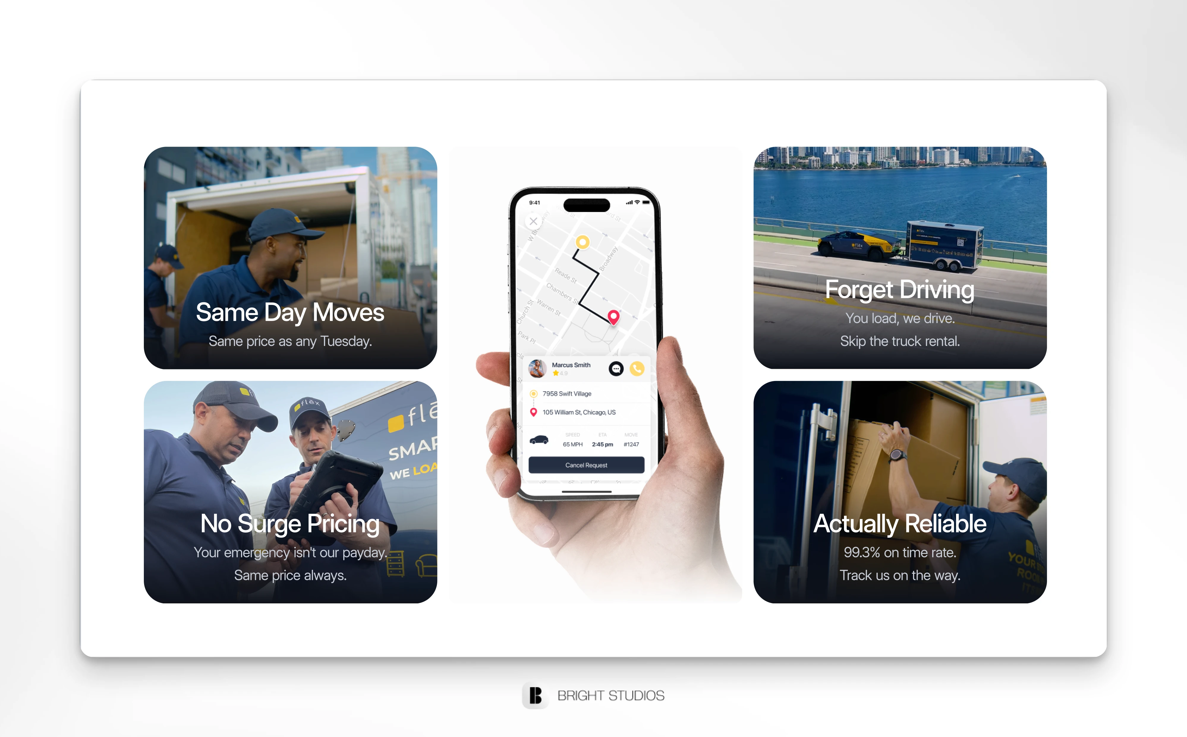
2. Three core promises (same-day, no surge, actually reliable).
3. Comparison grid - Flex vs. traditional movers.
4. Real social proof - videos, testimonials, numbers.
5. Strong CTA repeated where it matters.
Instead of trying to convince, the page just laid out the facts. It finally felt like Flex.
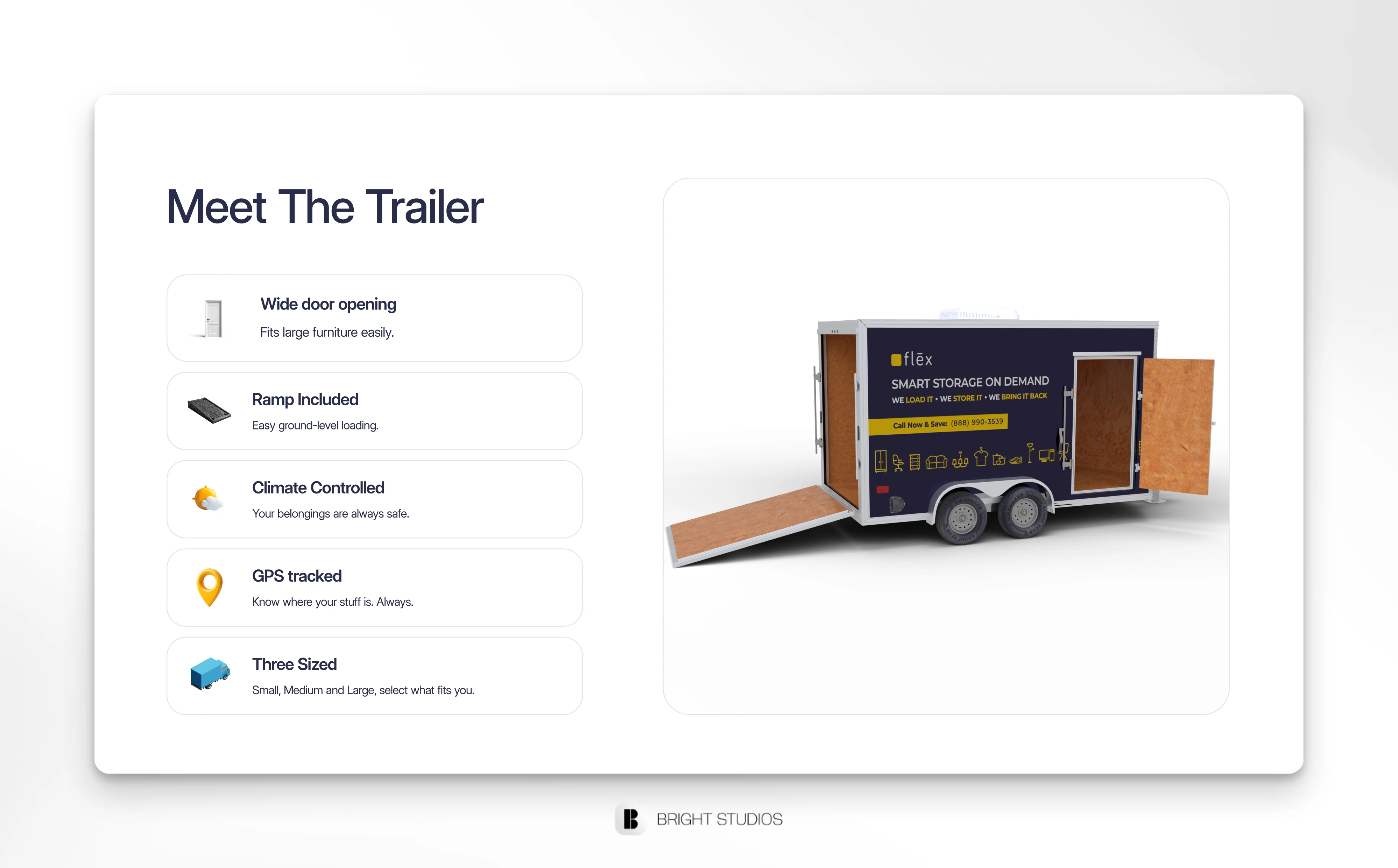
Meet the trailer
Building Out Storage & Deliveries
With the homepage locked, we split into Storage and Deliveries pages.
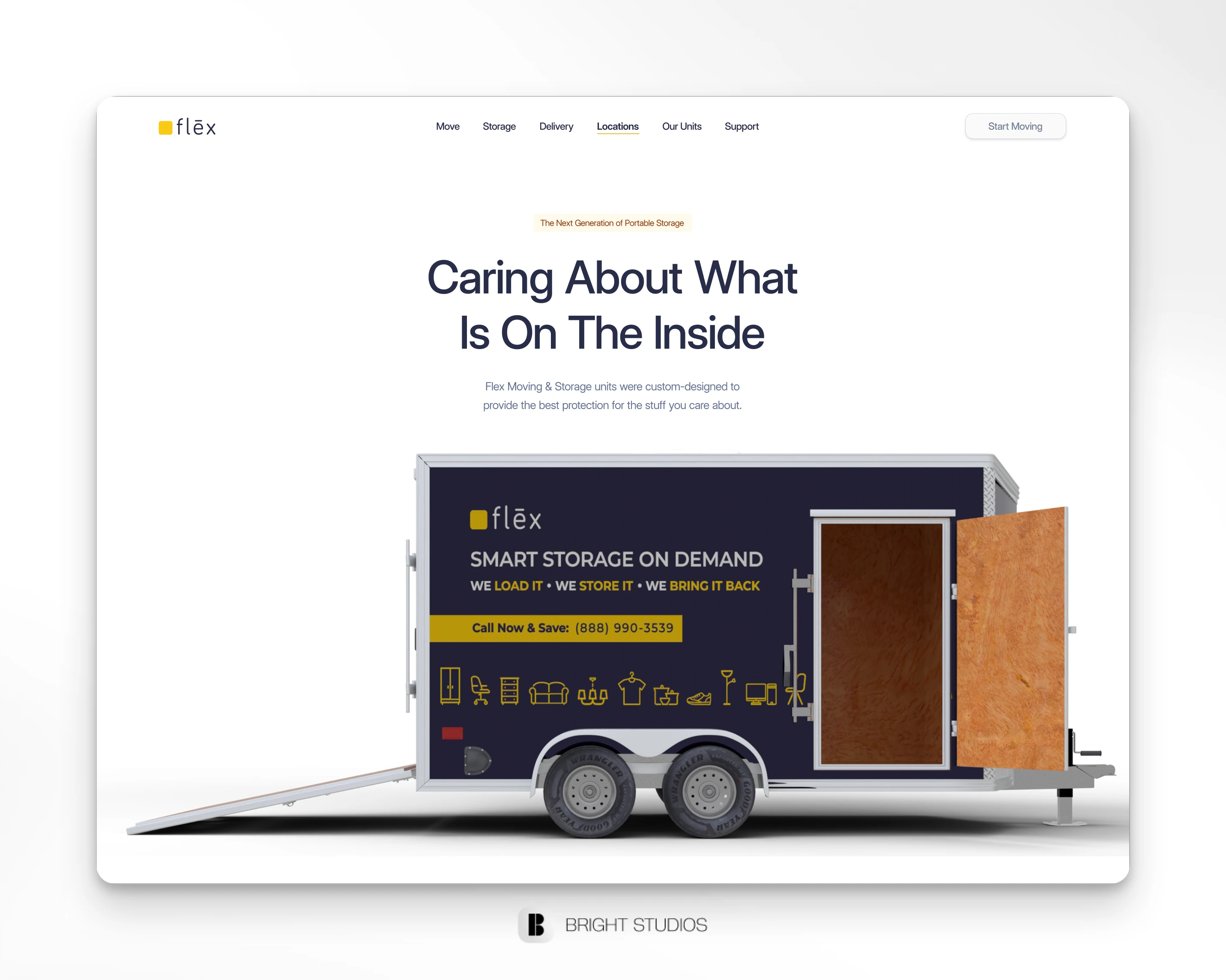
• Storage page told the story of “load once, skip the storage unit.” It highlighted the trailer as the hero - wide doors, ramps, climate control, secure locks.
• Deliveries page leaned into speed and transparency. We added a use-cases block (business, residential, events) and a stats section to make the reliability tangible.
Both pages reused the homepage skeleton but with focused storytelling. Consistency without duplication.
Bento Grid Design
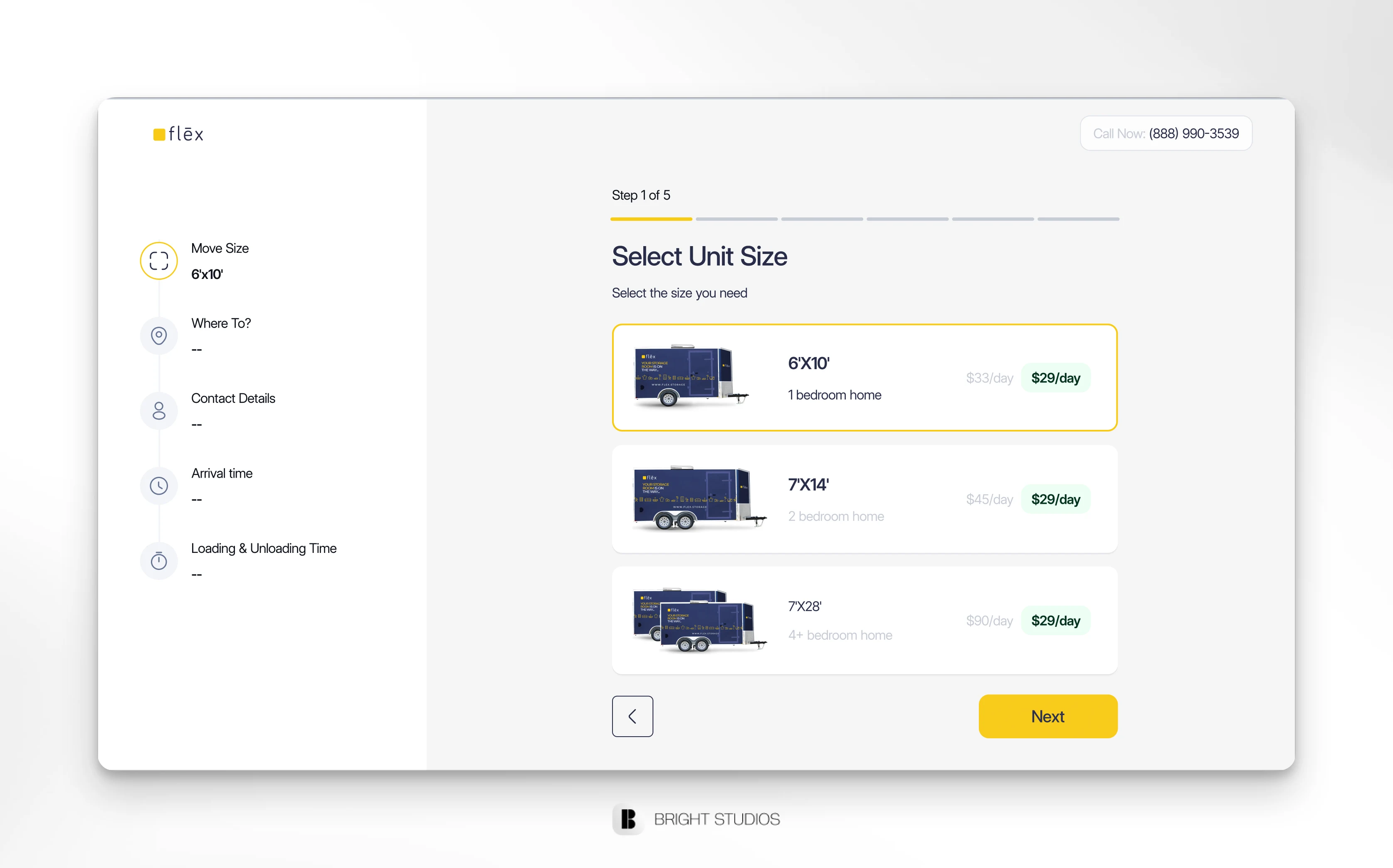
Meet the Trailer (Units Page)
This was where the design came alive.
We wanted users to see the trailer not as “equipment,” but as a product.
I designed a “Meet the Trailer” section with visuals, interactive size options, and feature cards: ramps, side doors, climate tech, and security. Then, a clean size comparison between Medium and Large - like a product spec sheet.
It turned the trailer into something aspirational, not just functional.
Meet the Trailer - Hero Page
Expanding With Locations
Next came the Locations page.
We used a map of the U.S., highlighting where Flex was already live and where it was “coming soon.” Underneath, a list of supported states and future ones.
It positioned Flex as more than local - an infrastructure system scaling across the country.
Deliveries Page Hero Section
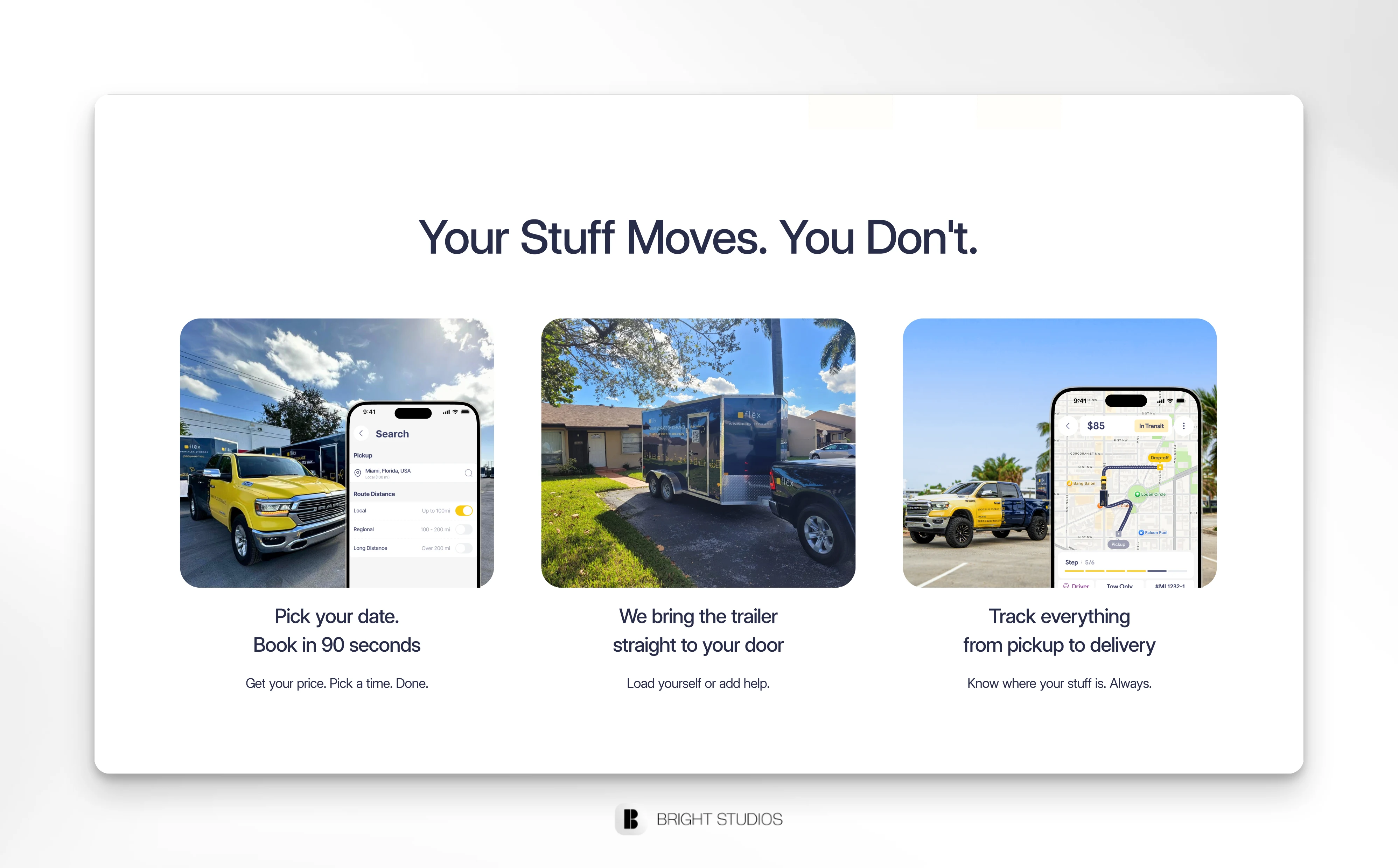
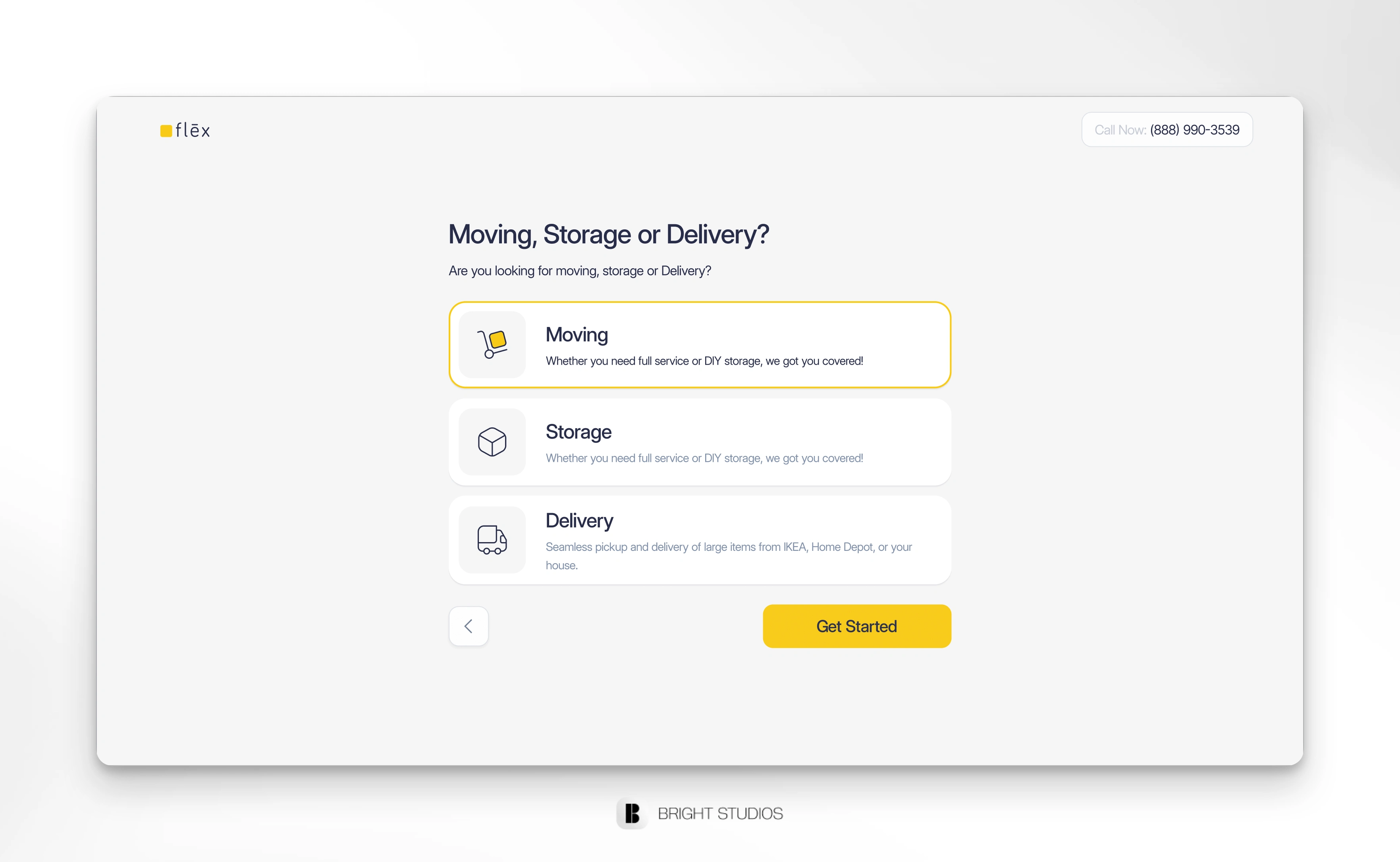
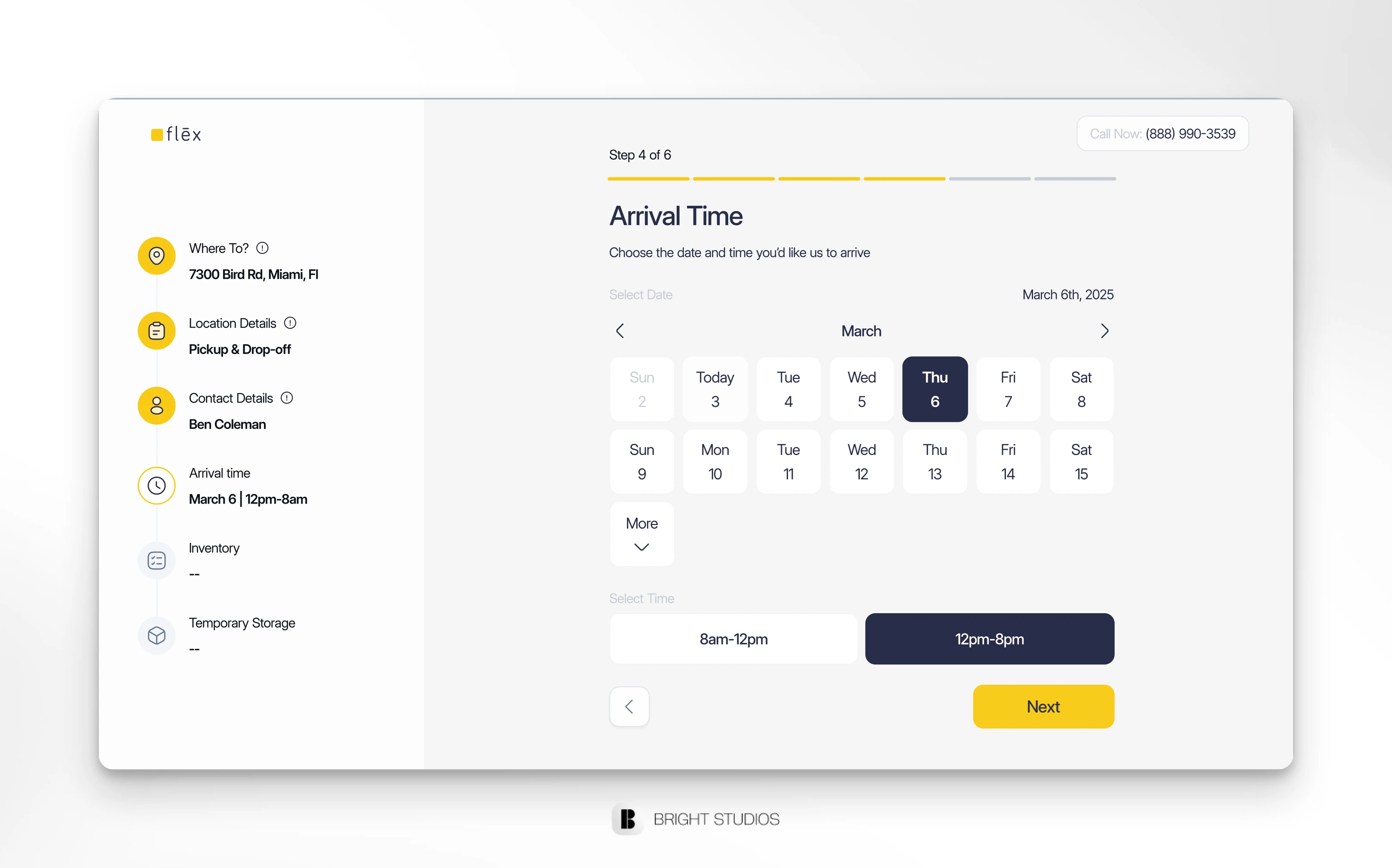
Redesigning the Flows
Finally, the heart of the experience: booking flows.
The old flows felt like forms. I redesigned them to feel like steps in a journey:
• Progress bar at the top.
• Cards for choices (sizes, service type, extras).
• Sticky “Continue” button on mobile.
• Price updates at every step.
Instead of overwhelming, the flows became fast, visual, transparent.
Flow Onboarding
Calendar
Unit Selection
Challenges Along the Way
• Balancing consumer clarity with investor polish.
• Resisting the urge to “sell” and instead letting the system speak for itself.
• Keeping multiple new pages consistent while tailoring the voice for each.
The Result
• A homepage that actually tells Flex’s story.
• Storage, Deliveries, Units, and Locations pages that scale the vision.
• Booking flows rebuilt to be clear, systematic, and mobile-first.
• A design system rooted in confidence and clarity.
Flex now looks and feels like what it is: the infrastructure for moving and storage - not just another mover.
Like this project
What the client had to say
Our team had a great experience with Daniel. He communicated effectively, delivered a terrific product, and moved quickly. I would highly recommend him and we are continuing to work with him.
Chris Griffenkranz, Flex Moving and Storage
Sep 10, 2025, Client
Posted Sep 7, 2025
From rethinking the homepage to rebuilding the booking flow, I helped Flex transform their website into a tech-driven platform that's ready to scale nationwide.
Likes
5
Views
210
Timeline
Aug 5, 2025 - Sep 7, 2025
Clients
Flex Moving and Storage