Built with Jitter
Aramaz Digital • Redesign for clarity and conversion
Portfolio project

Verified paid workView completed work
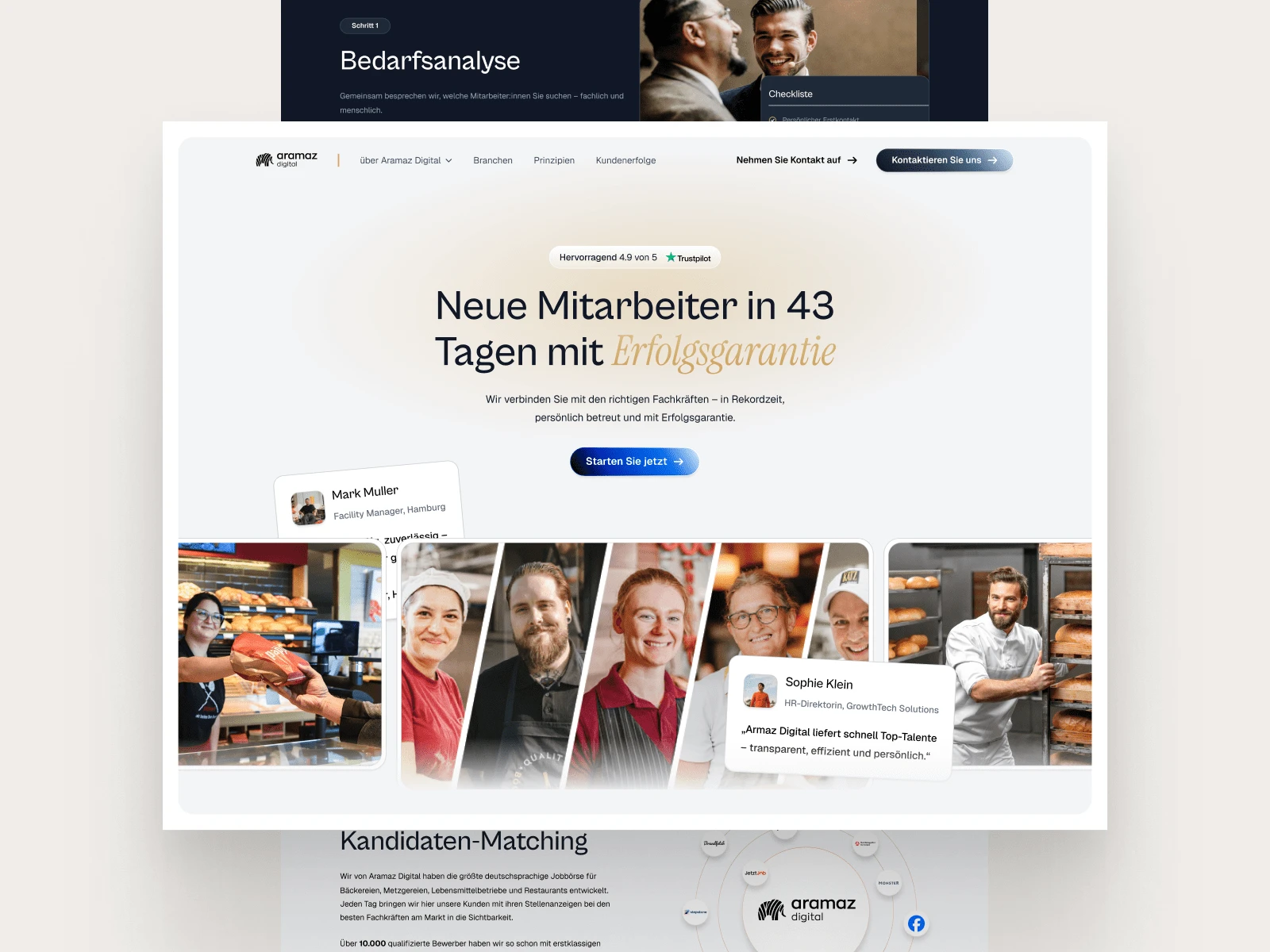
The Backstory
When Aramaz Digital reached out, they already had a brand — a logo, a signature red, a presence in the German market — but their website felt like a time capsule.
It was overloaded with content, heavy on copy, and didn’t do their mission justice: helping people find jobs, and helping companies find the right people. The experience was dense, a bit lifeless, and lacked any sense of momentum. So we kicked off a full redesign — not a fresh coat of paint, but a total rethink.
My Role
This was a solo project from start to finish. I handled everything from structure and layout to content editing (in German, which was a fun challenge) and visual direction. I worked closely with the founder and an in-house design advisor, then handed off the final product to a developer to build in WordPress.
Tools-wise, I worked mostly in Figma, used Midjourney for key visuals, and kept a flexible process to adapt quickly as content evolved.
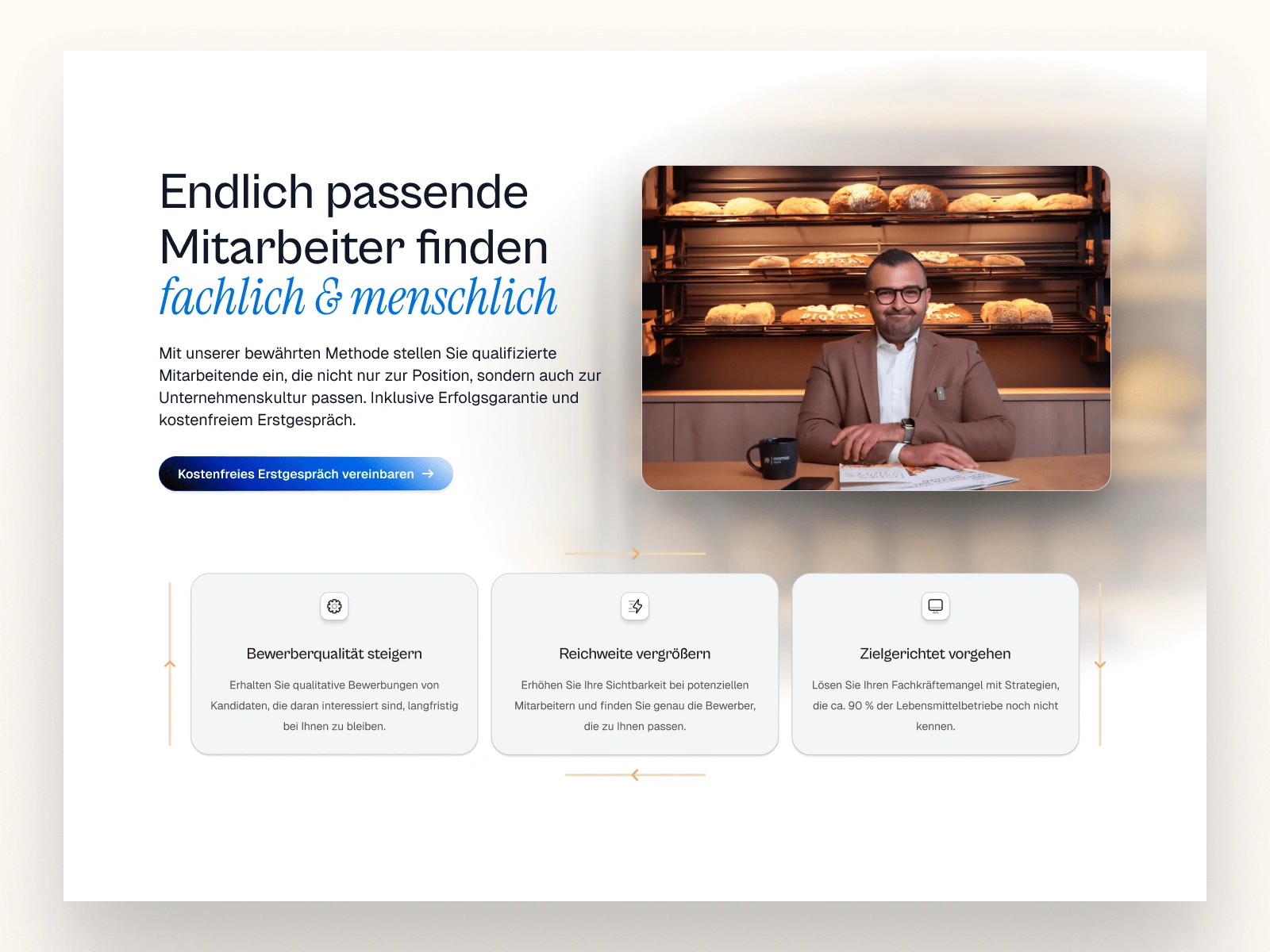
Inner Landing Hero
Reimagining the Experience
One of the first things I noticed: the site tried to say everything at once.
Long German headlines, big blocks of text, multiple audiences, and very little breathing room. The biggest challenge was to bring structure and space into that chaos — to create something that feels light, yet carries weight.
So I started from the ground up:
I kept the logo and core red but rebuilt the entire color system - added shades, accents, and neutrals that let the red shine.
I swapped the typography for something more modern, open, and legible.
And I restructured the content with one goal: let the user breathe.
Each section got its own rhythm. The site started to feel like a guided walk, not a wall of noise.
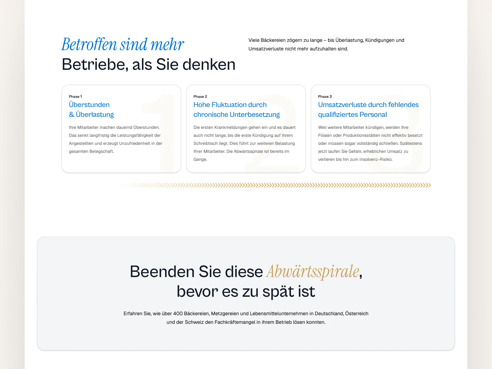
Information and Bullet Sections
Designing for Two Minds
The platform speaks to two very different people:
Those looking for a job
Those looking to hire
Balancing both without overwhelming either meant every section had to earn its place. No fluff. No filler. Just clear, thoughtful UX decisions:
Switched testimonial-looking images to icons for clarity
Built modular blocks to simplify long pages
Wrote CTAs that actually sound like a human wrote them
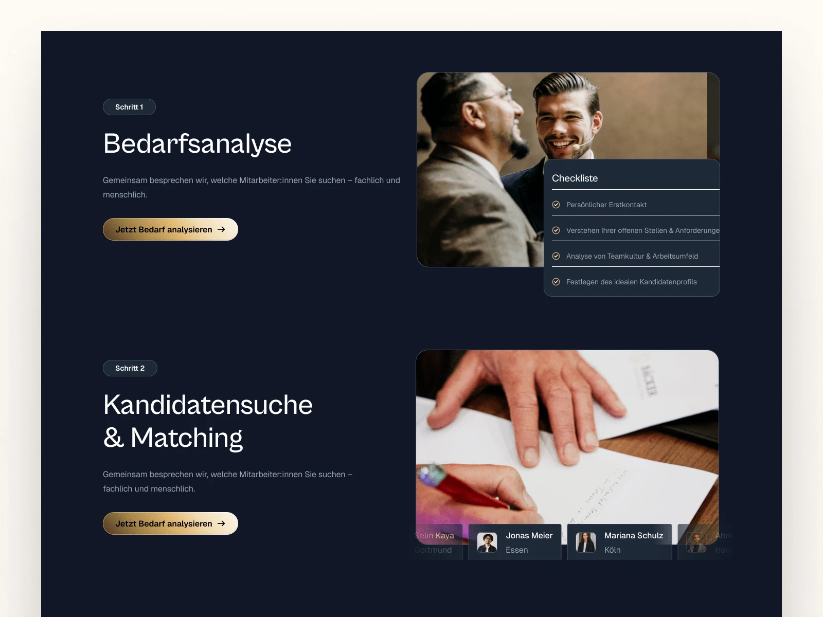
Dark content breakdown section
On Working in German
Designing in German was… surprisingly fun. But also real. Words are longer, and layout shifts happen fast. I had to rewrite and restructure a lot of content to make it fit visually without losing the tone or meaning.
This added a layer of UX writing to the process — editing paragraphs to reduce line breaks, simplifying headings, and trimming copy so the visual rhythm stayed intact.
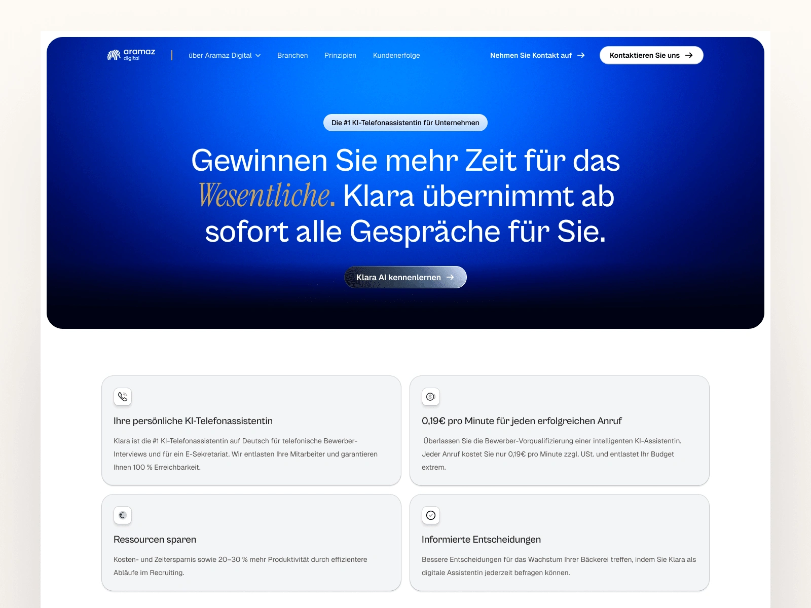
Klara AI Page
From Flat to Alive
Though I didn’t build the animations myself, I created detailed direction for how sections should move, interact, and respond. I wanted the site to feel alive — not overdone, but responsive in the right moments. Subtle motion to guide attention. Nothing flashy, everything intentional.
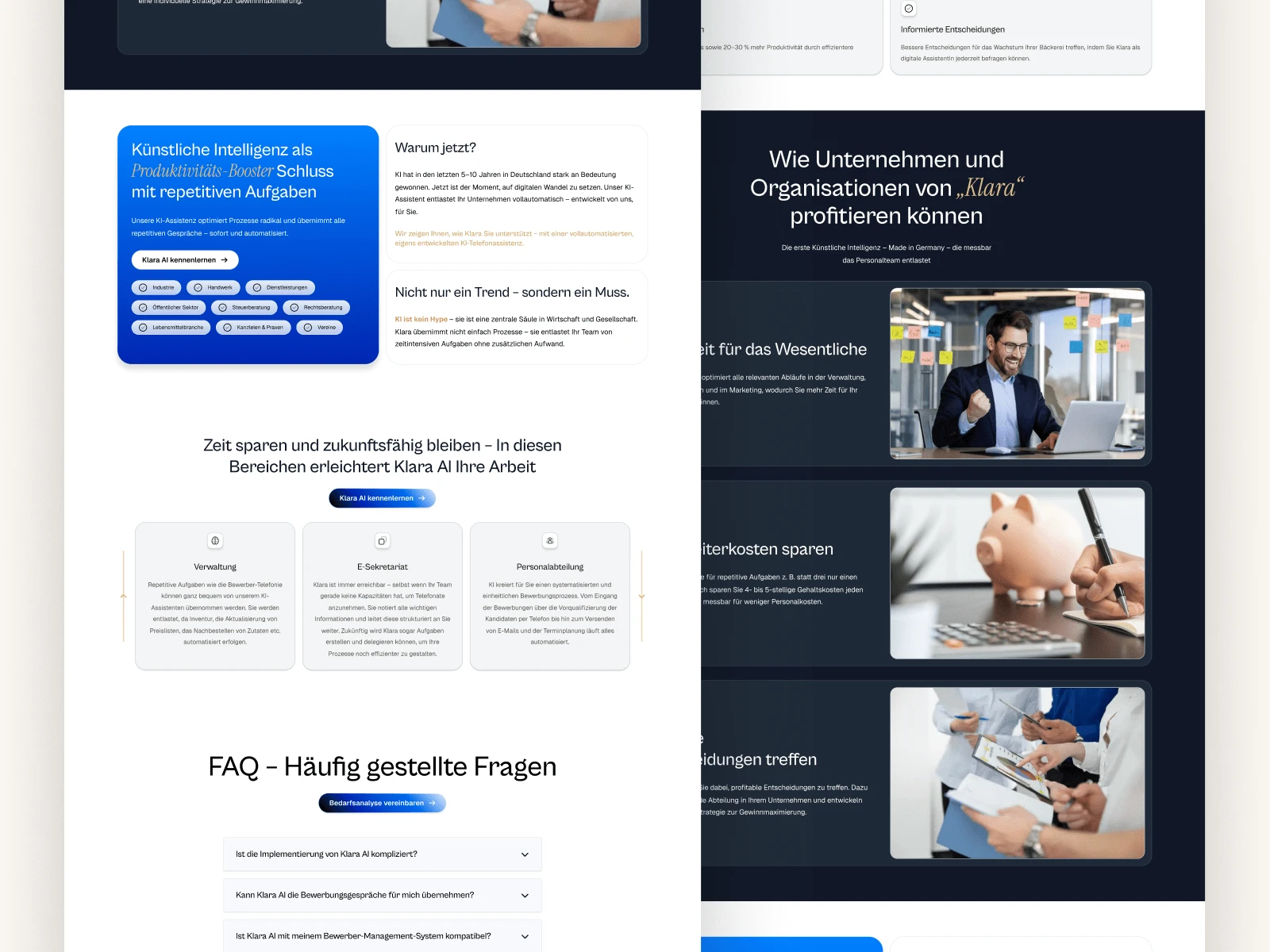
Features and FAQ
Final Thoughts
We ended up with 20+ pages - all designed, reviewed, revised, and handed off with confidence.
The client was genuinely excited with the result. It finally looked like who they were becoming, not who they used to be. That’s the kind of feedback I live for.
Looking back, I wouldn’t change the design. If anything, I’d just carve out more time to prototype the animation system myself. But for what we achieved, I’m proud. This one felt good.
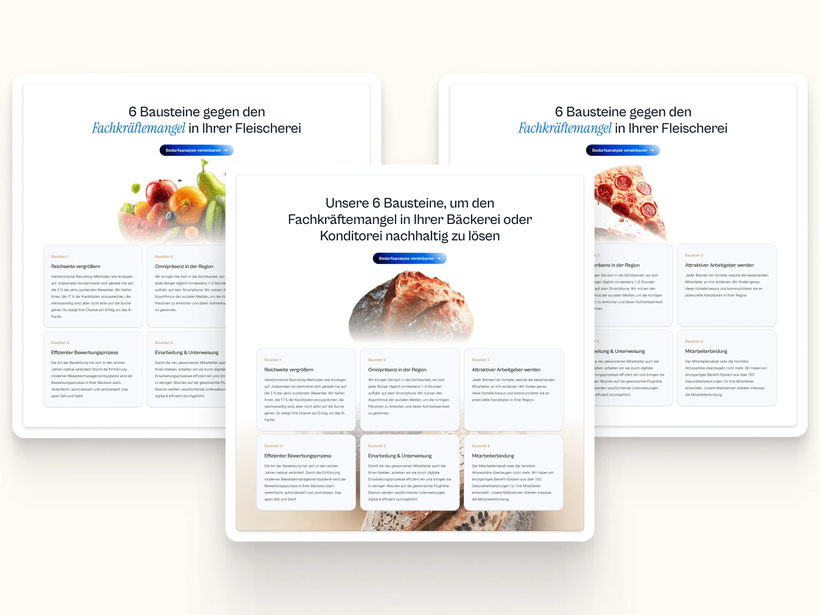
Food Specific Sections
111 likes · 3.6K views · May 6, 2025
A fresh 20-page experience built to connect recruiters and talent through clean design, smart structure, and focused storytelling.
Timeline
Apr 8, 2025 - Apr 30, 2025
Tags


What the client had to say
Daniel delivered clean, high-quality work that fully met our expectations. His communication was clear, reliable, and professional, and his execution in Figma perfectly matched our requirements.


Eyüp Aramaz, Aramaz Digital
Apr 30, 2025, Client