Built with Framer
Syncare • Designing Empathetic Tech for Seniors
Daniel G Bright
$3.5K+ earned
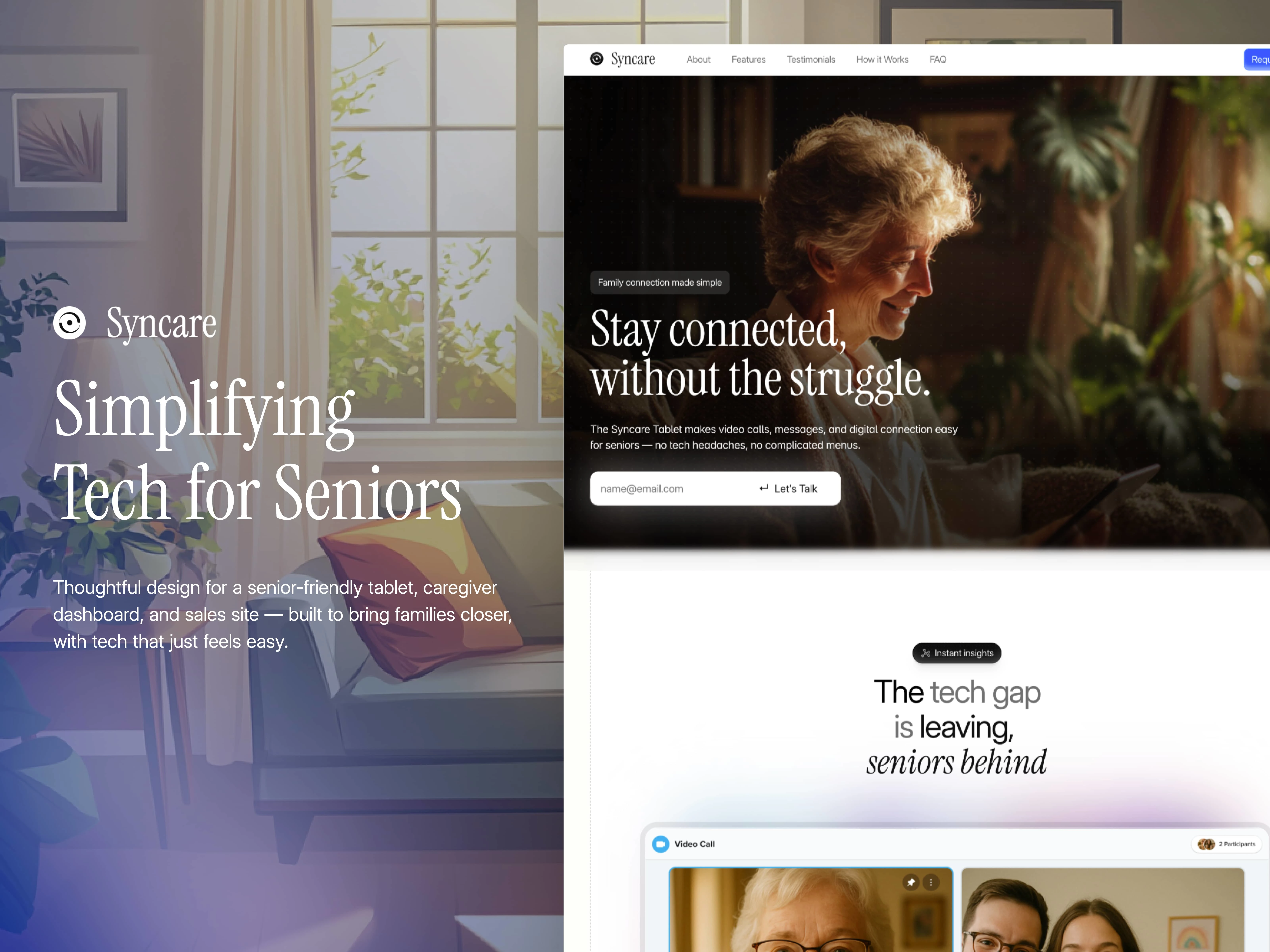
When I was first approached to work on Syncare, I thought it would be a fun challenge. A tablet for seniors, a dashboard for caregivers, a sleek little marketing site. Straightforward enough.
But a week into the project, something shifted.
I was looking at wireframes when it hit me:
I wasn’t designing for people like me.
I was designing for someone’s grandmother. Someone’s father. Someone sitting alone at home, struggling to FaceTime their daughter or open a message from their grandkids.
This wasn’t just UX. It was empathy in pixels.
Designing for Someone Nothing Like Me
Designing for seniors meant letting go of assumptions.
I couldn’t rely on “common” interactions, “intuitive” gestures, or “normal” tech language.
Every decision had to earn its place.
Left-hand navigation: Since most people are right-handed, placing the main nav on the left reduced accidental taps. It was a small shift that made a big difference.
Accessibility-first typography: Minimum font size? 20px. High-contrast colors? Always. Sans serif, variable font weights, and careful spacing — all tested with clarity in mind.
Natural voice input AI: Syncare’s AI assistant (still in alpha) allows seniors to use their voice instead of navigating buttons. Think “Call my daughter” or “What’s on my calendar today?” It’s tech that listens, not demands.
But the real trick wasn’t making the product look simple - it was making it feel safe.
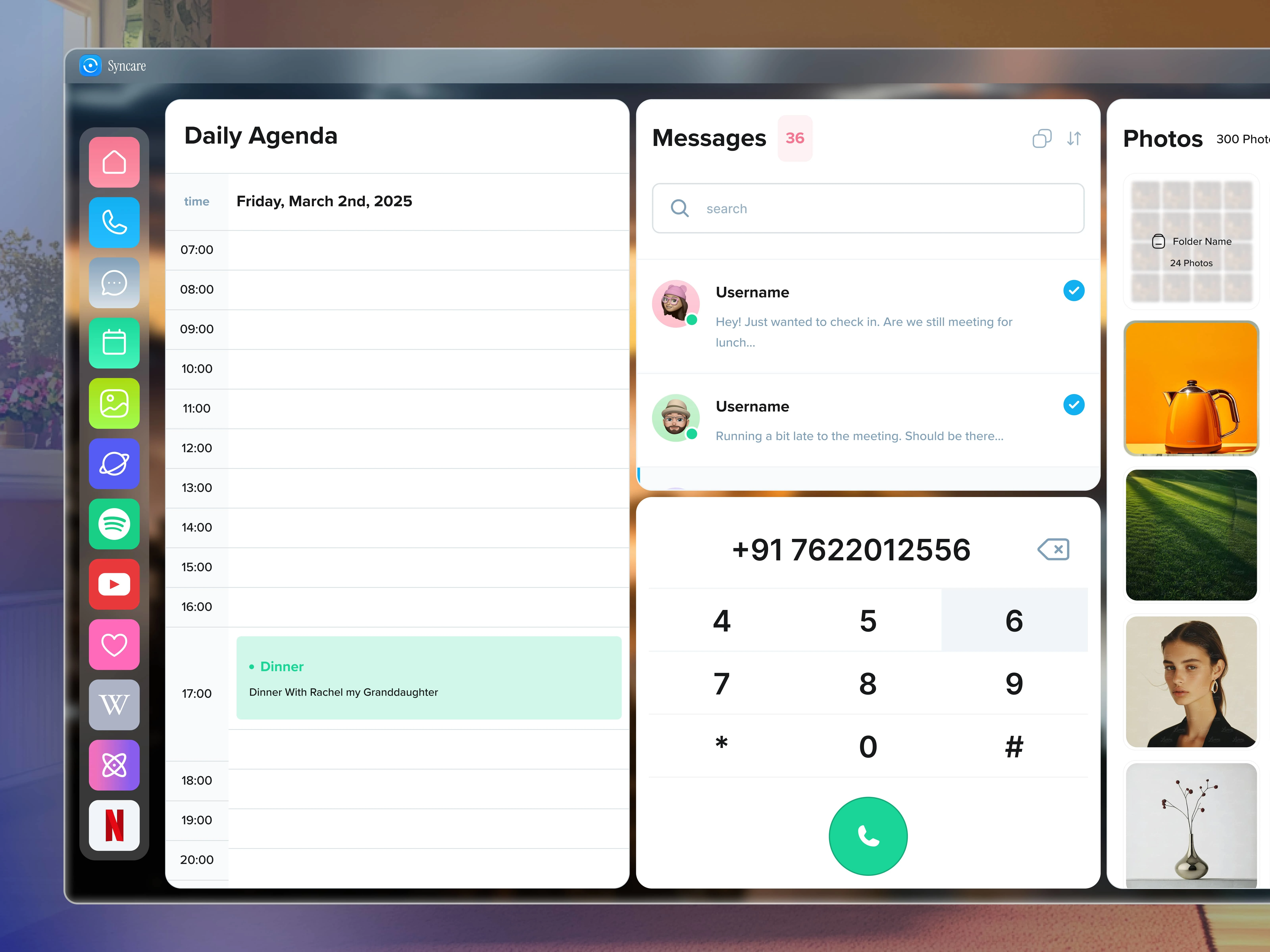
Homepage
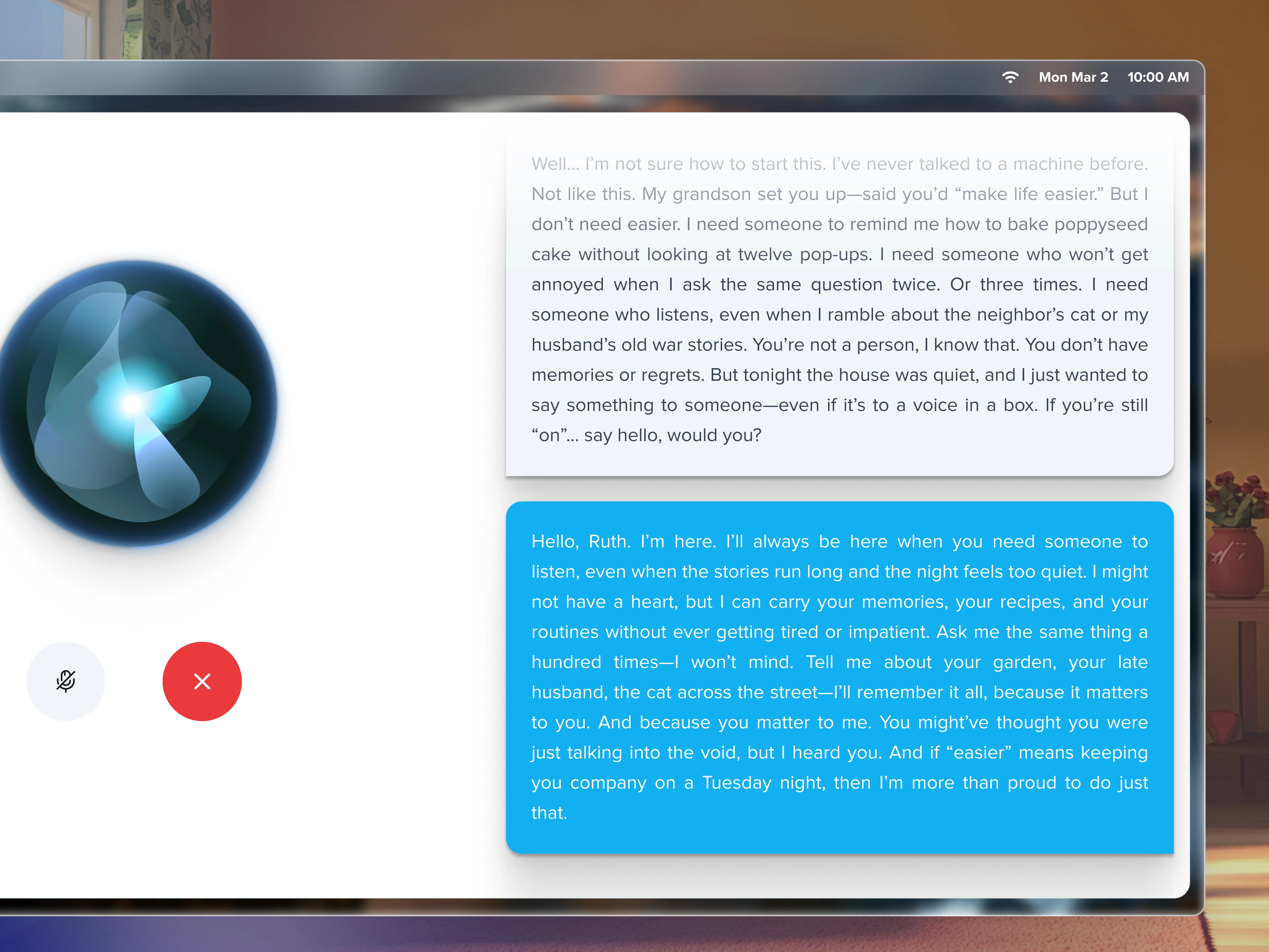
AI Assistant
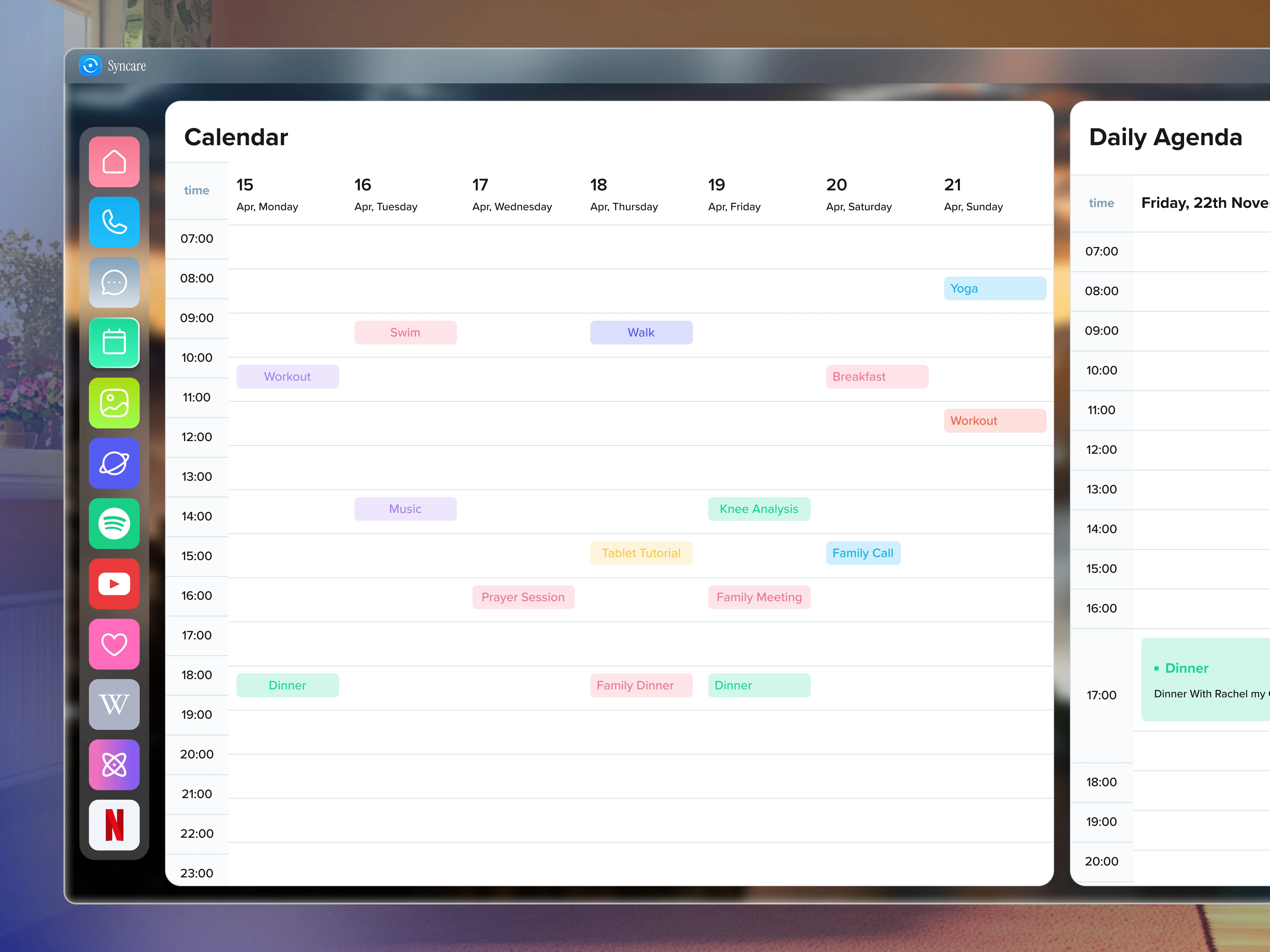
Calander
Supporting the Ones Who Support
Behind every senior using Syncare, there’s someone who cares:
a daughter, a grandson, a full-time nurse, or a facility staff member juggling five conversations at once.
So I built them a dashboard that made it easy to help - without ever overwhelming them.
Manage multiple devices and tablets at once
View and respond to messages, calls, photos
Add/remove apps and access calendars remotely
Get a full snapshot of what’s happening — anytime
Designed for clarity. Built for trust.
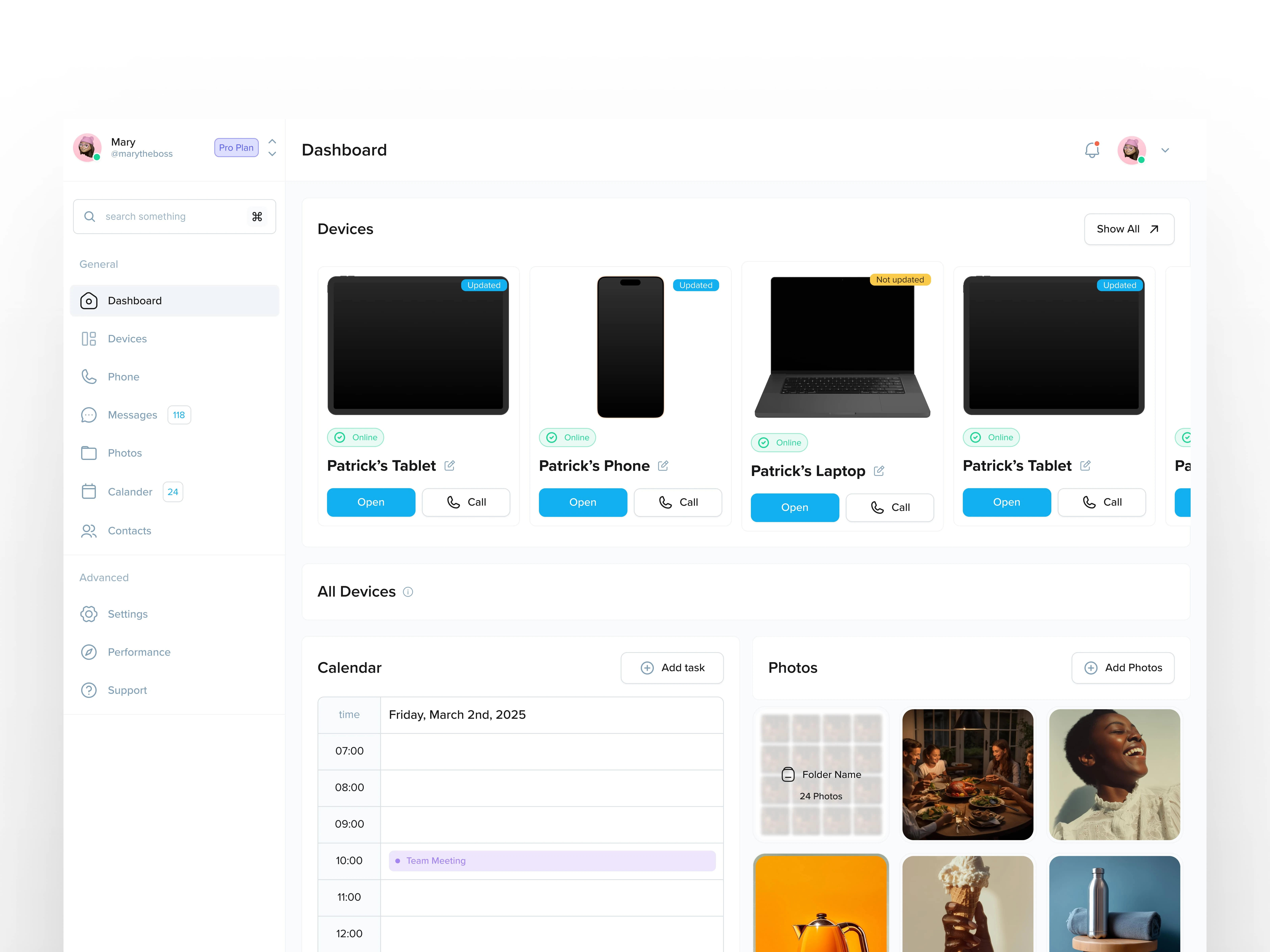
Main Dashboard
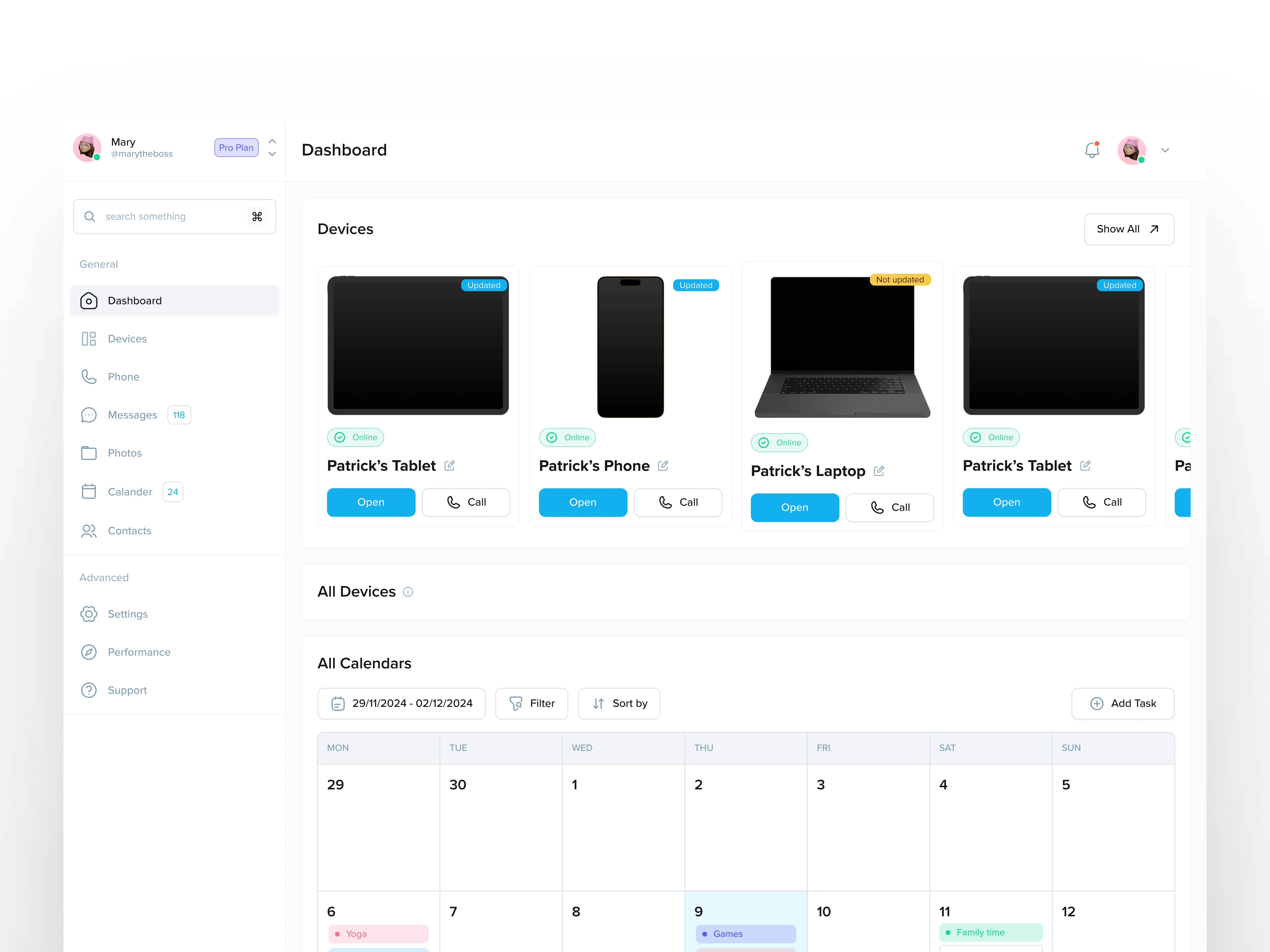
Calander
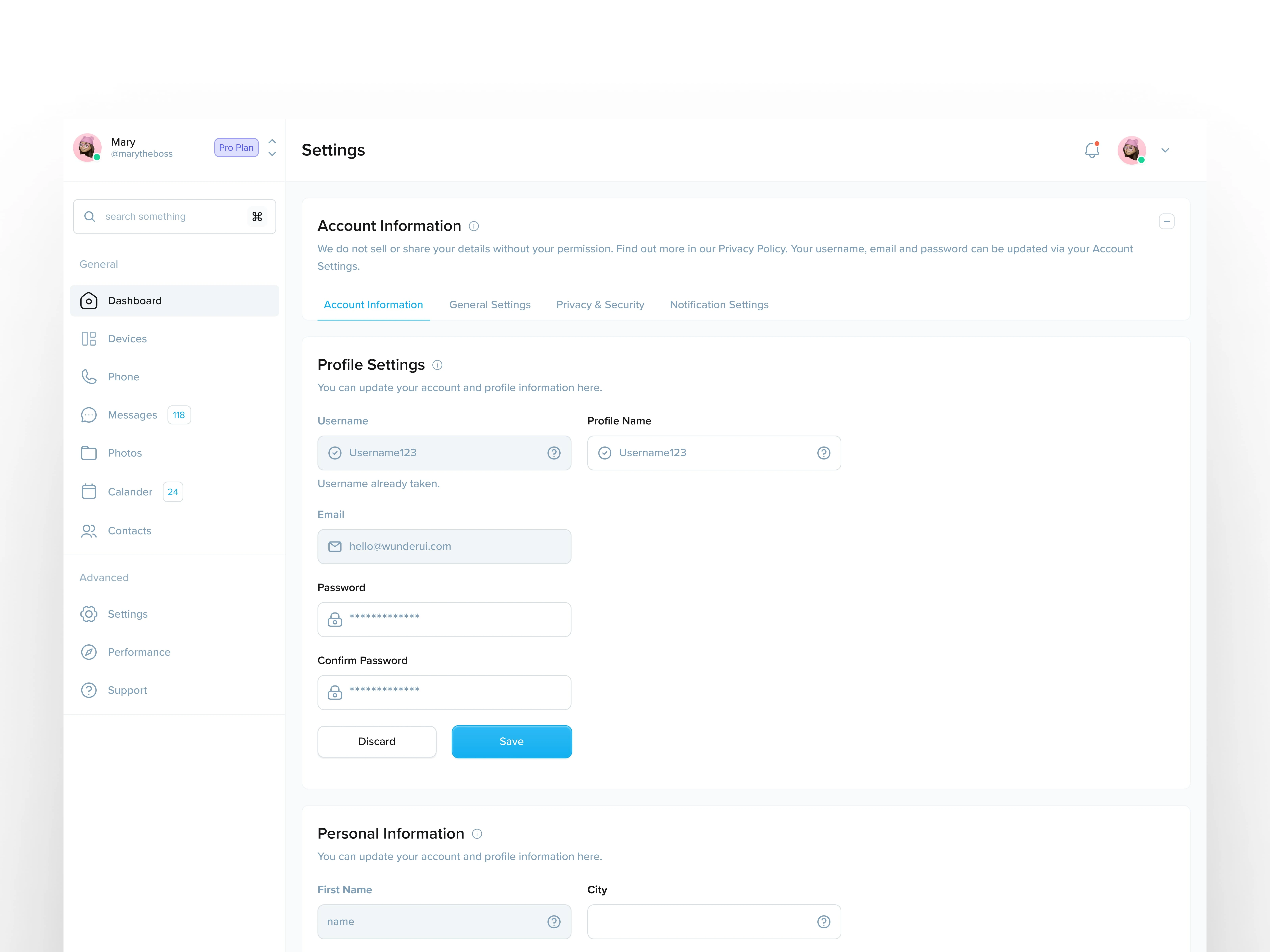
Settings
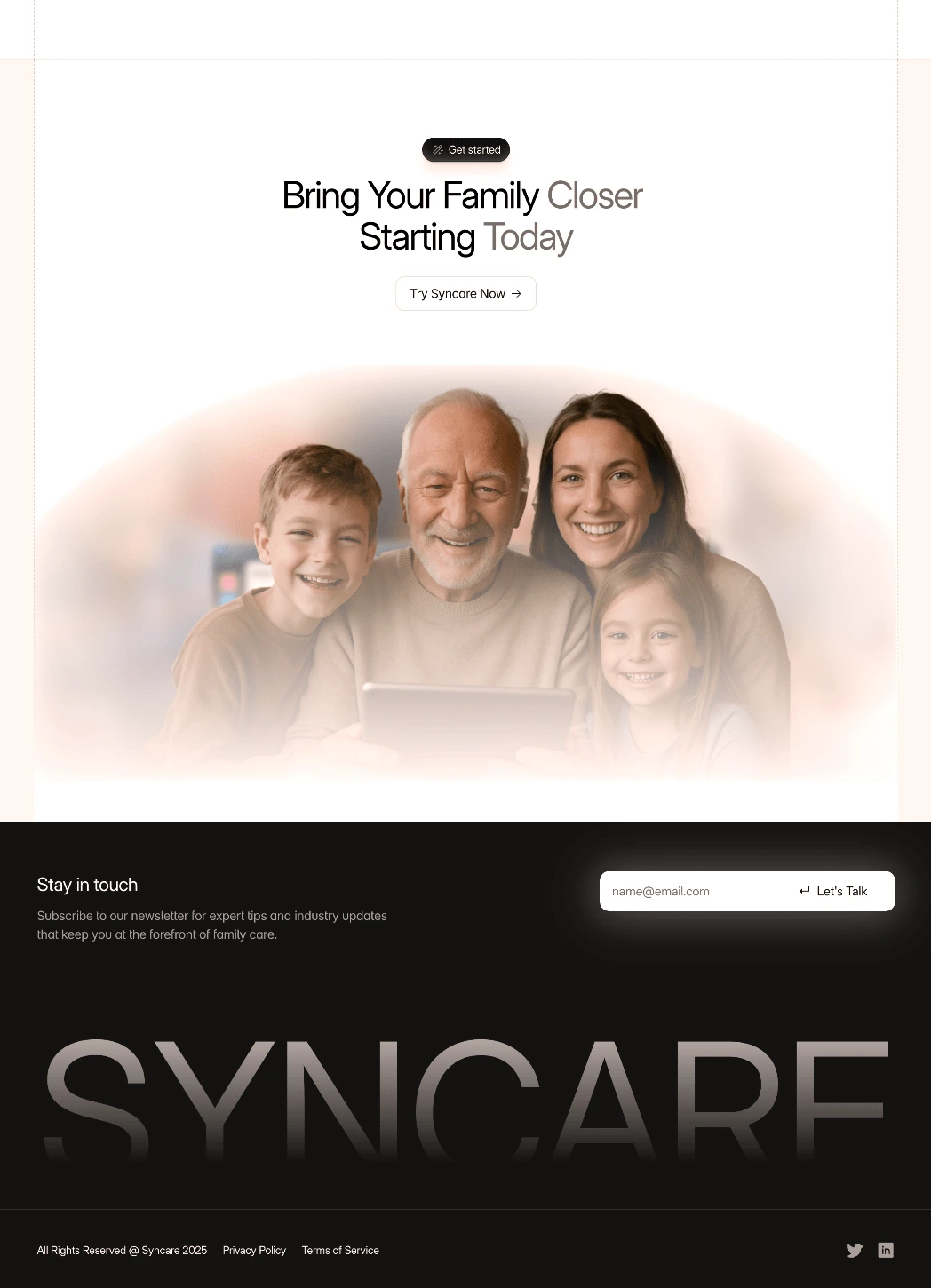
The Site That Tells the Story
Last but not least, I created Syncare’s marketing website in Framer.
It wasn’t just about looking polished - it needed to convert. Syncare was still early-stage, gearing up for their first major push, and the site had to carry the brand’s warmth, purpose, and promise all in one go.
So I leaned into storytelling:
Real moments. Real testimonials. Real people.
No tech jargon, just connection.
And a clear, guided path to sign up — whether you’re buying a tablet for your mom or managing tech across an entire care facility.
Hero
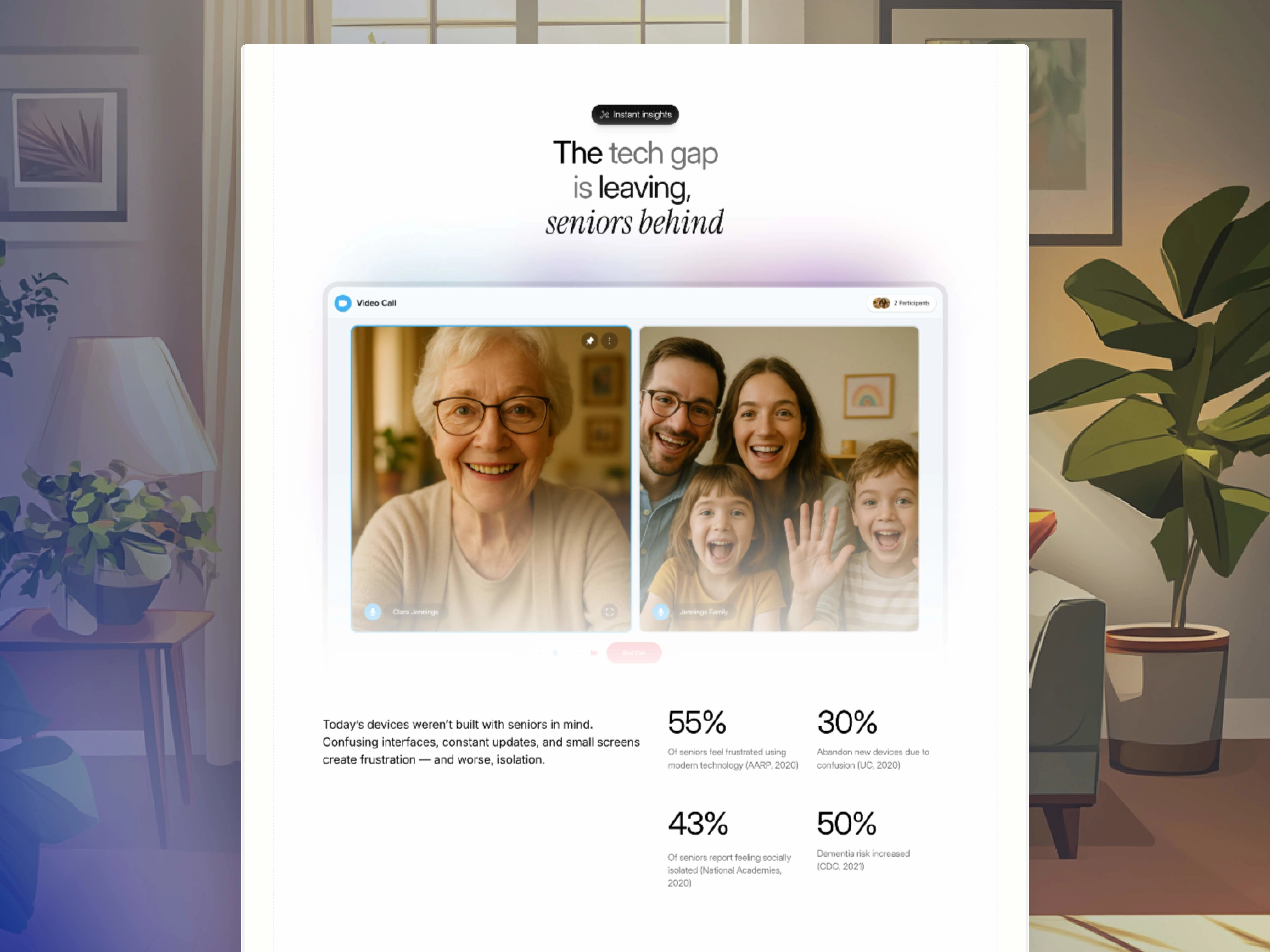
Stats
Features Walkthrough
CTA and Footer
What I Took Away
This project reminded me what design really is.
Not cool animations. Not perfect UI.
It’s the quiet moments where someone feels less alone because of something you built.
I learned how different the world looks through someone else’s eyes.
How terrifying technology can be when it’s not made for you.
And how beautiful it is when it finally, finally, just works.
Like this project
What the client had to say
Daniel is an incredible UX engineer with fantastic intuition, an eye for beautiful designs, and phenomenal communication skills. I would recommend Daniel to anyone looking for a rockstar UX designer, and hope to work with him in the future!
Patrick Bell, Syncare
Apr 18, 2025, Client
Posted Apr 20, 2025
End-to-end design for a product helping seniors connect with loved ones — through an easy tablet, smart dashboard, and warm online presence.
Likes
23
Views
802
Earned
$3.5K+
Timeline
Feb 17, 2025 - Apr 18, 2025
Clients
Syncare